
As per ususal here are some comparison shots and an assortment of extra shots for I, Mudd. Since this is the first 2nd season episode we also have an MP3 of the new theme, this one with the trademark soprano (related story).

Click the pictures for larger versions.
2nd Season Theme:
Click this link for the MP3 of the season 2 theme (940KB)
New Effects Video
(wmv)
Old versus New
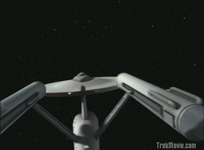
The CGI Enterprise suddenly changes to a new course
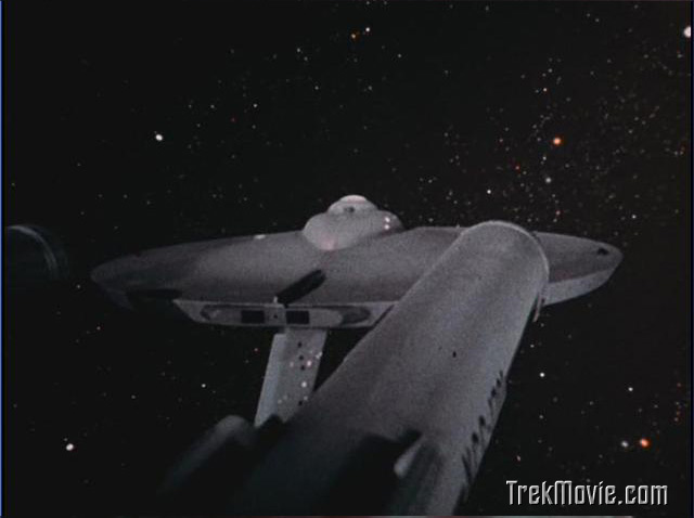
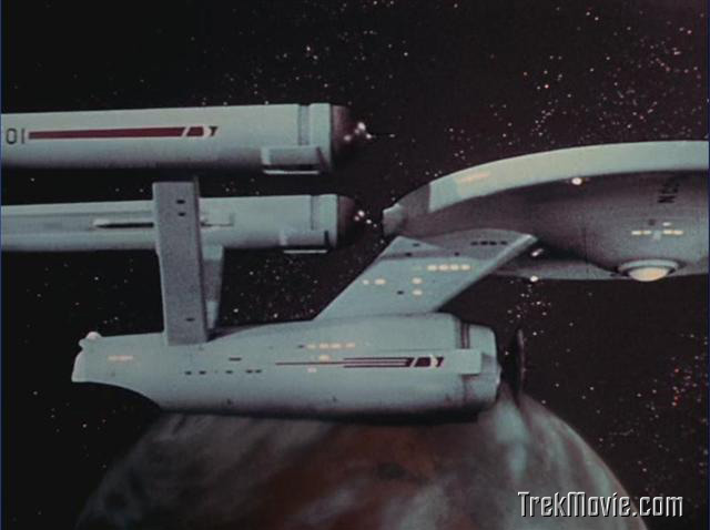
The old Enterprise model changes course
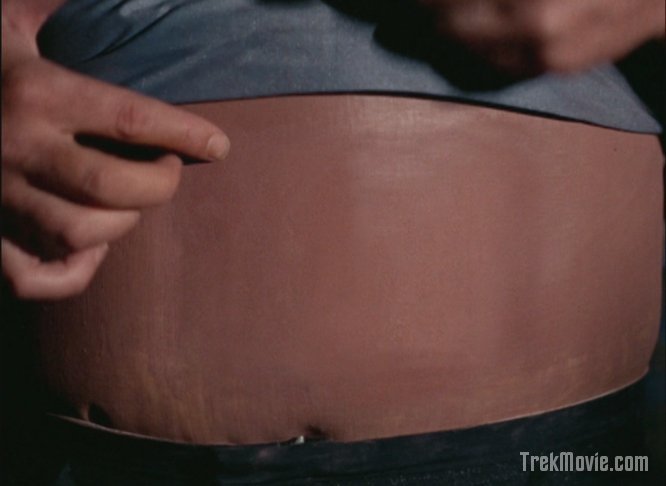
Norman’s retouched stomach
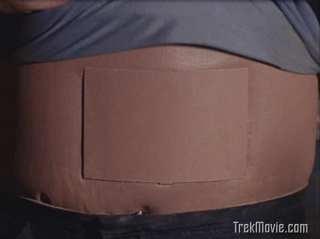
Norman’s original stomach effect
Norman’s new circuitry
Norman’s 1960’s circuits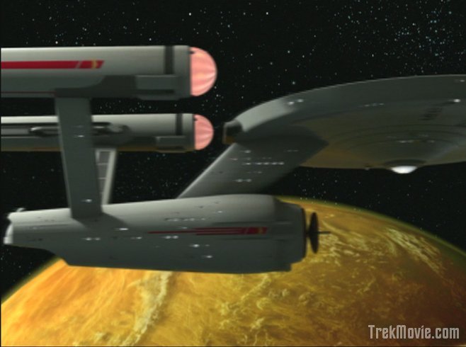
The new initial orbit shot
The old orbit shot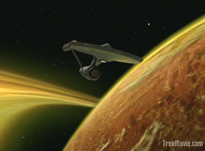
Leaving the andriod planet [new]

The old departure shot
Various New Shots
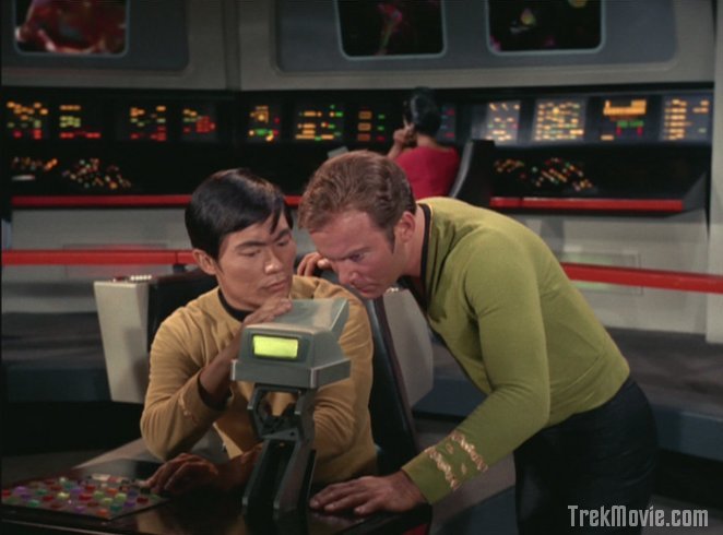
Sulu and Kirk puzzle over the course change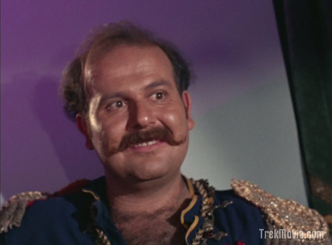
The lovable space rouge Harry Mudd
Mudd "bravely" helps the crew escape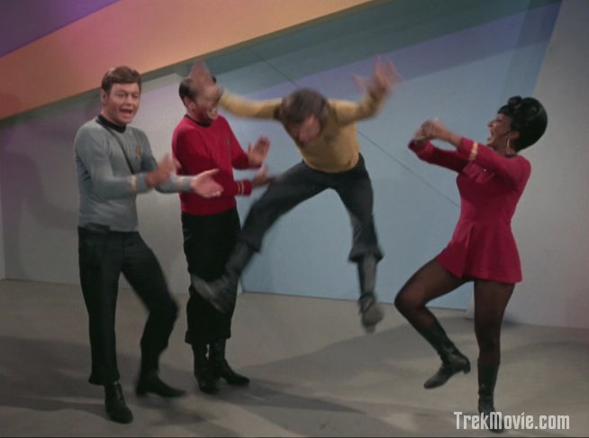
A good old fashioned Russian hoe-down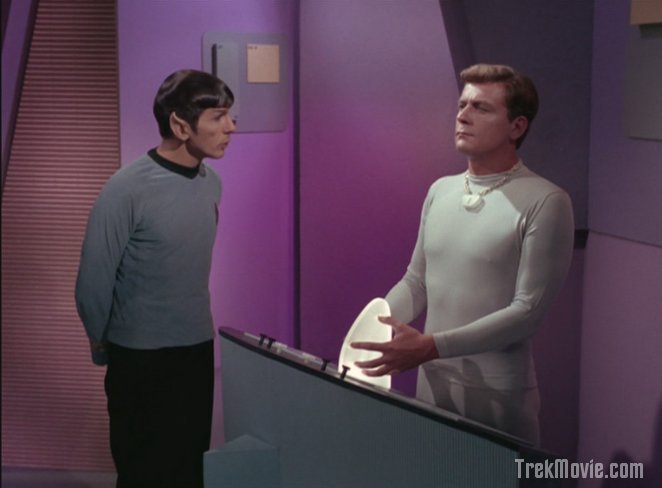
Spock confuses Norman while he grasps the "control mechanisim"
Tweedle Dum and Tweedle Dee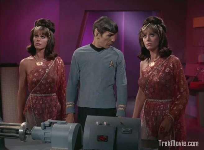
I love you… but I hate her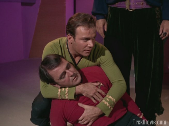
Kirk and "dead" Scotty
Harry is left with an army of his estranged wife to see to his rehabilitation
Yay! Norman still looks cheesy but it’s a lot better! How about that shot of Enterprise leaving the planet? Yowzah! I can’t wait to see this one.
well done Matt…is Nimoy looking down her shirt?
anyway I must say that the Ent shot above is not very impressive. I think that is a reuse from Miri which I think is the first episode they did. It is clear from the above shots that they are getting better at this, but there is an issue with them reusing the shots they made in their first weeks…we can only hope they replace them
The new shot of leaving orbit on a plasma 40 inch screen
was da bomb and it wasnt even in HD. Im surprised they didnt
incorporate new shots establishing that it had a ring as the Enterprise entered orbit or a new angle flyby as it orbited.
They need to stop being so slavish to the old material.
I wish theyd animate the screens that circle the bridge interior with varios stuff.
One thing I noticed on the re-viewing of this was, when they made this episode, they could only find one pair of really hot twins. The others, shown briefly, are kind of homely.
Though I have been having some recent issue with the CGI version of the Enterprise, that “Leaving the andriod planet [new]” shot was fantastic. I just wish they could get “the feel” of the old girl right all of the time.
Of the dissenters, I have yet to truly see anyone judge these episodes on their own merits,
rather what is occuring is the dissenters fall into two camps:
Those who prefer what Daren Dochterman proposed, or those who wanted a radical overhaul that changed the style and narrative of the various episodes.
This attitude is doing a tremendous disservice to the obvious care that Okuda and his team are putting into these episodes.
If something is to be damned, let it be damned for what it is, not what it isn’t or what it could have been.
I suspect had Daren’s particular approach not been seen prior to launch of this remastering, you wouldn’t be hearing alot of the criticism’s you now hear.
Warp nacelle domes? Come on, only someone deliberately nitpicking can find fault in something as inobtrusive as that.
Are they ORANGE? Yes. Do they Spin? Yes.
And that’s about all that is required I daresay.
How can someone behold that lovely shot of the yellow gas giant with rings and the Enterprise pulling out of orbit and find fault in that?
I mean really.
Some of the criticisms that have been postulated have been borderline ridiculous.
Some have actually had the audacity to say the original effects looked BETTER, that is lunacy. Better in what distorted mirror universe reality?
Now that a half dozen of these episodes have aired I think it’s time for some perspective.
If these episodes were as bad as some people like to claim does anyone honestly think they would be AIRED? Much less sold.
Professional reputation and pride alone would prevent any substandard quality effect from getting past Okuda’s QT control.
The man values his status and reputation I’m sure.
For everyone crying about slavish duplication, had they gone the other route, you would have people crying about their childhoods being raped.
I haven’t heard a collective fan Gasp rising up demanding they pull these episodes so evidently someone likes it.
No what is happening is you have a select people that don’t like it because it’s not how THEY would do it, so they judge it with the bitter pill of resentment instead of judging the work on it’s own merits.
I have shown these episodes to 4 people or so and the response was an overwhelmingly positive “Cool! It looks modern!” not “Oh holy **** look at the nacelle dome caps the fan blades are too fat and the orange is too muted and the….”
See how ridiculous it sounds.
I also don’t really understand the inconsistancy of the ship FX. This shot of the ship changing course looked bad….like something done with an airbrush or a very primitive video game, the well known planet “fly-by” ,sadly, looks like it’s a couple steps up from the animated series while the last shot of the ship leaving the ringed planet was absolutely stunning….although it would have looked even more stunning if they would bringing back the colored starfields…drop a bit of red and blue here and there….how hard can it be? Too many cooks in the kitchen perhaps, with each artist being assigned a different effect. Norman’s “innerds” was very cool and a nice surprise. The opening music with the new vocals was great, and what can I say about the episode itself? It’s a classic. I hadn’t seen it in quite awhile, it was a lot of fun.
“I suspect had Daren’s particular approach not been seen prior to launch of this remastering, you wouldn’t be hearing alot of the criticism’s you now hear.
Warp nacelle domes? Come on, only someone deliberately nitpicking can find fault in something as inobtrusive as that.
Are they ORANGE? Yes. Do they Spin? Yes.
And that’s about all that is required I daresay. ”
^^^^
No it isn’t. The point is to get it right, which they haven’t. It was supposed to REPLACE the 1960s effects shots to enhance the show. Why replace old effects that look better than NEW CGI? The shot of Enterprise’s course change look flat. The Enterprise looks fake.
Aside from spending 100 billion dollars on the real thing when has the Enterprise looked REAL?
Just look above. The old shotof the ship changing course looks a HELL of a lot better and more realistic then that sad videogame looking enterprise in the remastered version. That is the problem, some Enterprise shots look great, some look absolutely ridiculous. I cn understand back in the 1960’s there being this crazy inconsistency but now…?
I agree with much of what Josh says, but I think that he loses credibility with statements like”
“For everyone crying about slavish duplication, had they gone the other route, you would have people crying about their childhoods being raped.”
and
“what is happening is you have a select people that don’t like it because it’s not how THEY would do it, so they judge it with the bitter pill of resentment instead of judging the work on it’s own merits.”
As for the first statement, it’s not a valid argument to tell me how I would feel if they were to do things as I wished they would. I know how I would feel, and I would prefer a mix of what they’ve accomplished, and what Daren Dochterman proposed. I’m not screaming that Lucas raped my childhood, so please don’t assume that I would feel that way here.
As for the second statement, I think that most of us in here are adult enough to avoid this “sour grapes” mentality. I’m not a CG artist, and therefore I’m not bitter that anyone got hired to do this job instead of me. However, I AM a Star Trek and general movie buff, so I feel that I can safely say that I know what I think looks good, and I know what can use improvement.
Now, having said that, I like just about everything they’ve done. And I could care less about the nacelles. However, I think that they could have done more. No barrel rolls, or flip-di-flips, or loop-de-loops… just small touches. Animating some of the bridge screens sounds like a great idea.
And on a final note, adding more “mass” to the ship does not require $100 billion dollars, it requires a more talented CG artist… ;)
Since I cannot get the remastered episodes in my area (Montreal, Canada), I can only judge the quality of the new CGI effects from the various screen shots and low-rez video that appear on the net. I suspect that many of the commentators here are doing the same.
When I look at the second image on this page (The CGI Enterprise suddenly changes to a new course), I think it looks bloody awful. It really does look like an animated shot from a video game. I do suspect that this is because it is a freeze frame. CGI effects often have a blur effect applied to them that looks fine when seen in animation but awful when seen as a static shot. The spaceship shots of modern day sci-fi that are used as publicity and seen in magazines and posters are usually specifically created for these purposes and not just screen grabs from the actual movies or TV shows.
I am wondering if this is the case here. The Enterprise shot mentioned above looks very fake as a screen grab, but I suspect that it is much better when seen in motion. I would be interested to hear what others who have actually seen the show think about the shot. Even better, if someone would upload a decent video of some of these Enterprise shots, fans who have not seen the actual remastered show could express more informed opinions.
Somebody please tell me that this shot, in particular, looks better in the show than it does here.
…well Josh..since you asked…
http://ourworld.compuserve.com/homepages/Wuensch/enter3.jpg
http://tos.trekcore.com/gallery/displayimage.php?album=58&pos=1
http://tos.trekcore.com/gallery/displayimage.php?album=69&pos=0
http://www.ex-astris-scientia.org/scans/other/1701-dock.jpg
CGI Enterprise: matte-gray with light source “astronomically correct” in the little computer generated universe.
1960s model Enterprise: shiny or at least semi-glossy appearance perhaps because of several thousands of watts of high-intensity lamps focussed on it from a few feet away and from many angles!
Astronimcal correctness is a species of ideology that doesn’t play very well in a theatrical format. The Big E’s “swoosh” wouldn’t be real in space, but we earthers are accustomed to noise from the wind of a flying object. Likewise, we haven’t ever seen the solar lighting of an aircraft carrier in orbit, so we expect TV images to look like stuff on earth with light coming from all directions thanks to the sky’s diffusion.
Conclusion? Maybe the CG Enterprise is a good take on what an object looks like in deep space. But I have no idea what that might be since I’ve never left terra firma. Show me shininess and multiple light sources!
“The Enterprise looks fake.”
Um, it is. This is sci-fi. None of it is real.
You are joking right JonBoc?
If that was supposed to be some sort of demonstration as to a REAL looking Enterprise, I’m sorry, the grain from the film stock is obscuring the 11 foot model a bit too much to reinforce your point.
As I said before, I like my Enterprises clearly visible and clean.
I’m watching the episode right this moment,
I’m not getting personal when I say some people must evidently be nuts, I don’t see it, it looks splendid and glorious.
The sudden course change? It was awesome, a view of the Enterprise we rarely see with a starfield demonstrating the speed being traveled.
For everyone saying it looks like a video game, I want the video game system YOU have, or were you reffering to the CGI Defiant from ” Enterprise?”
In that case, I’d agree it looks completely like a video game, 8 bit even.
It looks awesome Scott, don’t sweat what you read on here.
I thought Star Wars fans were bad, I’ve never seen such ridiculous complaints.
Well, Josh… it seems the ridiculousness is coming from your direction. Why don’t YOU give it a rest… it seems the loud vociferousness is coming from the apologists direction today. There is obviously a difference of opinion… and you started with the personal attacks calling people nuts and ridiculous. It’s not just a question of perception here… there is an empirical difference between what the 11 foot photographed model looks like (snide comments of film grain notwithstanding) and the flat, even toned, badly lit Maya model they’re doing at CBS. It’s not a question of ability… it looks like when they do stuff like the norman stomach nernies, they can pull it off to look photo real. this is a question of art direction coming from the top… I would guess Okuda.
The caps look more consistant with the way all other star ship nacelles look and still retain the look of the original in doing so. The only thing missing is the blue plasma running through the inboard grills. Yes, when not at warp, the impulse engines need to be running (except while in standard orbit or stationary in space).
IMHO for the most part I think they are doing fine. Hand phaser beams could be tighter and less cartoon like. The monitors encircling the bridge should be doing something and not just static “screen savers” – some anyway. Isn’t that supposed to be the case soon in Where No Man Has Gone Before?.
In response to the post that there is too much attention being placed on the effects and not the merits of the story – that is really not required here. I for one have seen each of these episodes more times then I can count.
The point is what is new. My biggest problem with all of this has nothing to do with what the Okuda’s are doing and more to the fact that 9 minutes is being cut out to make room for comercials and that our local station runs ad animation through the whole show at the bottom of the screen as well as their logo watermark. All in all it really detracts from the experience. Subjective opinions on the CGI are nothing compared to that.
Josh:
“I suspect had Daren’s particular approach not been seen prior to launch of this remastering, you wouldn’t be hearing alot of the criticism’s you now hear.
Warp nacelle domes? Come on, only someone deliberately nitpicking can find fault in something as inobtrusive as that.
Are they ORANGE? Yes. Do they Spin? Yes.
And that’s about all that is required I daresay.’
You’re mistaken.
Elsewhere, I’ve made clear in detail what my problems with the nacelle effects are, but the simplest statement of why they fail is that they don’t appear to be part of the scene — they come across as a flat, animated effect of some kind rather than the result of any kind of light sources refracting through the transparent or translucent surfaces of the globes.
Saying that people wouldn’t have a problem with this if they hadn’t seen it done better by other artists is as irrelevant as saying that people wouldn’t think the original Trek effects were limited if “2001” and “Star Wars” had not been produced — ie, even if one agreed that it’s true it would still be a silly defense that has nothing to do with the real-world context in which the work is going to be judged now.
If you’re satisfied with the effect, fine for you. That doesn’t diminish in any way the validity or fairness of critiques by those of us who are not.
My take on the latest installment echoes previous comments.
Course Change:
While I like the angle and moving starfield in the course change shot, it still sucked. So how would I improve it? Greatly reduce the intensity of the lighting; add surface plate texturing to the ship; execute the turn more slowly. The lighting here washes out the ship so it looks fake, and the old shots of the ship surfaces look better with the imperfections, whether they be from film grain or model texturing or whatever. Most importantly, quick turns make us think of little toys instead of huge ships – it simply doesn’t matter if the ship really could turn that fast or not, you have to slow her down to make her look good to the viewer. Again I reference the marvelous close-up pivot shots in the original version of “Let That Be Your Last Battlefield”, one of the few times in the old series when you really feel the sense of scale of the Enterprise as she maneuvers.
Norman:
I’d have fully replaced his pathetic plastic torso with a real shot of a guy’s stomach and a cleverer reveal of the interior. Have a nice CGI retracting cover or the like. The old fake torso and flip-down cover are incredibly cheesy, even in the new shots. And just blurring the edges of the cover looks like a photoshop hack job – thankfully it isn’t that bad in full motion since it is on-screen so briefly. But the replacement innards look nifty, although they leave unaddressed the problem of how Norman could ever do a crunchie with a stomach like that! I guess his posture is always as stiff as his speeches.
Planet:
I too feel it would have been better to establish the rings in the opening shot. The best new shots in the series so far are the breaking of orbit shots in this episode. Wowser. Now THAT is what I want to see more of! Gorgeous work!
I think everyone here agrees that some of the new ship shots look great. They indeed do but some like the changing course one look awful. Why the inconsistancy?
See I think the problem of the ship course change stems from it being overlit. The reason why it is over lit for the given situation is it appears to be a recycle from Miri. In Miri the Enterprise was near a solar system. In I,Mudd the Enterprise changes course in the middle of nowhere, it shoulnd\’t be as brightly lit as it was.
Just like they did in the 1960s the CBS guys are reusing stock [CGI] footage. Which is just lame. I understand the need to reuse back in the ’60s when to actually redo a ship shot would require hauling out the model setting it up just right, etc. etc. All that it requires in the 21st century is to open up 3DSMax or whatever they are using and relight the model correctly and hit the render button.
If they don’t reuse stock camera angles on the ship and orbits, then within four or five episodes they have to depart completely from the original effects design of the series.
Episode after episode, for about eighty shows, call for little more than tight planet orbits and the ship passing camera to left or to right. There are only so many ways to do that while maintaining the same overall look throughout the series. They make some little changes here and there, but better get used to the “stock footage.”
Of course the Enterprise is not real. The point is that it is supposed to look real, not like a cartoon.
What is the point in re-doing effects if they don’t meet today’s minimum standards for what is considered to be a good special effect?
DB, I don’t have an issue they reuse it, in and of itself. It is that they can save that exact scenario as a file, the path it follows, everything. All they have to do is drag some spot lights around in the editor and render it again. It’s not like they have to make it from scratch every time and thus introduce consistency errors. They should just be able to tweak the lighting of the model.
They have the best of both worlds, they can reuse the basics of the stock shots, but with CG they don’t have to be exactly the same. The lighting could be tweaked to match the context of the episode they are using the shot in.
It would be cool if they could CGI little compartments opening up on the enterprise with grapples etc. coming out.kinda like R2 D2
I think they have been tweaking the lighting on the shots from week to week. Compare the left-right planet orbit in “Miri” with the similar shot in “City On The Edge Of Forever.”
“What is the point in re-doing effects if they don’t meet today’s minimum standards for what is considered to be a good special effect?”
The point is so that the audience doesn’t fall into the matte fissures when they watch it in HD . Seriously, the quality of the original effects images is lower and less amenable to a little “clean-up” than the live-action. They obviously decided that even as a “classic” the show was unmarketable in HD without some enhancement, but I don’t think the point was to make an effort to “modernize” the show in any big way.
This is the worst “re-done” episode yet. The shots of the Enterprise are simply pathetic.
They want to make more money by releasing the espisodes in HD, but they are unwilling to invest enough in the effects to make a watchable product. The Ferengi would be proud.
Well, i’m not going to go into any long winded rebuttal to the negative comments made here. I’ll just say this. I thought it was awesome. Thanks Okudas!!!!!
S. Lansing if that is true, will they now go back and tweak the existing subpar CGI to be consistent with what they have learned from our feedback? At some point these will be reaired in full HD resolution and eventually put on HD optical media, so it would be nice to have consistent effects across the board.
Everyone done?
Wow…. did some of you even notice there was a story attached to all those CGI effects?
Yes, you are entitled to your opinion…. and I expressed mine.
I’m very pleased to hear that the concerns of fans are being heard and that changes will be made to the Enterprise effects. Nobody expects the effects to be big-budget movie quality, but too many are a downgrade from the original 60’s effects.
Given that there is an acknowlegement that things need to change, how about redoing the release date and moving back “The Doomsday Machine” and “The Tholian Web” until the very end of production. These are perhaps the two most effects heavy episodes. They deserve the be done well.
One last thing: does anyone know of ANYWHERE that is showing these episodes “uncut”. I keep hearing all of this babbling about networks being offered BOTH versions (cut for syndication as well as uncut). I think that not one single station in the U.S. took the uncut option. If a station or two did: WHERE ARE THESE PEOPLE? The fans that are getting uncut TOS MUST chime in and tell us what effects we are missing at time AND post some screen shots, if they know how. lol…..my two cents!
I believe what the difference may be with the Enterprise could be the lighting. It is incorrect with the old shots while the new one are realistic. Seems like the old does a profile shot everytime, no matter where the light should be coming from. Looks good but incorrect.
Maybe there should be more id lights on the old girl to spruce her up? Personally, I like the new effects.
Jim J: there is no option for the remastered episodes uncut that I am aware of. They are offered in normal syndication packages.
The only uncut episodes are the original versions G4 shows Saturday mornings.
Ralph: you honestly believe space is that bright?
Matt
LOL! No. Just stating that I think people are use to the unrealistic lighting from the TOS.
Ug, as mentioned that scene when the Enterprised turned was awful.
But, when Norman showed us his goods, that was nice.
And I loved the soprano. That theme song still make me grin.
I believe All Our Yesterdays from the 3rd season is also being shown this week remastered. It seems to be only shown on the Sci-Fi channel. Can anyone confirm this?
From the Sci-Fi channel:
6/10/2006
07:00 – La Femme Nikita – New Regime
It’s kill or be killed for street girl turned elite assassin Nikita. Egram Petrosian takes charge of Section when Operations is gravely wounded, and makes Nikita his right-hand woman.
08:00 – Teleshopping
Teleshopping.
11:00 – Star Trek – All Our Yesterdays
All Our Yesterdays: The original series, digitally remastered. Kirk, Spock and McCoy become lost in the past of a doomed world.
It is also mentioned here:
http://www.startrek.com/startrek/view/news/article/27636.html
at the bottom of the article
Anthony,
As I mentioned on trekbbs, KNBC in LA showed “I, Mudd” in high definition. You might want to doublecheck with your CBS/Paramount sources. I think they have started to distribute the show in HD.
Having perused some of the comments here all I can say is no wonder Enterprise was cancelled.
The problem today is everyone is an armchair wannabe critic and the internet gives them a voice they otherwise would not have.
Evidently interest in this show comes down to pure taste, as I and many others find what is being done quite wonderful actually.
The criticisms I have seen are ill-concieved at best, ridiculous at worst, and lacking in appreciation, respect, and artistic merit.
IF the squeeky wheel gets the grease and the 5 people crying incessantly about their personal issues with this show serve to hijack and undermine any future releases of Trek: Remastered, that’s when you’ll see some true fireworks, as the minority HERE, most certainly does not speak for the majority elsewhere.
If Okuda and team take any criticism read on these boards to heart that is simply sad and a true testament to the fact message boards should not be read, their decisions and artistic choices should not be influenced one iota by any half cocked opinion on a message board.
There’s not a thing wrong with the effects on this show and people know it.
The Enterprise looks glorious and alive, colorful and three dimensional.
As far as “apologists” God Thang, I have found nothing to apologize thus far save for certain comments by certain posters on this message board, and if indeed Okuda does frequent this board then I do indeed extend a sincere apology that the Enterprise has been hijacked by “fans” that do not like Star Trek.
I find myself sometimes wondering if I have stumbled on the TrekBBS boards where Michelle Erica Green reviews each and every episode despite the fact she CLEARLY hates Star Trek and rarely if ever has anything NICE to say about ANY episode.
All I know is, whatever evidently would please some of you, I frankly do NOT want to see it remotely associated with anything that has to do with Star Trek. That’s why Star Trek was cancelled. Trying to appease the fans TOO much.
You guys are screaming louder, but loudness does not a good argument make.
I don’t want to see a CGI Defiant retread.
I like Daren Dochterman’s work but it isn’t right for this particular project.
Perhaps some future re-imagining of the series, but not this endeavor.
I don’t want a greebly infested U.S.S. Enterprise so hyperdetailed it looks like the Millenium Falcon.
The U.S.S. Enterprise isn’t supposed to be streaked, dirty, blue, paneled, purple, green, day-glow, or lit up like a Christmas tree.
In space things are mono-chromatic, flat, shadowed, plain.
We finally get a clear, crystal view of what the Enterprise was ALWAYS intended to look like, and people spend pages on message boards crying about it, instead of beholding it’s splendid beauty and praising Paramount for CARING enough to do it?
It’s truly unbelievable.
Are you guys sure something isn’t wrong with your televisions, or the station?
I don’t see how something could be so polarized – fine to some and hated by others, it’s nonsensical and if it wasn’t so sad it would be comical.
This message board is a PRIME example of why “fans” should have NO input in creative decisions of ANY artistic endeavor.
Okuda’s, I applaud your work, thank you.
Quoth the Josh:
“The U.S.S. Enterprise isn’t supposed to be streaked, dirty, blue, paneled, purple, green, day-glow, or lit up like a Christmas tree.
In space things are mono-chromatic, flat, shadowed, plain.”
Dude. No one really gives a hoot what things really look like in space. That’s the entire point! This is FICTION. It’s supposed to ENTERTAIN not LECTURE us on pompousities about “what space is really like”.
Besides, have you ever been to space? How do you know what anything “looks like” there?
Geese.
I do agree with you on the idea that the production workers shouldn’t take this stuff too seriously, but get real man. This site is just a chance for people to spout off a little bit. You make it sound way too important. If some studio manager/executive type scans these posts and finds something of value, cool.
But I am not aware of a single US corporation that really cares what is said about it amongst “those people” meaning activists, hot-heads, fans, whatever. Business decisions are made according to business criteria — not what some geek at NASA or a fan in Podunk has to say about anything.
If Net Present Value > 0, then accept the project. Period. All they want to know from us “fans” is, Will you tune in to this program and spend money with the sponsors?
Anything else amounts to jerking off.
Olde Timey Fan, MBA, MS
Fortune 500 Financial Management Consultant
I am in the camp that likes the new TOS remastered.
We do know how man-made objects in space appear. They are in the archives of every space agency which has sent a vehicle into space.
I am growing disgusted at the criticism of this project. When did accomdation to the limitations of a project turn into a vehement and passionate dislike of a project? Give this project time to mature. Let’s speak of its merits in a year, or even better, two years from now.
For me, the project pleases me. I didn’ t want a Lucas revision. I wanted the show which introduced me to Star Trek and which I like the most of the five or six series to be treated with reverence and respect. I feel the people behind this project have succeeded.
I have to admit being a little confused by the uneven quality of this episode. Overall, I’m a fan of what they’ve been doing, but I have to side with the skeptics on a couple of the shots of the ship — the reverse-angle course change shot looked REALLY sub par. But the closing shot was great! Assuming they have different people working on different shots, I’d give a raise to the one who did the closer and have a stern talking-to with the other!
My 51 year old cousin, who has been a TOS fan since it’s original run, wasn’t aware of the enhanced versions, but she saw the “I, Mudd” version over the weekend. When I told her that it had been enhanced, she replied, “I didn’t even notice anything different.”
So, either CBS can pat themselves on the back for “not changing anything too dramatically,” or this entire effort simply doesn’t matter to most viewers because the new effects are so subtle that they have become a mute point.
My view: I think they would have been better off just leaving well enough alone.
I enjoyed seeing Normans updated internal parts. They could even do the viewscreens above the bridge stations, that would be cool. The shot of the enterprise ‘changing course’ shown above, looked too much like a model (not in a good way).
The new second season titles are an improvement.
My wish is for some new enterprise shots, some the same. Regardless, I want the ship too look like they were using the 11 foot model, but clearer and better lit. Sometimes it seems that happens, other times, not so much. I’m hoping it will get fixed.
In response to Josh:
“The criticisms I have seen are ill-concieved at best, ridiculous at worst, and lacking in appreciation, respect, and artistic merit. ”
You destroyed any shred of credibility that you had with this single statement.
At least the rational among us are able to acknowledge some of the positive aspects of the project that you have rightly pointed out.
For you to categorically discount the artistic merit of any of our opinions is asinine. For you to call into question my love of the series based on the fact that I think there is room for improvement on the “Remastered” updates is ridiculous, arrogant, quite simply illogical.
I’ve got to say I agree with Josh. It isn’t cricism and dissent that becomes ridiculous, it’s relentless criticism and complaints about the same points over and over. When a criticism is repeated with intensity and frequency, the intent is not a simple “just giving my 2 cents” opinion, but rather is a misguided attempt to influence “the powers that be” into doing things differently — i.e. the way the CRITIC wants them done. Josh was right on the money when he said, “If something is to be damned, let it be damned for what it is, not what it isn’t or what it could have been.” As fans, we all create images in our minds and dream about what it would be like if WE were calling the shots. Some fans even make their own remastered fan films and their own CG effects. But all these dreams and actual attempts tend to negate the work of the real artists, the ones hired to do the job. As Josh correctly stated, “You have a select people that don’t like it because it’s not how THEY would do it, so they judge it with the bitter pill of resentment instead of judging the work on it’s own merits.” Man, that’s so true! In the case of the nacelles, for example, the artists made a choice to depict them as they do. In the original series, the nacelles never looked consistent from shot to shot (sometimes they spin, sometimes they’re just lit, sometimes they’re just dark brownish-red globes) — so saying these look “wrong” is a stretch. They look different than we are used to because we’re familiar with the inconsistent, grainy, faded, and scratched images of the past. The same is true of the Enterprise. I went back and watched the course change shot again after reading some of the comments here. The ship is actually very detailed. I can see hull plating, markings, etc. What’s missing from the original shot is a crap load of grain. The grain does lend a sense of “film reality” that has nothing to do with the detail of the actual model. It’s all about how we’re conditioned to see moving images. Back when color was first introduced to films, for example, there were many critics who felt black and white films looked more real. Seeing films in color looked “wrong” to their eyes. I hear the same complaints about movies shot on Hi-Def today. The images look “too perfect” and somehow “artificial”. In truth, its just people being nostalgic for the artifacts of a chemical photographic process. None of this is new. Think about WWII combat footage. Imagine if D-Day had been shot with Hi-Def cameras in full color. It too would look “wrong” because we think of those images and that event in a particular way.
Another of Josh’s comments is also very true. “For everyone crying about slavish duplication, had they gone the other route, you would have people crying about their childhoods being raped.” Damn straight! When the remastered episodes were first announced, the immediate fear was that they would go too far [insert cheap shot at George Lucas here]. Now, for some, the opposite is true. That’s why CBS should do what Lucas does (for the most part) and ignore the fans. If a fan REALLY wants to influence what goes into Star Trek (or Star Wars or ANY favorite franchise) get into the business, become a filmmaker and work your ass off to get hired to call the shots. But bitching about it on the internet in hopes of getting your way is not only non-productive — it’s just sad.
And that’s MY 2 cents.
Anyone who’s into Trek knows this:
The CGI ships in later DS9, Voyager, and even Enterprise blow away what’s being perpetrated in these episodes. Either something works- visually- or not. I believe that everyone’s criticisms are valid in that too many visual cues are being violated- too much just looks “wrong” with the ship. Hell, the android guts looked more believable than the Enterprise!
Mr. Okuda, please, you gotta be listening….
Another response to Josh:
I always find it amusing how some people find it necessary to attack people’s integrity/intelligence, rather than their arguments. Josh, I’m glad you like the remastered effects. Sit back and enjoy them.
However, many of us don’t like them, and we are trying to make them better. I don’t care you if agree or disagree with me, but I am entitled to my opinion and I will continue to voice it regardless of your attempts to silence the dissenters.