I believe this is the best revisualization yet!!! My initial skepticism is now starting to fade. Keep it up!! We will get more fans yet!
Laserlover2254
December 6, 2006 7:35 pm
Wow, great!
The Special Edition IS good for some things, after all!
MichaelT
December 6, 2006 7:37 pm
OMG… an amazing shot. Texture, depth…. wow.
Not even Josh’s thesarus can do it justice.
Jordan
December 6, 2006 7:37 pm
The new version is definitely better than the old. Wow!
MichaelT
December 6, 2006 7:38 pm
oops… thesaurus….
Anthony Pascale
Author
December 6, 2006 7:43 pm
lets face it, the original shot was not their finest hour. I know the CBS guys were really excited to get a chance to make a great new shot and really improve the show (thats right all you purists…I said ‘improve’…so eat it)
Imrahil
December 6, 2006 7:51 pm
Oh my GOD that looks cool….holy crap on a stick. The Fesarius doth rock my world.
Daniel Shock
December 6, 2006 8:04 pm
Man…I didn’t think it would be possible to both stick so close to the original design AND make it look like a real alien craft. So very cool
Jim J
December 6, 2006 8:05 pm
Good to see people feeling good about this. I think it looks great. Thanks for posting it, Anthony! ;-)
DB
December 6, 2006 8:11 pm
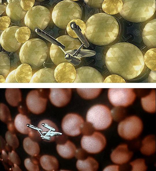
Based on that single shot, I don’t like it.
The original had the virtue of being somewhat indistinct, at least. This image is pin-sharp, and the lack of any surface detail below a certain size on the thing defeats any attempt at persuasively establishing scale.
It simply looks like a small model enlarged relative to the Enterprise. In this case, for the reason stated above among others, I prefer the original.
Scott of the Morgites
December 6, 2006 8:12 pm
Waaaaaaaaay Kewl !!!!!!!
Lti
December 6, 2006 8:13 pm
I wrote a post here which was extremely full of praise for this new version of the Fesarius. But for some reason it didnt post properly and it was deleted. So I am writting a new post with a different tact.
I have noticed that a lot of these new shots have replaced smooth spheres with geodesic domes.
It was done with the new matte in Devil in the Dark and has also been done here with the Fesarius. Now, while i personally dont think this is a problem, i am wondering whether it is representing quite a different design aesthetic to the originals.
Lti
December 6, 2006 8:16 pm
With all due respect, I completely disagree with post #10. How the hell are u supposed to show scale if not by seeing the size of something relative to something else!
Drew
December 6, 2006 8:24 pm
HOLY SHIT!!! WOW!!!
DB
December 6, 2006 8:31 pm
“With all due respect, I completely disagree with post #10. How the hell are u supposed to show scale if not by seeing the size of something relative to something else!”
If I take a photograph of a Ken doll and photoshop it into a picture with a grown man so that it’s bigger the human being, can you not tell by looking that it’s been rescaled?
There’s more to effective scale than simply relative size.
MichaelT
December 6, 2006 8:41 pm
I’ll take the new shot any day… detail and structure make this far superior to the enlarged button factory picture from the original.
Nelson
December 6, 2006 8:42 pm
This is a very cool preview of the new Fresarius. I have been eagerly waiting what they would come up with! And what has been shown here looks quite nice. The faceted spheres goes a long way to add realism and detail. I can see that just domes might not be as visually interesting, translucent domes with lighting effects internally can be rather pedestian.
Re: pst 13 and 10- The only place I can agree that scale looks “off” is the black areas behind the domes. The smooth surfacing on those areas appears scale-less, or as said above, something enlarged up. But this is a still, I think a true assessment can’t be made until we see the moving image.
What catches my eye more is how the Enterprise looks. The rendering of it looks very plasticky. Again, it’s hard to tell from this still, so I defer till we see it this weekend. What I like is that the Fresarius is so big, that it makes sense the light coming off the Fresarius would bath the Enterprise in it’s light. And that is what I am reacting to.
Looks great so far, can’t wait to see it this weekend! I believe we are at a point now where the new effects are becoming transparent. After Space Seed, I stopped looking at the effects with so close an eye and just watch the story. Which is both a good thing and also a sign that the novelty is wearing off and so thus we stop focusing on it.
Eric Augst
December 6, 2006 8:53 pm
Beautiful!
RAMA
December 6, 2006 8:58 pm
This might be production artwork or a concept sketch, whether it is or not I approve of the design! My only question…what is the SOURCE??
RAMA
Chris
December 6, 2006 9:01 pm
It looks like a sketch to me. I don’t like the surface detail.
senya cartel
December 6, 2006 9:13 pm
I consider myself somewhat of a purist, but I admit this looks great.
There were somethings in the original that were excellent in the original, like the artist conception of the mining station on Delta Vega in WNMHGB.
But this was an example of something that needed improving. Another example of things that required improvement (badly) was anytime the Enterprise would encounter Klingons and we would never get to see the ***** ships!! Something else I enjoy about these remastered episodes.
RAMA
December 6, 2006 9:19 pm
Being a “purist” is by no means something to be inherently proud of…the KKK and Nazis are also purists…however once we get past that nonsense we can get to the real crux of the matter…actual quality of these episodes. Glad to see senya is judging it on its own merits.
RAMA
Lti
December 6, 2006 9:24 pm
in response to #15. There would be no way of knowing whether it was a giant Ken doll or a normal sized Ken doll that had just been enlarged and pasted into the picture.
RAMA
December 6, 2006 9:31 pm
Just saw it on Startrek.com. It IS the digital version!
RAMA
An olde timey fan
December 6, 2006 9:37 pm
See Olde Timey’s original Fessarius special effect clip at StarTrekHistory.com:
In thirty years of owner that slide, I never noticed the technician’s image until I scanned it… Curt McAloney rescanned and processed the clip and was able to bring out a significant amount of detail from the darkness. He actually pulled out more, but did not want the tech’s image to look like a cut and paste job.
MichaelJohn
December 6, 2006 10:17 pm
I always felt the original “christmas tree light” effect was one of the most fake looking from TOS. It probably looked fake to audiences in the mid sixties too!
Almost anything the guys and gals at CBS Digital would have done, including using colored balloons, would have been an improvement, but I’m glad that their final effect looks as good as it does.
Keep up the great work. I’m sold these on
“remastered” episodes!
Mike :o
Admiral Deem
December 6, 2006 10:22 pm
I just hope the tranya looks like something besides OJ this time. Shaken, not stirred, of course.
MichaelJohn
December 6, 2006 10:42 pm
Did anyone get to see the spoof of this episode on the Shatner Roast a few weeks back?
For the most part I found the roast to be more vulgar than funny, especially the incessant Sulu gay jokes, but it was hilarious to see Clint Howard revive the role of Balok- 40 years later! The guy looked creepy as a kid, and he still does as an adult! Pass the tranya…
Mike :o
darendoc
December 6, 2006 10:48 pm
Well, it’s interesting. We’ll see when it moves. Isn’t there any color in space these days?
RAMA
December 6, 2006 11:06 pm
Isn’t gold a color??
Norbert Steinert
December 6, 2006 11:08 pm
Wonderful work. It looks fantastic!
Josh
December 7, 2006 12:07 am
I haven’t seen anyone mention it yet, but that looks HIGHLY alien.
Do my eyes decieve me or is that machinery visible beyond the plethora of geodesic domes on the surface?
Breathtakingly splendid and awe inspiring.
Dave Rossi did this one if memory serves.
You Sir are a DemiGod
Cranston
December 7, 2006 1:55 am
I’ve liked (and even loved) much of what’s been done in the Remastered project, but for some reason….I don’t particularly like this. I agree with DB — I prefer the original, at least based on this one image.
Don’t get me wrong — I think this picture looks fine — but it takes away the sort of “organic” feeling that the original did, by replacing something that’s all curves and spheres and replacing it with something that’s almost entirely straight lines. The original always felt like a big, pulsing, almost living thing. This looks more like Epcot Center.
I acknowledge that this is an aesthetic thing, and purely a matter of individual taste. At this stage, though, I’m a little disappointed.
I hope the episode changes my mind, though. One of my favorite eps.
Lti
December 7, 2006 2:39 am
old timey fan, you have been posting links to this page quite a lot now and ive been tricked into clicking on them almost every time tempted by the goodies you promise in side
Well everytime i go there i am bombarded with pop ups to access my clip board and there is nothing to do to get away from it other than ctrl alt del or some very quick finger work to close the window before the next pop up appears.
This may just be my problem, in which case can someone offer advice? but if others also have this problem then maybe you should consider changing the code on the page so it isnt such a dick. Or stop posting links to pages which are just fuckin anoying.
Sorry for the strong words. If this is just my problem then no offense meant.
Adam Cohen
December 7, 2006 4:44 am
Y’all have been real testy with one another lately. Everybody ought to take a step back and relax a bit. This is Star Trek, we *must* survive this century so we can ward off the Borg, right?
BTW, that shot from the show is nothing less than “trippy.” Wowza. I love it.
FlyingTigress
December 7, 2006 5:35 am
One thing about the ep has always bothered me… So, indulge a short on-line vent…
I know that it wasn’t get corrected in the remastered ep, since the image of the Enterprise being dwarfed (in the money shot) by the Feserius has been burned into our minds. Now, I’ve never been looking for Trek to be a video version of Scientific American or the American Journal of Physics…
Nimoy’s line of dialog is “Must be a mile in diameter”, right?
The Enterprise is listed as being approximately 1000 feet in length. That means that the diameter (the maximum lineal dimension visible on-screen, and the maximum aside from circumference of the nominal outer diameter of the Feserius outer hull sphere) Feserius is something greater than 5 times (1 mile, from the lower than the dialog-stated diameter), but presumably less than 10 times (2 miles, approximately) the length of the Enterprise itself. However, from an image scaling purpose, clearly the Fesarius (judging from that angular portion of the curve of the Feserius visible within the screen image), the implicit size of the Feserius is WAY larger than 5 – 10 times the overall length of the Enterprise. 10 miles in diameter? Probably an extremely lower limit of proper scaling between the two ships. Each of the larger spheres on the surface — unless the “E” were physically docked at the Feserius — are about the size of the Enterprise.
So, Science Officer… You can’t tell the difference between an object “More than a (1) mile in diameter” and (potentially) 10, 20, or more miles in diameter? Where’s that “probability to 4 decimal places” precision? Or, That depends upon your definition of “More than a mile in diameter” and referencing the surface “Bucky balls” (smile).
Now, pass me the bowl of popcorn and other snacks — and don’t interrupt me while one of my favorite TOS episodes: The Corbomite Maneuver, is being broadcast.
FlyingTigress
December 7, 2006 5:41 am
Of course, it could be that the Feserius’ tractor beam is also a shrink ray? Shades of The TAS episode “The Terratin Incident”, or Mermaidman’s (of Spongebob’s Bikini Bottom) utility belt?
“Balok…I Shrunk the Aliens!”
jonboc
December 7, 2006 6:45 am
Its a mixed bag, I love the detail of the humongus ship, but the Enterprise looks like a drawing or painting here. I cant wait to see that big orange ball in action!
John N
December 7, 2006 7:50 am
I love the shot… hopefully seeing it in motion will be even better!
#10 – Due to the fuzziness of the zoom, doesn’t the original shot look even MORE “like a small model enlarged relative to the Enterprise”?
#30 – I agree…. gold qualifies as a colour.. :)
John N
December 7, 2006 8:15 am
#34 – Lti
Just so you know, I’ve never had a problem going to that site…
Picardsucks
December 7, 2006 9:43 am
I likey!!!! Hope xbox360 get’s the HD version up quick so I can see the widescreen version
Lao3D
December 7, 2006 10:20 am
Wow. It’s Fesari-iffic!! Truly awesome!
Greg
December 7, 2006 10:43 am
That was Adam Corolla in the spoof as Tranyaholic Balok. You can see the clip on the comedy central site. It was the best part of the Shat roast IMO.
The new ship looks great. More awesome work by the CBS team. Thanks.
An olde timey fan
December 7, 2006 11:03 am
#34, Lti
Sorry about the problem you’re having. Unfortunately, it’s not my site so I can’t really explain what it’s doing. I’m running IE7.0 and it does provoke a security pop-up, but it goes away after clicking on “don’t allow”. I also run Mozilla Firefox (a super browser in my opinion) and I don’t get any problem at all at Curt’s site.
Keep in mind that Microsoft is forever pushing updates and patches on Windows users – my system has several dozen security patches and it’s only a few months after I installed SP2. Only Bill Gates knows what those things actually do!
Anyway, Curt’s site has some beautiful restoration work of many rare and fascinating clips, including several animated strips from folks lucky enough to get them from Lincoln Enterprises. Well worth the effort to browse it!
Mark 2000
December 7, 2006 11:09 am
I think this looks like a step back compared to latest improvements. The shot looks like a production painting. Not real at all. I also think the fesarius Model looks way too modern. These guy don’t understand the 60’s era aesthetic at all.
Imrahil
December 7, 2006 11:45 am
#34 – Try running Firefox. I haven’t ever had a problem with this site, and it’s really got great info and fascinating pictures.
MichaelJohn
December 7, 2006 11:58 am
#36 Flying Tygress…
I had similar thoughts when I watched the preview yesterday and Spock said, “It must be a mile in diameter.” I almost wanted to laugh! A mile in diameter, no way! It dwarfed the Enterprise like a planet! Maybe 100 miles in diameter would be closer to true scale!
Maybe the script writers and the special effects dept weren’t on the same page on this one!
Mike :o
Robert Bernardo
December 7, 2006 12:00 pm
Nelson wrote:
> What catches my eye more is how the Enterprise looks. The rendering
> of it looks very plasticky
Yes, I agree. The Enterprise does not look realistic; it seems to be more of a drawing/painting.
Truly,
Robert Bernardo
Orbitalic
December 7, 2006 12:02 pm
48 and 45… please keep in mind you are looking at a single static shot.
O
Greg
December 7, 2006 12:17 pm
The Firefox browser with the Adblock Plus plug-in easily solves pop up and many security issues. It is much better than the newest MSIE browser.
Again, thanks to the CBS digital team – being creative in what looks to be sweat shop working conditions can’t be much fun. You folks should be proud.
wpDiscuz
We use cookies to ensure that we give you the best experience on our website.OKPrivacy policy

I believe this is the best revisualization yet!!! My initial skepticism is now starting to fade. Keep it up!! We will get more fans yet!
Wow, great!
The Special Edition IS good for some things, after all!
OMG… an amazing shot. Texture, depth…. wow.
Not even Josh’s thesarus can do it justice.
The new version is definitely better than the old. Wow!
oops… thesaurus….
lets face it, the original shot was not their finest hour. I know the CBS guys were really excited to get a chance to make a great new shot and really improve the show (thats right all you purists…I said ‘improve’…so eat it)
Oh my GOD that looks cool….holy crap on a stick. The Fesarius doth rock my world.
Man…I didn’t think it would be possible to both stick so close to the original design AND make it look like a real alien craft. So very cool
Good to see people feeling good about this. I think it looks great. Thanks for posting it, Anthony! ;-)
Based on that single shot, I don’t like it.
The original had the virtue of being somewhat indistinct, at least. This image is pin-sharp, and the lack of any surface detail below a certain size on the thing defeats any attempt at persuasively establishing scale.
It simply looks like a small model enlarged relative to the Enterprise. In this case, for the reason stated above among others, I prefer the original.
Waaaaaaaaay Kewl !!!!!!!
I wrote a post here which was extremely full of praise for this new version of the Fesarius. But for some reason it didnt post properly and it was deleted. So I am writting a new post with a different tact.
I have noticed that a lot of these new shots have replaced smooth spheres with geodesic domes.
It was done with the new matte in Devil in the Dark and has also been done here with the Fesarius. Now, while i personally dont think this is a problem, i am wondering whether it is representing quite a different design aesthetic to the originals.
With all due respect, I completely disagree with post #10. How the hell are u supposed to show scale if not by seeing the size of something relative to something else!
HOLY SHIT!!! WOW!!!
“With all due respect, I completely disagree with post #10. How the hell are u supposed to show scale if not by seeing the size of something relative to something else!”
If I take a photograph of a Ken doll and photoshop it into a picture with a grown man so that it’s bigger the human being, can you not tell by looking that it’s been rescaled?
There’s more to effective scale than simply relative size.
I’ll take the new shot any day… detail and structure make this far superior to the enlarged button factory picture from the original.
This is a very cool preview of the new Fresarius. I have been eagerly waiting what they would come up with! And what has been shown here looks quite nice. The faceted spheres goes a long way to add realism and detail. I can see that just domes might not be as visually interesting, translucent domes with lighting effects internally can be rather pedestian.
Re: pst 13 and 10- The only place I can agree that scale looks “off” is the black areas behind the domes. The smooth surfacing on those areas appears scale-less, or as said above, something enlarged up. But this is a still, I think a true assessment can’t be made until we see the moving image.
What catches my eye more is how the Enterprise looks. The rendering of it looks very plasticky. Again, it’s hard to tell from this still, so I defer till we see it this weekend. What I like is that the Fresarius is so big, that it makes sense the light coming off the Fresarius would bath the Enterprise in it’s light. And that is what I am reacting to.
Looks great so far, can’t wait to see it this weekend! I believe we are at a point now where the new effects are becoming transparent. After Space Seed, I stopped looking at the effects with so close an eye and just watch the story. Which is both a good thing and also a sign that the novelty is wearing off and so thus we stop focusing on it.
Beautiful!
This might be production artwork or a concept sketch, whether it is or not I approve of the design! My only question…what is the SOURCE??
RAMA
It looks like a sketch to me. I don’t like the surface detail.
I consider myself somewhat of a purist, but I admit this looks great.
There were somethings in the original that were excellent in the original, like the artist conception of the mining station on Delta Vega in WNMHGB.
But this was an example of something that needed improving. Another example of things that required improvement (badly) was anytime the Enterprise would encounter Klingons and we would never get to see the ***** ships!! Something else I enjoy about these remastered episodes.
Being a “purist” is by no means something to be inherently proud of…the KKK and Nazis are also purists…however once we get past that nonsense we can get to the real crux of the matter…actual quality of these episodes. Glad to see senya is judging it on its own merits.
RAMA
in response to #15. There would be no way of knowing whether it was a giant Ken doll or a normal sized Ken doll that had just been enlarged and pasted into the picture.
Just saw it on Startrek.com. It IS the digital version!
RAMA
See Olde Timey’s original Fessarius special effect clip at StarTrekHistory.com:
http://www.startrekhistory.com/restoration/SFX.html
In thirty years of owner that slide, I never noticed the technician’s image until I scanned it… Curt McAloney rescanned and processed the clip and was able to bring out a significant amount of detail from the darkness. He actually pulled out more, but did not want the tech’s image to look like a cut and paste job.
I always felt the original “christmas tree light” effect was one of the most fake looking from TOS. It probably looked fake to audiences in the mid sixties too!
Almost anything the guys and gals at CBS Digital would have done, including using colored balloons, would have been an improvement, but I’m glad that their final effect looks as good as it does.
Keep up the great work. I’m sold these on
“remastered” episodes!
Mike :o
I just hope the tranya looks like something besides OJ this time. Shaken, not stirred, of course.
Did anyone get to see the spoof of this episode on the Shatner Roast a few weeks back?
For the most part I found the roast to be more vulgar than funny, especially the incessant Sulu gay jokes, but it was hilarious to see Clint Howard revive the role of Balok- 40 years later! The guy looked creepy as a kid, and he still does as an adult! Pass the tranya…
Mike :o
Well, it’s interesting. We’ll see when it moves. Isn’t there any color in space these days?
Isn’t gold a color??
Wonderful work. It looks fantastic!
I haven’t seen anyone mention it yet, but that looks HIGHLY alien.
Do my eyes decieve me or is that machinery visible beyond the plethora of geodesic domes on the surface?
Breathtakingly splendid and awe inspiring.
Dave Rossi did this one if memory serves.
You Sir are a DemiGod
I’ve liked (and even loved) much of what’s been done in the Remastered project, but for some reason….I don’t particularly like this. I agree with DB — I prefer the original, at least based on this one image.
Don’t get me wrong — I think this picture looks fine — but it takes away the sort of “organic” feeling that the original did, by replacing something that’s all curves and spheres and replacing it with something that’s almost entirely straight lines. The original always felt like a big, pulsing, almost living thing. This looks more like Epcot Center.
I acknowledge that this is an aesthetic thing, and purely a matter of individual taste. At this stage, though, I’m a little disappointed.
I hope the episode changes my mind, though. One of my favorite eps.
old timey fan, you have been posting links to this page quite a lot now and ive been tricked into clicking on them almost every time tempted by the goodies you promise in side
http://www.startrekhistory.com/restoration/SFX.html
Well everytime i go there i am bombarded with pop ups to access my clip board and there is nothing to do to get away from it other than ctrl alt del or some very quick finger work to close the window before the next pop up appears.
This may just be my problem, in which case can someone offer advice? but if others also have this problem then maybe you should consider changing the code on the page so it isnt such a dick. Or stop posting links to pages which are just fuckin anoying.
Sorry for the strong words. If this is just my problem then no offense meant.
Y’all have been real testy with one another lately. Everybody ought to take a step back and relax a bit. This is Star Trek, we *must* survive this century so we can ward off the Borg, right?
BTW, that shot from the show is nothing less than “trippy.” Wowza. I love it.
One thing about the ep has always bothered me… So, indulge a short on-line vent…
I know that it wasn’t get corrected in the remastered ep, since the image of the Enterprise being dwarfed (in the money shot) by the Feserius has been burned into our minds. Now, I’ve never been looking for Trek to be a video version of Scientific American or the American Journal of Physics…
Nimoy’s line of dialog is “Must be a mile in diameter”, right?
The Enterprise is listed as being approximately 1000 feet in length. That means that the diameter (the maximum lineal dimension visible on-screen, and the maximum aside from circumference of the nominal outer diameter of the Feserius outer hull sphere) Feserius is something greater than 5 times (1 mile, from the lower than the dialog-stated diameter), but presumably less than 10 times (2 miles, approximately) the length of the Enterprise itself. However, from an image scaling purpose, clearly the Fesarius (judging from that angular portion of the curve of the Feserius visible within the screen image), the implicit size of the Feserius is WAY larger than 5 – 10 times the overall length of the Enterprise. 10 miles in diameter? Probably an extremely lower limit of proper scaling between the two ships. Each of the larger spheres on the surface — unless the “E” were physically docked at the Feserius — are about the size of the Enterprise.
So, Science Officer… You can’t tell the difference between an object “More than a (1) mile in diameter” and (potentially) 10, 20, or more miles in diameter? Where’s that “probability to 4 decimal places” precision? Or, That depends upon your definition of “More than a mile in diameter” and referencing the surface “Bucky balls” (smile).
Now, pass me the bowl of popcorn and other snacks — and don’t interrupt me while one of my favorite TOS episodes: The Corbomite Maneuver, is being broadcast.
Of course, it could be that the Feserius’ tractor beam is also a shrink ray? Shades of The TAS episode “The Terratin Incident”, or Mermaidman’s (of Spongebob’s Bikini Bottom) utility belt?
“Balok…I Shrunk the Aliens!”
Its a mixed bag, I love the detail of the humongus ship, but the Enterprise looks like a drawing or painting here. I cant wait to see that big orange ball in action!
I love the shot… hopefully seeing it in motion will be even better!
#10 – Due to the fuzziness of the zoom, doesn’t the original shot look even MORE “like a small model enlarged relative to the Enterprise”?
#30 – I agree…. gold qualifies as a colour.. :)
#34 – Lti
Just so you know, I’ve never had a problem going to that site…
I likey!!!! Hope xbox360 get’s the HD version up quick so I can see the widescreen version
Wow. It’s Fesari-iffic!! Truly awesome!
That was Adam Corolla in the spoof as Tranyaholic Balok. You can see the clip on the comedy central site. It was the best part of the Shat roast IMO.
The new ship looks great. More awesome work by the CBS team. Thanks.
#34, Lti
Sorry about the problem you’re having. Unfortunately, it’s not my site so I can’t really explain what it’s doing. I’m running IE7.0 and it does provoke a security pop-up, but it goes away after clicking on “don’t allow”. I also run Mozilla Firefox (a super browser in my opinion) and I don’t get any problem at all at Curt’s site.
Keep in mind that Microsoft is forever pushing updates and patches on Windows users – my system has several dozen security patches and it’s only a few months after I installed SP2. Only Bill Gates knows what those things actually do!
Anyway, Curt’s site has some beautiful restoration work of many rare and fascinating clips, including several animated strips from folks lucky enough to get them from Lincoln Enterprises. Well worth the effort to browse it!
I think this looks like a step back compared to latest improvements. The shot looks like a production painting. Not real at all. I also think the fesarius Model looks way too modern. These guy don’t understand the 60’s era aesthetic at all.
#34 – Try running Firefox. I haven’t ever had a problem with this site, and it’s really got great info and fascinating pictures.
#36 Flying Tygress…
I had similar thoughts when I watched the preview yesterday and Spock said, “It must be a mile in diameter.” I almost wanted to laugh! A mile in diameter, no way! It dwarfed the Enterprise like a planet! Maybe 100 miles in diameter would be closer to true scale!
Maybe the script writers and the special effects dept weren’t on the same page on this one!
Mike :o
Nelson wrote:
> What catches my eye more is how the Enterprise looks. The rendering
> of it looks very plasticky
Yes, I agree. The Enterprise does not look realistic; it seems to be more of a drawing/painting.
Truly,
Robert Bernardo
48 and 45… please keep in mind you are looking at a single static shot.
O
The Firefox browser with the Adblock Plus plug-in easily solves pop up and many security issues. It is much better than the newest MSIE browser.
Again, thanks to the CBS digital team – being creative in what looks to be sweat shop working conditions can’t be much fun. You folks should be proud.