
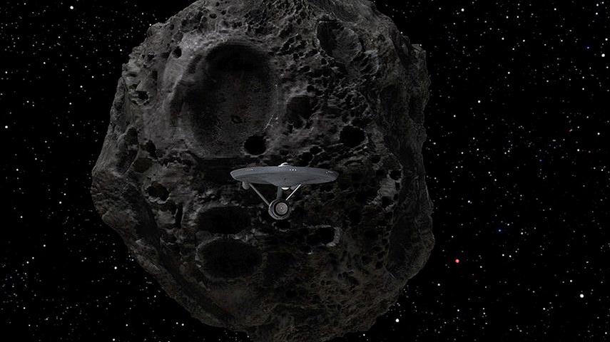
Here is a high res shot of the Yonada asteroid ship bearing down on the Big E
The Remastered "For The World Is Hollow and I Have Touched the Sky" airs this weekend. StarTrek.com has also have a new desktop with this image as well.
Click here for showtimes & locations. Click Here for video preview
Whoa!!! Now that’s an improvement. Keep it up CBS-D!!
I am thinking Star Trek 2’s, leaving the asteroid/ entering the nebula scene.
Good to see the deflector dish with a little light on it.
sweet jesus that looks impressive
But PUHLEEZE add some color to that deflector dish, guys!
Starfield looks better, though.
Can they CGI that lame kiss into something that looks like De wasn’t offended by Natira’s space halitosis?
Yeah, this looks much better than the original asteroid. Nice.
Van Halen reuniting with Davd Lee this week, now THIS wonderful mac in the pants work from CBS-D. Add that to Trek XI on the way, throw in Grunberg™ getting the role of James Tiberius®… things are definitely not sucking, people.
I feel like a pimp who’s got all da priciest hos in my stable. Life is grande.
best!!
=h=
A lot of anti-De Kelly kissing venom here isn’t there?
Flat, gray, unconvincing – i’ve seen computer games that did better. Not the finest moment of TOSR… neither as a recreation of that 1960s Trek “touch and feel” nor as a presentation of state of the art SFX. Sorry guys, there’s still alot of room for improvement.
Not to jump the gun, but the preview for “Journey to Babel” is now posted:
http://www.startrek.com/startrek/view/series/TOS/episode/68748.html
– Starfield, good.
– Scale, good.
– Deflector dish, need color.
– Nacelle caps, coyly hidden…
– Asteroid, nice but not very accurate. Here’s what a real asteroid looks like:
http://www.racine.ra.it/planet/testi/Foto/gaspra.jpg
Crud. I forgot that Yonada wasn’t a real asteroid. My bad. Do people still say “my bad?”
Good job, men of CBS-D. I haven’t seen this episode in a while; it should be fun.
Scott B. out.
WOW. Holy wow! Err, I mean HOLY COW! Is that not the prettiest sight you’ve seen all day or what? I know I’m a helpless geek when stuff like that picture makes me suddenly giddy.
Fellas, I loves me some Star Trek, and so do you. It’s good to be a fan again!
That’s one interpretation. Well realized. Very monstrous and dark. Realism isn’t alway better, though; part of the beauty of Star Trek is that it was stylized. It’s the difference between a digital photo of a beach in July; picnickers, sunbathers, kids. The photo would tell you exactly what’s going on; if an artist painted that same scene, though, it could be more evocative and convey more information; like an impressionistic painting. In this case, that rock looks like Nemesis in Asimov’s novel; some deadly doomsday thing, not a friendly but misguided rock-spaceship. It’s like in Star Trek II, the new uniforms didn’t make sense futuristically, but they were dashing, and evoked the romance of an 18th century man o’ war. Same for pulling grates up in the photon bay. Photo-realism and exactitude may be accurate, but it doesn’t always achieve what art does. Would that spindly Enterprise design take stress well? No. Is it gorgeous? Yes!
PS Abrams would be INSANE to not appreciate the classic aesthetic with stuff like this. You don’t need to do it 100% the same, but keep it relatively close. If the trailer for the new movie was simply a shot like that, I’d be hyped for months on end.
Well, I’m already hyped, so maybe I’m not the most objective standard! :)
I agree with Adam. Stylized is best. Hell, I STILL love Metropolis and that sucker’s 80 years old about. Of course it’s wildly off the mark. But, how can you not love androids, biplanes and model-t’s all together?
Adam makes another excellent point. It IS good to be a fan again. After the dullness of recent films and shows, it is so nice to get excited again.
HOOOOOLLLLLY SH*T!!!!!
Daren has his opening credits for his forthcoming remastered Doomsday episode up and running, looks quite beautiful as well. Plus he has a brand new shot of the crippled Constellation in the maw of the beast. He says he intends on having the whole HD remastered episode up by the time CBS has theirs ready. Comparisons should be very interesting. I do love his opening though!!
Oh yeah, well check out the “Journey To Babel” preview on StarTrek.com Holy ****!!!!!
Gimme a break!! You know why the deflector dish is bright gold on every shot in the original… because the original model was lit by Zues in order to contrast it with the Chroma-key (blue) background. They couldn’t have many, if any, shadows on the model back then because they would “keyed” out when composited. That’s SFX 101. There was no way back then to account for whatever “real” light may be in the exterior shot so the E was always the brightest thing in the universe.
These new renderings are getting spot on because they match the lighting of the scenes around them. CBS-D is doing it right. The ship reflects the light around it and doesn’t need to appear like it’s lit by a nearby sun when the object beside it or behind it bathed in darkness.
If forgot… I do have one request of CBS-D… please turn up the exterior lights of the E (i.e. window lights and running lights)… I do miss the more pronounced ones from the original model.
855 x 480 is NOT “high res”. How about posting some shots that are at least 768 pixels in vertical resolution?
So how are they going to walk around on the surface of that thing then?
#20 – check http://www.startrek.com/html/images/store/downloads/desktops/tos-065-yonada-1600.jpg ( posted again by accident on the Babel thread .. sry )
Wow, thanks Mooseday!
I’m going to crop that bad boy for my own personal use!
Why would they need to walk around on the surface of that?
WOW….looks cool. I can’t wait to see the episode.
Egad, that 1600×1200 image at startrek.com is absolutely dreadful. It looks like someone took a small 640×480 image and enlarged it… look at all the blurriness on the Enterprise. Yecch.
If memory serves there was supposed to be a follow up sequel episode to this dealing with Yonadas arrival and McCoy being present for that event per Kirks promise to McCoy.
As wonderful as Trek is, it’s still truly tragic we didn’t get the complete 5 year mission and 2 years are forever relegated to our imagination.
Josh T. wrote:
> As wonderful as Trek is, it’s still truly tragic we didn’t get the complete 5 > year mission and 2 years are forever relegated to our imagination.
In my opinion, Star Trek: The Animated Series makes up the other 2 years of the mission.
#11
The appearance of an asteroid Scott is entirely dependent upon what ore and alloy it is composed of, i.e., nickel, iron, zinc….
Yonada appears to be composed of the “Empire Strikes Back ” school of asteroid material.
Niiiiiice.
I wish startrek.com didn’t just take the tiny screenshots from other parts of their site, blow them up, and ship them off as 1600×1200. I’ve had the shot of the E in the barrier on my 1600×1200 screen, and I was finally tired of the pixelation of me blowing it up. I wish we just had access to more HD frames (like when this site posted the witch’s castle in Catspaw at 2600×1543). I think CBS-D should be providing startrek.com (or maybe just trekmovie.com) with higher resolution backgrounds.