
Our cup overfloweth with imagery from this weekend’s Remastered Doomsday. CBS have sent TrekMovie.com a couple of exclusive shots.
UPDATE 1: StarTrek.com has added another great shot to their Remastered Gallery
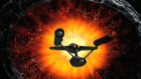
UPDATE 2: Ain’t It Cool News got their hands on two awsome new shots, the second shows the Planet Killer in better detail then has been seen before.

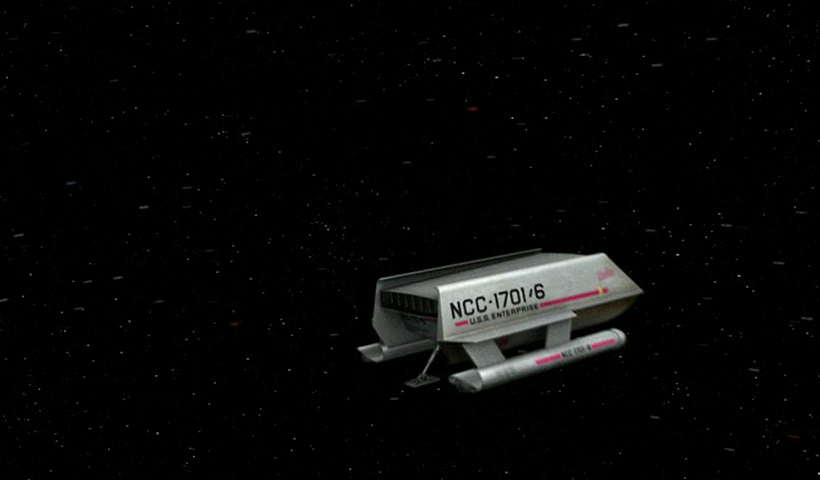
UPDATE 3: StarTrek.com have answered the question "what shuttle did Decker steal"…the anwers is "Einstein"…and here it is…see decription at their Remastered Gallery

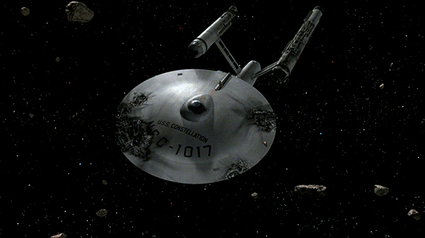
The Constellation looks pretty darn good, although I wish it had some glowing damage effects similar to what I have seen in DD’s 90’s version. Perhaps it just doesn’t show in the still photos.
This is going to be a fun weekend for all.
I like DD’s glowing damage effects too, but there’s also something to be said drama-wise about seeing a completely dead hulk. It’ll be interesting to see the progression from completely dark and dead early in the episode to something that has a bit of life left in it by the end.
Anybody know the name of the shuttle Decker steals?
3 – I blew it up. It’s the “Blur.”
I made this observation over at scifi-meshes.com but I’ll repeat it here: I think the artists at CBS Digital made a little goof on the font used for the Constellation’s registry. Look closely at the characters forming “U.S.S.” versus the characters in “CONSTELLATION”… they don’t match. In fact, the characters in “CONSTELLATION” don’t match the “NCC-1017” registry, either.
Oh well, it’s a minor quibble… the model is drop-dead gorgeous.
Re: #2……..Cranston, you have a valid point there.
I just rewatched Daren’s FX clip, and I noticed that he only had the glowing effects on the Constellation when the Enterprise initially approaches, and they board. Once the Constellation is taken in tow, the glowing effects are gone.
This looks like it might be the remastered version of the opening titles shot, which really makes it a neat point-of-comparison to the original. Does anyone here really want to try to convince me that this looks less “real” than a kitbashed AMT model after it had a close encounter with a soldering iron?
Scott, your eyes must be better than mine, though I’ll gladly take your word for it. And I still wish they’d done the Constellation as an older model starship like you did.
Michael, the apparently different fonts are much more obvious in this closeup:
To my eye, it looks like the characters in “CONSTELLATION” use the AmarilloUSAF font that the 11′ studio model had, whereas the characters in “U.S.S.” and “NCC-1017” appear to be a completly different font.
As for their Constellation appearing to be a contemporary of the Enterprise rather than a predecessor version, you have to admit that CBS Digital’s design choice probably was more in line with what we saw onscreen forty years ago. And besides… it makes *my* design choice all the more unique. ;)
you guys really need a life come on! these shots look great…this has give star trek “tos” a whole new life with a whole new generation.. quit yor whining!
“To my eye, it looks like the characters in “CONSTELLATION” use the AmarilloUSAF font that the 11′ studio model had, whereas the characters in “U.S.S.” and “NCC-1017″ appear to be a completly different font.”
Comedy GOLD! What was the combination of the safe in Kirk’s office again??? :-D
Wow that first shot is a great updating of the sort of iconic image of the wrecked Constellation. Kudos to the CBS people. That’s a wonderful homage.
That Constellation shot looks like the title-card shot, of course, minus the text.
Great job CBS-D.
http://www.startrek.com/startrek/view/series/TOS/episode/68730.html
Click on:
Constellation and the Planet Killer (Remastered)
The image is not that large and you have seen the shot it at the end of the released trailer but there it is fyi.
Oops, There is a larger image here:
http://www.startrek.com/startrek/view/news/TOS/article/28095.html
Click the link for the gallery of original and enhanced images and walk through.
“Michael, the apparently different fonts are much more obvious in this closeup:”
Yes, I see that now, and I think we can add something new to Trek lore: the guy in charge of the Constellation‘s refit apparently had an ancestor at NASA–the one who set the specs for the Hubble Telescope’s mirror!
Let me add my own observation about another of the photos: in the shot of Deckard’s stolen shuttlecraft exiting the bay, the gap between the hangar doors seems awfully narrow for that point in the launch, and I’m wondering if it’s a visual tie-in to the story point about it being too late for Sulu to shut the doors before the shuttle escaped.
Pat, I’m not sure which posts in this particular forum you’ve been reading, but I for one plan to have a splendid time watching this on Sunday. There are always nits to pick–that’s part of the fun–but it looks like the CBS team has done exemplary work on this episode by anyone’s standards (except, perhaps, those of the hopeless second-guessers and reflexive CGI-bashers). Watching this show, restored and revitalized, should make me feel for that hour like I’m sixteen all over again–and when you’re getting into your middle age, that’s not a gift you take lightly.
Decker’s unshaven face is probably a clue to how long since Constellation was attacked. It’s never said. Looks like a couple days. That plus the fact that the open areas are exposed to vacuum…. it makes more sense not to show anything glowing or burning on the outside of the ship, IMO.
I think it’s possible Starships have some sort of emergency failsafe or shutdown mechanisms inherently designed and incorporated into them in the event of catastrophic damage or failure.
Sure, nice sparklies, glitter, and lens flares look pretty, but in reality, if a Starship was drifting releasing anti-matter, the resulting explosion would be quite star like.
Perhaps the warp core is automatically ejected in lieu of the degree of damage done to Constellation.
Engineers and Starship designers would naturally take the worst case scenarios into account, and you can’t very well have the Constellation drifing in planetary orbit leaking radiation and anti-matter.
My two Lincolns.
The shuttlecraft’s name is good question. All known shuttlecraft are supposed to be listed here:
http://www.memory-alpha.org/en/wiki/Federation_shuttlecraft
As of my post, they don’t list NCC-1701/6, so the name on the CG model shouldn’t be any previously seen name. The name on the CG model is probably legible in HD so that’ll be something to find out. The original episode doesn’t show a name but used stock footage of NCC-1701/7 which is Galileo in other episodes.
The shuttlecraft’s name is pretty blurry, but I’m reasonably sure it’s “Ebola”.
You heard it here first.
I can’t believe you guys are debating the font on the ships — that’s super-geeky :-)
Anyway, these are more cool shots, but some of the stills (notably inside the planet killer) look more like illustrations to me, rather than photo-real. I’m guessing that motion and full resolution make the CGI look a lot more real in the actual show.
Nerd alert!!! ;-)
As Rick James sang, “he’s a super-geek, super-geek, he’s super -geeky!!!Yeeoww!!”
Every shot I see from this makes me more impatient for this Sunday, when the episode airs here in Pittsburgh, PA.
I am so looking forward to this; as Michael Hall said, to feel like a kid again for an hour.
Bring on the Planet Killer!
Well, Gammans is actually a CG artist, so his professional interest in fonts gets him a geek-free pass if he so wishes. Sadly, the rest of us have no such alibi.
I notice everyone is commenting on the lack of glowing energy leaks in the Constellation, just like in DD’s version of the DDM. But if you remember in the story Washburn tells Kirk. “Somehow the Anti-Matter in the warp drive pods has been deactivated.” So there wouldn’t be any energy leaks would there? Just a thought. I think the new version of the Constellation looks great.
RE: Shuttlecraft name. It looks like 4 or 5 letters, starting with a B, and with only one “tall” lowercase letter. Given that the other shuttles we know are named after early explorers/scientists (Galileo, Columbus — and was there a Copernicus at one point?), I suggest that it might be “Brahe” after Tycho Brahe.
It looks better than the AMT model kit used in the original version. Anything is better than that. Still the interior shots need to be dazzled up as well. Now redo the animated series.
Jack
#5: “I think the artists at CBS Digital made a little goof on the font used for the Constellation’s registry. Look closely at the characters forming “U.S.S.” versus the characters in “CONSTELLATION”… they don’t match. In fact, the characters in “CONSTELLATION” don’t match the “NCC-1017″ registry, either.”
I am concerned that no one has noticed the obviously low tensile strength of the exposed girders in the Constellation.
Sure are a lot of stars in the back ground.
With the release of each newly remastered episode, the CBS CGI crew is obviously improving. I’m very impressed with the screen shots from this episode.
Mike :o
They might one day compete with Eden FX. :)
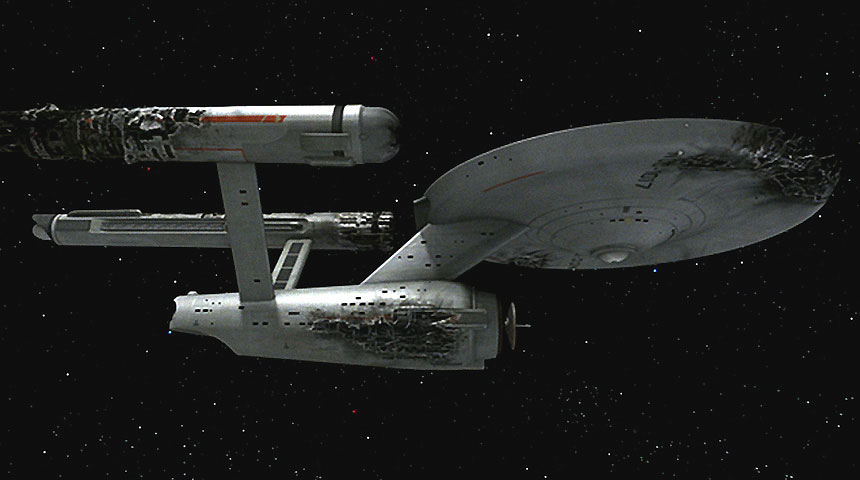
Wow, more shots previewed. That side view of the Constellation looks pretty cool, but I wonder if they might have almost crossed the line of overdoing the amount of damage! : ) Particularly on the secondary hull. Plus, doesn’t that engine nacelle look a tad faceted and oblong? I suppose the reasons are it’s damaged.
I like the side view of the Planet Killer, it’s nice to see the reddish glow coming out from inside like the original. And I like the textures and cracks.
“RE: Shuttlecraft name. It looks like 4 or 5 letters, starting with a B, and with only one “tall” lowercase letter. Given that the other shuttles we know are named after early explorers/scientists (Galileo, Columbus — and was there a Copernicus at one point?), I suggest that it might be “Brahe” after Tycho Brahe. ”
Oh crap…… its the “Berman”! HEEES BAAACK! :)
O man, SG … font mismatch … now I can’t sleep.
“CBS, please go back and fix this for the DVDs!” … Just kidding. ;-)
And the name of the shuttle … that alone is enough to keep me
caffeinated til dawn. Come morning, I’m gonna look like Decker.
No, Cranston, I don’t think it’s “Brahe” … after playing with it in photoshop,
it almost looks like “Beta” … I don’t know what it really says but
I do see something that looks like maybe a cross on the letter ‘t’ … ?
BTW:
If Sinese is a no-go for XI McCoy due to age … how about
Barry McEvoy? I haven’t seen him on screen. One reviewer
did mention that he “has a presence like a younger … Sinise.”
http://www.variety.com/graphics/ten2/pics/mcevoy.jpg
#33 Skippy:
“Oh crap…… its the “Berman”! HEEES BAAACK!”
Ack! But wait — they *do* immediately plunge the shuttlecraft into the maw of a planet-devouring behemoth, after all.
#34 yo:
I agree, it does look a lot like “Beta.” I know — it’s “Bela”, as in Lugosi! (Or maybe Oxmyx? :) )
One question about the shuttlecraft: in the original series, did we ever see an aft view of a shuttle in flight (i.e. not immediately after takeoff)? If so, was that landing strut always deployed like that, or did they retract?
There’s no real reason for them to retract, of course, especially in non-atmospheric flight (and the thing’s so non-aerodynamic for in-atmo flight, I can’t imagine that the landing strut would make a difference). Just wondering if we’d seen one way or the other before.
I’m still impressed. This is one episode where I’d nit pick it to death also as I like it best. Butthe levels of detail, like the asteroids, is way cool.
The new shot I’m most looking forward to seeing is the wide shot of the Constellation beginning to move on impulse. I still remember showing this episode to my future wife back in the late 80’s and her laughing hysterically as the AMT model jerked back and forth. Ruined the moment completely. Now, after 20 years, I get my revenge!
And this week I asked my 3 year old daughter what planet Mr. Spock came from. She very matter of factly said, “Vulcan.” Daddy almost cried….
I’m getting more used to this new “official” rendering of the Doomsday Machine now, and very much like the new screenshot that Aintitcoolnews.com previewed of it’s side view. I find the gaping opening somewhat reminiscent of a giant sharks maw…which is a design change I like. I am also beginning to like the colour-scheme of the object a bit better thanks to this paticular screenshot. I am looking forward to seeing it’s full eventual High Definition glory on a large screen.
May I take this opportunity to flag up for my fellow U.K. visitors to this site, any “completist” collectors, or anyone looking to have INDIVIDUALLY cased ORIGINAL series dvds as opposed to the pricey 3 season “clumsily packaged” boxsets, that a new weekly glossy publication combined with DVD has just been released, and Issue 1 is out NOW priced £2.99 and £7.99 thereafter. Each dvd contains 3 episodes, and full details and subscriptions can be seen at http://www.startrekdvd.co.uk
Just realised having watched your small preview once more that the reason I initially wasn’t too impressed with the lack of colour on the surface is because the clips show it as looking a bland greyish colour overall…and the reason I like the new screenshot is it’s obvious more blueish overall colour! What gives? I know that in a portion of the preview there is this blue look, but mostly it looks grey. I hope the blue / white dappled colouring is emphasised and comes across in it’s eventual airing as well as in this screenshot. COLOUR is good…
I love the shots. CBS-D is doing such a great job with the remastering. I did manage to see the previews on youtube of the other version… not a bad attempt, but I didn’t enjoy it as much as the CBS version. But I think there is some great work there. Much better than I could ever do. I know that some posters feel that the other version is better, I can appreciate that. Everyone is entitled to their opinions.
#34 – yo
I like your suggestion.. Barry McEvoy is a great actor, I can see him cast as McCoy.
I was going to comment on the whole font issue.. but I won’t go there. ;)
re: 28. Mark
“I am concerned that no one has noticed the obviously low tensile strength of the exposed girders in the Constellation.”
Gwahhahahahahahahahahahaaaaaaaaaaaaa!!!
These images of the Enterprise, as well as the shuttle, look much more “real” and less “flat” than before, and do you see why? It’s the lighting! Instead of the usual very homogenuous “grey” the hull is shiny and shows both shadows and highlights, as it should be.
So this is proof that the CBS-D people are perfectly capable of producing acceptable SFX in line with the original philosophy – if they want to.
According the Spock, “The bridge is wrecked and unihabitable.”
Not on these images, they aren’t…
Good catch, Kahn. Shouldn’t the exterior bridge show charred damage to match Spock’s analysis of the interior bridge’s condition when he is updating Kirk?
Well maybe it’s just damaged internally, or intentionally sealed off… who knows? I’m pretty sure they didn’t want to make it too destracting, and make it look similar to the orginal wrecked Constellation
Bridge damage is visible on the far side of the first image posted on Wednesday:
The color of the Planet Killer looks significantly bluer than the first preview shots and vid — I hope it stays that way!
Not a critisism, just a thought…
I know that CBS Digital have roughly replicated the size of the DM to match the one in the original show, but perhaps they missed a trick in not INCREASING it’s scale… It is meant to be a “devourer of planets” after all… This would have made this object even MORE scary.
The ability to destroy a planet is insignificant compared to the power of The Kirk. This is Classic Trek.