jump to navigation

Images From Remastered “The Tholian Web” [UPDATED] March 29, 2007

by Anthony Pascale , Filed under: TOS-R Preview , trackback

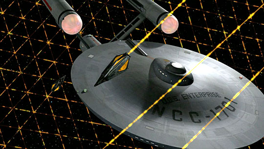
CBS have released some new images from this weekend’s remastered Tholian Web
[UPDATE: added new higher res versions]


Original


Original


Original


Original


TrekMovie.com expects to get higher res versions of these from CBS, so keep an eye out for an update of this article.

VIDEO: PREVIEW

Original Image captures by TrekCore.com

Comments»

1. TiberiusK - March 29, 2007

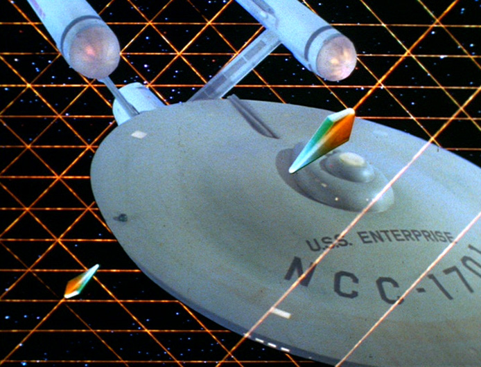
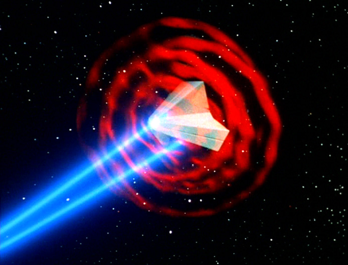
Third one is for cheese-factor?

2. Dave - March 29, 2007

I always thought this one was one of my favorite episodes in the series.

3. Oscar Benjamin - March 29, 2007

I always loved this episode! Great mystery combined with a real intellectual sense of wonder that only the best science fiction can convey. That being said I have always wondered how they approved those atrocious space outfits! Oh well it will always remind us that even the hardest of science fiction had its roots in the pulps! Live long and prosper-fellow fans!

4. Xai (in interphase) - March 29, 2007

#3 Oscar,
Agreed. Love the ep, Hate the space suits…except that mount or armature that stuck up above the neckline. Artistically I liked that for some dumb reason.

5. Gd846c3 - March 29, 2007

Looking better than I expected it to. I wasn’t sure from the preview but it looks good to me now. I think the big E has some good detail for the most part. Why does everyone think the phasers hitting the force field of the tholian ship looks cheesy. Although it could have been a little bit better, it looks okay to me. It’s also pretty close to the original effect. From what I see, good job overall on CBS’s part.

P.S. If you think that phaser effect looks cheesy than you ought to look at the original effect!

6. T Negative - March 29, 2007

I have to say that the E looks fantastic in the top image. The metal plating on the primary hull looks flawless. They are making it look less and less like a CG model with every episode. There are a lot of opportunities with this ep to make the E look good. I’m looking forward to it!!

In the “Immunity Syndrome” I am wondering how dark the E will look in the black void. Since there is no light source in there I would think that the E would be barely visible, kind of “self iluminated” similar to ST:TMP. I am curious to see what CBS does with it.

7. jsonitsac - March 29, 2007

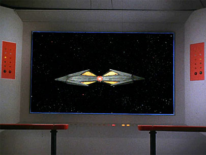
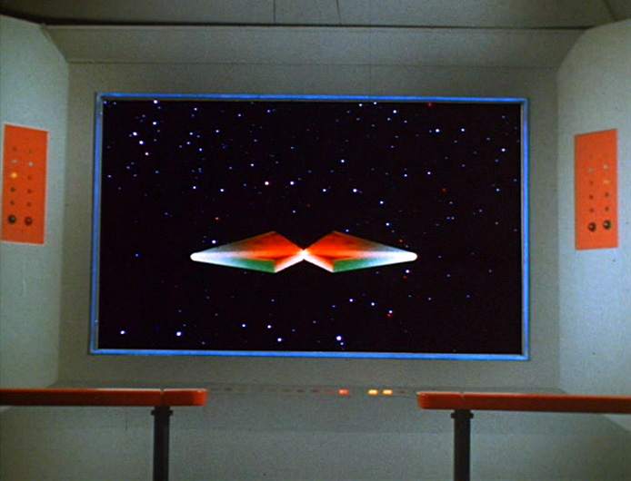
Looks like CBS decided to go with an ENT look for the Tholian ships.

8. Scott Gammans - March 29, 2007

Well I guess it’s just me, then… but the shadow detail on that first image looks completely wrong to my eyes.

I’ll give you a very specific example of what I’m talking about: look at the starboard side of the B/C deck teardrop-shaped superstructure atop the primary hull. The main light source illuminating the Enterprise is behind, above and to port of the ship, and indeed we see a shadow being cast by the superstructure to starboard. But there is also _clearly_ some light leakage from the primary light source **IN** the shadow where there should not be such a bright illumination of the hull.

I’m beginning to wonder whether CBS Digital is shaving some corners on rendering times by not using raytraced shadows, because the shadows in that particular scene just don’t look right. Not right at all.

9. Xai (in interphase) - March 29, 2007

#8 Scott,

I see what you are referrring to, and I agree it’s not a perfect image, but you also have the ports casting light there and the overall “web” structure glowing. We already know they are using a “lower-res” render on E… a lesson learned from earlier shows. Correct?

10. enterprice - March 29, 2007

I can see its a no news on the movie front this week…..

11. Gd846c3 - March 29, 2007

CBS, I think it would be cool if you would show the Enterprise in the standard “ship at warp” sequence that is seen in all the orther series where the ship is approaching the camera slowly but the stars in the background are moving by quickly.

12. OtterVomit - March 29, 2007

Oh Lord, have they added that Aztec-Mosaic hull plating to the original 1701 now, or do my eyes deceive me?

13. Duncan MacLeod - March 29, 2007

GD845c3

Yeah that would be cool to see, honestly starting with TNG i was simply fascinated by the trek warp effect that you are talking about. If you might have missed it, you can see a very nice rendition of your request in the Enterprise episode “In a Mirror, Darkly” the rebuilt TOS sets and the crazy moves the Defiant does is simply one of the coolest things ive seen in video trek. And besides, the plot of that episode (2 parter) directly relates to “the tholian web”

cheers!

14. 8of5 - March 29, 2007

I really don’t like what they’ve done with the tholian ships, the extra detail and Enterprise style textureing is fine, but I cant stand the nose cone thing.

15. Josh T. ( Tholians are Wal-Mart villians ) Kirk Esquire' - March 29, 2007

Josh likey the crisp details, Enterprise hull diffusion/scattering, and Tholian effects,

I’ve died and gone to Kirk Nirvana.

16. CommodoreZ - March 29, 2007

#8: I think there’s a difference between “I’ve found a flaw” and “completely wrong.” I don’t know enough about CGI effects to know if they’re shaving corners. Even if they are, I don’t think that it makes it “completely wrong,” even if it means it’s not perfect.

Myself, I think it looks pretty cool.

17. Mysterious "Trek Fan" Stranger - March 29, 2007

This was horrible. Not the episode, the SFX. I’ve been a big supporter of the CG thing, but this looked like a cartoon, or some kinda 60’s flashback thing.

I couldn’t watch it. Talk about taking things to far.

18. Buckaroohawk - March 29, 2007

Scott (#8) I think the “flaw” is actually shine from the surface of the main saucer impeding slightly through the shadow of the teardrop structure. The shine is likely caused by a secondary, low-level key light shining on the model from the front. Either that or the shininess level of the material map is set a bit too high.

Either way, even though I don’t think it’s really a flaw, you are correct that it “doesn’t look right.” it tends to make the teardrop shape look like its floating above the saucer instead of a part of it. The shadows themselves do indeed look ray-traced to me, though. They conform perfectly to the shapes casting shadows and they don’t look pixelated at all. Until I see the actual scene in motion, I’m going to call this a trick of the light.

Otter (#12): The hull looks just awesome on the Enterprise, and it seems to have an aztec plate design to me as well. I think that’s a good thing, since it brings the TOS Enterprise a little closer to her motion picture counterpart.

8of5 (#14): I must disagree about the Tholians. In my opinion, this new more detailed design is miles above the original one. A much needed improvement that gives the Tholian ships a more functional appearance.

And just to be contrary, I’ve always liked the specesuits from TOS. Shiny silver suits have always been the bane of sci-fi TV, but I think it works here since the spacesuits obviously aren’t everyday outfits. Anyway, they’re a heap better than the orange “bee keeper” outfits seen in the episode “The Naked Time.”

Looking forward to watching this weekend! Warp speed ahead!

19. DEMODE - March 29, 2007

The Enterpise saucer sure has that Aztec-Mosaic look going on in that top picture.

Mmmmm….. This is a season 3 episode… perhaps they are showing us now that the ‘refit’ began earlier than TMP(???) Do you think???

(.. nah, me neither… lol…)

20. CommodoreZ - March 29, 2007

The plating style looks like they were inspired by the aztec on the TMP ship, but the actual pattern is quite a bit different.

21. Jeffrey S. Nelson - March 30, 2007

I think I see Kulkukan on the Aztec plating,

22. Marvin the Martian - March 30, 2007

Color me unimpressed. I think the original is far superior, especially the Tholian ships. Their featureless design is that much more mysterious and interesting. I wish the remastered version had kept that design.

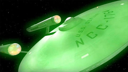
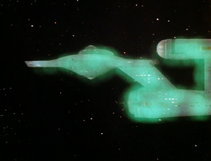
The Defiant is also more interesting in the original. First we had pink space fog in “Where No Man…” and now we have green space fog. Ugh.

I’m a *huge* supporter of the remastered episodes, but I think they missed the mark on this one.

23. Chris Pike - March 30, 2007

The “aztec” pattern derived from TMP style is much more repetitive and mirrored than the IMO much nicer more random plating used here, although care should be taken to not have it any more prominent than it is, and it would be cool to (only just) see that this plating pattern goes finer in detail on close-up. Looks to me that the lighting just has a nice fill/key ratio - maybe not natural for deep space, but looks “right” to the eye and is right from a cinematography pov. That rear key gives a nice kick, and lifts the model well. Just watch that internal nacelle cap lighting though…???

24. Montreal Paul - March 30, 2007

It looks great! I just saw the ENT “In a Mirror, Darkly” episodes last week.. was a great tie in to this episode… you got to see what happened to the Defiant. It was a great take on it. I love the 1701 in the pics.. CBSD keeps getting better. Nice work guys.

25. Anthony Pascale - March 30, 2007

I have updated with bigger images…thanks to the boys at CBS

26. Crusade2267 - March 30, 2007

Looks Great. Any idea when seasons 2 and 3 will be on I-tunes? I live in New York, and as big a trekker as I am, I’m not going to get up at 3 AM on a Monday.

27. Chris Pike - March 30, 2007

25 Anthony The higher res still make even more of an impression - just shows we can’t make proper judgements until we see the full HD version….although wouldn’t it be interesting to see some full 1080 HD stills…???

28. RoadSiren21/Mnl - March 30, 2007

i’m more curious about what the Tholians will look like on the viewscreen when Spock talks to them on the bridge. Will CBS-D follow their look in ENT-In A Mirror, Darkly??

i agree that the third pix is a little cheesy.. :P

greetings from manila, philippines!

29. John Kirk - March 30, 2007

I think I’m liking the original effects better. These images are not as “realistic” as I was expecting, and the original effects look more “in tune” with the rest of the episode. The viewscreen shot and the “web” shot make the Tholian ships “too cartoonish” in my opinion.
While I’ve loved a ton of what’s been done with remastering, I’ll stick with the original on this one.

30. Tom - March 30, 2007

Sometime, somewhere, someone reneder a TOS version of the Enterprise with the aztec haul plating (originally saw it on trekweb.com). It was really well done with the Franz Joseph Star Fleet station and dreadnought in the background.

So the aztecing can be done, and subtle enough to give Trek a consistent look to later incarnations

31. Tom - March 30, 2007

Was just curious about the higher resolution shots. The space scenes are rendered in the hi-def aspect ration (1.78), although they don’t have sufficient pixels to be actual HD images. The bridge scene is the typical SDTV ratio (1.33) and resolution.

So where actually seeing “more” here of the space shots than we will in this weekend’s broadcast.

32. doubleofive - March 30, 2007

30

You are correct, CBS-D renders all of the completely new shots in 16:9, but keeps the original aspect ratio in the composited shots. No one knows how this will translate into the dvd release, either keeping the original aspect ratio all of the time (like iTunes does), or switch back and forth between the standard and widescreen formats (as Xbox Live does). Some think that they will crop the original image to 16:9, but I can see the lynch mobs forming now, so I doubt that.

33. THEETrekMaster - March 30, 2007

These shots look fine. I think a big reason why some fans don’t like these new shot is that they are just too used to seeing the old ones — and I understand that because the new shots sometimes do take some time to get used to.

I do agree the original shot of the phasers hitting the Tholian ship was better. Not sure what I don’t like about the new one…can’t put a finger on it. I guess it does look cartoonish to a degree.

Quickly produced CGI is often times lacking. Having worked in CGI, I find that it takes a lot more time and effort to get those shots lit right and the models realistically textured than it does to photograph miniatures. Quickly produced CGI comes off looking very video-gamish.

That’s just a fact of life.

Now, you go and look at Daren’s work and you can see he put the time in to make his (for the most part, not always though) shots look like traditional miniature effects.

34. THEETrekMaster - March 30, 2007

#18: “And just to be contrary, I’ve always liked the specesuits from TOS. Shiny silver suits have always been the bane of sci-fi TV, but I think it works here since the spacesuits obviously aren’t everyday outfits. Anyway, they’re a heap better than the orange “bee keeper” outfits seen in the episode “The Naked Time.””

The “beekeeper suits” weren’t spacesuits…they were decontamination suits…

TTM

35. Holo J - March 30, 2007

I think this work is looking excellent much better than the original. The top shot looks fantastic.
The only thing I have to agree with is the shot of the Tholian ship getting fired on could have been done better.

A bit more of a dynamic view used may have made the shot work better.
They could have had the Tholian ship viewed from an over the shoulder perspective with the Enterprise in the distance firing on it.
That would have been a more interesting new view instead of recreated a shot which I didn’t think worked very well the first time round.

Otherwise it’s a big improvement for me.

36. Jim J - March 30, 2007

At StarTrek.com there is an explanation to tghe lighting issue you have all been talking about regarding the Enterprise and her hull: “Also, notice how the light source on the saucer section of the Enterprise indicates a possible nearby star. “

37. cbspock - March 30, 2007

I like the shot of the defiant in the original than the one they used in the above shot in the remastered.

38. FlyingTigress - March 30, 2007

As always, the reduced size may look ‘cheesy’, but I’m going to reserve final judgement until I see it on the TV set tomorrow night.

The #1 photo gets my vote to be in the “Top 10″ iconic images from TOS. Always loved that one.

39. diabolik - March 30, 2007

People always like the old better than new in just about anything. They’re just used to it. Any objective observer can tell the new is better.

I think it looks great!

40. Stanklin T. McFibberich - March 30, 2007

re:37. FlyingTigress - March 30, 2007
“…I’m going to reserve final judgement until I see it on the TV set tomorrow night.”

Good idea. That is usually the way to go.

I have very few criticisms of the Remastered effort, but just in principle, to use a Tholian ship design from “Enterprise” is a poor choice.

41. diabolik - March 30, 2007

I meant “unobjective” in the above.

42. Kyle Nin - March 30, 2007

The new Tholian ship doesn’t look EXACTLY like the ENT version. It’s not even the same color.

43. DEMODE - March 30, 2007

The new Tholian ship looks fantastic! It is definitley an improvement on the original design.

44. neo - March 30, 2007

sad. truly sad.

45. Kev - March 30, 2007

Hey! Why no more original FX big jpegs? I want my SFTV (wallpaper), please.

46. Skippy 2k - March 30, 2007

#44. Hey Kev, maybe not as high res as some of them but I just made one with the border from the “official” wallpapers. Used that top image with the enterprise, great shot.

http://img46.imageshack.us/img46/3696/tholianwebkx6.jpg

47. Jon - March 30, 2007

the ” Tholian” has a more Berman era Trek spin-off look to it,with those large flat lighted areas at the stern.

48. Skippy 2k - March 30, 2007

^ Saved that one before I had tried “sharpening”, didn’t do it much so while not much difference I figure I would upload it as well….

http://img339.imageshack.us/img339/7663/tholianweb2qo7.jpg

49. Lord Garth Formerly of Izor - March 30, 2007

Lord Garth loves Skippy’s bigger Higher Res image. The new effects (post -new Modeling process) are designed to really shine in HD/ High res. Unfortunately analog signal/low res imaging just doesn’t do it justice. CBS is putting in tremendous amounts of ornate surface detail which we really don’t see each week because of the non-HD low res broadcasts. Many still complain the the colors are flat, detail looks flat, ect ect. But that is because an HD image is being downgraded to an analog signal. When I first saw the HD 60″ widescreen broadcast of Space Seed via xbox 360 I couldn’t believe what I was seeing. Major motion picture quality effects for TOS!! Anyway I can’t wait to see this effects ladden episode.

Now Marta will dance for Skippy!!

50. Jon - March 30, 2007

TOS era ships weren’t known for lighted exhaust/thruster type design.To my recollection starfleet,Klingon,Romulan didn’t have it.This is a break from TOS era special fx visual look.

51. Marvin the Martian - March 30, 2007

#38

Well, I think your “objective” opinion is subjective.

52. jonboc - March 30, 2007

I also prefer the original color and simplicity of the Tholians to the highly detailed versions. I also prefer the spotty,almost ghostly, shimmer of the defiant to the uniform green glow. But the top shot of the E is gorgeous. I love the random plating effect and can’t wait to see more of it this Saturday.

53. Windsor Bear - March 30, 2007

I know this will sound strange, but part of the problem I see with the new phaser shots is the “color” of the blue being used. The TOS third season phasers used a blue line with a darker and thicker blue “glow”. I’m not sure why, but I’ve always loved that color effect. The new GGI phasers seem to be a white line with a light blue “glow”. Just doesn’t have the same effect with me. Eh… just one fan’s opinion.

54. Jeff - March 30, 2007

Finally, the Tholian “paper airplane” ships have been upgraded!

#52
I totally agree with your phaser comments. Completely silly but that old “neon blue” effect is still pretty sweet.

55. Mazzer - March 30, 2007

Anthony — can you get an update from CBS on the DVD/HD-DVD aspect ratio question? Have they made a decision yet?

Everytime I see the dramatic stills on this site in widescreen, I hope for an *option* of seeing the shows formatted to, perhaps, 1.60:1. I agree that 1.78:1 may be too wide for the film source material. And, of course, some will not be happy unless the 4×3 version is available… but I’m just hoping for the option of both 4×3 and widescreen.

Following on with people’s comments about the quality of the CGI work on this episide, I agree that you can’t judge its effectiveness till you see the full resolution images. I’m guessing CBS won’t send 1920×1080 stills because of similar copyright issues on unprotected full-res video. But I’m also guessing that even a full-res still image won’t always convey the drama of the CGI, because it’s just one frame — we’re not seeing the shimmering, light changes, movement, etc, that provides the reality of active video.

Anyway, cool stuff.

56. diabolik - March 30, 2007

Although I prefer the new effects over the old usually, I do agree that I prefer the darker blue phaser with the white core over the lighter blue we are seeing. The old looks more intense.

57. ozy - March 30, 2007

Tholian ship looks great. I like new design.

58. Dr. Image - March 30, 2007

Some subtle irregular “aztec plating” adds scale, though overall the TOS-E should be portrayed as a relatively smooth-skinned object. They’re being conservative with it, which is a good thing.
The plating on the TMP-E worked for it, and it alone. That look shouldn’t be applied to the TOS-E, IMO. Ever since the horrid overdone aztec plating on ships on Babylon 5, I’ve had an aversion to it.

59. Shaye - March 30, 2007

Sorry but the the new shots look like crap!…just my opinion here on this episode, as Scotty might say…”a chimpanzee and a three year old could do a better job than this “….remastering.

Most Third Season shows do not need “fixing on exterior shots…

Gods know what they are going to do with Commander Loskeen~!

I cringe untill saturday night…hope im wrong!

:-(

60. Cafe 5 - March 30, 2007

This episode was nominated for an Emmy for the Van Der Veer effects.
The new effects look really well done when you compare them to the 1969
originals. I think they will be OK and hope they enhance the Tholians as
well.

61. Robert Bernardo - March 30, 2007

Shaye wrote:

> Most Third Season shows do not need “fixing on exterior shots…

Except the Enterprise (3/4 angle flying from left to right) flyby shots in which the compositing is off and part of the right engine pylon disappears when seen faraway.

62. Chris Pike - March 30, 2007

It is interesting that Mike Minor contributed greatly to the award winning effects, designing the web structure filaments and animating them on the rostrum, as well as creating the Tholian and designing those great EV suits. He provided original artwork that dress the ships wall panels in this third season and went on to become a major influence on the way the ship interiors looked from TMP onwards. Fascinating……!

63. non-fanatic - March 30, 2007

Sorry but the the new shots look like crap!…just my opinion here on this episode, as Scotty might say…”a chimpanzee and a three year old could do a better job than this “….remastering.

Please, please, please do a proper version and post a link so we can see how it should be done. I’m really looking forward to seeing what you come up with.

64. Redshirt - March 30, 2007

I feel this episode was one of the Third Seasons high points. The Third Season had so many bad episodes but this was excellent . The character dynamics between Spock and McCoy were at its best on this story next to the Paradise Syndrome. And the theirs more to do for Chekov and Uhura to do without Kirk hogging every scene.

IMHO the Defiant shot really caught my eye. Just the overall view of the ship. What interest me if any of the optical effects inside the ship will be changed or at least cleaned up.

Unfortunantly the Tholian Shots are a bit disappointing. They look almost the same as the were seen on ENT I feel their was no need to with the plating detail on the Enterprise at all. The problem now is they are not being consistent with the new effects.. The shots of the E are not consistent of the other episodes at all. It looks like the hull texture of the NX-01. Which I find most disturbing.

I’m not holding my breath but It just comes down if the final product delivers.

65. Skippy 2k - March 30, 2007

^ I’m pretty sure its just the specular texture, the way the lighting is hitting the ship and the shot from that angle makes it stand out. I think that first shot looks pretty cool, I like the different phaser hit effect trying to have some of the look of the original. The main thing I don’t like in the pics is the lighting on the tholian ships, the first shot witht he enterprise looks good but the later ones seem overlighted….will have to see what they look like in action Sat.

Another cool effects episode!

66. neo - March 30, 2007

why in the name of all that is good are the camera angles still the same?

67. Josh T. ( To bloody hell with Excalbians ) Kirk Esquire' - March 30, 2007

One of the problems with filming the Enterprise is that the Enterprise only looks good from certain angles. All of the stock angles we see the ship depicted from episode to episode are of the best viewing angles of the Enterprise.

The D was even less photogenic and had even less complimenting shooting angles.

So the reason CBS Digital is replicating to some extent the shots from the series if that they are iconic and engrained in our imaginations.

68. laserlover2254 - March 30, 2007

Are there TWO new Tholian Ship classes for the new episode?

The camera angels look the same.

69. laserlover2254 - March 30, 2007

Angles!

ARRRGGHHH…

70. Mark 2000 - March 30, 2007

Isn’t there ONE TOS fan here offended by the fact that the Tholian ships are being remade to look like the “Enterprise” ones? A show that was designed to pretty much pop TOS out of the canon like a zit (barring Coto’s 4th season attempts to make it all work). I don’t know what sane person acknowledges ENT existed. And even if you do, the ENTerprise looks nothing like the Enterprise. Why would Tholian ships look so similar 100 years apart?

What it comes down to is TOS is a 60s show and should stay looking like a 60s show in aesthetics if not production values. Those Tholians look completely out of place. They could have sone something cool about making the multi-colored skins of the ships more organic and dynamic, but they took the lazy way out.

71. Ron Jon - March 30, 2007

I may not be sane, but I certainly acknowledge that Star Trek: Enterprise existed. And I’m pretty sure that the Tholian ships on Ent are NOT the same as the Tholian ships on Remastered. I think the Remastered versions are closer to the originals.

The amount of reflective glare that you get from reflective surfaces depends on the angle of lighting, both in CGI effects, and in the real world. The “aztec-ey” shot seems to be very strongly backlit, probably to make the specular paneling stand out more than usual.

72. Buckaroohawk - March 30, 2007

Mark 2000 (#70): I’m sure there are plenty of other TOS fans who might be offended by the newer Tholian design. Thankfully, none of them choose to post here.

The Tholian design seen above is not the same as the one seen in ST: Enterprise. They are similar, but that’s not a bad thing. Not everything about ENT was terrible. In fact, one of the things I enjoyed about it was the updated designs for the alien ships. I’ve enjoyed most of the stuff I’ve seen from CBS Digital, both as a Star Trek fan and as an amateur CGI effects artist. They’ve done a remarkable job of updating the look of the show without betraying its roots in 60’s television. They’ve always stayed as close as possible to the designs we’ve seen in the original effects shots. They aren’t going to make “the multi-colored skins of the ships more organic and dynamic” because that isn’t how they were featured originally. And I don’t want to see a modern retread of 60’s aesthetics and production values. I want better effects and more detailed ships, and that’s what I’m getting.

73. DreamerOutThere - March 31, 2007

Here’s what I got. I would love to see TNG + warp effects. Them not doing them I think is a big mistake. I think they should make the ship work how they made the Defiant work in ENT In a Mirror Darkly. That was one of the coolest Trek eps ever. Also, in Doomsday, they should of made the E use it’s aft weapons as well when what’s his bucket said to fire all phasers. Love the new Tholian ships. Love the ENT style. ENT was good I think. Please see into it too much and hate it for all the wrong reasons. And yea. They should take their ques from ENT on how to do a digital constitution class ship. They should be doing the weapons like how they did the Defiant’s in ENT and they should be doing the warp like how they did in ENT for the Defiant as well. Don’t hate me for saying it, just my thoughts and my $0.02. - Dreamer

74. Josh T. (The Phantom Shatner) Kirk Esquire' - March 31, 2007

I made the mistake of watching the Enterprise episode, and the Tholian ships look like these Tholian ships - in the same way the Enterprise -C looks like the original Enterprise, only broadly. I think if you cross your eyes and squint them, there may be a subtle similarity.

75. Crusade2267 - March 31, 2007

#70: While I try to forget Enterprise, and personally I don’t count it in my own personal Star Trek Canon, I know that it is part of the official canon. You can dislike it all you want, but it is there. Nobody tries to deny TMP is part of canon, and everyone pretty much agrees its not so great,

76. spockariffic - March 31, 2007

Aren’t the Tholian ships from the orignal the mortae weapons from The Cloud Minders lol. But it brings a certain stability to my universe knowing that I can go to Europe for a for a couple months and come back to find the same old discussions happening on trekmovie.com. “I don’t like it still.” “I still like it.” For the people who don’t like the new ones, ummmm, WHY ARE YOU STILL WATCHING IT LOL?! This is kinda what it is guys and gals. It’s not all of a sudden gonna be leaps and bounds better. Personally I love it! I’ve been catching up on all the episodes I’ve missed while being away and I gotta say WICKED COOL! Nice work CBS-D!

77. Mark 2000 - March 31, 2007

Ah, I know I’m talking to fanboys when we all look at something obvious and and its denied. The new tholian ships look identical to the ENT ones (http://memory-alpha.org/en/wiki/Image:TholianWebENT.jpg) with the exception of the blue color on the wings. The color and texture are the same. Even the little buttresses at the edge of the wings are copied. Come on guys, but fan boys, but also admit when the sky is blue.

78. Kyle Nin - March 31, 2007

Check this photo against the photo above:

http://trekmovie.com/wp-content/uploads/enttholian.JPG

It’s not the same ship. It looks like it could be related, but it’s not exactly the same. The shape is different and it’s a different color.

79. Mark 2000 - March 31, 2007

#78 The ship you cite above is not the “In a Mirror Darkly” ship in my link. That’s the ship that is nearly recreated in TOSR.

80. ozy - March 31, 2007

All federation ships are similar, all klingon ships are similar, all tholian ship should be similar ( contiunity )

81. DreamerOutThere - March 31, 2007

Yea, I like the new ships. Because of budget constraints they had to use old props to make the Tholian ships. And that right there is the only reason they look how they look. So, now since the budget is not forcing them to reuse props, I think they should make them look like actual ships.

82. Mark 2000 - March 31, 2007

81, thats balony. those are not reused. There were reused later, but they are not reused props. They were made for this episode. And I’m not against further detailing them. I am against trying to tie this into the aesthetic of Enterprise, a show so hated and poorly made it was canceled. Its like bringing in the younger actor in to replace the older anikin skywalker in ROTJ. It didn’t serve the purpose of improving the sfx, it served the purpose of retconning inferior new material into the old. Really, when you think about it, its purely a political agenda.

83. Xai - March 31, 2007

#70 and #82 Mark 2000

“don’t know what sane person acknowledges ENT existed.”

The day won’t ever get here when you start determining what I should like or dislike. Or get to tell me I am”insane” for what I like or don’t.

“I am against trying to tie this into the aesthetic of Enterprise, a show so hated and poorly made it was canceled.”

TOS was cancelled as well.
Have your opinions, bud. But don’t be insulting.

84. neo - March 31, 2007

re: 67

any star trek ship is best viwed not from a single angle, but a sweeping one. but i was referring to the tholians. we stil see them in profile most of the time.

85. neo - March 31, 2007

big suprise that the person with no attention to detail is the same one who doesn’t understand star wars.

look at the tholian ship from
IAMD:

http://www.st-intelligence.com/ship_database/fed/thol.php

it’s basically the one from FT with an added aft section.

the new one is very different. look at the original:

http://members.aol.com/IDICPage/tholian.html

see those triangular silver decals? in the remastered episode, those exact same triangles are reproduced.

also, the remastered one looks like it’s out of a video game, with no detail whatsoever.

86. Mark - March 31, 2007

#70 - This Mark agrees with Mark2000. I much prefer the original Tholian ships. In general, I like what is being done with the remastered episodes, just as in general, I disliked ENT (although there were some good episodes.) But in this case, I think the original Tholian ships looked much better. Even if I had never seen the original and was just given the choice to pick one for the episode, I’m sure I would have picked the original - I just don’t like the look of the new one.

87. Mark - March 31, 2007

#85 (neo) No offense if you have anything to do with that website (st-intelligence), but in the Tholian entry, we see these two statements:

“the Tholians are fearsly protective of their territory”

fearsly?

“used to trap vessels that have wondered into their territory”

wondered?

Doesn’t anyone proofread or pay attention to detail??? It’s like the word ‘canon.’ Besides being grossly overused on this site, how many times does it have to be seen before people here stop spelling it ‘cannon?’

88. neo - April 1, 2007

i just googled it up for a picture

one correction, apperently the tholian ship with no aft section was in IAMD, but was only one of them, the one that initiated the web. it’s flat at the back for some reason. maybe it isn’t warp capable?


TrekMovie.com is represented by Gorilla Nation. Please contact Gorilla Nation for ad rates, packages and general advertising information.