
TrekMovie.com has been sent a picture of a design sketch of the new Star Trek XI Enterprise from one of our trusted sources. [or then again maybe not]
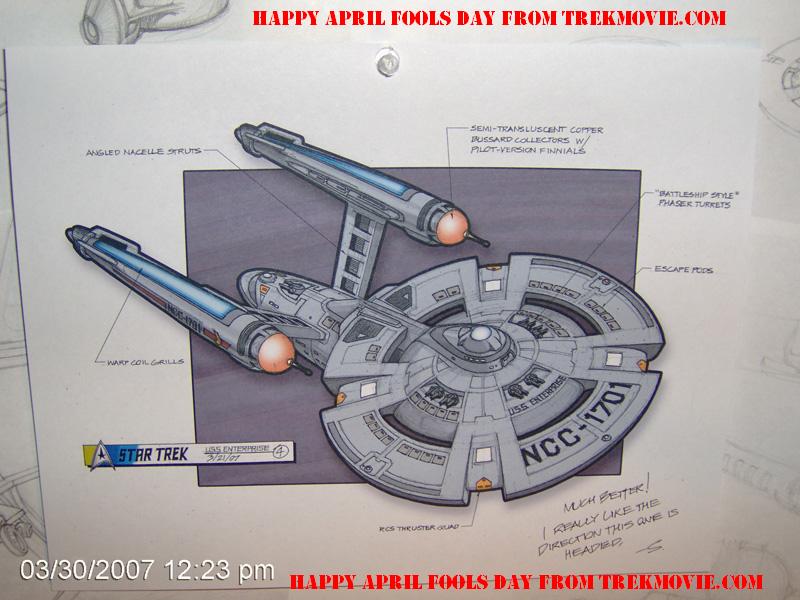
As we have reported before the full art department opens this month, but work has been going on for months. Our source tells us that this is one of many sketches being looked at but the leading contender. No word on who actually reimagined this Enterprise, but clearly they are taking some license with the original design.
UPDATE: HAPPY APRIL FOOLS DAY
In the UK there is the tradition of the April Fool’s joke on 1 April. Don’t know if that happens in the USA? Could it be?
This must sound like a clicé but don’t touch my Enterprise. The design is fine. I’ve seen a design for re-imagined Enterprise made by an artist working on Battlestar Galactica (meaning that it looks as much like the Enterprise as apples look like pears) and THAT looked more like the Enterprise. This is really revisionist. Not re-imagining. There’s nothing wrong with the design so don’t change it (too much, such as this). If this is the course they’re heading with Trek XI then there’s no hope left for that movie and possibly the franchise.
I hope that this design is dismissed by the people on top because this is awful.
NOTE: If this were a design for the NX-01 from Enterprise I would’ve liked it over the Akiraprise version.
I didn’t even realize it was April 1. I hope it’s a joke. Still Paramount don’t touch my Enterprise.
Yuck (if this is real)…what is wrong with keeping the exterior of the vessel as we have seen it for years a la Matt Jefferies?
If they want to toy with something let it be the interior of the ship, there are lots of things that we could see “upgraded” there (i.e. screens, displays) as well as parts of the Ship we have never seen.
I’ll tell you this (those powers that be that read this) I will accept no bastardizations of the TOS era…and likely most other will not. Just to get a few “new people” to go into the movie theater. What about those that have been doing that for years?
Keep doing this sort of thing and it will flop as bad as the reimaginged “Lost in Space,” and everything that is said about Star Trek V (truthful or not) will be true here…
I don’t mind the new actors…or filling in a few things in TREK history…but this is where I draw the line.
This has to be a hoax!!!
At least the nacelles have points.
I hope it’s not a joke. I think it’s a brilliant direction, a “Best of the Best” version of the 1701 through the years. I imagine it’ll look really interesting on screen as well, and quite speedy, powerful and maneuverable.
what color is it…it looks more the galactica than the enterprise
and isn’t the blue nacelle thing not introduced until the movies…which are post TOS?
i doubt the final design will look like this but i guess we better brace for change
A clever deception. Notice the “other plans” beneath Enterprise. Looks really good, but no dice.
this must be an april fools joke because in times of CGI-models nobody would do “old fashioned” sketches anymore. ;)
and i agree with simmeralpha – would have looked good as NX-01 (note the “battleship style phaser turrets” remark on the sketch) but this is way too ridiculous even for an re-imagined NCC-1701
Ok, this HAS to be an April Fools joke…ha ha, very funny.
You know when I first saw it, I thought… Christ oh mighty! Then after I looked at it for a few minutes, it started to grow on me. Other than the “phaser turrets” it’s really not that bad. I like the spikes on the end of the Nacelles that would fit with the time line. So far… not bad.
I like it, except for the two spikes sticking out of the front of the two engines.
Looks very appropriate for the fake Kirk and the fake Spock. Suggestions: Put pretty blue flames coming out of it when it is “zooming” through space with the fake crew…and maybe dub in the sounds of Fred Flintstones feet as it leaves drydock and of baseball cards rattling in the spokes of an accelerating bicycle as it goes into warp speed.
I think its a great design, absolutly love it.
But its not the enterprise, for obvious reasons. Phaser turrets? riiiiiiiiight…
It has to be first april joke, just like startrek.com is reporting that a new startrek show is coming called “The Guiding Orb” a scifi soap opera. Funny made :D
Aye, the haggis is in the fire for sure. Me poor bairns.
Hope this is a joke.
Captain, I canna take much more…borgus frat!!
re: 13. Stanklin T. McFibberich
“Flintstones” should have an apostrophe before the s.
#9 SPUNIK-this must be an april fools joke because in times of CGI-models nobody would do “old fashioned” sketches anymore. ;)
Actually, for those of us who still have some drawing talent, a SKETCH is always the preferred method until you at least reach the final stages of approval. It’s so much easier and practical to whip out a pad and sketch away. You could go through dozens of designs before you even reach something the production designer “sort of” likes. This makes tedious computer model building highly impractical at this point. Also, If it looks good in sketch form then how MUCH better will it look in CGI. SO, instead of wooden models, computer models are employed to see how it moves through various shots.
Then, final tweaking, detailing and color tests.
NOW, to the design…
I am APPALLED at how freakin’ LOUSY this thing looks!
It has STUPID gun turrets, Enterprise E warp nacelles with TOS caps. The saucer is all broken up and the skin is WAY too busy looking!
Don’t F&CK with the original whoever you are.
Jefferies was a genius.
YOU’RE NOT.
I’ll bet it is very much fun going sledding in a space toboggan down those “thruster quads” during winter explorations. Wheeeeeeeee!
VERY well said :-)
Thank you! Oh, I’ll bet you meant SPOCKBOY :)
Actually both of you :-)
Whether it is fake or not I really like it.
It looks like a ship that has both exploratory and combat purposes.
The riginal desihn was great, amazing eve, but on the big screen, nowadays, it would look a little bland. This revision is quite cool and if the saucer section does separate, at least it looks great, better than anything before it (separated).
BUT, April fools is a tradition in Romania (my home country as well) so I consider this to be fake.,
Despite that, I still really like it.
And yeah, I’ve seen 90% of all Star Trek.
This looks like some awful knock-off that would be sold as an unlicensed toy in third-world countries.
Maybe the “escape pods” can be used for Mr. Abrams to get away when being chased by angry fans.
Good joke it sill is the 1st of april!!
Hey, how many bathrooms and turbolifts on the bridge here? They should also really have one of those “porta potties” outside for the toboggan kids.
Well, if it’s an April Fool’s joke then my hat’s off to whoever put this together. They put some time and effort into it, and the end result is not too shabby. I actually wouldn’t mind seeing something like this in the movie, with the exception of the phaser turrets and most of all, the pointy things on the nacelle caps. Those just don’t seem to go with the rest of the design.
I think Trek ought to go with this level of redesign. Seeing this drawing, regardless of its authenticity, makes me realize how cool it would be to see Star Trek with a fresh eye again.
Yeah this is a joke. Note that the saucer section consists of two parts an inner saucer and connected to that is an outer rim. A Sovereign engineering hull, a Refit neck, NX-01/Nova nacelles, Battlestar Galactica turrets, Voyager RCS thrusters. I don’t know who made this but if it’s made by someone from CBS/Paramount (working on Star Trek: XI) then I must ask: “Why do you spend so much time on an April Fool’s joke to come up with a new design but when you guys need to make a new spaceship for a new series such as the NX-01 you just go the easy way.”
Still, I must congratulate TrekMovie.com on such a nice April Fool’s joke. Couldn’t have thought of such a great joke myself. I was the only one who really fell for it because I didn’t see the first post so I forgot it was April 1st. At least now we’ve made it clear that we won’t let CBS/Paramount tamper with the design, because they read this.
i agree with #28, if this is a joke, someone put some love into it. the ship includes all the elements from the original model that we’d want to see incorporated into a new design, which works for me, for the most part.
except…if this is a ‘reimagined’ enterprise, one would expect a little more imagination – gun turrets aside. i sincerely hope they don’t just take a look at the old enterprise and choose what pieces can be altered so that it appears fresh, which is what they seem to have done here.
i don’t think it should look like it was generated by the same old guys working on all the previous films. we want to honor the old design, but love it enough to really shake things up, don’t just copy and paste parts of other ships.
Oh, for crying out loud, you guys.
Stop nit-picking every damn thing that comes out and just hope they make a good movie. Batman Begins worked, the new James Bond (gasp! he’s BLONDE!) worked, give this a chance.
OK, so they totally fucked up Mission: Impossible in the first two movies (haven’t seen the latest yet) and George Lucas ran Star Wars into the ground himself, but calm down.
And if you keep this up, the Tholians will come by and slooowly construct a web around your apartment.
A very good April Fools joke :P
if this turns out not to be an April Fools joke, and similar to what ends up on screen,
A. It isn’t necessarily a canon violation so let’s not get in a tizzy without thinking this through clearly. We still don’t know precisely when this film occurs, the Enterprise could have experienced a refit to go from this version to the series version. We know anecdotally that the Enterprise has some history despite Pikes Enterprise and how it appeared in Cage and Menagerie.
B. This film could be an alternate timeline film, mirror universe, who knows yet.
C. This Enterprise could still exist within the confines of the established Trek universe, and would only require a slight suspension for this starship to be our Enterprise, merely a modern interpretation, not entirely different from the appearance of TOS with The Motion Picture, same universe, only several years apart, but radically different technology.
It wasn’t a stretch then.
D. This could be an entirely stand alone film, existing within it’s own universe, neither negating, conflicting, or eliminating established canon since the film is a bubble adventure.
E. If this is a relaunch/reboot, the appearance of the old girl is moot.
The interesting thing is, when you inspect this design closely, literally every feature of the Enterprise is present, simply interpreted slightly differently, i.e. the little white squares on the hull for example, or the black rectangles on the nacelle struts.
I think it’s premature to say yay or nay just yet, this is an interesting turn of events assuming it isn’t a joke.
Intriguing Captain, intriguing.
Tee hee. When I first saw it I thought “Um… no…” but then I remembered the date.
If those 4 slits around the circumferance of the primary hull is open space, that’s certainly a new and interesting innovation to the design.
Now that we have inner and outer rings on the saucer, all we need is some docking pylons and we’d have TOS, TNG, DS9, VOY and ENT all in one! Oh and a touch of Star Wars with Phaser turrets.
Seriously , if the saucer section was smoothed out and the “RCS Thrusters” not indented as much it could look OK! We know they are going to tart up the old girl for the big screen. Maybe they should just run with the Movie Version …. then eventually when we’ve all paid for DVD and HD version of the Enhanced TOS they could replace all the original series shots and movie visual shots to match then there would never be a continuity problem! LOL
The only thing i wonder about this is who took the effort of hand-drawing all this just to make it look more authentic as a April Fools joke…
This is supposed to be the bitchin’ version of the ship for a younger, fresher, Bitchin’ Jim Kirk.
Ain’t a thing wrong with the Enterprise all pimped out. If these bastard teens that cruise the strips can buy jalopies and pimp them out , why can’t an old lady like the Enterprise be pimped out?
Grand Trek Auto – New Kirk City
The primary hull spins dawg, it spins. Dat’s Phat.
The problem with changing the design of the ship basically means this is a reboot. Not a prequel or a film set before the original series but a proper reboot.
Da Star Trek
James T. Trick
Mistah’ Spock Rock Boyyyyyyy
Leonard Mac-DaddyCoy
Monty Scotzzzzz
Pavlov Jerkov
Yo Whore-ah
lieutenant Shoofoo
And Yeoman Capn’s lap
Da Enterprize, keepin’ dat shit real yo. Gettin’ dem Klingon-an-on’s all up outta my grill Bitch.
I like the design, hoax or not!
This is a relaunch for the 2000s, so the ship should reflect the time in which the film is made!
Word Dom!
Da U.$.$. Pimpaprize Dawg!
If it wasn’t April the 1st and the design didn’t have nipples on the nacelles then I’d take it serious.
I like it, the April fools joke could be it’s real, has a look of the original concept of the E but updated. Good job, I’d be happy to see it on the big screen. Even if it is a joke the design would look great for another class of ship in the film.
LLAP
This design is very “Sovereignized” and thus could not have been used for ENT, guys. The NX01 had to be a simpler, smaller version — not more advanced looking than the TOS Constitution class ship.
For me the phaser turrets gave away the fact that this was a joke.
Prank or no prank, complete reboot or not, I just don’t like this design.
John
This is a trekmovie.com April Fools joke. The design sucks!
#46 – It certainly fits the general “new” path Beavis & Butthead are pursuing so far with the movie though, i.e. boldly going where Berman & Braga unsuccessfully went before… more sex & action for the masses it is, so we sure need a properly sexed up ship – less canon, more cannons – as well… as attempted with NX-01, NCC-1701-E and so forth before…
How was that? “The more things change, the more they stay the same” ;)
Great sketch, whoever made it!