
 Because things are so preliminary right now there was no appearance by any of the team behind the new Star Trek feature (except for Leonard Nimoy who will appear this evening). However, the movie people did want to let the fans know that they loved them and so a new poster was made especially to distribute to the attendees of the Vegas Star Trek convention.
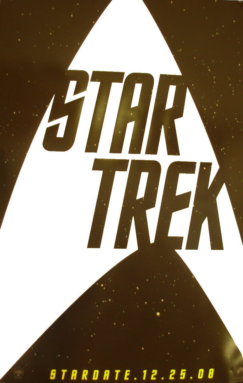
(click image to the right to enlarge NOTE: Hope to add a better image later.)
The poster seems to be based on the design of the new T-Shirt revealed at Comic-Con. It became available Sunday morning at 10:00 am. There was no announcement so if you are just finding out and are at the con you can pick one up in the lobby in front of the main room…limit one per person.
Handing them out to the fans

Awesome. So old school.
Nice.
The star field looked better in the previous poster, but it might just be the camara.
I was hoping for some official casting news…. I guess that Abrams and co don’t want to dilute the new Kirk announcement by announcing any of the more minor characters first.
Wait… did they just hand them out for FREE? That doesn’t sound like the Viacom that I know.
I think a brilliant idea for the new film would be to explain where the uniform patch comes from. I had hoped ENT would do that at some point. I realize it’s just a stylized rocket pointing up with a star in the middle, but they could tie a story to it. Perhaps Kirk and crew save an alien race from certain doom and adopt that planet’s cultural symbol as a reminder of their good work, kind of like a boy scout patch? Then each starship does something similar for their patches? Then since Enterprise was the best of the best, Starfleet adopts the symbol for the fleet. Something like that.
Hell yeah! Old World Trek!!!!
Just thought of the original Superman movie and how they did that with the family symbols Brando and others wore on Krypton, to explain where the Superman crest came from.
I love this new poster. Best one so far – extreme retro.
Teaser Poster #3
These just keep getting better.
– W –
* Retro, so verry retro *
I hate the retro look… Looks like from the 60ies.
Best teaser poster so far has to be GENERATIONS followed by FIRST CONTACT with the two Enterprises on it.
I have added a poster poll
Did it my iphone sitting here at the vegas con listening to nick meyer and killing time. Shat nimoy appear in 2 1/2 hours
Great poster. I too LOVE the retro look!!!
Dang! That’s a great freebie!
No special feelings for the “new” design, except I have a small patch just like it I bought at a convention in 1979 when merchandise was slim.
Woopie!
RE: Jimtibkirk [ I realize it’s just a stylized rocket pointing up with a star in the middle, but they could tie a story to it]
Judith and Garfield Reeves-Stevens tried to give an explanation in their book “Federation”
Not going to type it all out, but I’ve done a very basic summary of it here http://www.theare.ip3.co.uk/warp_explained.jpg
Basically the star is the speed of light, the curve the energy required in normal space and the offset curve shows warp drive
theres a nebule theres a NEBULA!!!!
lower right
I’m not there this year, but I was there last year, and they gave the “old” poster away, too – I grabbed several. To be honest, I’m not all that impressed with this one. And to #16, you beat me to it. I was going to mention they explained the logo in that novel. Kinda stretches it, but it’s not bad.
Calm down Sci-Fi bri – no nebula … clumpled poster paper lense flair i would say!
…oh can i just say 19th! lol…
UM… I think the retro look is intentional and the only way to go when redoing Trek Classic.
Love it.
Cool. Can’t quite make out the colors, if there are any beyond b/w, but it’s a simple, elegant way to tell everyone this is Classic Trek.
the starfleet logo from ENT looks a bit like the nasa logo. now if you strech and squeeze the arrow-like symbol, you get the enterprise patch from the 2260s.
Am I alone in hoping they give a subtitle to this movie, rather than just calling it Star Trek?
There is no subtitle.
– W –
* Just “Star Trek” *
I like it being called just “Star Trek”. That gets 2 points across: 1) It distinguishes it from the 10 films that came before it, and 2) it signifies the return to TOS.
They can resume the subtitles beginning with the sequel.
Good teaser poster. I hope the final one sheet poster will be along the lines of an old drawing they had for the series back in the early 70’s. It showed Kirk & Spock in their WNMHGB uniforms, Kirk holding a phaser rifle and the Enterprise warping out overhead. I had a bed spread with that on it. Something drawn, actual poster art not a bunch of photos or computer animated nonsense. Along the lines of the first two Star Wars movies or even the first ST movie.
Agreed; I like it as just “STAR TREK”.
Kevin wrote:
> Wait… did they just hand them out for FREE? That doesn’t sound like
> the Viacom that I know.
Yup, free. Lying flat, the stack of posters must have been at least 3 feet high (thousands of posters!). I was just leaving the Nimoy/Shatner talks when I saw them being distributed across the way from the registration tables. In fact, later on I saw Richard Arnold himself was distributing posters to anyone and everyone.
I thought CBS, not Viacom, controls Star Trek. Or is Paramount still under Viacom?