
 Since production on the new Star Trek film began, there have been several reports as to what the interior and exterior of the newly-designed USS Enterprise will look like. Now, comes more clues from someone who actually worked on the sets. Dawn Brown, one of the film’s set designers, tells SyFy Portal that fans should come to the movie prepared for a new look and hopes they will have an open mind. More below (some minor spoilers)
Brown tells SyFy Portal:
I think a lot of hardcore fans are going to freak out. As far as I know, only the exterior of the Enterprise had to stay the same. I don’t know if that came from J.J. or Paramount. … If you see this movie with an open mind and take it at face value, you may have a great time.
Brown naturally could not go into great detail, but she did offer some insight
into the film’s use of green screens.
I’m not a fan of the digital and green screen or blue screen sets. I understand they have their place, but I think it usually looks better when things are physically built. It gives the actors something to react to. The design of the film belongs to the art department, not the visual effects department. I worked on a very large set on ‘Star Trek’ that would have been an absolutely fantastic physical build. But it became a visual effects shot instead. My involvement was reduced to marking out blue screens and platforms. We have so many talented carpenters and scenic artists and sculptors, and I have seen some truly amazing sets. It is a shame to trade their contributions for green screens.
For the full interview, in which Brown also discusses her work on Batman &
Robin and the upcoming adaptation of the DC Comics mini-series Watchmen, see SyFy Portal.
Redecorating the 1701
Although some fans may wish for the NCC-1701 in the new Star Trek to be an exact duplicate of the 1967 design, that isn’t realistic, nor is it consistent with Trek’s past. The ship interior, and especially the bridge has gone through multiple changes over the course of the TV series and the films. When one looks at the bridge from “The Cage” and compares it to the one in the regular series, Star Trek: The Motion Picture, and Star Trek II: The Wrath of Khan it is apparent that Starfleet likes to redecorate every once in a while.
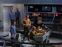
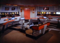
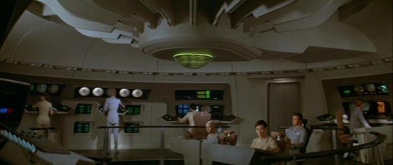
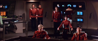
Bridges of the NCC-1701 Enterprise (Cage, TOS, TMP & TWOK)
About Brown
Brown has worked as an artist and designer on over 30 film and television projects over the last two decades including SeaQuest DSV, Lois & Clark, Charlie’s Angels, Tim Burton’s Planet of the Apes. and Steven Soderbergh’s Ocean’s Eleven, Ocean’s Twelve and Solaris. Star Trek is not her first forray into the final frontier. Brown did design work for the 1998 museum exhibit Star Trek World Tour, working under veteran Trek production designer Herman Zimmerman. In addition, Star Trek marks the sixth collaboration between Brown and Keith Cunningham, the film’s supervising art director. They previously worked together on Batman & Robin, Ocean’s Eleven, Solaris, Zodiac and re-shoots for Mr. & Mrs. Smith.More on Dawn Brown at her official site, Memory Alpha,
and IMDb
VOTE ON SETS
Are you a purist or do you want radical change. VOTE in the latest poll for what kind of set design you want to see for the new movie.
Sounds cool.
No!
How will this movie fit with canon then?
I don’t understand how they say this movie will RESPECT canon!
Canon has nothing to do with set design….
I hope the future does not look like the Enterprise of 1967
Why can’t they keep the Enterprise the same?
I mean, look at “In a mirror, darkly”. The Enterprise looked the same as the 1960’s version. Only the lighting and camera angles were modernized.
#4 Section 31 — In a Mirror, Darkly, was an episode of a TV show. Yes, it looked good there, but it just wouldn’t hold up on the big screen.
Well. This really is a reboot, then, whatever the screenwriters, actors, producers, etc. choose to call it. Personally, I’m okay with that, so long as it’s a good one (and, let’s face it, such was really inevitable)–but purists had best learn to deal with it now, or just stay away.
@Section 31-
What does a redesigned set have to do with Canon? I didn’t think set design had a lot to do with Canon, I am pretty sure it has a lot more to do with taking care not to contradict historical events. Whether something happened on a set designed ‘like this’ or ‘that’ makes little difference, that it DID happen at all, does.
Hate that
3) What do you mean set design doen’t have to do with canon?
In TNG’ Relics, the Enterprise NCC-1701 was not altered or redesigned. In DS9 Trials and Tribble… the Enterprise looked the same. The same goes for ENT’s “In a mirror, darkly”.
Says the opinion of Mister Trotter.
#4 You are right, they did keep the look and it looked bad im afraid to say. It would never hold up to a silver screen, high budget film. let them redesign the tech so that we don’t walk in and out of the theater on a phone that looks 40 + years ahead of the tech on the screen.
Canon has become impossibly restrictive for the future of Star Trek itself. This new film is a brave statement of protest. We must break free!
And with modern lighting, staging, and camera angles, the old 1960’s Enterprise looked darn good! No need to change it much, just more activity on the screens, and perhaps make them real touch screens.
If they are going to totally reboot the entire Star Trek franchise, why not start from scratch? I mean they did that for Godzilla, Batman, James Bond, etc.
The whole Old Spock from Star Trek (1966-2005) doesn’t need to belong with Star Trek XI.
It could. We’ve never been given the chance to see if it would.
I keep staring at the line about the exterior having to stay the same.
I keep staring at it and smiling :)
#10 steve623 — This movie is supposed to appeal to new audiences as well as older fans. Do you really think new audiences are going to be interested in a 23rd century ship that looks like it was made in the 1960s?
I think that it is great, same ship different inside, how many bridges did we see from the 1701-A, 4 or 5 I think, so this is a new bridge for a new movie. The Star Trek of old can not sustain another 40 years without small changes.
Cannot wait to see it.
13) Yes I agree! Why didn’t they go in that direction !
What I found significant was her comment, “As far as I know, only the exterior of the Enterprise had to stay the same.” I wonder how authoritative that statement is and how much subjectivity applies to her use of the phrase, “the same.”
Hmmm…
Did JJ Abrams and the rest of the crew watch ENT’s “In a mirror, darkly”?
Oh, good. This discussion again.
Sigh.
(The new info sounds good, BTW).
From her comments in the full interview, it seems like a lot of the sets are virtual – and my guess is that the really cool big set that she referred to was the new bridge, which I gather from previous comments is going to be a lot bigger than it was on TOS. My recollection of the current version of BSG is that the control center is also a fairly large space, maybe that’s the look they’re going for. I do feel the need to point out though that a big ship doesn’t necessarily mean a big bridge – the bridges (navigational and air control) on a Nimitz carrier are not big spaces, nor is the CIC on them. The really big space on an aircraft carrier – and hopefully on the Enterprise – would be the hangar deck.
Speaking of which…
Hey, Anthony, any word on that article you were going to run? Hmmm?
‘ a lot of hardcore fans will freak out’.
this comment concerns me. sounds like the bridge etc wil havve little resemblance to the original series. ummmmm interesting. im all for making it look fantastic and updating it for a new BIG movie but surely it has to look like the enterprise bridge to some degree. i do have an open mind tho so it might be great.
greg
UK
#14 Section 31 — Star Trek’s history is just too extensive and the fanbase too large to just start over. And by the way, please don’t confuse Godzilla as a “reboot” and especially don’t confuse it one that worked. ;)
SOOOooooooooo….
Star Trek from 1966 to 2005 will be called “Star Trek A”.
And Star Trek from 2008 to beyond will be called “Star Trek B”.
This certainly fits in with the recent “insider comment” about the new “sense of scale” for the interiors of that “massive starship”. Guess the sets will be HUGE and less “room-like” than ever before.
#3- ”Canon has nothing to do with set design….”
Set design is also part of the canon
I hope the new bridge will not look like the bridge from a Sovereign Class Starship.
Says the opinion of Mr. Trotter.
#29 I totally agree.
AHHHHHHHHHHHHHHHHHHHHHH!!!!!
YAAAARRRRRRRGGGHHHHHHHHHHHHH!!!!!
WHY WHY WHY must nothing be respected? I don’t mind some physical changes… but the more you change, the more history/comtinutiy/fanbase gets thrown out the door. It doesn’t have to be exact… but at least let it be recognizable as the bridge… the sickbay… etc. The only good thing I read, and even that must be taken with salt, is that the exterior could not be changed. I’m sure it will be.
One of the things that sucked about Enterprise was the neglect to the “retro-future” feel of TOS. It looked more advanced than TOS. I’m aware that show is 40 years old… but it’s more than the character names that have become legend and pop culture. Furthermore, I think the look could well be adapted/updated to WORK on the silver screen!!!
Well, too late to complain now. But I will anyway….
In short, this movie will respect Star Trak canon HISTORY, but not SET DESIGN.
Heart attack…. :(
#31 steve623 — And the opinion of the majority of people who saw 1998’s Godzilla. Have you read the reviews from critics and everyday moviegoers?
I hope there will be a protest against this movie. It’s like casting a white guy to play Martin Luther King, Jr. in a movie.
16, I’m with you. That particular line caught my eye and has me smiling. :-) Insofar as the inside of the ship, it is unrealistic to expect the sets to look like the sets of the 1960’s. Modernization of the sets is to be expected, if only to make them motion-picture quality.
I wonder how we’re to square this with Mr. Orci telling us that the designs are often very faithful to the originals?
That said, I also could be okay with a greater departure from the original designs than “In a Mirror Darkly” took. Still, considering how remarkably, vastly easy it would be to keep the basics of Matt Jefferies’s original designs intact, yet bring the details up to be more “of the now”, as was once described, it’d be a real shame if they’ve chosen to throw that all out.
‘Course, since even small detail changes could result in a very different look, perhaps that’s where it’s going?
On the up-side is this quote: “As far as I know, only the exterior of the Enterprise had to stay the same.” Looks like we’re not going to see something totally different pretending to be our beloved Enterprise. ;) Now, if the current team has spent as much time as folks like Andy Probert and Herman Zimmerman did on making the interiors look like they fit inside the hull, we might just be in good shape.
#20: “how much subjectivity applies to her use of the phrase,’the same.'”
An enormous amount, I suspect.
We need to give up on the canon. It’s a new movie. It should start it’s own canon legacy. Stop comparing new Trek to stuff that’s 40 years old.
Sounds good to me. Could you imagine the new Battlestar with the old 70’s sets… SHUDDER…
Aaron R.
Why didn’t they just create a new TV series based on the 1960’s Enterprise. I mean, Star Trek was a TV franchise.
9. Section 31 – In TNG’ Relics, the Enterprise NCC-1701 was not altered or redesigned. In DS9 Trials and Tribble… the Enterprise looked the same. The same goes for ENT’s “In a mirror, darkly”.
Yes, because the production team ‘chose’ to keep the design for the nostalgia…and because it was cheaper to borrow a section of the original bridge set that someone had re-created. Trials and Tribblations used original footage, so they really did have to match the original style. In a Mirror Darkly was another nostalgia piece, a gift wrapped episode to try and win back old fans.
At any rate, this new movie intends to be just that…new. I’m sure it will try and respect the existing history, but the sets don’t have to be exact replicas to do that. Give them some creative freedom, for heavens sake.
#41, but STAR TREK is unique. Keeping the 1960’s set designs will show to the world that the future is going to be vastly different from what we perceive. Those strange buttons on the bridge reflect an alien world in which we do not understand.
#31 Steve623
get over it, it’s his opinion. You have one or are just here as the mockingbird?
I liked the bridge design for “the Cage”, had a more “naval” feel to it than the series run. And the TMP design harkened back to that color scheme.
But the control interfaces aren’t only dated looking but totally unrealistic for space vessel, in light of today’s technology. Building those today wouldn’t only be a step back but also step towards the impractical.
Also look for more realistic colors for a spaceship compared to what we’re used to seeing. The bright colors were a mandate from NBC, as the network wanted to be a showcase for color TV viewing and wanted a lot of bright primary colors. That’s why the set and uniforms look so different between the pilots and regular series.
The lighting on the first episodes of TOS was fairly colorful, too,especially compared to the last year
IMO, you will not see drastic change… stations will remain in the same positions and hopefully Stanky gets his red bridge rail.
Doesn’t sound promising… but I’ll take a wait-and-see attitude and hope I’ll end up liking it.
Okay, fine then. If they are going to totally redesign the set designs, why not do the same for Wizard of Oz or Star Wars.
By the way, the original 1977 design for the Star Destroyer made an appearance at the end of Revenge of the Sith. In short, George Lucas didn’t redesign the bridge of an icon starship.
Man, some of the people posting here are either annoying 12 year olds…or crusty 90 year old geezers. Heaven forbid that a set designer might actually be allowed to do their job and ‘design’.