
 This week in the world of collectibles we have yet another Trek product and licensee to add to the growing list, plus a look at a first for Star Trek: unified product packaging design. We also have a report from the recent Wizard World, including pictures from the Diamond Select Toys booth.
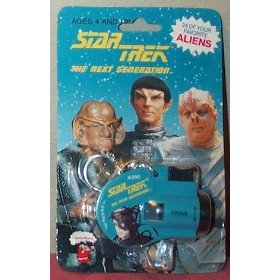
The Key "Chain of Command"
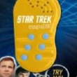
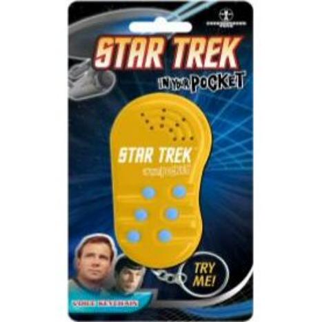
Underground Toys, makers of electronic toys and gadgets has announced their first Star Trek item this week. Available starting July 27th is a Star Trek version of their popular "In Your Pocket" voice key chain line. The new Trek key chain features six sound buttons and includes the phrases "Fascinating" and "Live long and prosper." (Mr. Spock) and the wisdom of "Worlds may change, galaxies disintegrate, but a woman always remains a woman" (Captain Kirk). The new “In Your Pocket" talking Trek keychain is available for pre-order now at UK retailers including Play.com. No word on if (or when) they will be available in the US and elsewhere.
The "Unification" of Designs
Even more interesting (and astute collectors might have noticed this) is that all the new Star Trek products seem to share similar design elements in their packaging. The four main new design elements are:
- Blue background with pattern
- Kirk and/and Spock image (usually in corner)
- TOS Enterprise with phasers firing
- Mew Star Trek logo & typeface (which is reminiscent of the TOS logo, but has modern detailing and a red border)
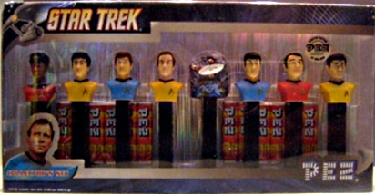
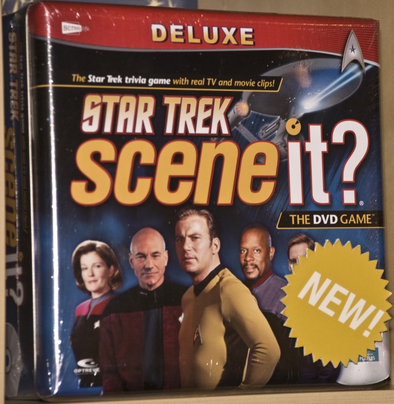
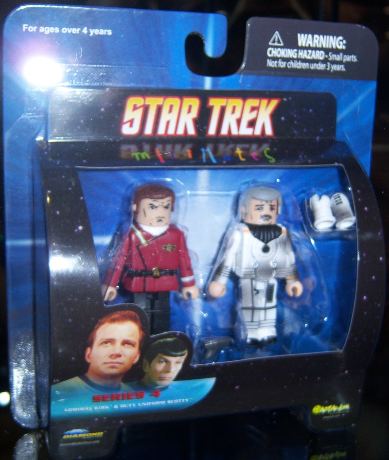
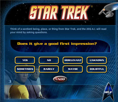
This new unified design for Trek products can be seen across companies (both new and established licensees) and on a variety of different types of new products. These include the above key chains, the upcoming Pez packaging, the Scene It? game, and new packaging from Diamond Select (at least for Minimates). The same elements can also be seen on the new 20Q website (and will likely appear on the packaging of the eventual 20Q device).
4 companies , 5 products (including the keychain) – 1 look
This unified look is a first for Star Trek. While previous Star Trek licensees occasionally utilized a unified logo and design within their lines (think of the Playmates Toys Generations or Insurrection action figures), never before has there been this kind of coordination of packaging between differing companies. It also appears that this Classic TOS style applies to all Star Trek items, regardless of which version of Trek is being featured (the TOS-like logo and a picture of Kirk are on an upcoming Minimate pack with TNG figures). This is an important and smart move by CBS Products. Star Wars has utilized this kind of unified packaging for decades. This new unified Trek marketing look helps show people how popular Star Trek is because recognizable elements are seen on various products in various retail locations. It helps to reinforce the idea that Star Trek is one franchise.
More from Wizard World
Speaking of Wizard World, Star Trek was well represented at this annual popular culture convention in Chicago, held last weekend. Diamond Select Toys was there with a booth that was heavily Star Trek themed, including banners and a contests for one of 300 "Gold" U.S.S. Enterprise 1701 toys. DST was showing off all the 2008 toys and one that was particularly impressive was the a prototype of the Enterprise D. The TNG ship might be the best toy offering from DST and it is about twice as big their previous TOS era 1701 Enterprise toys. [The D is available for pre-order for $49.99]
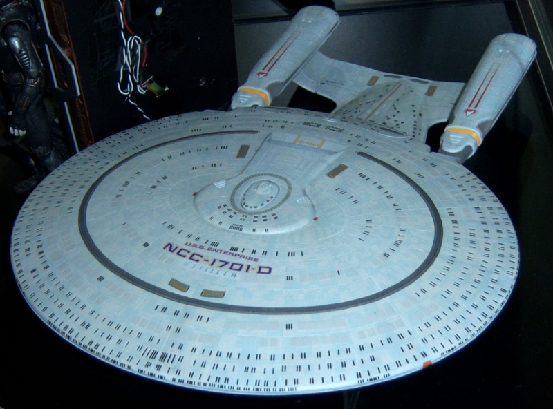
At 17″ long, the new D is big (click to enlarge)
This autumn’s Borg Alcove line was also shown and the detailing on Seven of Nine is very good.
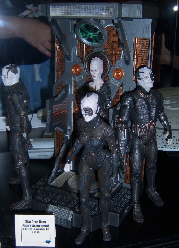
Hey kids, assimilate the fun! (click to enlarge)
There was a placard announcing that there will be a TWOK phaser version this December, and Trekmovie.com will provide more details about this item as it is available. While the 1/4 Ultimate Kirk was not on display yet, DST did have the Star Wars versions of these 18 inch action figures. The detailing was impressive with the Obi Wan Kenobi action figure and hopefully this quality will be available with the Star Trek items.
Chase Masterson from DS9 and Of Gods And Men was also at Wizard World, helping to raise funds for her various charities. As usual, Chase was friendly and was excited to share her music with fans (her CDs are recommended and available at her website). It was especially great to notice that fans were dressing as Star Trek characters again, and there is nothing more fun than a fan dressed as Spock attending an American Gladiators panel.
More key chains to come…a return to a long Trek line
Underground Toys is a major company, with licenses for many franchises including Star Wars, Doctor Who, 24, and Transformers. Although it is just a talking keychain, this continues the trend of big companies marketing the original 1960s Star Trek in anticipation of the 2009 feature film. Collectors should also be on the lookout for the figural Star Trek key chains from the company Basic Fun which should be available this autumn.
The new keychain joins a long line. Star Trek sound key chains have historically been a popular collectible, with previous licensees including Applause during the 1990s. These previous key chains were either figural, miniprops such as key chain versions of tricorders, or sound effect squares from various Star Trek shows.
Trek key chain from the 90s
1701-D available now for pre-order at Entertainment Earth
| Star Trek The Next Generation U.S.S. Enterprise D |
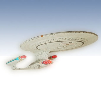 |
| $49.99 (pre-order, available September) |
That D!!!!!!!! Gotta love it!
MORE, MORE, MORE! I love this stuff!
SC
How big is the Enterprise D toy? What are the demensions?
I still have my phaser keychain that came out in the 90’s.
Their right little Pez heads now,,,
:o)
I like how the sticker is over Archer’s face.
apparently both the Borg and Enterprise – D are going to be a little bit smaller when they go on sale however, if anyone has the Enterprise – D from Playmates, expect this sort of size for the new DST one – except the DST version will have separating saucer function. The Borg will be in scale with the TNG and DS9 lines now available.
Shame the “Scene It?” version isn’t available for Xbox!
John,
When is Scene it coming out? The keychain is to much! Reminds me of the one from the 90’s with the TOS FX!
When will Toyota come out with a shuttle craft….that would be better than any pez dispenser
I couldn’t agree more. All 6 Star Wars films use the same Star Wars logo and the same opening music. All Star Wars items have similar packaging and does not distinguish Episodes I-III from IV-VI. Therefore, I agree with CBS’ decision to create a uniform packaging design for the reasons TrekMovie stated in it’s article. (Also, the classic Trek title logo is the best Star Trek ever had so I’m looking forward to it being used on everything.)
Do you know when the Star Trek Scene It? comes out? That’s something I definitely plan of purchasing.
I’m extremely happy about the Ent-D from DST. Since TNG is my favorite series I’m happy that it’s getting the treatment it deserves. I’ll display it right next to my Ent-E from DST. The two best Star Trek ships ever designed!
By the way, great article and I look forward to future updates. Thanks!
Yeah, the unified packaging is a very good idea. Good on them.
I’ve been playing with that 20 questions site all week — it’s pretty amazing!
Hello Wesley and LoyalStarTrekFan,
Here is a previous article about the Scene It? Star Trek version
https://trekmovie.com/2008/02/17/toy-fair-report-2-new-trek-board-game-playmates-movie-toy-details-but-no-prototypes/
Thank you for the question!
Talking Trek keychain from the 90s ???
thats not a talking keychain , i have one (in face its that one )its a video slide keychain you look into it and click the botton and see pictures of aliens.
MINI-MATES…
…look like something that would spring to life at midnight and try to kill you in your sleep.
Why do they all look so angry and EVIL?
My Kirk keeps trying to kill me!
Here’s your problem Mr. Simpson, it was set on evil mode.
Gots to have that Pez set. But what’s this about a “mew” logo? Spock’s got pointed ears, but he’s not a kitten!
That Scene It package design is a mess. 1/4 of the artwork is devoted to the Scene It trademark? And half of the Enterprise is obscured. Not to mention the on-pack sticker… just slapdash amateur-hour.
What’s a “Mew Star Trek logo & typeface “?
It still kills me to this day that they destroyed the Enterprise D to introduce a new ship in the movies, that really lacked the style and originality of the TNG tv show design.
@21 , well i do love the E, but i was say to see the Enterprise D go , i did not like it for years , and then it started to grow on me , and then its gone :( , it was cool to see the bridge with the side consoles and worfs seat and the dark lighting in generations , oh well . there are alots of letter in the alphabet left , here is hopeing we get to see the enterprise z one day.
At least on the Scene It package there is some respect for Sisko and DS9. It kills me when magazines and packages display the other Captains but no Sisko.
Now poor Archer gets a sticker over his image, I guess they have to pick on someone…
Trek Day
is coming.
Is it just me, or does that Enterprise D not look much better than the Playmates version from back in the day? Don’t get me wrong, it’s very nice and I always like DST items, but for $50, I’d expect it to be much nicer than the old Playmates toy.
$$KA-CHING$$……merchandise revenue is suh-weet!
Love the unified packaging.
The Trek keychain is something I have been waiting for, though I wanted a dedicated KIrk or Spock model. The generic packaging unification may make corporate sense, but as a former Trek collector I loved the different types of packaging. Mego, Milton-Bradley, AMT, Playmates– they all had unique, great package design. Whatever happened to IDIC? Ironically, Trek does not celebrate rigidity.
John,
Darn it! Does it still have the new movie footage? We need to steal one of those after post production is over! Then we can actually see something from the new trek movie! The only problem is, that with the James Bond one, it covers only 21 movies, or 42 hours, but the trek one covers all 800 episodes, and 11 movies? Seems like alot! What was nice with the Bond one is that even a occasional watcher could figure it out, lets hope that the trek one doesnt ask something like: In what STTNG episode was the tackyon pulse used and for what space phonomena? Or what episode did Captain Sisko sing with Vic Fontaine? or What VOY episode was the first appearence of Leonardo Davinci? What ENT episode was the final episode featuring only the word Enterprise in the title? It could get very hard!
Almost forgot to ask, did they have any of the new playmates stuff there?
Wesley,
Those probably won’t be available until the 2009 Toy Fair.
Darn it! Didnt they have some at one of the toy cons. already? Someone needs to get some spy pics.!
John,
Thanks for the link to the “Scene It?” TrekMovie article.
Just in case anyone wants to know, you can preorder the Ent-D (DST) from NewForceComics.com for a cheaper price than listed in this article. NewForceComics sells is for $34.99. I’ve received all of my DST items through NewForceComics and have never had a problem. Just wanted to let people know so they can shop around for the best price.
21, while I love the Ent-D the Ent-E is a better ship, in my opinion. Instead of a wide-open Bridge, the Ent-E bridge has more workstations for the crew and would be more easily defended in case the ship were boarded. This also adds a look of functionality to the Bridge and shows it to be a workplace not a comfortable conference room as the Ent-D bridge looked like until Generations. Second the Ent-E has more firepower (12 Type 12 Phaser Arrays, 5 Torpedo Launcher (FC-INS) 16 Type 12 Phaser Arrays, 9 Torpedo Launchers (Nemesis) as opposed to 12 Type 10 Phaser Arrays, 3 Torpedo Launchers (TNG)) and the Ent-E was designed with a more rugged mindset. This can be seen in the design of the corridor bulkheads, the Bridge, Main Engineering, etc. I think the design was excellent and the streamlined look payed off well. It wasn’t big and fat like the Ent-D instead it was long and sleek. I think John Eaves did a great job designing the Ent-E and they did the right thing by getting rid of the “neck” that connected the stardrive section to the saucer section.
Anyway, that’s just my opinion. The Ent-D is an excellent ship design (my second favorite in all of Trek) and I look forward to adding it to my collection.
Now if only DST would do the Ent-B and C ships so they could complete the Enterprise ships collection (they’ve already done the classic Ent, Ent-Refit, Ent-A, Ent-NX, Ent-E and Ent-D comes out soon) I’d be very happy. I’d also love to see them do Voyager. Voyager was another ship that I liked and would probably qualify as my third favorite ship design.
RE: #33…
I agree wholeheartedly. I’ve ordered all my DST stuff from Rick at New Force and never had a problem. And, New Force consistently has lower prices. Plus, Rick is just a really nice guy.
Love the unified packaging, can’t wait for Scene It and 20Q (the site is so awesome), and everything looks pretty good so far.
Starting to get more excited now…
O.K., Trek keychain now ordered from Play:com
Unification: Not just the name of a great two-parter. :-)
Also, just thought of something: I wonder if the new unified font will be used for (1.) the new movie titling and/or (2.) toys and collectibles relating to the new movie.
I thought I posted the second message in this thread? Wasn’t there a pic of Chase Masterson as well, cuz I’ve checked the other threads and I’m totally not seeing in it. Anthony?
I was at Wizard World Chicago last weekend. The new Diamond Select Enterprise 1701-D ship does look great in size and detail. The length of the ship is about 1′ 1/2″ long and the saucer section is about 1′ x 7 “. I may be a little off in those measurements, I ‘m doing this from memory, The ship was just laying inside the glass display case. It wasn’t attached to its base. This ship is going to need a big, strong base to display it properly. Anyone who saw this ship in person would be extremely impressed with it.
I also meet Chase Masterson at Wizard World and purchased her autograph. I didn’t get to talk to her for very long maybe a couple of minutes. She had a family matter that she needed to call her family about. She was real nice person and had a variety of 8 x 10 photos of herself to choose from to be autographed and some of her CD’s to purchase. She supports a great cause in helping soldiers overseas place phone calls to family members in the U.S.
Unified package, why not. However, they could’ve pick some universal, neutral-looking logo that would fit all the series. Maybe something based on the credits font from movie 1-6. Since it was used in the credits of five movies and two series, I’d guess it is more universably recognizable than the original font.
Anyone ever notice that the bridge of the E is really the bridge from the A just with new chairs and workstations? If you dont believe it, look at theof the turbolift doors and the area directly behind the captians chair.
I drool in anticipation of the “D” but the Borg queen looks atrocious!