
 The big Star Trek event for Comic Con 2008 was the brand new poster (or actually 4 posters) which revealed four cast images for the first time. The poster was well received, but it was also highly stylized, saturating the Trek crew with colors from the traditional TOS uniforms (gold, red and blue). So TrekMovie decided it would be interesting to ‘reverse engineer’ the actual images from the poster as they might appear in the movie.
The following poster is a fake
Firstly it is important to note that the following image IS NOT an official poster from Paramount, and is in fact, a fake. TrekMovie’s resident artist Steve Moss took the high resolution images from the official Star Trek site and did some Photoshop magic to see what each character might look like. And here is what he came up with…
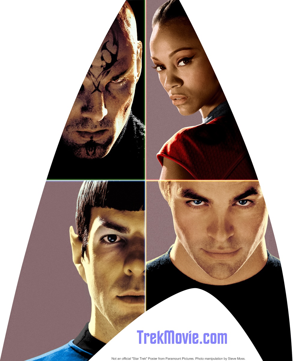
‘New’ TrekMovie.com version of the Star Trek Poster
– colorized by Steve Moss
(click to enlarge)
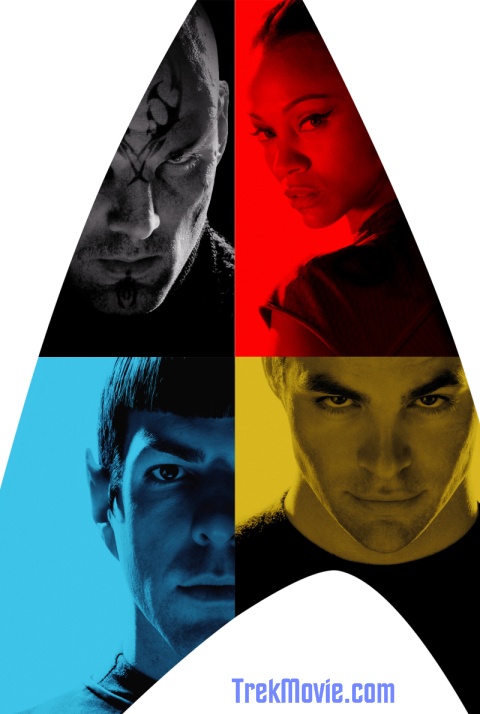
Original poster
Some guesswork and some revelations
To return the characters to what they might look like, Steve based his poster on the actor’s actual skin tone and also some look back at the original characters (like for Spock’s makeup). The biggest guess work was with Eric Bana’s Nero as there is no original character and the base photo was essentially black and white, so in theory the tattoo could be just about any color, as could be his skin tone. However, some things that are revealed in TrekMovie version of the poster were not guesswork. For example, look closely at Zoe Saldana’s (Uhura’s) uniform and you should see that the weave includes a pattern of delta shield emblems. This pattern was in the original photos released by Paramount, but was just much harder to see.
Steve will also be creating ‘extended’ versions of Kirk and Spock and we may be creating some TrekMovie.com desktop wallpapers of those.
Find out more about Steve Moss at his Retrograde Imageworks website.
Nice!
Awesome work, Steve…really does give us a better sense of the characters. Well done!
MMMM… Tasty!!! This is what makes you guys so awesome!!
WOW!! Great great job!
Neato!
“highly stylized, saturating the Trek crew with colors from the traditional TOS uniforms (gold, red and blue)”
Kind of like a Police album from the ’80’s.
Great job Steve! Now try to add a pointy ear tip to Nero to fix the… er, injury.
Could’ve fooled me. Looks perfect.
Have we had confirmation that Quinto was wearing the yellowish makeup for Spock?
You can now really see the upswept eyebrows on Nero.
Did one of Uhura’s sleeves get hacked off her uniform?
About Kirk’s eyes: It looked like originally Pine is wearing dark contacts over his blue eyes to match Shatner’s brown/hazel eyes. I guess we’ll see.
LOL, I did a full-face version of Quinto as Spock over a week ago that came out pretty damned good:
http://screenrant.com/zachary-quinto-spock-image-picture-vic-3014/
Vic
I salivate at the thought of having the TrekMovie.com version of the poster as desktop wallpaper.
Nice job!
There might actually be some other stuff near Zoe’s arm on her uniform other than the emblem. Now I might just be imagining it, but I think I see a ‘Y’ and ‘R’ and an ‘S’ too.
Vic
why do you come to this site and say stuff like that, clearly Steve’s version is infinately better than yours. are you accusing them of copying you what is the point of your post and the ‘lol’ ?
Excellent work.
And wasnt your site the one that was CERTAIN there was a Trek Trailer with Indy 4 …and didnt you say there was going to be a Trek panel at comic con? Both of which were debunked by this site…and so you think your lame Quinto as the Hulk image from last week somehow proves you ‘beat’ trekmovie? wtf?
#10 I think Lt. Uhura is sporting a sleevless Mini-Skirt for a uniform, no wonder she went up the ranks so quickly.
@Kruge No, I’m not accusing anyone of copying. I knew that TrekMovie was working on a similar project, but mine has been out there for a week, shows a full face look at Quinto/Spock, and I thought it at least warranted a mention.
I’m by no means a Photoshop expert so of course the coloring on Steve’s is better, but I thought people might like to see what a full-on version would look like?
Sheesh, there are some defensive commenters on this site…
Vic
how come no one has mentioned that he left pine’s eyes as blue instead of brown like kirk has?
13, Spockanella,
Drool over pine. He’s SO much better when he’s not filmed over with yellow….
Mmm….
20,
Who cares? He’s hot. Denise, back me up?
12. ScreenRant.com
What’s up with Spock’s underchin beard?
Why is this Poster split into fours?
My Huckabee friends say the poster shows a cross in the image
A show of support to Christianity?
Seriously, the poster design should show a nice montage of charcaters.
The quadrants do not compliment the classic lines of the emblem and its weird how the designer positioned the characters.
Nice retouch though.
Where do I buy the poster?
well I was slightly being sarcastic as many jump on little thigns like that…but also somewhat serious since so much attention was spent on other color detail.
and hmmm…well let’s just say my phasers don’t fire that way.
23, TrekMadeMeWonder
I had to track down a frontal picture of Quinto to fill in the missing chin area from the poster and the only thing I could find were pictures of him looking scruffy.
Vic
just like karl urban said – like TOS but in ‘HD’
Oh, and I did want to add that Steve did an EXCELLENT job – shows what someone with REAL Photoshop skills can do. Wish I was that talented with that program.
Nicely done.
Oh, and Kruge – I said I found it hard to believe there wouldn’t be a Trek panel at Comic-Con (as most other movie sites have commented on in disbelief), not that there would be one for sure. As far as the trailer, my source was wrong, what can I say?
I guess you’ve never made a mistake, eh?
Vic
Thanke Anthony and crew, ye’ have saved me my Crayolas… and made tha’ once monochromatic images now much bonnier than’ tha’ graphic designer…
Now I can concentrate on me own Warhol rendition…
Arrrrrr…
Now this is much better. i orginally voted in the poll that i didnt like the new posters all that much. They were cool….and i get that they were sorta going very basic and retro in the feel….but the design just didnt quite do it for me. I like this “version” much more. I know it’s less “arty” but i think its better this way.
NICE! Very,Very, nice!!!!!!!!!!!!!!!!!!!!!!!!
Lt. Uhura, this isn’t the California Penal League. We wear caps and sleeves at this level, girl.
GREAT work! If you’re playing with the images more I’d love to see Nero with a yellowish-greenish skin hue comparable to the TOS Romulan makeup that matches Balance of Terror. Or, alternately perhaps more pastey grey such as that Shinzon’s Reman buddies.
In any event, now that we can see Bana clearly… ’tis wonderful what the ‘Supreme Court’ came up with to have Nero interact with the TOS era before BoT: his mangled ear tips, shaved head and tattooed forehead clearly disguise his Vulcanesque Romulan features. Ten golden quatloos to them for coming up with a great save for canon…
Too bad they couldn’t have given a bit of a shave to Pine’s eyebrows and made Quinto’s reflect Nimoy’s a bit more.
Also on the wishlist… recolor Quinto’s uniform top to greenish gold to match the WNMHGB unis! ;)
great job guys…..wud luv to get a peek at the E, but this’ll do 4 now.
Peace and long Life
Great work! Yes, much better like this.
I sure hope the Enterprise lives up as well.
Vic, can you do half Nimoy half Quinto?
Looks great! Thank you Steve for the exc. work and to Anthony for bringing it to us!
@ali Nah, I got enough grief for this one which took a lot of time to do. I do have a side by side on of Nimoy and Quinto on the post.
Vic
Steve will also have ‘full picture’ versions of these. This poster was done last week, but I held it until after Comic Con so it didn’t get lost in the shuffle. I am not sure if Steve is taking requests beyond that for as #32 wants. Steve and I did debate quite a bit on what to do with Bana and he did do a version that was very romulan green, but I thought it should be more neutral as we dont know for sure what Nero will look like and I didn’t want people to think we were making a bold statement one way or the other on Nero.
Well to me it’s amazing how Quinto looks so much like Nimoy. He looks just like spock did in the 60s and thats fantastic. I think Pine will do a great job as kirk as Pine has that look and feel of the young James T Kirk. Uhura looks to hot to handle and nero looks mean. great job and im so looking forward to the new movie. Tme to sling shot around the sun and go forward in time to see the movie.
Hey Anthony, looking forward to the full versions. Good luck finding a non-stubble chin for Quinto – then again your man Steve will probably be able to “shave” it in Photoshop. :-)
Vic
And this is why this is my favorite site to go to daily.
Oh, and another thing… is Kirk’s shirt his regular uniform is it all black? I see a hint of gold on his shoulders….
*or is it all black?
Grammatical error! My bad.
Pine looks even more like James Van Der Beek from ‘Rules of Attraction’ there…
good stuff trekmovie
greg UK
21: I do drool over Pine. Currently, the “yellow” version of him is my laptop wallpaper, but from a few feet away he looks pretty sinister…it will be nice to have a pic to look at that isn’t washed over in yellow. Yum.
I know people always say Kirk had brown eyes, and I know that sometimes they appeared brown, but his eyes were really more of a hazel (a green/gray/blue with undertones of brown). They looked a little different depending on the lighting. Which doesn’t mean that it’s ok for Pine to suddenly play Kirk as blue-eyed, and I’m not trying to be a canonista. Just thought I’d point it out.
It’s FAKE!!, But looks so Cool.
#47 Spockanella- they always looked more green than brown to me, too, especially when they did the Elizabeth Taylor-type lighting on them. Also, they looked greener when he wore the green wraparound shirt, and browner when he wore the maroon tunics in the movies. My Mom has eyes like that.
Zoe really pops out now. I hope the rumors are true that Uhura is a major character.