
 It has been a month since Paramount released a full image of their new USS Enterprise, sparking much discussion. But for the last two years there have been numerous sightings of a ‘new Enterprise’ which usually turned out to be mistaken reports based on designs from Gabriel Koerner, a Trek fan featured in Trekkies and professional CGI artist. Today Koerner has decided to weigh in on the new ‘real’ Enterprise.
Backstory on the most mistaken Enterprise
Gabriel alerted TrekMovie to his new blog post on MySpace titled, ‘The New Starship Enteprise: Gabe’s Take‘. Korner discusses the history of his ‘Koernerprise’ which started as an entry in a "Ships of the Line" calendar before he posted some updates to it on his own website two years ago. Koerner is genuinely flattered that his design was so often considered good enough to be the offical new ship, noting:
It really, really, really means a lot to me that what I felt was just fan wank was deemed professional enough by many people to be a viable and believable enough to be the "real" Enterprise. Not everyone loved my treatment of her, but I have no gripe with that.
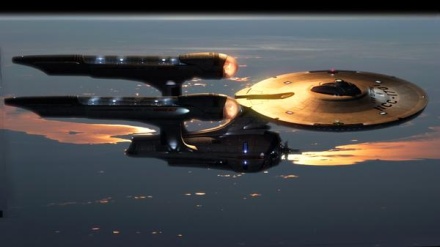
One of the angles of Koerner’s reimagined USS Enterprise
Koerner is such a Trekkie that he is still making tweaks and refinements to this day. He included a new version in his blog, which he calls a ‘more retro, smoother variant’
New ‘retro’ version of Koerner’s Enterprise
Thoughts on the new Enterprise and it’s designer
The new USS Enterprise was designed by veteran artist Ryan Church, who has worked on The Star Wars Prequels, Transformers and the upcoming James Cameron film Avatar. Church even made a comment here at TrekMovie.com about his new design and some of the reaction to it. Koerner notes that he and Ryan ‘threw some similar ideas into the mix’ and he also has a word for critics of Church’s work, saying "no one attack the artistic merits or design abilities of Ryan Church if you do not favor his design." Koerner points out that when working on a major film, final designs are based on what the producers want in the end and "we don’t even know how closely it represents the designer’s own taste."
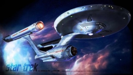
First promotional image of the USS Enterprise in JJ Abrams "Star Trek"
Regarding the ship itself, Koerner says it is "really, really hard" to critique it because he wanted to be involved personally and he is "not arrogant enough to think that the film is any less" without his contribution. But he does weigh in, with pros and cons.
On the pro side Koerner writes:
I like how clean it is, how uncluttered by greebles and decals while still retaining scale. If anything it adds to the scale. I like that it got away from the VERY RED bussards VERY BLUE BLUE STUFF of TNG era ships (and NX-01). I like the blades on the engine
…
I like the shapes of the individual components: The turbine-esque nacelles, the reinforced neck, and the nuevo-TMP saucer. But the engines and the saucer look a bit foreign from one another. I like the deflector dish. Its a cleaver way to both be a detached dish with a spike, and pay homage to the TMP blue glowing dish as well.
On the con side he notes:
It’s very front heavy. I see the rationale of putting the mass of the engine hull that much further forward. Ryan pushed the neck back and has it sweep back much further, and by taking the engine hull and squeezing it like a half full tube of toothpaste to put all the weight up front, he’s admittedly got a balance between engine hull and neck that’s a lot sturdier than the classic in its distribution of mass. I just don’t find that balance as aesthetically pleasing. I’m not big on how the struts taper in at the top and that they mount almost at the very front of the engines. And with so much up front, the engine hull has a long skinny tail that makes the engines seem like they’re overwhelming the struts.
But in the end Koerner feels he will "come to like" the ship and buy the model kits as well.
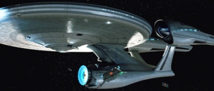
New USS Enterprise as seen in the trailer
For the full blog, see Koerner’s MySpace.
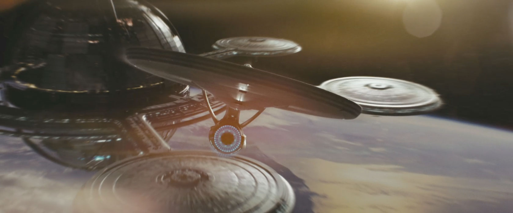
Such a beautiful shot–that Enterprise over the Earth during a sunset.
Should I just go to Red Alert now? Or is this one actually going to remain civil?
Nice comments from Koerner. I wasn’t a fan of his version, but I loved aspects of it. seeing his ‘smoother retro look’ is right on track to where I think the E should be.
Having said that, I’m waiting for the movie to come out before I pass judgment on the new E. Got to see her in motion… it’s the only way.
I like the general design of the new ship… though it does look a bit front-heavy from this angle. I’ll reserve full judgment, though, until I see it from some other angles other than front and this one. So far, so good though. Gabe’s ship is really awesome and would have made a good movie ship, but I like them both equally.
Um, (gulp) first?
I’m somewhat interested in what Andy Probert thinks of the new design. I sent him a link to a pic of it from when the new pic was released not too long ago.
Without seeing the new one in action, it’s not fair to judge it, I agree. However, from the stills, I like Gabe’s a lot better.
I like Koerner’s design better than what’s gonna be in the movie, but that doesn’t mean I don’t like the movie design. I just can’t get over those drooping parts underneath the nacelles.
When you see his design in traditional lighting and from a classic angle, it has plenty of issues. I do like his nacelles, though, and that sunset shot is a classic of fan art.
Yeah, I agree that the new design looks like the engineering hull has been squeezed forward and I think it does look ugly, as well as being a waste of space. The nacelles them selves I think are too big in the front, but besides that are ok. I’m glad, though, that on the saucer section they flattened out the lower part because the upper curve of the old design pretty much wasted an entire deck of space, one of the two biggest decks of the ship. But yeah, the saucer section looks totally TMP while the rest looks…new, but they dont go together well, at least from what Ive seen.
I imagine if they would have compromised a perfect mesh of Koerner’s and Church’s Enterprise, it would have looked very cool.
Gabe, I love you ship, especially when it’s in motion. Church’s version will probably grow on me after the movies release, but I still wish they’d went w/ yours. Bravo!!!
Being on this movie is an alternate timeline the question is moot about the look of the Big E compared to the original. If the timeline is different what difference does it make?
I see no reason to go to ‘red alert’. We ran two polls on the new E and I think after people saw it in the trailer, they warmed up much more.
Having seen more images of it and seeing it in motion at the four scene preview, I certainly like it a lot more than that first image. I really think that the image released by Paramount was a mistake. It is a bad angle of the ship and doesn’t really sell it well, especially as the first image people see of it.
Sorry Anthony, it’s just that there’s so much…. passion, recently, it’s gotten me rather worried about these sort of threads. I, like most, don’t like seeing the “hate mail” posted against Bob, the creator of the ship, or anyone else. It was out of line to post that. I apologize.
STOP THE SPOILERS
Look ppl, if you cant keep spoilers to yourself then dont F***Ing post them matter of factly in every message post here sheesh…….
^^^
no worries and I agree
There is a difference between “I think the nacelles are too big” and “so and so is $%#@er”
I would rather see Gabesm it reflects more of the TOS and TMP Enterprise than the one that is going to be in the movie, in all honesty I think the new one looks stupid, it is so far out of proportion it is not funny, very very dissapointed.
15
Sexyasiangurl
Did I post a spoiler? If so I apologize!! It is no secret. Especially of late around here!
Other than the saucer, I have complete and utter dislike of it.
Nothing in the preview/trailer made me change this opinion.
I like the new Enterprise, both versions.
Let me say this though, and please pass this on to other forums, we have been wanting a new Star Trek film since Nemesis, well J.J. and his crew have made it for us, now we may not like exactly what he is doing, but at least he is doing it. So could we please just wait until May to tar and feather them, after we have seen the film?
I agree with most, if not all, of what Mr. Koerner has to say. And that head-on view of the new ship from the trailer definitely does look better. But a good design shouldn’t have a “good angle” from which to view it. You wouldn’t have said the same of any of the Enterprise designs up until now. It traditionally looks good no matter where you look at it. And I’ve looked at the rest of Church’s design just there on his website, and he’s got some really amazing stuff on it. So I don’t doubt his skill and talent as an artist and production designer. I just can’t like this new Enterprise.
In saying that, it wouldn’t take much to make the new ship look a lot better. smaller nacelles and the connecting strut between the two hulls being moved forward and you’d have a class looking ship.
I kinda like the new ENT better than the one in that pic. That one looks a little clunky to me. The Enterprise should be more streamlined.
What’s a greeble? Do they wobble but not fall down?
I like Gabe’s stuff in the way I liked the artwork on some of the 70’s paperbacks. They offer variations that don’t have to be the final final. I love the new art books on DC superheroes — showing gritty detail we’ve never seen before. I don’t think of these images as the definitive versions… just fun variations. I don’t think of the new film as the final final either. Frankly, the gold standard for TOS era is TWOK, ship (I know, it’s from TMP) but also the sets and especially the unis.
Anyhooo — JJ’s new E is at least OK from the outside. The sets inside look very dated already. I doubt I’ll like them at all in ten years. (I stopped tolerating TMP’s unis long ago and the rec room furniture looks like my parent’s basement.)
Koernerprise > Churcherprise
Gabe Horner’s design speaks to an age I suppose, although it’s not my ideal since I’m happy with the original.
But iTrek’s “Macinprise” is most certainly the AMC Gremlin of Starfleet:
(Brand Launch Control to Engineering)
High tech? Check.
Bells and Whistles? Check.
Latest ergonomics? Ummm, yeah, sure, check.
Good use of the AMC parts bin (i.e., a modified AMC Hornet)? Check.
Forward looking form-factor (i.e., hatchback subcompact)? Check.
Aerodynamic body? Check.
Good balance of fuel efficiency and power? Check.
Available small block V8? Check.
Built to a market-optimized price point? Check.
Design?
Design?
Design?
Hello, Design, do you copy?
Design?
Ah heck.
Lift-off!
#25 CS-
Thank you! Dead on! I could not hope to be as eloquent! LOL!!!!!!
(Design has not responded. We fear the worst…)
Gabe- You got it, bro!
…..waiter, a saucer of milk for post #15 please….thanks, I will pick up the tab.
#16
What!
#20
Amen.
I much preferred Gabe’s Enterprise. I think it was the perfect marriage of the traditional design elements of the ship and newer, more “modern” elements. I would have loved to have seen his ship on the big screen. The one that we will actually see may take some time to grow on me.
#20
I agree. Now..let’s see how long it takes before that advice is completely discarded. It’ s one thing to make objective critical commentary or observations on known facts, but the level of immaturity and spitefullness is staggering at times.
If Ryan reads this, I want him to know I think his ship is gorgeous.
I never really liked Gabe’s design. There was always something that bothered me about it and couldn’t pin point it until I saw both designs side by side.
I find the the bussards as well as the saucer section look the same on Gabes and the new one.
I think the thing that always bothered me about Gabe’s was the secondary hull. It looked out of place with therest of the ship. The nacelles and saucer were sleek… the secondary hull was more BSGish. It didn’t really fit with the design of the rest of the ship.
But to each their own. I applaud Gabe for his design skills.. I could never do something like that.
I do like the new Enterprise design.. it really gives you a sense of scale and magnitude. I look forward to seeing it on the big screen.
But my favourite Enterprise has to be the one from the original 6 movies. A true classic.
Not the topic of this thread, but since it’s the most recent article, and a subject we all have an opinion of, and should be read by most of the readers here, I figured I would post it here, too. fwiw, I just saw The Day the Earth Stood Still, and give it a D+. The original is 10 times better.
Gabes is much better than the one we have ended up with.
Biggest problem I have with the new Enterprise is that the neck sits so far back…it lost some of it’s beauty with that design flaw.
When compared to the redesigned original Enterprise to the redesigned original Battlestar Galactica, the Enterprise is more faithful to the original 60s exterior look. It looks very realistic and hopefully would inspire a whole new generation of fans looking toward the stars.
“he’s admittedly got a balance between engine hull and neck that’s a lot sturdier than the classic in its distribution of mass.”
Yes, that’s one of the first things I noticed, and one of the elements that, for me, made more sense. Back when the picture of the new E was first shown, I remarked that the shuttle bay could be more like in the lower part of the neck now, since the engineering hull and the neck are more of a piece now. I wonder if I’ll turn out to be correct on that.
Unlike Koerner, I like the struts and the way they attach to the nacelles.
If no one else already answered:
CmdrR – December 13, 2008
What’s a greeble? Do they wobble but not fall down?
“greeblies” are the “stick on” details, non-descript pieces that add detail and dimension, but don’t do anything obvious. Greeblies are often seen on props, such as buttons, dials, other things that are there to make it look interesting.
Does that help?
I like this new design. I think the neck being further back protects it more giving the Enterprise a tactical advantage in combat. I am looking forward to this movie!
So what is difference between a greeble and nurney?
““greeblies” are the “stick on” details, non-descript pieces that add detail and dimension, but don’t do anything obvious. Greeblies are often seen on props, such as buttons, dials, other things that are there to make it look interesting.”
…And Greeblies on studio models usually consist of parts from model kits for tanks, cars, ships, and planes, along with scrap and sheet plastic cut and/or bent so that when they’re all pasted on the hull, you won’t recognize where the parts originated from.
Unless it’s the original Battlestar Galactica…:-)
#39 Pray tell, how does cramming the neck halfway down the 2ndary hull convey any tactical advantage?
gabes non-smooth design is pretty spot on, classic connie proportions and interesting details, but those long nacelle end-caps would look better shortened.
i loved the star wars prequels, but i am not a fan of most of church’s work, he has an awkward sense of proportion, see his site here:
http://www.ryanchurch.com/
some of his works are very nice, but others? the hardware he was responsible for in the prequels were often silly, has ralph mcquarrie retired for good?
the connie in the new movie looks awkwardly kitbashed, the primary hull does not belong on that gloppy star-drive section at all, two different designs altogether.
i can get past the absence of the classic concavity of the primary hull, i suppose, but the rest?
high budget fan film, i’m sure it will be a fun watch.
they should have seen what richard hudolin could have come up with for this production.
#13 “I really think that the image released by Paramount was a mistake. It is a bad angle of the ship and doesn’t really sell it well”
i have yet to see a bad angle of the original jefferies design, or the trumbull re-fit for tmp. there simply arent any.
thats a constant in traditional ‘fleet design, though the profile of the 1701-e is probably the worst for the sovereign class, too short and too long… still, a fine looking ship.
of course, i’m regarding the 1701-j as a figment of the future and hopefully wont be taken too seriously…
someone mentioned andy probert earlier, it would be interesting to know his impression of the new starship.
LOVE Gabe’s version of the Enterprise. I’m making a modification to the Polar Lights TOS Enterprise. I’ll be posting shots of it on starshipmodeler.com soon. (Gabe, if you read these, I’ll be happy to make one for ya!)
#29 and #31
I am glad that some one finally agrees with me, you’d be surprised on how many don’t. I am betting that my advice will be forgotten long before May 8th and that J.J. will be on a BBQ spit soon after.
Anyway, I will say that when I first saw this design for the Big E that I was taken aback, but it has grown on me. To tell the truth, the only part that concerns me is the bridge; it looks like Star Trek by Apple. But, I can live with that. But, to me, the new nacelles look real cool. They look over-sized, so that the smaller ones from TOS look like they could be the next upgrade to starship design. I can also see the neck having to be thicker because the ship was constructed on Earth and it gets smaller as the ship is refitted in the micro-gravity of Earth orbit.
Two additional things:
1. Does anyone know where I can find a larger image of the new ship?
2. Are we completely sure that this film takes place in an alternate timeline?
it’s funny I didnt like Koerner’s enterprise at first but seeing the actual enterprise from the film I prefer Koerner’s (not his retro). I’m sure in the end we’ll love this enterprise just as much as we have the others. The major turnoff for me is the nacelles front, I’m sure I’m not alone. I’m sure I’ll get over that. as we see more shots.
For the record, I do love Gabe’s version as well.
But this one seems like it is all right too. I love how it blends so nicely with the TMP refit, which, I think, to this day is considered by far the most beautiful of Starfleet vessel types on the whole.
I wouldn’t be so concerned about front heavy vs. back heavy. Originally I didn’t like how the neck was so far back but I realized it was like that on the original Constitution class ship and then was moved forward in refit. This is, therefore, basically in keeping with the original design.
Great position of the docking portals, just as in refit Constitution. The closer you can get to that ship, the better.
46
I have seen some larger pics…but nothing too large…and of course..it escapes me where i have seen them.
regarding your second question…it would seem from Bob Orci’s interview on this site, as well as his input throughout the forum below that interview…yes….at one point (Bob if you are reading this feel free to correct me) that all previous ‘canon’ events of tos, tng, ds9 all of them have to happen before this movie can happen….i.e. those events lead or feed into to this film and its adventures moving forward…..so you have to have them as the back story in a sense….
46
It has grown on me as well…the main thing for me was the hull and the way it sloped so soon up to the back…but i am used to it…and while I didn’t like the bridge…ok…that’s too harsh….I was shocked by how white and bright it was…and that was offputting…..I am waiting to see it in action…it could be fine, and probably will be .