
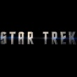
 The new Star Trek movie has yet another logo, lets hope this one is going to stick. Just this evening Paramount released a new logo image, which will presumably make its big screen debut on the new theatrical trailer coming with the Watchmen movie in exactly two weeks. See it in high resolution below.
New Star Trek Logo
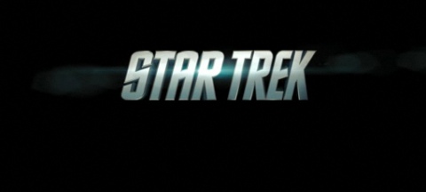
Star Trek stands up straight in new logo.

Star Trek’s newest logo
The type treatment logo has been evolving in the last year, with the biggest difference being that previous versions were italic oblique, while still using classic TOS type. The new logo also has a more 3-D feel than previous versions (seen below), with some metal texturing.
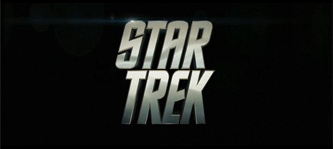
Logo used in Super Bowl spot (Early Feb. 09)
Logo used in Theatrical Trailer (Nov. 08)
All borrow from the look of the original Star Trek logo
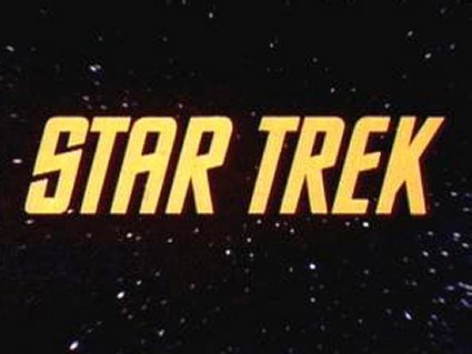
Logo for Star Trek The Original Series
Awesome. First?
Cool!
Cool. This is the best one yet.
My favourite so far is the one from the Superbowl spot. I like the new one of course, but I wonder why they keep tweaking it.
Good, they’re sticking to the old font. I like the italics, but I can live without them….
Gotta agree that I like the Super Bowl logo the best, too, but this ain’t bad!
New one feels very…Transformerish.
Come on… Bubble Font!
Yep. Friday night and I’m checking out the font for the new Star Trek flick. Damn it feels good to be a Trekkie.
I like the font used on the new toy packaging better. I wonder if that will be the final logo used in the opening of the film.
I like the new logos — and in this age of branding these things actually have weight — but I also really like the classic movie Trek font.
*sigh* …Transformers much?
Not much of a change. Just show me the movie!
I like this logo! It’s exciting!
Hmmm, interesting….
http://img.photobucket.com/albums/v58/PixelMagic/trek_logo.jpg
Heh.
Ooh, shiny. I like this actually.
I liked the Superbowl one better.
15
Daniel you’re ahead of your time.
#10 – “I like the font used on the new toy packaging better.”
Me too. I have the font on my comp (well I think it even came with some Windows machines) but it reminded me of a modern take on the old logo.
interesting daniel
but i have you beat….check out mine from July 2007, not as shiny, but same design
https://trekmovie.com/2007/07/07/trekmoviecom-made-trailer-for-star-trek-2008/
Anyone know who the original designer was of TOS font?
The new logo looks like the Transformers title from that movie. Check it out. It’s true.
The Trek Logo got Borgified.
I like it, but it feels very “Iron Man” to me.
Hmm. I noticed that yellow Star Trek logo. In all the Star Wars movies, the opening crawl is always in that yellow color, but not the font.
I like it. . . .
“The new logo looks like the Transformers title from that movie. Check it out. It’s true.”
I noticed that too at first. I think it looks cool though.
wow, making it look like transformers. i hope that by the end of this theres still that thing we all love about star trek left. With that said im still very excited. Very Very! But still, first thing i thought was transformers…
It reminds me of the First Contact logo.
From a designer’s perspective, I’ve always thought that the retro logo for the new film is a great throwback to the original series with a new spitshine. I’m not so crazy about the type that’s got the wide tracking and “straightened” – just doesn’t seem to work.
But hey, they didn’t ask me first.
Let’s ask Wil.
I liked the other two logos. This new one looks too much like the Transformers font.
It looks like the cover of an AC/DC album. Thank Rock and Roll…
I like it.. brings Trek into 2009 yet still keeping the flavour of the original. Nice touch!
At least it’s not those colossally bland block letters from the Playmates packaging!
I miss the old school slant, but this new logo still has my vote!
Interesting, but I do prefer the italic logo, as it is more reminiscent of the TOS logo. But it’ll do.
God bless!
Hmmmm…. Are they going to spin around like a cheesoid Windows 3D text screen saver like the logos from Lost & Fringe?
…Or the Transformers.
#7, #38
That was my first thought, exactly.
Not totally surprising as the title screen in the film and the logo for promotional stuff often differ.
I’m totally looking forward to Iron Man.
Er, Star Trek. Star Trek. Sorry, got confused there.
20
Ooooh can I go see that movie instead?
:-)
————
Like the SB one best and the newest one the least…
it looks like the same texture as the Transformers logo!
This will be a popular movie amongst the children and teenaged demographic. It does seem that each new item brings it farther and farther away from the original claim that it was based on Star Trek. Remember the original publicity art? It featured pretty recognizable designs such as the exact logo, the exact insignia, the exact colors with a pattern made to resemble textiles implying the uniform tunics from the television program.
A note to the legions of devout Defenders of the As Yet Unseen Totem, this is not an insult to this future and sure to be amazing motion picture event! It is rather an observation that we long-time fans were led to believe one thing, but now something quite different is revealed as we approach the release date.
In all, the tactic reminds me of the many insincere promises made during a political campaign, to secure certain blocs of voters, that are quickly abandoned once the election is won.
In the terminology of President Clinton, this must be the Trek version of “triangulation” and “running to the middle”.
Fascinating!
Sincerely,
C.S. Lewis
Star Trek “straight up” now, eh?
Interesting how the original was golden, like the Starfleet delta. “Golden Age” of Trek.
Now with PunkTrek, we have silver, as is the new Starfleet delta! “Silver Age” of Trek.
Now all we need is “Crisis on Infinite Enterprises”.
I have no idea why they didn’t just stick to the old title, which was just fine and had a nice TOS flare to it. Is it a coincidence that the title is looking more and more like the ‘Transformers’ title when the film’s writers are exactly the same?
I like it. It looks more 21st century. The previous trailer logos reminded me more of the Star Trek Remastered logo than the original. They look identical. This one still maintains the font style of the original but looks more “real”. No surprise there :) In the end, though, I don’t really care.
oh boy, the ‘change scares me’ crowd is out again. Ironically all the new logos for the movie are far more faithful to the tv shows than any of the previous 10 feature films. The TMP style has zero to do with TOS
http://www.imdb.com/media/rm2333971712/tt0079945
Meh. I prefer the italic (no, oblique) title. Implies speed, action, moving forward. The straight-up font implies standing still.
Totally at odds with the footage we’ve seen so far.
43:
For crying out loud, they straightened the letters and put them in line. We were TOTALLY misled by that oblique typeface!
/sigh
43. C.S. Lewis – February 20, 2009
i did not have sexual relations with that logo…