 Star Trek director JJ Abrams has worked for years with the Emmy-winning production designer Scott Chambliss and that includes the new Star Trek, but in a new interview with SciFi Now, he explains how he needed some convincing to go to the final frontier. The designer also talks about his approach to (re)designing the future, see excerpts below.
Scott Chambliss: Designing the future’s past
Considering production designer Scott Chambliss’ long association with J.J. Abrams, from Alias through Mission: Impossible: III, it’s a little surprising to hear that he didn’t immediately jump into Star Trek with both feet when he had the opportunity. In the interview with SciFi Now, Chambliss admits:
My reaction was really all over the place. Of course I wanted to do J.J.’s next movie and I was excited that it was something we’d never done before. But at the same time, I also felt a lot of trepidation because of all of the history and baggage that the franchise has. That was a little troubling, but then we figured out how we had to approach it and moved forward. From a creative standpoint, there’s a real difference between approaching a piece of new material that doesn’t have any history and expectation based on what’s come before, and this only has history and expectation. It’s got a fervent group of believers in the material and there’s just so much that you had to be aware of beforehand in terms of what’s come before, which had to be considered before we even approached how we might want to do this newer version.
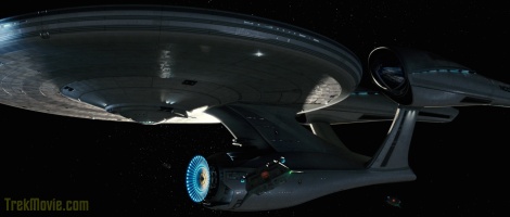
The new USS Enterprise
When they began designing Star Trek, Chambliss and Abrams had a few ground rules. First of all, they were primarily paying attention to The Original Series from the 1960s as well as Robert Wise’s Star Trek: The Motion Picture and the direction it took. The designer explains:
From that point, to me, what made Star Trek the concept radically different from sci-fi of the last 15 or 20 years, was Star Trek was optimistic. It wasn’t a view of the future that was post-Vietnam, post Nixon, post environmental disaster where the future was bleak and f—ed up. They worked things out and no matter how much conflict they had to deal with in outer space with different cultures, it was ultimately an optimistic framework for the story. That made me, just from a design point of view, look at what was going on. Not in the era that the original designer was drawing his references from, which was an updated Flash Gordon, but, instead, I was looking at what was contemporary and really forward-thinking and very scientifically based in architectural design, vehicle design and industrial design. I remember in one of our first meetings about the basic concept, we were saying the same things about the optimism and I began fleshing out with him visual references from there.
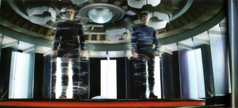
The new USS Enterprise Transporter room
It’s suggested that optimism from a design standpoint means something sleeker and “cleaner” looking than, perhaps, vessels from the Star Wars universe. Chambliss agrees, noting:
That’s part of it. From looking at the work I’ve done with JJ, you can tell that he always tries to make things accessible. He always tries to suggest real life. If you’re in a vehicle, whether it’s a military transport spaceship or an older, massive spaceship like the Kelvin in this movie, they’ve been around for a while. They’ve got bumps and scratches and paint is peeling and things have been fixed with gaffer’s tape. That’s real and that gives an environment a tactility that a super sleek, clean, everything-is-perfect kind of cartoon view of a perfect world would not have. That’s not what we were going for. At the same time, if you look at something like Children of Men, where everything is charred, sawed-off and smoking, it’s the opposite of that. It’s still a real world, there are still physical realities you have to deal with and things do still break down and explode and catch on fire, and that’s part of what they’re still dealing with in outer space and on planets. But, for instance, look at the new starship Enterprise: that’s optimistic in its sleek, beautiful design. If you make a comparison, that’s the digital world as opposed to the analog world of the older ship that’s 30 years older. There’s a streamlining effect that doesn’t imply that things will be forever perfect, but it’s the kind of thing where you look at it and you feel good about it; you feel good about the present and hopeful about the future.
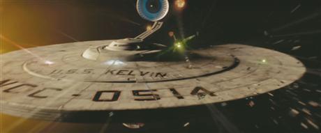
The USS Kelvin
Without going too into detail, Chambliss does point out that there were elements of the original Star Trek that they wanted to maintain in this new incarnation:
You wouldn’t want to go on the Enterprise and it not look anything like you remember from the TV show. You want to make sure you have the heart and soul. We did three different passes on what this thing should be, and one of the things we focused on, of course, was the bridge. Particularly the captain’s chair and his relationship to Sulu and Chekov and their consoles in front of them. That was such a given. We wanted to keep Spock and Uhura in the places, physically, that we were so accustomed to seeing them in the old show. It was about recreating the physical relationship of these characters on the ship in a way that was familiar; we wanted similar spatial relationships and the rail that wraps around the central core of that area, without slavishly duplicating the color palettes. We wanted to update the technology in such a way that was super cool without being cheeseball.
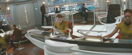
Bridge of the new USS Enterprise
Chambliss goes on:
We wanted the bridge to feel really functional and very detailed and very multi-media. And very tactful at the same time. Sexy, by all means. One of the problems with the old show is that they had no budget and everything is made out of cardboard; it felt like a soapbox derby in outer space. All of that stuff is so sweet to look at now and it was definitely of its moment. Well, we wanted this one to be our moment, just brought further into the 21st century. But it’s virtually impossible for a movie to present technology that’s way ahead of its time, because everything we’re referring to right now as new, by the time the move comes out it’s all going to be out there. We didn’t want to find ourselves in the trap of making such a big fuss about the technology, that it was super cool and super new, when we would find ourselves down the road saying, ‘We’ve seen that at Sharper Image and it’s really fun to play with.’
For more of my interview with Chambliss, pick up a copy of SciFi Now #23 (available for to purchase online).

Visit Ed’s new websites: The alien Visitors are back! Learn about “V” both past and present at VisitorsAmongUs.com. Also, looking for some sci-fi in your superhero adventures? Keep up to date on the film adventures of Green Lantern and the Green Lantern Corps at GreenLanternFilm.net.


Cool stuff!
I still ponder the use of numerous practical bar code scanners.
Has there been an explaination for the bridge barcode scanners?
That’s not a dig. I just want to know what they do.
#2 I believe they are the holo-projectors for the viewsceen in front of the windshield /front window
cool
Interesting article about the approach to the design. Nice to see the respect to the old but with an attempt to update the look and keep it real — something that Nicholas Meyer did pretty effectively in Wrath of Khan.
ST : TFB is going to Rock!
:o)
Off topic here a bit but does anyone else, whilst watching the new trailer when Kirk pulls the rip chord and lands on Nero’s device and the camera pulls in on his grinding his teeth to hold on-anyone else find themselves grinding their own teeth and thinking “hold on”??
Or is that just me being Nuts?
Personally I’d be going for the latter….
I’m glad they’re using modern architecture as a reference point. I see a lot of Santiago Calatrava in the new ship (ever seen the new wing of the museum in Milwaukee? Stunning).
Is it possible to obtain a somewhat larger photograph of this man, perhaps 18″ x 18″, that would be suitable for mounting between a coloured bullseye and a cork backing?
:-)
Sincerely,
C.S. Lewis
But the Bridge Sucks though….it’s just fugly.
Still think the bridge is a bit too big, feels so much like the Enterprise-E. Just wondering what the explanation for the vast differences between the old and new design of the ship in context with the film. Kelvin blown to hell facing some space octopus so we need a warship?
Obviously the sets need to be modernized and look like they’re part of a $150 million movie. If the heart and soul of Trek is indeed there then we have nothing to worry about.
What the hell is wrong with #10? Sod off, mate.
Is it possible to obtain a somewhat larger photograph of this man, perhaps 18″ x 18″ and autographed, that would be suitable for mounting between a collection of new Star Trek posters?
:-)
Sincerely,
c0mBaTkArL
Very interesting. Overall, I have been very pleased with the new design. I’m sure he will offend some hard-cores from his statements, but they are, all in all, very honest. I know that there are some fans here who don’t understand why they had to change the design as much as they did, but it is pretty obvious. You can’t deny the cheesiness of the original bridge. I agree, it gives the show a lot of its character and I love it, but if your goal is to go for something that looks like a future version of today, you really have to do a lot of changing to that design. I am actually pleased they are as faithful as they have been, especially in keeping the original layout of the bridge.
Great article! THANK YOU! I love reading about the behind the scenes stuff. Wouldn’t it be so cool to be part of that? To re-imagine the bridge of the Enterprise? Man, that would rock. I can’t wait to see the movie!
10. C.S. Lewis
I was just waiting for you to say something like that. You’re so predictable.
Also, I hope your recovery has been going well.
Best Wishes,
The Governator
I like what I’ve seen so far and I’m confident that this movie is going to be great….barcode scanners and all.
Question: does this movie take place before or after The Cage. Or does it completely disregard it. Because I’m good with the last two lol. I bet it disregards The Cage, that would make alot of sense and I’d be good with that lol :P
I just watched the new trailer again.. every time I watch it.. it gets better.
If the movie is as well done as the trailer.. I think that everyone who sees it is in for a treat. I will ignore the things that don’t sit quite right with me about the re-imagination, and hope that they can explain.. and make it a great movie that will spawn a new generation of trek.
Barcode readers on the bridge is just bad design! The new Enterprise is not beautiful, at best you can say it looks awkward!
I like how the color of the uniforms stands out when on the bright, white bridge.
“My reaction was really all over the place.”
Yes, as are your designs.
#10 No need for that.
#13 No need for that either.
#14 – This is more like an accurate and dignified Trekker response. Well done.
Interesting article. I would contest that the original designers just “updated Flash Gordan.” Because that isn’t what they did. They really had to be on the cutting edge with no money. There’s a certain charm and awesome in the designs of the original interiors, and alien scapes. Some bits held together by nothing more than glue, nails black paint and takeout lids painted gold. Fantastic, inventive, and artistic attitude.
The halls of the NeoEnterprise have grown on me (In particular the doors). I’m not certain how I feel about dividing the ship up into classes as has been suggested (That it gets all rusty and mucky in engineering). That doesn’t quite fit to me. Seems rather unwieldy to me to put that in there, but oh well. I like some aspects of the new bridge, and dislike other aspects.
The one thing im certainly starting to like with the overall redesign is the color scheme in some areas. Particualrly the pearl white seen on the exterior and in the hall ways. Reminds me of the Refit Enterprise in drydock in the first film.
A second comment:
Quoth Chambliss, “We wanted to update the technology in such a way that was super cool without being cheeseball.”
With all due respect sir, these designs bear no resemblance to any command center, communication center or control base I have seen anywhere, at any time in history, in person or through written record, commercial, institutional or military. This includes various complexes at the Pentagon, the Westinghouse Supercomputing Center, assorted state EOC and numerous Fortune 500 headquarters that command billion upon billions of dollars of activity and millions upon millions of lives.
No sir, these are imaginary designs, virtual in nature, apparently targetted at teenagers and other youthful buyers of movie tickets, 99.999% of whom could not spell “command and control” if their lives depended on it, which in our bloated society of virtual indulgence, they certainly do not.
“Flash Gordon” as you so dismiss it, at least had the grace not to take itself seriously, in its humorous and delightful interplay of 19th C. admiralty and Great Powers politics (all gone apre le deluge), high tech Tesla-style gimmicks of the burgeoning Age of Electricity, and the good old-fashioned “cheese” cake of Dale Ardens esp as portrayed by the fetching Miss Jean Rogers.
Sincerely,
C.S. Lewis
And there is no windshield on the outside of the bridge of the new Enterprise! Barcode readers look stupid!
“But at the same time, I also felt a lot of trepidation because of all of the history and baggage that the franchise has. That was a little troubling, but then we figured out how we had to approach it and moved forward.”
Master of understatement! What a job to have. I also like the “sweet” comment he made about he TOS bridge.
#”Is it possible to obtain a somewhat larger photograph of this man, perhaps 18″ x 18″, that would be suitable for mounting between a coloured bullseye and a cork backing?”
“Lewis,” you’re easily as clever as those old Galactica fans who thought that drawing bleeding bullet holes and hatchet wounds in photographs of Ronald Moore and Bonnie Hammer was really, really funny.
For all your pretensions, you don’t even aspire to the basic civility of your overrated namesake.
Looks sweet but the purists are gonna be mad at parts of this interview
Sharper Image? lol, that store went bankrupt, your designs would’ve been safe, dude.
I interviewed Chambliss a couple weeks ago and got pretty much the same sound-bytes (right down to the CHILDREN OF MEN reference), along with a lot of, ‘I can’t talk about that, mate” and the like. He did mention deliberately choosing to use lots of reflective surfaces because he hadn’t seen much of that in the SF films he researched (I’m guessing he must not have gone back as far as 2010 or 2001.)
My very strong impression is that they had nobody looking at things with an eye toward likely design progressions, for the ship or the city or anything else. He stressed that ILM worked from his dept’s designs, which normally would make me happy (not a fan of ILM DESIGN work), but in this instance, well, I don’t like the look of this pic at all.
Dennis Bailey, you are the living embodiment of what the rest of us think when we hear the word “Trekkie”.
Live long and prosper,
Sincerely,
C.S. Lewis
I freakin LOVE the new designs, and how sleek and sexy and futuristic everything looks.
Unlike some fans, I can actually take a step back from TOS and look at things with an objective eye. And see that, yes, they did need to radically rethink some things.
I like some of what he says but the comments that Star Trek TOS design was an update of Flash Gordon seems like he hasn’t researched Jeffries experience and how that fed into his designs. I think “updates of Flash Gordon” is a fair criticism of fantasy science fictions like Forbidden Planet, 1970’s Buck Rogers, Dr Who and pretty much anything BBC, and Babylon 5 (Star Wars breaks the mold). Star Trek’s color palate was certainly out of the 60’s, but the concepts of ergonomics and practicality that dictated the design aesthetic were very rooted in a practical take by Jeffries shaped by his experience rather than any dream or fantasy which is why the design of the Tricorder, the Phasers I and II, and the original Enterprise look so appealing years later. I think the iPodish, white-light look of this modern incarnation looks as much of today as TNG with touch screens looks very 90’s, and TMP and TWOK look very 80s– there’s nothing wrong or correctable about that. Few movies (blade runner comes to mind) don’t look dated years later If he were right about TOS being an update of Flash Gordon, the fan base would be begging for an update rather than cautious approaching this new film.
From what I’ve seen so far (and that is, of course, a big caveat, to say the least) I’m not a fan of the new bridge and Enterprise interiors. To my taste, it’s all a little too on-the-nose “futuristic”– the art-deco, iPod “future,” where everything is either plastic or stainless steel, shiny white or polished chrome. Frankly, I find it the whole style hideously ugly…give me bright red hand-rails and black consoles with blinky red buttons over that any day of the week… :)
And why? I’ll tell you why. What I’m really looking for is…color! Give me color, bright color, and lots of color, and I’m a happy man. Stainless steel just doesn’t cut it in my book.
Of course, all of this is very, *very* preliminary…I’m fully prepared (and excited) to be pleasantly surprised when I actually see these sets on the big screen.
But, one way or the other, I’ll live…:)
Chambliss:
“[…] look at the new starship Enterprise: that’s optimistic in its sleek, beautiful design.”
“You wouldn’t want to go on the Enterprise and it not look anything like you remember from the TV show. […] one of the things we focused on, of course, was the bridge.”
…. no comments….
Is it just me or does anyone else not like the swirly effect of the transporter? I thought the particle drop down effect looked just fine
15
Personally, I would’ve enjoyed the bridge design more if he’d kept some of the original color scheme around. While the all white does look futuristic and optimistic, the updated/changed look would’ve been easier to swallow if the colors were similar.
I think the movie will probably be very good and entertaining and I will see it atleast once! I can really appreciate JJ’s appreciation of TMP!
25
Huh? On the one hand you chastise them for not making things realistic enough and dumbing things down for the youth… and then you suggest they’re taking things too seriously? lol
Making something “super cool” by definition implies they’re NOT taking things too seriously.
Besides, why the heck would they want to make the bridge look like something we’d see today?
“We wanted the bridge to feel really functional”
fail
“We wanted the bridge to feel like lots of little lights are cheap in the future”
win
“We’ve seen that at Sharper Image and it’s really fun to play with.”
fail
“We’ve seen that at every supermarket check out line since the 80’s, and everyone will recognize it as being anachronistic.”
win
and as long as I’m at it, where do those glass panels in the transporter room come from, the movie “Timeline?”
I dunno. As one who saw The Menagerie on the big screen I gotta say Matt Jefferies’ designs hold up really well in today’s day and age. That being said, the update as seen in Star Treks I-IV are more… I don’t want to say respectful, but definately different and yet still recognizable as something from that Universe, whereas this new Enterprise is… too different.
“…look at the new starship Enterprise: that’s optimistic in its sleek, beautiful design. If you make a comparison, that’s the digital world as opposed to the analog world of the older ship that’s 30 years older.”
I really have to disagree on this one. The “sleek, beautiful” design of the TOS and the Refit Enterprises are more “sleek” and “beautiful” than this new one. Matt Jefferies’ designs are not that… cardboard looking or fake looking. As much as I’m not one to defend Star Trek: Enterprise, I gotta say that the Mirror Universe episodes show that the old designs hold their own in this “digital world”.
He should say, “We wanted the bridge and the rest of the ship to feel like you were walking into a giant Apple store. Everything’s white and shiny with lots of computer monitor doing God knows what, as long as it’s cool.”
it this were the frist trek known to man kind design wise, and the 60’s designs were to be used in the movie you would still be complaining
Over all, I think the new bridge design is pretty sweet (especially the view screen and the sleek white overtones), but I still can’t get over all of the bright lights. It’s like twenty police officers standing in a circle shining flashlights in the viewers’ eyes! :)
#10: Funny stuff, Mr. Lewis! I can’t STAND the iBridge.
“As much as I’m not one to defend Star Trek: Enterprise, I gotta say that the Mirror Universe episodes show that the old designs hold their own in this “digital world”.”
Dude, that’s so true. All they really need to do is update the panels so that they aren’t blinking lights and still slides on the monitors and you’d get a very futuristic looking bridge. What always liked about the old show was how it felt a bit like a nice submarine. It wasn’t so colorful as to be distracting, yet it wasn’t dark and gloomy and mechanical either.
I’m loving the design of the transporter room! Keeps enough the same and yet changes enough to make it look fresh! Nicely done!
40-
A conscious, studied attempt to make something “super cool” and taking oneself too seriously are not contradictory. I see my 4 year old doing it all the time.
#37
Despite the fact that I “like” the swirly effect (if they ‘had’ to change something, they did make an effect that looks cool, and should probably be difficult to reproduce in a TV series), the raining down thing makes more sense from a practicle standpoint. I mean, if you’re moving lots of charged particles from a long ways away all the way to the ground in 5 seconds, they’re going to be accelerated rapidly at both ends. That will tend to produce some sort of radiation, even if it’s not visible. The direction of the “raining” should probably be related to the direction of the transporter “emitters” much like it was when the Enterprise beamed away the scorpion attack cruiser that Picard & Data were in in Nemesis, which was one of the better points of that film.
oh, and the way they threw in the enterprise theme when it happened was so amazingly inspired. Gave me goose bumps. It was kind of like “who’s awesome, the Enterprise! Who can beam a shuttlecraft? The Enterprise? Who’s your rescuing you from a cloaked-ship fighting scene when the enemy is about to grab you with a tractor beam and crush you like a tiny bug but I saved your life transporter daddy? The Enterprise. Nanny-nanny-boo-boo, you can’t touch—-
—-I’m over here now.
lol