
 It’s back to the Taurus Reach in this week’s edition of the Library Computer as we take a look at Dayton Ward’s new contribution to the Star Trek: Vanguard saga, “Star Trek Vanguard: Open Secrets.” We also have a super-sized version of the book cover designed by Doug Drexler.
REVIEW: STAR TREK: VANGUARD – OPEN SECRETS by Dayton Ward
[SPOILERS: for this and other recent novels]
In the wake of Tim Pennington’s redemption (so to speak) and Commodore Diego Reyes’ arrest, things on Starbase Vanguard keep moving along, revealing more and more about the true mission of the station, and giving an added urgency to Starfleet’s presence in the Taurus Reach. To say that I couldn’t have been more surprised by a book might be a bit of hyperbole, but Dayton Ward’s “Open Secrets” totally defied anything that I expected… and in the strangest of ways. Why strange? To be frank, it’s because everything I expected to be in this book was there, just as I expected it to be… just not quite. And it’s the not quite that makes this book such a vibrant read.
As with most previous Vanguard books, there are several storylines to keep your interest, though Ward made a great effort to bring some of them into parallel for this outing, making it a bit easier than in the past to keep track of some of the development and interplay between the ensemble cast. While the true story of the Taurus Meta-Genome remains at the heart of nearly everything in the book, each devoted subset of the book has its own unique flavor and direction that is both appealing and positively engaging.
As Reyes faces his court martial, Starfleet sends Admiral Nogura to take over the station from the XO, Jon Cooper, who has been doing an admiral job since Reyes’ arrest. The choice to place Nogura in charge of the station provides the reader with the chance to develop at least a bit of a profile of the admiral that Kirk was able to influence a few years later when faces with the V’ger Crisis. Nogura quickly demonstrates himself to be every bit the skilled leader while, at the same time, never succumbing to the temptation to create either the anti-Reyes or the Kirk-clone.
T’Prynn’s storyline continues to grow and develop as her ongoing internal struggle forces M’Benga to travel to Vulcan in search of a desperate treatment that even its practitioner isn’t completely versed in. M’Benga takes with him Tim Pennington, and their trip leads to many interesting discoveries about T’Prynn’s backstory and family.
Taking place as it does concurrent with the first season of The Original Series, “Open Secrets” makes effective use of Vanguard’s situation to further compel the unease between the Federation and Klingon Empires. Several incidents lead to continued complications and bickering between the two parties – and when pirates come into the picture, things go from bad to worse.
There is just so much in “Open Secrets” that it is impossible to truly unpack it all just this short review, but as I noted earlier, there is so much you expect to happen in this book that does that you feel like you might come away disappointed. And yet, nothing is as it seems to be… and the book concludes with a “What the…?” moment I would never have expected in a million years. I set down the book in absolute shock (a good kind of shock!) as the final pages played out. I just couldn’t believe what I had read.
Told with a pacing that is both engaging and exciting, Dayton Ward has a real hit on his hands with “Open Secrets”… a story that will make Vanguard fans ache for December’s release of “Precipice”, and that would probably appeal to anyone who was coming into the Vanguard series for the first time.
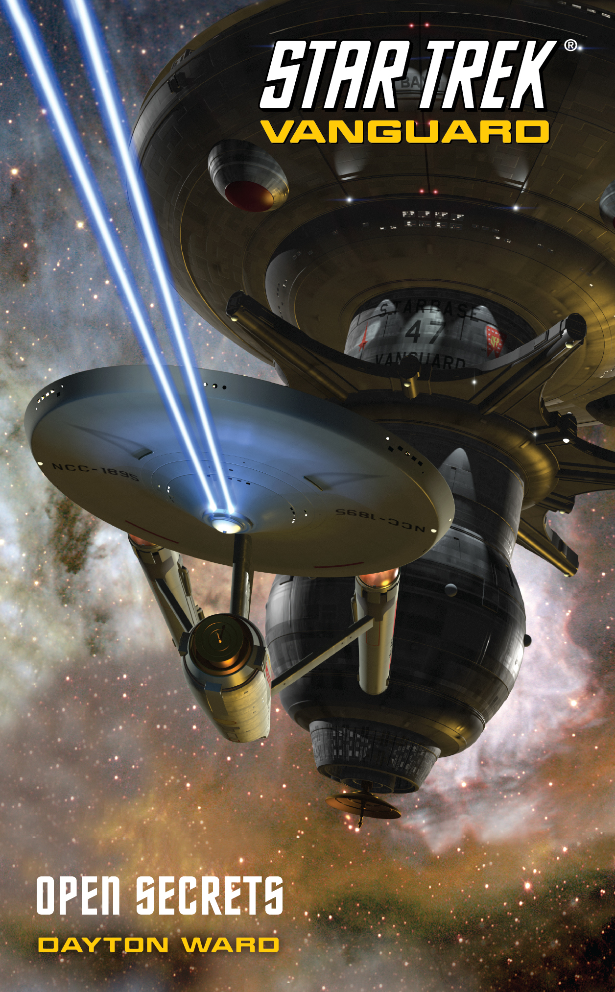
[click image to enlarge]
"Vanguard: Open Secrets" is just arriving in in bookstores now and can be ordered from Amazon.com
COMING UP…
Upcoming reviews for the next month from TrekMovie include the recently released Peter David New Frontier novel “Treason”, as well as the upcoming Star Trek movie adaptation by Alan Dean Foster and later in May a new TOS novel “Troublesome Minds,” by Dave Galanter.
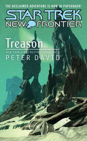
"New Frontier Treason" (available now)
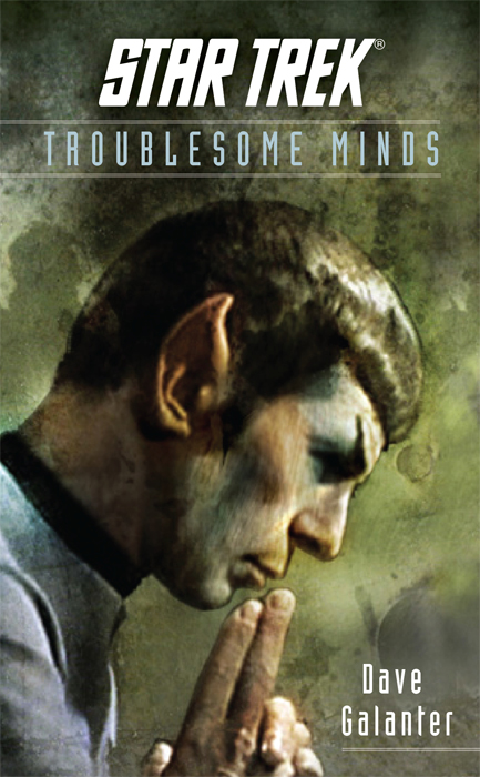

Available for pre-order for May: "Troublesome Minds"
and "Star Trek" (movie novelization)
Love the artwork on these covers.
Those are cool graphics!
They are indeed, cool graphics
That makes me think again how that Enterprise would look in the new Movie
Very nice artwork on the Vanguard covers, somewhat reminiscent of those old James Blish books I used to enjoy many many years ago.
How could these Starships fly with so tiny nacelles?
Wow, the classic Constitution looks great! What a pity that it isn´t in the new movie…
A friend of mine described the Classic Enterprise as ” the iPod of spaceship designs. Sleek, elegant, minimalist and just as cool-looking today as it was then.” (http://erictrautmann.vox.com/library/post/yeah-that.html – neat site, from a great author.) Of all the redesign I see in the new movie, this is I think the one I can’t get behind. It’s a neat design from some angles, but the TOS Enterprise will always be the Big E.
#5 My thoughts exactly.
Wonderful.
I look forward to reading the movie novelization. Alan Dean Foster did a fantastic job bringing the animated series to print in the ’70s, with ‘Yesteryear’ as my favorite. (go figure: older Spock going back in time to meet a younger Spock…)
The animated series had some GREAT stories, pretty sophisticated stuff for a Saturday Morning cartoon.
weerd1: As for the Big ‘E’ take heart: rumor has it that “Budwieser Classic” that Uhura orders comes in nacelle-sized cans. ;-)
I love the classic E, I really, really do. Um…but when you really think about it, I dont know how much it would hold up on screen, in a FILM in 2009. Please no hate mail, because yes, it looks cool on television (as do the retro interior designs) but on the big screen in a feature film in this day and age against the insane visual effects I’m sure a redesign was the best way to go.
That being said, I dig all the healthy debate that goes on in here (not including the stupid “my trek is better than this trek” talk).
11- (not hate mail!) I get the idea of updating the ship for the new movie. I don’t prefer it, but I get it. The bits and stills of the new design I have seen though I think are inferior to the original Matt Jefferies design. The simplicity of the original design connotes for me the idea that our tech is really good in the 23rd century. You DON’T see seems and surface detail, because the construction techniques are that good. To give full disclosure, I am more of a fan of the lines of the ST:TMP style ship, but for this film I think they could have gotten away with something like the Phase II Enterprise.
Can you imagine a new Love Bug movie with a “new” bug as Herbie? Sometimes you don’t mess with the classics.
Now- the movie may still be great (I haven’t read a bad review yet), and I may totally buy into the new design. I may hold out for the fan edit though which cuts the remastered TOS Enterprise into the new film! (Get to work you computer geniuses!)
8, I must disagree. The Classic E looks like three tubes with a radar dish on the front with a frisbee at the top. It also has several Art Deco designed which where popular around the time the ship was designed by Matt Jefferies. It is just a typically old ’60’s design. It would have never held up on the big screen today. These days, the old design is just boring and isn’t exciting to look at anymore.
The newly designed E looks more functional and is much more modern and believable and it looks a heck of a lot better.
Obviously this is an opinion post, and I’m not trying to off piss anyone off, so if my comments offend you, don’t take it personally.
Others have said it but it bears repeating: That Vanguard cover is so so pretty …
#13 Brad. I could not disagree more. I think the original Connie holds up very well.
13- No offense taken! I love a good debate, and realize I have very little objectivity regarding this matter :)
I think however I would be far more willing to buy the new E if the saucer section didn’t give the impression of riding so far back on the secondary hull. I want to pull that whole thing forward and stretch out the neck. Oh- and red nacelle caps, with an overall nacelle design closer to the Kroener Enterprise, or even the NX-01. The new ship looks like it’s hunching down to me.
It really doesn’t hold up though. The basic form is interesting, but there are some big flaws in the execution of the basic form. The biggest flaw is that the neck & supports for the engines are waaaay too flimsy and fragile looking.
Compare the thickness of the neck to the bridge to get an idea as to how thin the thing is. How are elevator…*ahem*… turbolift shafts suppose to fit in there along with other stuff like a staircase, support structures, etc.? Same with the engine-supports. There’s a window at the top of them..they’re too skinny to contain any sort of room + elevator where that window is.
The concavity of the primary hull: looks kind of cool, but really it’s another bad idea. Wasted space & all that.
I know the rationale behind the original’s lack-of-surface-detail, but details and texturing add a visual impression of scale, so it’s cool they put more detail on the new Enterprise.
I do like the radar dish on the original though. They should’ve stuck with a big sensor dish there, and maintained that it is in fact a sensor dish, not the “navigational deflector”. A sensor dish makes more sense.
One thing I DON’T like about the new Enterprise is the big chunk they hacked out of the secondary hull. It makes it look like the power-plant is in the shuttlebay.
I remamber as i watched the first trailer and i belived they taken the old original design of the Enterprise into movie and how i disapointed i was when i saw the first picture. If you look closly on the new dsign you can see how they try to “translate” it. I must agree that it doesnt look lelegant as the old design and the nacelles look like,… well i dont now how the look like butt all in all i doesnt look so bat. I think the trekkies will aprecheate the new ship more if they saw it in the new movie with all those amazing special effects.
18.
i’ve had the new enterprise as a wallpaper for a while and after absorbing it for a while, i think the refit enterprise is kinda bulky. that secondary hull is sooo big. its huge.
i watch ST 1-6 now and i’m like “its soo bulky and slow looking”
One advantage of the new STXI Enterprise is that you visually know which timeline you’re looking at.
I’m fond of both designs and always enjoy realistic use of the classic TOS design, like in Trials and Tribble-ations and In a Mirror Darkly. But look at the recent screen grabs from the TOS Blu-ray “Enterprise tour.” Granted, it shows the remastered TOS ship at a higher level of detail than the digital model was meant for, but close up…
…the original design just isn’t as physically convincing. The ship looks flimsy and barely connected, like a really big prop.
The TOS Enterprise is an undisputed classic, especially considering the fact that it was designed 45 years ago. While the nacelles always looked a little plain and static to me and the overall model could have used more detail to better accentuate its size and mass, not too many other spaceship designs from that era have held up nearly as well.
Having said all that. since buying the Playmates model of the new version, the new design has grown on me as well. It does look good from a lot of angles and even the nacelles don’t seem as disproportionate relative to the rest of the ship as they first did. One just needs to get over the fact that the proportions between the sections are different this time around. It’s not the most attractive ship to bear the name Enterprise, but it isn’t the ugliest either.
20- wow, love that shot! Where many are seeing flimsy, I am seeing elegant. Now, to be fair, I had a pewter version of the Old E, and the weight of the nacelles literally bent the soft metal of the pylons and they drooped. Gravity not the TOS Enterprise’s friend…
Yess Tony thats exectly the point i can remember as i swa the first time the Enterprise-E and i initially fall in love with the design. With the new old Enterprise is it like a good girlfriend you dont love and dream about her, but its defenitly a plesure to see her
I had the great opportunity to interview Dayton Ward on my podcast he is a stand up guy and a huge Star Trek fan, he even sent me and and david some signed cover flats with that great Doug Drexler artwork. I look forward to reading this book
#21 says “It’s not the most attractive ship to bear the name Enterprise, but it isn’t the ugliest either.”
I definitely agree with that.
15 – While I appreciate the original Matt Jeffries design, it just doesn’t hold up these days. Again, it’s retro, it’s tubular, and it doesn’t reflect modern design advances. Heck, I’m sure than in another 40 years, the new “E” from this movie will probably be redesigned again to something else and we’ll all be having this discussion once more (if we’re still around to discuss it).
The original E is a beautiful ship for it’s original design, but it’s not a movie ship. Heck, that’s why it was “refit” for TMP, to give it more detail and a look that looked believable on the big screen.
I like both designs. I’m not saying that the new version is perfect either, but it does seem more believable to me than the old one.
What ship is NCC-1895?
The Millennium Falcon is nearly 32 years old, and it’s design has held up well.
USS Endeavour (NCC-1895)
The Star Trek Encyclopedia lists the ship as a Constitution-class vessel.
In fairness to the Old Girl, I offer up the following data about those flimsy attributes (with a 20th century steel structure for size comparison.)
Interconnecting dorsal:
Length, top: approx 105 feet.
Length, bottom: approx. 88 feet
Width: 7 to 21 feet
Nacelle strut:
Width: 35 feet
Thickness: 9 feet
Golden Gate bridge:
Width of bridge: 90 feet
Tower, each leg: 33 feet by 55 feet
So yes, they LOOK flimsy, but in “reality,” they are quite large structures.
(calcutions based off of the 947 foot length found in The Making of Star Trek and the exhaustive study of the 1701 by Alan Sinclair found here:
http://www.cygnus-x1.net/links/lcars/sinclair-enterprise.php )
^^
calculations lol
I like Dave Galanter’s writing, and I look forward to getting his new book next month.
The Vanguard cover is excellent!
30- there you go BK! Thanks for standing up for the old girl! I have no math…only aesthetics!
Oooh, this is out. I can’t wait–I’ll have to go pick it up this week.
Can’t recommend the Vanguard books strongly enough. It’s what I wish DS9 had been–set in Kirk’s era.
New “E” looks good, will look better in motion on the big screen. Love old “E”, always will, but with life comes change, and those who refuse to accept change are destined to become irrelevant. The few scenes in the various trailers/commericals with New “E” in motion, simply fantastic (and some great new angles we’ve never seen before). ST:TMP was my favorite “E” for some time, but I am anxious to check out the New “E” in full on the big screen next week. My tickets are ready to go, and my uniform is pressed, phaser is fully charged. Beam me up!
Again hate to sound like a broken record, but why couldn’t Doug Drexler’s ingenious 21st Century version of NCC-1701 USS Enterprise suffice for the next movie? Why do we have to go with the nonsense of the biggest mistake of the next movie – all hope that the connection to the series will be lost by the abortion … for lack of a better term … in the ship design?
I don’t like the look of the new Enterprise.
35
Have no problem with change but any changes you make should result in something better. Given the choice of the nu1701 or the classic 1701 with all the power of modern FX brought to bear on it, I’d take the later. IMO it’s the better choice. I would have much rather have had a even better choice than either of those.
So to be clear, for some of us (or at least me) it’s not that they made changes, it is that the changes are inferior to what was already there.
IMO anyway.
I can understand some of the feelings that the original Enterprise design wouldn’t hold up today, but I think a lot of that is a perception from looking at a filming model created more than 4 decades ago. I’ve seen some modern renditions of the original design, complete with much greater surface detail, that look very modern and yet are incredibly faithful to the original design.
Based on that, I have no reason to disbelieve that if the original design had been up-rendered to a modern level, it would be quite convincing on-screen.
Comparing the original 1701 to Ryan Church’s design, I actually don’t see the pylons on the new version as much more solid than the originals, and the secondary hull looks stripped-down so much that there isn’t room for the equipment that we’d expect to be in there. It made me wonder if Church was coming at the design from a different theory of some of the technology than has been popular among fans in recent years.
That all said… I love the Open Secrets cover, and I am hugely psyched for the book…much more so, actually, than I am about the movie. Go figure…
I notice a good drawing of Nimoy as Spock on the cover of Troublesome Minds, which makes me wonder, will future covers start to feature Quinto and Pine etc., instead of Nimoy, Shatner, Kelley, etc.? Hmmm…
#39: I agree, absolutely. The original shooting model would not hold up on a modern IMAX screen … but the original design, updated subtly in terms of detailing … that’s another story. Very important not to conflate the original Enterprise design with the specific prop used to represent it.
#40: I’ve been wondering that, too, and not just about the covers. Will we start seeing tie-in novels which are explicitly set in this new Trek timeline (and will there be an attempt to slowly phase out novels set in the original timeline, or will it be a gradual case of let’s-try-both-and-just-see-what-sells?)
Worse still, will there be some cheesy six-part novel series (with obligatory crossovers to OTHER series) where the new-timeline characters meet the original timeline ones? Because if so: yarg.
The vibe I am getting is that, for the time being, Pocket will stick pretty close to what they already have going. The Destiny trilogy and its aftermath have been pretty major shakeups in 24th century storytelling, and all the TOS era material on the table sounds to feature Shatner-Kirk and Nimoy-Spock alone.
This isn’t to say that Pocket does not have some plans (beyond ADF’s adaptation) to bring the Pine-Kirk and Quinto-Spock to a bookshelf nearby, but I have yet to see solid proof or even questionable rumors to that end.
Rob+
As much as I currently do not like the new design of the E, I will wait and hold final judgement until I see the movie, unlike the Kelvin which I liked from the first.
I picked up the new Vanguard novel yesterday and cannot wait to get into it. I wish they would do more spin offs like this.
The Vangard illo is beautiful. Love that ship. Can I marry her?
#41, 42 – I figure there are a few issues involved regarding the dual timelines and what Pocket might do.
First, even if they started getting new-continuity proposals immediately after the release of the film, it’ll still be somewhere around late 2010 or early 2011 before they’d be published, unless they really rush them through the pipeline.
Second, aside from a few fairly obvious differences, it’s not clear how different the continuities actually are, and it may well be possible to do a lot of storytelling that would fit fairly seamlessly into either continuity.
Third, it’s likely that only TOS itself would be impacted, at least in the short run (though perhaps Vanguard might be infliuenced, as well). ENT is shared by both timelines, and TNG, DS9, VOY, and Titan are all pretty much explicitly in the prime universe.
I guess the real question would be, would TOS be split into two different series, original and Abramsverse, or would original TOS be supplanted by Abramsverse TOS?
I just wish that question never had to be asked. :(
If you think about it, many of the books take place in alternate versions of the TOS Universe, like “Spock Must Die” or the Blish adaptations. Even the “Phoenix” series of books. In fact, just about every book that features Klingons or Romulans diverge from Canon in some way. The famous Romulan Commander from the Enterprise Incident is the most over-used character in the books, and each time has a different name and backstory.
Richard Hatch’s BSG novels are so off the wall, that they are considered an alternate take to the original BSG series as well.
So, I don’t doubt there will eventually be books based on the new movie. We’ll just have to wait and see.
I don’t like the new Enterprise design. I like the original and TMP designs the best, with the Ent-E and NX-01 after. I never cared for the B or D, though I liked the Excelsior. I didn’t like the ugly changes to the B that differentiate it from the Excelsior.
The classic Klingon D7 and the TMP upgrade are also favorites, but the STIII Bird of Prey isn’t.
It’s all a matter of taste.
I echo the immediate liking of the Kelvin, I hope there is a model or toy of it in the works. If not, a resin garage kit will show up at some point.
Vanguard rocks, and so does the original “E.” I had the exquisite opportunity to view the re-mastered version of “The Menagerie” in a local theater. The applause was palpable when the original Enterprise filled the screen with digital perfection. We were all fans, of course, and maybe a little biased.
#4
Me too. I’d love to see the non-fan’s reactions as they laugh themselves out of the theater at the sight of a 1960s looking design.
#47 – Hey, Lynn! I remember that night. I was so excited to see the Big E on the screen, I had to have my gall bladder taken out! ;)
To Rob Lyons – Thanks very much for the review. It made my day.
Well, Dayton, it’s good to know the Big E can still elicit a “gut” reaction. All this time we were blaming the Chicago style pizza. Can’t wait to read your new book.