
 Stardate 7101.9. The year: 2270. Cliffhangers, lost crewmen who were not actually lost, and memory loss. Whatever the clues mean, it’s time for "The Burden of Knowledge" to be weighed. Read on for the review of the fourth and final issue of IDW’s Star Trek Burden of Knowledge.
REVIEW: BURDEN OF KNOWLEDGE #4
Scott and David Tipton pick up the story in this final issue of "Burden of Knowledge" moments after the end of the third issue. A landing party from the Enterprise comprised of Kirk, McCoy, and a redshirt has discovered a lost crewman, Ensign Thompson. The same Jason Thompson that is a bridge officer at the helm. Somehow, Thompson had been stranded on an Orion freighter, while also being at his station on the bridge of the Enterprise at the same time. The two Thompsons are identical, but are not recently grown clones. The confusion, and the last stop of the Orion freighter, leads the Enterprise to head back to the Mygdalus system last seen in the first issue of the series.
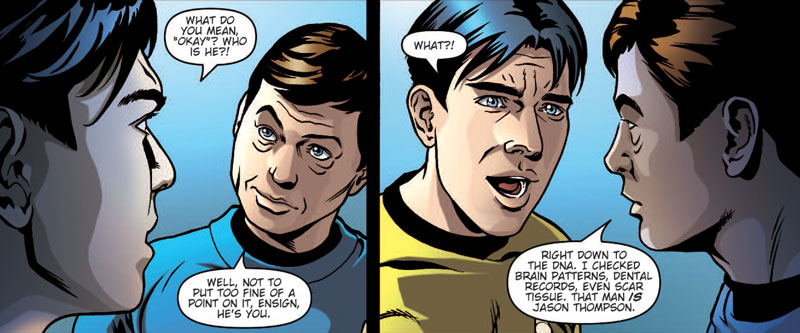
How would you feel if you came across yourself… (click to enlarge)
Federica Manfredi completes the artwork for the series, and while there are still issues with some of the faces and poses, she has channeled her talents and has given the issue a feel like an original series episode. Her best work in the issue is when she is given license to imagine the actors on the set of the original series during a television production. Those panels stand out as the strongest and most memorable in the issue.
Andrea Priorini and Arianna Florean provide the color work, with assistance from Chiara Cinabro. Like the other issues in the series, the team does a fine job of evoking the original series feel, and has the added bonus of being able to portray a flashback sequence in a different light to make it stand out. Robbie Robbins finishes off the lettering for the series, getting to create several sound effects through the issue. The piece of work that stood out in the issue is a grunt of pain by Thompson that escapes from the confines of the word balloon, giving more depth to the pain.
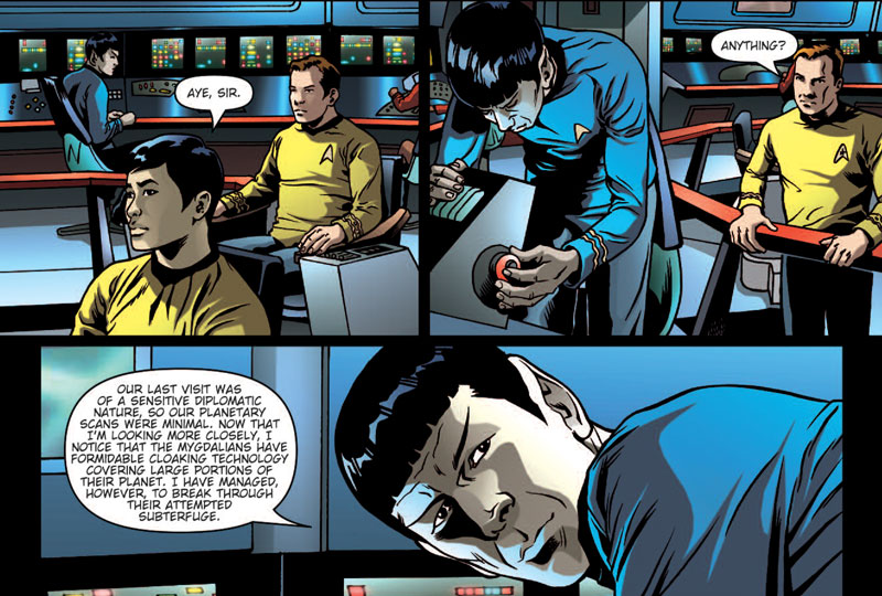
Spock’s science station has all the answers… (click to enlarge)
The issue comes with two cover variants, the main cover portraying a classic pose done by Joe Corroney, and a retailer incentive presenting what appears to be early (and just inked) basic cover drawing from the A cover. The cover focuses on Kirk and McCoy in classic poses underneath the Enterprise.

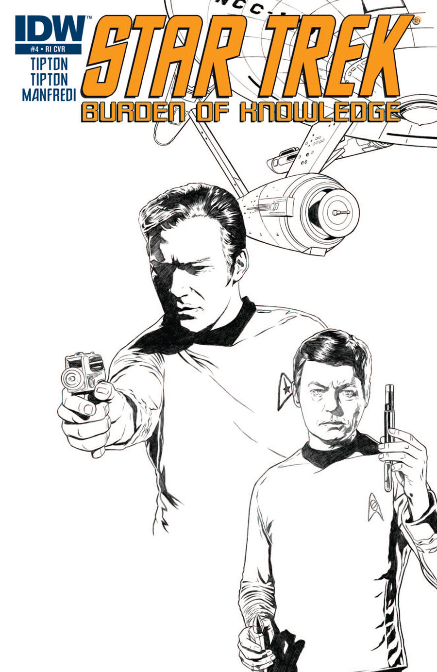
Covers for "Star Trek: Burden of Knowledge" issue 4
(click to enlarge)
The first three issues of this series appeared to present one-off, stand-alone stories, but the final issue tied everything together in a satisfactory method, while presenting an unusual moral question of the variety often tackled in the best of the television episodes. I previously compared this series to the first IDW miniseries, "Star Trek the Next Generation: The Space Between" in that respect. "Burden of Knowledge" accomplishes the goal of stand-alone issues far more effectively than IDW has managed before with their Star Trek line, adding another notch to the Tipton Brothers’ belt and giving yet another reason to keep reading their Star Trek work.
Burden of Knowledge 4 available now
Star Trek Burden of Knowledge #4 retails for $3.99 and was released Wednesday September 22nd. You can buy it and the three previous issues at TFAW.


PREVIEW: DECEMBER STAR TREK COMICS
The art work is some of the best I’ve ever seen in a TREK comic series.
“Something has gone wrong, the page you’re looking for can’t be found.” – spock_at_science_station.jpg
It annoys me that for a TOS comic series, where they could (SHOULD) have used the TOS Tellarites and Andorians, they have to use the crappy ENT versions.
#3 – So they should draw now cheesy 60’s makeups?
@2 – Image fixed. My fault. Forgot to upload it.
#4 – Yes. Yes, they should.
#6 – Why? Chances are any new films & series will use similar (modern) makeups.
The modern design of the Tellarites is simply stunning, in my opinion, and I couldn’t be more pleased to see it depicted so accurately here. I, for one, won’t miss those cheap pig masks!
#8 Agreed
They’re still the same old Tellarites. In Enterprise, they looked really cool and very believable as a race, but in TOS you could so easily tell it was simply a mask.
Why would you want that back?!
3
Is there ANYTHING you DON’T complain about? I mean seriously, these comics are supposed to be fun! As long as a Tellarite looks like a Tellarite, it’s all that matters. And besides, why should we expect all Tellarites to look exactly the same? Humans have various skin colors, facial structures and other (slight but noticeable) differences.
The nitpicking that goes on this site must drive Anthony bonkers at times.
“makeups”?
TOS purist’s remarks are just plain sad.
Speaking of which, the artwork is really ace, a lil bit of artistic license never hurt nobody.
Mygdalians? 101 Mygdalians? Starring Glen Close as…….
#9: Despite the better makeup (sometimes), a lot of the “soul” to the writing simply isn’t there. Same with a lot of the rest of HOllywood…