
 Today Cryptic has announced the winner (and runners up) of the Design the Next Enterprise Contest. Check them out below, plus a video showing off Star Trek Online’s new Section 31 uniforms. All that plus the latest STOked podcast.
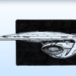
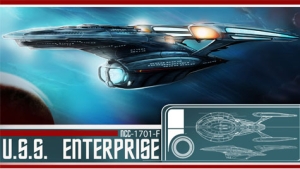
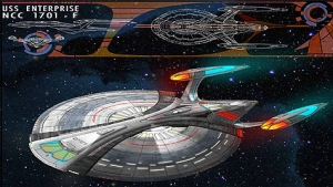
Star Trek Online’s New Enterprise
Cryptic turned to the fans to help create the next Starship Enterprise to be used in Star Trek Online. The winning entry was created by Adam Ihle. Here it is.

Winning entry
Here are the first three runners up.
2nd Place –
by C. Calloway
3rd Place –
by D. Shick
4th Place –
by JM Trexler
Visit startrekonline.com for full list of winners and runners up.
New Section 31 uniforms
Officially Section 31 doesn’t exist so it seems kind of ironic that they would have uniforms, but maybe it is one of those things where you have to be in the know. Regardless, Cryptic has added new Section 31 uniforms, available now in the C-Store.
STOked: Podcast Summit Highlights
The latest STOked shows off highlights from the recent STO Podcast Summit.
cool design!
Would like to see more pictures!
We still have insurgents in the 24th century? The Patriot Act must have lost its effectiveness.
Ugh. Well, they’re certainly not giving me any reasons to restart my subscription to this awful game.
Which one, Gorn Captain? I like 2nd place better.
I like it. Beefed up, yet graceful design that looks familiar. Bring on the renders! :D
How do you get from the primary to secondary hulls, and vice versa? (See: Oberth problem.)
Ok, maybe im just getting old,,,,,,
But what happend to when Star Trek starships looked sleek, graceful and majestic??
They look like Borg assimilations .
I so miss Matt Jeffries and all the original designers and consultants.
The winning entry has a mix of all the famous starships in Trek-lore. Very Impressive indeed.
Very good. I like all of them!
As a side note, I hope STO goes free-to-play like Champions Online. Has anyone heard how free-to-play Champions Online is working out for Crypitc?
Yeah, not sure I really like the first place one but maybe better when put into 3d. I liked a couple of the runner ups much better and a few really good ones that didn’t even make it to the final choices?
To me it looks more like a step back, somewhere between the Ent-D and E maybe.
I must be getting crotchety in my middle age, but I agree wholeheartedly with # 7 (Dave Thornton).
Ya just can’t get any better than the Andy Probert Motion Picture redesign for beauty and grace!
Just my two cents, people.
I don’t like the winner. It looks bad.
If you ask me, fourth place looks like what an Enterprise SHOULD look like.
Even the New Movie Enterprise; (Exterior) with modern C.g.I. ,
never Once (NOT ONCE) looked as beautiful and elegant as “The Motionless Picture” U.S.S. Enterprise did.
This game was a huge disappointment. A shame.
These are all nice work, but one must keep in mind that they are all variations on Matt Jefferies’ original design concept. A concept, I must add, that has stood the test of time.
BTW, my favorite of the above entries is the 4th place one.
@7:
No, you are not getting old. Because I am under 25, and I’m wondering why all the Enterprises are getting fatter and webbier with each decade. I totally agree with #12–the 2009 movie Enterprise was my favorite next to the original.
1st and 2nd look pretty good
I like 3rd place the best, at least they are trying to establish some design lineage towards the Enterprise J from Enterprise.
Ugh, they’re all pretty poor. Agree with #19 in that at the very least there’s some design lineage (although the J didn’t look like a particularly pretty ship.)
Just looking at the silhouette for the first place winner shows why it’s a bad design–it’s heavily imbalanced, and lacks clear lines for the eye.
They all feel like they belong in Star Trek Online – which is a bit of a visual hotch-potch as it is. I find them all a bit meh, but then there’s only so much you can do with a saucer, engineering section and two nacelles that hasn’t already been done many times. Like some other folks here, the TMP refit is the pinnacle of Enterprise design for me and I’ve really not seen a design that I either liked nor felt was in any way doing anything interesting since the Enterprise D.
Certainly the Enterprise E was one of the contributing factors in my lack of enjoyment of the Next Gen movies. It’s just so bland.
My opinions:
The winner: awful, probably the worst design for the Enterprise I’ve ever seen (except for the “battleship” Enterprise I saw floating around some years ago). It takes the worst aspects of the Enterprise-D (my least favorite), and exacerbates them.
Second place: stubby looking, but okay.
Third place: Enterprise-J much? Still, seeing as it’s transitional, maybe that’s not so bad.
Fourth place: An acceptable amalgam between the Sovereign and Intrepid classes.
My rankings of favorite Enterprise classes:
1. Sovereign class
2. refit Constitution class
3. ST2009 Constitution class
4. original Constitution class
5. NX class
6. Excelsior class
7. Ambassador class
8. Galaxy class
The official site has a load of other runners up.
http://www.startrekonline.com/node/2415
They’re all equally bland an uninteresting, that is to say that the couple that do do something interesting and unusual break the silhouette so completely as to be unrecognisable as the Enterprise.
That said, I quite liked J. ‘Vector’ Lee’s:
http://www.startrekonline.com/enterprise/gallery?share=1335
Of the runners up, this is the one I would have chosen:
http://www.startrekonline.com/enterprise/gallery?share=869
Clean lines, well balanced
That is quite nice, actually and sits quite well between E and J.
I like both J. Vector Lee’s and Chris Madden’s.
I also like this one:
http://www.startrekonline.com/enterprise/sites/default/files/imagecache/preview/shawn_weixelman_1701f.jpg.
The shuttle bay has a cool Syd Mead look to it.
I am not disappointed in the winner. I think everyone that entered would have given their best. However i am disappointed that it was selected by cryptic as the winner while some really nice designs were overlooked and that’s just in the runners up.
It wasn’t really selected by cryptic it was selected by paramount. Thats how I understand it anyway and why it took like a month longer than it was originally planned…they didn’t like them.
26. Yeah that was one of the nicer looking ones, though I wasn’t sure about it as an Enterprise…and it didn’t even make it into the top 25… :(
Went back and found one of the Eaves/Perpetual designs I kinda liked.
http://johneaves.files.wordpress.com/2010/04/fed-starships-11.jpg?w=655&h=355
stupid idea that section 31 has ‘uniforms’ ^^
That won??!! WHY?? its so ugly!!! =(
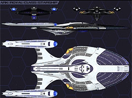
Chris Madden’s design is really wonderful, IMO.
http://www.startrekonline.com/enterprise/gallery?share=869
Of the ones shown above, I also think the 3rd place one seems most logical. It’s looks like something between the E and the J.
24. 4 8 15 16 23 42 – May 6, 2011
I agree with you guys who have mentioned Chris Madden’s. How the hell did that not win? It’s absolutely stunning. It somehow manages to subtly tie together the essence of all the ships without looking completely cobbled together….unlike the ship that actually won. That ship looks like it was just put together with used parts from the older ships. :/
Crapola.
At least the design looks nothing like a “Hot Rod”. Freaking Trek09.
Fourth place is amazing! Looks so confortable!
4th place was better by a LONG shot.
Wow, I REALLY hate the winning entry.
Who judged this?
Chris Madden’s ship… my god, Paramount ouught to take a look and that I think about doing a new series using that design!
Chris Madden’s Enterprise-F is the best and most beautiful Enterprise-design I’ve seen since John Eave’s Enterprise-E. Okay, Andy Probert’s and Richard Taylor’s TMP Enterprise is above everything, but Madden’s ship come very close. His artwork is stunning as well. If someone would ask me, his design should be the next tv-Enterprise – when a new show will be produced one day.
I can’t understand the judges and their decission – but if you look at the STO-starship-designs produced for that game, then you know someone has a very bad taste anyway.
@ 7 Totally agree.
No disrespect to the designer, but I think it’s horrid. A crude mashing together of the D & E.
I don’t know why they couldn’t hire someone like John Eaves or Rich Sternbach to design it instead of the public.
@24
Yep, by far the best design on there.
Congratulations to all! I can’t wait to see the finale model for the winning design.
Chris Maddens design is stunning…use it for a tv show please
Sorry, but the Original Series design was perfection. Anything else is just a step down…IMO, of course ;-)
Again I repeat: How does one resolve the Oberth problem with the first-place version? Those twin struts do not look particularly efficient as a means of conveyance if one has to go between hulls.
Does anyone think these things through in such manner anymore, or is it simply a matter of pure aesthetics?
http://www.startrekonline.com/enterprise/gallery?share=869
Best one. The Winner one is fugly as susan boyle
Who picked these? J.J.’s designer?
Chris Madden’s all the way. It is graceful, elegant, stunning. Definitely a ship worthy of the name Enterprise. I want some 3d renderings and meshes of that ship.
At least STO is not canon, right? Never played it so I wouldn’t know.
Darn, I was hoping to get an early reply to this. But please vote here whether you like the winner or not:
http://polldaddy.com/poll/5022933/