
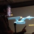
 Our friends who conduct the Starship Smackdown panel (a perennial favorite at SDCC) were surprised to have famed astrophysicist Neil deGrasse Tyson stand up from the crowd and talk about the greatness of Star Trek’s of the USS Enterprise. Watch the clip below..
Niel deGrasse Tyson talks USS Enterprise
Tyson speaks the truth…
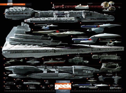
The poster Tyson was talking about was this Starship Smackdown created for SDCC by Geek Magazine.
Thanks to Fibbs1701 for video
Looks like Brandon’s video allowed it to be used here. Good job, Brandon. :)
My wife and I were there for the panel, as is my SDCC tradition, and this was a FANTASTIC way to end Comic-Con.
I’ll remember this for some time.
Love that poster.
New Enterprise is bigger than the star destroyer
Way to go Tyson!!!
I’ve often thought of it the same way. Both aesthetically and scientifically, from the matter-antimatter engine, to the transporter, to the viewscreen NOT being a window Matt Jeffrey’s Enterprise was an incredible leap forward in real world thinking and changed how space ships were presented on the screen. His Klingon D7 wasn’t too damn shabby either.
Another reason Neil deGrasse Tyson is the REAL “most interesting man in the world.”
“It’s a beautiful lady, and we love her.” :)
Hear, hear.
Can we get this man on Trekmovie? I love to hear him do a talk on this on this site.
All I ask is for a tall ship and a star to stear her by.
The Enterprise looks like a futuristic cruise ship, instead of a battleship. It could be home and for me that’s what’s so attractive about it.
Like McCoy said: “You treat her like a lady… and she’ll always bring you home.” (TNG: “Encounter at Farpoint”)
#3 – Um, no it’s not. Not even close. Not even if you use the over-sized dimensions the ’09 ship supposedly has.
Meanwhile, in reality–great video! As always, Tyson’s geek cred shines through!
I always felt the Ent-D looked like a cross between a Chrismas tree and a duck. Look at the bill on that thing. It’s just awkward looking. Clumsy. Not sleek at all.
Now the Ent-E was a worthy successor to the original TMP design.
The best, though, was the TMP design, used throughout the entire TOS movie series, of course.
Enterprise E is ugly… looks more dated today than any of the other main ships I think (bad CGI in Insurrection doesn’t help). The D is sleek and curvy and looks like something beyond just imaging our own technology today updated 300 years in the future… the E has too many doodads and looks squashed. I don’t like how the saucer starts to merge into the secondary hull like Voyager… I like my ships to have some neck! Love the original and the D.
JJ: Turn it into a Hot Rod.
I agree wholeheartedly with Mr.Tyson. The original TOS Enterprise and her Motion Picture successor are both elegant and functional looking. I never tire of gazing at them.
The original Enterprise and the motion picture version are elegant and iconic. And the 1960’s Enterprise is still one the best ‘spaceships’ to grace the the television screen.
That’s why they keep using the basic design…over and over.
No bloody A, B, C.. or.. D.
i thin k the enterprise d looks nice
I love Tyson. He’s the best thing to happen to popular astronomy since Carl Sagan.
How do I get Smackdown to use MY poster?
‘…everything else is derivative’….
So true.
I hated the D when I first saw it, but over the years I learned to like it. But it, like it’s crew, isn’t in the same league as the 1701 or the refit. My list is:
1a. 1701 refit/1701-A
1b. 1701 original
2. JJPrise (I know, the nacelles, but I loved the mixture of TOS and Refit designs/color scheme)
3. 1701-B (always loved the Excelsior; I remember being a child and seeing TVH in the theatre and telling my Dad they were going to get the Excelsior)
4. 1701-E (like a previous poster said, it’s a logical evolution of the Connie)
5. 1701-D
6. 1701-C (again, logical bridge between the Connie and Galaxy class; I wish we could’ve seen more of this design)
I like Tyson, except for helping demote Pluto :)
My wife and I met Dr. Tyson last week while dining at our hotel restaurant near the San Diego Comic Con. A few others nearby recognized him and he was gracious enough to interrupt his own dinner and pose for pictures for us. He wore a fedora and khaki shirt, and I’d joked with him that at first I mistook him for a very good Indiana Jones cosplayer. He laughed, and he even said a goodbye to my wife and I after he’d finished his dinner.
As a 15 year member of The Planetary Society, this was a real geek-out moment for me. Tyson is a very gracious man with a great laugh. Meeting him was both a thrill and a genuine pleasure.
;-)
# 23
If Pluto’s a planet? Then so is Vesta, Ceres, Sedna, Eris, etc. etc. Kind of opens a Pandora’s box (Pandora the myth, not the Avatar planet… hee hee!).
I think demoting Pluto was good for the overall health of space science as it takes sentiment out of the equation. Although I have to admit I dislike Pluto’s current status/name of ‘dwarf planet.’ How about ‘planetoid’; sort of a halfway point between a planet and an asteroid (and a term used frequently on ST)?
Oops! There I go being sentimental again…. ;-D
#25
I agree. Wasn’t too fond of the demotion at first, I admit, but once I heard Tyson’s reasoning behind the decision it made much more sense. And yes, planetoid does sound better than dwarf. The latter sounds like Dorf Goes to the Outer Rim. ;)
By the way, very jealous that you got to meet Dr. Tyson!
As for the Enterprises shown above, the C is my least favorite design. I’m sure they did it on a budget with some serious time constraints, but I can’t help but wince a little when I see it. So chunky and thick through the middle. Like something a librarian would drive.
# 26
Vultan~
Normally, I’d hate to interrupt a celebrity eating dinner for a pic or an autograph, but Tyson just got right up to pose for pictures for everyone without a second thought. After the pics, no one bothered him again. But as he got up to leave a while later, he stopped and said goodbye to my wife and I. That was VERY classy of him.
And yes, I was very geeked out afterward…. ;-D
Some of the scales in this poster are way off. The EDF Yamato is too big. The reimagined Galactica is way too small.
#27
Every interview and speech I’ve seen of his I’m amazed at how, forgive the pun, down-to-Earth he is. Really liked the speech he gave about space funding last year. He sounded borderline angry about the situation—as we all should be.
How was Comic-Con? I’ve never been but have considered in the past few years. Is it really that crowded and poorly coordinated/managed?
Watched it as a kid on the ol’ television screen in the early 70’s and this reminded me of how impressed I was, how different it looked to anything else I had seen. And to my mind that made it more real, if that makes sense. I guess I figured who would come up with that odd design just from imagination.
Too bad Matt Jeffries can’t hear this…
Mr. Tyson is correct. Everything else is derivative.
But um, where is the SDF-1 on that chart?
I’ll always love the refit/-A Enterprise, but I kind of understand why the ‘neck’ section was phased out. I mean, if you wanted to hit a weak point on the ship, you’d go for the neck! I actually rather like the Enterprise-C. It’s an intriguing combo of the original/refit/-A Enterprise and the Excelsior, to my eye!
Been a TREK fan since the beginning, but have always thought the design of the Enterprise was disappointing. The design is all over the place with three sections of the ship: the saucer, the nacelles, and the lower section not uniform at all. Its like three design teams worked on the ship and never compared notes. The worst design element is how the pylons attach to the lower section of the ship How the pylons attach seem unnatural and ackward, unlike birds wings which attach to it’s body gracefully and believeably. Later designs of the Enterprise have improved on this flaw, but still don’t completely work for me. I had thought ST ’09 would have corrected this, but they only made things worse.
#34 You should do some reading about the designing of the Enterprise. A lot of thought went into the design, such as placing the warp nacelles as far from crew quarters as possible because of the incredible energies being manipulated there, etc.
It’s a very smart, well-thought out design that has held together for 40+ years.
Never liked the Star Destroyers, Darn ugly. Blahh!!
# 29
Vultan~
Comic Con was crowded; as always. You can’t just make 130,000 flow well into a convention center without bottlenecking, pushing or shoving. But the security did a fair job of crowd control (even if they were IMO unnecessarily bulldog-ish about taking zoom shots of some of the celebrities).
It was a lot of fun. But as my wife pointed out, it’s not the scheduled events themselves, but rather the little cool, unexpected things that happen that REALLY make the convention fun (like running into Dr. Tyson at our hotel restaurant, or sharing a table and a nice talk with “Six Million Dollar Man” star Richard Anderson). Those are the moments that aren’t planned, but make Comic Con so very worth it….
It truly is a Geek Christmas/Mardi Gras.
26… Pluto and the others were called Dwarf Planets because of the precedent of other smaller versions of astronomical objects being called dwarf versions, i.e., Dwarf Stars and Dwarf Galaxies.
Re: comparing the TOS Enterprise to the refit. I was under the impression that Probert worked with Jeffries’ Phase Two refit concept. A lot of Jeffries went into that design. I consider it a Jeffries ship as much as a Probert ship, and I also consider it an improvement, aesthetically.
The Destiny from Stargate Universe is the Greatest Ship EVER created in Sci Fi!
#40 I agree wholeheartedly…Though the ancient battleships were right there with it!
So sad that there isn’t any stargate left on TV….Hopefully someday it rises again!
40. That slice of pizza looked like crap!
I can’t see the names of the other ships… I don’t see anything from Babylon 5 on there. I always thought the design of some of the ships on that show interesting, especially the Vorlons.
@15: … Your point being? Hot rods are awesome.
@43: Seconded! B5 had some amazing ship designs — I loved the clunky human ships with the spinning sections for gravity.
# 38
I know; but ‘dwarf planet’ just doesn’t roll off the tongue like ‘planetoid.’ ;-)
#45
How about “junior planet”? And you have to say it like Sean Connery.
“June-yuh?!”
#35
I can appreciate that a lot of thought went into the design, but to me the end result of all the varying elements and shapes of the ship just don’t work together organically for me. Later designs have improved upon it, but I still maintain, how the neck and pylons connect to the saucer and lower section of the ship, just don’t work as a whole for me. Makes the ship look like a “toy” rather than an actually ship.
47. Considering the mechanics of how space warp works in the Trek universe, the nacelles make total sense in terms of design and placement. The saucer, being able to separate, also makes the neck logical. Would you have prefered the wacky ringed design that we saw a glimpse of in TMP as a painting (or whatever that was)? Jeffries’ design set the standard for sci-fi spaceships that lasts until this day.
I met the man who discovered Pluto, Clyde Tombaugh, and his wife, on a dinner cruise for students in 1991. I wonder if he and Tyson ever met… would have been many years before Pluto’s reclassifacation. So, I’m sentimental about Pluto myself. Tombaugh was a gracious and kind elderly man at the time, and he and his wife seemed like very warm and genuine people. Seems like a lot of these luminaries are astoundingly kind and gracious with the public, which is impressive.
check this out…
1701 Prime Alternative:
http://www.mediafire.com/file/54wybly9vowxxe3/PrimeAlternative_HD.wmv
early internal lighting “Test” vid was acquired from the build FX studio shared file site –
The 1701 Prime Alternative is a state of the art Three foot SFX Model
built by a veteran ILM model builder over the last 2.5 years—
Designed* by two ST fanboys, one in CA and one in Fl; by borrowing* design cues from all the Big Es + a little Kelvin, and then infused them into the great Matt Jeffries original design architecture.
works for me…
Anonymous –