
 The creative folks at QMx have announced a couple of exciting new Star Trek products. First up they are finally ready to take pre-orders on a replica of the Starfleet Academy ring from the new JJ Abrams movies (and it’s only $20). They have also revealed the latest set of cool retro posters for the original Star Trek. Check out all the details and images below.
QMx Starfleet Academy Ring Coming In June – Pre-order now
QMx is finally ready to release an item they announced back in 2010. You will now be able to show your school spirit with a replica of the Starfleet Academy ring. According to QMx it is a 1:1 scale, screen-accurate replica of the actual prop worn in Star Trek (2009). The ring is made of a high-strength, scratch-resistant metal alloy that simulates the sheen and brilliance of polished sterling silver.
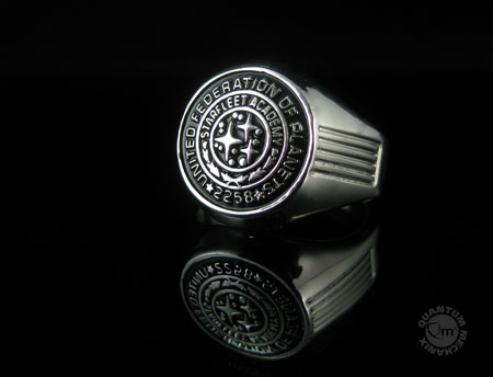
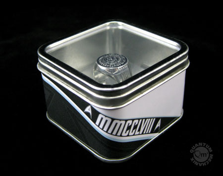
This gleaming collectible comes in a custom metal case with a clear topside window and sits in a floating vacuform stand, ready for display. The prestige of Starfleet for just $19.95. The ring comes out in June and you can pre-order one from Entertainment Earth.
The ring is for the class of 2258, so it could be worn by James T. Kirk, Dr. McCoy or Uhura. While they are promoting it as a replica from 2009’s Star Trek, you can also seen characters in Star Trek 2009 with the ring, including the ‘father’ (played by Noel Clarke) and Scotty.
Star Trek TOS retro posters Set #6 arrives Late January – Get On The Waiting List
Quantum Mechanix has also announced the sixth set of four retro posters for original episodes of Star Trek. This time designer/illustrator Juan Ortiz takes on "Miri," "Mirror, Mirror," "The Tholian Web," and "The Savage Curtain."
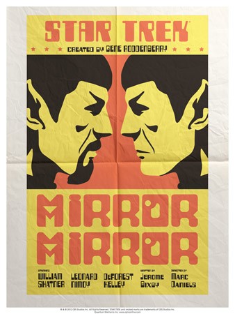
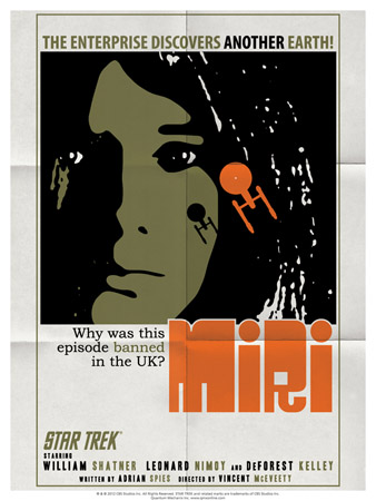

The Star Trek: The Original Series Art Prints – Set 6 consists of plated-printed lithographs on 100-pound, aqueous-coated, satin-finish paper. Each print measures 18 inches x 24 inches. The set and all others in this series will be available for a limited time only. None will be repeated or reprinted after they’re gone. The set costs $34.95 and will be released in late January. You can sign up for the waiting list at the QMx site.
Cool posters. Thing about the rings: Only d-bags wear class rings. It’s true.
Miri was banned in the UK?
Why WAS Miri banned in the UK??? (Didn’t know that fact until now!)
@3: If memory serves, “Miri”, “Plato’s Stepchildren,” “The Empath,” and “Whom Gods Destroy” were all banned in the UK because Trek was viewed there as a children’s program, and those episodes were deemed too intense for children.
I think they eventually were shown in the 70’s in UK Trek conventions. It must have been amazing to see completely new (to them) episodes years after the show went off the air!
with Miri i beleive there was a squeamishness about the relationship between Kirk and the elder girl (not that there was anything to be squeamish about).
If i recall all episodes have since been shown on the BBC in the 90s
Any word on whether or not America will get the JJ Enterprise model kit that’s supposed to come out in May? I read on another site that it’s being produced by a different model-maker than the one that produces for American markets.
I kinda like that ring. Granted I’m not one to wear uniforms or anything but I’d display it and then probably wear it on halloween when I’m a JJUniverse red shirt zombie. It does look great though, like something you could get away with wearing as an actual ring every day.
If I am a giant head, and I have a starship coming in to my face, I think the last thing I would be doing would be looking at anything but that ship. Just saying.
I like Mirror, Mirror and Miri. The Tholian Web could have used a web in its design. And you have my opinion on the Savage Curtain.
Abraham Lincoln: [interrupting] What a charming negress. Oh, forgive me, my dear. I know that in my time some use that term as a description of property.
Uhura: But why should I object to that term, sir? You see, in our century, we’ve learned not to fear words.
Uhura = Class.
7. Colin
There IS a web in the design! But poorly executed. : (
1. Caesar – January 8, 2013
Cool posters. Thing about the rings: Only d-bags wear class rings. It’s true.
*****************
Well duh! It’s not designed to be WORN, it’s designed to be dropped in glasses of water, tearfully!
*LOL*
I was thinking “Wow, only 20 bucks, that’s cheap! Then I realized I would never wear it, and I didn’t purchase a ring from my college or my high school because the only physical things I need from either are my diplomas and transcripts *L*
7. Colin Lindsly – January 8, 2013
If I am a giant head, and I have a starship coming in to my face, I think the last thing I would be doing would be looking at anything but that ship. Just saying.
*****************
Somewhere, there could be a hippie going, “Whoahhhhh mannnnn…I remembered the time I played space-chicken with Abraham Lincoln. I was driving my starship right towards his eye, and that dude didn’t even BLINK man…he wouldn’t even LOOK at me.”
Speaking of QMx, whatever happened to those animated character maquettes? I remember them releasing a picture of the Kirk one like 2 years ago, and then…nothing?
@8. rogue_alice – January 8, 2013
Uhura = A glorified telephone operator who knows her place. It’s great to know that by the 23rd century, we’ve finally tamed the savage.
Yeah, I know their hearts were in the right place, but that scene with Lincoln is pretty naive and makes me cringe a bit. Roddenberry’s utopian view of the future is incredibly simplistic, and I think the reason I’m such a DS9 fan is that the ignored most of that silliness.
And to get back on topic: I love these posters, especially the Miri one.
Miri was banned in the UK. So were several other Star Trek episodes, and scenes were cut from others. From Wikipedia which is sourcing the UK’s Star Trek Action Group newsletters:
“… [when] ARENA was cut, they removed all references to the ingredients of gunpowder. In a letter Theresa H received [from] Caroline Mackersey said, ‘Arena was minimally edited because it is not BBC practice to show the exact process by which gunpowder is made. This is to prevent the children emulating their heroes.'”
@14. That’s particularly funny considering how Benny Hill had to be cut for U.S. audiences.
Danm, I just dropped by Starfleet Academy ring in a glass of what. Guess I don’t know my own strength anymore given all the genetic medication that I’ve been taking.
“water”
Graduates of US and most other nation’s formal military academies wear academy class rings. National military academies are fairly exclusive universities–no doubt Starfleet Academy is as well.
This is so much a “thing” that non-academy officers (ROTC, direct commission, etc) and enlisted personnel often refer to academy graduates (semi derisively) as “ring tappers.”
Of course the ring tappers know this and make a point of flaunting them. So it does cut both ways
@13 Amorican
Actually, it’s quite a proud moment in history, our human, prejudiced history that an African American woman was able to get an iconic role on a forever iconic show that addressed issues of morality and humanity still relevant today.
For that time in our history, Star Trek WAS revolutionary. If you want to compare Uhura to telephone operator, then okay, I see where you’re coming from. I supposed she might have had similar feelings at once because she considered leaving the show…before MARTIN LUTHER KING begged her to stay–as she was a model for women and minorities alike. Also, she did more than Rand and a lot of the other useless eye candy ever did.
…..telephone operator…psh!!
Uhura= You Wish You Were This Awesome.
http://tos.trekcore.com/gallery/albums/publicity/uhura/uhura_vintage_pb.jpg
# 19 Lizardgirl- I am with you.
It takes more courage, in my opinion, to believe in and advocate for a better future than to criticize hopefulness and settle for the status quo. Even at the risk of being called a dreamer. Change doesn’t come from naysayers.
Thank you Gene. We need the light in the darkness more than ever.
And yes, that last sentence works on both levels – as the sentence reads, but also as a reference and a concern about JJ taking Trek into darkness (despite Burke’s comments).
THOLIAN WEB poster looks great … except for the ‘directed by Herb Wallerstein” part.
Ralph Senensky, TREK’s most consistent director, shot the first 3 days on the show and was fired for being a few minutes over schedule. Pretty much everything good in this show is his, and Wallerstein is probably what keeps the show from being a classic. Remember, Wallerstein is the same mug who directed Shatner to leave a scene in TURNABOUT INTRUDER by heading in a direction where THERE WAS NO DOOR … The Shat did it right, leaving the set, then continuing right off the stage.
I suppose I could crop out the bottom of the poster … naaah.
Love, love, love the posters.
Starfleet Academy ring?
Go ahead, try picking up chicks in a bar wearing THIS thing!
You’d end up going home alone, drunk, and playing with your captain’s log!
@4: A 50 yr old UK TOS fan writes….. Miri was actually screened once on the BBC (I remember watching it when I was 8 or so) and then it was subsequently banned because of it’s horror-factor for a family TV slot. Kirk’s relationship with Miri had nothing to do with it. The other three eps were specifically banned on first screening rights because of their themes of torture and mind control. So us UK fans had to make do with the Blish script adaptions for quite a few years until we finally got to see screenings at Trek cons in the mid to late 70’s. So you can imagine how excited we were to finally see what for us were brand new unseen TOS episodes!. By the 80’s the BBC relented and all 4 eps were screened during repeats of the series.
Posters look great, really in the spirit of classic 2-colour silkscreens. As usual, as a designer myself, my only quibble is anachronistic fonts.
Miri poster: Myriad Condensed is a 1990s typeface (top line of the Miri poster), and Bookman was more of a newspaper headline font (as used by the New York Times). Much more common to see various weights of Franklin Gothic for secondary text, if not hand-lettering.
Tholian Web: Mishmash of eras. 1920s-30s Art Deco type at top, more authentic B-movie-poster hand-lettering in the middle, then 1890s UK subway typeface (P22 Johnston) at the bottom, which wasn’t available outside Transport for London’s sign shops until P22 released a digital version in the 1990s. You’d never have seen this combination in the 1960s.
The Savage Curtain: I don’t get the use of the Russian-style constructivist font (also by P22), as it has little to do with the episode. The digitally stretched and distorted type is a really 1990s thing; an authentic poster would have *possibly* done some optical effects, but the print quality was not such that you could get tiny, thin type to come out looking like that, plus it wouldn’t really be readable from a distance outside a movie theatre.
I do applaud the effort to get the retro aesthetic, but a little bit of research would have really put these over the top.
Mark Simonson, designer of the typeface Changeling, which was used on the bridge displays in JJ’s Star Trek movie, has an entire series of blog posts about the use of anachronistic typefaces in movies and TV shows, and it’s instructive for set designers and graphic designers who want to maintain the suspension of disbelief. Not that hard to go into libraries and find microfilms of period newspapers, and Google Images can find tons of period posters for reference.
And it’s not that hard to find authentic-looking B-movie poster fonts (if you avoid those horrible free-font sites), for instance, use ‘B-movie’ as a search term at MyFonts to find some great ones by TypeArt Foundry.
(counting the minutes till this comment gets deleted. If it is, could one of the mods please email me and tell me why?)
I like the ring! And I like that it’s available at a reasonable price so I’ll get one and display it with some of my other memorabilia. I liked when they released a static prop of the STXI phaser for $50; that’s doable. It looks great with its display and has the right heft. I wish the same company would make a whole line of similar static props for all of the Trek phasers. I would buy all of them at $50 a pop.
25,
That’s possibly the most informative post I’ve ever seen on this site (maybe just about any other site, either.) Thanks very much!
other TOS news … just got all three seasons on blu ray at deepdiscount for about 80 bucks! it ain’t never that cheap USED …
27 – kmart. Glad to be of service.
I actually saw Miri and The Empath together on VHS in the UK in the early 1980s. I would have been about 9, so say 1983-84. They were marketed in the blurb on the back as ‘banned’ episodes, if I remember rightly. This was the era when buying movies or TV shows on VHS was still ridiculously expensive and we were still reliant on small (pre-Blockbuster) video libraries to stock our top-loader recorders! We picked up the episodes a week or so after hiring TMP. We enjoyed Miri and The Empath a great deal more than TMP, I have to say! Different times…
#25 Thanks for letting us know how you feel and educating the internet masses with an overt display of your ‘specialist’ knowledge. Perhaps these posters are merely meant to be conceptual rather than intended to stick to a specific time and place. Why is it a problem that a poster uses Myriad Condensed if it isn’t attempting to lock itself down to an era in the first place? Perhaps your over-exposure to these fonts makes them jump off the page at you, which is fair enough, but perhaps you could ‘applaud the effort’ on a dedicated blog of your musings.
In any case, these posters appeal to me, though perhaps ‘Mirror, Mirror’ and ‘Miri’ to a greater extent than the others. Perhaps it is my negative association with ‘Tholian Web’ that makes me dislike the poster more than I should (it was one of the weakest TOS episodes in my opinion). My wife will never let me have these up in the house (or she’ll slyly remove them from a wall and hide them behind a wardrobe while I’m out), so perhaps I could justify one of these in my office.
‘Specialist’ knowledge is often the only way general data in history avoids becoming oversimplified and/or error-ridden. The information he offered IN THE CONTEXT OF THE 60s is quite valuable, and points up the kinds of errors introduced when folks are only using a little bit of information instead of researching thoroughly.
If you don’t have specialists looking at trek history, you’ll wind up with what we nearly have already: ‘print the legend’ type journalism that has folks believing Klingon blood color in TUC was based on ratings concerns, when in fact it was entirely plot-driven.
#24 Your summary of why those episodes were banned in the UK ties in with my recollections as to the reasons behind the BBC’s decision although as you point out, they were subsequently screened when TOS moved to a 6pm slot on BBC2 in the early 80’s (in contrast to its predominantly mid-evening slot on BBC1 throughout the 1970’s).
As a now near 50 year old I remember huddling round the TV screen as a boy in the early 70’s and counting down the minutes to when the preceding show (e.g. Z-cars etc.) would finish and Star Trek would at last, begin. Curiously the BBC took the approach back then to edit the opening titles to play before the teaser. Memories indeed.
#30 Thanks also for the memories. I too remember watching these hitherto banned episodes on Betamax (would you believe) videocassette around 1983.
31 and 25
25 I enjoyed your comments on the posters I also have some experience in this feild and Its not very often that you get to have a conversation about the finer points of typface and how it can be used and misused. The history of poster art is facinating. What I didn’t understand was your concern over being deleted until I read down to comment 31. Why on earth would someone become so offended by learning something new that they would actually complain about it.
34, This is not a criticism, but that last sentence might be a little naive (unless it is meant to be sarcastic.) Some people reject new scientific findings so vigorously that they will pull their kids out of school to keep them from being unduly influenced by the teachers disseminating the new knowledge.
kmart, thanks for the tip on the TOS complete series on blu-ray for $81 on deepdiscount. I never thought I would be able to afford these. Wow, what a deal!
Thanks dude!!!!!
I am totally with you, #19 Lizardgirl!
Uhura/Nicholls did a lot in inspiring and encouraging people, as has been reported and witnessed first hand.
#33 – Funny that you mentioned “Z-Cars”. That has been mentioned as one of the inspirations for “Hill Street Blues”.
#21 – From what I can recall, even though the great Ralph Senensky was replaced by Herb Wallerstein, “Tholian Web” still went a day over schedule. Senensky was offered a co-director credit, but turned it down.
#36
Now the price is $97.
That was like the Bond 50 BR set … as a special Amazon had it at less than a hundred bucks, and then suddenly it jumped up fifty bucks and now it has been back over 200 for several weeks.
Apparently they didn’t limit the number you could buy, so folks from bond fan websites bought 7 – 20 sets each, so they could resell them and make enormous immediate profit.
I
I want a Spocks Brain poster! It’s the single greatest episode of Trek ever!!!!
25. I found your “specialist knowledge” pretty darned interesting. I find fonts fascinating.
And it *is* relevant, I think… we’d easily notice if there was a 1981 Mustang or a 2004 Honda Civic sitting parked on the road in a scene of a recent movie set in Chicago in 1960.
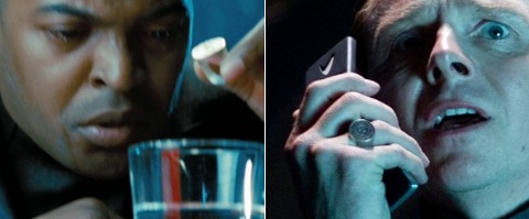
And about the ring… come on, am I still the only one here who thinks that the ring being dropped in a glass of water isn’t necessarily a symbolic act of giving up on ideals. Through it into the sea, leave it on the table for your wife to find and realize what you’re up to, but plop it in a glass of water like an alka seltzer? It may be symbolic too, ultimately, that it’s an academy ring and not, I don’t know, a Cardassian altoid — but, look at the shot, he’s looking at the ring like he’s waiting for something to happen… The choice of an academy ring may be (obviously?) symbolic… but I still figure there’s something on it or in it (or already in the glass?).
I’m imagining a poster like Mars Attacks, where you have cauliflower fields with Martian brains poking out of it. Only you have a pair of pointed ears too, with ‘BRAIN AND BRAIN … WHAT IS BRAIN?’ written in wavy wheatfield like weaves all through the image.
Either that or a yin/yang poster with MORG for the black portion and IMORG for the white part.
(though a part of me just wants them to joke it up — just show that box containing his grey matter, the one with the bike spokes coming out, but put the line in from Se7en, “What;s in the box?”)
@25. By the way, was the font on the Mirror, Mirror poster around in the mid-60s. Before I read your post, I looked at the lettering on this poster and thought it didn’t look like it was from 1967 at all. 70s or 80s? Just curious. Anyone know the name of the font? Same with the one in the Miri poster.
By the way, was the font on the Mirror, Mirror poster around in the mid-60s? With a question mark. Er, because it’s a question.
20. “And yes, that last sentence works on both levels – as the sentence reads, but also as a reference and a concern about JJ taking Trek into darkness (despite Burke’s comments).”
Nothing personal, but this pessimism kind of pisses me off. This sort of thing gets said all the time here. But, look, we all know that Star Trek was never all sunshine and flowers and teary-eyed marveling at passing comets — there was plenty of darkness. There was the real threat of war, and there was death, loss, violence and conflict. The characters got through it all. Sometimes with scars and real losses. And the point was how they made it through and the choices and sacrifices they had to make.
Just because they’re trekking into darkness doesn’t mean they don’t make it through darkness and back into hope.
This idea that the Federation, and our heroes, will never face a threat or real problems (from within or outside) because the future is wonderful is kind of, well, nuts. What will be telling is how they respond to this terror, for lack of a better word, and, will they be able to maintain their ideals.
Having ‘advanced’ ideals is great, but what happens when they’re tested?
Just because it’s Star Trek, it doesn’t mean that human nature has somehow changed (or that the elements of good stories have somehow changed).
“We are very advanced and we’ve outgrown all drama and conflict but we won’t tell you how” does nothing to comment on humanity, on right now, or on the real problems we face. It adds nothing to the discussion. It provides no visceral, emotional connection. For everybody who griped about JJ saying he wanted to make Trek more visceral — well, the best Trek was indeed visceral.
Great stories are parables, they get us thinking, feeling and relating, even when there isn’t a creaky, self-evident moral flashed across the screen and woven throughout the dialogue.
I worry that some of the pessimistic “Trek is supposed to be optimistic!” people want Star Trek for Dummies.
@46. Well said, Jack. You had your coffee today! I agree 100%
47. (sheepishly) yes, apparently far too much coffee.
And I apologize for the three-in-a-row.
But the “Star Trek wasn’t/isn’t supposed to be (dark, fun, exciting, thrilling, amazing to look at)” arguments drive me nuts, because they’re about some imagined ideal of the show. Judge the movie on its own merits over what works and what doesn’t. But the “Star Trek didn’t have explosions!” refrain bugs me, because, well, it certainly did have explosions — even when they couldn’t afford the proper fx for them.
Some of the most popular/best Trek episodes and movies had dark themes and or explosions.
“The Wrath Of Khan”, “First Contact”, “Star Trek”, “Best Of Both Worlds”, “Yesterday’s Enterprise”, “Mirror, Mirror”, “Balance Of Terror”, “The Doomsday Machine”, “Chain Of Command, Pts 1 and 2”, “The Siege Of AR-558”, “Scorpion Pts 1 and 2”, “Sacrifice Of Angels”, “The Search For Spock”, et al.
I swear some Trekkies either have short memories, don’t pay attention, or have some sort of grudge against J.J Abrams. Or a bit of all three.
#43 — Love your ideas!! Hahaha!!