
The Star Trek: Discovery exhibit opened on Thursday at the Michael J. Wolf Fine Arts Gallery, located a couple of blocks away from Comic-Con at the San Diego Convention Center. On display are genuine props, costumes and sketches from Discovery, a captain’s chair where you can take photos and a Star Trek gift shop. There are plenty of Starfleet (and some Federation civilian) costumes and props on display to feed the Discovery-craving fans.

EDITOR’S NOTE: Descriptions of all items comes from the placards in the exhibit.
Starfleet Costumes
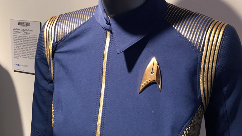
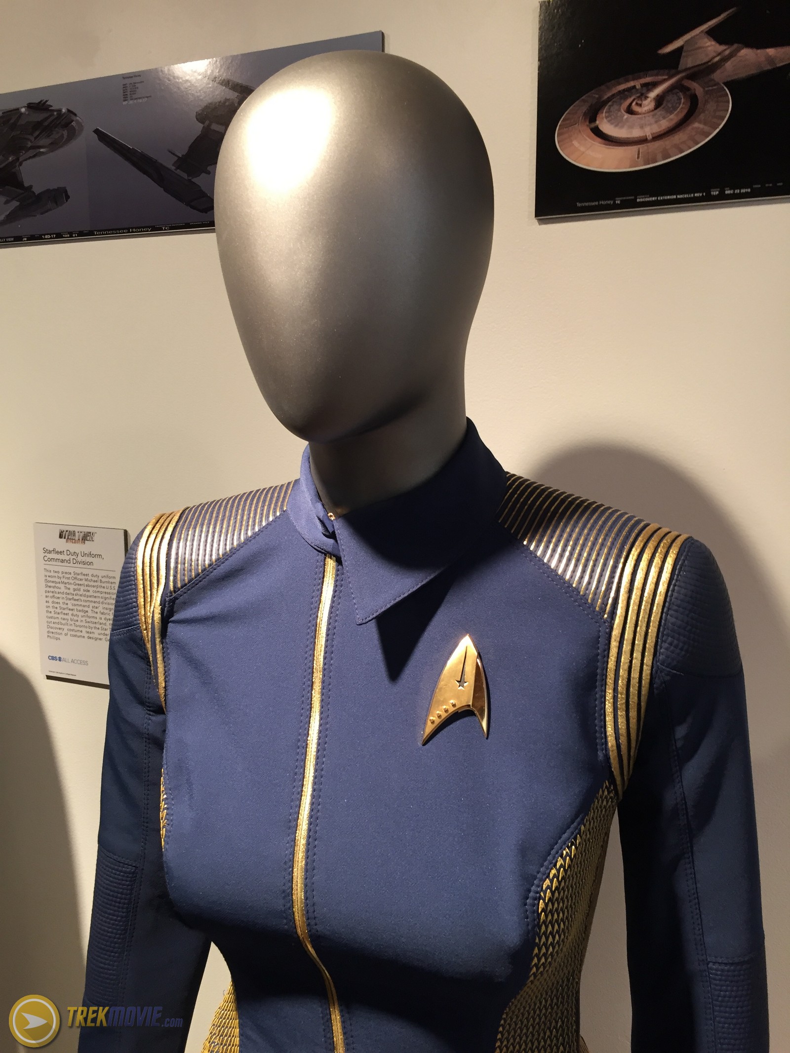
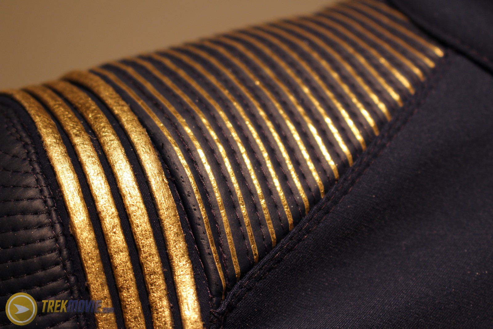
Starfleet Duty Uniform
The fabric for the Starfleet duty uniforms is dyed a custom navy blue in Switzerland, then cut and built in Toronto by the costume department of Star Trek: Discovery under the direction of costume designer Gersha Philips.

Captains Uniform
Captain’s uniform adds gold piping on the shoulders.
Short sleeve variant
This is a variant duty uniform worn by Starfleet officers that features elbow-length sleeves and alternate detailing
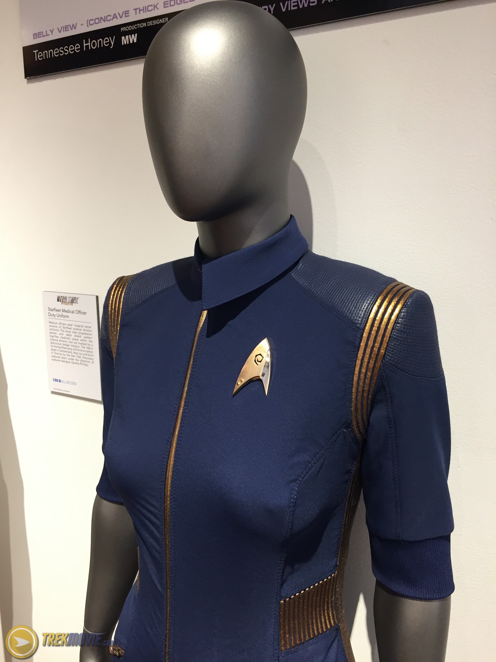
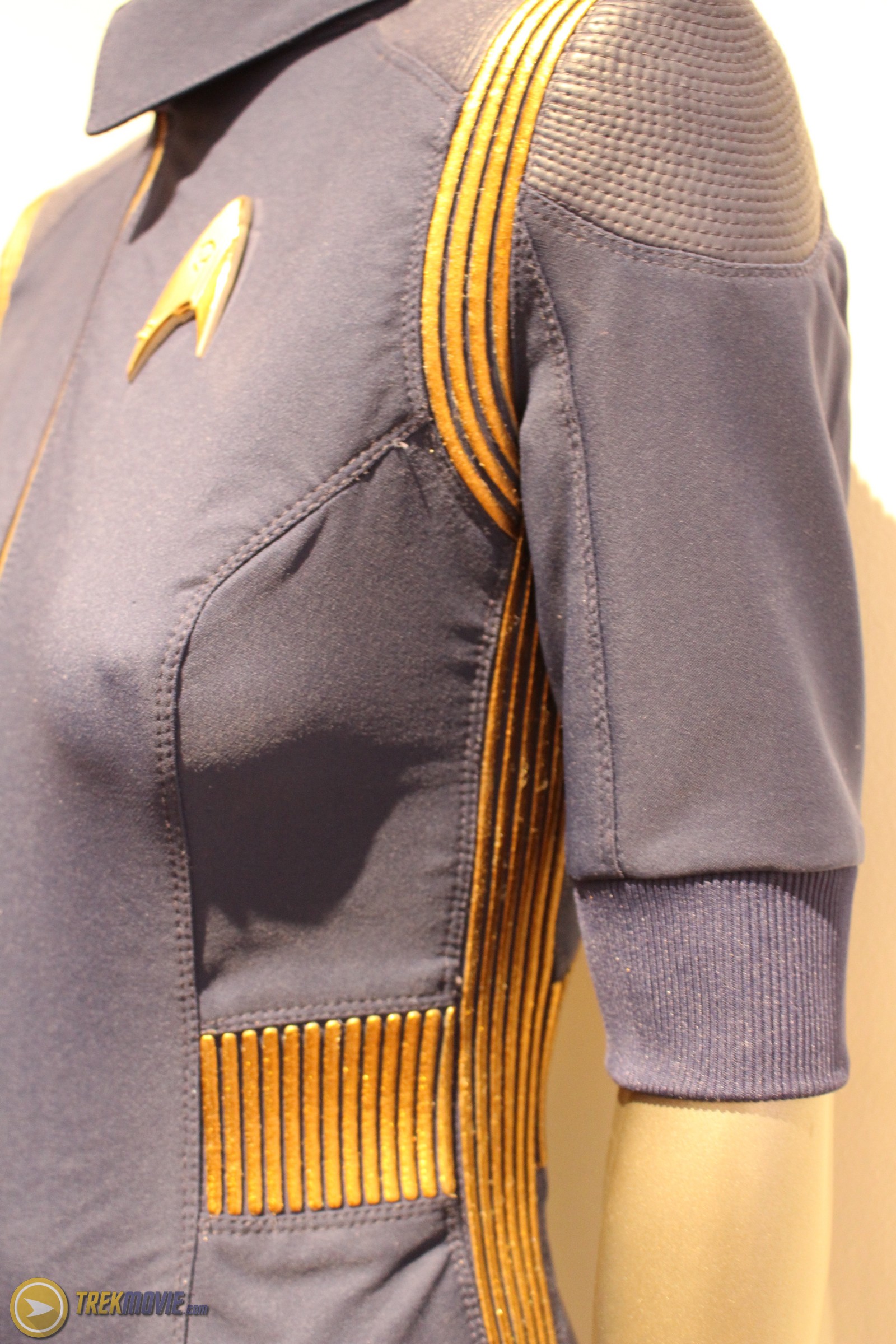
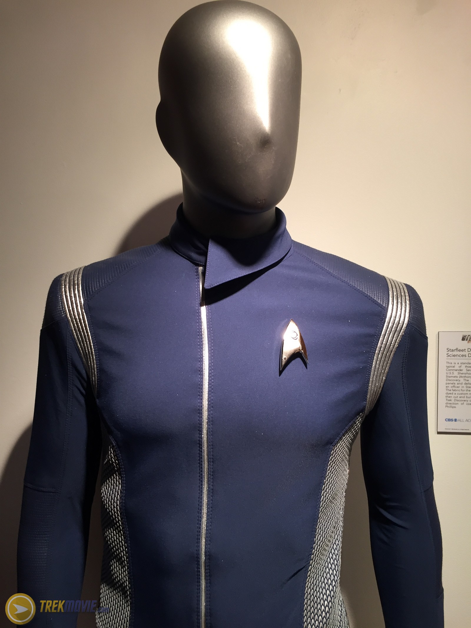
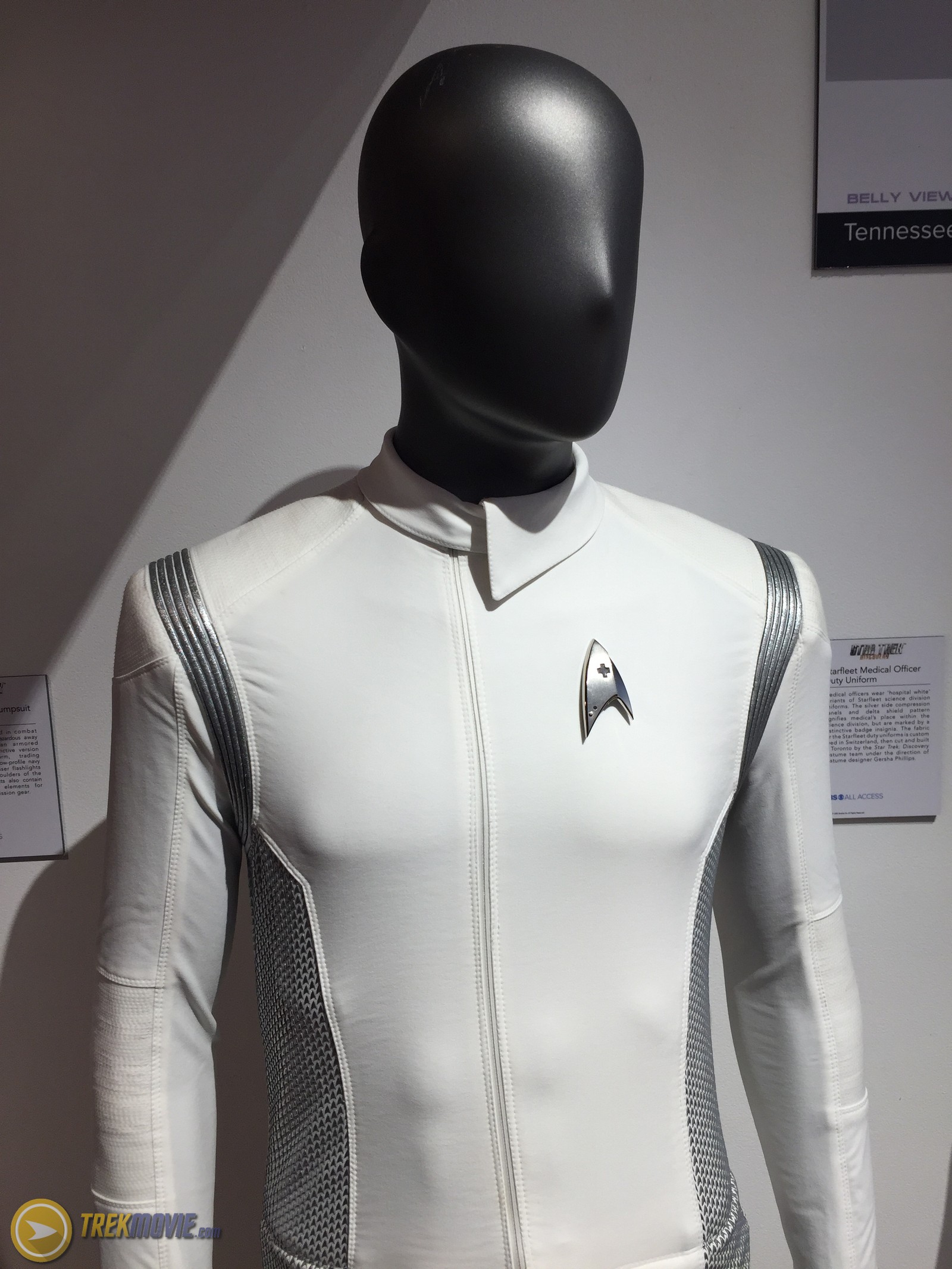
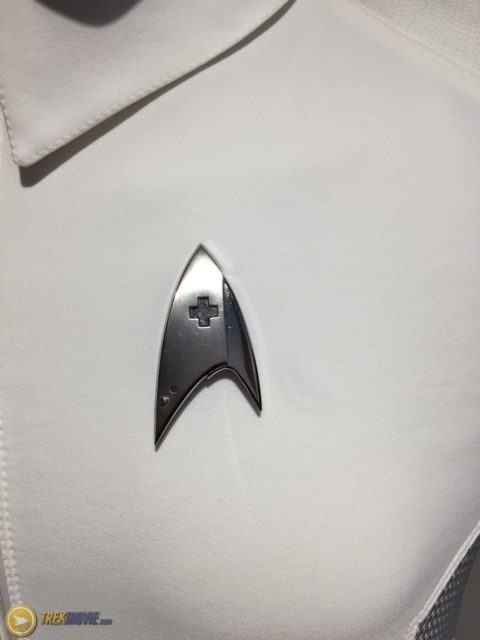
Medical Uniform
Medical officers wear “hospital white” variants of the Starfleet science division uniforms. Like the regular uniforms, the fabric is custom died in Switzerland, then cut and built in Toronto by the costume department of Star Trek: Discovery under the direction of costume designer Gersha Philips.

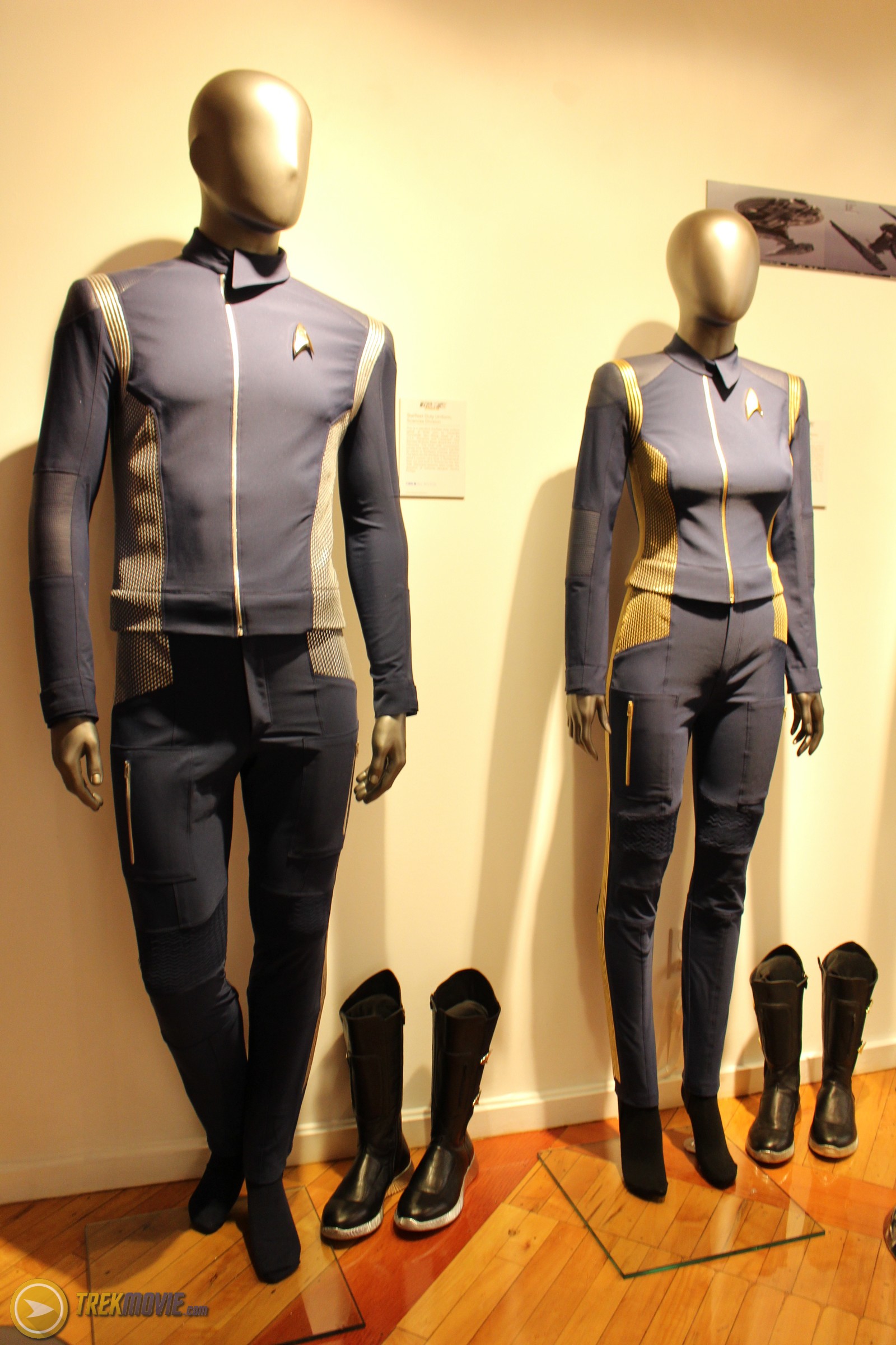
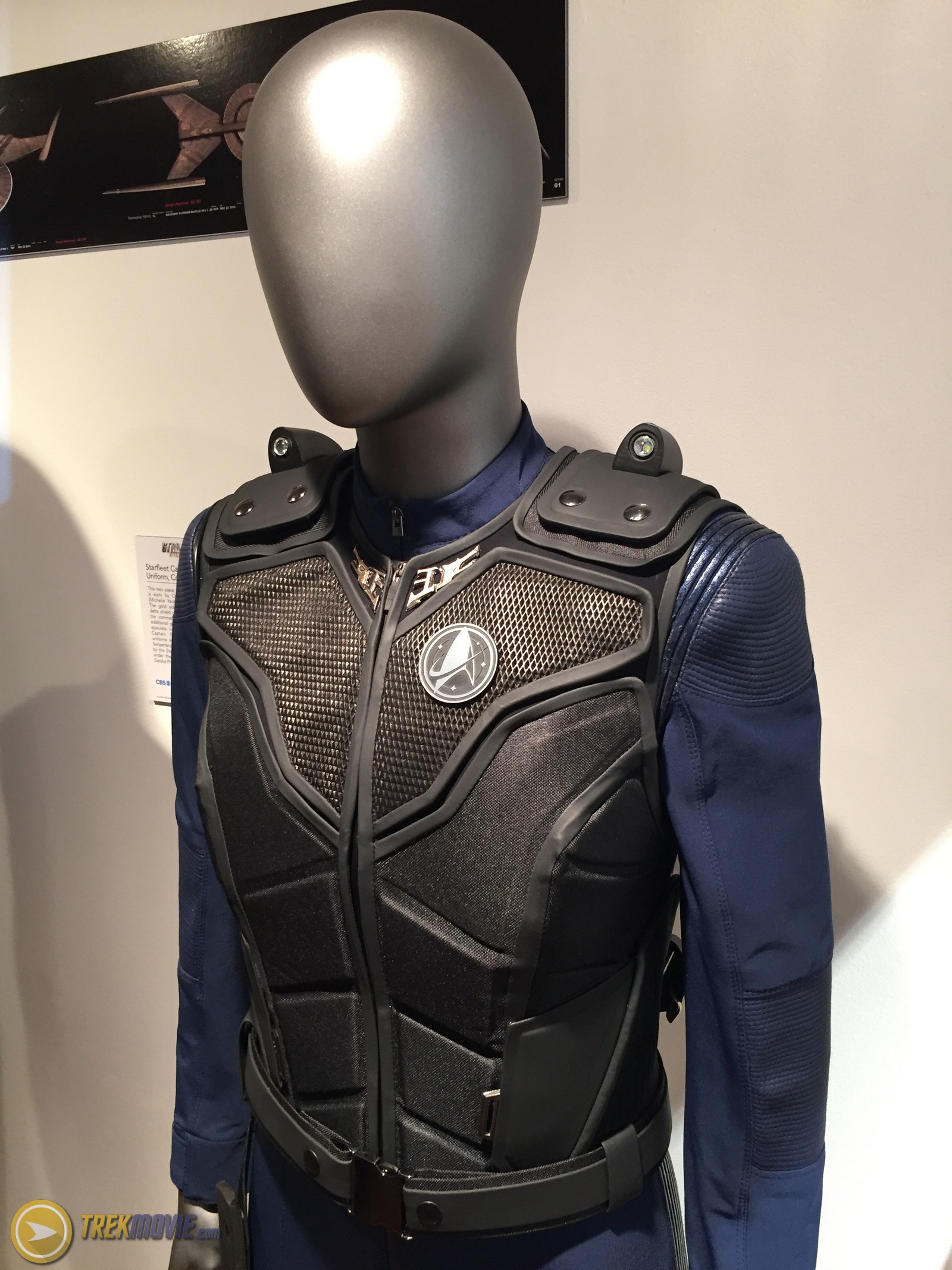
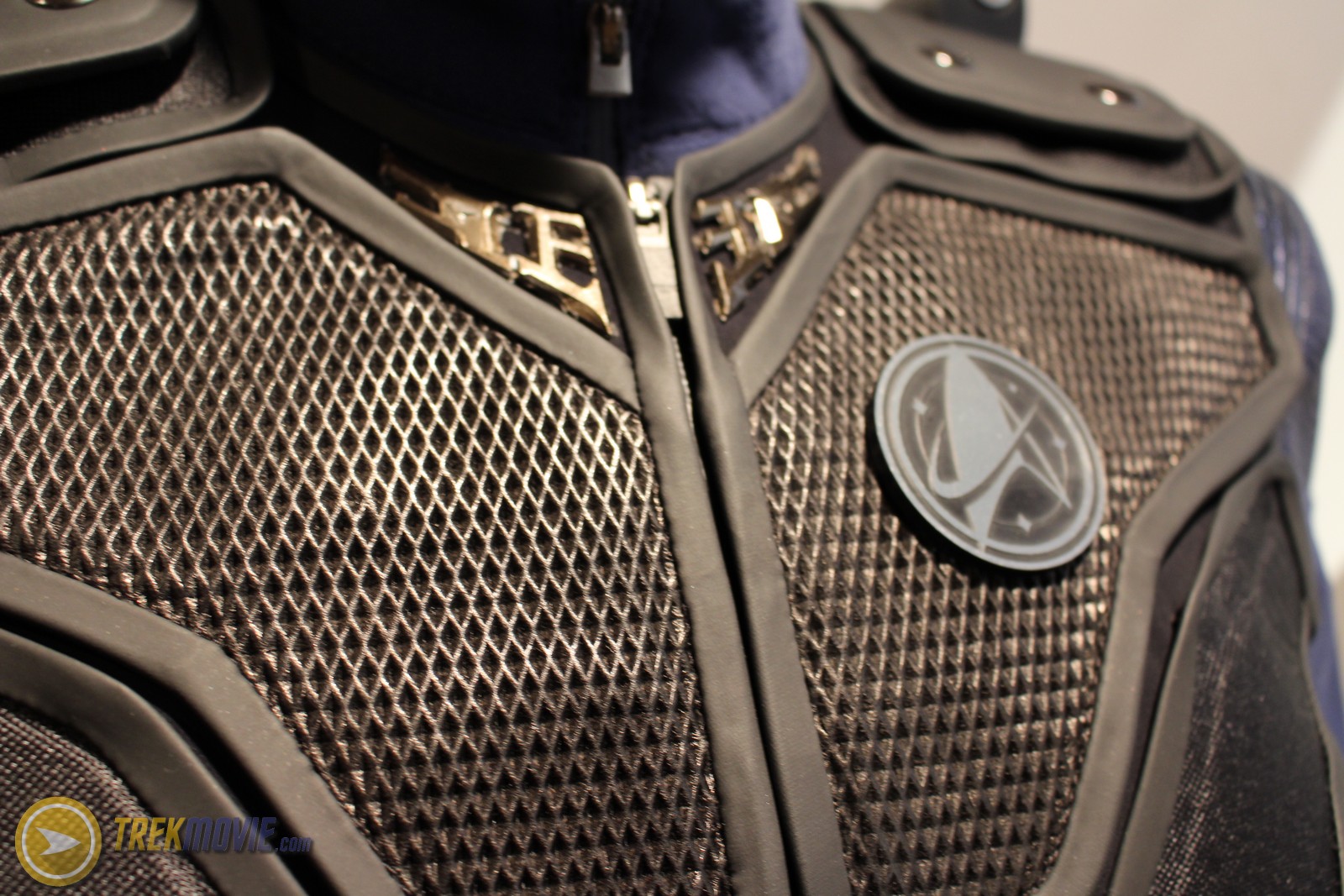
Tactical Jumpsuit and Vest
Starfleet officers engaged in combat situations or potentially hazardous away missions are issued an armored tactical vest and distinctive version of the duty uniform, trading metallic accents for a low-profile navy compression panel. Laser flashlights are installed in the shoulders of vests for guidance. Vests also contain additional functional elements for attaching mission specific gear.
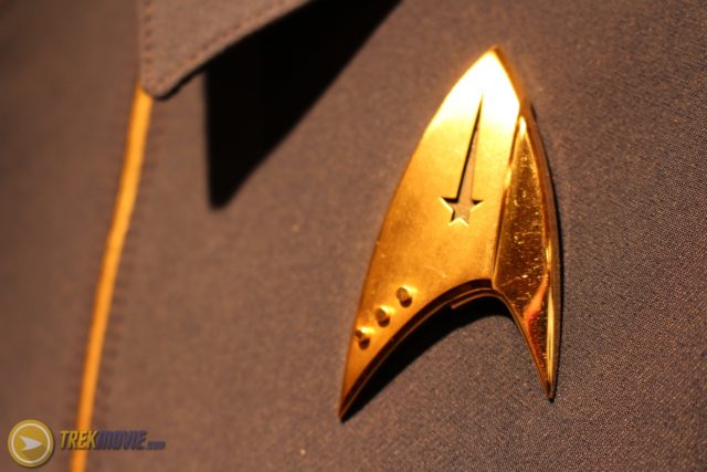
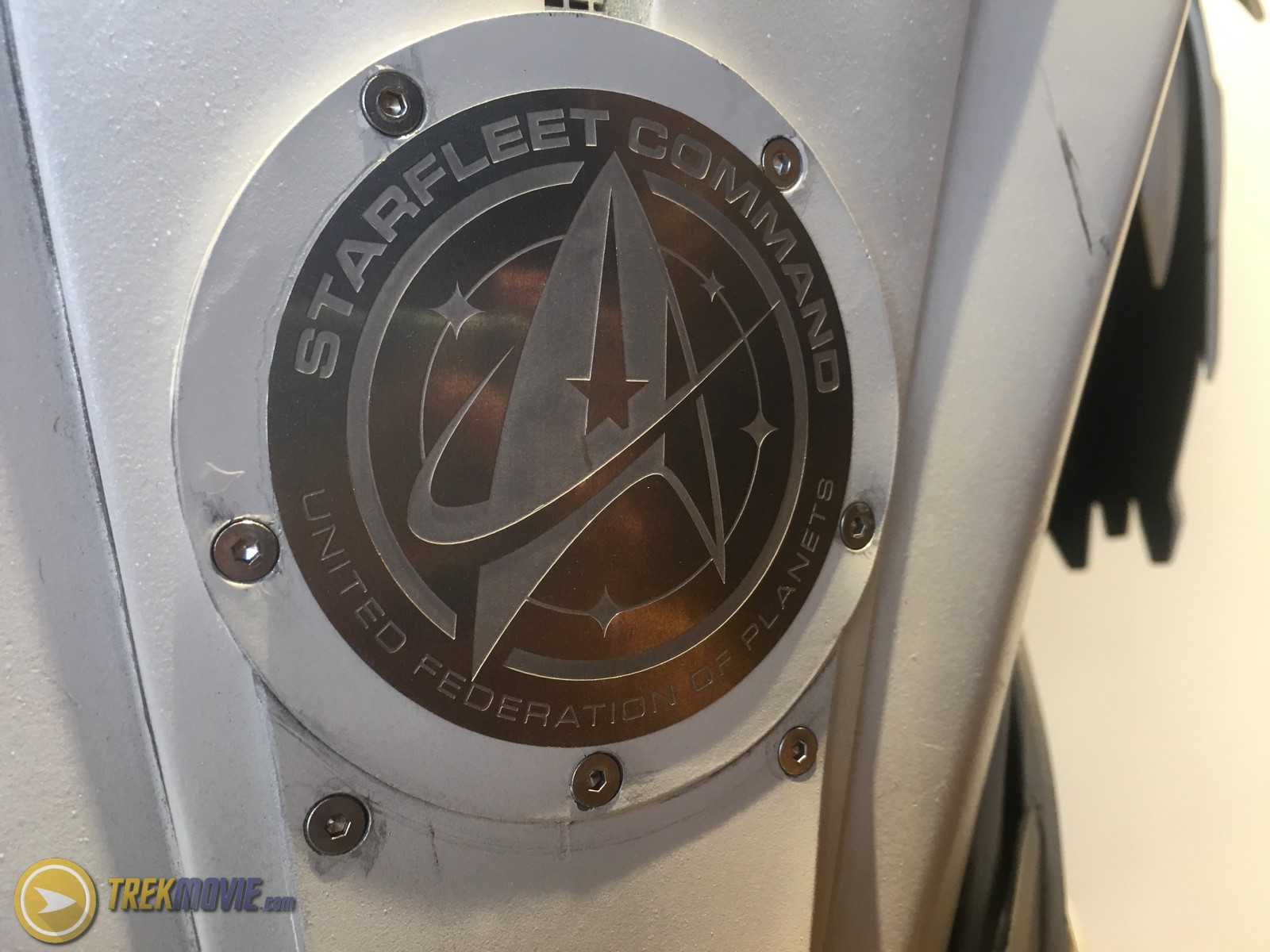
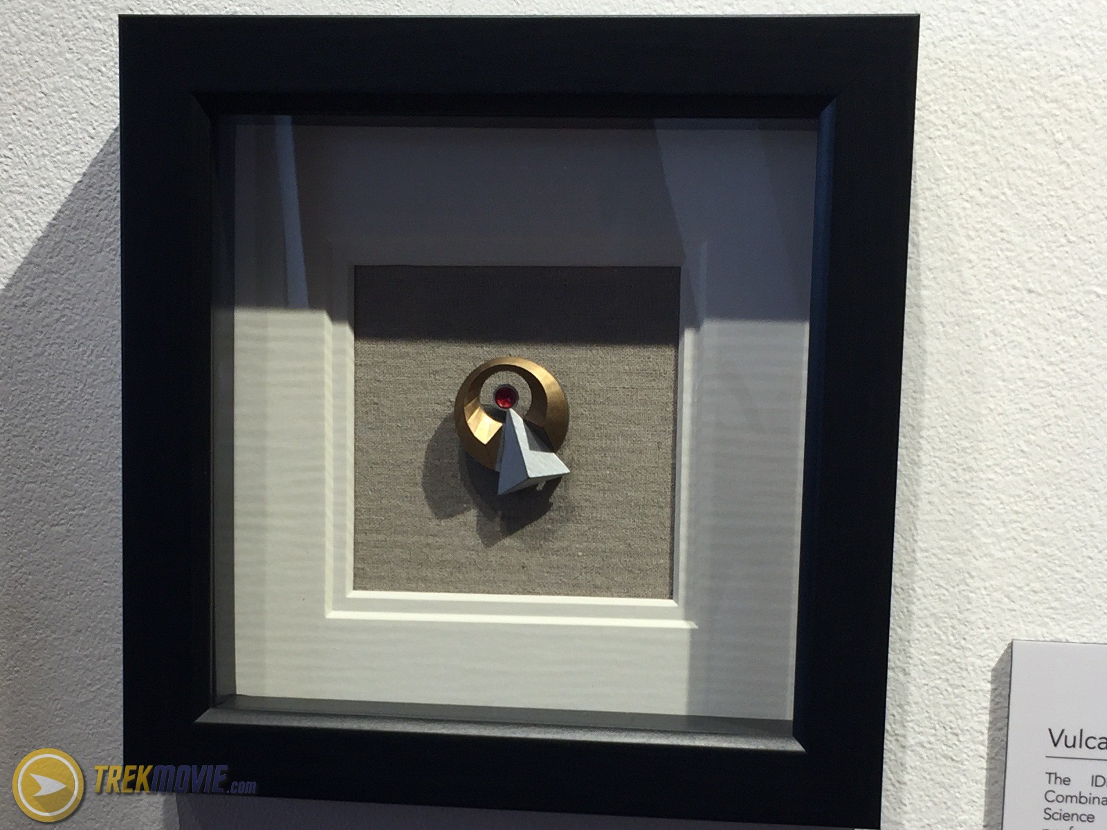
Starfleet Insignia Badges
Starfleet badges were made to match the time of the uniforms and are matched to Starfleet divisions: command (gold), sciences and medical, (silver), and operations (copper). The gold, silver, and copper badges were made in Toronto by making wax models from 3D prints, then creation plaster molds for silicon bronze to poured into. The bronze badges are then polished and plated by a jeweler to creation custom colors for Discovery.

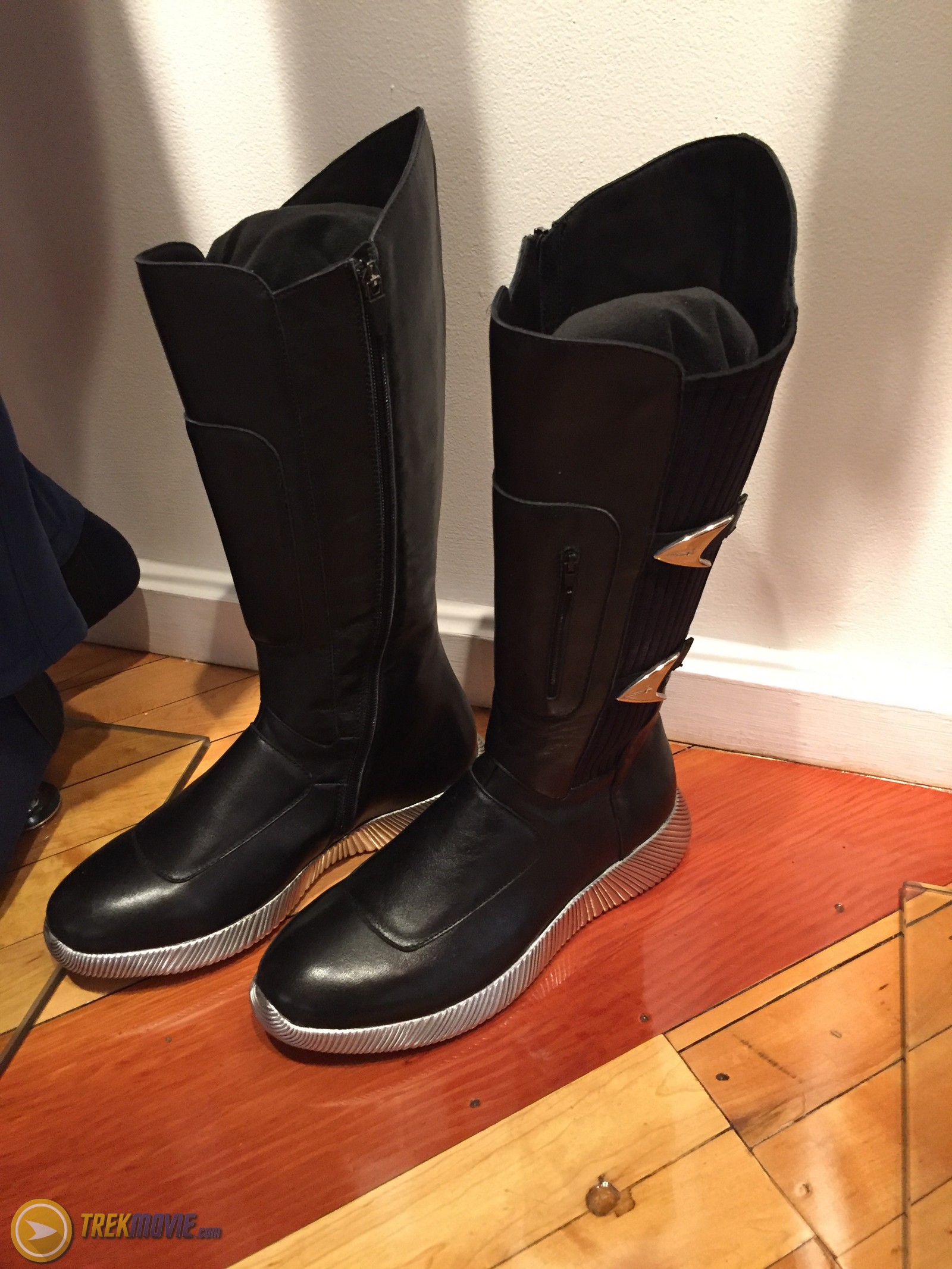
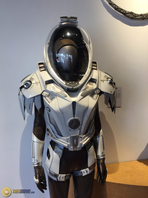
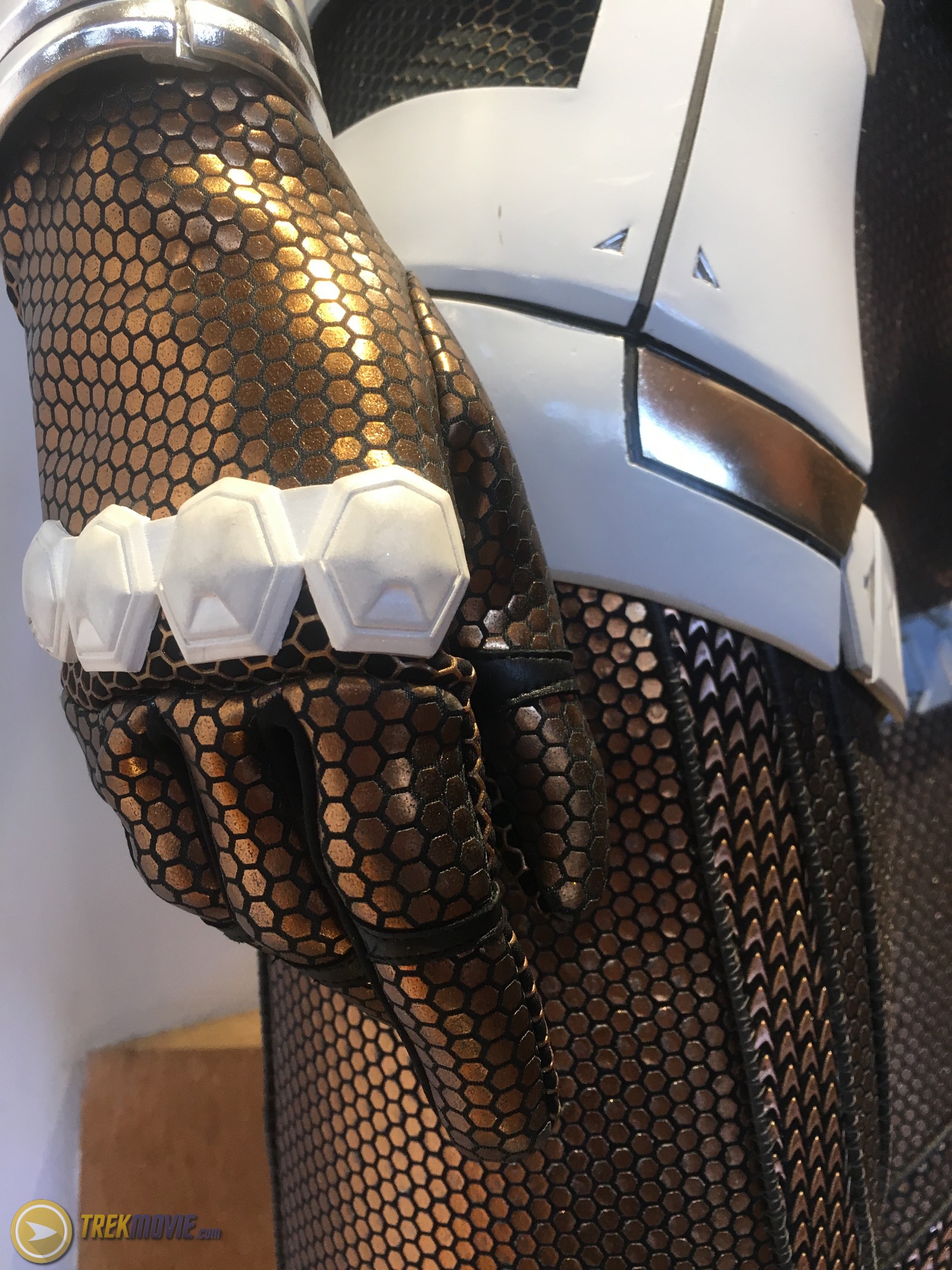
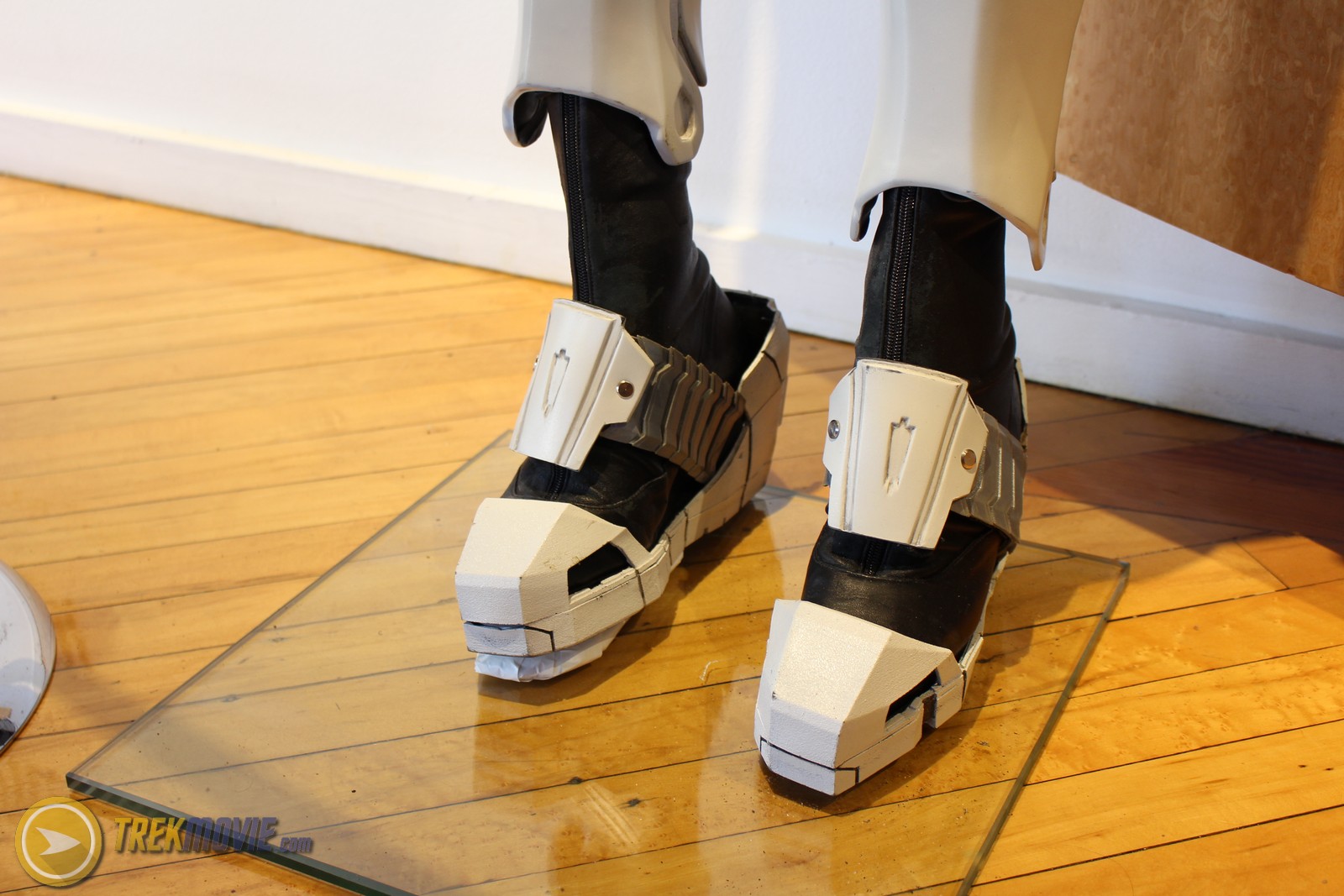
Starfleet Long Haul Space Suit
The Starfleet Long Haul EV suit was built in the UK. It was milled by high-density foam as one unit and then draped in fiberglass. The suit was then sectioned into pieces that fit as clamshell of the actor’s body. The optically clear lens of extruded plastic was made from a 3D scan of the helmet and had to be perfect to fit the suit’s frame.

Starfleet Equipment
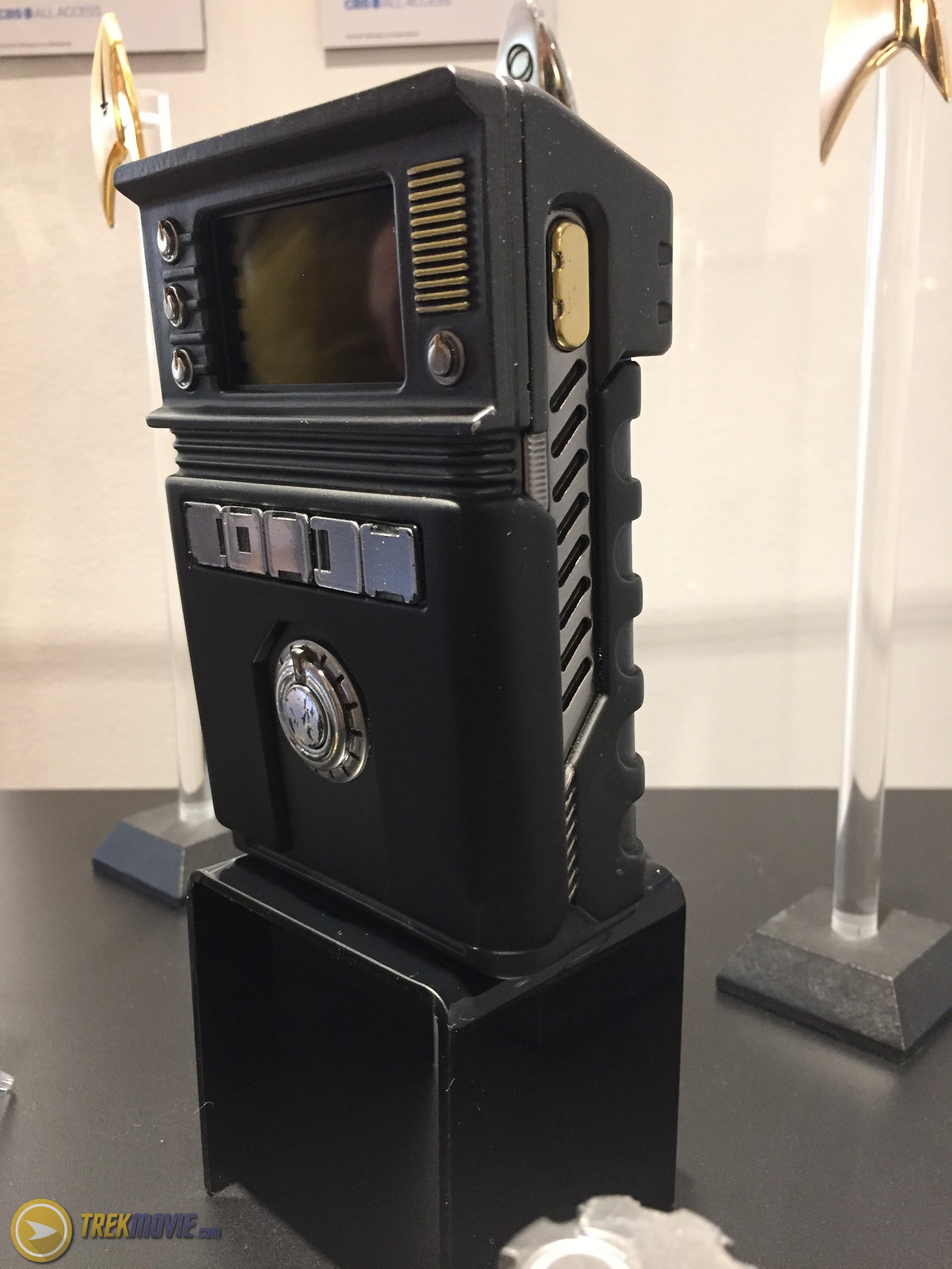
Tricorder and Hand Scanner
Standard issue for scanning and recording data on away missions. The tricorder includes a removable hand-held scanner. The screen employs the use of a smart phone with video looping images. Made entirely with a 3D printer.

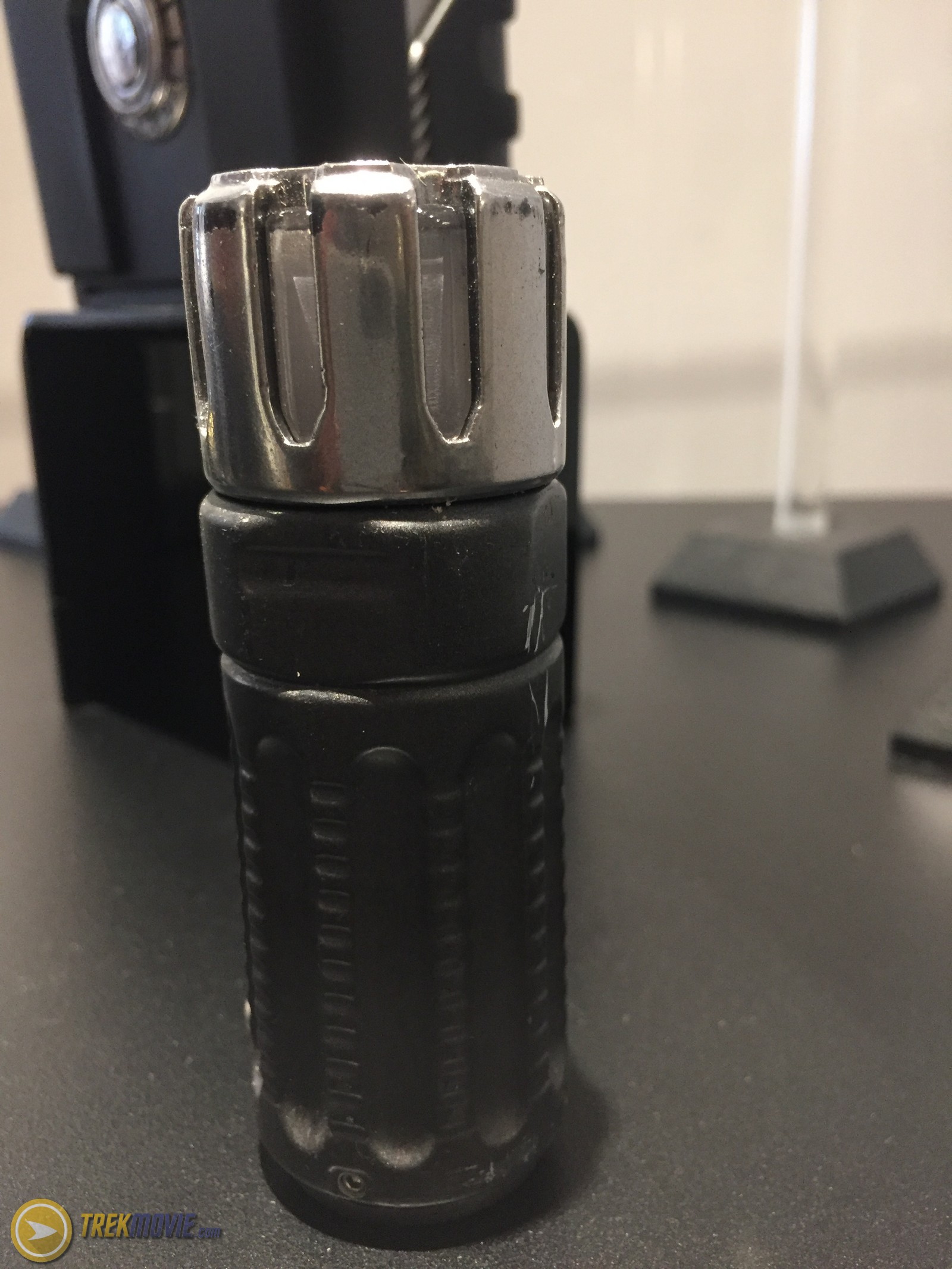
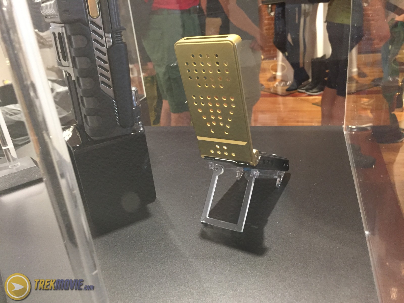
Communicator
Standard issue for away missions. These were heavily influenced by the ones seen on The Original Series and are made from milled aluminum.

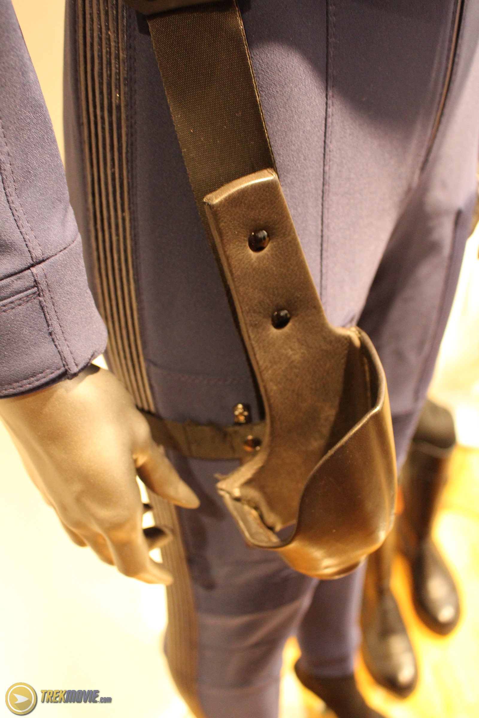
Phaser Pistol
Standard issue by Starfleet Command, the hand phaser is reminiscent of the original series phaser, but the design was given a “tougher” look to indicate a more militaristic functionality. The phaser was built and painted in Los Angeles and is 3D printed with a removable magazine that houses the batteries and electronics.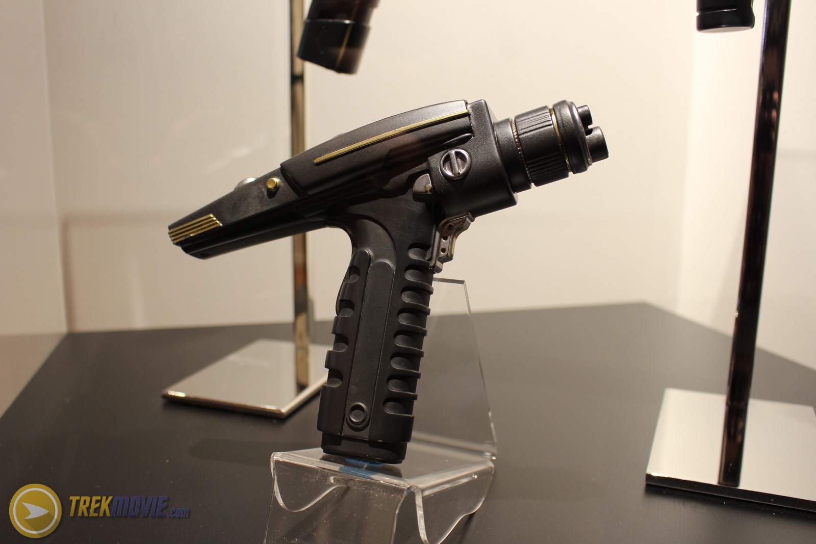
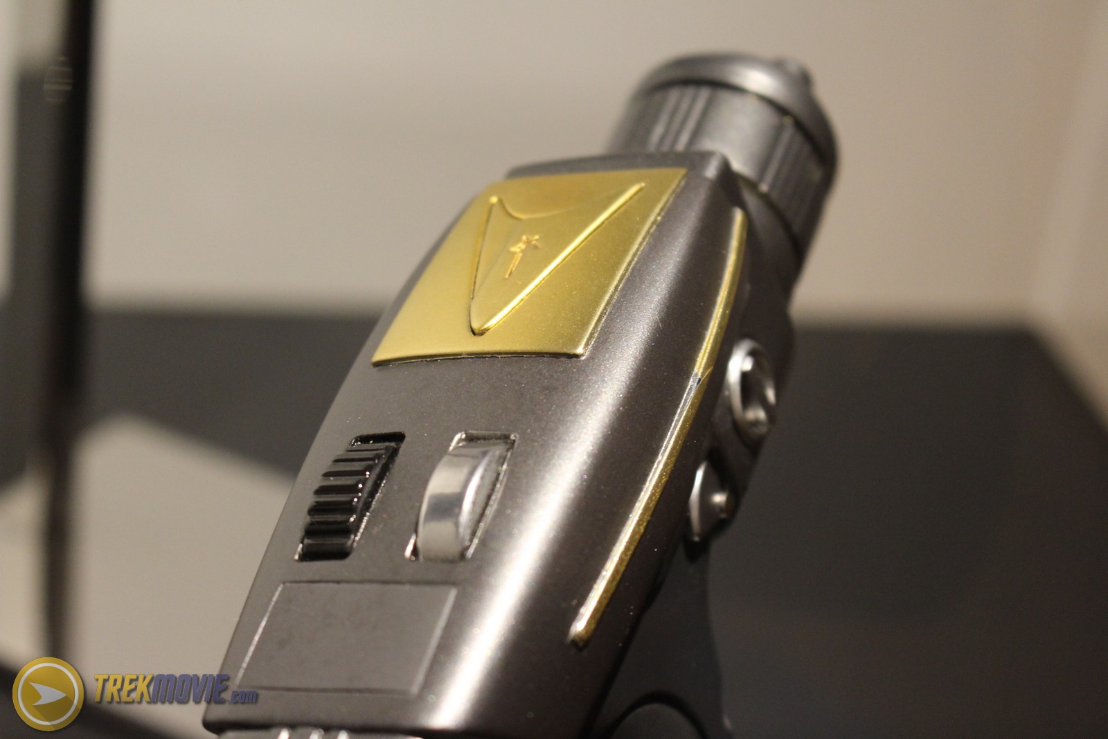

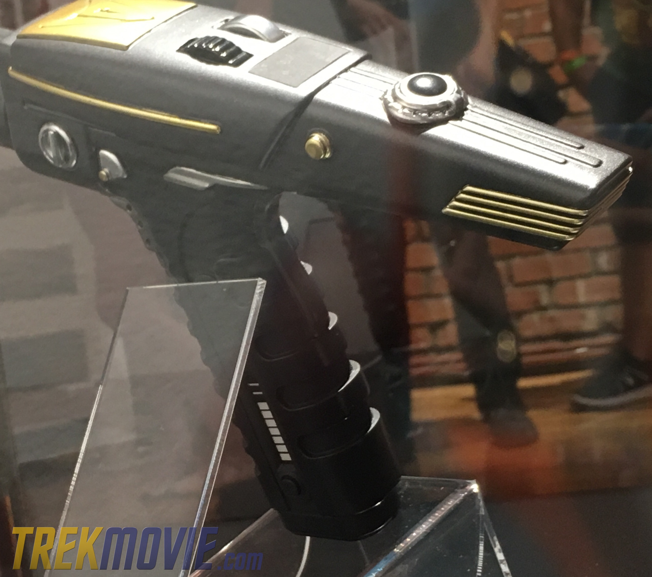
The left side of the grip has a power meter
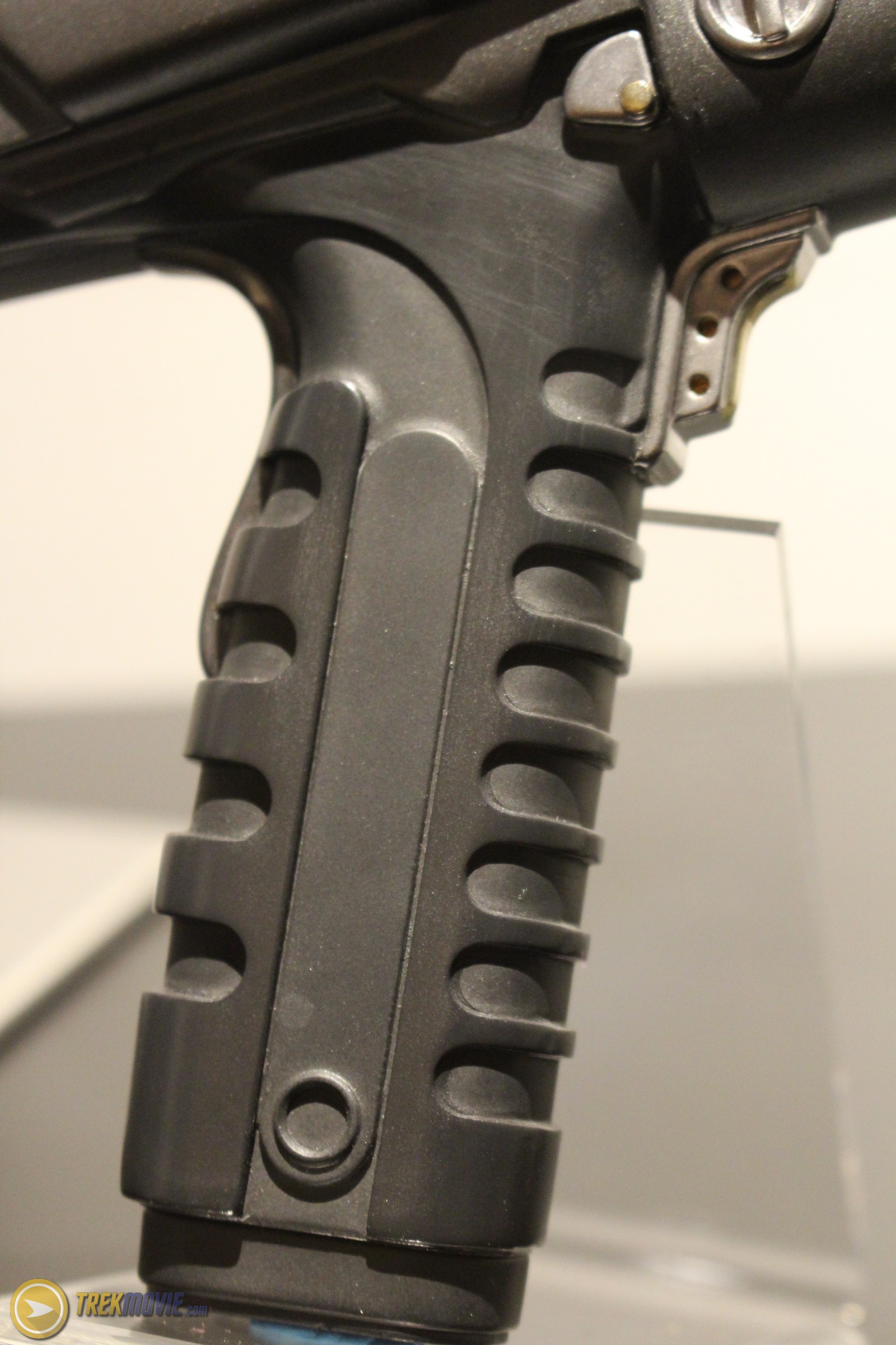
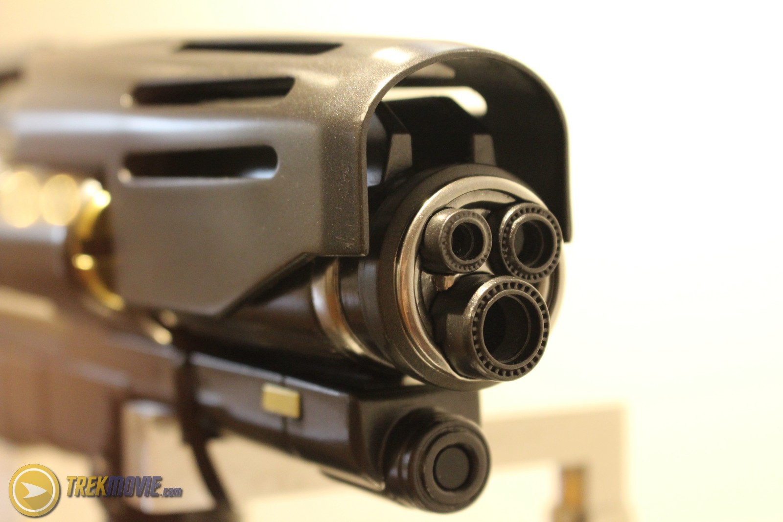
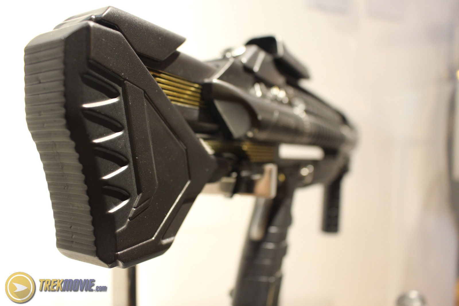
Phaser Pulse Rifle
Standard issue by Starfleet Command, the pulse rifle is inspired by Pup rifle designs of today. The pulse rifle has one nod to the The Original Series phaser rifle that observant fans will notice and that is the orange/copper foil chamber with the barrel. The pulse rifle was built in Los Angeles and is almost entirely 3D printed.

Federation Character Costumes
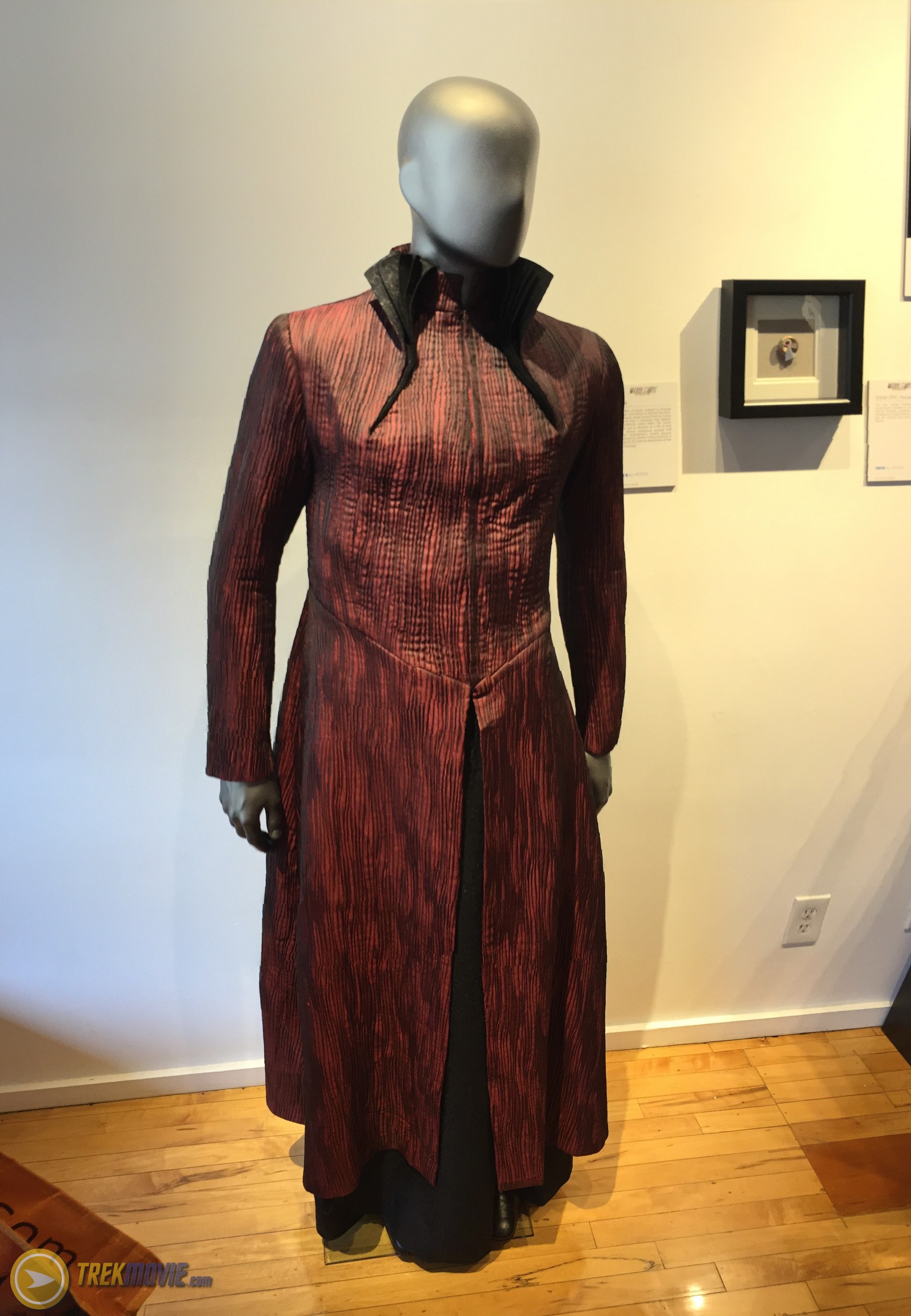
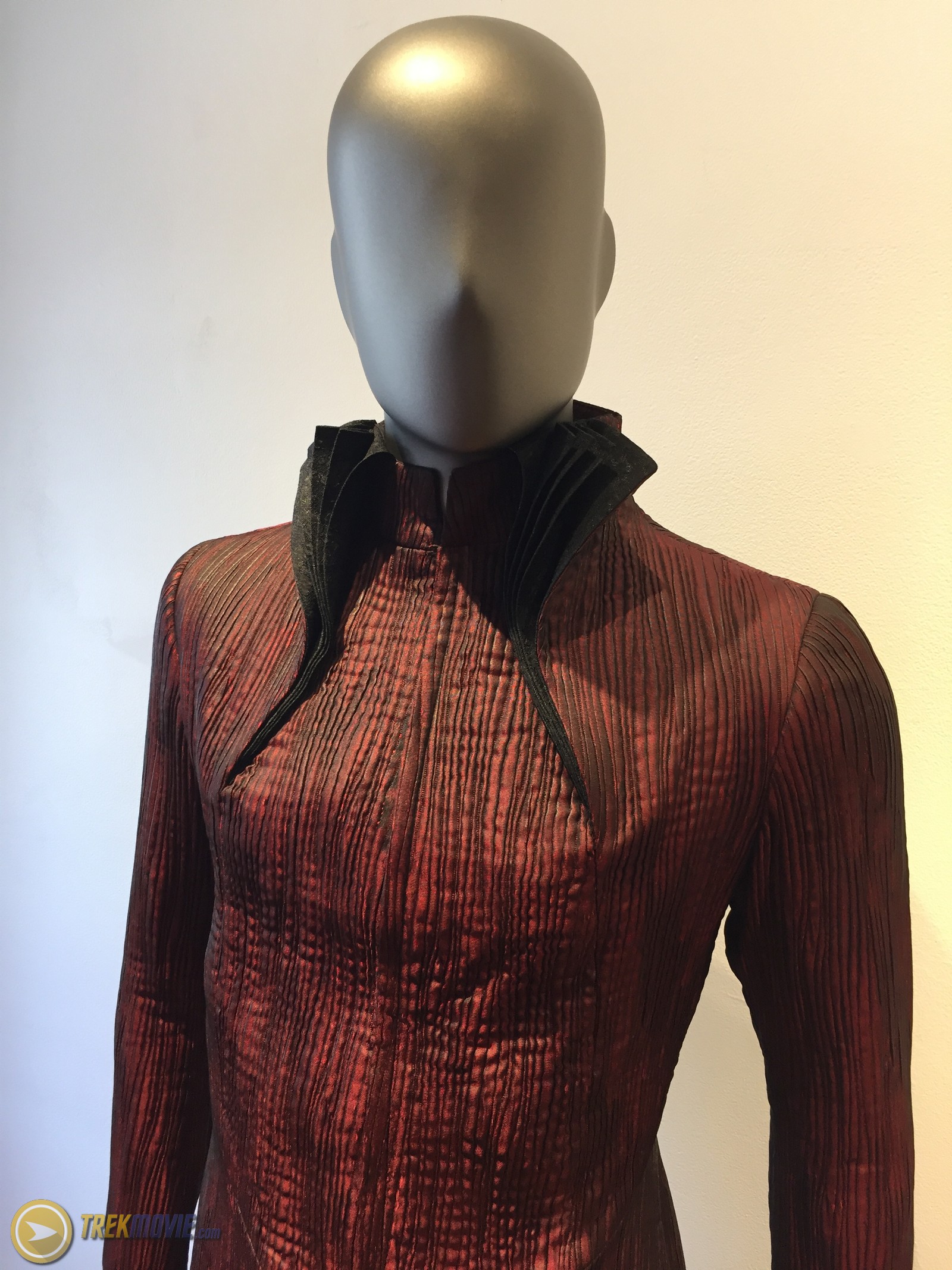
Sarek
His traditional robes reflect the Vulcan culture and its devotion to a life of pure logic, serious intellectual pursuits, and spiritual contemplation. Sarek’s costume is designed by Gersha Philips and built in Toronto by the costume department of Star Trek: Discovery.
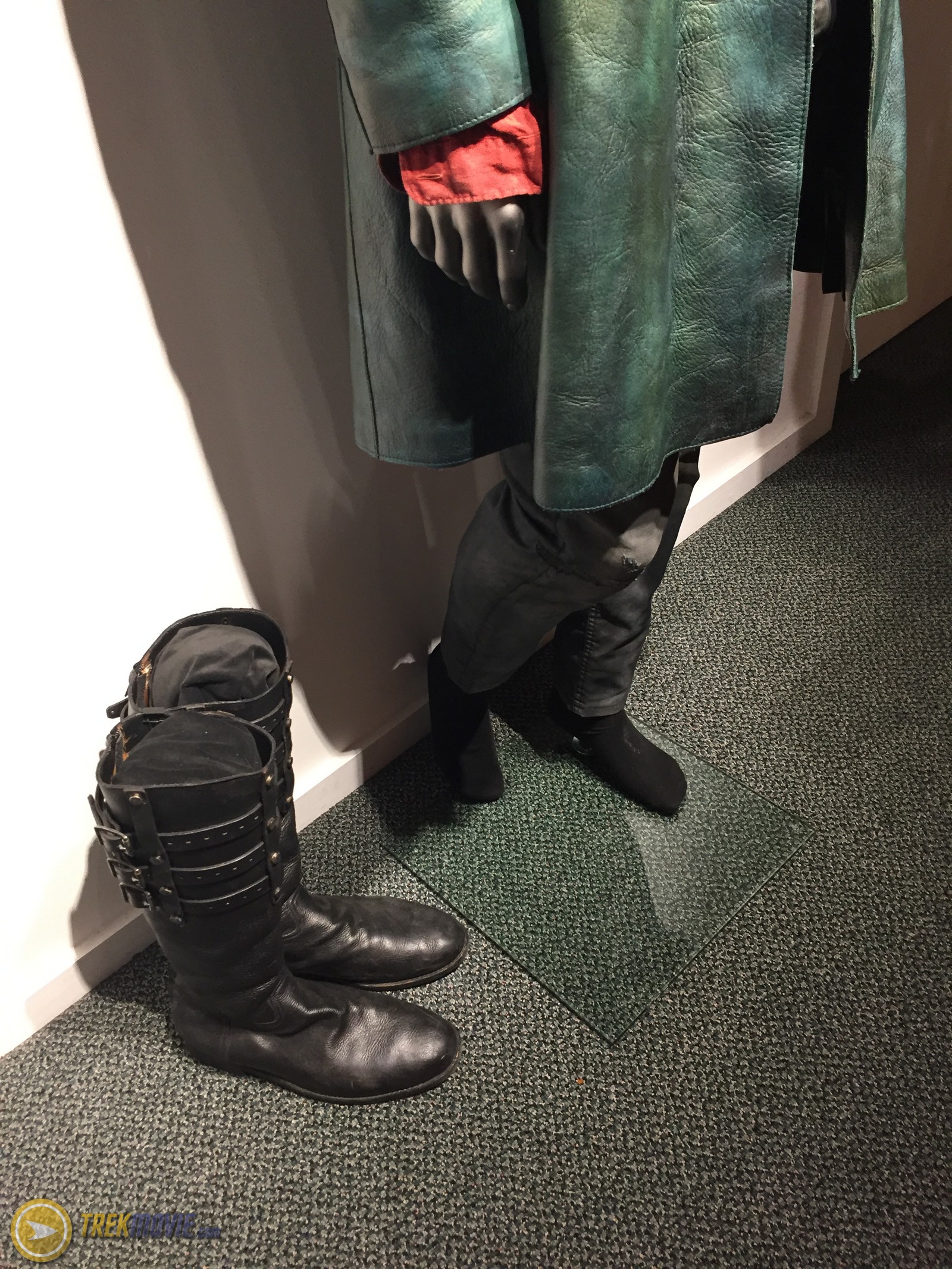
Harry Mudd
Designed by Gersha Philips and built by the Star Trek: Discovery costume team, Mudd’s costume is primarily leather and inspired by Adam Ant. 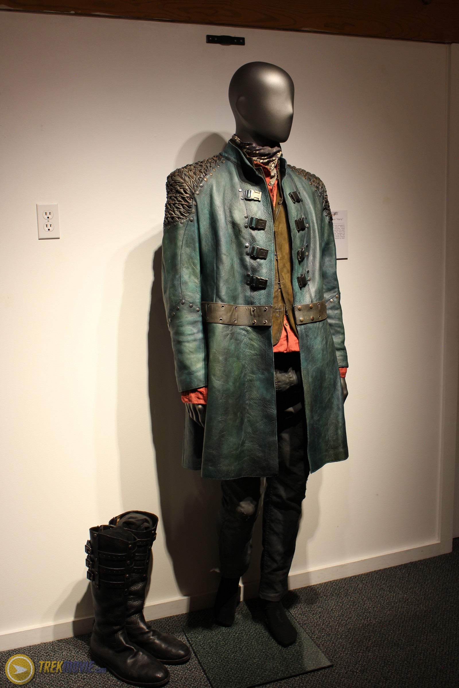

Captain’s Chair
The gallery also has a photo opportunity with a captain’s chair.

After taking your picture you get sent an email with the background from the U.S.S. Discovery to share on social media.
My Star Trek: Discovery Captain’s Chair photo via @StarTrekCBS and @StarTrek #TrekDiscovery pic.twitter.com/iVggYSG4LG
— TrekMovie.com (@TrekMovie) July 20, 2017
The chair also shows off some of the controls available to Captain Lorca.


More TrekMovie SDCC coverage
SDCC17: See ‘Star Trek: Discovery’ Klingon Costumes And Props
SDCC: Klingon Torchbearer Revealed + Gentle Giant Announces Discovery Collectibles
SDCC17: ‘Star Trek: Discovery’ Concept Art Details Klingon And Federation Ships
Stay tuned to TrekMovie all week and weekend for our full team coverage of San Diego Comic-Con.
Star Trek: Discovery premieres on September 24th on CBS with all subsequent episodes on CBS All Access in the US. See our Discovery info page for more details.
Keep up with all the Star Trek: Discovery news at TrekMovie.


I’ve been excited about DSC since it’s announcement but these teaser updates are getting me even more excited each time! Glad they are building some anticipation!!!
Holy crap this all looks way better than I expected. Phaser is amazing. Costumes actually look better up close than they did in the trailer, which is a rarity.
I can completely accept that as a TOS tricorder. It looks great!
I am mildly disappointed the EVA suit doesn’t more closely resemble an electric razor, but other than that, I’m onboard.
Lol!
And I thought it was just me……..
The sheer amount of detailing on the Starfleet uniforms is just absolutely incredible. Cosplayers are going to have to really step up their game to make realistic replicas of these beauties!
No problem. It will all be on sale at the CBS Store!
A simple, yet cunning, form of copy protection…
So they are already making the tricorder and Communicator props as smartphone cases, right? They both work by using smartphones underneath…why not go ahead and sell these as cases that are screen accurate? And don’t forget the app to make it properly replicate the series’ UI’s. Maybe even have the physical buttons have a use and do different things with each press? Plug it in the case via USB and the app automatically starts.
In spite of the flack I’ll likely take for this comment, here goes: If JJ had half the creative vision that Discovery’s Art/Prop department has in building these props, those movies would have been much, much better. These props are EXACTLY what they should be. Contemporary, stylish, and exactly how Gene would make them if he were the creative genius behind the show.
Whoever had the final say on these props, get props from me. Before seeing the premier, I give the creativity behind it an A-. I imagine that once I digest the pilot a couple of times I’ll have a much better grade, but so far the excitement, anticipation, and debut of these props, and uniforms have captured my full attention.
Time for me to sign up for All: Access and support the work of these amazing artists.
Interesting. STD is employing many of the same prop makers, artists and designers used on the Kelvin movies.
please elaborate?
I completely agree. JJ did not have half the imagination of these people. But it shows you don’t need imagination to make a lot of money.
JJ came from a place of not liking Star Trek or really knowing it. So when it comes to approving designs his basis was what looks cool to him personally.
Exactly. I can’t remember the exact article, but somewhere I read that the hole idea behind the redesign of the Enterprise in the Kelvin timeline was to give the ship a “hot rod” feel.
My biggest issue with the JJ Enterprise was how massive it was. The ship had no character in the JJ films whereas in the TV shows and the films you had the sense the ship was a character.
Being so huge and so shiny with the iBridge and massive everything, it just lost some of what made it interesting.
In TOS, as advanced as it was, you still had the sense that it took many men working in the equivalent of coal shoveling in the bowels to keep the ship going. And even when pushed beyond it’s limits, the Enterprise would hold together, seemingly through sheer will. Being on this ship felt dangerous. In JJ films it felt like you were on a luxury liner.
I never got the impression the TOS ship had a ton or needed a ton of crew to run it. Quite the opposite. It always felt to my child eyes as a ship that just needed a few people.
I mean, the engine room was always seemingly empty (compared to say, TNG, with various engineers running around) and the one guy would always just be sitting there at a desk…
And the Enterprise had what, 1 pilot, 1 conn officer, a communications officer, a science officer, and a captain? Maybe some other guy milling around in the back. But a real Naval ship circa 1960s/70s had about two dozen crew members piloting and running the ship on the bridge.
There were 430 crewmen on the TOS Enterprise. That is mentioned in several episodes.
@Torchwood – yeah I get what you mean. I didnt mean there were a ton of guys, I meant to invoke the visual of the Titanic but without the man power (due to budget). But it was always Scotty having to work a miracle to keep the damn ship going lol
But it was like a super advanced ship but had the sense that space travel was still dangerous. I think there was an episode where they lost power and it was said they were some huge number of years from the nearest starbase. I liked references like that to remind us that they were essentially alone out there with only the ship and their own ingenuity to rely on.
Agreed, that and its magical ability for the interiors to vastly exceed the amount of space shown by its exteriors. But what starship doesn’t need a brewery right?
You’re probably on to something. Perhaps the difference between discovery and Jj films is the people making discovery think Star Trek was good and just needed some care and respect. Whereas Jj’s team thought Star Trek sucked and only they could fix it.
Exactly, and this is supported by the fact that JJ and co. wanted to stop the production and sale of merch from the prime timeline.
JJ wanting to stop TOS sales was probably more to do with wanting all the cake for himself. Remember they were teasing TV shows and animation etc. They wanted to create a Star Trek Universe. Which is a good idea, just not with Bad Robot at the helm.
Hopefully Discovery is as good as it seems and CBS can produce the next film.
It’s also an issue of brand confusion. When you’re trying to market your film and make it a hit, you don’t want another competing brand– particularly one that looks nearly identical to it to the casual fan– on the shelf at the same time. I understand JJ here, and I understand CBS/Para’s reluctance to agree. Not an ideal situation for either of them.
Another good example of why the two sides need to be merged again.
And potentially another reason for Discovery being in the general TOS era but all new… all those TOS merch sales can only help Discovery and vice versa. Possibly a reason they were interested in Dorn as well, bringing in a TNG character to market to TNG fans.
Sarek works as a TOS character to add because he was never a starring character and not heavily marketed, but still very well known to fans, probably known to casual fans too (from the JJ films and anyone who knows Spock knows his father was Sarek).
Paramount controls the movie franchise. CBS, controls the TV franchise.
While I agree with some of the previous statement, I don’t know I agree with CaptJWAmick. Reason being is this: if you make something in the here-and-now you don’t want a previous incarnation of that thing being sold or put out there to the public because of perception and competition. That’s not JJ being greedy or diabolical, it’s business. Marvel has their cinematic characters and their cinematic costume designs, etc so what do they do? They change the comic book costumes and attitudes to move more in line with their film counterparts. Warner Bros debuts Wonder Woman in the film Batman V Superman and she has a much more armored/gladiator look and in the comics what did they do? They got rid of her costume at the time and without explanation crossed her over to a very similar cinematic costume. They also carried that over into video games and some animated showings. It’s just something that generally happens (whether it’s right or wrong is not something I’ll make a case for).
The prop makers for Discovery and the Abrams films are largely the same people.
Can you elaborate on this?
Nick Meyer said almost exactly the same things that JJ did about Trek when he was hired for TWOK.
They’re largely the same people.
I agree wholeheartedly! While I’m not a JJ Trek hater, I didn’t care for the props that much. These are excellent.
I have to agree with you and it’s why -although I really enjoy the 2009 film- I go back and rewatch Beyond much more. Beyond felt and looked more like a true Trek installment because of the shift in look that was modern yet retro. Discovery goes even farther with this and really knocked it out of the park with props and costumes.
To be fair to JJ’s Trek I didn’t have a massive problem with the aesthetic of the movies. Don’t get me wrong, there were aspects I didn’t like – the Klingon look being one but Discovery also has that problem. What I did like was the update to the TOS uniforms. I remember when the first pictures for Star Trek 2009 started to emerge being both shocked and impressed that they’d kept the primary colours of the original series and regarding the Klingons, I think both the movie and the TV show had an impossible job keeping fans happy there. Both DS9 and Enterprise had made the mistake of establishing that the Klingons actually did look different during the TOS era and you couldn’t possibly expect a modern production to replicate 1960’s TV make up.
The throw-away line in DS9 really sucked. Ignoring it would have been ideal.
Barring that, the simple explanation that “some” warriors were altered to appear more “human” (and in fact closer to Vulcans and Romulans too) for some reason. They could have even had someone ask if it was reversible to which Worf could reply sharply “Not always”. (We know it IS reversible).
Looks like Captain Lorca can run the whole ship in battle manually from his chair without barking orders to raise the shields, fire phasers and torpedoes, etc.
He might technically be able to, but I don’t think we will ever see it other than him starting or canceling an alert. I think most of the buttons give him a status of the involved systems. Sure you might be able to fire off port forward torpedoes, but there is a lot more that needs to be known and done to safely do so (which target, type of detonation (contact, proximity, etc.), range before emergency detonation, yield, etc.), all best left to a fuller tactical interface – and someone dedicated to the duties/decisions/responsibilities of that task/post.
Man, is it awesome to be contemplating the minutia of a Trek show again! Despite that I thought Star Trek (2009) and Beyond were good and great, respectively, they were not at the same level of detail as building a whole new series in a (somewhat) new time with new, well-thought-out designs.
A wealthy person can run their entire life with minimal effort with today’s technology, but they still employ assistants, servants, etc.
That tricorder looks awesome. As functional or even more functional than the TNG/post-TNG era version but definitely bulky enough to be credible as a pre-TOS era prop.
I just hope that the phasers go “BRRREEEE!”
The new uniforms are starting to grow on me, but what is with the freaking collar and the off-center zipper? If they would just put the zipper in the center like normal and remove the weird collar flap to make the uniforms symmetric they would be perfect. I mean seriously the zipper and collar serve no purpose whatsoever and just ruin the look of the uniforms.
Love the off centred look and half-collar. Makes the uniform, otherwise it would be boring. By the way, the ST:TWOK uniforms were off-centred.
Agree that the hand props (phaser / communicator / tricorder) are perfect updates of the TOS ones – respecting the look of the original props while doing a tasteful update.
While I think the new ship designs and Klingon designs are creatively impressive, I just wish they’d taken this same approach.
Some flare to look futuristic? Lol
As mentioned below star fleet likes the off centre look.
Funny, I never noticed the half-collar deal in the production stills and teaser clips. They are a bit weird. But I think they look more out-of-whack on the mannequins with the harsh lighting. Properly fitted and under studio lighting, I don’t think they will bother me too much.
Am I the only one who silently hopes that they’ll have someone with a bit of a gut wearing one of those uniforms – you know, like almost everyone (except George Takei) on TOS, or Colm Meaney and Jonathan Frakes on TNG.
It’s just that, sitting on those mannequins, the uniforms look like something straight out of an Abercrombie & Fitch catalogue.
So in the future with all your fake diversity, the personnel of the medical corps are required to wear an insignia badge with Christian symbology. Got it.
Isn’t the medical insigna badge based on the Red Cross flag, which it is officially described as being derived from the Switzerland flag to avoid any association with Christian symbology?
This is likely based on the Red Cross sign, which in itself was based on the reversed colors of the Swiss flag.
Yeah, what Zack said. Plus, this has been a symbol in Trek medical for decades
*yawn*
I love when whiners think they are being clever but actually don’t know.
Aren’t you precious.
It’s not Christian symbology. It’s clearly based on the Red Cross symbol.
Those looking for reasons to be negative will typically find them.
yeah, isn’t the christian cross longer on one leg? gesh. Just don’t make the cross red, I’ve red that the red cross frowns on that.
Well… I need to lose weight and get fit so that Uniform will be looking good on me :) Also I like the info about the Tricorder using a Smartphone. But the Security Vest Combo reminds me a bit of Fallout Vault Security Uniforms but guess what I LIKE IT!
Typical prequel problems: all computers (incl. tricorder) look much more advanced than in TOS and less advanced than today’s computers and smartphones. They will never learn…
We will have to agree to disagree on that sentiment.
This is the new look of tos. So it’s a moot point if they oook more advanced than the 60’s. They’re supposed to.
Not sure where you think they look less advanced than today. A communicator and your iPhone are not the same.
This is par for the course for a series that tried to predict future technology in 1966. We’re now currently more advanced in 2017 than a lot of what they showed in TOS.
My favorite little stat is that there are computers today that have more processing power than what Data was listed as.
They don’t look more advanced than the 60s, just slightly more detailed, which is understandable considering that we’re gonna be watching it in 4K, not in 320×240.
And they don’t look less advanced than today, they simply use a different design sensibility. Which is entirely understandable, considering that between today and 2200s, there was a war that returned the mankind into the middle ages for several decades.
Sure the tricorder looks bulkier than your smartphone. But can your smartphone record a raw data stream of ENTIRE EARTH HISTORY? Wait, scratch that… can your smartphone do ANYTHING USEFUL AT ALL without being connected to the internet?
Imagination, man. That’s what separates the man from lesser animals. Use it. :-P
Oh, grow up.
Appears the captain’s chair has WiFi signal strength & battery charge indicators… 😂
I think it would be awesome if that iconography lasted that long. I wonder how long the 3.25 inch floppy disk icon will be used for “save”?
I had to check to see that you are correct, they do still use the 3.25″ disc for “save”. Never noticed! haha
3.5″ 😊
I. Love. It.
I like the way the phaser rifle is an intermediate step in design between the Enterprise phase pistols & Cage “hand lasers”; makes sense a combat weapon would still be more rugged.
It’s great that you can clearly see the “three coil” design of the phaser rifle from “Where No Man Has Gone Before” in this model. If you took off the forward cowl, I think the two rifles would look very similar.
spacesuit and helmet REALLY remind me of Carrie Anne Moss’s outfit at the end of RED PLANET. Hope that is the only similarity …
Something about the IDIC shown that makes me think AngelAtopXmasTree, slightly tipsy.
I seriously don’t get the need to put the Starfleet logo all over everything. The spacesuit having the visible mount screw/bolts around the SF logo plate is awfully damned retro too. I know this is just complaining about details, but you know what they say is in the details (and ” … in the Dark” too, going by 1st season TOS.)
They joked about the branding saying Star fleet was suddenly brand conscious.
Clearly it’s part of cbs strategy to make the logo ubiquitous. It’s going to be on absolutely everything.
Agreed, the delta logos on top of the phaser and all the boot-buckles are a bit much. Take it down a notch, production folks, we know what show we’re watching! But still, it’s a minor quibble with such great work overall.
Agreed. They are going a bit overboard with the deltas.
I think I’m in love…
Hey dude? Your other lapel is tucked into your collar, let me fix that… there ya go. Okay, okay, I’m sure it’s supposed to be a vestigial remnant of the big single-sided lapel from old Royal Navy uniform coats (TWOK-era movie Federation uniforms go the other direction and make them even bigger). Even with half the uniform having a Nehru collar and the other half having a 70’s-disco-era-sized lapel, still pretty stylin. Me likey.
Custom-dyed in Switzerland. Cut and built in Toronto. Still looks like a 1960s tracksuit. :-P
http://i.imgur.com/vcn9eZy.jpg
No, really. It may look better on-screen when worn by a live actor, but that first photo of man and woman dummy looks extremely unflattering and ill-fitting.
The white one is extremely cool, though! Even if the boot design is a bit overdone and needlessly complicated.
And the spacesuit, that’s a work of pure art.
Good. Very good. Please continue.
Some fans complain that it looks too modern and want it to look like TOS, and you complain it looks like something designed in the 1960s. Odd.
Can’t be a 60’s track suit with 2000’s cars in the background… :)
I don’t think they look very much like a tracksuit!
That’s the 1960s updated to today!
What ship is that on the bottom of the first command chair screen?
You know I was wondering what that was, it looked like some kind of HUD wheel to cycle through options, but yeah, it looks like Discovery’s saucer section. Likely to select “forward” “aft”, “starboard” and “port.”
I’m wondering if this supports the theory that the promoted Discovery is a mash-up of several ships. The ship on the Discovery chair screen has a totally different secondary hull.
I’m not seeing a graphic on the chair with a secondary hull? Also, I’m not familiar with this rumor. Where can I read about it? Sounds intriguing…
There was a theory Discovery was a Star Fleet saucer on a Klingon secondary hull. But that was when there was a belief our heroes were working with the Klingons and that doesnt seem to be the case.
Sorry, it’s on the chair’s control screen. There are two images below the caption “The chair also shows off some of the controls available to Captain Lorca.” On the bottom of the first image there is a circle in the middle of the phase controls with a little schematic of (presumably) the USS Discovery. The saucer looks roughly right but the impulse deck (two on either side of the spine), secondary hull (smaller and not triangle shaped), and warp engines (don’t taper and are closer to the ship center-line) are all different.
I don’t have any references to the mash-up rumor. I just recall that some folks in the comments said the triangular secondary hull and non-federation style engines on the original Discovery CGI test looks somewhat Klingon-ish and postulated Discovery was a mash-up of more than one ship.
@MB
Took me a minute to figure out what you were talking about, since it’s like a cloud and we’re seeing different things:
What I saw was the entire large circle as JUST the saucer section. But I see what you’re seeing now: the little center circle as the saucer section, with the straight vertical bars as the nacelles. And I think you may be right.
And I’m not sure what ship that is. It doesn’t appear to be the discovery, and not sure it’s the Shenzhou either. Hmm.
Looks more like the Excelsior. Are they marketing those photos ops as being in the Discovery Captain’s chair? If so, its odd that the graphic would be of a different ship…
Looks like a combination of the reliant and the excelsior. Could it be a ship the captain currently in communication with, targeting, etc?
Hmmm possibly but I would think it would be his ship although Im not even sure why unless it indicates damage, shield strength or direction. But its awfully small.
Looks very much like a Centaur-class, and is definitely not the Shenzhou. Wonder if it’s being targeted by the Discovery…
I’m not seeing a ship – I see controls for phasers and photon torpedos.
Damn. Nevermind. See it now – I clearly need reading glasses.
I’m loving ALL of this!
The main Uniform…still looks like a rejected high school band uniform…and, I don’t know, it might even grow on me if that stupid side panel with all the tiny deltas didn’t expand down into the pants as well. Looks goofy and upsets that little rule of 3/4ths utilized in design and composition.
I also prefer the uniforms that do not color the neck-to shoulder ribbing. But that’s just personal taste. The poor design comes in having departments depicted in different metals. Gold…Bronze…silver…all very reflective, all very hard to differentiate one from another at a distance. I miss the more immediate identifiable color-coding. And having to get your face in someones chest to see and identify those silly little pips? No thank you. And the fact that the material is obtained in Switzerland means nothing to me.
Like the medical uniforms.
Like the boots and cut of the pants.
The body armor makes sense.
Like the space suit, although it’s a little bulky, prefer the sleeker streamlined look. All the detail looks like just about every other space suit in any sci-fi flick or sci-fi channel movie in the last 20 years.
For the most part, I really like all the props. Bigger and bulkier than their TOS counterparts, as it should be. The phaser may be just a little too reminiscent of TOS, which doesn’t really suit it, aesthetically. The TOS phaser is iconic because of it’s streamline, sleekness. Turn that into bulk and it starts to look like a bad TOS toy phaser from the 70’s. Especially with the Delta shield on top. Fans will know the toy I’m talking about. It was hideous lol
The phaser rifle? Why?
The WOK antenna grill on the communicator is stupid and the boxy ice-cream sandwich shape is, no doubt, a bitch to try and hold and flip lol Lots of bloopers of that beast flinging out of actor’s hands I’d bet.
The Tricorder is ok. But I still would have rather had some sort of hidden screen when not in use. It’s kind of a signature design element of tricorders through the years. Have it swivel up, pop up, door open. Something.
Captain’s chair is meh. Again, visual controls that have to be read to be located and activated…sigh…on the captain’s chair, no less. A captain…especially 10 years prior to TOS, should have immediate tactile feedback and be able to operate his controls with a blindfold on. JJ’s bridge was the best, when it came to practical functionality and the station controls with it’s nice marriage of tactile switches and buttons with touchscreen tech. I can only hope the rest of the Discovery’s bridge has that marriage as well. Wall to wall touchscreens is just impractical. Ever try opening your smartphone and selecting an app, then using said app with your eyes closed? Try it sometime and you’ll see just how ridiculous those controls would be in a high stress situation when there is no room for mistakes.
As a kid watching reruns in the 80s, TOS uniforms just looked like bad sleepwear to me. Every costume look is going to give a skewed perception to an audience determined to hate it.
My father (who was skeptical of TNG) said the uniforms looked like something circus performers would wear.
You are just determined to hate it because it’s not exactly what you wanted, so you’ll pick apart everything. At this point, why are you still here? There is NOTHING for you, clearly, so it’s like walking into woman’s fashion show and spending hours telling everyone how the clothes don’t suit your tastes and you’d never wear them.
I was surprised that the JJ films essentially kept the traditional uniforms because they do look a bit out of place although I suppose they’d be comfortable.
The TOS film unis are awesome and Enterprise got the unis right as well.
Personally I like these uniforms because I like continuity and I see a direct lineage from Enterprise to kelvin to these.
Regarding the captain’s chair, I’d agree that actual buttons would make more sense so he can find them without looking. But maybe there is haptic feedback. Also, if they were buttons/switches you’d have just as many people squawking about it.
At some point when making a movie or TV show, real-world logic must give way to what looks good and makes sense in the show. Non tactile surfaces don’t make sense in this kind of setting, but we’ve had them since at least TNG in Trek, and we accept them because they look nice, and at the end of the day, that’s what matters. It’s a reasonable compromise.
It’s interesting to me that TNG got a lot of praise for it’s set design, Okuda particularly for his creation of the control surfaces, but now fans criticize them for not being realistic– and I boil that down to the fact that in 1987 those flat panel surfaces with controls you could manipulate and re-arrange were still science fiction. But now that we all have a similar tech (arguably more advance) in our pockets, we are drawn back to “what makes the most real-world logical sense” for a starship, rather than what technology looks good on TV and/or feels futuristic.
I mean really, our tech in 2017 in some places (like control surfaces) is so far advanced from what Trek did even 20 years ago, that to be truly “futuristic” you’d have to go to computers controlled by the crews thoughts!
Ive used that exact example to explain why I didnt want to go post-Nemesis. Star Trek is a huge universe with so much to explore between Enterprise & Nemesis (and pre-Enterprise too really).
Enterprise got some things really right. The Unis and the control surfaces. I remember some people screaming about buttons and switches when we have touch screen now but in the world of space travel it still made sense.
However, what really makes sense is a combination of both. Look at a Fly-By-Wire Glass Cockpit for example. Still has buttons and switches even though they arent necessary.
A series has to be realistic for its era but also the tone of its show and marketing.
Would it make more sense for the crew to wear non-descript comfy jumpsuits with flaps for bathroom breaks? maybe. But thats not visually appealing or dramatic.
Should the Captain have extra flare on his uniform when he’s on dangerous missions so he can easily be identified and taken out by a sniper? Probably not (mentioned in A Few Good Men) But it looks cool.
Should the delta be on friggen everything? Meh. But the marketing people want it there.
Getting more excited every day. I really HOPE this show lives up to my expectations.
We still don’t have a holodeck, transporters, universal translators, a cure for cancer, hyposprays (no more needles)…. no replicators, no androids or intelligent robots, yes, plenty of stuff still to be realised I think!
All those things you’ve mentioned are in the early stages though. And sure, maybe they will never exist like they do in Trek, but we’re at an age where they are technically plausible today.
I believe Hyposprays are actually used. And Im sure I read about a universal translator as well.
They’ve been “transporting” matter for awhile now.
Holodecks are probably inevitable to a degree.
Well I happen to like them. I do agree the uneven collars detract a bit, but only a bit, from the final product. And I do like the variety here.
” At this point, why are you still here? ”
I guess, because, at the end of the day, this is all just a pretty package. I’m waiting on the meat and potatoes. Not at all thrilled that the Klingons are probably going to be in every stinking episode considering all the effort put into all that artsy costuming. But time will tell the tale. All this stuff is just fancy wrapping. Could be a diamond or a pile of targ shit inside. Have to wait and see.
Then maybe you should stop commenting on this stuff and wait to see what the meat and potatoes look like. When a restaurant serves me a bad appetizer I don’t sit around for 20 minutes going on about how the entree sucks before they bring it to me.
No, but if they bring me an appetizer that was bitter I’m going to bitch about it because I don’t like bitter. What you have heard from me, to date, concerns what they’ve placed before me. I like it or I don’t. The acting, the stories, the quality of the writing…is all yet to come…this is all decoration. All I’ve speculated on is the fact that I personally do not care for serialized, soap opera storytelling as it effectively renders it impossible for me to go back and rewatch individual episodes…should I really like it. I’m no more likely to do that than I am to pick up a favorite novel and read chapter 9. That is a big strike against it, for me, no matter how mind-blowing it may be. It’s opinion, not everyone shares it. It’s all part of the build up. I’m also no fan of heavy Klingon presence throughout. But it is what it is. The only thing I love about it, to date, is the production values. Don’t care for the way they are tinting the good guys in blue and the bad guys in gold. But it’s slick and dripping money. I just hope, in the end, it pays off where it really counts.
So if you get an appetizer, you’ll sit around with your friends who are enjoying it for the first 20 minutes of the meal bitching about it?
Boy, that’s pretty damned rude, you must have some patient friends. you sound like a huge d#ck to me.
…awww….I’m sowwy… I’ll lie and tell you what you want to hear, just so you’ll be happy. :)
….not!. lol
TOS and TMP a little mashed up. But Yeeeeees. This is nice.
Love it. Absolutely love it. Very TOS/TMP. Even the security armor looks like an early version of the ST:Movies security vests. Communicator, phasers and tricorders look spot on!! Medical uniforms make sense, look TMP. Love how the logos have “Starfleet Command”. Uh, only complaint I can see is that Discovery has rear photons, I’d have left those out to ensure she comes off as pre-Constitution class and open the door for some tactical starship drama but that is a nit pick! So far so good on a return to Wagon Train… to the Stars!!!
Defiant had aft torpedoes and she was constitution class
I grew up on TOS, loved (most of) TNG and I think everything looks fantastic thus far for Discovery as far as costumes, props and uniforms go…the attention to detail is pretty stunning and clearly the production’s budget is generous. Not so thrilled with the Starship Discovery herself yet, but that will grow as we see her in action. The other ships look cool, and the Klingon ships downright menacing, great stuff. As long as the writing is on par with the effort put forth thus far, we may have a winner here. I’m still not a fan of the time period it’s set in (I think post TUC, pre-TNG would have given them more room, 70 empty years in the timeline to play with), but hoping for a good explanation for why it is set when it is.
And for those of you who think everyone who grew up on TOS is against this show, you’re simply wrong.
Optimistic!
Like this much better than the Klingons. Seems with the Fed props they have found a good bridge between old and new.
It looks like they’re putting a TON of thought into the costumes and props. If they put that much thought into the SCRIPTS, I’ll be a very happy fan!
Im cautiously optimistic considering the writing team they have assembled. specially with Meyer having a hand in writing the premiere. He deserves a lot of credit for establishing a vision for the world Star Trek inhabits when he write WoK.
Given everything we know, we can expect them to treat this like a premium TV series and that includes the storytelling.
Certainly, we will not all agree on every creative decision. For me, I can use The Sopranos as an example, which I personally think was the best adult TV drama of all time…there were many creative decisions I greatly disliked. But I could never say those decisions were poorly executed.
I’m not as big of a Meyer fan as most people are, but I’m excited about the fact that they have a novelist on staff, suggesting that they want meaty stories and not simple-minded ones.
I started out cautiously optimistic, but I think I’ve probably reached UNcautiously optimistic by this point. :-)
Yes, I was going to mention that as well. A novel writer. Interesting. Hopefully indicates a desire to keep some story threads going continuity-wise (not just the big story, but little personal threads and traits).
I am cautiously pessimistic considering the team they assembled (Goldsman and Kurtzman). They could outcrap Berman and Braga on their worst day.
Not one mention of you trying to steal a uniform for me… did you even try ;)
Gold and copper are gonna be hard to tell apart
Yes that was a weird choice. Should have gone with red.
@albatrosity — I don’t necessarily agree, but in any event, does it really matter? It’s not an essential component for crew interaction — the choice was likely more for the audience sake (though I wonder if an actual reason has ever been published). Audience’s don’t really need that anymore. It’s not like someone who quickly needed a red-shirt crewperson knew whether they were grabbing an engineer, a security guard, or a historian.
Keeping the vaguely nautical theme, Harry Mudd’s clothes look like for a pirate!
About time the medical staff have their own uniforms, insignia and color. Luv it. Louve everything so far. The quality of the props and costumes are mind blowing. Great that it is taking serioulsy. Im confident it’s going to be great.
@Shawn — medical always had their own uniforms. Nurse Chappel had a custom variant of the standard female uniform along with a custom isignia, and McCoy had that satin short-sleeve top.
It’s that the tricorder from Search for Spock?
Heavily influenced by it, as we noted earlier this week.
https://trekmovie.com/2017/07/19/star-trek-discovery-tricorder-teased/
I’m really loving the props and most of the costumes! They hit it out of the park with the Tricorder, Communicator & Phaser. Big time! Good work, designers.
My only complaint is the awkward and ugly single collar on the uniforms. What were they thinking? It’s hideous.
Well, if the series is successful you can be sure we’ll get updated uniforms at some point. So they can sell them!
I don’t really have that much a problem with them.
Unless our new heroes are forced to enter a fashion show by an evil regime, I think the new uniforms will be just fine.
The single right-sided collar looks like a fashion show costume.. this was my point.
Whoever designed the control panels on that captain’s chair probably played some Star Trek Bridge Crew :)
I’m still not sold on some of the personnel or story-telling decisions for this show but I do really like the hardware; it is one aspect that they’ve nailed. It looks futuristic but not out of line with classic design. That and no silly chrome phasers.
Ah “Star Trek: Bridge Crew” – love that game! Anyways, true – although minus the holographic displays for your armrests. I wonder how comfortable that chair really is. I’ve heard some complaints but I never sat in it, so I don’t know. Commanding officers should have practical controls on their chairs, which this command chair features.
I love these designs — especially the props. Beautiful Job.
That said, is it me, or are they over-doing the use of the starfleet chevron in these designs? It’s as if all the equipment and uniforms for the US military had to have little US Flags all over it. Until the Kelvin Universe stories, the chevron was used much more sparingly.
Really excited for this. Only thing I have issue with is the Bat leth. Honestly think it’s weak compared to what we are used to. Could have been better
The phaser, tricorder, communicator and some of the civilian clothes are period acceptable if BARELY. The rest is crap! A-historical and Non-canon.
Agreed. But it is canon. Canon being anything shown on the screen by the official owners of Star Trek. So, canon? Yes. Consistent with TOS/Cage timeline? Of course not.
The props are the only things that actually look like they’re from Trek and specifically, an updated pre-TOS aethetic. Everything else, from ship design to makeup and sets very little like the Trek aesthetic. I’ll be surprised if this isn’t a rebooted timeline, though I won’t be watching beyond the pilot.
I don’t think you’ll be surprised.
I discovered TOS in the mid 70’s. As a 9 or 10 year old, Trek grabbed my attention with all the cool gadgets they had.
I burned through many AMT exploration sets.
If CBS is paying this much attention to the props and costumes? I’m excited!
Watching Star Trek tonight I think I may have found a way to reconcile all these drastic differences in aesthetics inside my head…. Instead of “…well.. I know TNG showed the the original Bridge to look like this…and I know Ds9 went back in time, and showed the insides of a 23rd century starfleet to look like this…buuut… we’ll just ignore it. I mean, we know they looked like that, but we’re gonna ignore it and make it look like this…kinda because we can.” Sigh.
Suppose there was a drastic change of technology. Something so broad, it affected every bit of technology in Starfleet. . Suppose some genius came upon something revolutionary and introduced Starfleet to the ever-important ” transtator.” technology. AS described by Kirk and Spock in TOS….Spock and McCoy and Kirk were quite concerned (Kirk to a lesser extent) about the consequences of McCoy leaving his communicator behind with the imitative culture, the Iotians:
MCCOY: I left my communicator.
KIRK: In Bela’s office?
SPOCK: Captain. If the Iotians, who are very bright and imitative people, should take that communicator apart
KIRK: They will, they will. And they’ll find out how the transtator works.
SPOCK: The transtator is the basis for every important piece of equipment that we have.
KIRK: Everything.
Suppose this ” transtator” is not yet a “thing” during Discovery’s time. Perhaps this amazing piece of tech didn’t come down the pike (pun intended) till later…..maybe it even accompanied a fleetwide roll out of new interfaces, using the transtator, maybe even integrated with the newest Daystrom computing systems sometime before Pike took command from April.. This could possibly create a whole new aesthetic to everything from the ship’s computers, to communicators, phasers…as Spock mentioned…everything. a refit from the clunkier, busier designs of Discovery, to the look of the Cage. And this type of tech would rock on until the Enterprise returns from its 5 year mission and finds yet another wave of new technology awaiting it …something replacing the Daystrom tech…ready to be installed into the ship…along with new phasers, communicators, etc. The styles are so radically different between TOS and Discovery, at least this gives me something to wrap my brain around to explain the differences.
Or, if such matters don’t bother you, then by all means, just chalk it up to GOT .lol
I clearly have too much time on my hands tonight!
It’s funny but of the various iterations of Star Trek over the years, TNG is the only series that never seemed to fit the aesthetic of the original series. Discovery actually seems to flow seamlessly from Enterprise into what was then introduced in TMP while TNG always seemed to go as far out of the way as possible not to evoke TOS until First Contact.
As for the Klingons, I suspect that the appearance of the Klingons wasn’t changed just for the sake of changing their appearance.
There’s nothing that I’ve seen of the uniforms or props that I dislike. Well the the Klingon outfits will take a little getting use to. I think we’ll learn they’re not their standard military unis. Too ornate and flashy for warriors imo.
The one thing I’m surprised no one has commented on is the delta symbol on the phaser. To my eye its orientation is upside down. Small thing.
The phaser props, the tricorders, even the Captain’s chair control details look FANTASTIC! I love the multi barrel phaser emitters, nice nod to The Cage era lasers. I love the communicators, the flip kid looks very similar to the large communicators seen in Star Trek 2.
Where this series loses me asthetically is uniforms. These are ridiculous. They’re hideous. They’re overly and unnecessarily gaudy. Why even have those stupid shoulder loops if they don’t actually do anything?! Why are those not the rank insignia?! Galaxy Quest has better costumes.
Not too shabby.
This. Is. Awful.
props are EXCELLENT! =D
uniforms are weak