
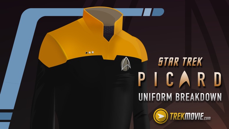
Thanks to filming on location at the Anaheim convention center, a number of photos from the location shoot for Star Trek: Picard have surfaced. Everyone’s talking about the uniforms, so here is TrekMovie’s breakdown of the uniform, created by artist Aaron Harvey. He didn’t have a trailer to go on, as he did when he created a similar graphic for Star Trek: Discovery, but he looked at the photos and pulled together a best guess based on what’s out there.
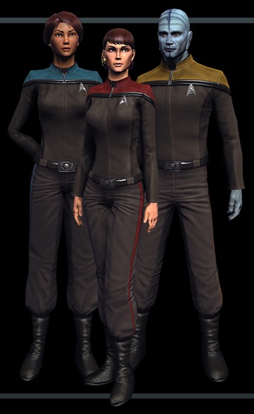
The Starfleet uniform from Star Trek: Picard
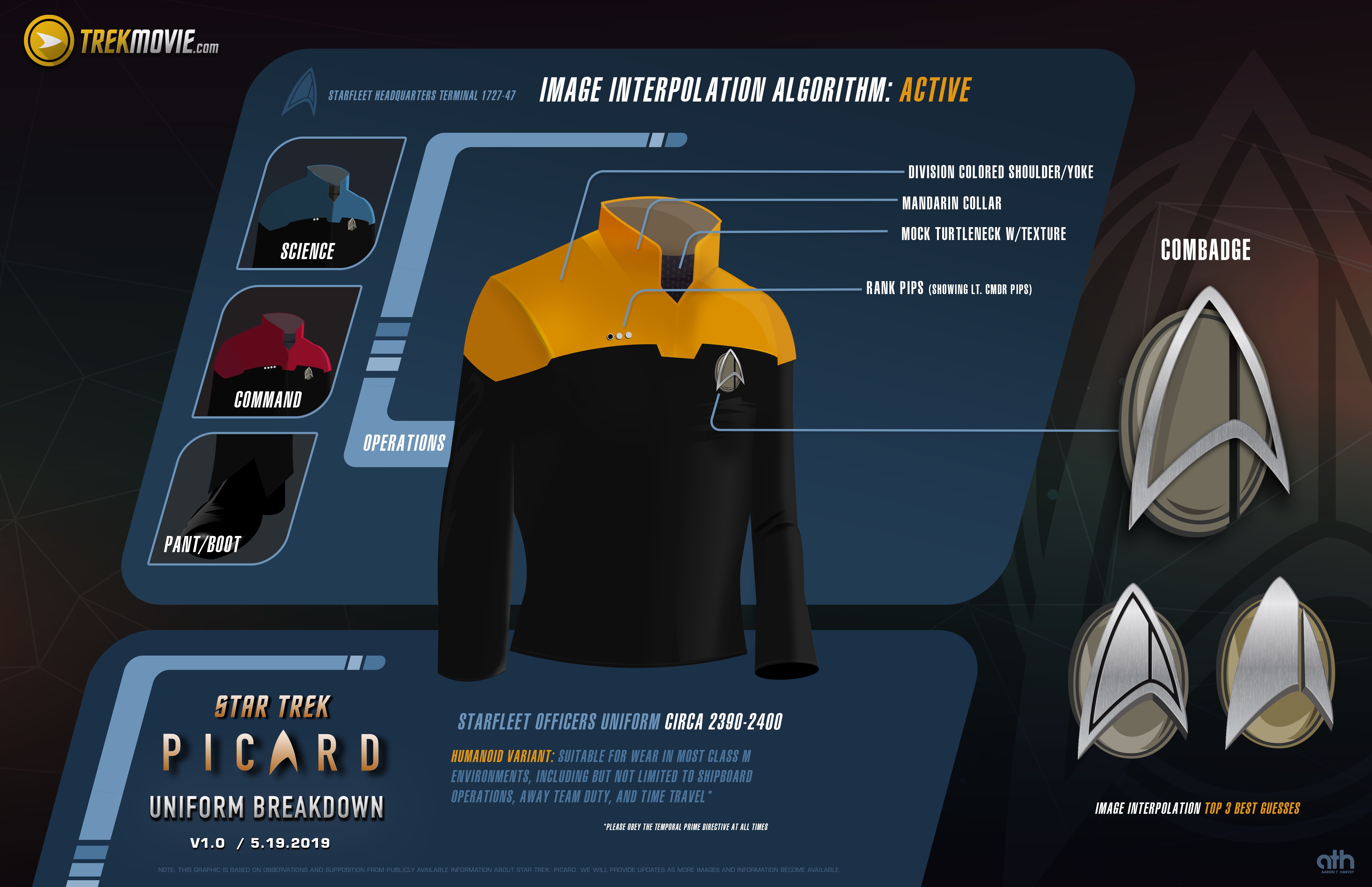
Star Trek: Picard Starfleet uniform breakdown (click to enlarge)
Design Notes
- Division colored shoulder/yoke
- High collar
- Mock turtleneck, possibly with a subtle texture
- Rank pips have been moved from collar to right breast (similar to uniforms seen in Star Trek Online and from the 2009 “Countdown to Star Trek”, movie tie-in comic book)
- Combadge is larger than its TNG-era counterpart. The little bit we can see in the CBS Upfront image suggests an open framed delta similar to the “All Good Things…” combadge. The rotated oval is a homage to the combadges of TNG and the promotional delta imagery used to celebrate the 30th anniversary of Star Trek in 1996.
- While it would be odd to have a split delta AND split background, it does seem that Starfleet’s “bifurcated delta” as established in Star Trek: Discovery is, for the time being, the delta of choice. This is supported by a closer look at the Starfleet Headquarters banners that have been seen in the recent pictures from the location shoot for Star Trek: Picard.
- The uniform consists of 3 pieces: undershirt, pants, and a zippered uniform tunic/jacket.
- The pants appear fairly similar to the TNG-era uniforms: full-length pants covering all but the heel, with a subtle triangular-cut opening for the top of the foot and toe.
- This uniform feels oddly plain, considering it’s from a modern, 2019 show. It lacks the detail most contemporary genre shows heap onto their costumes—the result of using super high-resolution cameras, and larger-than-ever home theaters. That perhaps indicates that this is not the final iteration of Starfleet uniform that will be seen in the full series. This could be an early mock-up of the uniforms used for a brief clip specifically filmed for CBS All Access’ UpFronts for advertisers. Similar footage was made and used for the same purpose for Star Trek: Discovery in 2017. It could also indicate that this series will be something quite different from all earlier Star Trek series, one that won’t feature Starfleet or its uniformed personnel as heavily in the past
Design Influences
This new Starfleet uniform has a lot of influences from the 24th (and early 25th) century; it’s a bit of a mashup of designs we’ve seen before.
The Next Generation
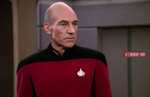
Perhaps the most obvious influence is the Next Generation season 3 uniform with its trademark Mandarin-style collar, which makes a return in Picard. Also, this new uniform is a two-piece design, like the TNG uniform.
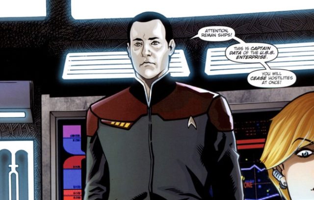
Countdown
The collar in the Picard uniform is higher and has a deeper V-neck than the TNG uniform, somewhat resembling the collars seen in the semi-official Countdown graphic novel prequel to Star Trek (2009), which shows the Prime universe events that led to the destruction of Romulus in 2387. The Picard design also borrows the similar positions of the rank pips—on the right breast, rather than on the collar.
Deep Space Nine/Voyager
Perhaps the second most recognizable design influence is that the division color is on the shoulders while the rest of the uniform is black, a lot like the more utility-focused jumpsuits seen on Deep Space Nine and Voyager.
Star Trek Online
Lastly, there’s a bit of the enlisted uniform from Star Trek Online as well, especially in the neck area, with the idea of an undershirt that you can see through the “V” in the collar. The division color is on the shoulders, like the Picard uniform.
Aaron Harvey is a graphic designer from Los Angeles and co-author of the upcoming book “Star Trek: The Official Guide to the Animated Series.” He also studies improv at Impro Studio in Los Angeles and will be in a fully-improvised show in the style of ’90s Star Trek, “The Improvised Generation: Night Shift.”
Star Trek: Picard is expected to be released in late 2019. It will be available on CBS All Access in the USA. Space and CraveTV in Canada, and on Amazon Prime Video for the rest of the world.
Keep up with all the Star Trek: Picard news at TrekMovie.


It does look cheap to the point of it being a one off use for the pilot. The design is cool, the materials and detail lacking.
And you can tell this from some blurry long distance on set photos and a fan-created extrapolation? Frankly, if it does look like this, i’ll be pleased. I feel some modern shows and movies overdo the “detail” and “texturing.” I know why they do it, but it’s actually starting to become less and less realistic/believable.
Umm, no, there is a short video (from a CBS promo) showing it much more clearly and it looks bad.
link?
I get the design choices… It would be nice to see some synergy between the new show, IDW’s Countdown and STO. Pipe dream, I know. But still.
Love when TrekMovie goes in depth on little tidbits while we are waiting for more info to drop. My money is on the uniforms not being important to the plot and/or a flashback.
I hope you’re incorrect, but you’re probably right.
I hope you are 100% correct, GQMF.
I don’t think the uniforms are insignificant, I just think they’re the Starfleet uniforms and there’s not much more to it than that. I DO think however that we’re not going to be spending much time at all with Starfleet in this series. I think the first few episodes might be on earth or at SF but other than that Picard will be going off on whatever mission it is that he feels he needs to complete to “make things right” and no that won’t be time travel.
Agreed…
It’s great to get the in depth look – with graphics!
THIS. IS. A DISASTER!!! OF BIBLICAL PROPORTIONS!!!
Now that we have that bit of nonsense out of the way, good analysis.
The new uniform has a similar cutaway as the Countdown version as well, though reversed.
The close up photo of it looks like cheap cosplay. Is this 2019?
Dr. Image I’m not sure cheap is the issue.
But it does look like the construction of the top wasn’t ideal on the ensign’s uniform. There is a definite bump where the neck facing ends, and another where the shoulderpad begins.
I keep thinking of Gersha Phillips point in a recent interview that the bright colours, especially the yellow, show everything.
It may be that with high definition a boldly coloured solid fabric is really unforgiving.
And it suggests that all the super detailed costumes we’re seeing in HD are as much to cover up small fit and construction issues as to take advantage of HD.
But it really doesn’t. The closeup of it on that actor talking to Stewart reminded me of the countless ensigns and background characters on TNG who seemed to wear the earlier versions of the uniform.
But at least theirs fit. It was obvious they weren’t wearing custom tailored uniforms like the main cast, but they didn’t exactly look unprofessional either.
I dont hate it. In fact its more true to the era then i was expecting!
so silly question.. you sure this is Starfleet and not Academy uniforms?
That was my initial thought as well!
Yeah I wouldn’t be surprised if it turned out to be either an Academy uniform or a Starbase uniform.
But if it is the regular uniform I think that’s fine too.
Yes, the banners show them at Starfleet Headquarters, there would be a mix of uniforms if these were cadet uniforms. The guy in the video is an ensign and the other shots from a distance show more pips so they are even higher ranked.
Well the pips could also indicate Class as in 1 = freshman 2 = sophomore etc.
The pips for Academy and the Pips for service are different, from the leaked footage I could see that they’re using the TNG rank pips, so if they were in the academy, then the pips would be more square, not round
Since the new trailer states Picard was an admiral, and he left Starfleet for some reason, that doesn’t seem to connect him to the Academy. My first thought was he is back at headquarters about to make a request or something…
All the banners in these shot say “Star Fleet HQ” so I am betting they are not academy uniforms.
TNG uniforms are my favorite, so the color over black isn’t what I hoped for. Still, I’m not going to judge anything until I see the show properly. If I judged a show based on costumes, TOS would be the worst Trek show, which IMHO, is not the case.
Nicely done, Aaron! Can’t wait until we get a look at the ship designs…
If Starfleet doesn’t play a major role in this show, they may have decided to design the uniforms mostly to provoke nostalgia.
Agreed. That’s why I went with the oval that calls back to TNG.
That promotional delta premiered with the special celebrating the finale of TNG, in May 1994, more than two years before the 30th anniversary.
The strangest thing is that they are using the TOS type font for the “Star Trek” title instead of anything related to TNG or DS9/VOY… It worked fin for DISCO or the KT movies, but this is the 25th century.
I’m guessing that TOS font is meant to be the brand for all Star Trek series now, like the Star Wars logo. Works for me.
Agreed.
OTOH, we are still 4-6 months out from the premiere. Go dig up the very first Deep Space Nine promo (the one without any photos or video of the cast—“Coming in January 1992!”).
THAT font was truly repellent.
The thing about that is the TOS font is widely recognized as iconically Star Trek. The TNG font is amazingly dated and just doesn’t sell the show anymore.
BUT the split font that screams 80s would fit with the bifurcated Starfleet insignia. Junkball on YouTube has a fascinating video about fonts in Trek, and I’m surprised by how many references there are across the series to various “Star Trek” fonts
The uniform on the cadet in the clip where he asks for Picard’s name looks like it doesn’t fit him and looks a bit odd. Seems to be really loose and like it was meant for someone else.
If you look at the chick walking behind Picard, her uniform is loose too.
Is there a particular reason why my comments keep going *poof*?
I really hope those are not the new combadges. The one from “All Good Things…” and “Endgame” would be better and more in line with canon.
It would also be nice for there to be better synergy between ST:P, IDW’s Countdown and STO. It would be nice for CBS recognize at least some aspects of the game as canon. I’m not so sure about all the story lines, but definitely the Enterprise-F and the uniforms.
LOVE IT!!!!
As said, its very TNG era, but updated to recognize its in a new era. That’s how you SHOULD do it!
But it still may just be a cadet uniform although the officer uniforms may only be slightly different from this anyway
When the uniform change is this subtle, it doesn’t really matter much in the grand scheme of things. The only thing I saw that I liked was the move of the rank indicators from the collar (always felt that was silly) to the more visible location up front. Otherwise, not much of a change.
I think it far more likely that the position of the pips was influenced by those on the future uniforms in various episodes like “All Good Things…”, “Endgame”, and “The Visitor.” Those uniforms would have inspired the position of the Online and Countdown pips, after all.
That’s where they were in Enterprise
I bet Geekfilter made the infographics. Just gorgeous!
Look very much like the discarded Generations uniforms they originally used before changing to DS9 while filming.
Not really, the colors were reversed
Do we refer to this commbadge as the Commbadge Plus or Commbadge Pro?
Do not need elaborate detail. Simple texture is enough.
It seems to be lacking even that however.
Also love the new com badges! That’s the biggest indicator we are back in the 24th century. I even loved when they made an appearance on Discovery with Section 31.
The Section 31 badge is the best one I’ve seen so far. I almost bought one, but I’m too cheap.
Could this be the first Star Trek show that is NOT based on characters in Starfleet? That actually would be kind of cool and different. Perhaps Picard is a diplomat on some journey or quest? And maybe since the uniforms are not heavily detailed, Starfleet is just in the background, only appearing every so often.
This sounds very promising, but with the track record of these Discovery writers my optimism is diminished. But, here’s hoping!
It’s a different writing team and Michael Chabon is on it.
Chabon did some work for Discovery as I recall. At least the Short Trek about the abandoned ship falling in love with a stowaway. I thought it was well done. He may have some behind the scenes coordination with Discovery depending on whether his short syncs up.
I have a feeling we may not see Picard in Starfleet in the beginning but by the end of the season he may become part of it again. But yes this would be something really different and interesting if its not directly about him being in starfleet anymore. It shows they are willing to think outside the box and thats what Star Trek needs.
I’ve been very skeptical about any TNG characters making appearances, and have basically assumed the storyline will be away from Starfleet.
But Jonathan Frakes’ new tweet showing him with Patrick Stewart has got me reconsidering.
Yes, we know Frakes is directing the 2nd two episode block.
But he looks like he’s had a significant beard and hair style reshaping from his directing stints on Discovery and the Orville.
Could be just happenstance…but it made me wonder if he has a small role as Admiral Riker.
I still have a feeling a few characters may show up first season TG47, just trying to keep it all a surprise. Yes, I expect to be completely wrong lol but I just can’t get over the fact the same group that put Pike in Discovery for 14 straight episodes and made him captain of that ship when he was already captain of the Enterprise when there was NO reason to do it other than obvious fan service and to get more people to watch Discovery is not going to push the fan service envelope a little more on this show too. Especially when they know other characters will only motivate people to watch more.
But maybe they think Picard is all they need to get those people on board. But people still want to see him interact with others from TNG. Its not about having a ‘TNG reunion’ it just would feel weird he would have no ties to any of them at this point. Or maybe the plan is to hold off on any TNG characters until second season and let the new characters develop first. If so, then thats a valid reason.
Personally, I would be pleasantly stunned if NO TNG people appeared somewhere in this show. I am fully expecting two or three to show up and various points during the run. When they all say they have not been contacted, I cannot help but think that a rouse.
PLEASE, make a uniform that fits Picard this time.
But then he wouldn’t have an opportunity to perform “the Picard Maneuver”!
Thumb’s up to that comment!
When Star Trek 2009 was announced, I wrote to J J Abrams and suggested that all the crew on the new Enterprise wear baseball caps with ‘Star Trek’ written on the front.
Could this happen in the new Picard series? I might write-in and suggest it…
Baseball caps already happened in DS9.
And Enterprise. That NX-01 hat was boss, though.
I think the combadge might just be the existing “future version” seen in All Good Things instead of this oval-shaped one. The sharper angles in the existing one would also seem to match the uniform better, but I could be wrong.
It will probably be neither! It’s hard to guess from just a tiny bit of the top of a delta and a blurry far off shape, but that’s part of the fun of guessing!
Trekkies are irredeemable a-holes. If it’s not exactly like the originals, it’s newfangled “crap”; if it’s exactly like the originals, it’s not “advanced” enough, which is actually crap, since comfortable, practical clothes aren’t going to change in only 300 years, if ever.
Nice over-generalization, yawn
I like them overall. I agree with those saying we might not see much of Starfleet, Picard and Co might actually be trying to avoid them. Perhaps Picard starts off as a Professor or Professor Emeritus at Starfleet Academy.
There was a list of character descriptions for “Picard” reported a few months back. Have no idea if it was authentic, but it seemed to suggest Picard would be teamed with a group of Han Solo types. Or better yet something like the “Gambit” two-parter from TNG.
I’m not sure about the authenticity of the character descriptions, but the casting has definitely skewed younger. Somehow this is all supposed to tie-in with the destruction of Romulus, though it’s unclear how big a part of the story that will be, or if it is just an important character moment for Picard. I really enjoy Discovery, but moving ahead to post-TNG-era is exciting, as we can get subtle (and maybe not so subtle) tie-ins with the events of TNG/DS9/VOY.
Exciting indeed.
I would like to see props like the type 2 phasers, tricorders, and communicators of this era.
Some of the Starship designs would be good too…
Maybe we’ll see the USS Emmett Till from DS9 doc!
..Though as an Amazon Prime subscription holder I’d like to complain about the unfair advantage given to Canada and EU countries to watch this for Free through their subscription. While the USA counterparts get screwed and have to pay CBS all access!? It’s like a “WTF” momemt !
Aaron, Amazon is not free. In fact its actually higher than All Access in some places like in America. In Canada, they still have to subscribe to that cable channel to get it and one person said you can pay up to $18 a month to subscribe to it depending on your package deal and location.
Why do some people act like these shows are being watched for free everywhere? Its NOT, every platform both Discovery and Picard are all on paid media. No one is showing it over free airwaves. And believe it or not not everyone has Netflix or Amazon already. Some really do have to subscribe to those just to watch the show as we did for All Access. That’s the point after all, to get NEW people to subscribe.
And dosent everyone just down load or stream the shows illegally of they can’t get or want to pay? Am I the only one that still downloads torrants and putlocker type sites?
I guess most sites frown on people advocating to download things illegally so most people don’t mention it, but sure people still do it. But I do think it has become less and less of it as media companies have become more saavy and there are more crackdowns on those sites.
But I have no doubt plenty o people watch the show illegally.
We’re still paying extra. That’s the point he’s making. Come on. Yes, people are paying for Amazon all around the world. But only the US has to pay extra for the CBS subscription. To watch it on Amazon. Which we’re already paying for.
Speak for yourself. I don’t pay for Amazon Prime. It’s currently not worth it at all.
Agreed, like no one needs 2-day shipping, and Amazon is an evil corporation, total antithesis to Federation values, so like why would I want to line Jeff Bezos’s wallet?
I honestly cannot tell if you are being sarcastic or not.
Yes well, welcome to America. We pay more for everything, like healthcare. CBS has chosen us [their home country] to make their money off their streaming service. Seems to me like they’re entitled to do that.
As a non-US resident Id’ like to complain about the unfair advantage given to US residents only needing a single subscription to watch Star Trek.
Aaron we can no more watch it free through our paid subscription to Amazon than you can through your paid subscription to CBS AA.
Sometimes you just can’t improve on perfection. I have always thought the STNG Season 3 uniforms, with Picards own variants, were the best of all series and closest to what TOS uniforms could have been in the future. DS9 and Voyager were variants of the academy uniform and never had the impact for me. Similarly the Enterprise D is still the most beautiful and sleek of all starships with it’s smooth lines. the USS Discovery took a while to get used to but I still don’t think it’s a ‘beautiful’ ship. I suppose we’ll just have to get used to these new uniforms designs.
The Disco is ugly as hell, and although the D is graceful and elegant, she isn’t my favorite design
From the combadge design I get the sense that in this Picard timeline perhaps the Federation is fractured 20% Section 31 or some other force maybe?
Beautiful art, Aaron – represented like the true communication artist you are. Although all things must evolve, I must say that the badge/communicator established for the 7 seasons of TNG was the best. Its beautiful, almost art deco-ish design, is/was timeless. They never needed to stray from it, except for mirror/alternate universes, and finally officially for the TNG films.
Thank you! The badge is guesswork based on blurry imagery, so it may be totally different. It does seem markedly bigger than in the TNG era though!
UGH-LY
As much as I loved DS9, I never really liked the early-DS9/VOY era mostly-black jumpsuit uniforms. These are pretty reminiscent of those. I don’t think I’m in love with them.
Sometimes, less is more though. I’m happy at least they do not appear overwrought like some contemporary TV and movie designs.
Reminds me of the alternate generations uniforms with the colors flipped
So what happened to the blue grey uniforms in Ds9 and movies? Seems likes these are a step backwards.
Had they brought in Robert Blackman we probably would have seen that design updated in some way. What we have here is essentially a reimagining of the uniform from TNG Seasons 3 – 7.
Seems more reminiscent of DS9 Seasons 1 – 4 and Voyager uniforms with the colored shoulders and black everything else.
Yeah, I liked the three piece upper body part of the uniforms. Lots of options—jacket, vest and solid undershirt, or just solid undershirt. Looked spiffy.
TNG uniforms all the way, ive spent countless time, drawing those as a kid, very inspirational uniforms
Can we PLEASE get away from the broken delta? That’s literally my only complaint.
Mine too. That is truly my only complaint of this uniform. And while I prefer the final DS9 uniforms* to this, these are decent uniforms. But that “bifurcated delta” has to go.
*My favorite uniforms are the TWOK ones and the FC/DS9 ones. Uniform uniforms, HA!
Why not just modify the First Contact uniforms? Just work from those designs. Why the drastic and backward alteration? Even real life uniforms in the armed forced have not changed that much over the decades. Not very believable to be honest.
holy jawas it’s finally happenning!
Ahh. It has the Kurtzman “25% different” delta.
Midnight’s Edge don’t know anything.
They know what they’re doing. They’re angry fans trying to de-legitimize what they don’t like among other (presumably) angry fans. And from the comments on Youtube and AICN it’s working. It’s having a Trumpian effect on the community. They know from personal experience that angry people are pre-inclined to believe anything you say as long as it’s negative.
Interesting analysis Sam.
It really makes me appreciate the articles and atmosphere here at Trekmovie all the more.
Hey, you win most ridiculous comment so far, and the page is 95% ridiculous comments!
Afterburn being afterburn. Do you need an analgesic cream? Or maybe a tranquilizer
The 25% difference thing was an offhanded remark by John Eaves and it was an art directors note which had NOTHING to do with legality. He’s said that over and over but now some YouTube channel that thinks it knows better has manufactured a conspiracy theory out of it.
I get that kind of note all the time. “Make it X% different” It’s a verbal shorthand for “Can we get something different? Not sure how much but just make it visibly different than the last iteration.”
So damn frustrating.
Nice graphic, although some of the details are a little off. For example, you can see from the set photos that the coloured shoulders are not pointed in the way that they used to be; the ‘point’ is now flat, to match the little affectation at the front of the yoke.
I quite like them. They, at least, follow the established uniform aesthetic that has gone before, unlike the actual Star Trek Online or Countdown versions.
Thankfully they’re back to a sensible rank display.
Looking again at one of the set photos, is it possible the combadges are different colors to match the uniform’s division coloring?
Looks like a DS9/VOY uniform altered to look more cartoonish. The “V” division color bump in the middle, the black shirt/turtleneck underneath… Meh
Will there be a dress uniform like the ones on the next generation? It would be net to see that one.
Doing the Morn’s work. Thank you.
I get the impression that Starfleet is not factoring into this series in a huge way, so I suspect we won’t be getting much opportunity to be horrified about some minor design details.