

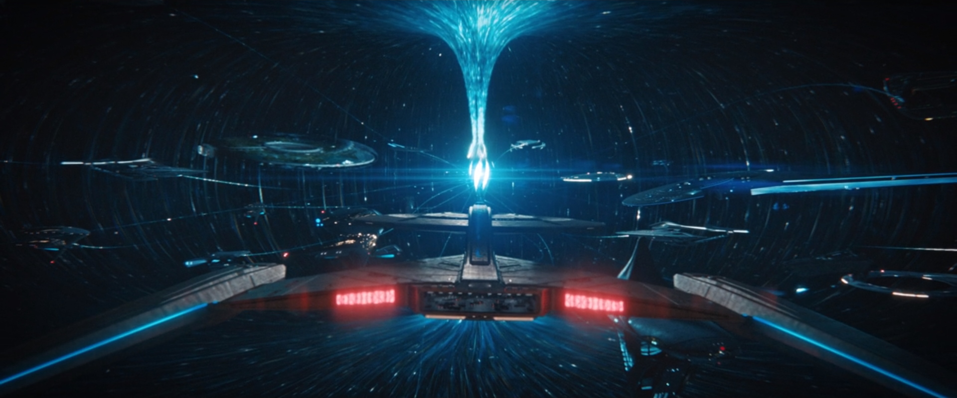
What has fans buzzing most about this week’s episode of Star Trek: Discovery is finally getting a good look at Starfleet in the 32nd century. In a new video released today by CBS (originally shown on The Ready Room aftershow), visual effects supervisor Jason Zimmerman talks about what went into that scene. We have that video and a closer look at some of the Starfleet ships, including some homages to Star Trek: Voyager and Deep Space Nine.
Creating new Starfleet is terrifying honor
Speaking to Wil Wheaton, Jason Zimmerman gave full credit to the art department, production design, and show executives when it came to putting together the sequence introducing the 32nd century Starfleet HQ and ships. He also talked about how putting together the sequence, and how a certain ship was a “scary” challenge:
This is new canon and it’s not just new canon, it’s going to be one of the most beloved things. It’s Federation headquarters. The fans are going to be rabid to see what this looks like. And they are going to be very, very scrutinizing about how that looks. It’s been a great honor to be able to do something on that magnitude for Star Trek. The Federation headquarters, the look of it, the Voyager. Any time something canon comes up when we are doing it, whether it was the Enterprise in season one or now the Voyager, it’s an honor. it’s also terrifying because it is something that belongs to canon. But to do the Voyager now… outside of the timeline we have seen before, man it is scary. All you want to do is make sure every fan that sees it says, “Oh my god, it’s Voyager.”
Watch it…
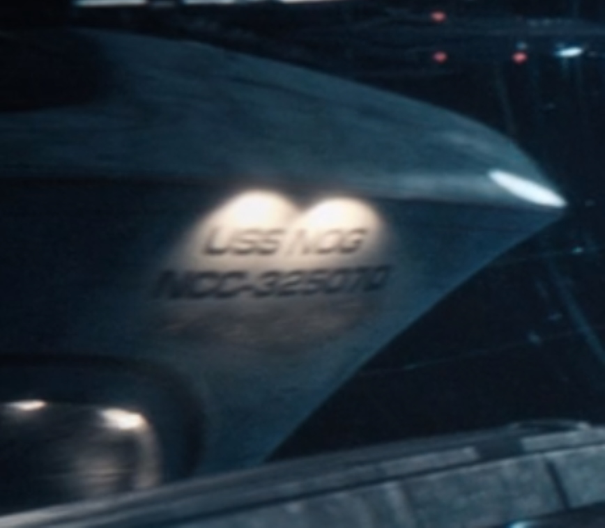
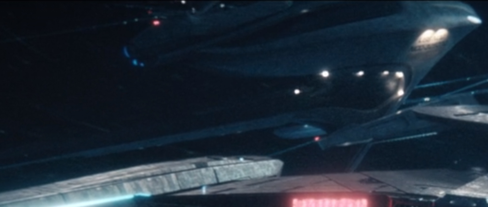
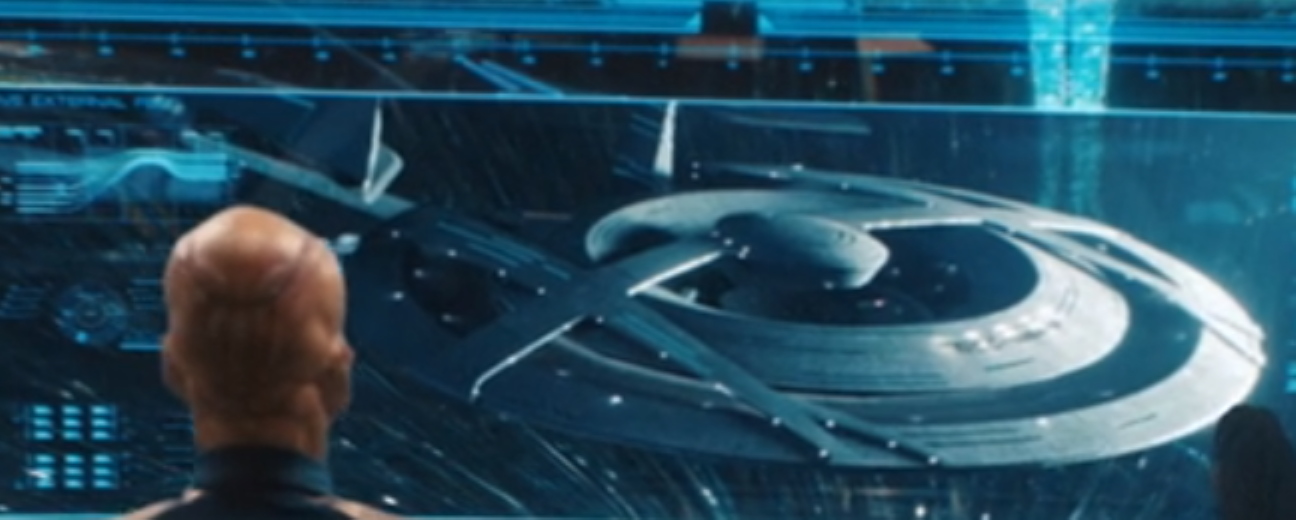
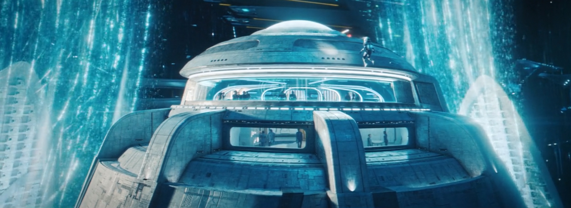
A closer look at the USS Voyager-J and USS Nog
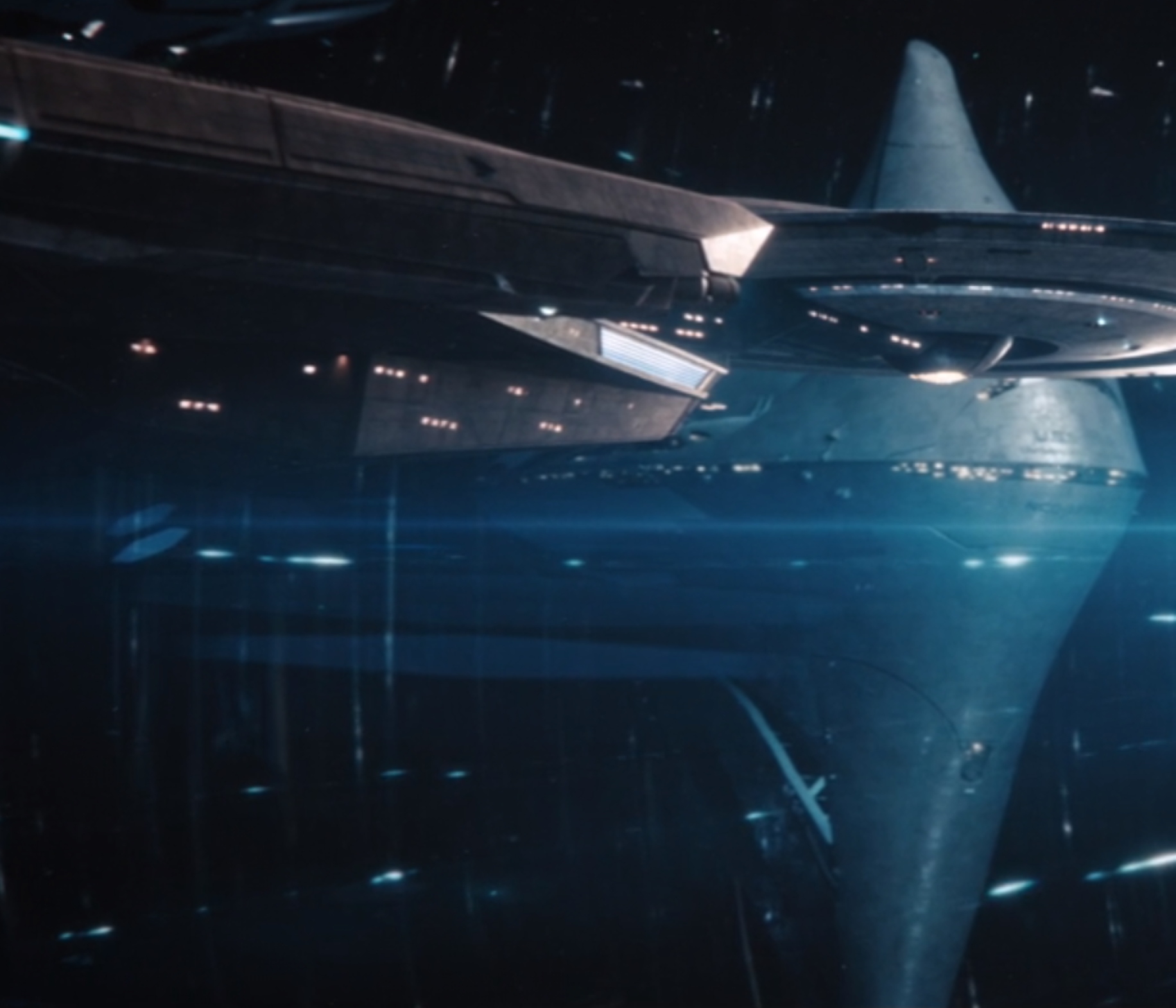
There was a lot to look at during the introduction to Starfleet sequence, but two items stand out. As Zimmerman noted, the update to the USS Voyager from the show Star Trek: Voyager was pointed out by characters on the show.
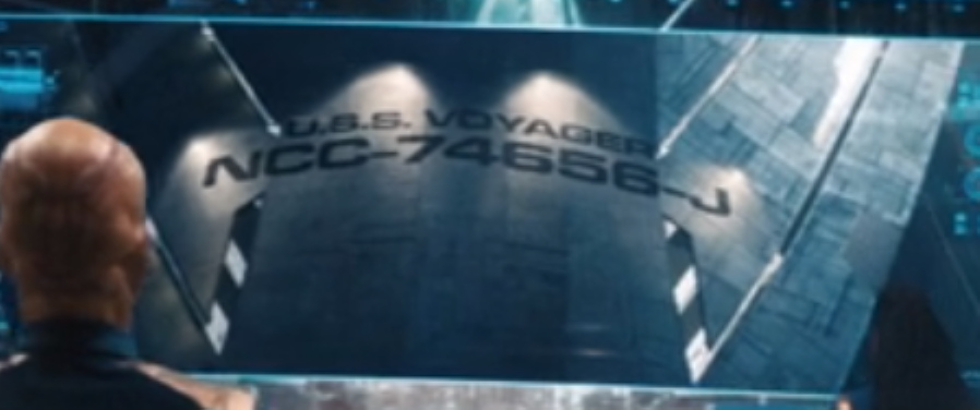
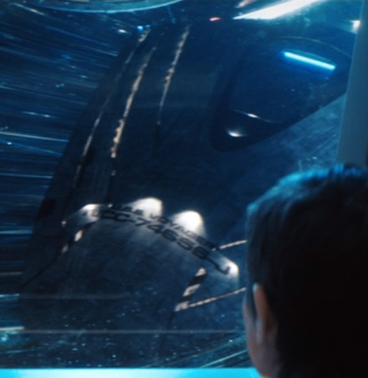
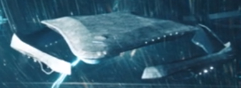
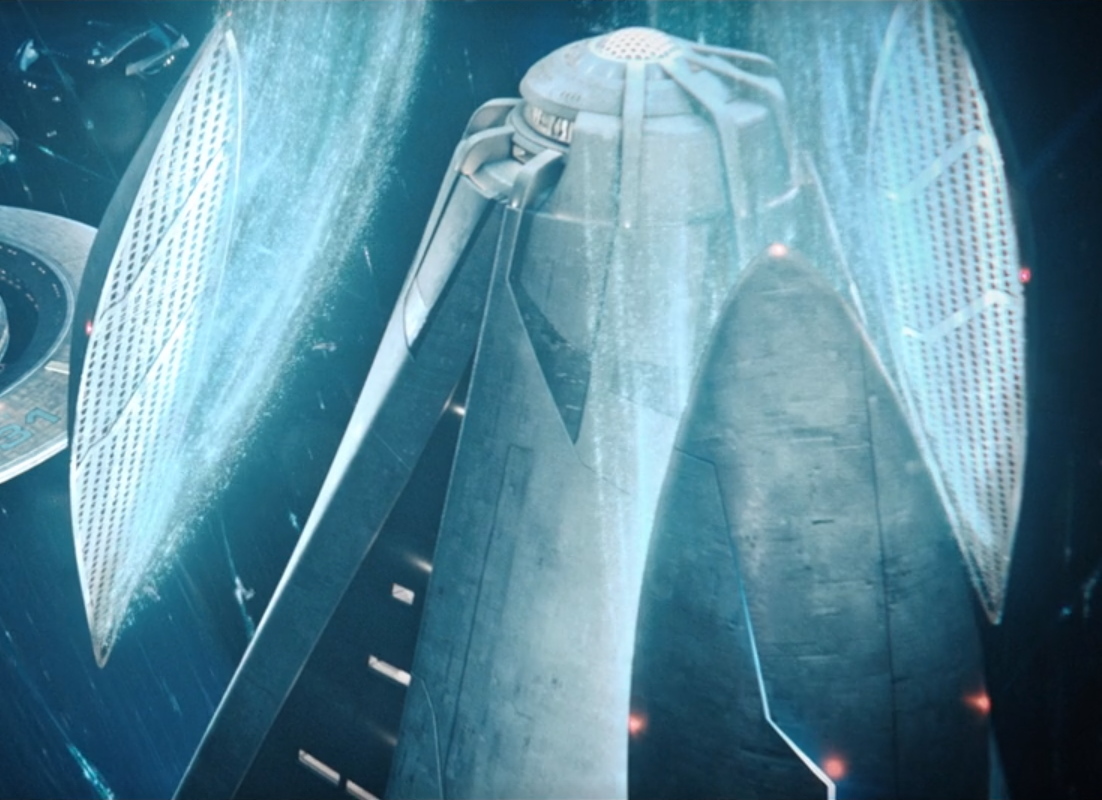
While not mentioned by the characters, the Discovery also passed by a new style ship called the USS Nog (NCC-325070). Presumably, the ship was named for the Star Trek: Deep Space Nine character Nog, the first Ferengi in Starfleet. This is a nice tribute to Nog actor Aron Eisenberg who passed away last year.
More 32nd century Starfleet
Here is a wide shot of the fleet.
And there was some speculation by the Disco crew that this was a new large Constitution-class (like the original USS Enterprise).
There was also a new scout-type vessel.
And also what Tilly referred to as a “flying rainforest.”
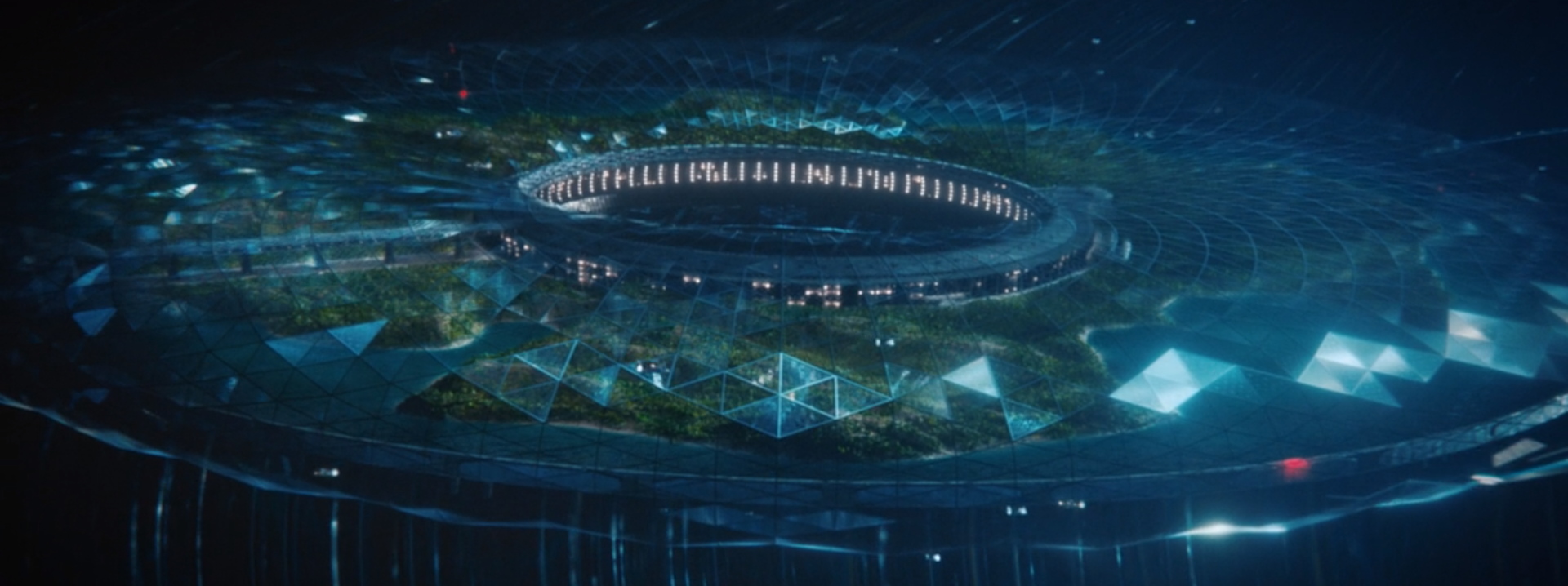
Finally, a closer look at Federation/Starfleet HQ.
More from cast and crew on new Federation
A new “Moments of Discovery” with co-showrunner Michelle Paradise and some of the cast talking about the new Federation,
New episodes of Star Trek: Discovery premiere on Thursdays on CBS All Access in the U.S. and on CTV Sci-Fi Channel in Canada, where it’s also available to stream on Crave. Episodes are available on Fridays internationally on Netflix.
Keep up with all the news and reviews from the new Star Trek Universe on TV at TrekMovie.com.


These vfx shots were dreadful. Shameful lack of effort and imagination.
It was neat, but sooo hard to see and make out
Oh, come on!
Really!?
Really!? Yeah man it’s an opinion.
I’m certain it’ll look much better on blu ray once it comes out, at best I get 6 mbps download speed.
So sorry, not to offend anyone, just that I was totally surprised, I really enjoyed the visual aspect of that scene, the whole concept, the ships, etc. It has been one the most exciting minutes of Discovery. Beautiful idea and amazing execution! I was waiting 5 episodes for this, to see the 32nd Century. Looks messy, can’t figure it out the whole bubble, but it totally awesome.
Bravo to the team, for including USS Nog, Voyager!, and the new Enterprise? Titan? Discovery?
My favorite easter egg was the USS Nog, strong emotions thinking about the actor, he was an great human being, always grateful for his character, DS9, the fans. Nog as well, an amazing character from my favorite Star Trek Show.
I am really enjoying Discovery. =D
It’s all good man
“Shameful lack of effort and imagination.”
If you say this about the ships, what are you going to say about the uniforms?
The admiral’s uniform was too blingy — par for the course for the Discovery uniforms. However, the rank-and-file uniforms weren’t awful.
I don’t get why the uniforms from STD and JJ Trek look like Nazi officers uniforms. Not a good look. Much unlike the Admirals uniforms in TNG DS9 etc.
I’m not commenting on aesthetics but the fundamental functions. It’s like the designers produce WW2 uniforms in a medieval knights movies (instead of chain mail armor). Maybe the WW2 uniforms look cool and no effort was spared in the craftsmanship, but they get an “F” from me regardless for missing the mark by about a thousand years!
I completely agree. With the partial exception of Voyager, we actually got to see very, very little detail. The entire shooting/lighting style of JJVerse Trek and DISCO makes it hard to make out anything. The long Enterprise sequence in TMP this was not.
AGREED.
This presented a significant contrast from the finale of “Picard” where an eagerly anticipated reveal left fans universally disappointed. Discovery delivered with this scene and left fans eager to see what awaits them in upcoming episodes.
They really created something beautiful and intriguing. And during their own Covid-related displacement. And taking Earth out the equation right away was a masterstroke.
Picard fans were not universally disappointed, so please do not try and speak for everyone.
A LOT of fans were disappointed.
I loved Picard, but the cut-and-paste fleet was a real letdown. It would have been nice to see variety, or at least some Sovereigns, Intrepids, Novas, or other established classes.
Agreed. All around, I thought PICARD was excellent, possibly excepting the character of Narissa, who was a real moustache-twirler. But…the could have done *something* that didn’t make it look like cut and paste.
Totally agree Kakairo. The final episode of Picard, you can tell A) They did not have the budget or B) They didn’t have the time to design all the ships. It was a missed opportunity.
I thought they missed a trick by not taking advantage of all the modelling done for Star Trek Online… I’m sure it would’ve been quite easy to wrangle using all their ships for background vessels where the lower resolution would not have been an issue, and the Zheng He class could’ve been a forward wing of just a dozen or so leading the fleet (which would’ve given them more time to make those models look less… plain)…
Wonder if they are allowed or would like to use Star Trek Online ship models. That will save them time instead of creating new ones. All other scenes look fine, not sure how they missed designing more ships for Riker and Oh. I believe time or budget was the big factor. When I saw they used the bridge of Discovery for the Titan, I knew budget was an issue for the finale.
I would have enjoyed more variety in the Picard finale but I was ok with what I saw. I do think with these shows they’re constantly learning a little bit more and more about how to make Star Trek in a way that pleases fans and lets them do what they want. Like the TNG writers had to learn over a few years as well.
It does feel like they’re understanding a bit more the balance between useless fan service and real worldbuilding and imagination-building. This latest episode opens up the imagination and invites you to speculate about the deeper world of Trek, whereas a lot of fan service closes imagination off by just regurgitating things you know.
They could have avoided that embarrassing fleet of identikit ships by just having one Federation starship commanded by Riker and one Romulan warbird, rather than making it a fleet battle.
What works on the page doesn’t always translate to film, as they say. I think the unexpected arrival of a Federation starship would have been enough to avoid a potentially larger conflict.
For me the problem in the Picard finale and Discovery 303 (the Burn scene), was that the perspective wasn’t right. I really did perceive the depth of field, and that’s a fundamental failure for realism/believability.
But in 305, the static warp bubble of Federation/Starfleet HQ worked in terms of perspective so that I could enter into the awe.
I hope to see more soon.
So true. I remember how excited I was to see all those ships show up just to be disappointed a few seconds when it look like hundreds of the same freaking ship. It was still a good scene but Riker saving the day in the LDS finale was much better IMO with only one ship.
Its still weird they couldn’t just a few more variations, especially when you see what they been doing with Discovery fleet line of ships in season 1 and now season 3.
“This presented a significant contrast from the finale of “Picard” where an eagerly anticipated reveal left fans universally disappointed”
It seems to suggest a vast difference in budget between the two shows, much more so because Picard’s was the season finale!
(Or Stewart is eating it all up!)
Stewart didn’t come cheap, to be sure, but I think the starship SFX difference is more broadly attributable to other production costs. It’s way more expensive to do a show in Hollywood than Toronto, though you do get what you pay for in California — the scale of the film industry there means there’s just a much deeper talent pool when it comes to (secondary) acting roles, set designers, camerapeople, etc. I thought the difference really showed in “Picard” too, SFX aside — to me, it had far better production values than “Discovery” overall. But, since Toronto is so much less expensive in general, that means the money saved in other elements of the production can be funneled over to the SFX (which can be done anywhere, in the digital age) without compromising the bottom-line too much.
Totally agree, Denny C. You can see they spent more time, for the new look and feel of Starfleet and the Federation.
I was expecting these type of scenes since the first episode when Burnham arrived.
I enjoyed Picard, but we are comparing Picard Season 1 vs Discovery Season 3.
To keep the tradition, Discovery is now getting better, usually happens after tye third Season.
“we are comparing Picard Season 1 vs Discovery Season 3.”
And why again do they need to un-learn all painful lessons from Discovery just 2 years later? It’s the same freaking people!
I think the majority of TV shows need time to adjust, to polish the final product. They have been very busy, non stop, they are doing great. I give them credit to bring Star Trek back, not only one show, but 4, and two more coming next.
The mushroom spacedock looked cool, the starfleet ships from the 90s looked great, this 31st century starfleet headquarters is boring, not memorable and dull.
Can someone explain to me why the crew of the Discovery made such a big fuss about a ship called Voyager. What significance would that name have for them? Does not make much sense to me.
That is a good point. They were 100 years before Janeway’s Voyager, so would have no knowledge of its historical significance.
Seriously! Of course they dont know Voyager. They also didnt know about Trill Symbionts until that Odan Episode of TNG. So they acted as if they knew, or they just werent surprised. But those are minor quibbles.
Saru explained that he learned about symbionts from the sphere data.
They recognize that ships named after other ships are given a letter. They don’t care about Voyager itself, they see the J and think ‘wow, one ship was so legendary it has almost a dozen descendants’.
I still don*t understand how they could recognize the meanig of the letter, when Starfleet started this tradition not before Enterprise A.
How do we know that? Just because it wasn’t on screen doesn’t mean there wasn’t an NCC-100-A or something before.
You’re putting more good thought into this than the people making the show, who are content to just wink at the audience.
its not so hard to figure out why there is a letter attached to the name,
Although it was later retconned, the Yamato in TNG was originally given the registration number of NCC-1305-E which could imply that there may have been an NCC-1305-A contemporary to the NCC-1701 (& NCC-1031)… Utterly apocryphal now, I know, but it fits my headcanon…
Right after Tilly said that about the J, someone else commented “I’d love to hear those stories.” I think that was meant to be an homage to Voyager as a tv show, not the ship that they new nothing about as far as their experience. Voyager was definitely one of the best Star Trek shows made.
Voyager was one the best 5,000,000,000 Star Trek series made.
Since they have the spore drive there’s no reason Discovery can’t visit the Delta Quadrant. I wonder if we’ll see any elements of Voyager re-visited. Though I can’t really think of anything I want to see again in this show. None of the aliens really felt worthy of re-visiting, except maybe the Borg. But Picard is doing that.
Oh please bring back the Kazon. No way. Also Element of Voyager ha sbeen revisited. Seven of Nine is in Picard.
There was a Kazon listing in one of the scenes at Starfleet in the beginning of the episode.
Someone else said it, but it was probably the fact it was the ‘J’ that attracted them. That there were ten other ships named that was unique for them.
It was a marker of how much time has really passed and technology has advanced that they could viscerally understand.
Thats a great idea! Too bad they missed other potential markers to denote the passage of a millennium (insread of “business as usual”) ;)
That never made much sense to me. It is a ship’s name that history remembers and honors, not some registry number. The World War II Enterprise, CV-6 was the most decorated warship in US history. The next Enterprise was the first nuclear carrier and was CVN-65. The next will be CVN-80.
The Enterprise in Star Trek IV should have been NCC-2701 or something similar. There has never been any strong justification for the letter suffixes.
For the letter, this is just how they do it I guess but your way sounds good too.
A bit of trivia for you, but the Enterprise in TNG was originally suppose to have a number next to it instead of a letter, but when TVH came out with the Enterprise A so they changed it. In case you didn’t know.
Surprise!
Starfleet doesn’t exactly follow US Navy Conventions or general military honors conventions…
It isn’t just US Navy. Can you point to any other ship in any navy receiving the same registry number but with a suffix when a new ship with the same name is built?
No, you can’t. Why? Because it doesn’t make any sense.
Starfleet isn’t the Navy though. I hear what you’re saying but it’s not some rule they have to follow just because they borrowed a few ideas from that group. And frankly I prefer the letters for the show.
It makes sense since it isn’t the Navy or any other US military branch.
It would be interesting to see a theory on how the letter suffixes came about. But it is going to be some tortured logic, I suspect.
Ok so I have a love/hate feeling about the Starfleet HQ & ship reveal.
What I loved:
What I hate (or don’t quite understand), comes down to one thing, the look of the future fleet of ships:
this is far in the future, past the Enterprise J era (which, in itself, was flat as a pancake). So I guess that’s just the way things go in the future. If you don’t need giant engine rooms, you don’t need a big fat ship.
constant feeling for both visuals and characters/stories: always gasping to make (or feel) something out from the pacing they´ve chosen…. i´m a star trek guy al the way but i am understanding and therefore enjoying the mandalorian so much more…. maybe i´m old or something…
This scene in general was still incredible. Seeing the Voyager J was a surreal moment for sure and hope we can see her in action on the show this season.
Impressive how some people in the comments can still be sad and angry about something like this … It was an enormous fan service and I personally loved it. I actually watched that sequence three times and that is very, very unusual for me, because I am a fan, but not a nerd.
I have to say that this season of Discovery has brought back a lot of the excitement, fun and sense of wonder that attracted me to Star Trek TOS when I watched the reruns as a little kid and when TNG started when I was in my teens.
It is impossible of course to do everything “right” for everyone. But it is clear that a ton of very talented and dedicated people are involved in this show. And I am looking forward to my Star Trek Thursdays! :D
I don’t understand your first paragraph. Pretty much most people loved it here. There will always be a few who don’t like something but they are far from the consensus. It seems to be a homerun, especially showing Voyager and the USS Nog.
Yeah it was fanservice…. nothing more. And this is sad.
That’s the insight into the production process I’ve been asking for, thanks!
Now, let’s do the same for the costume designers and hear their rationale for designing the new uniforms: “1000 years? Ok, let’s do the same but in grey!” ;)
Sameold/sameold for NewTrek TV VFX …Just a stunning lack of detail … man, anybody running these images against 20th Century mo-con model stuff is going to think this is just animatics/placeholders for real finals coming later. Just awful.
Some of it looked unfinished, but not all.
The design and depth of field was definitely better.
Let’s remember though that many of us said here that we’d accept something a bit short of the mark due to Covid.
Personally, I’d rather they have the fundamentals right and have the chance to polish later, than to have bad design that we’ll have to live with indefinitely for this era.
I’m just going by the clip showed above — was there some space scene in the show that was actually clear and sharp? (would be a series first.)
kmart, problem is, they think “smudgy” is a signature style ;)
Style that is out of touch with or deliberately not cognizant of the reality of a thing — unless in service to a genuine artist, which ain’t the case here — isn’t really style to me at all, instead just owing to cheapness and/or stupidity/trendiness.
Folks might not think this a valid example, but I think MESSAGE FROM SPACE fits the bill nicely. During a spacewalk scene, the characters are seen on the hull outside without spacesuits. Questioned on it, the director said he wanted space to seem a more friendly place! The smudgy DSC/CBS look (and I definitely include PICARD on that, the borg cube stuff is disgraceful) suggests that the call to wimp out on clarity in space is equally disrespectful to the nature of space, as amply demonstrated when comparing it with film and video of real space missions. You can (and should) fault TNG for having too many light sources in early space scenes (I think Justman or Probert admitted that it was scientifically correct only if every system they go to has 11 suns – that was in an early poster magazine), but it wasn’t as flagrant, stupid, and visually unappetizing as what we’re getting served up by Kurtzman’s folks.
I doubt this is due to covid.
It was the same in the other seasons.
I’m thinking in particular of a few shots, like the top section of the station, that just look unfinished, almost like pencil sketches or black & white mattes.
Those I’m excusing on the basis of Covid, and hope to see better renderings where the inset characters in the windows don’t look to be part of a different project.
I agree with kmart that the entire way lighting in space is handled is weird, but I can understand that they are sticking with the “look” of the series at this point, although TNG was able to move from away from bluescreen during its 7 years of production, so transition to better could be mapped out.
What really annoyed me was that, despite a lot of talk about different production styles across series, the same approach was used in Picard.
It seems to be either a blind spot or a money decision.
It would make sense given how Discovery is performing, and the standard set by the competition, that ViacomCBS would increase the budget to enable SNW and the S31 series to up a level in vfx and bring in another team and even company.
I’m not particularly hopeful though.
People keep using the Covid excuse and I keep thinking, there are people sitting at home doing this for fun with ZERO budget and making things 10x better than a team with a million dollar budget.
You can’t buy passion and dedication I guess.
Ok. Million Dollar Question. Where is the Enterprise!!!! Lol.
Saving the day in the season finale, no doubt.
Captained By a riker hologram
I feel like Star Trek has struggled going from models to cgi for space sequences especially with ships. The Kelvin films I think are an exception, but starting with Insurrection and going into the current batch of shows there is a disconnect in the story telling between the live action and cgi shots. It still just looks fake. Even though the matte work wasn’t always great and there were so many limitations with the models there was something tactile that made the ship seem real, it wasn’t a cartoon or video game (save for the ST:V disaster). I don’t think it’s the design of the elements themselves like the ships,, but the execution of the shots. I think they value fancy and busy over simple and real looking. What’s disappointing is that other shows, as far back as the BSG reboot and Mandalorian or Lost in Space today get it right, the effects heighten rather than confuse the story telling.
The only stuff that worked for me in the Abrams-directed films was the Kelvin stuff, which really looked liked a physical miniature (and since Kelvin Optical, the physical fx part of ILM, did work on the film, it has made me wonder whether they actually did build a closeup section of hull for the dozen or so shots that impressed me, but nobody there has ever discussed this work, and I lost an article on the 09 film over just trying to contact them about it.)
If they started with the basic precept that space is a vacuum and that you’ve got hard hot sunlight on one side and nothing on the other, the work would look better (BEYOND respects this in ways the previous two did not, even if they still have too much dirt on the lens and flaring.) But they take the BSG weirdness of under and overexposure (which drives me nuts) and makes it even less watchable by providing so little detail.
I had the exact same reaction Will did when we saw Voyager. No lie. I literally screamed out loud. Thought it was great. and the USS Nog was a nice touch.
I really couldn’t see clearly what any of the ships looked like. A more recognizable bit of the Voyager theme would have been a nice touch along with the extreme close-up of the hull that obscured what the ship looked like.
can someone tell Jason Zimmerman that this is not how canon works… at all…
This ship is not the voyager, it is not something we know, it is not pre-existing canon.
All it shares is the name, thats all.
Canon? What’s that?
I watched the Starfleet scene in slow-mo a few times. Discovery is obviously the most detailed 3D model, then the HQ and another ship less detailed, and other stuff is pretty basic. A good 3D model takes weeks to create. The objects in the background may even be 2D, they don’t change perspective.
I love Star Trek. I love Star Trek Discovery. This is a very strong session visually. But when are we going to talk about how The Mandalorian has massacred Star Trek Discovery visually as a 2020 Sci Fi TV show?
Star Wars has always massacred Star Trek visually. Why are you surprised about this?
Not for most of TMP it didn’t, but other than that, yeah.
And there were all those years when there was no SW outside of print world where TREK did a lot of its most effective miniature work, so there wasn’t anything to compare it to at the time in SW.
To Andrew’s point … MANDALORIAN has the original film’s visual aesthetic to adhere to, and it does wonderfully. Part of that aesthetic is a certain softness to the image that very much ties into the analog technology and techniques of the earlier era. That actually makes it easier for them to deliver the goods. If Trek were to try that (and IMO they didn’t even try with the Talos IV / THE CAGE stuff on DSC last season), they’d be matching to a higher rez format (35mm) / low grain film look that, while I would adore it, would probably turn off all the newer viewers who see film grain as a visual aberration (same people probably can’t distinguish digital ‘noise’ from grain.)
MANDALORIAN doesn’t eschew newer advances, either, the hero ship has lots of shiny metal glints as it flies by, and that would have been nearly impossible using bluescreen in 1977. But it still looks like part of the same universe. Nothing about the TREK universe today looks anything like it did in the 60s, 70s, 80s, 90s. Some of the cartoon look of the modern stuff (mirror universe big thingamajig, looking at YOU) does remind me of the painful VOY and ENT stuff I sat through before giving up on those shows, but it is even more tightly locked into the KELVIN flare-city/dirt-on-lens look, which I simply detest.
The effects on Mandy are ok,bit dodgy here and there but it’s a tv show,lol. Ditto STD. I love watching both,but season two of Mandy so far has been…..ok. It’s like we’re just waiting for something major to happen. Hope not every episode is……he wants info but has to do something for someone first to get it,lol. Hopefully it’ll pick up.
Hated this VFX sequence. You couldn’t see anything in detail, or full-view. Too many lens flares and obstructions. I agree with others – it was very lazy
I kept thinking “This must be meant for a 80″ 4K TV or something”, because I couldn’t see much either on my 1080 56″.
I had a similar reaction to ENT’s pilot, figuring CG that bad must have been made with newer TVs in mind. But no, the stuff just looked terrible, only occasionally not flat, and people were saying it looked great.
Wondering why Tilly is reacting so delighted when she sees the Voyager-J…
Is it just because of the J?? Because of course she can not know anything about the famous Voyager – it´s story happened far later in the future…
I am the only one who thought of this? :-D
It appears a considerable number of posters here would have preferred the Starfleet HQ sequence to have been more brightly lit with more fine details rendered.
From a practical real world perspective, recall that due to COVID lockdowns virtually all of this season’s computer generated visual effects had be done from remote terminals, a far more time consuming and tedious process than working from a fully staffed VFX facility.
The same goes for the production of the show’s sound effects and music.
I can imagine any number of brainstorming sessions among the technical staff on how to get everything done on time and on schedule with the unexpectedly limited resources they were challenged by.
In light of these restrictions I am pleasantly surprised that the music, sound, and visual effects are as good as they are.
Starting out with a fairly dimly lit Starfleet HQ creatively gives them the option of producing more heavily detailed “beauty shots” later. I’d love to see a hero shot of the USS Nog, to cite just one example.
The Covid excuse is lame. There are people doing better work sitting at home and with zero budget. They have passion and dedication though.
But you’re taking the time to drop in to complain even though you’ve said that you haven’t actually watched season three, which very many of us are finding has finally found its groove.
You therefore haven’t seen most of the vfx for the series this season, but still feel you’ve got enough evidence to make a sweeping judgment.
I just find folks like you very tiresome.
You’re suggesting that seeing the VFX out of context of a full episode will impact one’s perception? If so, then the work is definitely NOT top-tier, because if it were, it would register as successful even if just viewed in clip form.
The DSC crew should have had zero reaction to any Voyager since Voyager is TNG era – 100 years after them more or less. Maybe the fact that the ship had a -J suffix
It was clear from the dialogue that the J suffix is what they were excited about.
Where are pics of this new Constitution class starship??? I didn’t see it and can’t see anything in the screen shots???
On Voyager can it really be a -J?? They’ve lost a lot of Voyagers! Also why would it be an old Intrepid class? Shouldn’t it be something else 10 ships later?
It doesn’t look like the old Intrepid class. It seems to be a new Intrepid class. 10 Voyagers in 900 years doesn’t seem like a lot. We had seven Enterprises in just 200 years.
There were 11 Voyagers in 800 years.
But there were 6 Enterprises in less than a hundred years. ;)
And 7 Enterprises in 200 years if you include the NX-01.
Even if you include the Enterprise J by the 26th century that will be as many ships as Voyager and still only be around 400 years, ie, half of Voyager’s time.
The Voyager ships actually had a pretty good run when compared to Enterprise.
Cool ships
It’s interesting. Nice. But good grief, guys. It’s just a TV show. Nothing worth nit-picking or arguing about. Just kick back and enjoy it, or not, if you don’t wanna! ;)
I was universally disappointed by Picard and the overall laziness of the show. I don’t think I can get over that. I haven’t watched Discovery this season since I’m just not interested in this show anymore but I did watched the clip of the 32nd century federation and the ships I read about and my reaction to this scene was………I couldn’t see s*&t, which is a good thing because I don’t want Kurtzman+Co. screwing up the future of Trek as well!
Back to watching the Mandalorian.
(Not so) subtle visual references to TMP (Vger energy effects and the straight on view of Enterprise and the orbital office platform).
Better than the cut and paste fleet from Picard but that’s not saying much.
An unneeded recognition of Voyager.
I appreciated the tribute to Aron Eisenberg with Nog but unimpressed with the design.
It was really hard to see while watching. I appreciate the screenshots here.
Admiral’s uniform is better than Discovery’s.
Anyone know if the registry number of the Nog (NCC-325070) is a reference to anything?