
 Kirk and the gang find a planet where an alien odd couple has set up their own private house of horrors complete with spectral witches, a sinister castle, a black cat and zombified landing party members. All of this seems to be an elaborate ruse to discourage uninvited guests and/or evaluate their worthiness as a species, etc, etc. It’s a rare, Halloween themed episode of Star Trek with some fun and memorable moments, but mostly you’ll go home with a bag full of cheese instead of candy. With the new remastered ‘Catspaw’ you get more castle, more cat and no strings attached.
A fans guitly pleasure
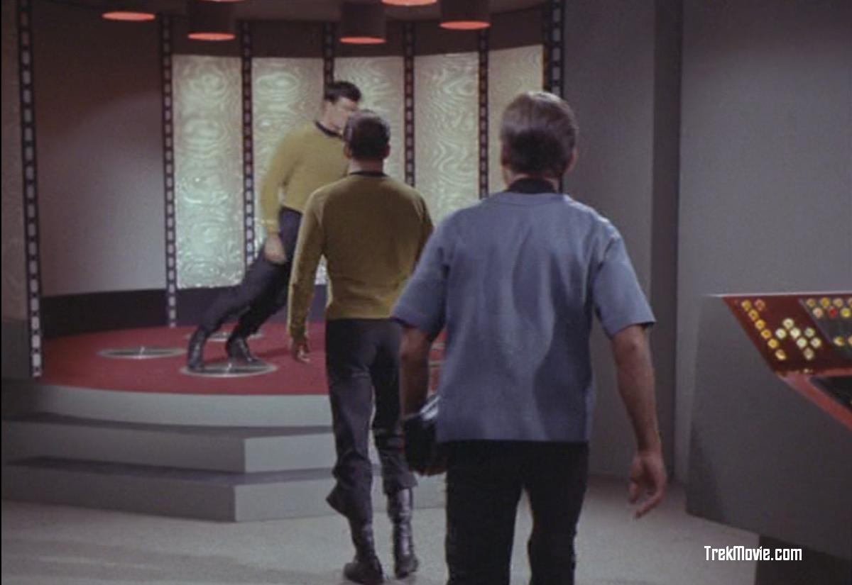
From the moment crewman Jackson beams back up from the planet and does a body-flop off the transporter platform, you realize this is no ordinary episode of Star Trek. Face-plants like that are usually only seen on America’s Funniest Home Videos. Then comes the Disembodied Voice of Doom: “Captain Kiiiiiirk! CaptainKiiiiiiirk! Leave this place or you shall surely diiiiiieee…” As much as I love Star Trek and as much as I feel it gets a bum rap for campiness and not enough credit for its depth and substance, episodes like “Catspaw” are an acquired taste
TIMBER!!
Trek or Treat?
I like the idea of a holiday themed episode and I wish the various Star Trek series had done this type of thing more often, but ‘Catspaw’ probably isn’t the best example of the concept. The episode is thematically uneven at best, never quite managing to be profound or thought-provoking but never fully embracing its playfully scary fun side either. It gets a little more serious after Korob and Sylvia enter the picture, except for Korob mugging and groveling and Sylvia getting alternately turned-on or ticked-off by pretty much anything that moves. It goes from total cheese to mere silliness to dire jeopardy to titillation back to dire jeopardy and ultimately to a grim and humorless end. They tried to base a mostly serious episode on the utterly preposterous premise of Halloween brought to life on an alien planet, but I think it would have been a lot more interesting and fun if they’d just stuck with the preposterous angle and run with it like they did in “A Piece of the Action” or even “The Trouble with Tribbles.”
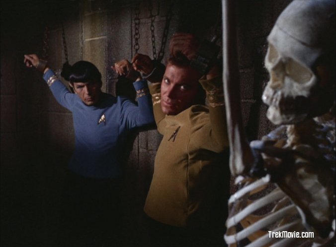
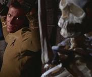
Hey Spock…he has a screw on top
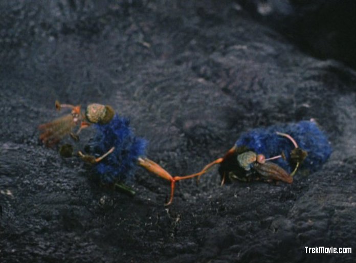
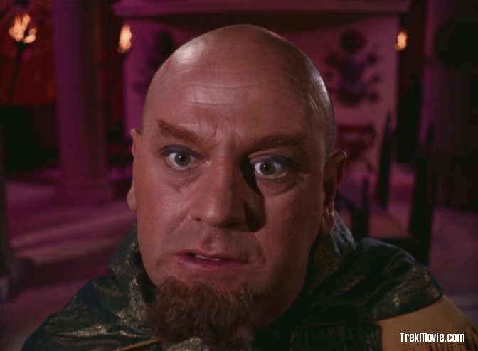
There are hints of the more humorous approach in the first half of the episode, such as Kirk teasing Spock about being a natural Trick-or-Treater, but the lightheartedness soon fades and we get down to the nitty-gritty of Sylvia and Korob and their nefarious schemes. What they’re actually up to is never fully revealed, but Sylvia is clearly only interested in soaking up the new sensations provided by the human form she has assumed. As usual Kirk is only too happy to provide these sensations, if only to trick her. Kirk didn’t count on a woman who could read his mind and she goes off on a tirade that gives all new meaning to the term, “catty". Things get gravely serious when Korob sacrifices himself to save Kirk and the gang. Kirk evenually solves the dilema by literally ‘breaking’ the spell revealing Sylvia and Korob as they truly are. We are left with pair of tiny little creatures that look to be half squid, half Cookie Monster, who quickly go up in smoke. Just in case anyone is still laughing at this point, the episode ends on a somber note with Kirk reminding them all that not everything was an illusion, Jackson is still dead.

She sees right through him
An alien’s home is his castle
As far as updated visual effects go, the stand-out moment for this episode is definitely the new wide-shot of Sylvia and Korob’s haunted castle. They really put some nice work into this one, expanding on the original shot of the castle’s front door to include the entire structure and its creepy surroundings. My only complaint is that it’s too dark, with the castle itself barely visible as a silhouette. I know from the stills that first appeared right here on TrekMovie.com that there were a lot of cool details in that castle façade, including the suggestion of a face contorted in terror or agony on the left-hand side, but you can barely see any of it in the actual episode. A few other live action scenes have been spruced up as well. The transmuter effect has been subtly enhanced, presumably to better mask the transition when objects appear, disappear or turn into something else, and Sylvia in her cat form has been added to one of the later scenes so her hissing, spitting mouth is visible through the window in the dungeon door just before she knocks it out of its frame and flattens poor Korob.
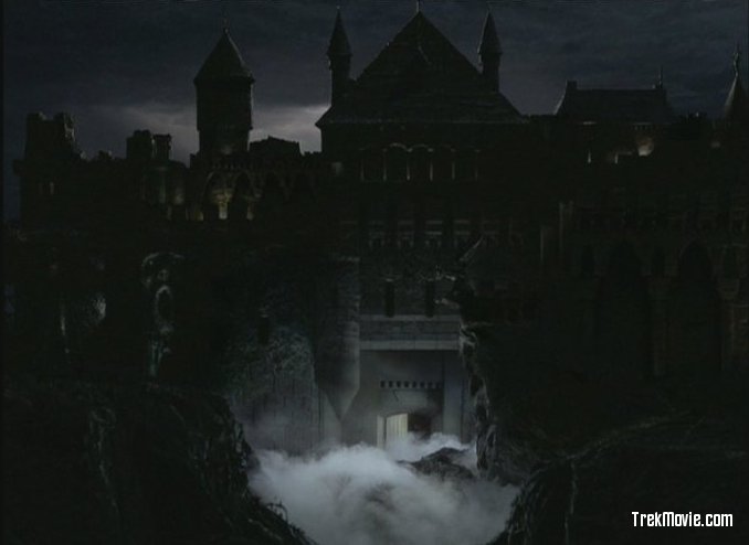
Beautiful, but a bit dark…even for a spooky castle
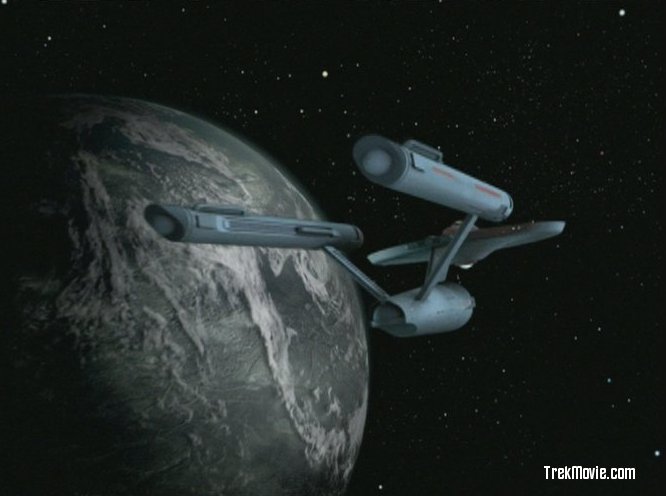
Of course, there’s the usual assortment of stock shots showing the Enterprise in orbit and leaving for parts unknown at the end, most of which look pretty good overall. CBS continue to improve on the originals by matching the planets with the ‘beam down’ shots. This time the planet has a nice black and white horror movie effect. Even the heinous nacelle domes look better in this week’s shots, less garish and more internally defined. The lighting is pretty good also, and I notice that they seem to have significantly increased the blue tint on the ship’s hull, which is a surprisingly big improvement. I think it makes the shots more reminiscent of the originals with the added benefit of modern visual quality. If this is the direction they’re headed in terms of the “look” of the effects then I’d say they’re on the right path.
if Vincent Price had a home world…this would be it
Finally, the last scene with Sylvia and Korob in their true forms has been left basically unchanged, but the wires from which the little alien puppets were hung have been digitally removed. Some had speculated that they might be totally replaced with new CG versions. However, as simple as it may sound, doing so convincingly would have probably been more difficult than anything else they have done in the remastered episodes. Although I am generally in favor of more radical changes, I think the minimalist approach was the right one in this case.
no strings attached
Let’s face it, “Catspaw” will never be ranked as one of Star Trek’s most sophisticated episodes, but it does have its fun aspects and the characters of Sylvia and Korob are well played. If you want real thrills and chills or even belly laughs for this Halloween then you might want to go with something more traditional, but we Trek geeks will still have our guilty pleasures.
boo
Related: Catspaw Screenshots
Jason Lee is a lighting designer and computer graphics specialist. Better known by his online moniker, “Vektor,” he owns ando perates Vektor Visual, a graphic design and 3D visualization studio, and is working on his own CG updateof the special effects from numerous original Star Trek episodes.
Good Job Jason. You’ve covered all the bases. Well thought out review.
To those involved in working on the spooky planet, great work people. Now if the planets seem to be getting such a RADICAL overhaul, doesn’t it follow that you fx guys can be a little more expressive regards other aspects in this enhancement? I for one don’t need every shot and camera movement REPLICATED where the Enterprise is concerned. This is an enhancement after all. Give us the same timing of shots by all means, but give us DIFFERENT views if you feel it would improve things. Keep up the good work.
Great review!
Nice subtle changes throughout which worked very well. They missed an opportunity at the end, I feel, when the castle disappears and we see the crew revealed against an almost solid grey background “sky.” Seems like that would have been a perfect opportunity to add some sky/cloud effects behind them without too much difficulty. But overall a solid B+ effort.
The MY NAME IS EARL dude scores again. A very mac in the pants kind of review. excellent work my friend.
EDITED…for the last time! – A.P.
Thanks for a great review. What’s this week’s episode?
Next Up — “The Trouble with Tribbles”.
Will, in fact, the New CGI Model of the ENTERPRISE make it’s debut during this episode? No one has said for certain.
The Trouble with Tribbles is that they’re just not tasty!
Another hollarback, saying good review. Hit all the major points concisely.
The only point no one has expounded upon has been the big red shirt DeSalle, who in my opinion was more stiff than the departed Jackson! What was that “beans to navy creds” line about anyway?
TomBot — DeSalle’s basically saying its a sure bet they can put a dent in the force field — he’d wager his valuable “credits” against your worthless “navy beans” that they can do it.
Clearly his gambling problems got him kicked out of StarFleet pretty quick though…
DeSalle is AWESOME! He’s a no-nonsense take charge military man. I wish they would have used him more often. His line “I’ll bet you credits to navt beans we can put a dent in it.” probably comes from the old saying “I’ll bet you dollars to doughnuts” meaning “I’m not afraid to put up real money against doughnuts because I’m THAT sure I can do what I’m saying.” Seeing as credits are the Starfleet (or maybe whole Federation – like Euro dollars to standardize planetary trade or something) unit of currency, I’m thinking (pant, pant) that’s what it meant. Phew!
LOVED the planet, and if the Enterprise doesn’t get a smidge any bluer I’m ok with it like that, but I’d like it a little teensy bit grayer. I’m sure I’ll get slammed for my OUTRAGEOUS views, but gray makes the ship look wicked cool…like a real ship imho.
Sorry Spockariffic, but the Big E in “Catspaw” was way too blue for me. I don’t hate it like some self-appointed “purists,” but I wish they could make the hull look a little less like plastic. I’m keeping my fingers crossed that they’ll fix it next week with the new ship.
Oh and by-the-by, startrek.com just posted a shot of the new remastered K-7 on their TTwT remastered page… Let the kvetching begin!
Thanks for the head-up, Lao3D!
The new station looks awesome! Looks like a massive industrial facility in space, even better than in the original episode or ‘Trials and Tribbilations’. Couldn’t tell much about the new Enterprise, though. Guess we’ll have to wait a few more days.
I think it’s funny that even Startrek.com is complaining that the red stars are missing! Maybe red stars cost too much!!
Did anyone catch just how dark this print was? The color saturation was nothing short of amazing, though. I wonder if the darkness was deliberate in keeping with the Halloween theme?
Do a scene-by-scene comparison if you have the DVDs…the DVD is much brighter, but the colors are much more washed out looking overall.
I guess I’ll have to re-buy these again when the get re-released…will this ever end? :)
Seriously, I’m enjoying this and wouldn’t mind re-purchasing if the new product is of better quality…
Jon
That’s funny about the red stars. What is the deal with the decision to go from colorful stars to monochrome? Stars look pretty colorful in Hubble images.
Not that I’m an expert or anything, but a lot if not most of the images we see from Hubble and other astronomical instruments are “false color” meaning they’ve manipulated and heightened color to emphasize things like depth, variations in temperature, radiation etc. Kind of misleading if they don’t point that out clearly.
Anybody have more in-depth knowledge of what it really looks like out there (or what we think it looks like)??
Well, if you don’t live in an area with a lot of light pollution that wahes out the sky. The magnitudes and colors of different of stars are clearly visible in a very dark sky such as you might see from space minus a huge light source washing them out, like the sun.
I’ve been looking at the night sky since I was 14 and I grew to love it very much. I think the biggest problem in the colored stars on the original starfields is simply that there were far too many of them. Yellow stars which are the most common, would tend to look white from a great distance away therefore the starfield should appear mistly white with some stars tinted a faint bluish white or with a touch of red. The various other colors available would not be obvious unless you were parked right next to it.
The Hubble images are indeed produced using false-color. When you are looking at Hubble images they are combining a number of different filters that are applied to the image to create the colorful images that you view online or on the evening news. Space really isn’t that colorful unless its a planet or a nebula. In the case of a nebula it will be ht or miss based on the gases in the region and the types of stars forming within.
Great writeup Jason!
Jason – you are dead on with that review. Next to the “Empath,” this was one of my least favorite episodes.
I thought the subplot of the Enterprise junior staff led by DeSalle trying to get to the landing party was actually more interesting than what was happening down on the planet.
I also thought this print looked awfully dark, which I did not care for.
The enhancements were right on – and while I respect the fact that the re-mastered version are not trying to change the original shows too much, I think they could have created CG aliens to replace the pipe cleaner puppets and not even the purists would have complained much.
Wow, that’s not saying much since DeSalle and Co. basically got Nowhere…. heh,heh. ;-D
The little blue fuzzy aliens were the mos among the most convincing if not the most convincing alien life form on the series totally non human and unlike any thing from earth.