
Giant CG Space Amoeba!

SFX Video
(WMV)
New and Old

Heading for Starbase

Black space?
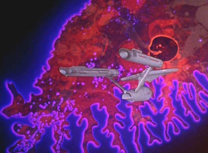
The Enterprise in the void

The Enterprise in the void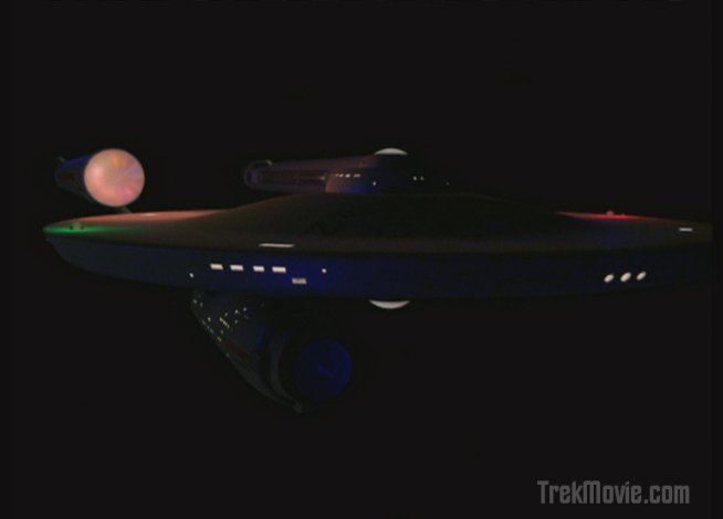
The Enterprise continuing into the heart of the void

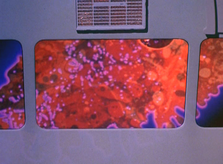
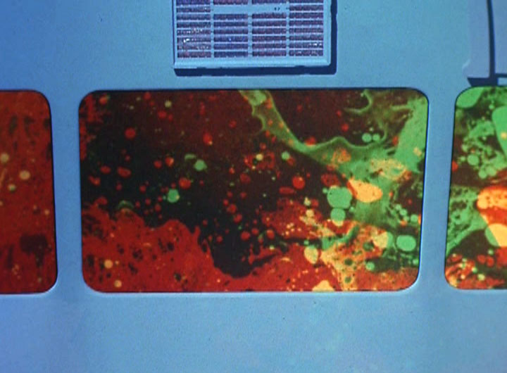
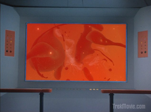
At the center of the void…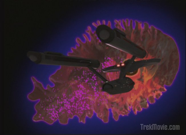
Being pulled towards the amoeba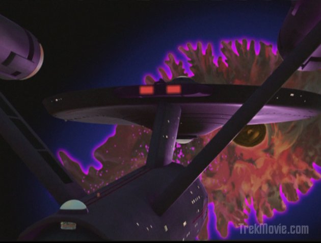
Holding ground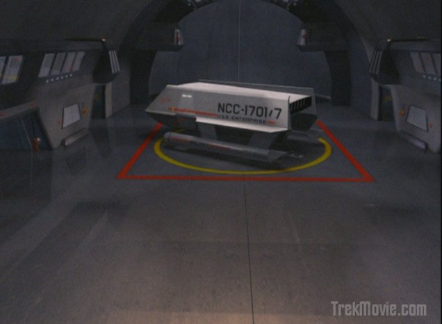
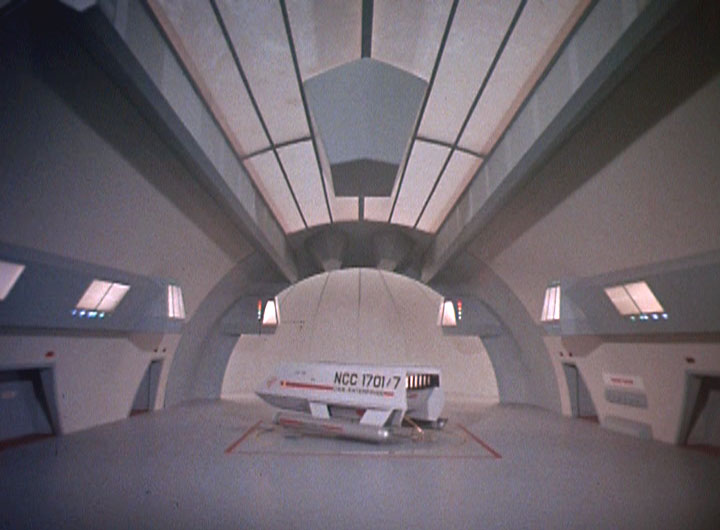
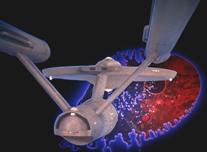
Shuttle launches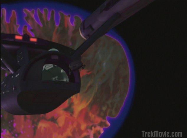
Leaving the Enterprise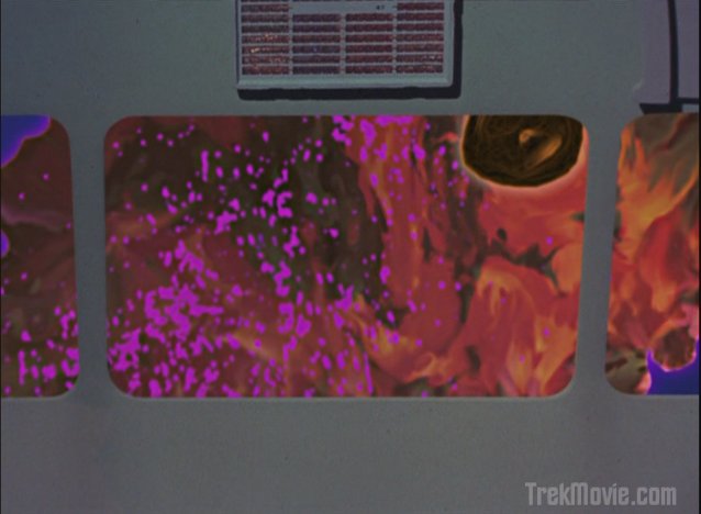
View from the shuttle
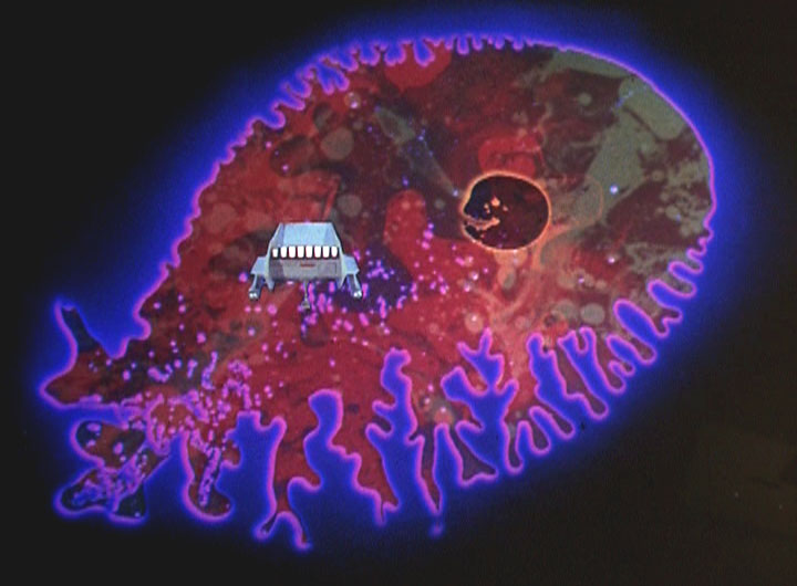
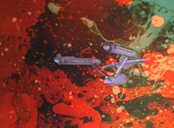
Into the protoplasm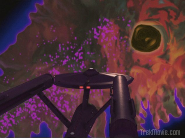
Being dragged slowly…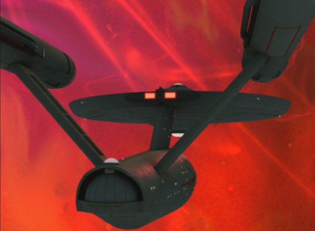
Closer…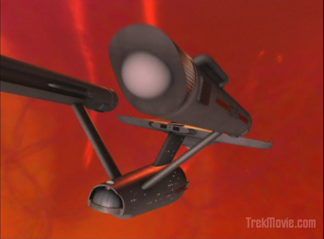
Letting the amoeba pull…
Letting the amoeba pull…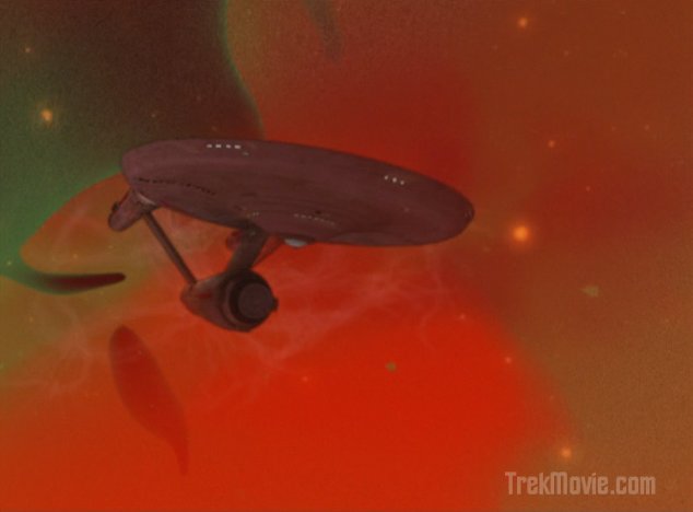
Into of the protoplasm
View from the bridge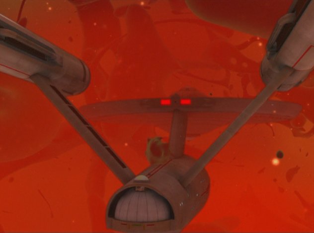
Timer set, backing out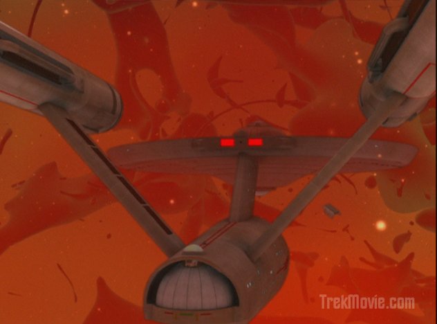
Spock’s shuttle in tractor

Spock thrown to the floor (notice the new rotoscoping)


Landing the shuttle
Various Shots

What happened to the stars?
Grant me Vulcan Dignity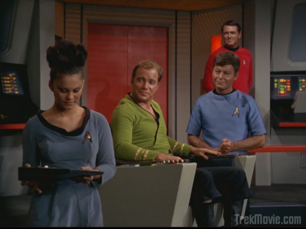
Kirk leers at the female crew member
Good work CBS-D. I look forward to your future work.
Gotta love this! Fantastic work!
Boy, looking at the photo comparison, all I can say is that sometimes it’s difficult to distinguish between Remastered and the original. That’s not to compliment the new version for adhering to the flavour of the old, actually, on the contrary. I’m just saying…….
Good job guys! Its actually dark in the Zone of Darkness!
NEXT GENERATION & THE NEW BATTLESTAR
GALACTICA ARE STILL BETTER THAN THIS!!!
#5 …TNG effects looked horrible then ENT-D always looked like a model.
UPDATE
TNG looked more CGI (too many fuzzy beauty passes) than model, or so I think.
The new Version was leaps and bounds better than the old versions. In almost every shot the old images stick out like a sore thumb because it looks tacked onto the background image. There’s no lighting and the ship fits in the shots worse than a preschooler’s artwork would fit in the Louvre.
However, the old effects of the amoeba (from a distance) still stand up pretty well today, the close ups don’t.
Wow but that was a lot of work for a very average episode. The effects are definitely the best thing about this otherwise paint-by-numbers installment. Well, the effects and that one really enthusiastic bridge crewman who does a sumersault during one of the many shaky camera moments.
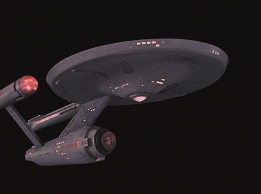
Many episodes, including this one, show the Enterprise being illuminated by what looks like “star light”. This is in stark contrast to the original, brightly lit shots.
I’m not sure if I really like this more realistic rendering of the ship, but it’s probably much closer to what the Enterprise would look like if photographed in deep space.
Most of us have become so accustomed to watching episodes of TOS that show the Enterprise so consistently bright in each episode, that we have failed to realize that this is not an accurate or realistic effect.
So I guess I should give the CGI team more credit, as they are obviously trying to be more accurate with regards to the proper lighting, shadow and contrast in any given situation.
Mike :o
Frak me!
was that helmsman ‘KYLE’ doing a different accent..?!?!?
I’m with #87 on that shot of the Enterprise entering the amoeba. The ship could have been shaking and shuddering for a bit as did the camera effects inside the ship. But overall I enjoyed it very much.
Also, I’m wondering, where did the details from the physical model go? Is the new CGI model forgoing the ‘rust ring’ which encircles the front of the saucer below the lettering? Is there no longer ‘weathering’ on the interconnecting dorsal, the warp engines, the engineering section and the front edge of the saucer? Has subtle ‘hull plating’ replaced the now generally well-known details of the physical model? Surely, some of these details can be retained with the new look of the CGI model? I believe the first model had the rust ring in “Balance of Terror” when they inserted a new shot for that show. But I don’t think the new version incorporates this look.
I like the CGI version, in fact I welcome it, but I think it’s a fine-line these artists walk when doing something like this.
As I see it, the ship should be ‘cleaner’ in the early adventures in the first season. As if the ship had been restored, upgraded and made ready for Captain Kirk and his crew.
As the show progressed, the ship entered “standard orbit” many times and various planet atmospheres might leave a slight weathering effect on the hull, as well as entering areas of space where the effects would be left on the hull.
And as the missions multiplied into the third year, the ship’s exterior would reflect this.
Of course, it would never become as ‘weathered’ as the EM version in the Smithsonian. That is overdone, as we all know….. but unless…….yes, the ship was eventually sold to a descendent of Gene Roddenberry and he took the Enterprise light years away from any recorded civilization, never to be found again.
….sorry, posted in the wrong article…
Well done CBS-D!
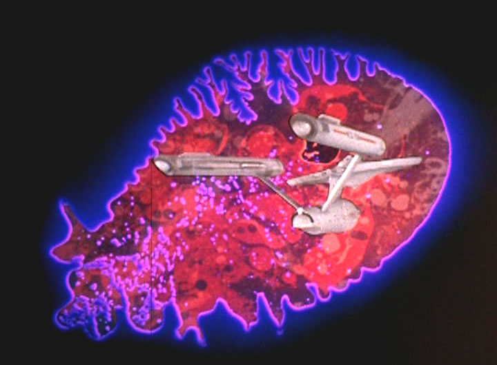
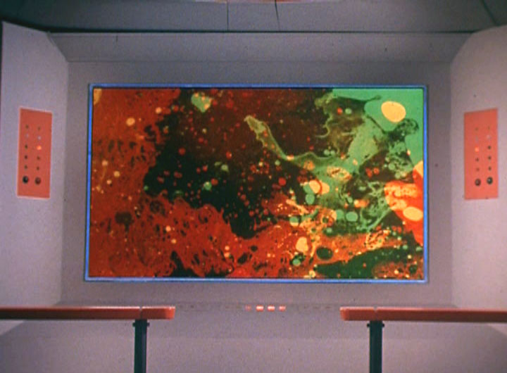
I’m glad the kept the same basic look for the space amoeba in full and reworked the inner structure to look more organic and less like oil and color dye visuals seen at Grateful Dead concerts.
-cs™
> … Grateful Dead …
yeah man …
“Now I’m just sitting watching TV …
Think about the way things used to be”
— GD, “Ermaline”
“All the stars are gone ….”
— GD, “Built to Last”
“A lady of nobility … a splendor in the dark”
— GD, “I Need a Miracle”
Older shots of “the inside of amoeba” look better, aesthetic-wise, to me. Those remade just look like any other generic nebula in Star Trek.
Stars in remastered version are still way too dim (blatantly visible at both “Heading for Starbase” and “Black space?” shots. Visually, there’s nearly no difference between open space and “the void”. Space looks just as bland and empty as the void.
Otherwise, episode is nicely made. I’m pleasantly surprised they kept the amoeba design.
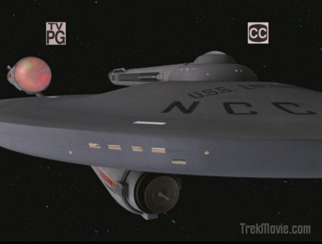
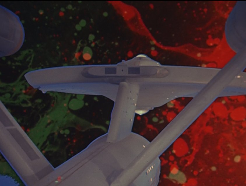
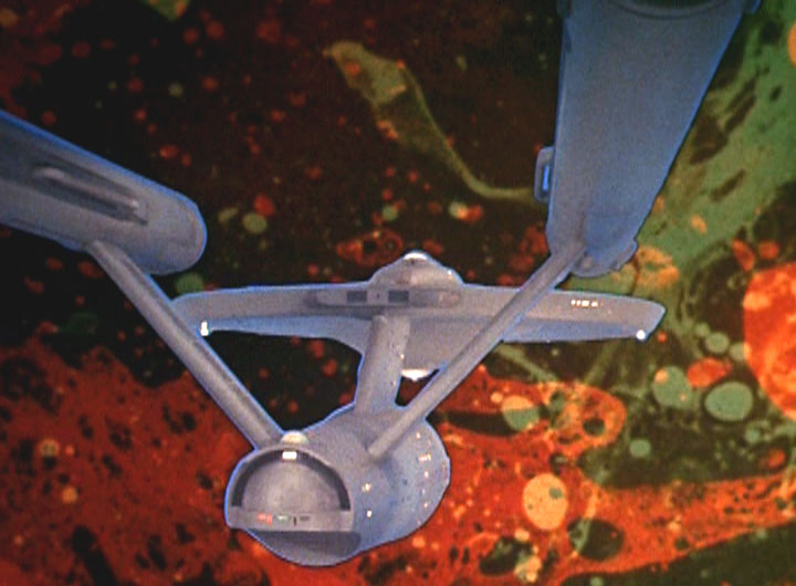
The hull of the ship looked spot-on in the opening shot, in both color and texture, to the original studio model.
You can actually see the perspective change in the square viewports as the Enterprise approaches, too. I always took some of these as being sensor ports rather than just view ports, but the remastered version is certainly redefining them.
Also the viewport just above the hanger deck doors is apparently a control room of some sort. But the CGI model is still missing the flashing beacon on the side and the green and red fantail lights.
One more thing – is it just me, or does the amoeba shape in remastered version stay all the same for whole episode? Now, THAT’s lazy. In sixties, they managed to make it change shape, yet in 2007, they can’t do the same with modern computers?
Yes, it really should change shape. The word “amoeba” comes from greek “amoibe”, which means “change”.
SOME nice stuff in this one once again, but (and there always seems to be a but…),
#18 Tom
The MISSING rear lights were always visually pleasing on the original Model, and would have helped to “sell” the CGI new stuff better in this remaster to my mind. The fact that established details like this are left out sometimes (they have them on TOO infrequently) make the “original” work shine in photo comparisons. AND even when “lights” such as the red and green ones on top of “saucer” are done, they seem to be POORLY lit, and NOT as vibrantly colourful as the “real” versions on the filmed miniature. Bring back BRIGHTNESS, and make the CGI versions look truer to the original and more interesting to look at. Oh and brighten up those “windows” too… Also, although the “E” in darkness shots are nice, I believe there should have been MORE “light spill” from the various lights and Nacelle Caps, but that’s just me.
#Thomas Jensen
Yes, I think it would have been great to see the “E” starting off “bright and shiny” in certain episodes, then a little “weathered” in others, reflecting the look of the original Model work.
I soooooo hope they release these re-done ones on dvd.
and they’d better be cheaper than the $100 ones they already released!
Should’ve made the hangar deck brighter and that shot would’ve looked a lot like the final shuttle pod launch in 2001.
#12: I believe Kirk said “Cowell”, not “Kyle”
I don’t know how they managed the rotoscoping in the shuttle shot with Spock on the floor – there’s a hexagonal grille between the camera and the effects insert. Really, really impressive work.
>>#12: I believe Kirk said “Cowell”, not “Kyle”
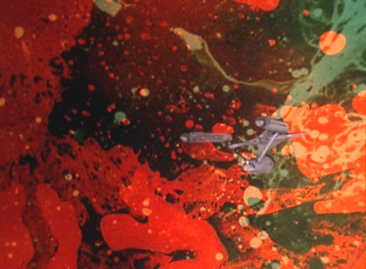
Did anyone notice that the “hole in space” has the same shape as the amoeba?
If you look really close, the grill has slighty changed, but who cares? That really is impressive work!
On the video (and this is the one thing that still gripes me about CBS-D’s work-about the only thing that does), at the times 0:42 and 0:37 on the fx video the ship looks fair, but somewhat plastic. I can live with it, though. At 0:34 it gets much better though. But the BAD one (and they use almost every episode) is the shot at 1:06. I HATE that shot, it reeks of plastic/fake/YUCK!!!!!!
Drives me nuts, because I love everything else they are doing. CBS, please get rid of this shot or redo it, or something. Using it over and over again is depressing.
Hey Kyle (or is that Cowell?)- Good observation. I hadn’t noticed that, but you are correct sir. Interesting!
WOW! and Double-wow!! I saw this ep when it aired on sat but I missed the shuttle diparture during a beer run… cool as hell.
Is it me or am I seeing interior structures through the windows on some of the E close ups? It’s definitely more than a bright white light coming through the windows. When I saw the shot of the E being pulled into the “beastie” I thought it was too much motion, but when you cut to the bridge and everyone is literally jumping out of their chairs, the motion of the E is sold. Kinda looks like a jumbo jet in bad turbulence.
Great job CBS-D.
I just tend to really dislike shots showing the exterior of the Enterprise shaking around or too rapidly changing vector–to my eye they just ruin the sense of scale.
Otherwise, everything just looked splendid. This episode now really is Trek’s “Fantasic Voyage” in all respects, good and bad.
Well, I finally saw it last night. I must say… MIXED BAG on the effects. Some shots were big spot on, some just plain sucked.
The good: The beauty passes are much better, even if the coloring is still off. ie, the deflector dish… the overall lighting of the Enterprise. But still, they are much improved on sense of scale and movement for the beauty shots.
The bad: The episode specific effects still suffer. The shuttle leaving the Ent: landing bay, was terrible. The Ent shaking as it entered the amoeba was awful. I use the words “cringe worthy” with full intent. Not impressed at all. The amoeba looked good, the constant movement within the amoeba, but I agree with a previous poster that the amoeba looked more like a generic trek nebula than the amoeba that was presented in the original episode.
Overall, I’m genuinely more and more disappointed overall than I am impressed. And again would reiterate that there is no way in hell I would buy these on DVD if re-offered. So not sure where Paramounts bottom line is on this project, but it’s not enticing me to spend more money. I’m actually saddened by this missed opportunity to do something really cool.
Doug
“The Ent shaking as it entered the amoeba was awful. I use the words “cringe worthy” with full intent.”
I agree completely with that statement.
Amd on a completely unrelated matter, I got the entire run of “In Search of …” on DVD-R yesterday and it is soooooooooooo cool.
Man, you guys really analyze this stuff. I do to an extent, but I don’t even know what some of you are talking about some of the time. You notice details I would never in a million years think about.
I’m not saying that’s bad. I’m just saying I am not seeing a lot of it unless it is brought up.
All-in-all I like this episode and thought the remastered version was mostly excellent.
Not really that hyped-up about Gorgon. I suppose I will tape it, but as far as watching the whole thing, maybe not. Can’t be a lot of opportunities there for the remasterers to work with.
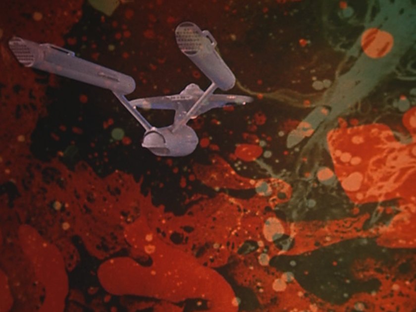
Meh…I like the shot.
It shows the powerful pull of the giant amoeba.
Something that big in comparison to the Enterprise would have the ability to pull it like a toy — and make it look like one.
No problem there for me.
TTM
This episode has some of the most amazing new FX shots I’ve seen by CBS-D so far. Even from the just the fx reel and the pictures it’s already surpassed my expectations.
Can’t wait to see the proper episode!
re 33:
Hi Stanky! to your point. it’s not so much an analysis, as I simply react. I either see something, and think… hey that is F@*&ing Cool!!! or , that looks totally fake. It’s completely visceral for me. I want to be blown away with each episode.
Unfortunately, It’s just not happening. Critical? Yeah, but I can’t help it. d
I think it’s just a matter of taste. Some like coffee, some like tea (Earl Grey, hot). Doug, I find it interesting that some of the effects you enjoy, I do as well, yet some that you really have a problem with don’t bother me that much. Im still cringing only when I get that behind the Enterprise shot fro above that looks like a tiny plastic toy (see my post #27). I’d be curious what you think of that shot. Am I the only one bothered by it?
36. Doug
My comments weren’t really directed specifically at you or anyone else . I just kind of marvel at the detailed analysis that some people make of things. Like I said, I don’t have any problem with it, I just am not as tuned into some of that as others, I guess. I see it in more general terms as well.
I do like the running lights casting their glow on the hull in the dark. However I wish they would work more on the shuttle bay interior. The “globes” near the doors are now what… greenhouses for zero gravity hydroponics? On the original they were structural… no reason for them to be framed and translucent.
After watching the effects reel a few times over, I’m ready to make this one my favorite remastered effort to date. Just great work. The mix of ’00s technology and ’60s pop, the departure shot of the shuttle from outside the ship, the giant proto-loogie, and (even though it didn’t make the effects reel) the subtle window rotoscoping in the shot with poor, collapsed Mr. Spock — so much to love and so little to hate! My only wish for the future DVD release would be MORE!!
I already noticed the problems with some of the shots with the Enterprise as it was reduced looking like a toy. Mainly as the Enterprise rocks uncontrollably inside the amoeba. Just the couple of the shots were unnerving to watch.
That was the only thing I didn’t like out of all of it.
They make up for this with some nicely rendered shots. Everything else works.The oozing effect of the amoeba was quite excellent. A far departure of overall in a matter of one outing. The work improved. The lighting was good. No more of that visible hull plating shots like we seen last week. If the Enterprise needed to be darker then they should gone with this route.This has become one of my favorites too.
re 37:
Well, there are two thoughts to that. One would be that you don’t like that angle in general, the other is that the effect is bad. For my purposes, I think I know what shot you’re referring to, and I don’t like it either. I hate to be a hater, but I do sort of look at things with an analytical (and hopefully artistic) eye, and I’m mostly left flat. But that’s me. There are obviously others who are loving every detail.
You know with a million other things going on your life, you tend to latch on a little stronger to things that take you back to your childhood a bit, so I probably get over critical.
But as an example, with Battlestar Galactica (and lots of posters hate this comparison) which is stylistically very different, the end result is that when I look at the effects, I’m really impressed. Regardless of if the show is good or bad or whatever you want to attach to it. The effects are impressive, and I’m blown away.
You can do a million things stylistically with effects from a classic look to a more modern or inventive look to sublime and I’ll be open minded. If they are good and believable to my aesthetic, I’m onboard. Trek Enhanced too often looks like bad models or cartoons, with the random spot of inspiration thrown in for good measure. They definitely are doing some things right, but not enough for me.
I generally look at things with an editors eye. I want to get my hands on it and fix what I don’t like, so each week when people have the opportunity to do just that, I watch and hope for the best.
I’ve said all this before. Hope I’m not boring you dudes. Later, d
Going back to the ship movements… you can’t have people jumping and being hurled all over the bridge while exterior shot shows a rather tranquil motion of the ship. The enterprise is big, but it’s not so big that subtile movements will send people hurtling across the bridge. It’s LOA is slightly longer than Tiger Woods can hit a golf ball off the tee and it’s about as wide as a cruise ship is long. To send people suddenly rocketing out of their chairs on a cruise ship would take some serious movement and that’s just what CBS-D had to create in order to sell the frantic goings-on inside the bridge.
In reply to ANN O RAKK – April 9, 2007
I love new Battlestar and TNG too; however there would not have been any of those shows without TOS.
I have to believe that the guy playing Mr Kyle was re-cast in this episode as Mr . Cowl. They change his name, give him a gold shirt, and I think they give him a stripe on his sleeve. If everyone remembers, TOS did this a lot with actors, changing names, shirts, rank, and even place of service. For example, Look at Commander Giotto in “Devil in the Dark” He appears in The “Ultimate Computer” as Commodore Stone. Right?
Where as I am a fan of the remastered trek, I prefer the original version. I didnt like the the new ameba but everything else was good. I am frustrated in finding all the ones I am looking forward to dissapoint me, and the ones I dont think about look great and impress…like the Corbomite Manuever. Hmmmm….I think its a good think for trek overall though. Can’t wait for new film.
Oh my God the opening beauty shots are gorgeous. By Jeffries, I think they’ve got it!
Still don’t like the cartoon-like “medium” views, along the z-axis and typically looking down the warp engines and the secondary hull. There is not much on those tube-shapes and the coloration reminds me of an 8-bit rendering.
Found a website of a writer who pitched a couple of scripts to Star Trek Voyager, and he has the scripts featured on his website. The scripts got him on the Paramount lot a couple of times. I read both scripts — pretty darn good!
Thought you’d all be interested in taking a look. His site is at http://www.bankoftheclown.com
Maybe one of you photography experts can help me.
I watched the reel half-a-dozen times to identify what bothers me about those “looking forward from the rear” shots that to my eye look like a video game.
I think the problem is this: there is no sense of “forced perspective”. i’ve been at Norfolk and seen the Big E in person, among other supercarriers.. I’ve been at Cape Canaveral and saw a Saturn 1b and several space shuttles — not to mention the VAB. Those things are HUGE! and about the size of the ST Enterprise.
When the ship moves away from my “eye”, the spacing between the warp engines does not change and I see too much detail for the supposed distance. In other words, it looks like my AMT model held up to my face and moved away a few feet. The apparent size remains essentially unchanged.
It seems to me that, as the Enterprise moves away, the sheer distance would make the forward portion of the ship seem MUCH MUCH smaller and fuzzier. You guys know what I’m talking about — it’s the classic “railroad tracks” they teach us in junior high school art class.
The URL under my screen name links to a page on the USS Enterprise, CVN-65. There you will find a number of good shots of her from various perspectives. Notice they reveal everything I am trying to explain in words, except of course there are no movies of her underweigh. Perhaps I’ll dig around for footage of maneuvers at sea, although we’ve all seen enough WWII footage of real ships at war to know how they look: HUMONGOUS!
If this isn’t the first, then forgive me… but Matt, thanks for adding the sound to these clips. It helps SOOO much.
And YES, this is how the E should look. They’ve nailed it like Kirk on a yeoman.