
AICN got the net buzzing today by linking to this image with the suggestion that it may be a leaked design for the Enterprise in the new Star Trek.
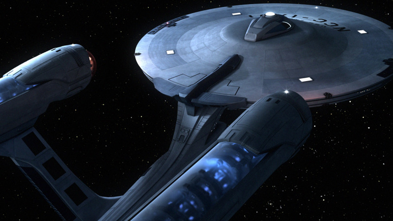
…but CGI artist Gabriel Koerner has confirmed this is actually one of his designs.
Koerner tells TrekMovie.com:
It would’ve been a dream to create a beautiful Wagon Train to the Stars for JJ Abrams worthy of the command of James Tiberius Kirk. I have not seen the design they chose, but this is one of three ideas I had designed as what I would’ve done if tasked with that assignment. The one pictured here was published in Pocket Books’ ‘Ships of the Line’, a calendar of CG imagery by Trek VFX alum. I am sure Ryan Church has done the vessel justice, betcha his makes mine look like a Pinto.
Gabriel Koerner is well known to Star Trek fans as both a beloved fan featured in the documentaries Trekkies and Trekkies 2 as well as an accomplished CGI artist. Koerner is living the dream working at Digital Domain and has done work for Star Trek Enterprise, Battlestar Galactica and many feature films. He is currently at work on the new Speed Racer film from the Wachowski brothers. Like any CGI artist who is also a Trek fan, Koerner loves to make Star Trek models and many of his concepts for a ‘new’ Enterprise have shown up online, often mistaken for the real thing (by no fault of Gabe’s).
The supposed leaked Enterprise is actually available on Gabriel’s website. Here are a couple of other angles of the same Enterprise on Gabriel’s site:


One of Koerner’s designs has even worked its way into a fan made teaser trailer:
NOTE: THIS WORK IS NOT ASSOCIATED WITH OR COMMISSIONED BY DIGITAL DOMAIN
You can visit Gabe’ site at gabekoerner.com.
UPDATE: Orci Responds
In the talkback section below, Star Trek co-writer and executive producer Roberto Orci responds to this latest false positive and gives a hint at what we might see for real
I think they’re quite beautiful. A lot of nice work.
You just can’t deny the SHAPE of the ship, which is so great — so elegant.
Can’t wait to show show you ours.
With flames :)
…fyi…he is kidding about the flames (or we all hope so)
i know everyone else is picky about the design, but it looks good to me!
nope- its what the Borg would have done to the E if they had assimilated it.
new ship will be a datsun
It would have been fine for me.
I like Koerner’s designs in general, however, I can do without the see-through nacelles and the “foreskin” on the bussard collectors.
(I guess I’m one of the “picky” ones Harry mentioned) ;)
I caught this and knew better at AICN news this morning but thought to observe how far it would go. LOL
Gabriel is a good CG artist, but I don’t think he’s had any training or from what i can see, any sense of design. He’s more of a interpretor of past designs. Taking elements from others and incorporating them.
I feel his images are just that, images, not a real design. There is no clear focus or “big idea” to his work. A great design requires a simple pure thought, not a mish-mash of so many different elements. I agree with the above comment, it’s more like what the Borg would have done.
There is a purity and elegance to the original Jeffries design. It’s a clean design.
No offense to Gabriel, cause he’s good at what he does with the software.
Haven’t seen the top image, but the rest has been on the web for months. Interestingly, I believe Mr. Koerner posted some angles of this on Trekweb, to much acclaim, months ago, but he said in posts there that it wasn’t his preferred look for the E. I don’t want to speak for him, but I think he wanted it smoother. I hope the movie ship looks that good.
They’re pretty — but it’s not Star Trek. I think that the more plates and bolts you show, the more you’re getting into the “Jules Verne” aesthetic, where 19th century technologies are used to project futuristic machines.
I think that a more convincing Enterprise would have a smooth simplicity, like the one from ST The Motion Picture.
I was waiting for someone in the news to mistake one of Koerner’s models for the new Enterprise and spread it around. I guess the wait is over.
As for Koerner’s design, I like it. Could be a little smoother, but otherwise its great.
If the Enterprise looked like this for the original series, it’d be fine. No problem, but with the movie, something like it would only fit in if (as rumored) the timeline was changed. I’m hoping for an Enterprise that would actually fit in with what has been established as the early Enterprise around the time of Pike; with more minor detailing.
They would be really clever if the ship was somewhat different when the view is close-up, but looked the same from afar. But I’m not actually thinking that will happen. I think it will be familiar, but with lots more detailing with the same basic shape.
I think this ship is objectively beautiful. But I prefer a more conservative interpretation of the 1701 for the movie.
Still… I’d be lying if I said I hadn’t watched the Gabe K video several (dozen) times.
There’s much more where this came from, including a new shuttle design. Gabe’s site does not link to everything, but…
http://www.gabekoerner.com/ent/ will give you file access to 11 movies in various stages, and 30+ pictures.
Very cool stuff –
And Gabe, disable your view directory settings on your web site! It will keep nosy guys like me out ;).
Oh AICN is stoned, Koerner’s Enterprise has been around for ages!
It’s what I like to call the “anime enterprise”, as it’s design reflects that youthful style so popular in the last 10 years. It’s not a bad design, it is what it is and I think Koerner did a fine job all around. I noted the animation itself gave terrific weight and feel to his ship. However, it’s not the more mature design I have come to expect from Trek films over the years. Of course, I say that excluding the enterprise-e which I like to call the “stealth enterprise”, a less mature design on it’s own but without the excuse of being a single design by a young Trek fan.
Seems like a nice guy, but I hate his design.
It’s a great and impressive piece of digital work. But I do hope it does not resemble the ship we will see in the film in any way, the design looks like some freakish mutant and is certainly not Trek or M Jeffries. However, if the Mirror episode were done today…..?
#7: I think the “big idea” should remain faithful to Matt Jefferies and the small ideas of modernizing some tech issues shouldbe the bain if the new guys. It will be loads of fun nonetheless. Please make her large and glorious!
personally, i like it. if they went this way with the E i’d be happy. very close to the original but visually updated. gives a much better idea of the scale. the tos design could never give the awe in size that a modern design could.
I am very mixed about this look. I believe someone is tampering with history and that i snot a good idea..We have to already get used to seeing our favorite characters played by other people and if that’s not enough now they are changing the beloved ship also. Hey Stop!! Don’t do anymore, someone said this ship look like a freakish mutant, the Enterprise on Steroids!! Or maybe the ship stripped down and thrown back together with some new parts or maybe the ship doing an episode of “Pimp My ShiP”.
From his website, THIS is his best deign.
Before he gussied it all up, it had a distinct 1950s look to it, like old 1950s car design. It’s simple elegant and stylish:
http://www.gabekoerner.com/ent/1701_001.jpg
I believe someone caught the “error” pretty early today in the AICN forums.
I am sorry I did not space that “i snot” to is not!! Ha Ha!! Well snot on that idea…..
It seems to me like one of the better mods I’ve seen… if not a little bit bloated… I personally hated the E design, understood why they went B, C was good… D was to the A what the TNG crew was to TOS crew.. i like the TMP Enterprise best though.. of course I’m biased because TMP was the best trek..
Hey, he can do a better job than I could do, so kudos to him. And I like it …. looks great
#13 Thanks! This http://www.gabekoerner.com/ent/trekreel002.mov actually gave me chills when the phasers fired. Very well done. :)
I like Gabe’s design. When I first saw it, like, months ago, I wasn’t too sure I liked how modified it was, but since then, I’ve grown to like it. It’s updated but it still maintains the same basic shape. It’s almost like an homage to the original vessel, while upgrading it to look more futuristic than the original design. If this were the Enterprise for the movie, I wouldn’t have a problem with it at all. :)
OMG the thing looks so beautiful… the sunset sky shot is simply stunning. W-O-W, nice job
I might add, picky bastids or not, we can only HOPE something this professionally well-done happened to the E when they redesigned it for the new film. holy crap
Oh, to look up and see the Enterprise at sunset…geek love…
*sigh*
That’s exactly how she looks in my dreams.
I hope the one they chose is better than this. (and that would be damn hard to do!! :D )
Come next year we may all be WISHING that had been the design used!
But I hope not.
I like his designs. I particularly like the “sunset” one – as it looks the most realistic of any CGI Enterprises I have ever seen. Not to reignite the model vs. CG debate – but you can’t argue that this one doesn’t have “heft.”
Personally, I think we’ll be lucky if we got something as faithful to Matt Jeffries as that one.
Maybe I’m just pessimistic. Oh well, hopefully I’ll like it!
following up on my previous comment – if you look through the directory of files linked to in #13 above – you’ll come across this picture, amongst others:
http://www.gabekoerner.com/ent/1701b_092007_006.jpg
I think Gabe is a stunning realist. His use of shadow, shade and focus places these drawings squarely in the “real world” – even without any reference points (like the sunset one). This picture looks remarkably like an extreme close up of a real model.
I kinda’ like it… not everything about it, mind you… but it does have an interesting and compelling design aesthetic to it.
Funny… it kinda fits into the visual lineage moving from the NX-01 to the refitted NCC-1701 in TMP.
interesting, kind of looks doomsday machinish. I don’t get how anything like this is an improvement over original model. The old painted hull is still by far the best as is…
I like the shuttles a lot
I must say I like the enterprise too, a little too mechanical and muscular but probably a lot more realistic for what a space vehicle would actually look like with external machinery etc…
Id actually like them to really re-imagine this a bit and get away from all previous incarnations while trying to stay true to the original beauty and simplicity of the original. This is not an easy task and will be thoroughly criticized no matter what they do. Personally I can’t frieking wait for the new voyages to begin!!!
The least criticism will come from leaving the exterior as is from Pike and Kirk E…
i hate gabe’s deflector dish, the way it is detached from the hull, its deprives the enterprise of looking like its made of advanced technology and as if its been cobbled together.
by the way, I’m okay with changes to interior, but I think most of the original E bridge elements, like the big screens looked much better than the movie bridges
Generations may have been a bad film, but the music was absolutely beautiful!!
There’s almost something reptilian and sinister about the rendering of that enertrprise.It would make a good’Mirror Miror’ enterprise.
Here it is, the new Enterprise ;)
http://probertdesigns.com/Folder_STORE/Folder_CONCEPT-KITS/Ambassador_Kit.html
The new designs look great but it’s too radical for me.
I think what I like best about this model is the blue glow from the nacelles, and that you can see the phaser emitters and RCS thrusters.
I’m glad this isn’t what JJ has in store for us. Having said that, I’m also a bit nervous to see what JJ DOES have in store for us.
#47 “the blue glow from the nacelles”
Funny, back in my college days, I had the very same physical reaction when my date would turn down my request to make out! :)
I don’t know why everyone hates Star Trek Generations. It’s a great movie.
#43 J C :
I agree with you. Change the hull finish to mostly black, add some Terran Empire “Earth-with-dagger-through-it” logos…
Shame on you #43, You know those are not the new designs for Star Trek.
It’s far too Next Generation,and completely flies in the face of the retro feel for this film.
The only way this could have happened is if the merchandising division took complete”artistic” control.
This is the Ambassador Class Enterprise
http://images.google.com/imgres?imgurl=http://www.shiporama.org/Images/ambassador/1701c2.jpg&imgrefurl=http://www.shiporama.org/ambassador.htm&h=322&w=764&sz=112&hl=en&start=7&sig2=Cyh-t2F4JBb54P3KEK4gKA&um=1&tbnid=-gPK1Jko2udyGM:&tbnh=60&tbnw=142&eid=At5VR-OQA4uKiQHX0YXaBQ&prev=