 Earlier TrekMovie.com listed a release of the “full image of the Enterprise” as one of the big Star Trek movie events we can expect in the upcoming year, but today the #3 ranked story on Digg.com is “Could This Be the New Enterprise From Star Trek 11?.” Well for this one, Vreenak doesn’t even need to suit up as the answer is an obvious…no.
The Koerner Strikes Again
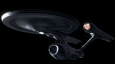
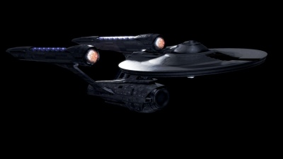
Over the last year TrekMovie.com has received countless ‘tips’ over some designs made by digital artist (and Trekkies celebrity) Gabriel Koerner. Through no fault of Gabe’s, his reimingined NCC-1701 has been mistaken for the real thing by fans and even some major websites (like Aint it Cool News). The new Digg article (which itself has been subsequently picked up by some other sites, resulting in a new wave of ‘tips’ to TrekMovie.com) is actually showing one of the Gabe’s old designs. It is one TrekMovie debunked in December after AICN got duped. If someone really wanted to get a ‘leak’ rumor going, they should have picked some of his newer images, which are still pretty cool…check them out (click to enlarge).
More Enterprise designs can be found at Gabe’s site.
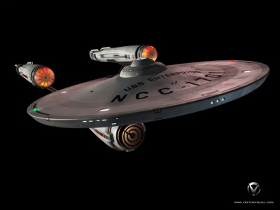
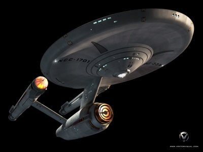
Another imagined new Enterprise from Vektor
Gabe isn’t the only one who has imagined a new Enterprise for the new Star Trek. Before the teaser trailer premiered, our old friend Jason ‘Vektor’ Lee (designer of the 2007 ‘Foolerprise‘) has taken a crack at it by creating something more detailed and realistic, while retaining original design elements, even down to “The Cage” era pointy nacelles. (again click to enlarge).
More of Jason’s ‘Conjectural Trek XI Enterprise’ at sci-fi meshes
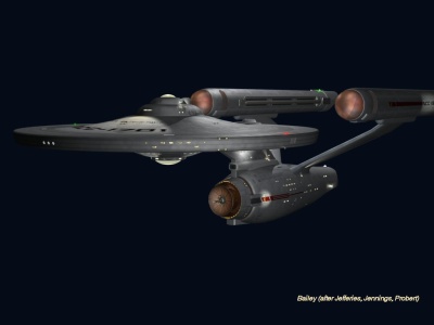
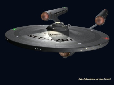
And another from Dennis Bailey
Dennis Bailey (TNG writer and Starship Exeter CGI artist) also took a crack at a reimagined 1701 by blending the TOS, Phase II and TMP era Enterprises, check it out (again click to enlarge).
Of course these are all just fun designs and none were meant as hoaxes, but that probably wont stop people from sending in tips about all the new Enterprises they find.
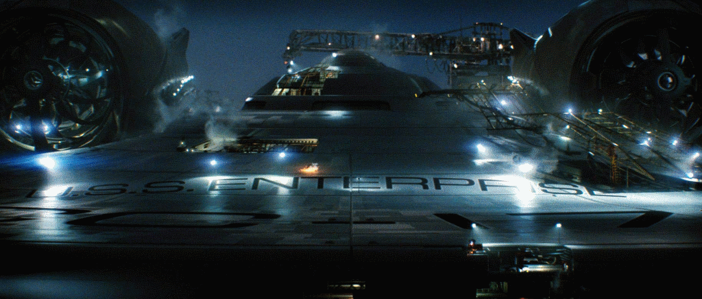
For now the only real picture from JJ Abrams Star Trek is of the Enterprise ‘under construction’ but at some point this thing has to fly.

I want some news NOW!!!!!
mmm hmm
it’s a long wait
Real or not they’re still amazing
Definitely a long wait ahead… sigh…
Jason ‘Vektor’ Lee’s design, without the pointy nacelle cap extensions, is the winner for me. Koerner’s designs are too muscular, and Dennis Bailey’s is too drab for my taste.
500 pics of GI JOE which isn’t even coming out until AUG 09 are out there, but we don’t get crap!! I’m getting really pissed
Just goes to show that the most creative Trek fans can be found on the Trek BBS. ;-)
This one is still my favorite:
http://www.gabekoerner.com/ent/enterprise_orbit_1080.jpg
Thank goodness for Koerner and his talented counterparts. At least they give us something to chew on while Paramount remains silent.
Why do I feel like the only person who is actually somewhat non-unhappy that there’s still a lot more to leak out? Once you’ve seen the Enterprise, it takes away a bit from the anticipation.
It’s like the night before Christmas. Anticipation is half the fun.
THEY ALL LOOK DAMN GOOD!!!
Can’t honestly say which one I like the most… they’re all great for different reasons. Koerner’s is the most modern-looking; Vektor’s shows that only minor tweaking to the original designs could still work; and Bailey’s is a nice, geeky nod to TOS, Phase II and TMP.
I’d put any one of these on my desk at work… proudly!
I’ve heard that when someone is suffering from extreme starvation, you cant feed them very much too fast or they will die.
When something comes out after a long while, I hope that’s it’s not too much that it will kill me.
Thanks guys for making a statement regarding these conjectural designs! I thought that even if they weren’t it, they are a good tease.
DRuss B-Flav is my fave.
Tis mac in the pants.
best!!
=h=
I like Vektor’s. It just looks like a more detailed Enterprise to me, but still looks like the Enterprise.
I think we won’t see the good ship Enterprise completely for another 364 days.
Hoping all this patience pays off. Nice shots, some of them look better than the one authentic pic we have, but I can’t be completely certain as we are seeing only a piece of the E from one angle, but I agree, we’re gonna need something soon, something to wet our lips again since we’ve got an extra 5 months of waiting.
16.
I have faith in the internet’s ability to find something.
It’s getting to the point where NOTHING will live up to this anticipation!
Thanks for the pics, Anthony. LOVE seeing what some of the incredibly talented fans are doing out there, especially with our beloved E. Must end this now so I can go back and gawk at them some more.
Jason ‘Vektor’ Lee’s design is by far the best. The others are interesting as federation ships, but they don’t look like the Enterprise to me. Vektor’s design captures the magic of the classic ship, with just the right amount of detail to modernize the ship.
I like the first ones. I suspect the movie version will strongly resemble those.
I can tell by the nacelles on the official image though that it’s going to be a bit too souped-up for my tastes. But I’m biased. I’m a borderline TOS purist.
J.J. Abrams or anyone from ILM? Hire Vector Lee for the new movie effects NOW!!
That is so awesome, At first glance it’s the Enterprise, but when you look closer, so many details pop out, its not even funny!
Daniel Broadway needs to post some pics, I’m itching to see what his E looks like after seeing his fake footage!
Jason Lee AKA Vektor is the winner.
Sorry, Gabe. Your design fits best with an alternate future timeline (“Yesterday’s Enterprise” style). It is an incredible homage to 1701, but it’s too much, imho. Nothing beats that orbital rendering, though. Brilliant stuff. (Mr. Lee, care to try something akin to that?)
Sorry, Dennis. Your design is flat, which is surprising as I’m a big admirer of your CG work and believe you’re capable of better design work.
Here’s to hoping the ILM team scores with a design mod that superceeds these creations. We’ll see…
Oh, and Dennis, why not post some pics of your USS Phoenix design? I was actually hoping the movie version looked like that months before the trailer came out. I thought it looked perfect for a prequel!
You’re other ship looks really cool too. It looks like a perfect Phase II ship!
And Gabe Koerner’s designs are awesome too. I’m not sure about the Enterprise, but Captain Tahir needs a ship with ‘muscle’ eh?
The first few images….can anyone see a bit of borg in em?
I can almost see a “meatier enterprise” for JJs trek, and, although Im up for change ….! But now i can see things out of box!……… how about,… before kirk…..before we saw anything……the enterprise was different?!!! arghh!! see what waiting does?!$”^
Vektor’s is pretty damn sweet.
You think JJ is sitting back and just laughing at us all? I hope so. Wheres life without mystery intrigue and magic. I like JJ’s tannens magic story from his boyhood. Makes waiting actually enjoyable, well maybe barable.
Gabe’s is very, very good and sort of “Star Trek” meets “Aliens.” I agree that it would be excellent in an alternate timeline — maybe the one next door to “Yesterday’s Enterprise”. It has the same kind of vibe to it.
But, even more than Gabe’s, I like Vektor’s and Dennis’s, and it’s a toss-up between them. I’ve admired both designers for a long time. I won’t say which one I like better — it’s THAT close.
This is what I saw in my childhood dreams, when I closed my eyes and made a wish:
http://www.gabekoerner.com/ent/enterprise_orbit_1080.jpg
All these fan designs are great, but my favorite is Dennis Russell Bailey’s. I have two of his Enterprise designs in my CGI model library (the USS Phoenix early Constitution design and the TMP Enterprise) and they are, far and away, the finest and most beautifully detailed meshes I’ve seen, Trek or otherwise.
Far from being “flat,” there are subtle details in his designs that only show up when you get in close to the model. They have such a realistic aspect to them that it can be difficult to distinguish them from actual physical models sometimes. And they render pretty darn quick to boot, a big plus for those of us without the luxury of professional render farms.
As has been said earlier here, these fan designs are a lot of fun to see, but I’m going nuts waiting for a photo of the Enterprise from the new movie. Won’t someone working on that film please, PLEASE, for the sake of my fragile sanity, show us what she’ll look like? We trek fans need something to rant about other than oblique quotes and references from the cast.
Come on, J.J., give us the “Big E.” You know it’s the right thing to do.
The Vektorprise© is highly impressive.
Nice Job!
=h=
I bet the movie Enterprise wont look as good as some of these fan renderings….
I dislike the Gabriel Koerner Vers. I’m sorry Gabe. I think that I went to your site once and saw some videos that you made and I think that I liked them back then. Perhaps the pics here dont truly represent what you are working on.
You know what fellas, who really cares when we’re talking about Sir JJ’s new movie? We all know that it’s gonna be somewhere in between the original, and probably the designs presented in this thread. It’s basically really really close to what we all know and love. Quinto ain’t Nimoy, and Pine ain’t Shatner. And as far as I am concerned, 2008 ain’t 1968.
I love that Roddenberry said that someday people would look back on TOS and compare it to the goings on of the present, and conclude that the new version being done by people he would never meet would be much better than what he did. That to me is effing presence of mind and vision of art.
BEST!!
=h=
On Dennis’s Enterprise how come the number on the nacelle looks like a NCC-19 (cuts off) instead of NCC-17?
re: 30. girl6 – May 8, 2008
“This is what I saw in my childhood dreams, when I closed my eyes and made a wish:
http://www.gabekoerner.com/ent/enterprise_orbit_1080.jpg ”
agreed. THIS IMAGE is the Gabriel Koerner© Enterprise that got me totally enthused.
Gabe, I’m sorry for the disrespect and apologize to your work. That image is spectacular.
BEST!!
=h=
@hitch #34
Poetry. That is what art should be. I also love your ‘2008 ain’t 1969’ bit too! Brilliant.
Vector… your rendering still ROCKS!!!
Sorry, but why does Gabe keep showing up?
He’s a competent CGI artist, but a terrible designer. He’s not trained and has no eye for design, proportion and originality from what I can see.
Gabe’s Enterprise looks like as if it has been assimilated by the Borg…
9. Ensign Ricky
I agree, though I really like Jason Lee’s retro look as well.
re: 39. Bart – May 8, 2008
whoa………….
seer of seers. effing a. Like a psychologist, you’ve just put a label on a feeling that we all have. Ever take some of those classes, dude? It’s merely a mapping of the human condition, which is understood and not be discussed.
=h=
I agree with Harry up at #1. Time for some real news.
It’s fun to see how some competent designers have re-imagined our favorite ship.
Does anyone know who has re-designed NCC-1701 for XI?
They all remain highly sexy, despite not being the real deal.
considered that there is a year to go till the movie opens I dont mind that I dont know what JJs 1701 will look like. It would be like Damon explaining what smokey is two years before the Finale in 2010 ;))
Vektorprise is way ahead of the others, and maybe even better than the official trailer version.
damn gabe aree you ever gonna finish that thing?
will people stop saying ‘long wait’ please. it hurts bad enough already. :)
#19
oh that was hard
I really like Jason ‘Vektor’ Lees ship. The Gabe is too futuristic for my taste…
I think JJ Abrams is clever not to release something too early however perhaps a little teaser, maybe just a glimpse of this ship b4 indie, like i dunno a sequence in space starting with a shuttle, camera follows shuttle then pans across to reveal the Enterprise, all shots cut by flashes of white, then the Trek logo then summer 2009
sorry forgot my 0.02 quatloos.
i dont like JJ’s ent. i think it stinks. for this era i like vector better.
#23 “Daniel Broadway needs to post some pics, I’m itching to see what his E looks like after seeing his fake footage!”
I’m in the process of making a second teaser, which will “continue” the events of the first real teaser.
It features a whole new Enterprise, than the one from my first teaser. I hope you enjoy when it’s released.