
 Just one day after we reported on the new Star Trek posters to be handed out at Comic-Con next week, the official site for the new Star Trek movie has been updated. In addition to a redesign, the site now has a download section for desktop wallpapers and IM icons, based on the new posters.
Here they are


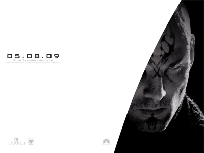
So far only the US site has been updated, but the site is accessible from anywhere in the world.
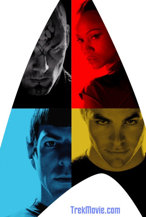
UPDATED New composite poster made from desktop images
Awesome! I’ll be buying it!
Wow, looks amazing!
Awesome. Thanks, Trekmovie.com staff, for keeping us updated with the latest. You guys do a great job, and sometimes I think we take it for granted. A great and fun service you guys and gals provide.
heh!! They all fit together into the starfleet emblem! :P cool!
Already knew this from the Facebook group. :)
I have Spock as my wallpaper and AIM icon now.
I can’t believe how good Chris Pine looks for the role. He has a similarity to Shatner that I can’t quite put my finger on.
Hey the little red dot for the ncc-1701.com viral site has been removed.
Nero looks lame-o. Bald heads and tattoos?
On the other hand, Quinto looks great as Spock. Pine is going to take some getting used to…
It’s amazing how much Quinto looks like a young Leonard Nimoy. There’s no mistaking that pic…it’s Mr Spock!
These are great.
Everyone is struck by how much Quinto looks like Nimoy. So, I kinda wish they had shaved Pine’s eyebrows down to more of a Shatner-like shape. If they’d just done that little thing, I think Pine would have come much closer to the level of the original as Quinto, and maybe even Urban, has done. Then, with the proper floppy Shatner forelock of hair (which I don’t think we’ve seen yet), we’d have a pretty good match for the Big Three. When I cover Pine’s brows up, he really starts to look like the young “Twilight Zone” Shatner, especially across the eyes.
Even so, I’m really hoping the new portrayals are true, which should go a long. long way to pulling off the total effect. When I watch James Cawley as Kirk, for instance, he doesn’t look much like Shatner to me, but his portrayal convinces me that I’m watching Kirk.
I’ve always been a Canon stickler, but let’s face it… in order to bring our beloved TOS back to life, certain visual details have to be compromised and updated. We obviously can’t have the original cast for a TOS-era film, so the characters will look different. Extend that same flexibility to even the ship, props, uniforms, and we can finally have what we’ve been waiting for for so long.
I remember having a similar reaction when ST:TMP came out and we had all-new Klingons. In TNG, we started getting updated Romulans. But we’ve all gotten over that by now, so let’s move on.
If only they’d trimmed those eyebrows… Okay, I’m over it.
Notice the uniform — the collar and shirt on Spock…
What if…
Kirk ISNT a captain untill the near-end of the movie.
That would explain the uniform absence.
On the very large image, Bana’s facial markings look less like tattoos and more like some kind of war paint.
I like the new wallpaper!
I hope this is the start of a flood of info, pics and more!
It’s a good day!
I think I just got more excited about this!!!
Has anyone else noticed on the large pictures the ST logo in each characters eyes? Either a trick of the camera or very clever, either way pretty cool!! Also does it look like Eric Bana’s ear is a little singed, either a battle wound or too much playing rugby!!
Chris Pine looks downright sinister in this shot; at first I thought he might be the Romulan baddie until I scrolled down and saw the much more obvious (and notably cheesy, I must say) tattoo guy.
Now that I adjust, I think it’s an excellent look for Kirk — especially a young Kirk who is presumably even bolder in his maverick nature. But just for a second there I mistook that evil gleam for, well, an evil gleam :)
Nice stuff.
10. Ramblin’ Jack…. you are right on the money. Shave those eyebrows, Mr. Pine. And Quinto’s could be thinned a bit, too.
Site isn’t working for me right now, is it down?
Urban? Pegg? Where are they?
And so it begins…
“To the undiscovered country…..the future.”
“What do mean…the future?…This is the past!”
If Bana’s look is any indication, we’re in for a treat! While he doesn’t seem to have the caveman-Romulan look from TNG (thank goodness… always hated that), it looks like he has some sort of prosthetic on the bridge of his nose or around the inner part of the eyes– thickening and flattening his face– almost tiger like. Looks mean.
Notice the weave on his collar? Is it me, or is that the a classic TOS Romulan uniform? Is that a wool sash on his shoulder?
Eric Bana’s ears have obviously been mutilated like that because he’ll be playing his ‘Nero’ character as ‘Chopper’! Wouldn’t that go down well?!
what i adore about the poster, and let’s face it, nothing is on a poster that isn’t well thought out and quite signed-off by the art department, is the very clear and happily obvious SEAM on spock’s collar. it’s a sweet wink to 60’s design. it says as much as anything about the art direction of the film.
notice the enterprise insignia reflected in each characters eyes, look at the big scans, :)
Um, about ZQ’s hair… Is that a wig? While else would his sideburn be sticking up so strangely? And why not use his own gorgeous hair?
I love this poster, but it still creeps me out. The other actors are suggestions of Kirk and Uhura, but ZQ IS Spock!
I still wonder what going to happen in the movie re: ZQ’s Spock that will make us cry? (according to JJ)
293 days to go!!!
OK.
Now this looks better.
In the previous mag scans, i thought the “grain/cloth pattern” was native to the design, which gave the whole thing a “dated” look.
But now that I see the images in its intended quality, it looks sleek. Now. Yet hearkens back to the old Trek. Pretty cool.
Where is mc coy?????
The 3 elements of startrek were Spock: Intelligence, Mc Coy: Emotion and Kirk the element that took the first 2 and made descisions…
Maybe we know why the film has Romulan villians before any of the characters met a Romulan in Balance of Terror. They lopped their ears of in disguise! ;)
Everybody seems to love the looks of CP, ZQ and EB and I like their looks too but what about ZS as Uhura? I think she looks AMAZING!!!
WTH is Pine going to pierce with that look? The new audience?
And will we get to see a funny version of the poster with at least Quinto and Pine roaring with laughter?
I want answers…
Well my 2 daughters (17 and 14) and her friends are dying to see the film…
mostly for Chris Pine, so the marketing is already working for the non trek fans!!!!
Gotta say I love the Retro/21st century look of the posters in keeping with the Starfleet uniform colour scheme also i see!
Damn Quinto has really taken the look of 60’s Spock amazing
Seems like JJ really is sincere in his apologies about Comic Con…
…we forgive you, JJ!! =)
I’m going to make this simple.
SWEEEEEEEET!!!!!!!!!!!!!!!!! :)
Other than sex appeal, I don’t understand the rationale for putting Uhura on the poster. McCoy would have been the obvious choice.
Oh, nevermind. I see where they are going here. They needed someone who wore a red uniform in order to both balance the design and fit logically with the color scheme.
P.S. If we’re going to play the nitpicking game, Quinto should squint his eyes a bit. Spock/Nimoy’s eyes squint just a bit ; )
Iowagirl: We all know you’re sceptical. We get it already. By now it almost seems like you’re trolling for attention.
Qlthough these new actors will never take the place of William Shatner, Leoanrd Nimoy and Nichelle Nichols, I have to admit they look pretty good.
Quinto looks the best. Still not sure about Pine, only Shatner is Kirk.
Hope this is a great movie and that Abrams does not screw this up for the Trek fans
Good Lord, some of you people are tiresome. Nitpicking hair and eyebrows, and the way somebody is simply looking out at us from a stupid poster. I find it all quite pathetic.
Fandom has gone too far when the fans think they have some kind of ownership of their obsession. It’s what keeps me away from here most of the time. I think the “purists” ruin it for the majority of people.
So I’ll go away again, like I always do, and come back some day with yet another name.
Sweet. I DESPERATELY hope the whining will subside now.
I think the poster looks really cool and I like the tattoos and the scarred ear.
To the people saying why is Uhura there instead of Mcoy. Here is some simple answers….
The three main colours for Starfleet uniforms – Red, Yellow and Blue.
The only other choice would’ve been to put Scotty there, but with all due repect to Pegg, he doesn’t have the same sex appeal as Zoe.
Another reason is you can’t really have it all men with no women in the poster. THEN there would be a bunch of complaints about sexism…… yadda yadda yadda
#39 sez: “I think the “purists” ruin it for the majority of people.”
Purists are tiresome, it’s true, but they can’t ruin it for the majority of people because (thankfully) the majority of people – including the majority of fans – never meet one. They’re much rarer in the physical world than the virtual. While there are unfortunate exceptions, as a general rule the only people who have to put up with purists are those who choose to (or are paid to – I’ve been in THAT seat and it’s a squirmy one).
Even here, at a nexus of online fandom, purist posts are a pretty tiny minority of the whole. Most folks here seem to be good-humored fans with highly varied tastes.
People bitching about them are at least as common, and just as repetitive.
I said they look good but to me they aren’t going to take the place of the originals.
Kirk Van Der Beek needs brown contacts
Sorry, I couldn’t resist posting this from yesterday’s notice about the poster…
#16 & #23–
ah, you no doubt noticed the ears? perhaps you could explain the accident you had as a child… you see, he got his ears caught in a mechanical rice picker…
#37
Jovan: Seems like I’ve succeeded in grabbing your attention…LOL
# 6 — I see what you mean. Reminds me of some shots of the “bad” Kirk from “The Enemy Within” episode…
Did anybody notice that the little red dot is gone?… the shipyard link???
#48 —
The dot is gone but the shipyard is still active:
(http://www.ncc-1701.com)
Man, those guys have been welding those same spots for quite some time now.
Hey!
Two more Wallpaper:
http://www.treknews.de/treknews/newspro-treknews/static/121647937495541.php
Enjoy :)