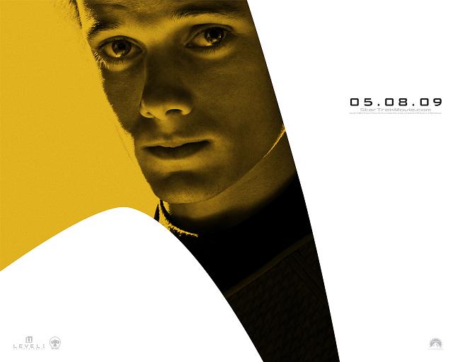
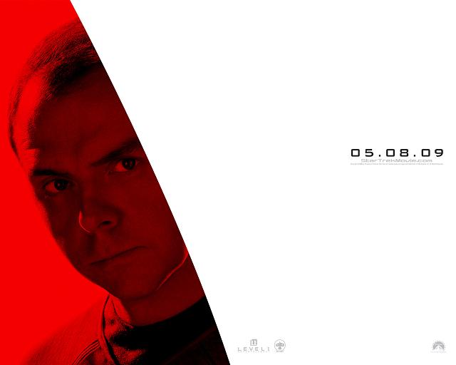
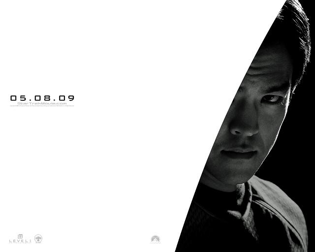
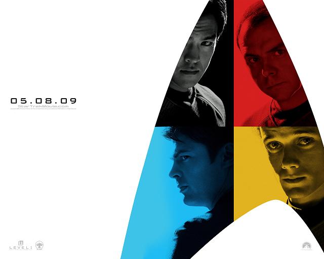
 As was done when the first set of character posters were released at Comic-Con (see story here), the official site for 2009’s Star Trek has been updated with images from the Vegas convention posters available as wallpapers and IM icons. Besides giving us more options for Trekking out our computers, the updates also give us our first high-res looks at the movie’s Sulu, Scotty, Chekov, and McCoy.
And here they are:


cool!
wow cool!!!
Awww… at least Kirk had the hint of a smile. They all look so aggro. =(
Totally loving the TOS-ness of the uniform though. Time to start making one to wear to the premier. Haha.
Look at the uniform design, they are little star trek symbols
I cannae see the Trek chevron/logo in Scotty’s eye! I’m sure it’s because I can’t blow it up big enough to look w/o distorting the image.
It’s amazing how different these actors look in these images. It’s the lighting more than anything else, I think.
Someone said that this McCoy looks to hard, too edgy. Well, he’s just come from a nasty divorce with his wife and had to leave his precious Joanna as he runs away into space to get away from the pain of it all. That was supposed to be McCoy’s backstory we were supposed to see in season 4, right? That makes it canon, riiight? Will this be part of the ST11, I wonder?
I wonder if Chekov in the movie will say everything is from Russian origin?
4. Uh, WHERE?
Huh. If you click on the individual pix, it takes you to the movie trailer.
Peace. Live long and prosper.
The Vulcanista }:-|
Pegg needs a toupe for his role.
The Vulcanista is an idiot — you click on the link that says DOWNLOADS.
You should consider renaming yourself ‘The Pakledista’, more accurate
Sam, never slam a woman (especially someone as lovely and talented as The Vulcanista) who is trying to tell you something for your own good!
Hmm, Sulu could’ve been colored gold and that would’ve looked fine in the composite opposite Chekov. Regardless, still awesome!
I hope more posters come out. Next 4 could be old Spock, Sarek, Amanda and Pike. Plenty of name actors cast for this film to make posters with.
If Dark Knight can capture everyone’s imagination this summer, perhaps Trek can next year? That would be fantastic.
#10–Sam
Not cool, dude. It’s considered poor form to cap on someone in such a manner here. And Vulcanista is a friend, so now I don’t care for your comments on a completely different level.
Ya’ mind rephrasin’ that, laddy?
Yeah, especially since the tool is wrong! When you click on the poster pictures you ARE linked right to the trailer! What a wanker!
I wonder if the same guy that colorized the last one will do this one?
pleeeez.
that’d be awesome!
So now I have 6 of the 8 posters. I’m so bummed I couldn’t get Sulu and Chekov. I did get duplicates of Spock and Uhura, though, so my best buddy’s firefighting son gets them! He just got home from fighting California wildfires…21 days straight! Wish I had enuf extra cash to get Quinto’s autograph on it for him.
BTW…the posters are HUGE.
#10 – Sam,
Dude, cheese it, man. Take your hate to a Star Wars, or Lost, or BSG site.
it took me a couple of days … but I buy Pegg as Montgomery Scott now…
just took a couple of days… that serious look Pegg has… you know.. Scotty was pretty serious a lot of the time too…
McCoy is my second favorite behind Spock as the best update from the original.
just some thoughts….. end transmission.
When I first saw Anton Yelchin’s poster I was alarmed by not only how much he didn’t resemble Walter Koenig, but how freakish the shape of his head was.
Then I realized the edge of his face is just so brightly lit that it matches the background. And that, with his full face, he’s not only not freakish, but looks like an excellent young Chekov.
Try to look at Karl Urban’s expression and not think, Dammit Jim!
There’s no helping the release date, but I resent it all the more for delaying the start of the sequel. I feel this is going to be utterly great.
Sorry to post twice in a row — Here Scotty looks dramatic, we’ve heard from the convention that Simon Pegg provides great comic overtones. I think what will clinch him as Scotty is when we hear the brogue. We’re accustomed to Pegg’s regular Gloucester voice, but as soon as he canna change the laws o’ physics we’re all going to recognize Scotty.
Looking at the eight posters now, Kirk is coming into the game late. We’ve already know he is the one not wearing one of the new unis. Now seeing the whole cast except for him in one leads me to think we’re not going to see him as Captain Kirk until late in the ball game.
If you go to the official website, I swear Pegg’s left eye (right side on the screen) is reflecting the Enterprise. I could be wrong, but it looks like it on my screen ^_^! Can’s see much though :( Just the saucer and the fuselage.
Can anyone else see that?
#8 — The Vulcanista — each image takes you to the official site, where you can access the wallpapers and icons by clicking on the downloads link.
#10 — Sam — warning for flaming/personal attacks
It could be the reflection of someone else though. Neck and head. I dunno.
While I understand that the new actors don’t have to be carbon copies of the originals i kinda wish pegg were to have a more original scotty haircut.
I did a photoshop test here…
http://img364.imageshack.us/img364/6421/scottypeggyt5.jpg
25 much better
Crazy how much Yelchin looks like Alexander Siddig!
And Urban looks like Justin Bateman.
And I didn’t recognize Pegg on first look.
Sweet… a bunch of character actors able to do a bit of morphing. This moive is not only gonna be cool, it’s gonna be smart!
Hey Sam…
In tha’ Royal Navy sometimes few of us blokes can’t really handle a missile… all that computer junk ta’ go through… geez, why be it so complicated ta’ shoot a missile at a small, defenseless nation… At least a bonny lass like Vulcanista wouldn’t point tha’ missle at ye’… But I’m not as sweet o’ disposition as her… look above ye’ mate.
Arrrrrrrr…
(wuz that a tad more homo-erotiic rather than bein’ defensive towards a beloved chatter? Am I gettin’ banned now fur fist-i-cuffs?)
Now then, oh… tha’ poster… uhhh… well… it’s surely primary…
Arrrrrrr….
#10 Sam, You are not a Gentlemen. and #25 ….Um YEAH, HELLO!!
See? Not too difficult. Righteous!!
Vulcanista = cool… Sam = not… ’nuff said…
Pegg looks much less “Tuvokian” (thank God) in the official version… ;-)
Those tunics are SWEET!! I want one! (…for when I go on jury duty… heh!)
…also dying to see the phaser / communicator / tricorder!!!
Mmm…pointy sideburns…
Can Sarek, Amanda, Pike and Spock (Nimoy) be far behind?
how about a new poster!
Black- Phaser
Red- Tricorder
Blue- Communicator
Yellow- Uhuras Earpiece :P
nah, but i have a tiny idea about what might be in the next one:
Yellow- Pike
Black- Spock
not sure about blue and red, let’s pass around some ideas
:D
Sorry thar’ Mr. Trotter, fur our hot-blooded outrage… and it’s always a good word from ye’
Best ta’ ignore tha’ foolishly rude (dunna pick on TrekMovie mate) …but let’s move on ta’ tha’ meat o’ tha’ article…
Thanke’ fur tha’ looksee at tha’ new Bones, Sulu, Anton and… and… hey- that red bloke struck me with a cricket bat! I ain’t dead, mate!
Arrrrrrr….
These posters are great and I have downloaded all 10 of them! It’s good to see the entire Trek 2009 crew in costume. I’m looking forward to TrekMovie putting the posters in real color like they did with the previous Trek posters (Nero/Uhura/Kirk/Spock poster).
The real color TrekMovie altered poster can be found here:
https://trekmovie.com/2008/07/30/trekmovies-new-view-of-the-new-star-trek-poster/
also, not to go off topic :P
but has anyone noticed that now the whole overall image has gone from a darker Trek (old website layout, trailer, posters, etc) to a brigther and (dare i say) more campy style?
Agreed on the missing Scotty hairpiece,,,
everything else looks good.
“but has anyone noticed that now the whole overall image has gone from a darker Trek (old website layout, trailer, posters, etc) to a brighter and (dare i say) more campy style?”
changing background from black to white will do that. i don’t understand how white background designed to match poster background with very few conservative and elegant design elements can described as campy
eh, maybe “campy” was the wrong word.
re #39
“…maybe “campy” was the wrong word.”
I think the word JJ would use was “KITSCH”.
;-)
What happened to the links? They all link to the trailer.
Ok, I figured it out, but I still think the pix should be linked to the hi-res versions directly to avoid confusion… or maybe because I am a Pakled too….
#42 — There is currently no way to link to the download page, let alone the page for each individual image, since the whole site is Flash-based. Hence why they are all linked to the official site, where users can simply click on the “downloads” link and voila!
Teeth are for chewing… links are for clicking. :)
22. MattTheTrekkie,
All I can see is the Starfleet logo in both eyes. Admittedly, there is another shape in Pegg’s left eye, but I can’t make out what it is. I know it doesn’t look like the Enterprise to me, anyway.
Talking about Pegg, I prefer having him natural instead of a goofy hairpiece.
Okay, am I the only one not remotely seeing these on the official site?
me neither
#10- sam, if you say anything like that again, I will sneak up on you, hit you over the head, and hide your body in a closet. you shouldn’t be so horrible and I hope anthony bans you from ever posting again.
anyhow, I thought it was strange that clicking on the pix takes you to the trailer too.
TO EVERYONE —
On the official site, one of the links on the black bar that comes up when the page loads says “downloads”. Click that. The trailer might load first, but for me, the trailer and links load at about the same time.
When you click on downloads, you will be taken to a screen; the site will automatically increase in size and will tell you to hit escape to go back to normal view… unless you have NoScript or something similar preventing the site from doing this. If you have NoScript, go ahead and allow the official Star Trek site, there’s nothing there that will hurt your computer.
On the download page, there are ten thumbnail images — eight different characters and two composite images with four characters each. The top five are Kirk, Spock, Uhura, and Nero, led by their composite image; the bottom five are Chekov, McCoy, Scotty, and Sulu and their composite.
Here is a visual aid:
Clicking here: http://img515.imageshack.us/img515/8247/clickingherewa5.jpg
Takes you here: http://img84.imageshack.us/img84/8633/takesyouherelg1.jpg
Hope this helps! :) If not, then the issue might be with your browser or connection.
And let’s take it easy on the death threats, too, people. :-P