
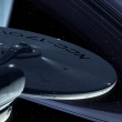
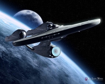
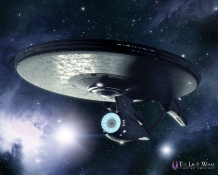
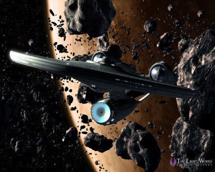
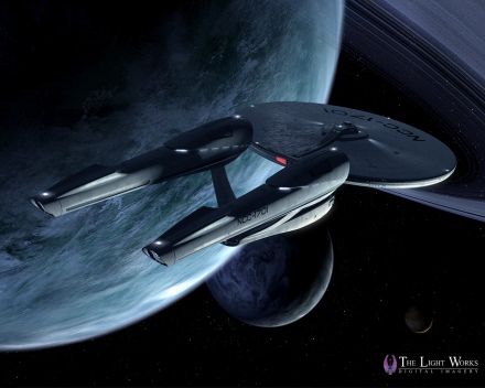
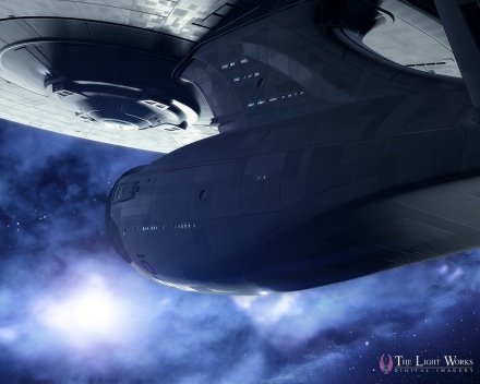
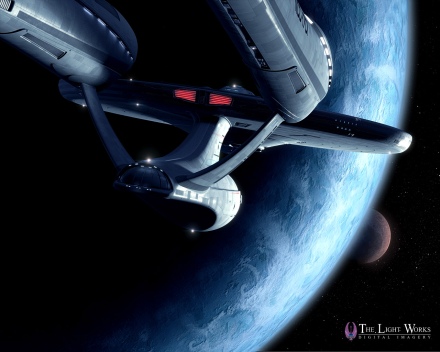
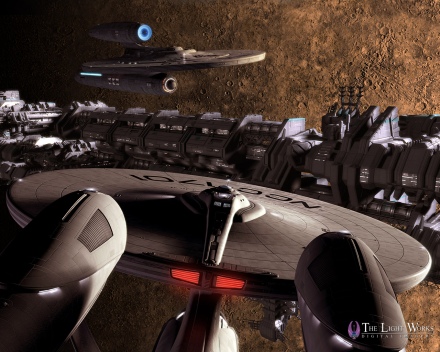
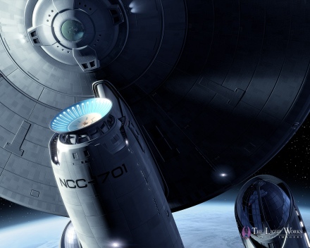
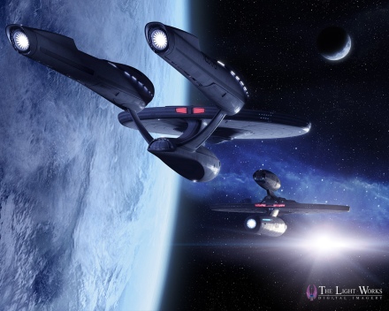
 In December TrekMovie featured some amazing ‘fan made’ images of the new USS Kelvin from the upcoming Star Trek movie, by German CG Artist Tobias Richter. Since then Richter has been at work on the new USS Enterprise, and today we bring a first look at what he has come up with. Check out his stunning Big E desktops below.
Do it yourself Enterprise
Tobias Richter is a big Trek fan who also happens to be a veteran CG artist and owner of The Light Works graphics studio in Cologne, Germany, which does visual effects for games, TV and film. Although he has done some work on DVD covers for Paramount Home Entertainment, the following images are 100% ‘fan made.’ His model of the Enterprise is based solely on reference material available (the official image release, the three trailers and even the toy images). Since the total source material is limited, some areas of Tobias’ version are conjecture, however he feels confident it is ‘fairly accurate.’
And here they are:
Desktop images:
[Desktop Downloads: 1280×1024, 1920×1200]
[Desktop Downloads: 1280×1024, 1920×1200]

[Desktop Downloads: 1280×1024, 1920×1200]
[Desktop Downloads: 1280×1024, 1920×1200]
[Desktop Downloads: 1280×1024, 1920×1200]
[Desktop Downloads: 1280×1024, 1920×1200]
[Desktop Downloads: 1280×1024, 1920×1200]
[Desktop Downloads: 1280×1024, 1920×1200]
[Desktop Downloads: 1280×1024, 1920×1200]
[Desktop Downloads: 1280×1024, 1920×1200]
It took Tobias about three and a half weeks of total time for modeling, texturing and lighting, all done using the Autodesk Maya software. The Enterprise features 150 light sources, more than 30 texture maps, and even has some furniture inside and blinking running lights to add a lifelike feeling. Tobias says that he still prefers the shape of the TMP ‘refit’ Enterprise, but feels this new one will grow on people. While working on the model he was impressed at how many references to previous Enterprises were worked in to the new ship, such as the color scheme on the neck area (the green and red stripes).
More to come at FedCon
Tobias will be doing a more elaborate animation video showing the Enterprise and the USS Kelvin together, which will be premiered at the big FedCon convention in Bonn, Germany in May. Although he is pretty certain they don’t interact with each other in the actual film, he thinks seeing them together ‘looks cool’…indeed.
For more on Tobias, visit The Light Works.
Awesome!
-Keith
I def love these downloads. Good work
She actually looks pretty good – nice work!
in the Words of Mister Spock: o.0 fascinating.
Looks like the Enterprise. :-)
beautiful!
These beauty shots are fantastic. You have to admit, the Enterprise (even this newest incarnation) is a beautiful ship. Well done, Tobias. Well done.
I remember when he did the opening animation for Team 17’s Alien Breed like 16 years ago…A lot of time has passed indeed.
…Yeah, but what some of us *really* want are 3-views – side, front, top – like the Franz Joseph Technical Manual layouts, as if they were displayed on an LCARS of some sort.
I know some people won’t like the changes but damn! I love her.
Wow. Nice stuff.
I hope once the film’s out, he goes back and corrects whatever need correcting (like if the Bussard collectors glow a certain color).
WOW!!! Great work!!! Incredible!!!!
Can’t wait to see the video at the FedCon!!!!
Live long and prosper!!
Splendid!
Wow, I hated the new Enterprise till now. Great work. Thank you so much.
Wow. If those prove accurate, they really isn’t bad. Much better from those angles. I still want red nacelle caps though…
Those are some astoundingly beautiful renderings of a couple of supremely clunky starship designs.
I admire your craftsmanship, Tobias. Beautiful compositions and colors. I particularly like images 1,4, 5 and 9. Great work.
Scott B. out.
Beautiful.
Thanks Anthony! I was about 5 minutes from dropping a line to you asking when these were coming out. And I mean literally. It’s been on my mind all day!
1701 looks better than ever.
Tobias does some very good work given the limited reference material.
Having said that, I’m back to not being a big fan of the redesign. The angles are good, but the ship itself…”looks like a swollen-up balloon at a Starfleet shoving-off party.”
But, like Tobias said, maybe it’ll grow on me. We’ll see.
Well done I think this ship will continue to grow on me.
I didn’t know what to make of the (official) first images…I didn’t like them too much…I didn’t hate them..but..it was .. more different that I would have thought….then the toy images softened me some…and now ..even though these aren’t official…wow….I dunno…I think she is really growing on me…..it’s a thing of beauty….
so cool
This ship isnt worth 1 meg. I’d take the backgrounds over the ship anyday, thank you.
“And Admiral…it is the Enterprise!”
*faints*
Now I get it. I finaly figured out what does the new ship remind me of…It reminds me of an Enterprise with a clown nose and big flappy shoes…
Beautiful rendering work, outstanding in fact.
Even achieves the impossible and makes the design look good from some angles.
But I think this just shows up how the classic and elegant lines of the original are ruined in the new one. It’s what remains of the original 1701 that attracts the eye. Everything new in the design repels.
“These are the voyages of the starship…Enterprise.”
EPIC!!!
nacelles are too big and way too close together in the new enterprise. doh! gimme STTMP refit any day
I’m still not sold on the proportions of the new ship, but these images do put my mind somewhat at ease – the angles are better than the official images shown thus far. Really nice work, made all the more impressive by the limited amount we’ve seen the actual ship. Major kudos, Tobias. And thank you for sharing.
22- So Bob, are you allowed to tell us how accurate these seem?
I’m tempted to bring up the “TMP” argument, since it’s my second-favorite E (First place goes to E-E). But this isn’t a TMP movie. This takes place 20-30 years BEFORE TMP, so I’m not gonna argue too much.
“Gentlemen, we’ve come home.”
from some angles the new E isnt ugly…from some, but for the most part I still hate it. Yep, nacelles wayyyy too big and close together, and how bar back the pylons are, and how the collectors are all dark and lifeless on the fronts…ugly ship, I dont think I’ll ever like it. Still some of those wallpapers that avoid the ugly features look good.
Absolutely stunning!
These are so Kool even Bob Orci was Inpressed. I know I am .These are very beautifull and Wow What can i say. If the big E in the Movie looks anything like these then we are all in for a wonderfull treat. Oh and did I say WOW!!!!!
30. weerd1 – February 23, 2009
22- So Bob, are you allowed to tell us how accurate these seem?
they seem pretty accurate…
This Enterprise is truly a thing of beauty in these screens. I wasn’t sure before but if she comes across like this in the movie then I’m a fan. This big E shows elegance and power (although I still wish the engineering hull extended a little farther back as has been mentioned ad nauseum).
Oh, and I hate clowns.
Wonderful work. I too feel the new E growing on me; though the STTMP is still my favorite.
Mmmm- no bridge window? That’s a MINOR nitpick on gorgeous work though, which may not be reflected on the movie Enterprise…
Hey Bob Orci. On the Next Trek Movie you should hire Tobias Richter. He does outstanding work.
Beautiful artwork Tobias! Thanks
I remember how much the Enterprise D was criticised when TNG came on…but it grew on everyone. The rest of the show vehicles after that just became familiar and accepted in their designs (defiant, akira, intrepid, etc.) even though they were far out for Federation design.
The critics will become familiar with the new Constitution class and fall in love with her as well.
35- Cool! Thank you Mr. Orci!
My first love is still the original 1701 from the series, but this version just may become a second or maybe even a tie for first.
Gorgeous!
-cs™
Wow it actually looks like its from the 23rd century and not the 1960’s. Shock……
*J
Decloaking . . .
The big E is the best thing this team has done, Design Wise, for the future of Trek.
Recloaking. };-D>
This guy does amazing work. But to tell you the truth, it has made me like the new E a bit less. The nacelles are too bulky and crowded. They need to be slender and graceful.
Truly awesome work.
Mr. Orci, like #39-Capt Mike said, you should definitely consider hiring him.
*J
The new ‘old’ E looks better here than the ‘official’ images, but she still comes across as aesthetically compressed and clunky, like she slammed into an asteroid during a test flight. Not a bad design, but definitely room for improvement.
Of course, if we accept it as a pre-TOS and TMP design, and Scotty ovehauls the whole thing later on, then it’s not so bad.
If the Big E looks this good in the movie coupled with some awesome sound effects I will be happy! It’s not my favorite Enterprise. But I can live with it. We’ll always have the others too.
Thanks Tobias for making this version look the best it can be. I’ve enjoyed all of your other work and display them on my monitors. I know you didn’t design this ship but you sure did it justice!
These are absolutely amazing! Best Trek wallpapers I’ve ever seen!