
 Next week IDW returns to Star Trek: The Next Generation with their first issue of "Star Trek The Next Generation: Ghosts," written by Zander Cannon. To get you started, check out our exclusive five-page preview below.
Preview:
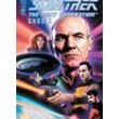
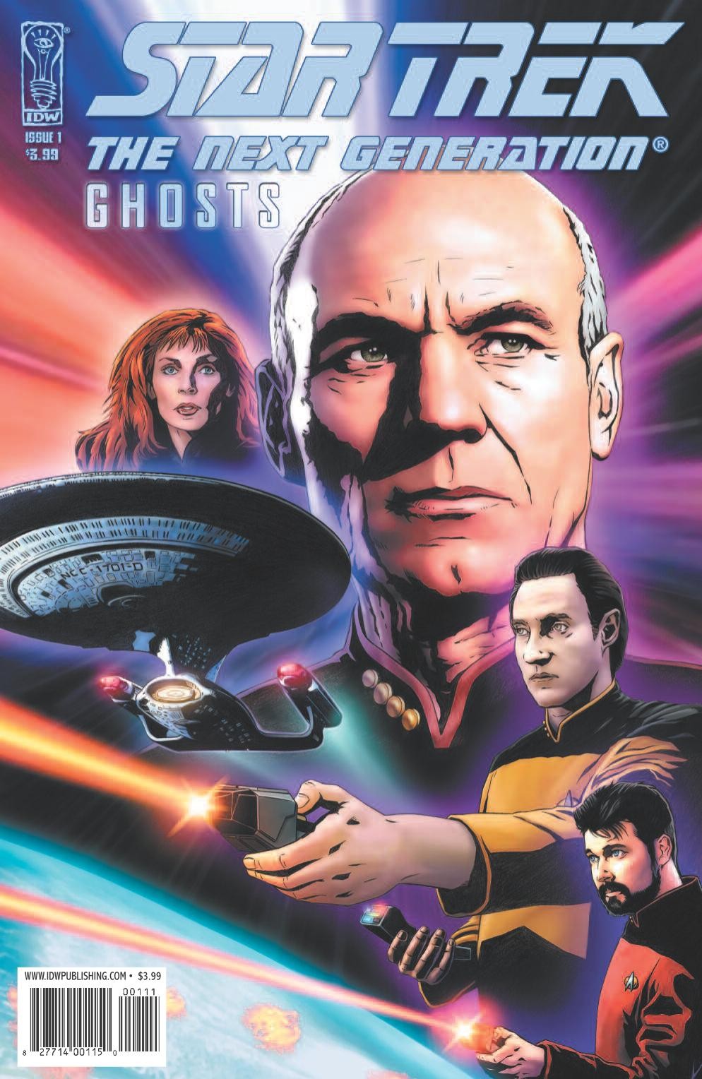
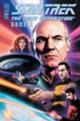
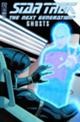
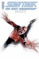
Star Trek: The Next Generation: Ghosts #1
Writer: Zander Cannon, artist: Javier Aranda, cover: Joe Corroney
Synopsis
Captain Picard and the crew of the Enterprise respond to a distress call and find a terribly wounded scientist aboard a marooned ship. While evaluating the planet below (and its two warring nations) for possible Federation membership, Picard discovers to his horror that the survivor of the disaster is foreseeing his death. Written by Eisner-nominated writer Zander Cannon (Top Ten).
Issue 1 covers (regular and dealer incentive ‘virgin’ cover)

5-page preview:
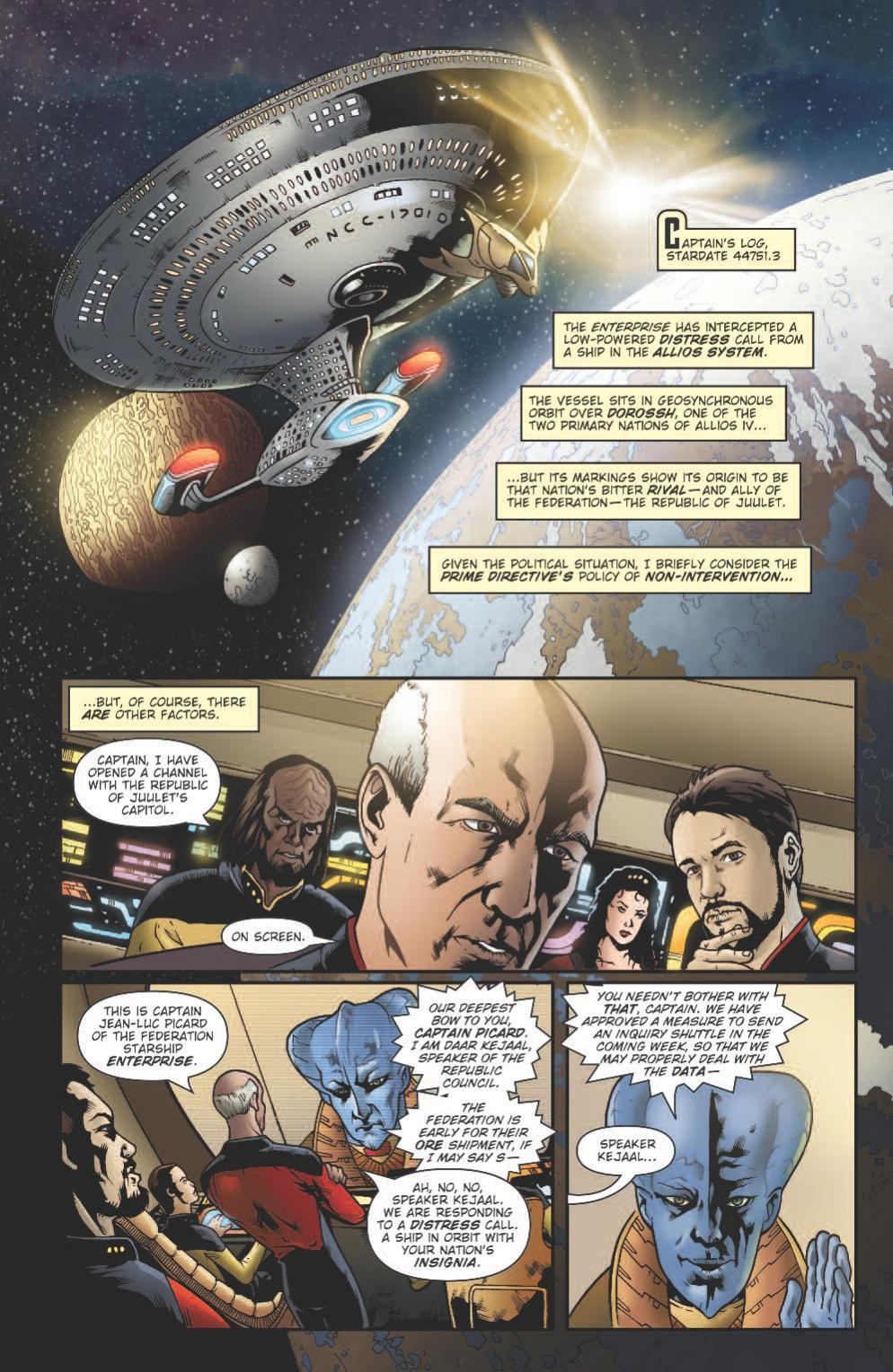
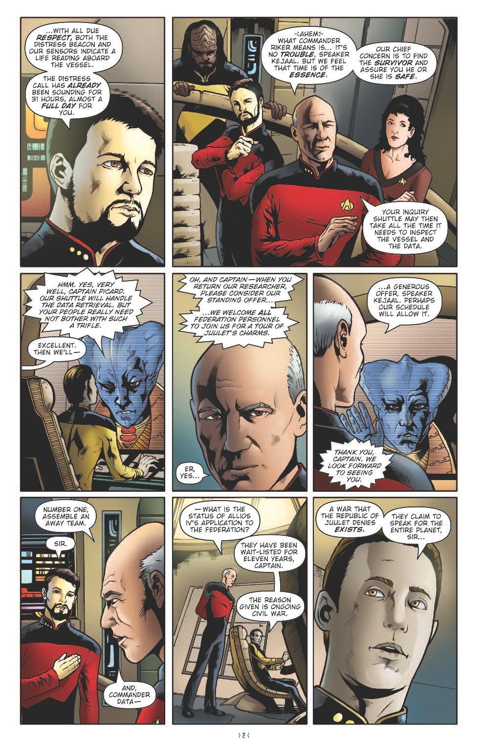
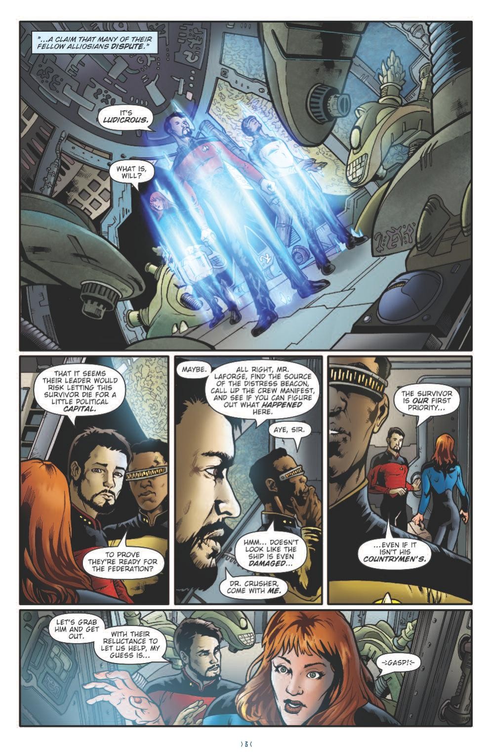

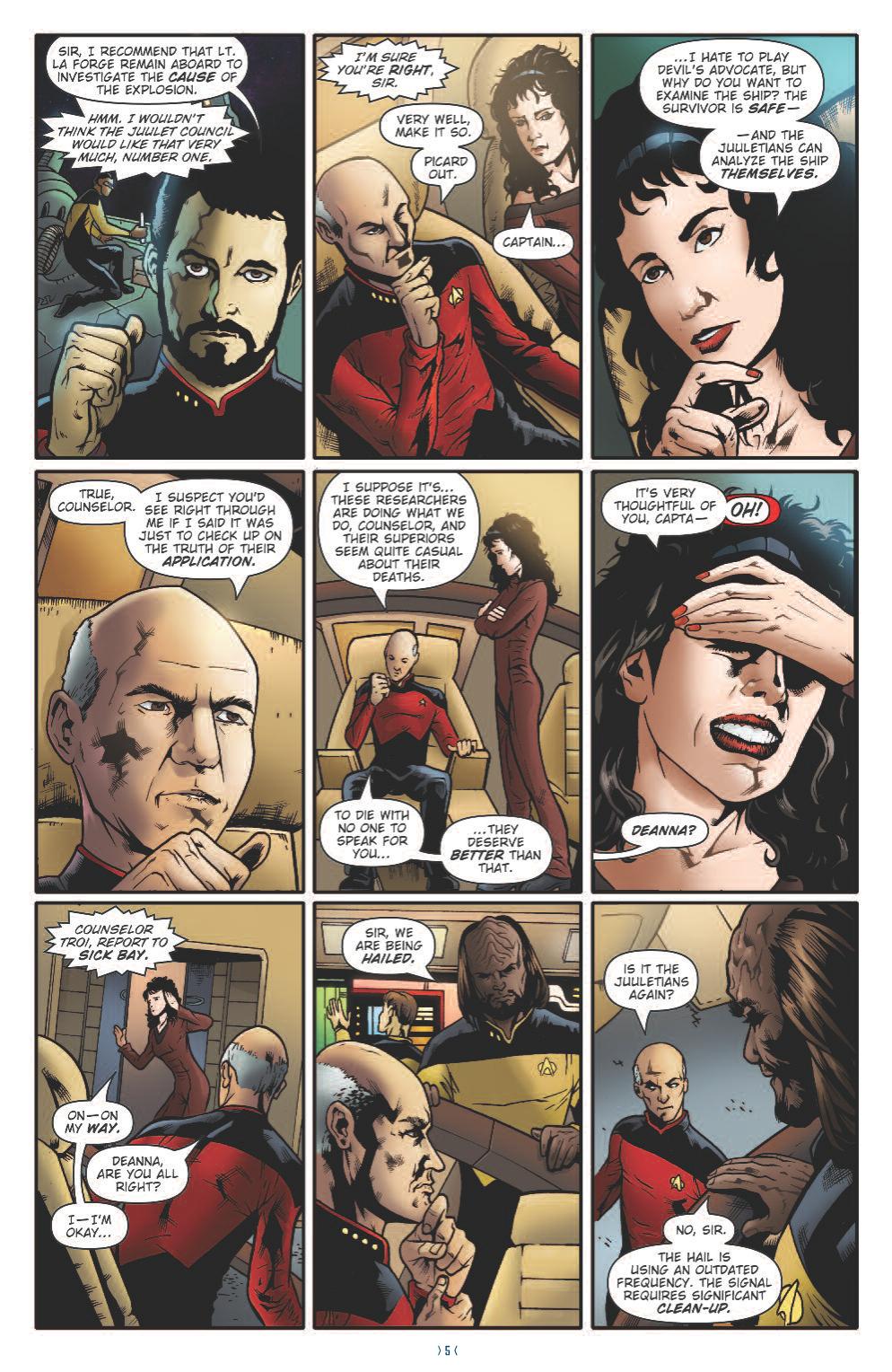
(click to enlarge)
Star Trek The Next Generation: Ghosts #1 is available in comic stores Wednesday November 18th. You can order it and next two issues at TFAW.

Quite nice, although I must say that the characters look a little different from their appearance in the series.
Nice colors!
Looks like it could’ve made for a nice TNG episode. That said, I miss Messina’s artwork already.
I’m sorry, but that art is terrible.
I believe, fully, in the right to interpret reality in the creation of art – even in comic art – but that’s just … totally unimpressive.
@4: Sadly, I have to agree. This is the first time I’ve been unimpressed by the art in an IDW Trek comic. Ah well, there’s always next issue.
Wow, that is really bad art! The artist even forgot to draw Worf’s baldric.
My namesake looks different in every frame, and in the wide shot of the bridge — how the hell can a human even strike that pose??
Anyway, it looks like a fun read.
@6
Uh hu!
God…why does the art in Trek comics suck these days? Seriously? The cover art is fantastic, amazing even! But once you open the pages, dear lord, it’s like opening the Ark of the Covenant….
Will and Geordi are buddies – if anything, Geordi would be calling Will “Commander Riker”. Will wouldn’t be saying “Mr. LaForge” – Picard would.
Honestly, the art looks piss-poor, like someone took generic concepts of what the characters and Enterprise should look like and improvised the rest. Riker doesn’t look anything like Riker – his beard is waaay too thin around the edges and his lips are a little too puckered.
Deanna looks like someone got everything EXCEPT her face right. Like that Mr. Bean movie, where he’s supposed to be guarding the original Whistler’s Mother, then he scrubs off the face by accident and draws a smiley face in its place. Yeah. That’s pretty much it.
Data and Picard, pretty hard to screw up but they definitely tried.
The Enterprise, the nacelle supports aren’t tall enough and look too squat as a result. The saucer looks like the original Enterprise’s saucer, too circular and not nearly oval enough.
Cheap is the word that comes to mind here, hurried perhaps.
7, that’s an interesting point. What is Riker doing in that pose anyway? He looks like he’s scratching an armpit or something.
Just sayin’.
But I do like the idea of having a Trek comic and I’m confident the story must be pretty cool, in case I sound too harsh.
Soooo… These are characters from TNG, right? It’s quite hard to tell.
Every comic artist has his or her own style of drawing, so no two artists work drawing the same characters is going to look alike. Besides, in the end it’s the story that really matters most. The art is there to help the story along. If the story is bad, then you have a bad comic. As we approach Thanksgiving, let’s all be thankful that we have a company that is publishing Star Trek comics again, even if the art doesn’t live up to what some of us think it should be. Live long and prosper!
No. 9, Happy Russia,
Unfortunately the cover art isn’t even impressive. IDW has the poor habit of taking photographs, blurring them, then penning over them as they’ve done here. That’s not an artist’s work, but a technician’s…
You bet I’m happy we have Trek comics again! Just having fun with them, is all. :-)
#11–yes and Worf looks like he just had a bad case of gas pains or diarrhea LOL guess that prune juice finally did its job ROFL!!!
This is like coloring book art, that’s appalling!
My god, I have never seen so much bitching in my life.
I can’t draw anywhere near that well, so I don’t feel like I’m in any position to criticize the artwork. The characters don’t look exactly as they did on TV, but it’s close enough.
The question I have though is, why is it set on the Enterprise-D? I thought all new TNG fiction was supposed to be set in the time between Insurrection and Nemesis.
i do find the art is second rate- nothing interesting or unique about it.
no stlye- nothing.
i can forgive innacuracies if there is mood & style- like the trek 2 adaption.
#14
Who’s to say an ink-ed over photograph can’t be good cover art? May be a personal annoyance, but I don’t think just because it wasn’t drawn 100% by hand it should be discredited.
(As for the interior, eh, not the greatest, but I could settle for it. If I were going to buy the book, which I’m not).
Wow, the art is pretty subpar.
I must add, however, that the best I can do, art-wise, is pretty much limited to stick-figures. I kid you not.
It is me, or does Riker look more like Wesley in several frames (such as second frame on page 1)?
24 – I was just going to say the same thing. In that first panel, my first reaction was “Woah – Wesley grew a beard!”
I don’t want to pick on Aranda’s work, but Trek comic art has been done much better. Gordon Purcell and Jerome Moore perfectly captured the actors and characters for decades. John Byrne does a fine job now.
And it’s a sore spot with comics in general that you can so easily end up with a Rob Liefield. I’m still convinced he did the second Romulan Spotlight.
Wow, awful! I didn’t even notice that they’d forgot to draw on Worf’s baldric! I also noticed that Worf has 3 pips on his collar, whilst Geordie only has 2. Anyone who watched TNG knows that Geordie made Lt. Commander a long time before Worf did.
I get the feeling that the artist may have drawn some of these figures from a mental impression of the characters rather than, say, looking at frames or stills from the series. I don’t know if this is true, though.
Anyway, in the end, it’s really the story that counts, and the story could be quite good!
I don’t know what happened with his work on TNG but here are some other examples of the artist’s work: http://jsa.deviantart.com/art/Ghost-Whisperer-83082374
http://arandart.wordpress.com/
Perhaps IDW didn’t pay him enough or maybe he was rushed but judging from the samples on these pages, I would’ve expected more. He seems to be a very good artist. I looked him up when I first heard he was drawing this mini-series and I was excited. After seeing the 5-page preview, I can’t say I’m rushing out to purchase it.
wow that looks good