
 Yesterday the Art Director’s Guild nominated Scott Chambliss for his work on the 2009 Star Trek movie. Scott has sent us a brief statement about his nomination, plus we share some cool behind the scenes photos of some of the sets from Star Trek.
Chambliss on his nomination
TrekMovie asked Scott Chambliss for his reaction shortly after he learned he was nominated. He said:
It’s an honor that STAR TREK is included among so many impressive and beautiful films nominated for an Art Directors Guild Award this year. On behalf of the entire talented army of art department, set decoration, and property folks who worked diligently on our film, many thanks to the the Guild
membership.
Chambliss’ nomination for Star Trek is his first for a feature film, but he was actually nominated four times by the Art Director’s Guild for his work on the TV series Alias (with one win in 2003).
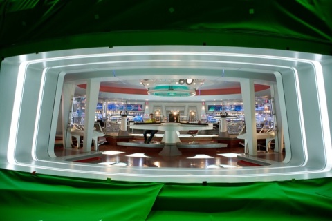
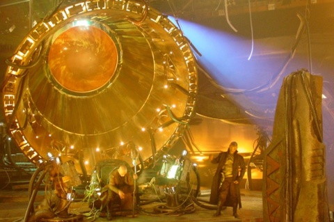
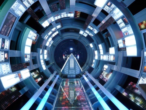
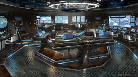
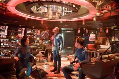
Star Trek production design images
As noted in previous articles, Paramount has been promoting Star Trek as part of their ‘for your consideration campaign’, including the website at paramountguilds.com. The site has a section for each aspect of the Star Trek movie, and the ‘Production Design’ section has a lot of design sketches and behind the scenes photos of sets from the movie.
Here are just a handful of the images
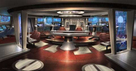
USS Enterprise bridge design sketch
USS Enterprise bridge set
Transporter room design sketch
USS Enterprise transporter room set
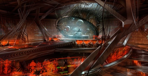
Narada bridge design sketch
Narada bridge set

Vulcan Jellyfish cockpit design sketch
Vulcan Jellfyish ship cockpit set
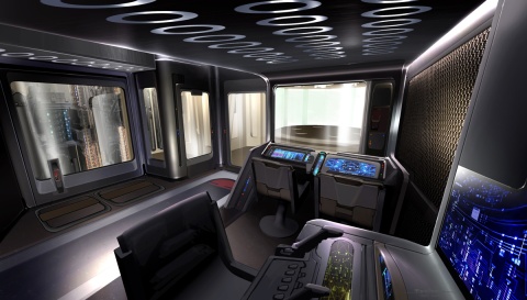
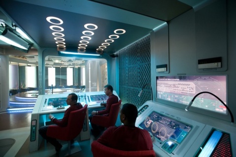
USS Kelvin bridge design sketch
USS Kelvin bridge set
Go to paramountguilds.com to see the full set, and in higher resolution.
If you want even more of the art of Star Trek, then get the book. "Star Trek: The Art of the Film" is available at Amazon.com now.
Congrats. Very good work. Totally deserving.
Enterprise bridge design sketch looks far more better than the actual set. It’s les crowded and does not have all those spotlights and barcode scanners everywhere.
Cool stuff!
the enterprise bridge in this movie is growing on me but I prefer the original bridge more.
I still think the Enterprise E bridge was cooler than the new movie bridge but the new one I like more now than I did.
Still hate Engineering. Why?
I agree with #2 about preferring the bridge design sketch to the finished set. It’s much nicer on the eyes (and looks less like an Apple store).
I wish people would stop bitching about engineering, in this film the engineering deck looked more realistic than anything that has come before!
Check out the real engine room of a ship:
http://www.yachtforums.com/forums/attachments/technical-discussion/20617-ship-engine-room-main-engine-1-.jpg
See what I mean? The original series engine room was a ‘waste of a set’. Thats a quote from GR in the book ‘The Making Of Star Trek’!!!
Congrats, Mr. Chambliss and the design team. By the way, could you tell us what function each of those bridge stations serve? :)
Good luck Scott! You deserve this one — Art Design on Trek 09 was incredible.
@6: I wish people would stop bitching about the barcode scanners, myself. They were friggin invisible, and had no effect whatsoever on the movie, but fandom being fandom…. yeah.
Agreement with #2 (and #5) … the design sketch for the bridge is actually pretty darn spiffy, lacking the bald white glare of the final design.
Awesome Scott!!!
Truly an award-worthy set of work, and it’s nice to know JJ Abrams has such top talent making it work for him. Trek’s in good hands!
I agree with Carlg (#8) about the barcode scanners; they didn’t ruin the design, they weren’t a big deal, and you folks should relax.
That said…
As much as I love this movie, I really dislike almost all of the set designs, mostly for the reasons we’ve all given/read/heard/grown sick of. The design art is MUCH better than the actual sets, especially for the bridge, so I’m pretty sure most of the problems (too frakkin’ many lights for NO REASON on the bridge, etc.) aren’t Chambliss’s doing.
A big problem is that too many scenes look/feel like a fan production using whatever semi-futuristic locations they can find. Instead of building an engine room, fans have to find someplace that looks engineering-ish, but a production of THIS magnitude shouldn’t look that way. I love the entire Kirk/McCoy “numb tongue?!” scene except for the fact that Sickbay and Uhura’s communicaton-brewery location looked like they’d been filmed in whatever random location could be found.
Oh well. I have watched the movie around 12 times so far, and I still love the entire experience, so these aren’t major complaints. :)
The bridge design sketch really looks awesome! Now I know what I hated about the actual bridge…those stupid lights. It really made it look too brightly and plasticish. I hope they go to that type of lighting in the next movie. Very mice.
I can’t understand why so many people are upset with the new bridge design, watch the end of the fourth movie ” Voyage Home” the bridge is very similar to this one. Go Scott! May you live long and prosper!
I really love the Kelvin bridge design sketch — more so than the set (though I do like the set).
14
The bridge is growing on me. But the engine room works if it were set in the 20th Century but I feel a Budweiser brewery goes against the set design of the past shows and I feel that the scale of the engine room is massive for the Enterprise.
Also In the Engine room on the Kelvin when Robau walks up to the second level of the Engine room there is cinder blocks on the wall. Cinder blocks on a wall on a 23rd Century Starship.
It doesn’t look right to me.
you forgot to show the ENGINEERING design sketch and the production set
hahahahhahahaha
@17- Probably because it would look nothing like what came out the other end.
12- No. The barcode scanners are unnessesary, distracting, out-of-place elements which serve only to RUIN the design lines of the bridge, which are actually a refreshing departure from the “Zimmerman look.”
That being said, congrats Scott. (You should slap the guy who put all those scanners there- even if it was yoursef! ;)
Original very cool without all the lights, yes.
I like the mood and tone of the scetch, transporter too because I don’t like bright ultra-clean and shiny all the time, like the final design.
I liked the new movie although I think the Enterprise was the only thing after multiple viewings I still think as a whole they got wrong.
Yeah, I’m just not a fan of the design work in this film. It’s not horrible, but it’s not great either.
I don’t even mind change, as long as it looks good. The 1969 Mustang to the 2009 Mustang is a good change. Both are beautiful, both are instant classics with their own aesthetic. The Kelvin looked about right in updating a 1960s TOS aesthetic to a modern one. Could have been slightly less cluttered on the bridge, but still nice.
I wanted to like the Enterprise, but I simply don’t. It’s not awful, but I give it like a 6-7 out of 10. Lots of potential, but ultimately, feel short.. If John Eaves had designed the Enterprise, it probably would have been kickass. Ryan Church’s design isn’t all bad, but something when terribly wrong with the secondary hull. The bridge itself, yeah, too bright and busy. Tone it down like in the concept sketch, and it starts to look pretty good. Sigh. What could have been.
The Zimmerman look was better
When you go to the source site, point “production design” and then “images”, you can see some sketches of an old Enterprise design that incorporated the orange dish from the original series instead of the blue glowing deflector.
There is also a series of bridge desings for the Big E that never made it into the movie. And more interestingly, when you keep browsing, you also find some old sketches of the Kelvin where that ship is called “USS Iowa”
Dani
#2, 5, 9, et al–
Yes, the final design sketch for the bridge definitely looks better than how the finished set appeared in the film. Actually, if you look at the promotional interview videos the cast did from their stations on the bridge during production with the individual spotlights off and a much reduced lighting level, the set looks a lot better that way. As photographed, the Enterprise bridge had no sense of atmophere; only Abrams’ constantly moving camera kept things visually interesting. I hope they reconsider the lighting design for the sequel.
#6, Roddenberry never said any such thing about TOS’ engine room in The Making of Star Trek, to my knowledge. Citation, please. Chambliss’ design for Engineering is actually pretty impressive and may have worked very well on film, but financial constraints got us the brewery; I still don’t understand how this happened in a film with such a substantial budget.
I was okay with most of the production design but couldn’t work up a great deal of enthusiasm for it, overall much preferring the earlier work of Jeffries, Sternbach, Zimmerman, Eaves, et al. Once set I think they did get very right was the transporter room. Not only did it tie-in very well to the look of the bridge and the other “clean” areas of the ship, but for the first time in the history of the franchise it really looked like a very powerful device that could perform the exotic function of transporting matter over vast distances. Get rid of those ridiculous flex-mounted lights which served no functional purpose at all, and it would be perfect.
I can’t get the higher resolution images to open on the site. (And my pop-up blocker is off)
Looks like the bridge was a great design badly executed.
While I’m happy that Scott Chambliss is being recognized for his efforts, I too feel the production design on this movie dropped the ball somewhat.
The bridge was simply too bright and cluttered with way too many levels and too many people stationed on it. Even the double-doors were way over-engineered.
The odd proportions of the transporter room make it look more like a long hallway than an actual functioning section of the ship.
And the engine room is a joke, as were the area were Uhura was originally stationed and the live action hangar deck, plain and simple. I expect that kind of a look from a low budget SciFi (sorry, SyFy) Channel movie, not a major motion picture.
The whole notion of using the brewery and other real-world locations to double for the interior of the Enterprise was just a poor, misguided decision. I watched the movie again today and every one of those scenes just took me out of the experience.
The filmmakers would do well to look at Harold Michaelson’s brilliant designs for ST:TMP, set the next movie a year or two into the 5 year mission, and use that as an excuse to present some redesigned sets.
26. Sid – January 9, 2010
Looks like the bridge was a great design badly executed.
——————
I feel the same way about Chambliss’ designs. All were badly executed in the film.
Hell, allot of things in JJ’s film seem badly executed.
Where did the budget go? “starbucks?” “dinners with tom cruse?”
I think JJ blew budget on F***ing around like a big shot and that the lens flares were to hide the cheapness.
These designs are visually appealing, but functionally bankrupt.
They appeal to our love of shiny things, but insult the intellect.
I liked “Sci-Fi” better when it was not “popular”… =(
(Transporter Room and Kelvin Bridge are not *TOO* bad…)
Hey, I found some Engineering Section concepts here:
http://www.paramountguilds.com/star_trek/images/lg/EwarpdriveFORE.jpg
http://www.paramountguilds.com/star_trek/images/lg/EwarpdriveFOREwarningl.jpg
still evokes diesel engines, but a HELLOFALOT better than beer tanks!
Here’s a nice one of the Iowa, ne Kelvin, looking very TOS-ish in a nice UFP paint job and nacelles:
http://www.paramountguilds.com/star_trek/images/lg/IOWA2_0.jpg
Notice that the designs for the Communicator / Phaser / Tricorder are not represented: they are embarrassingly crappy.
Actually, the phaser, communicator and phaser look just like toys! LOL!
Who knows… maybe they WERE designed by Playmates?
I like how the sketch of the starship grave yard scene above Vulcan has a couple easter eggs:
1. A wrecked saucer section from a NX-01 type ship
2. A fairly complete wreck of a three nacelle version of the old Jeffries Constitution class
Too bad these wrecks didn’t make it into the final cut of the movie.
The Kelvin bridge and uniforms were a very nice transition between “Enterprise” and TOS. Overall, I love the new sets. Talking about engineering, I liked it too because I stopped over analysing and let the scenes flow with the industrial mood.
I think my fave design detail in the whole film is how the chair and the window/cockpit on The Jellyfish make up the Vulcan IDIC Symbol…brilliant touch there.
It seems to me that hardly any thought was given to functionality in these designs, it’s only about cool looks.
@ 38
Well, the new Enterprise was given some moving parts…. part of its functionality…. the fins on the nacelles and the deflector dish expands and retracts.
But yes, the actual set designs lacked a lot of functionality….. also…. the future won’t look like a apple store everywhere. I think the designs in the future will combine design aspects from many different cultures from all over the world !
#38 “It seems to me that hardly any thought was given to functionality in these designs, it’s only about cool looks.”
We are talking about science-fiction. The future. A world that we can’t understand. From this point of view, “functionality” is a highly subjective idea. Watching TOS, or TNG, or VOY, or some other movie, I never thought that those desings were… functional.
When it comes to the real fine arts, many people dismiss them for computer generated graphics. Even though his competition is pretty heavy, with “Avatar” on the list, I hope his work reminds people of how beautiful and awesome human interaction with tools and materials can be.
As someone who has a degree in the design field, I can appreciate all the hard work and effort his team put into the stage sets. I can only wish that someday I could work for someone like Mr. Chambliss.
Even though he didn’t innovate the tools for the trade, he and his team found innovative ways to use them.
Bless you man!
I don’t love the new sets, but these concept sketches are incredible. Wish I could draw like that.
#30
Thanks for those links. Those are engineering designs that I could have gotten behind. A little bit of expanding on the thought and you get something functional looking and futuristic looking. And they don’t appear to be too expensive to build. I hope they go back to that in the next movie.
40: I think you’re right to a certain degree. But I’d say that some basics of functionality will be the same in the future. We suppose that it’s still the same human beings who operate the ships.
And also, if you’re right and we don’t understand the future then the look of the sets is far too close to the present IMO.
If I remember right, the Captain of a starship gets to make a few decisions of how his bridge looks. Maybe with the 2nd movie and now Kirk as Captain, Kirk will make a few decisions on the lighting and look of the bridge that hint at a more TOS feel?
#38 – Problem is, a lot of the designs didn’t even look ‘cool’ to me.
The bridge just had way too many stations on it (not to mention those oddly placed clear vertical panels) and people were practically bumping into one another. The use of the brewery for sections of the Enterprise was completely unconvincing; most people are saavy enough these days to recognize all those large tanks for what they are.
The poor design choices become even more evident when the movie is viewed at home. It’s one thing to watch it only once and have the sets whiz by, never to be viewed again; but after the 4th or 5th viewing, some of the sets become visibly, almost painfully fake and downright silly (like the area where Uhura was first stationed at, complete with little chains dangling from the vats – what would that have to do with a communications section).
I don’t mind the sets looking different; but they should also look better. A bunch of giant vats surrounded by pipes and girders is not even remotely futuristic. JJ Abrams’ feelings notwithstanding, I think sets like engineering and the hangar deck would have been better served via CGI extensions than using real-world locations which, quite frankly, stood out like a sore thumb.
46
I agree 100 percent. It felt strange and out of place. 100 percent non futuristic. Hopefully they won’t be stubborn in the sequel.
Other than than that great job!
Does anyone know what function those 7-11 barcode scanners served? Please tell me. Do we know?
I do love the colourful scheme, and the brightfulness, of the new Enterprise. I do not, however, like the “busyness” of the two bridges, such as the Enterprise’s, and the mish-mash of the Kelvin. I wounder, how much more stuff would be included for the future (alternate) ships? What would they look like? Another confusing situation here are the colour schemes for the officers on the Kelvin. Why blue, when blue suppose to be for medical, and science? Not for command, and the piolets. Kelvin is not (what I remember) a science vessil. Even if she was, the ship still is Starfleet, and the command code of colours still should be the way they always were. Now, the last confusing part is that of where the officers are situated on the bridge of the Kelvin. On screen, it looked like Commander Kirk was at the helm, so did officer Jordon. But, this is NOT the case when shown above. And, the alien security officer looks like it’s at the navigational station. And, it seems like officer Jordon was the tactical officer, and was always keeping an eye on those torpedos heading for them. I know that the Kelvin, in this timeline, was indicated as a destroyer, or something like that….so maybe it is quit different in this zone of time. ;)
I love the enterprise but that’s just me :):)