

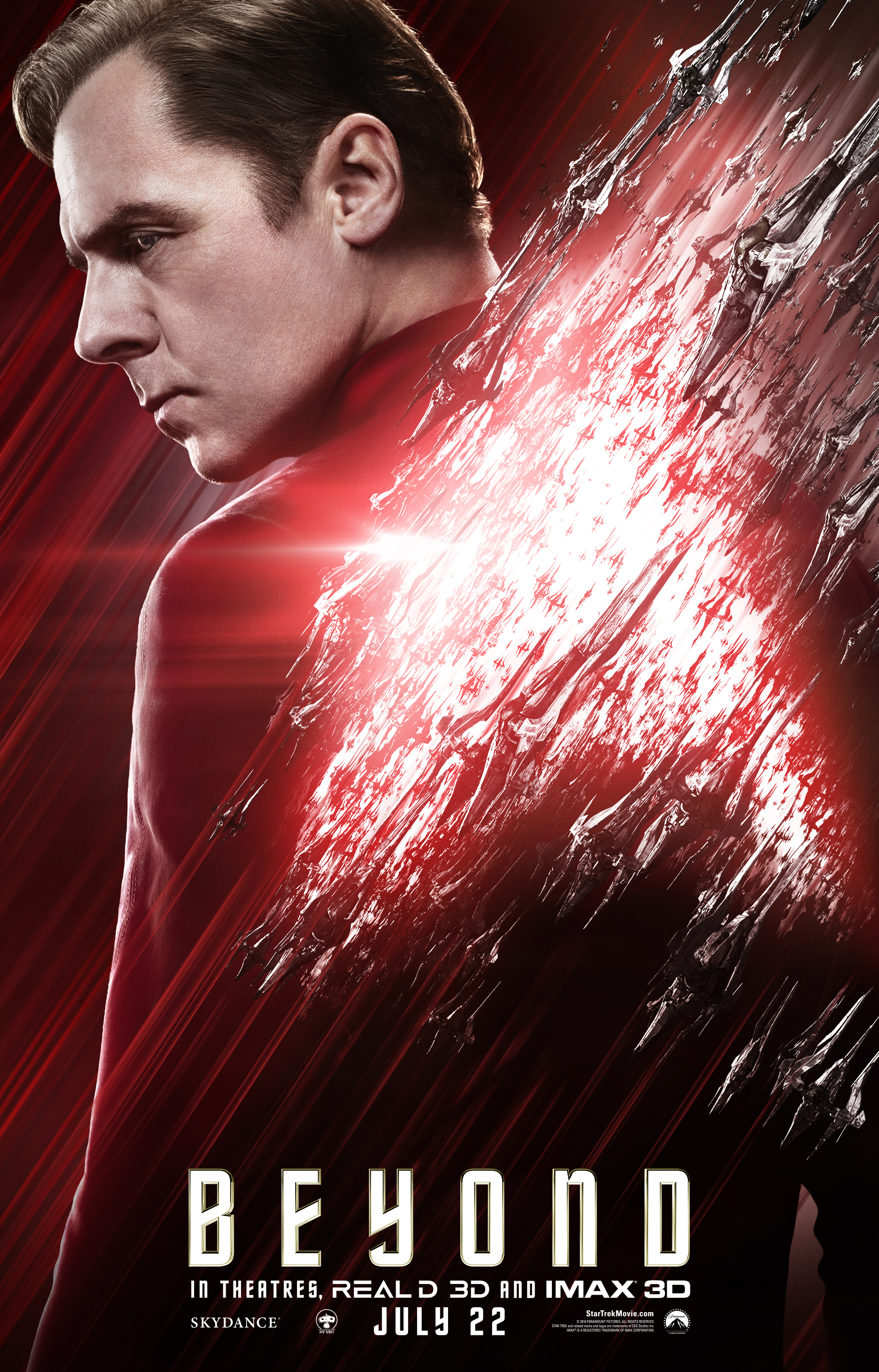
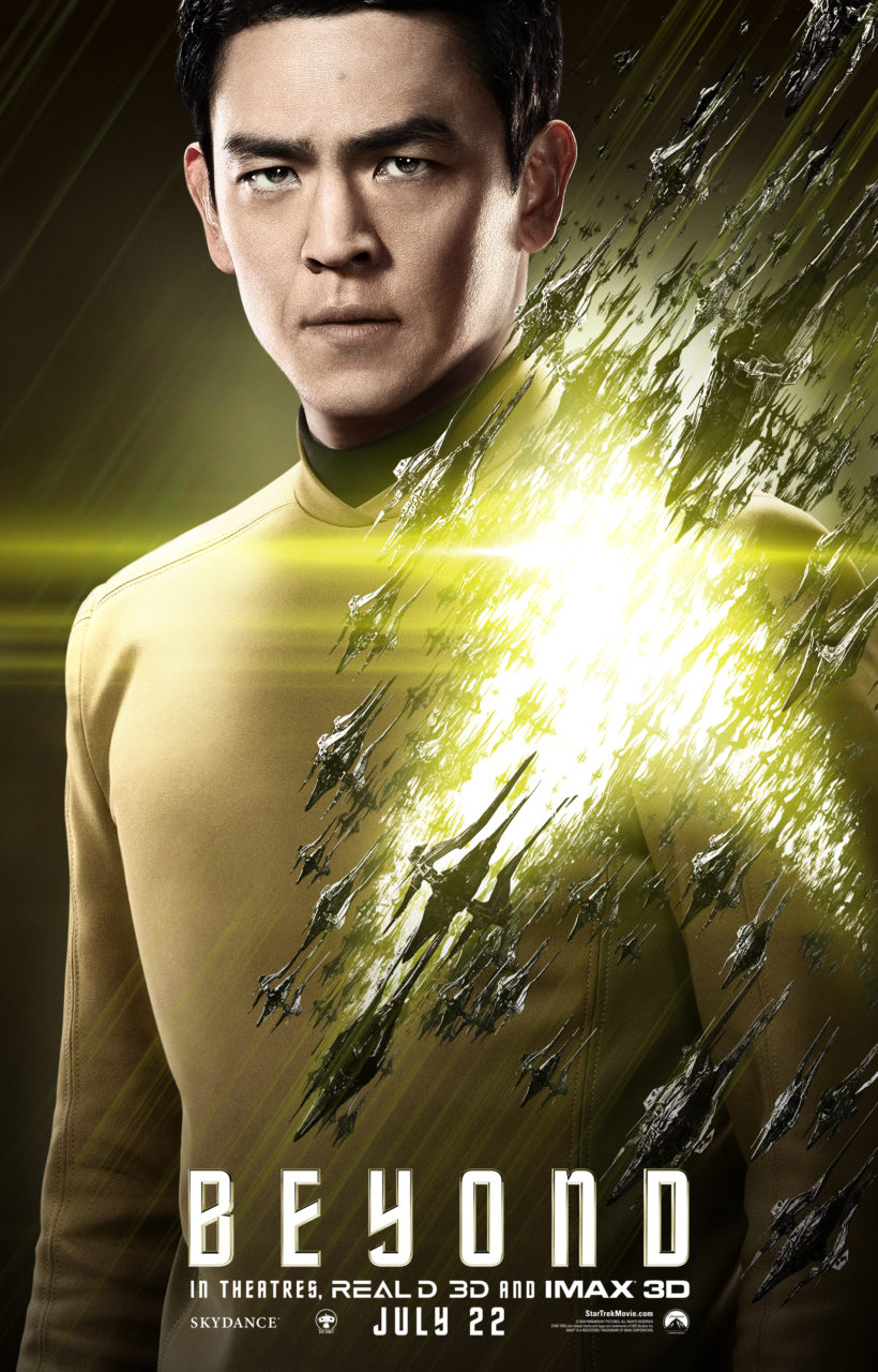
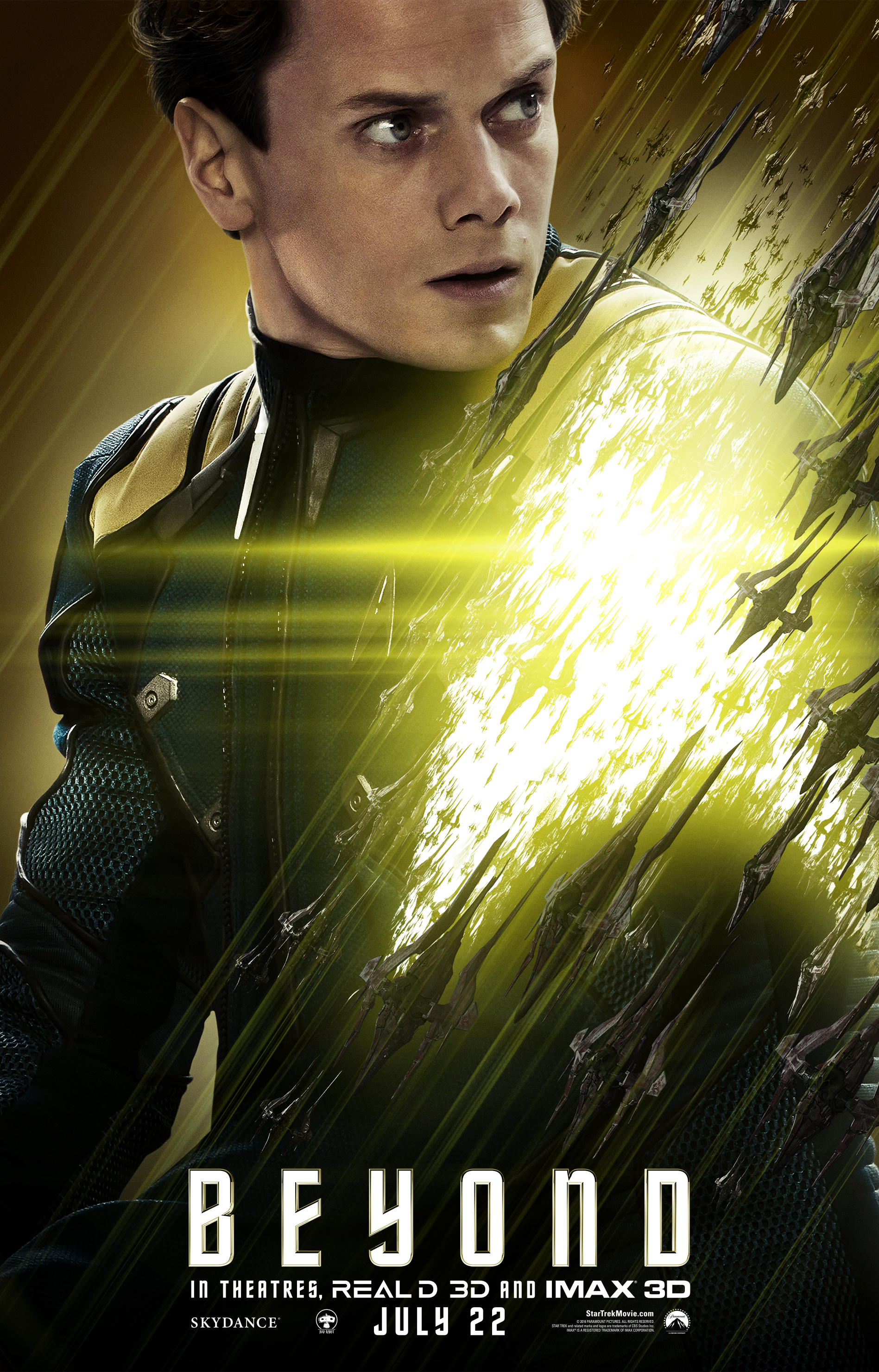
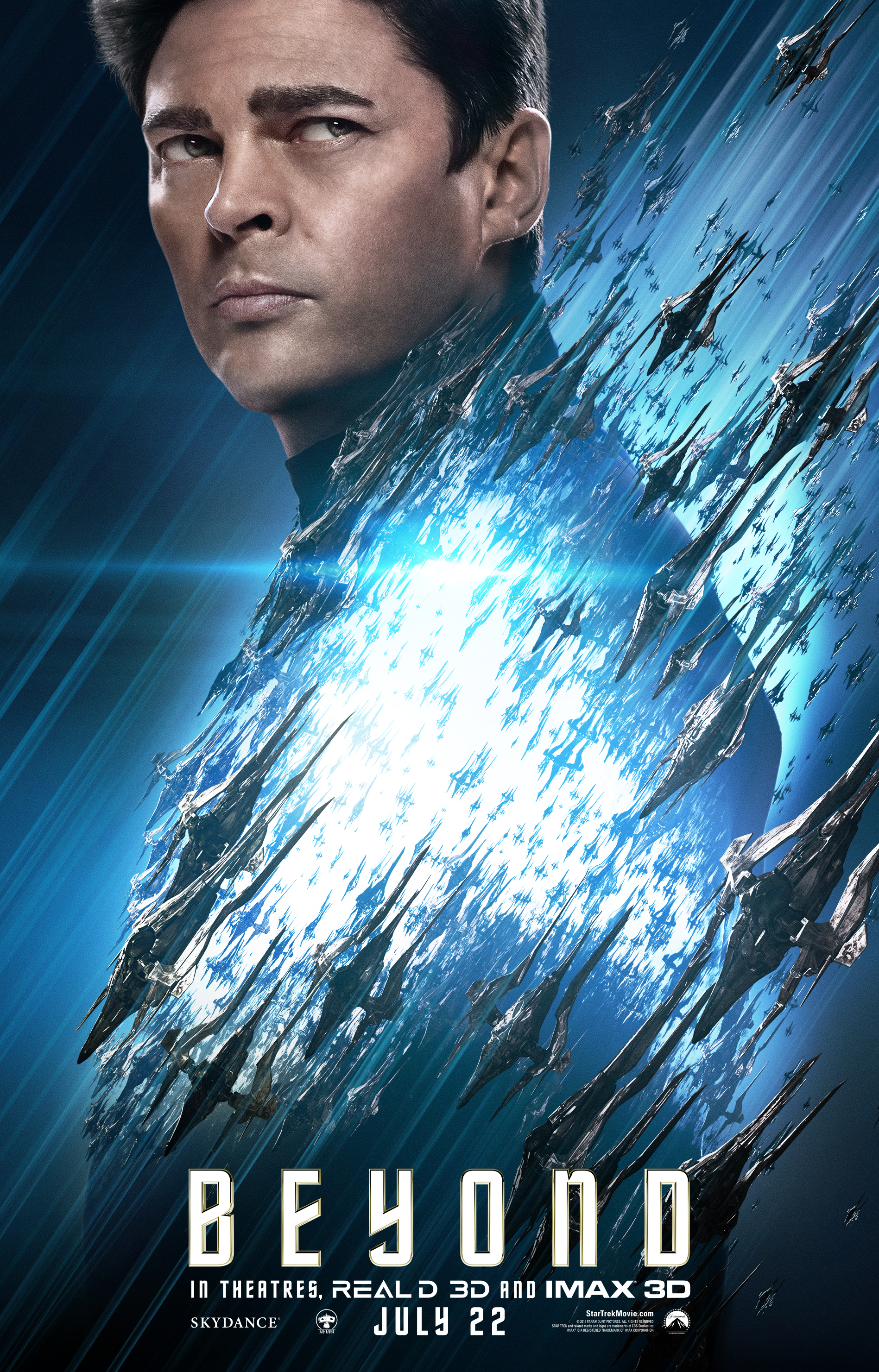
Scotty, Sulu, and Uhura join the crew with these three new Star Trek Beyond character posters released this morning. *UPDATE* Paramount realized that the Sulu and Uhura images were incorrect (the Starfleet delta was on the wrong side) and issued corrected versions late yesterday.

These three join the rest of the crew, whose posters were released over the course of last week:

Of course, we’re still missing the man himself: Captain Kirk.
Star Trek Beyond hits theaters July 22.


You’d think they’d know by now which side of the uniform to place the star fleet insignia. Placing Sulu’s mirrored like that is an insult.
Who cares! Don’t get your panties in a bunch over such trivial things. Seems like a small mistake.
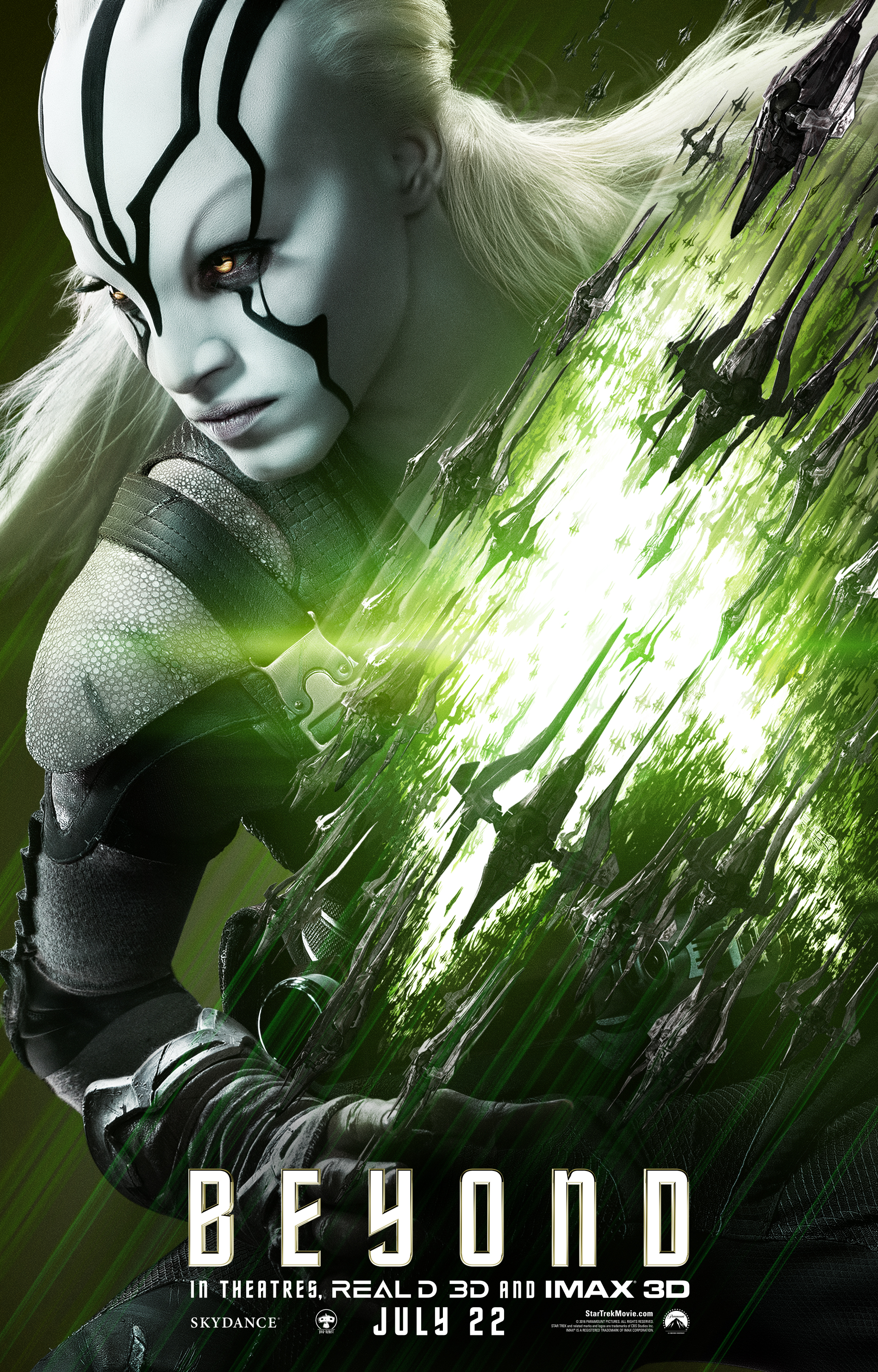
The more I see, the more I think that Sofia Boutella is going to be a breakout star from this movie. I hope they add her to the crew for the next few movies.
How is sulu’s badge on the wrong side? Seriously bad amatuer fail.
Yea, we heard you the first time, B-fill in the blank. LOL
Somebody flipped the image. Who cares?
He is from the mirore universe.
Tomi_SI,
The Mirror Universe used a different insignia.
You are looking at their reflection from a window where they are looking at the Swarm.
Mirror Universe = Mirrored image ;)
Prediction: Lydia Wilson is playing Bone’s X-Wife.
It’s not just Sulu’s insignia that’s wrong. Uhura’s is backward, too. NOT inspiring confidence.
Its just a poster—not a shot from the movie.
Spock’s insignia was backwards while chasing Khan in Into Darkness… And that WAS a shot from the movie.
Well, that was very illogical of Spock.
The inversion of the Sulu poster is sort of like when the VFX team for Star Trek Remastered pranked their EP by making a video where the USS Constellation was named USS Consolation, then told him the preview had already gone out to syndication–except the Sulu poster is neither funny nor a prank.
This really disappoints me when an art department can’t get the image correct.
Sulu’s image is reversed. Kind of off putting…
They are just honoring the original series where this happened a few times :) Yeah, that’s it.
The nerd rage is strong in this thread. I can feel your anger, it gives you focus, makes you stronger. . . ah screw it the NHL finals are on.
What nerd rage? Some of us have made mild comments about the insignia reversal. That’s all. Nobody’s raging in this thread, especially compared to the typical thread around here.
@Paul – if you say anything remotely derogatory about the film there is a small vocal collection of nuts that will try and berate & insult you into silence. Dont let them.
Are we going to see Krall get his own poster, too?
A little Idris Elba Love?
I love how people here are pointing out the mistakes on the Sulu and Uhura posters and saying “It’s an insult” or “this doesn’t bode well for the movie”, or some such nonsense. Look, I understand that the Trek purists will look for ANY excuse to rag on this movie, but come on. They’re technical errors on two posters, for cryin’ out loud. Yes, it’s sloppy; no question about that. But dial it down on the gloom-and-doom, folks; it’s a little ridiculous.
They fixed Sulu’s https://twitter.com/StarTrekMovie/status/737477235305676800
It’s a reversed negative, or in other words, a mirror image. They do this all the time when you like a shot but reversing the negative would enhance it. In this case they do it because the insignia would have been blocked out by the art. Reversing the negative allows the insignia and poster art. Easy fix
Great. Now we need something else to be insulted, outraged and offended at.
Good sir, how DARE you bring logic, reason, and facts into a thread dedicated to nerd rage. I brought all this cheese to the whine party and now it’s going to go to waste. Guess I’ll feed it to my cats.
I see your point, sir. I suggest a new strategy, let the ragers’ win…
Except it’s wrong. They didn’t seem that concerned with Chekov’s shield. They should have just photoshopped it out. The same with Uhura’s, which is barely visible, and it looks even more like a mistake than an attempt to make sure the insignia is seen.
This is an actual mistake. There’s no defending it.
Actually there is an incredibly obvious reason for why the insignias are reversed….they are looking at the Swarm through windows and what you are seeing is a reflection.
Uncanny Valley, yo.
Where’s Krall?
Cringeworthy.
OMG People! It is only the artwork. MANY MANY productions flip images for their artwork. It is not like they changed it in the freaking movie. Good Lord… people complain for the sake of complaining.
By the way, Paramount has since released corrected versions of the Uhura and Sulu posters, basically they just removed the reversed insignia pins. Ahh, the magic of Photoshop.
Cho’s mole is still on the wrong side! LOL
That’s actually a huge problem with flipping images like this … I’m sure the PTB decided it was close enough in Cho’s case, but can you imagine if they had done this with Angelina Jolie? It just never would have happened. I’m not sure what the solution would be here … Move the mole, or photoshop it out?
I was about to ask about that. Didnt bother me since mirrored images are often used. Not a huge deal.
So angry right now… WHY DOESN’T KEENSER GET HIS OWN POSTER??!!!111
And now Kirk and Krall
http://www.latino-review.com/news/star-trek-beyond-character-posters-for-captain-kirk-and-krall-are-here
The badges look like they’re in the right place to me. Left side of the chest. Not sure what everyone is complaining about.
They fixed it.
Who’s the guy on the Scotty poster?
@ TUP: I have heard rumors that it’s some guy called Simon Pegg who likes to impersonate Scotty from time to time.
I just realized Uhura looks just as airbrushed as Kirk does in his new poster. Missed that earlier. And so does Bones … interesting how comic book like these posters are ..
The Simon Pegg poster is so awful it looks like his stand-in was put on the poster by mistake.
Karl Urban looks like a vague GQ model
Luckily these posters will be rarely seen except by collectors.
I’m glad they fixed the uniforms because the posters look really good. Simon doesn’t really look like himself though. Maybe it’s the hair? Overall the photos are really polished and I can’t wait to see them hanging from ceilings and along the walls at my local theater. As someone mentioned earlier in the thread, we need a Krall poster. I’d love to see the Enterprise too.
…nevermind, I see the Krall poster.