
IDW’s bold Star Trek anthology series Waypoint debuts with Original Series and Next Generation tales.
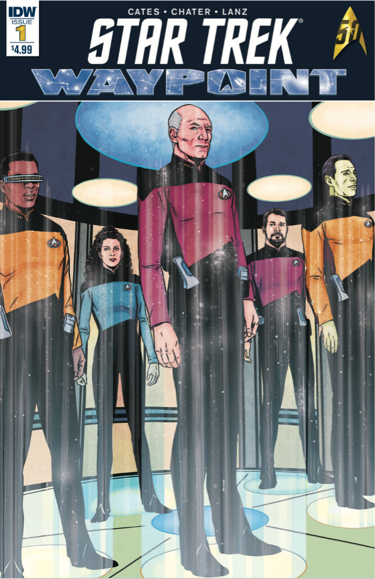
Star Trek Waypoint #1 is available for $4.99 from IDW
“This is the 50th anniversary and I wanted to do something really special.”
Ambitious in its scope, IDW Star Trek comic editor Sarah Gaydos’ dream has finally been realized in the release of Star Trek: Waypoint #1. The six-part bi-monthly anthology series will feature two stories from one of the five televisions shows in each issue, with this week’s #1 focusing on The Original Series and The Next Generation.
The series’ goal is to act as a waypoint, a stopping place, along Star Trek’s 50-year journey allowing Star Trek fans to “reflect on what’s come before, and look ahead to the next 50-years of Trek”.
“Waypoint for me, was a way to answer all the fans who keep coming up and begging for a Voyager ongoing or an Enterprise ongoing,” Gaydos explained. “There’s just not enough resources for us to be able to do that.”
Story 1: “Puzzles”
Intimate in its approach, both stories for Star Trek: Waypoint #1 focus on a few characters rather than the crew of an entire series. First up is a TNG tale, “Puzzles”, written by Donny Cates, drawn by Mack Chater, and colored by Jason Lewis and Dee Cunniffe. The focus of the issue might remind readers of the classic TNG episode, “A Fistful of Datas”, as everyone’s favorite android populates every position on the bridge sans the captain’s chair.
In “Puzzles”, Geordi LaForge is now captain of the Enterprise, and he has been tasked to investigate a new mystery.
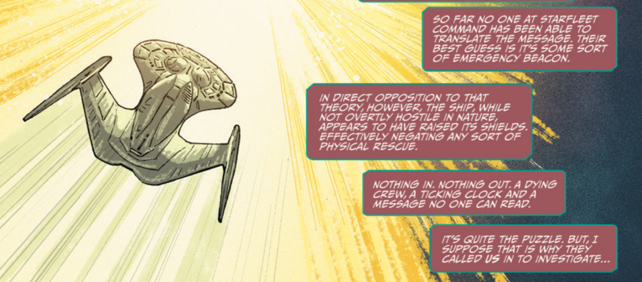
The story focuses on Geordi and Data and explores their friendship, as well as their roles on the Enterprise. Cates captures the interactions between Data and LaForge well, although the former does come off a little more wooden, which might be due to the medium and not the writer. Chater does solid work with his likenesses, and the unique style gives the story a little edginess and sense of urgency. The real stars of the issue however are Lewis and Cunniffe, who do an extraordinary job on colors, especially in closeup moments with Data facing a monitor as well as when the Enterprise encounters its mystery.
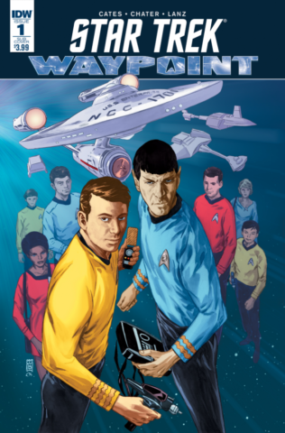
Alternative TOS cover for volume #1
Story 2: “Daylily”
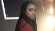
The second story in Issue #1, “Daylily”, is written and illustrated by Sandra Lanz and features Uhura from The Original Series. Its story might remind some of the TNG episode, “Darmok”, in which Picard and an alien captain are trapped on a planet. Without a way to communicate, the two must try to work together to survive. While “Daylily” is not exactly the same (thank goodness), it does give Uhura a moment to shine as a transporter accident leaves her isolated on a landing party mission.
As she holds position until the Enterprise can bring her back up, she encounters a life form indigenous to the planet. It is a nice small scale story in which Uhura shows us why she is such a strong character and member of the bridge crew. Lanz’s likeness and storytelling are strong, which focuses solely on the Enterprise’s communications officer.
“Interesting” and “enjoyable” are the best two adjectives to describe Star Trek: Waypoint’s debut. Its intimate tales allow readers to focus on a specific character/s, which adds a bit more understanding to each individual involved. This is a must-read for all Star Trek fans, as the comic anthology is allowing creators to explore themes that a television episode could never feature with these crew members.

What is up with that alternate cover?
Love that Riker lewdly positions his holster for the cross-draw. ‘This is my phaser, this is my gun. This one’s for fightin’, this one’s for fun.’
The TOS alternate cover iis a mixed bag. I like the layout…nevermind the fact that Kirk never resembled Mel Torme, But the attention to detail is sloppy. Kirk’s captain’s braid would have a broken middle section, not solid. It wouldn’t be so bad if there weren’t 79 hours of screen references and an infinite number of images available allover the internet. One shouldn’t have to rely on foggy memory to create these images. Hopefully the artwork inside fares a bit better.
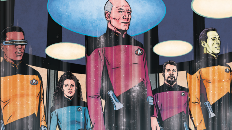
Seeing that TNG cover:
RIKER: “Sir, you cannot go on this mission…”
PICARD: “Number One, I hear your concerns. Duly noted. I, however, am still going.”
Admittedly, it is very strange to see most of the TNG senior staff (sans Worf and Crusher) on the transporter pad together…
In the spirit of jonboc’s comments on the TOS cover … the composition of the TNG cover is oddly inept. Everybody’s slightly tilted relative to the vertical of the transporter and cover, Troi and Data aren’t centered on their pads, and there’s tangency between Troi’s wrist and Picard’s hand (a compositional no-no mentioned in every guide to comic book art). I can imagine that the artist drew each of the five characters separately, then composited them onto the background, but… badly? And the background itself, the transporter platform and overhead, has discs all over the place with no attention to perspective, angle or spacing between the center and periphery — rushed work with an ellipse tool, looks like. (A few minutes with Google Sketchup would’ve done wonders.)
Lexomatic,
Re:In the spirit of jonboc
I mention the following not claiming any expertise in the matter currently, but rather, as I haven’t purchased a comic book in decades, expressing interest in learning how things may or may not have changed since the decades of my youth spent doing so, to wit, aren’t publications’ cover art produced by an entirely different arm, as opposed to that of the content, with an entirely different set of laxer guidelines, as its primary goal is one of getting the object noticed so as to induce a likely purchase, and NOT necessarily to depict anything with more than a passing “accuracy”, at best? Isn’t the old adage, “Never judge a book by its cover.”, still the appropriate dictum?
I believe jonboc’s spirit even gives a nodding acknowledgement of this historic disparity when she noted, “Hopefully the artwork inside fares a bit better.”
Re:Transporter pads
Jarring as it is as a matter of art composition, we can have an interesting Trek nitpick back and forth on whether canon supports a transporter that can lock on and beam up someone tens of thousands of miles away on a planet’s surface without the requirement of a transporter pad but would somehow find it suddenly impossible to lock onto and transport the same person mere inches away from the transporter, itself, if their footing strayed off a pad, if you’d like?
Re: Old Business
Apparently STAR TREK ONLINE’s been generating infographics since at least 1/30/2013:
http://www.arcgames.com/en/games/star-trek-online/news/detail/1017080-pc-gamer-exclusive-reveal
Disinvited, you’re right, the cover is usually a one-off…but regardless, a one-off by an artist who, through training and talent, should know better. These types of mistakes demonstrate either lack of ability or disregard. And neither should be acceptable…unless the services of the artist were complimentarty, then it’s simply a matter of you getting what you paid for.
Also, not sure if you had a slip of the fingers or just didn’t know, but my Y chromosone remains fully intact. lol (last time I checked, anyway)
jonboc,
Re: you had a slip of the fingers
My apologies. More like I was getting distracted proofing that and confused you with another “j” starting nick.
The technical details of transporter targeting are immaterial here; my concern is that the *actors* when *on set* traditionally position themselves at the center of each pad (during normal operation, as opposed to rushed emergency beam-ins), and the audience would expect this artwork (since it’s realistic, not stylized as some covers are) to follow the same tradition. And even if that posing isn’t universally true, it just feels *weird* if the rule isn’t followed in this *particular* high-profile artwork. Master Splinter once chided the Turtles, “The first rule of a ninja is, do no harm. The second rule is, when you DO harm, do LOTS of harm,” and the same principle applies in 2D composition — when an competent artist chooses to skew or misalign elements, it look *intentional* instead of *accidental*.
Lexomatic,
Re:The technical details of transporter targeting are immaterial here
And I agree with you on that, which is why I said, “Jarring as it is as a matter of art composition… .” I was just inviting you to a fun nerd nitpick-off on the number of times when someone beaming out on screen wasn’t so centered. Again, being clear, that as a matter of composition in the art of that TNG cover it is, indeed, jarring.
However, I will note that, from my youth, I recall great annoyances with inaccuracies depicted on comic covers to the point that I eventually became convinced that some of them where being done on purpose, or more to the point, the artwork was being chosen for the cover precisely for some calculated marketing boost from said “jarring” effects and especially as it might ignite comic nerd rage causing it to be more “noticed” and talked about than the average issue.
Marketing being such an arcane business, I’ll not hazard a guess as to what the actual reason is for each of these Trek covers’ “inconsistencies”. But I will note that it is a head-scratcher why your TNG cover’s art was chosen?