

The tricorder, along with the communicator and phaser, complete the typical landing party equipment we’ve come to expect from a Star Trek show. Earlier this week CBS used brief Star Trek: Discovery teaser videos to show off the new communicator, phaser pistol, and phaser rifle. Today CBS tweeted out yet another brief teaser video which includes glimpses of various things from the new series including a uniform, phaser pistol and what appears to be a tricorder, with the message “Space: the final frontier. #StarTrekDiscovery premieres September 24.”
Space: the final frontier. #StarTrekDiscovery premieres September 24: https://t.co/G1ivpNLflr pic.twitter.com/54hXHE8mZG
— Star Trek: Discovery (@startrekcbs) July 19, 2017
A closer look
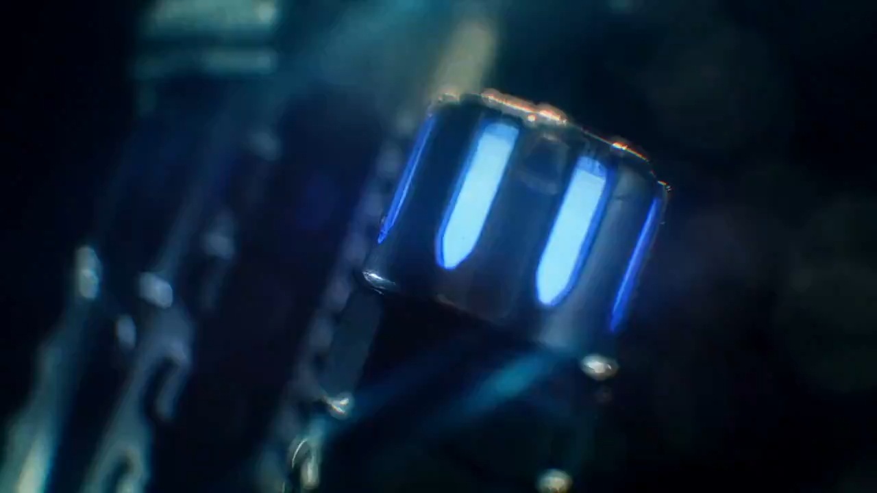
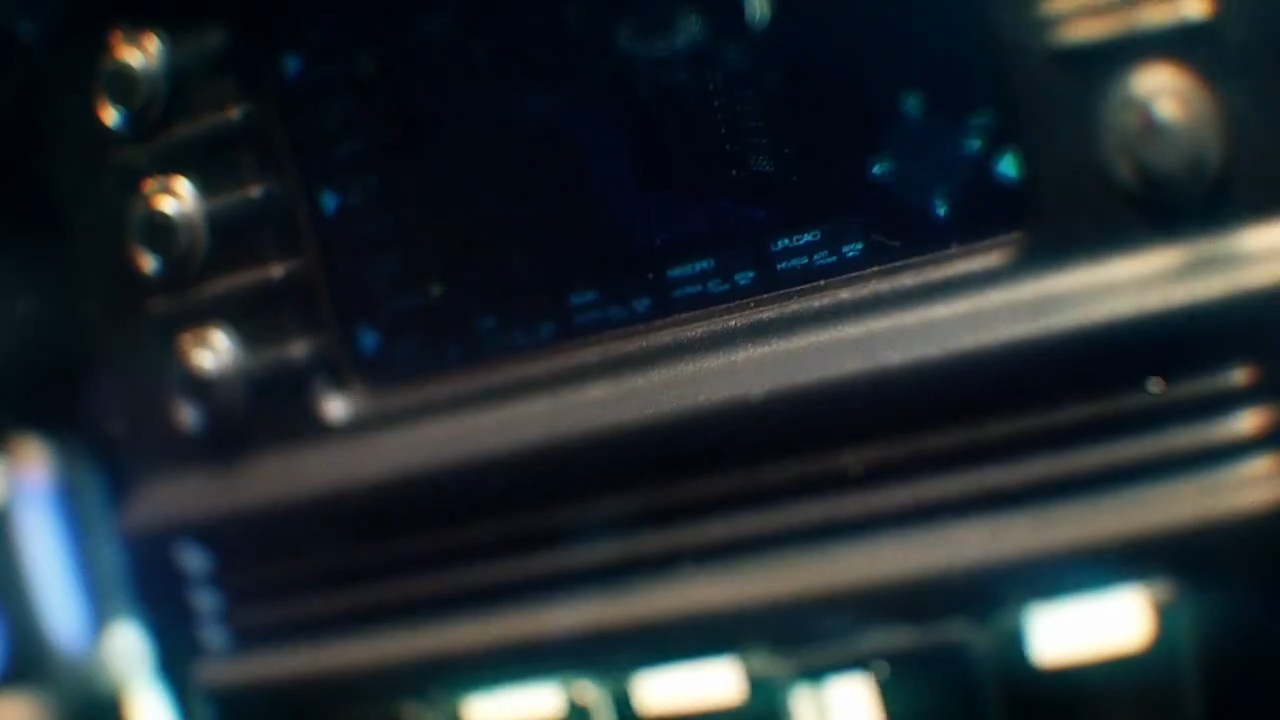
While we don’t get a full look at the tricorder, we can see it has an overall rectangular box design with a screen on top. The materials and color seem to be in line with the previously shown props. There also seems to be a separate cylindrical scanning device.
We caught a glimpse of the tricorder before in the very first official image CBS shared with the press back in May.

Tricorder?
Design influences
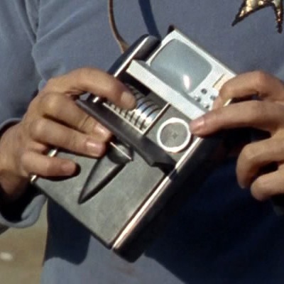
The new Discovery tricorder picks up on many elements from the the tricorder seen in Star Trek: The Original Series. Beyond the overall form, many details are similar, such as the three circular buttons and screen in the top portion.
The scanning device also seems to be based on those used for medical tricorders.

It also appears to share some design influences with the updated tricorder seen in the later TOS movies (The Search for Spock, The Final Frontier, and briefly in The Undiscovered Country). Specifically, there’s a break with ribbing between the top “head unit” of the tricorder and the main body that the Discovery version seems to be inspired by.

Star Trek: Discovery premieres on September 24th on CBS with all subsequent episodes on CBS All Access in the US. See our Discovery info page for more details.
Keep up with all the Star Trek: Discovery news at TrekMovie.


All the call backs are there. Retro cool.
exactly the same. No wait. It’s not. But it is a great evolutionary take on the tech and a positive way to update tos visuals
I love everything they are doing. The phaser, communicator, and tricorder are all thoughtfully done. They are what the props would have looked like if TOS was made in 2017. These all show much more respect for Star Trek than JJ’s stuff. I hope this also holds true for the spirit of the show as well. Fingers crossed.
I don’t even remember what that stuff looked like in the JJ movies lol. I thought it was kind of the same approach. But I admit as much of a Trek nerd I am, I’m just not that nerdy I guess. I like all this stuff for example, but I couldn’t tell you how different it looked from TOS unless someone put a picture of them side by side. So for me, its close enough. ;)
Goood. Love those designs so far…
with ONE little exception: Why did they have to slap a Starfleet emblem on the top part of the phaser (i.e. the Phaser 1-part … presumably)?
That would just seem like a very odd choice… the idea of Starfleet putting their logo just EVERYWHERE like a brand logo doesn’t make a whole lot of sense to me. I mean: Most branches of real-life military doesn’t “brand” their weapons and other “tools of the trade”, neither does NASA – so why would Starfleet do such a thing?
Its a future fad.
You just answered your own question. It’s branding, that’s the real world explanation. CBS wants the logo on everything for toys and props and collectibles.
You’re probably right. It’d be naïve to hold the designers at fault here.
They tweeted, tongue in cheek, that Star Fleet has become brand conscious and they have slapped the delta on everything from props to uniforms to chairs to boots etc.
Its smart from a marketing perspective, even if its odd in a real-world military way. They want that delta symbol to be as effective in screaming Star Trek as seeing the words.
Right on with the Tricorder! Readings show signs of life coming from ST:Discovery!!!!
I’d hardly call that a tease or glimpse. Almost saw nothing.
Huh?
@DrewM LOL. Good one.
-blurry slo-mo close up-lens flare-STAR TREK DISCOVERY
I do look forward to actually seeing these props, without artsy blurred focusing.
If only Abrams hired those guys when creating his first Trek movie!
2151 – Starfleet in its infancy launches Enterprise with handheld tricroders and slim communicators. The phase pistols are pretty bulky looking, though.
Somewhere between 2151 and 2256 – Discovery begins its mission. Starfleet decides handheld tricorders aren’t large enough. They should be oversized and require two hands despite various forms of technology over the last 300 years being somewhat smaller.
2266 Starfleet continues to allow its flag ship to fly around using old outdated tactile interfaces rather than refitting the 20 year old vessel this is the case for every starfleet vessel the Enterprise encountered.
Somewhere between 2293 and 2363 Starfleet reverts back to smaller equipment.
Between 2363 and 2381 Starfleet revises its equipment quite frequently. Phasers and tricorders undergo at least 4 revisions, albeit small but noticeable.
A better way to look at is, everything you said about the TOS visuals are being refreshed and written over.
If an item is larger, perhaps it does more things than a previous model? Perhaps its more efficient to use. Afterall, my iPhone is a lot bigger than my old flip phone and the trend is to get better, not because they have to do be, but because people want larger devices because of how they use them.
everything is certainly…blue. lol But I will give credit in that the props, in their design, do have an aesthetic that dates them to being prior to TOS. TOS’s props were all about being streamline…sleek…very few lines…lots of curves. These props are decidedly more clunky. Squared off with lots of detail (what I call the Star Wars effect….where as the Enterprise was a sleek vessel, the ships of Star Wars have these inexplicable little pieces of junk glued everywhere that serve no purpose other than giving the model texture.) I always appreciated the differences between these two aesthetics and I hope Discovery doesn’t blur the lines too much…even if it really should look clunkier, taking place prior to TOS. One style isn’t really better than the other, but I’ve always enjoyed the clear distinction. But the lines do seem to be blurring.
Why is the delta shield in two distinct pieces, one on top of the other? It looks designed to slide. I have to wonder if there is some form of functionality to this badge now. It’s clearly not a communicator. I don’t know, but the design, being in two separate pieces seems to suggest it may be more than just a badge.
Hmmm, in the close ups, it does look like it could slide. Interesting…