
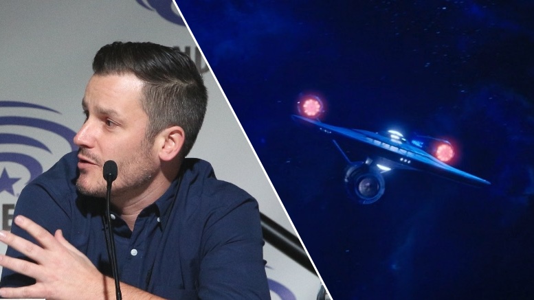
One of the production department heads on the Star Trek: Discovery “Visionaries” panel at WonderCon was visual effects supervisor Jason Zimmerman. Following the panel, TrekMovie sat down with Zimmerman and other journalists at a roundtable interview where we talked about the process for making the award-nominated effects for the series, including the new USS Enterprise.

Jazon Zimmerman at WonderCon 2018
Re-making the Enterprise
How quickly did the approach for the USS Enterprise come, or were there a lot of designs?
A lot of the design stuff comes with the art department and production design, where they put things together. They do a ton of research and a ton of study, to see what the legacy of the ship has been. So, by the time it gets to us, we have a pretty good idea of what it is going to be. As we get into it, we have our modelers talk directly to the art department to make sure we understand this is this, and how does this work, and how does this relate to that.
Fortunately for me, one of the guys who was working on the model on my team is a huge Star Trek fan and knows as much as anybody. Having his knowledge has been invaluable. He has been able to go to them and ask, “This particular thing, why does it look the way it does and where is this from?” They had a lot of interaction with the art department, but having him was really, really helpful.
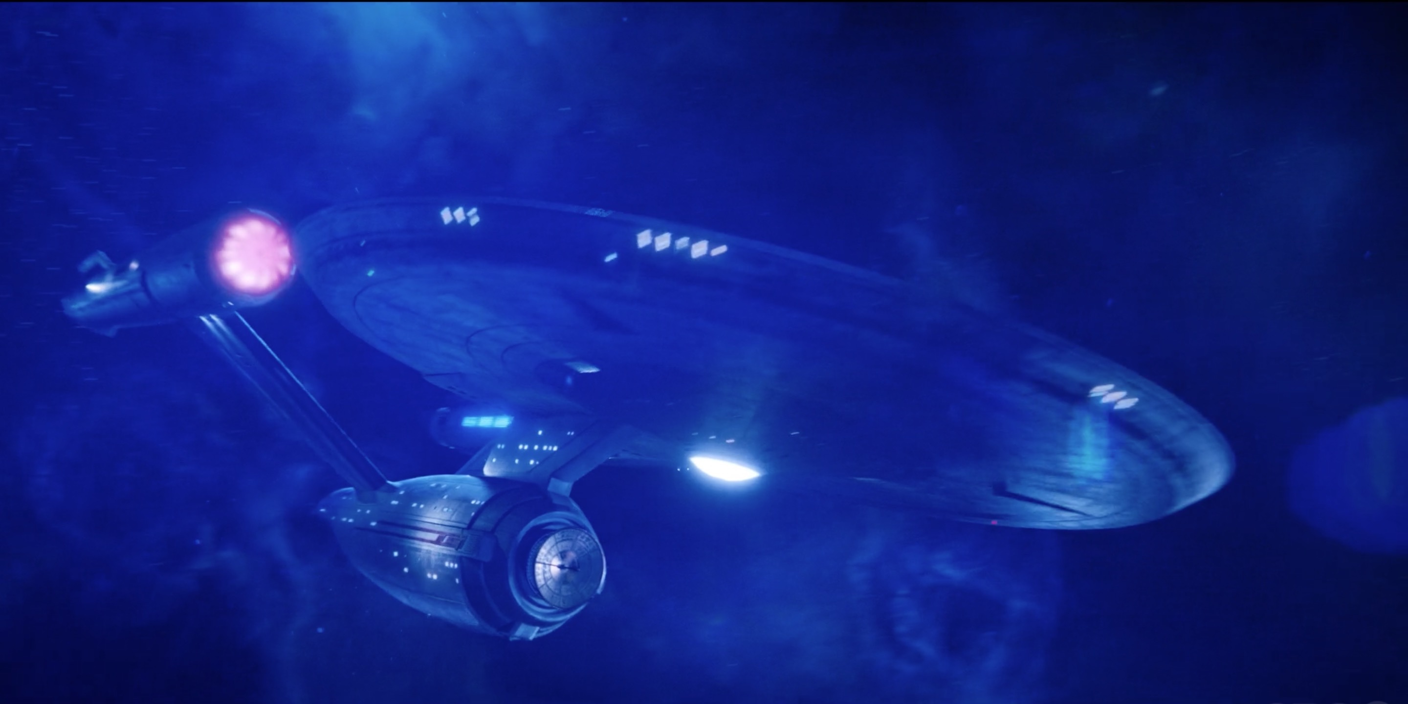
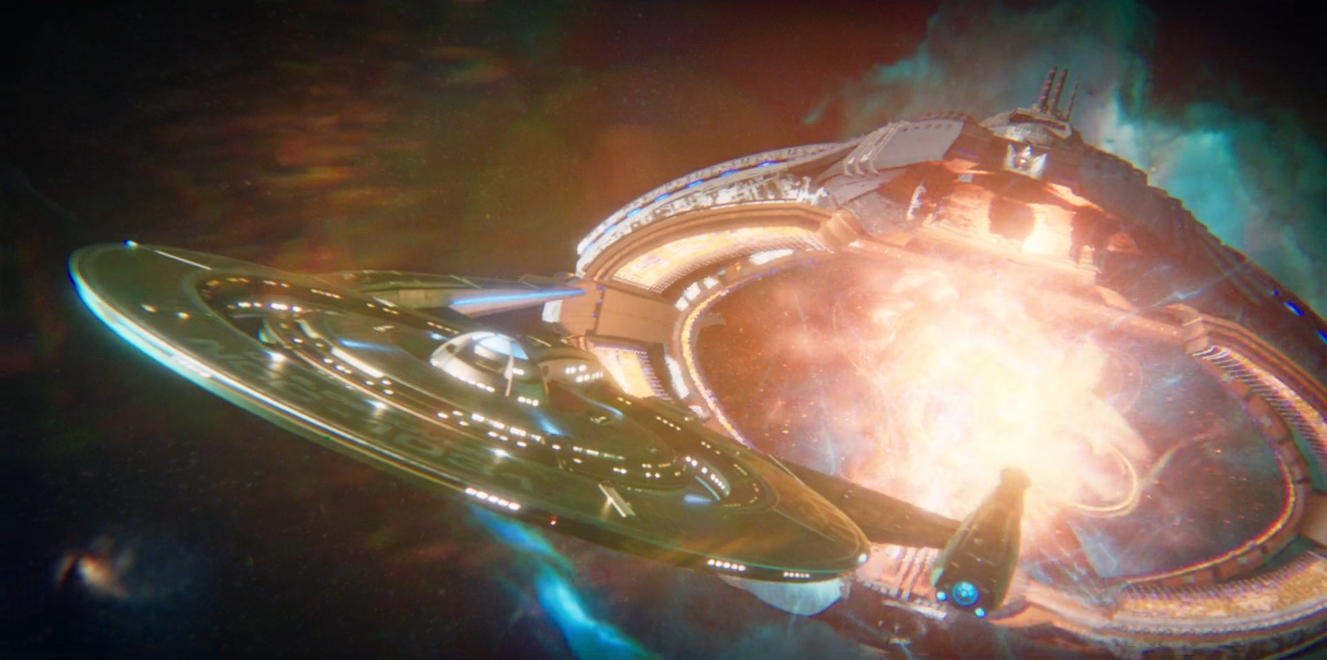
The USS Enterprise from season 1 finale (episode 15)
Favorite and most challenging shots
Is there a particular model or shot that you are particularly proud of?
I am proud of a lot on the show. There is a lot of stuff that I think looks good. I love in episode 1, with [Michael Burnham] flying to the artifact and that whole sequence, there are some really fun shots in there. I love Vulcan in episode 6, I am really proud of that. There are a lot of cool details we put into that short sequence. For episode 10 with Jonathan Frakes, he had a lot of great stuff. And for [episode] 15 we got to do the Enterprise, so that was one of those moments where I was like “I’m done, I can retire now.”
Was there anything that was a particularly hard challenge or struggle to get right?
I wouldn’t say we struggle with it, it is always just talking about the best way to shoot something. For instance, when you shoot zero-G, that is easier said than done. You are talking about wire work and wires have gravity. So, trying a way to shoot that and making it believable, especially as it has been done really well like in the movie Gravity.
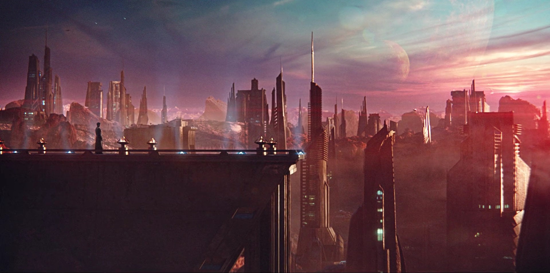
Planet Vulcan as seen in episode 6
Feature film level effects, but not driving the story
What is the typical episode process?
It starts with the script and we go through it have a lot of questions at that point. We have a meeting with the department heads and Aaron [Harberts] and Gretchen [J. Berg] and Akiva [Goldsman] to talk about it and what they are thinking and what their ambitions are on what needs to be visual effects and what doesn’t need to be visual effects. After that we start building our assets and start putting together a shot list. We then shoot it and start to get an edit together and actually put into the visual effects into the edit. It evolves greatly, starting like with a title card that says, “Ship flies here,” and at the end it is the Enterprise and the Discovery facing each other.
How many effects shots are there for each episode, typically?
It varies a lot. For the season it was something like 5,000 [in total], so like a feature film.
That is kind of the ambition, to give the production a feature film texture?
It is definitely about having high-end visual effects. Ultimately the good thing about [executive producers] Aaron, Gretchen, Akiva, and Alex [Kurtzman] is that it is always about what the story is. If the story is that there are ten visual effects shots in an episode, that is what it is, and if it is 500, that is what it is going to be. We don’t drive the story, but we help it out. Looking at from that paradigm, you are not locked into a certain way of thinking. And at the same time, we get a breather every once in a while.
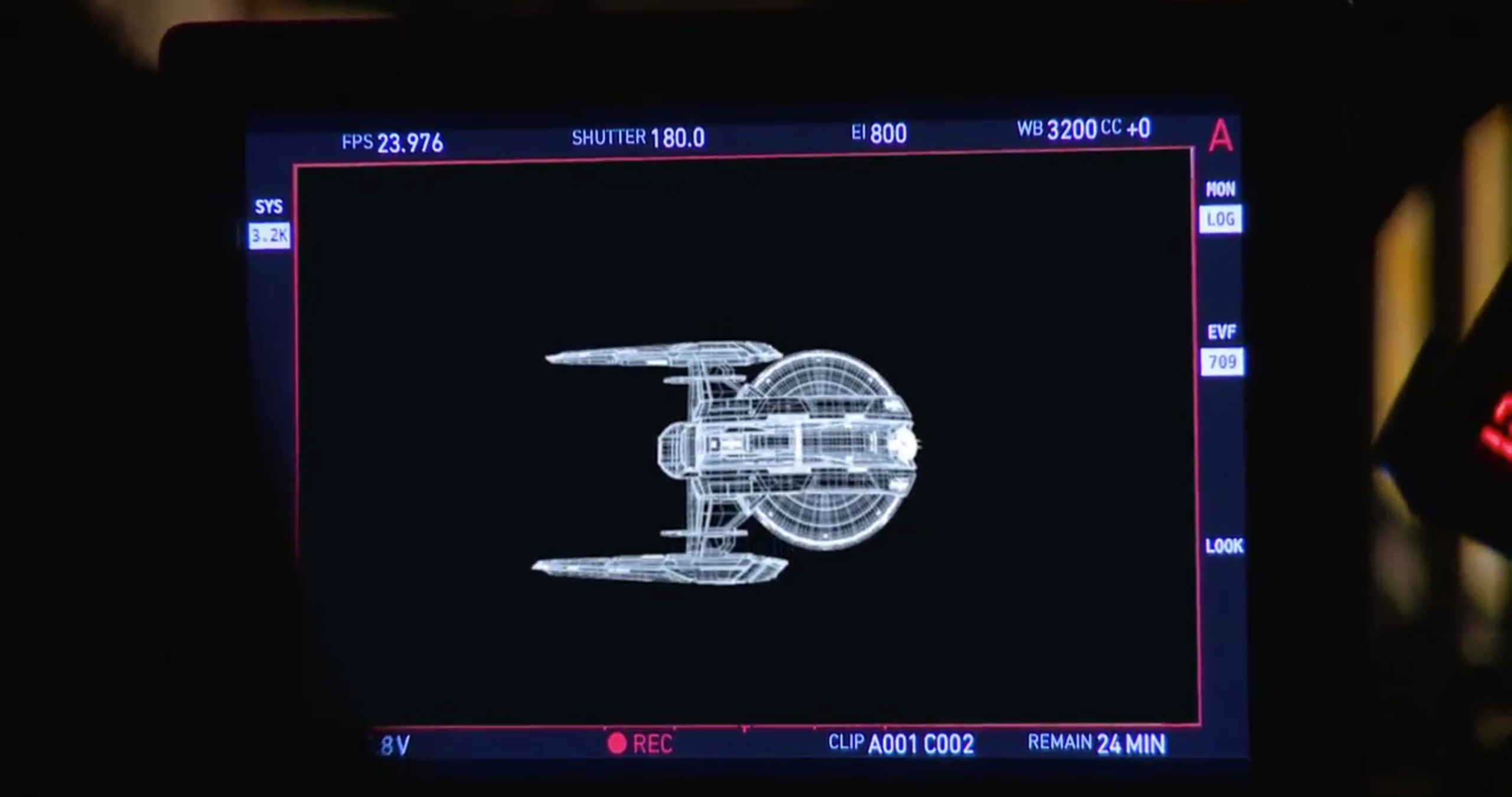
A wireframe view of the USS Shenzhou CGI model
Have you ever had to say “no,” due to time constraints?
No, it’s like anything, it’s a conversation. It is never a “no,” it is talking to everyone to see what they want and how much time we have and going from there.
What was the most iterations of a single effects shot that you have gone through?
We had one that was 146, that was the highest for the season. That is high, even for me. When I saw that, I felt really bad for the vendor.
Was that for the ISS Charon?
What is funny is you would think it was for one of those big “scopey” shots, but I think it was just a monitor comp. I don’t know why. We kept changing the graphics.
The USS Discovery destroys the ISS Charon in episode 13
More TrekMovie WonderCon 2018 coverage
Interview: Mary Chieffo Talks Klingon Sex And L’Rell’s Future
Full Star Trek: Discovery Visionaries panel video
‘Star Trek: Discovery’ Showrunners Confirm Number Of Episodes In Season 2, Give Production Update
7 Things We Learned About ‘Star Trek: Discovery’ Season 2 At WonderCon Visionaries Panel
WATCH: ‘Star Trek: Discovery’ Bonus Scene Reveals A Familiar Storyline For Season Two
Star Trek: Discovery is available exclusively in the USA on CBS All Access. It airs in Canada on the Space Channel and streams on CraveTV. It is available on Netflix everywhere else.
Keep up with all the Star Trek: Discovery news at TrekMovie.


For season 2, would you please lay off the “blue filter” and disable the Lens Flare Generators? Thank you.
Absolutely. Call me old school, but the zoom-ins and rainbow filter and ultra-short starship shots have to go. I want to see what is going on, space should be dark, not look like some LSD-induced nightmare, I want flybys of starships and swooping shots instead of crazy pan and zoom. How many times did they really take time to show the ship? It’s a character, just like anyone else.
Absolutely agree. Trying to make out the designs of the various ships shown at times during season one was frustrating as all he*l. If I have to go back and freeze a shot to see what a ship looks like, that’s a problem for me.
I can live with space nebulae. However, some of the ship renders looked really cartooney. And the movements of both the ships and the camera often felt off, in addition to being only very short shots.
Space nebulae, in EVERY SHOT thou? Sure, they might be a near a nebula once in a while, but everytime we see ships from the outside? Disable the Blue Filter, or in the very least, tone it the f— down!
Agreed, the rainbow color look feels strange, especially since the interior shots of Discovery and other locations don’t apply the same “cartoony” style. I think the pictures above are a good indicator of what’s wrong here. Vulcan looks like it’s been filmed through a soap bubble, the Enterprise looks like it’S coming right out of V’Ger’s butt. :D
No
Blue. Blue haze everywhere. I look at their reimagined Enterprise and I don’t know what I’m looking at. Something underwater? Blue haze. Bad writing. Dark. Everything so dark and blue. I feel stressed after watching it. What happened to Star Trek?
Just think of all the hardworking crew who have to put in such long hours after being handed scripts produced by Aaron & Gretch overseeing a room of howler monkeys banging on typewriters.
You are getting extremely tiresome. Quit trolling and get a life.
Please, Admin, ban Galt the troll.
Please Admin, don’t ban anyone. Let Star Trek fans voice their criticism. Refering to the writers as howler monkeys is appropriate. The 11th hour ‘oh no, let’s change our minds about the war we were winning because they’ve planeted a bomb in our planet’s cave system’ had to have been written by howler monkeys, anyone that says different is being too defensive and needs to ask themselves why any negative opinions or critics of Discovery need to be “banned”? If you were so confident in Discovery being a good show, why would you be trying to censor people?
Yeah, let everybody have a say! Even the stupid ones! Martin, Galt, go ahead, share your profound views! Looking forward to it! Love monkeys with typewriters!
I’m not defending any one person’s post, but calling people out by name as being “stupid” should not be acceptable here either.
The difference is that Galt is a *troll*. They are completely incapable of making their point without resorting to name calling (“Gretchy”) and snark. It’s tedious, it’s incredibly rude and it’s now supremely annoying.
I have no issues with people not liking Discovery. We cannot all be the same after all! What I *do* have an issue with is people like Galt who simply resort to trolling and making fun of people. It’s as disrespectful as it is baffling. Why do folks like Galt feel the need to endlessly talk (and watch) about a television show that they clearly don’t like? That just tells me that they have nothing better to do with their day- which is pretty sad (but not entirely unexpected if I’m totally honest).
So yes, I do think that the administrators of this site need to block or at least warn people like Galt who have crossed a line from legitimate complaints into trolling. Also note how he only ever name calls Gretchen J. Berg. There’s a hint a sexism of there that needs to be shut down immediately.
No. It is not appropriate, unless you’re younger than fourteen (or Donald Trump). You needn’t get personal with your criticism to voice what you think went wrong with Discovery (and in that sense, I’ve been plenty critical). Unless you’re claiming that the finale was literally written by howler monkeys, there’s nothing accomplished with that insult that couldn’t be better expressed by just taking the writers to task for their work.
Galt,
You know I’ve praised your insights in the past, and hope to continue to do so. A little less snark might be helpful in that regard, though. Criticism is one thing, dude, but it should never be necessary to get personal.
Herein lies the problem, Michael: Galt has no insight. If they had that- they would be involved in the production of the show. They would be privy to such details.
As it is- they appear to simply be a nasty, immature troll who takes some perverse pleasure in being extremely rude and offensive about the people involved in the creation of a television show that they do not like. They routinely belittle and insult those who have tried their best to create a television show. It has gone beyond critique and into the realm of trolling and cyber-bullying.
It is exactly this kind of so called “fan” that makes me deeply ashamed to be a part of this particular fandom. Galt is part of a fandom of a franchise that extols “infinite diversity in infinite combinations”- and yet they refuse to accept something different. It is *extremely* hypocritical.
What is more disheartening is that this wanton trolling and cyber bullying (calling the writers “howler monkeys” IS exactly that) has been allowed to go unchecked by the staff of this website. If I was to resort to Galt’s tactics, I have absolutely no doubt that I would be banned from this site- or something to that effect.
You can only criticise Discovery if you work on the show? Haha! No mate, we can say what we want and will. A poor first season, poor writing, poor continuity, poor insecure bullies who try and shut down any negative critique.
But–whatever you think of their performance on the show–so far as we know the writers on DSC have had no part in bullying or trying to shut down critical views on these threads. I would strongly suspect that anyone who would defend referring to such people as “howler monkeys” has at least a touch of the bully in him, though.
I’ve NEVER said that and you know it. And don’t you call me “mate”- you are not my friend. And dont you dare call me a bully. I am NOT attempting to prevent people from criticizing the show. I myself have taken issue with various aspects of the show but I have done so without name calling and resorting to disparaging female production staff with patronising name calling.
What I *am* doing now is calling out nasty, immature trolls like Galt.
And now you, Martin.
Should’ve asked why they used SO MANY NEBULA SHOTS! Seriously…it feels like I’m watching Pulsar Lost Colony due to the lack of normal space shots. Its all blue nebulae or some multicolor nebula. I don’t mind it for a shot or 2, but in EVERY shot?! Come on!
Black empty space is boring.
your short little snipe posts are what is boring. Try adding content next time.
A kmart just closed in my area.
Boring but it happens to be reality. Remember the long shot of the Discovery in 2001 without moving stars? Done for a reason… The old school motion control photography of the refit constituion class Enterprise by the amazing guys at RAA, Apogee, FGC, ILM for ST:TMP-VI (lets ignore Bran Ferren and mob in V) was the best, please bring it back. Even Seth McFarlane acknowledged this by getting the old Image G guys to undertake motion control photogrpahy of the Orville (then augmented with CGI where necessary)
madtrekfanuk,
Not to contradict the rest of your otherwise excellent post, but the stars are drifting in nearly every ship shot in 2001. Perhaps you are thinking of 2010, which has some cuts — one in particular of LEONOV docked with DISCOVERY — that look like freeze frames owing to the lack of any motion in the ships or starfields.
Also, RAA contributed nothing to the finished TMP except ship design and completion of the interior wormhole shots — everything else was tossed and/or redone by Trumbull and Dykstra teams. As to whether the RAA actually SHOULD have been tossed … that’s another issue altogether, but there’s no chance RAA could have possibly made the release date mandated, given the lack of equipment assembled in the previous year’s time and the way the show was being run. I’ve interviewed probably 30 VFX folks from TMP over the years, including a few from the RAA team, and there was way too much wrong going on there — it was NOT a case like ILM on the first SW, where it took them a year to assemble and finesse all the pieces to get running smoothly, it sounds like drugs and all sorts of other shenanigans were really sabotaging the process.
Also: Glenn Derry of the late Technoprops (now absorbed into Fox as part of their VFX and virtual production unit) worked with Rob Legato to execute the ORVILLE miniature build and shoot. I see he has credits going back to 1995, but nothing about him working at Image-G. Do you have some details I do not?
kmart,
By “moving stars” I think he’s actually referring to multiplane stars, as utilized so frequently in TOS. I remember Dykstra mentioning in an interview once–I think in reference to his work on the original BSG–that multiplane stars drove him crazy.
Both of SW’s main VFX guys, Dykstra and Richard Edlund, hated multiplane stars — ironic, given that Edlund got his start on TOS doing beamups for a show that made multiplane stars into a thing and that the jump to lightspeed in SW (shot by Dennis Muren) is TOS on acid with a dose of 2001 — and I’ve seen Dykstra bring it up a few different times, including at least one interview about TMP (in RETURN TO TOMORROW book, and possibly Cinefex #2, and how you have to use it with discretion if at all.
I reread madtrek’s post and still can’t tell if you’re right or not about his intent. The ‘drifting stars’ thing in 2001 is featured in the new book about the making of Kubrick’s film … turns out that the stars drifting was not done to accent the music chosen, but because that was the limit on speed without the stars strobing. Then Kubrick just started playing music against the footage until Danube just clicked for him (though he did poll the folks in the room too, so he wasn’t above considering the opinions of others.)
That new book is called SPACE ODYSSEY and comes out in a few days, but you can probably do what I did and find an Advance Reader Copy on ebay — it is the rarest of books, something on 2001 that actually has NEW information and insights. The shot of the leopard attacking a guy during DAWN OF MAN — two of the ape guys in the background are ROTOSCOPED into the shot because the performers didn’t want to be on set with the animal. I’ve seen that sequence 200 times at least, and never noticed the very very slight giveaways, but if you look at the blu-ray, you can definitely tell something is off about those two guys at a couple of points. The death of HAL scene was much longer as shot, and probably would have been as painful as watching ET croak if kept at that length. Lots of good stuff, and the author has actual writing talent in addition to being a good journalist. I’m frankly quite jealous.
Thanks for the info. and the heads-up about the new 2001 book, always of interest considering it’s one of my Great Films (maybe THE Great Film). I was, and still am, very fond of Agel’s book about the making of the film (though the best sections are actually more about the reaction to it), even though I haven’t read it in decades.
With the exception of an occasional LOSCON I don’t do conventions much anymore, but some years ago I found myself in a dealer’s room confronting an old guy who looked absolutely nothing like Gary Mitchell or Frank Poole but nevertheless claimed to be Gary Lockwood. (This isn’t meant as an insult; as Steven King once mordantly observed, time kicks the crap out of people.) I’d really only meant to thank him for his work–and maybe reflect with him on the irony of a an actor who came across as the ultimate jock being so closely associated with two of the great nerd lodestones of the 20th century–while considering the purchase of the Trek/2001 memoir he was there to hawk. Unfortunately, he and his co-author were holding forth on politics, and it was as dismal a spectacle as you might imagine, so out of respect I just bit my tongue till it bled and turned away. I don’t regret my discretion in this instance, but kind of wish I’d gotten the book anyway.
I remember a Lockwood interview in STARLOG where he claimed Kubrick and Clarke started working on 2001 in 1954, not 1964, so I think anything he had to offer in later years might have been a little suspect. The book
The production values are top notch. Including the VFX. Too bad the writing and story people aren’t as good.
Someone should tell him the VFX look absolutely terrible in every way. Rendering, colour timing, filters used, design etc etc looks inferior to amateur Lightwave Trek shots from many years ago!
Agreed!
Let’s see some of the effects work you’ve done, so we can compare ;)
Dr Beckett, why should he do that? Are you saying one has to be a visual effects artist in order to have an opinion of visual effects? That makes no sense.
Jason, if you ever read this, please stop with grading everything in blue. The whole show takes on a hazzy feel and it does effect the way we feel as an audience trying to follow a scene in earnest. I resent the changes you all made to the Enteprise, when the DS9 episode had such respect for the past and did it so well. Some humble aztecing and some of your patented lens flares would have been enough. You all act like you’re ashamed of what came before, why not try creating new things instead of urinating on what came before? Or is that just too hard? You keep apologising for the aesthetic you’re now torch-barer to. The recent Star Wars disney films celebrate their aesthetic and preserve it – but Star Trek, always in the hands of non-fans tries everything it can to apologise for itself. ‘We’re cool now, honest. Look our Klingons have 4 nostrils and you sound like they have a mouth full of marbles’. ‘Look, it’s the enterprise but a sexier version because this is the Discovery universe, um, we mean Prime universe, um, we don’t quite know what it means but who cares, it’s only a paid tv gig until the next show I work on.’ You’re not fans and you don’t care.
it’s a lot easier showing 60’s technology and aesthetics when you are doing a show 100 years in the future. Discovery is trying to present a modern look because they have to to be taken seriously. They can’t show a 1960s ship in the same timeline. Why can’t people just accept this?
So by that logic, I guess everyone will be wearing glasses with Blue Filters applied, or being futuristic and all, probably implanted with cybernetic eyes with Always-On Blue Filters…
that’s the epitome of over reaction lol. No, my fought, I was really only addressing the line, ” I resent the changes you all made to the Enteprise, when the DS9 episode had such respect for the past and did it so well.”
That DS9 episode was a joke, the Enterprise looked like crap.
You are a joke HN4, and your posts are crap.
How mature of you Meurik.
Meurik’s just being honest, Ad. When somebody consistently posts one-line snipes, and rarely offers any content to back it up (and said content when proffered isn’t bringing anything special to the table), a response like Meurik’s is direct in calling attention to the core matter.
Now somebody who actually brings a POV AND usually supports it with content, that’s another thing (probably more dangerous), but HN4 (based on the last few days, which is the only time I’ve taken notice), doesn’t have the wherewithal or inclination, or possibly even the ability (though he/she does like LUTHER, which indicates some higher level function.) When I drop a one-liner, it CAN be supported by my history of posts on the subject and other significant writing credits, but so far as I know HN4 doesn’t have any street cred on which to cruise over that issue.
Kmart
I think you need to lay off the coffee.
If im honest- as much as I enjoy Trials and Tribulations as an episode of DS9- it does draw attention to how dates the TOS aesthetic was by the mid 1990s. The same goes for In A Mirror Darkly and Relics. I can see where HN4 is coming from in that respect, although I would hesitate to call such a feel good episode like Trials “a joke”.
It was a fanservice episode. They even considered giving Worf a makeover to make him look like a TOS Klingon. So it would have just been Michael Dorn wearing a foomanchew mustache.
Kmart,
I have street cred. I’m wearing Spock underpants and matching socks. Am I one of you now?
Gooba-gobble, Gooba-gobble
No one who chose to wear such sacred attire would say that the Enterprise looked like crap in “T and T.” You’re lying.
I would.
Post a photo, sport–then we’ll talk.
Respectfully disagree. The Enterprise in DS9 looked AWESOME! Plus, it was a ship from nearly 100 years in the past. It was reasonable it still maintained the TOS look. However, in STD, they set a production style that Enterprise had to match. Or the aesthetic they set up would not work (for their show, not for any other show). They decided it would be better if Enterprise looked right for their re-imagined TOS era than for the TOS era that was already established.
Exactly. And that was a reasonable decision for the FX people to make, even if you disagree with it.
The last three feature films capture that aesthetic you’re referencing will managing to present ships and objects in space that look physically real. The Enterprise in the last three films appears as an object you could physically touch. Everything on Discovery looks animated.
I think that’s because the CGI budget from the Kelvin Timeline movies were drastically higher than the CGI budget for Discovery. It’s not really fair to compare blockbuster CGI to some found on a TV show. Even the CGI in the Expanse looks animated.
Because this is the Trek fandom and for some reason, people cannot accept any kind of change whatsoever.
Man, I’d retire if I had a nickle for every time I’ve read someone making that silly Wars/Trek analogy. It’s just not the same challenge with regards to aesthetics or modernization at all.
Star Wars Rogue One shows you can make a sexy, flashy, modern film while celebrating an iconic aesthetic. The nostalgic Trek fans don’t want a button by button recreation of the TOS bridge, but entirely reimagining an iconic hero ship is the height of arrogance. They could show a close reproduction, subdue the colours, adapt the consoles, do things in a careful way to gel their series with the other 5 and decisions that were made before. They won’t do anything carefully. They create a prequel, and urinate all over it through their hipster chinos.
All right, I guess I need to spell this out for you.
Though Star Trek and STAR WARS are both ostensibly space operas, their appeal and thus their aesthetic requirements are entirely different. The production designers of ROGUE ONE had no difficulty seamlessly integrating their work with what had been established four decades ago in A NEW HOPE, because the factors that made those designs work back then haven’t changed. As a tribute to the Flash Gordon serials George Lucas loved as a child, and set in a galaxy long ago and far away, STAR WARS had no need to come off as a realistic depiction of humanity’s future in space; indeed, such realism would have been beside the point. Even Lucas has described his franchise as more space-fantasy than science fiction, and as such its settings are timeless, much as Oz and King’s Landing are timeless. Much of the tech looked worn and dated even by the standards of 1977, with the Millennium Falcon as a battered space jalopy and even the awesome Imperial fleet coming off like lumbering vintage World War II-era battleships. ROGUE ONE and the other films expanded the STAR WARS universe and the scope and scale of the visual FX, but did relatively little to update the original designs for the simple reason that it simply wasn’t necessary. STAR WARS isn’t expected to be modern, or believable. It’s just supposed to look exotic, and expensively cool.
Rebooting Star Trek was never going to be as easy, because for all its roots as a limited-budget TV series it had a vision of the future that people took very seriously, and that was central to its appeal. (That’s why Ballantine’s editions of the Enterprise blueprints and The Starfleet Technical Manual both became major bestsellers.) Unlike STAR WARS, and as articulated in the show’s Writer’s Guide, believability was key. When there was talk of reviving the show in the early ‘70s Roddenberry was initially resistant to changing the designs that had worked so well for the show, but by the time the ill-fated Phase II series went into preproduction in 1976 he had been convinced of the need for a fairly radical overhaul, to be not-so-convincingly explained by the ship’s presence in drydock for the previous year or two. So fiber optics and rear-projection replaced the old back-lit readouts, and the ship’s exterior took on a complexity that Matt Jeffries had never seen the need for. And over the ensuing decades, each iteration of the franchise has struggled with the conundrum of how to keep the show modern and believable while preserving the original design elements that audiences loved in the first place. You can certainly argue that the Discovery producers could have done a better job in that regard, but what you can’t argue is that STAR WARS and ROGUE ONE prove that believably depicting the future while honoring the past is easy. It isn’t.
Well stated. You can look at the Prequel Trilogy and see an evolution of design there, from the more 1930s-y Flash Gordon-y ships, exotic costumes etc of Phantom Menace, to a “1950s” streamline style in Attack of the Clones (hovercars, flying wings), to a point believably 16-18 years before Star Wars where we see things beginning to resemble the Original Trilogy designs. Rogue One ends 10 minutes before A New Hope begins, so it is contemporaneous to that time period (and Star Wars: Rebels if you count that).
The problem with designing anything for Star Trek is that there’s arguably too much visual canon, particularly from the TNG through Voyager periods, where we have a relatively neat linear evolution of ships, uniforms, displays, etc. Obviously some of that was retroactively created backstory, like the gold ship models in the briefing room, the reuse of the Excelsior for the B, the clunky but plausible execution of the model for the 1701-C, etc. As always, much was done for cost-savings like reusing set pieces, props and uniforms with slight modifications. But once it’s on screen it’s hard to imagine another interpretation.
In retrospect I think the production designers of Discovery did a very good job given the envelope they were allowed to work in, and made good choices where they decided to ignore previous visual canon. For instance, hairstyles are always something that can date a production; TOS had 60s hair IN SPACE and TNG had 80s hair IN SPACE basically, something you can’t really say about Discovery (Keyla Detmer’s undercut having at least the practical excuse of her optical prosthesis thingy). The Klingon designs do much more to make them alien, and not a human in a rubber forehead and wig. I can see the uniforms as a transitional style evolved from the 2230s high-waisted Buck Rogers / Forbidden Planet uniforms.
Where the show does fall down is its space shots, a few from the 2-part pilot excepted. They do indeed seem far too short; there’s something jittery about the animation frame rate at times, and there’s no great sense of scale.
The space backgrounds are indeed very busy, and in the larger battle scenes it’s been very hard to tell what’s happening. It’s paradoxically overlit and underlit at the same time.
The spore drive multiple-image spin effect just doesn’t really work – especially the way it jumps ‘up’ out of frame and then ‘down’ into frame like it’s some sort of ship on a string being lowered into a puppet show cabinet? And the counter-rotating ship sections made little sense.
Overall, the Klingon ship designs seemed the least successful; the BoP is dramatic looking compared to previous ones, but it really looks far too much like nuBSG’s Cylon Raider; the other ships have very confusing looks that seem to resemble clocks, violins and generic space-MMO game designs. They don’t really work on TV, especially not when shown in such short shots.
CHARON just looked like some previz work, absolutely godawful.
Wow. Jason Zimmerman is kind of a babe.
We need to get down to exploring again. Let’s see Discovery seek out some new and unusual lifeforms, and new civilizations. However, it seems as though ‘Section 31’ has commandeered our experimental science vessel for some, likely nefarious reason…
I’ve never liked the concept of an autonomous, highly classified, unofficial department in the Federation that operates without the restraints of Starfleets directives. How could any honorable Starfleet officer serve this bastardized section?
It’s like, “Screw the Prime Directive, we’re effing Section 31!” I understand it makes for great story telling, but it still seems anti-Star Trek to me.
I don’t care about lense flares but yeah, the FX shots need to be a tad longer and sharper to truly impress.
I think the main problem is the ship design. All starships called Enterprise, even Voyager, looked great from almost every angle.
Discovery looks astonishing from some angles, especially from atop, but it looks ugly and uninspired from other angles. The side view is just plain hideous.
Maybe they are trying to hide that shortcoming by using almost cartoonish color palates, background nebulae and zoom-in quick shots.
I think Trek FX had reached an all-time high during ENT’s third season, crisp and clear, straight-forward, well-balanced space action. The transition from physical model to CGI, that had taken over a decade, had finally been finished and it finally paid off at that point.
Everything that came afterwards, including the KT reboots, moved astray from that (near) perfection by experimenting too much, agressively trying to be different.
I think the CG ship stuff actually looked very good in just the opening of the 09, with the close views of KELVIN, but that pretty much everything else in the whole film was a letdown, along with ID’s VFX. BEYOND went a good ways toward altering that, but ENTERPRISE … except for a few medium range deep space flybys, I don’t think I recall any shots in any season that convinced in the slightest. I’ve only seen a handful of seasons 3 & 4 eps, but I have looked at the occasional youtube anthology of VFX shots, and I just don’t see crisp & clear so much as I see Wrong, Wrong & Wrong. It still blows my mind that except for a few shots in GEN and FC, that the best ship shots in TREK seem to be from 1979 (though if DS9’s model shot VFX ever got recomped at full rez, they might be prime contenders.)
I’ve just rewatched the Season 1 cliffhanger minutes a couple of times on YouTube. I just love that scene. But what I’ve found most astonishing is the musical score during that scene. If I’m not mistaken, it contains a cue that’s highly reminiscent of Michael Giacchino’s movie scores… shortly after the NCC-1701 code comes in and Saru hails the Enterprise, there is a moment that has Giacchino’s semi-hysterical string tremolo that’s used to set up tension before the KT timeline main theme tunes in in the movies.
Maybe it’s just coincidence but it certainly feels like a nod to that great score…
I understand it’s an artistic choice, but I prefer the photo realism in fx shots to this new “painted” look. The space scenes look like background for some colorful anime rather than Trek. And there’s nothing wrong with using your scale and virtual lenses in a way that suggests heft and bulk as opposed to zipping around everywhere like a cartoon. The jump-drive-spin borders on being comical it looks so ridiculous.
Just think of all the time and money they could have saved the art department if they had simply respected the Star Trek universe and realized the Enterprise didn’t need redesigned. It just needed to be built. All I can do is shake my head at their incompetence.
CBS doesn’t own the rights to the TOS Enterprise. If they used that design they’d have to pay royalties to the Matt Jefferies Estate, so they elected to brief Jon Eaves and Scott Schneider to make the Enterprise 75% the same and 25% different.
Its a money thing and CBS got greedy so they had a new design they own created.
Can you provide a link substantiating this claim? Because, right now, I have a hard time believing it.
I find that explanation unlikely. My BD’s of TOS all have the CBS logo on them. The new CG added to the shows (done by CBS Digital, BTW) all used the original Enterprise design. If CBS weren’t allowed to do anything the HD upgrade never would have happened.
I find it pretty unlikely too. Seriously, that 25/75% split can definitely make the difference as to whether the Jeffries estate sees royalties or not? Never mind that such royalties would have to be minuscule in the context of the start-up costs associated with DSC’s first season; I’d love to see such a thing argued in court.
I talked to Scott Schneider, one of the designers of the Enterprise, on the Unofficial Star Trek fanpage on facebook where a lot of production members haunt.
He said Jon Eaves and he were briefed to change the TOS Enterprise by 25%. That’s why certain details like the red stripe beside the deflectors have two stripes rather then three for instance.
He was told by other people the Jeffries Estate owned the rights to the original design. I have yet to confirm this but I also havent had the time to.
Either way he was told to change it by a quarter but could leave 75% the same.
Can you provide a link to this exchange? No disrespect intended, but for the reasons listed above this just doesn’t make a whole lot of sense to me.
I think the reasoning behind the design tweaks has much more to do with “Discoizing” the look as overseen by executive producer Akiva Goldsman, who, as I understand it, was the driving force behind the inclusion of the Enterprise in the finale. Looking online, I believe it was an assumption Scott made about why he was asked to tweak it more.
I’ve never heard (nor can I find any evidence online) of this idea that Matt Jefferies owns a piece of the rights to the TOS Enterprise.
Being a production designer for a TV show means you’re an employee. The TV show hires you as a regular employee, so anything you make ends up the property of the production company that hired you. Typically employment contracts also have specific language built-in that spell it out.
In fact, basic copyright law says:
Source: https://fairuse.stanford.edu/overview/faqs/copyright-ownership/
Furthermore, if CBS were somehow trying to avoid paying fees, then why has the classic Enterprise shown up on countless pieces of merchandise, even to this day? All those pieces of merch have “Copyright CBS Studios” on it. Not “CBS Studios and the Jefferies Estate”.
And of course the classic Constitution class design was shown repeatedly throughout the franchise, in various on screen graphics, and then in physical form in DS9 “Trials and Tribble-ations”, and ENT “In a Mirror, Darkly”. Jefferies helped design the bridge set as well, which of course was shown in TNG “Relics”. And as others mentioned CBS made new CGI visual effects shots for TOS-R circa 2006-2008.
vfx were overcooked and looked bad the majority of shots, doesnt look like star trek at all, so i guess thats the reason, but please some realism would be nice
Feature-level FX? Just LOL.
Cartoonish video-game like, where, sorry to say, even over 15 year old show (ENT) has managed to pull off a more convincing/realistic CGI.
This show tries so hard toNOT BE Star Trek in all it does, including visuals and look&feel its funny. They got to find a way to sell it to 15y old ADHD teenagers, for sure.
I feel like there is a ‘vaseline’ filter on all the effect shots, and way too many flares and over the top colourization of nebulae and other space phenomena. Often times it feels like they are using all these filters to cover up potential mistakes or poor work — which I know really isn’t the case but it still feels that way. Give us an unobstructed view of the action! Some of the CGI shots in Enterprise and Voyager are superior and more realistic than this show. Really not trying to hate but I really don’t think this aesthetic will age well.
The nebula in Lethe was a particular low point for me. It looked like Babylon 5 disco strobe lights!