
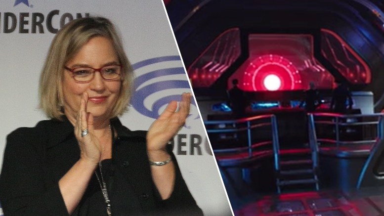
After wrapping up four seasons on the FX series The Strain, production designer Tamara Deverell joined Star Trek: Discovery about half-way through the first season, making it her job to take the show to the strange new world of Pahvo and into the Mirror Universe. Following her time on the Star Trek: Discovery “Visionaries” panel at WonderCon, TrekMovie sat down with Tamara and some other journalists at a roundtable interview where we talked about her time in the first season and some plans for the second.
Tamara Deverell at WonderCon 2018
Changes in Engineering coming
Will we see an actual engine room in season 2?
We might. We’ve expanded parts of the ship. We’ve added a corridor that we didn’t have so now we have like a loop corridor. We went a little more mechanical with that corridor which I’m pretty excited about. We had designed something much bigger but we could only go so much, so we’ve got new spaces. There’s a new opening into the mess hall, and one into sick bay. One of the problems we had with [Stamets’ Lab] in Engineering was that it was very dark in one area and the DP, our cinematographer, kind of complaining and a lot of light came from the [spore chamber] cube. So, we are doing a little bit of renovation there, and I’m just going to leave it at that. But I’m pretty excited about it.
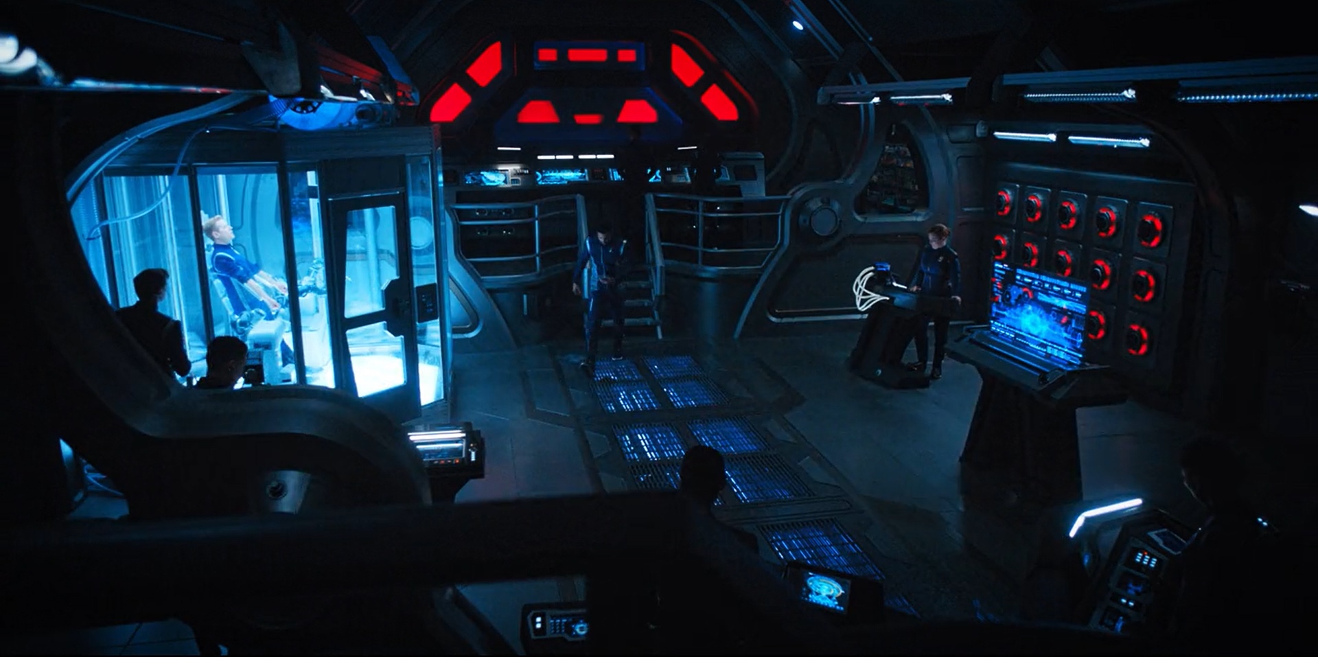
Stamets’ engineering lab in episode 13
The 10-minute Pahvo pitch
How much freedom do you have designing. Like for example when you went to Pahvo, did the writers tell you exactly what they want it to look like or do you get to use your imagination and create it for them?
That was funny. That was actually the network said “We need to go to a planet and we need to go now. We want to get off the ship, so you need to go somewhere.” And so the writers called us and said “We need to go to this planet and they gave us some parameters and said pitch us something—in 10 minutes.” This is a true story. So, we went away for ten minutes and I was like “Ah, ah, ah…a yurt?” No, a yurt is not good enough. It has to be like a membrane structure. So, we built this membrane yurt. And it has to be mathematical. So, everything we designed is based on this math equation to build these fins and it’s quite complicated to make this membrane thing. But that was my pitch. And they stuck to it!
So, they go to this planet and the planet beings build this thing. We talked about getting dancers to be the Pahvans, but it had to be VFX. We tried a costume, but to be something that ethereal and it’s not TOS days anymore when we can put a guy in a goofy costume. You have to really charge the audience with something exciting. So, it became this amorphous being. I hope we do a few more of those because it’s kind of fun.

Inside the Pahvo “yurt” from episode 8
Fitting with The Original Series
Can you talk about the challenge of designing tech that fits in between Enterprise and TOS?
It’s impossible. So, when I started out I was like “Wow, this isn’t TOS.” You can never go back to TOS. Those were charming, lovely sets made out of cardboard and sticky tape. You can tell if you watched them what they did. Like when they went to the Mirror Universe, they literally took a Terran logo – which we did use as a basis of ours – and slapped it on a couple walls and called it done, called it Mirror. We have all this technology at our fingertips to build, including 3D printing, and the audience expectation now in science fiction is to give them things that are more “designed,” and more exquisitely designed. We just had to make that leap of faith and say the audience is going to come with us on that journey. Yes, we are pre-dating TOS, but no we are not going to offer you TOS again fifty years later.
At a panel last year it was mentioned that the colors on the show may evolve to be more like TOS, instead of the more darker tones. So, will we see that evolution in Season 2?
Boy, you guys are really digging around! I guess it depends what we build! But we really did go very dark when we went to the Mirror Universe. I left some of that. We actually put dark, shiny things in the sets and reflective things and we kept some of that because there was a shift when the Discovery went to the Mirror Universe and we want to feel that darkness. It’s a little bit of a blight on the whole world of Star Trek: Discovery right now. It’s a thing, a memory, that they have and so I sort of want to show that in the set.
It’s a darker show in general terms compared to all the other Star Trek shows. Part of that is the technology and the way we light the sets and use LED lighting which makes it darker. And also it’s what people expect now. They expect darker parts. It’s not all dark, though.
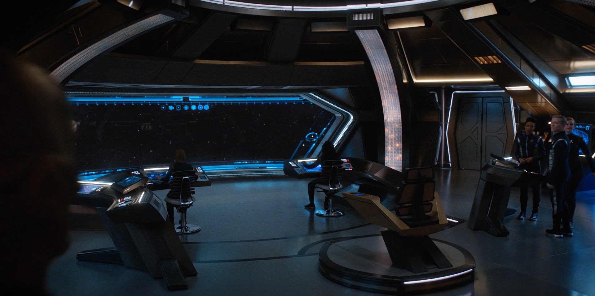
Bridge of the USS Discovery from episode 15
Discovery Challenges
What were some of the biggest challenges for you in season 1?
Well I started around episode 6, so I’m just getting caught up. The reason I decided to do the show was that I was blown away by the sets. At first I was like, “Star Trek, sci-fi, hmm, I don’t know.” I like to design big things, but then I went on a tour with my predecessor. I was like “OK, I want to be a part of this!” And then, BLAM I’m in there. They had a long time of getting up to speed on building things and I was thrown in and all of a sudden I had to do the Terran ship, which is this massive ship and the sets for it. When you start a series, you have months to build, and we had episodic timing. So, I had to think quick on my feet about what to design that we could do quick enough to get it to make it look great. And of course, relying on some visual effects and set extensions was key. So, that was the biggest challenge.
And getting up to speed with canon; having to go to “Star Trek University.” There’s a lot of stuff out there. I grew up with TOS, because that’s my generation. So, I had to do a lot of going back. You know there’s amazing resources out there, like fan sites that you can just go and with a click I can get, like Section 31. There’s not a lot on Section 31. They’re very secret.
Glenn [Hetrick] was saying that HD cameras make his job a little tougher and kind of took away all his tricks and tools. Has the HD camera made your job more difficult?
Yeah, things shift. So, you pick a color for a set and you’re like “Oh my god it looks green or blue.” We don’t have time on an episodic show to do camera tests the way you would on a feature film. But, if we test things it helps us to know what we will get. So, all the main ship colors have been tested with the [HD] camera. It’s the nature of it. Sometimes the DP [director of photography] will say I want to light this or the director will want to make this a blue scene or a golden scene. That happened in episode 11. They decided to make the sun of the Harlak planet right through the windows, and the whole set was washed in amber. And I wasn’t expecting that and was quite taken by surprise. But when I saw it, I loved it. We’re working fast. So you just have to go with it.

On the ISS Shenzhou in episode 11
More TrekMovie WonderCon 2018 coverage
Interview: ‘Star Trek: Discovery’ Makeup Team On Klingon And Tellarite Updates And Borg Hopes
Interview: Jason Zimmerman Talks USS Enterprise And 5,000 VFX Shots For ‘Star Trek: Discovery’
Interview: Mary Chieffo Talks Klingon Sex And L’Rell’s Future
Full Star Trek: Discovery Visionaries panel video
‘Star Trek: Discovery’ Showrunners Confirm Number Of Episodes In Season 2, Give Production Update
7 Things We Learned About ‘Star Trek: Discovery’ Season 2 At WonderCon Visionaries Panel
WATCH: ‘Star Trek: Discovery’ Bonus Scene Reveals A Familiar Storyline For Season Two
Star Trek: Discovery is available exclusively in the USA on CBS All Access. It airs in Canada on the Space Channel and streams on CraveTV. It is available on Netflix everywhere else.
Keep up with all the Star Trek: Discovery news at TrekMovie.


It’s funny that a big complaint is usually network interference (in TV and movies, etc., and not just Trek), but it was the network that recognized that they needed to get off the ship and go somewhere.
Very glad they did. Hope there is more of that in season 2
The producers on TOS were under constant network pressure to do the same thing. Nothing new there at all.
I call bullshit on her assertion that you can’t design to fit between ENT and TOS! Just look at “Prelude to Axanar”! I could’ve been done. There were/are plenty of smart people working on this show. Why can’t they just be honest and tell us that they updated the look because they wanted to? They keep telling us to be patient and to trust them, but I absolutely have no faith in them.
IMO you can’t be hung up on maintaining wood sets, special effects and makeup from the 1960s! Earlier today I saw an episode of DS9 with Koloth, Kor and Kane. They looked nothing like they did in 1967-68 because the makeup capabilities of the 1990s made the TOS Klingon makeup obsolete. Did it make me dislike the show? Of course not! IMO the same thing goes for Discovery, you can’t realistically expect production designers in 2018 recreate the wooden sets from HALF A CENTURY AGO! I am sure some will disagree but as long as the writing is good, I will be happy.
Take a look at Rogue One though, they could also have “modernized” the effects and sets because the story took place before a film made 40 years ago, but they changed very little, goes to show it can be done if the producers really want to.
I don’t think Rogue One is a good example here. Because Star Wars had a movie budget and production values. Star Trek certainly did not. So compare apples to apples. Has there ever been a revival TV show that tried to replicate the exact look and feel of the original?
They would have a much easier time with replication if they had set this series in the TOS movie era instead of pre-TOS.
I think they certainly had the budget, it is just the issue of not wanting to do it. I gave the Rogue One example to show that it can be possible and successful to use classical aesthetics when designing modern films. I am just trying to say that we shouldn’t just blindly reject old aesthetics because they are old.
Star Trek isn’t classical aesthetics. Most of the Star Wars ship interiors mostly work just as well now as they did then.
But it’s also not a series set in our future (so they don’t have to reconsile 2018 computer graphics to what their displays look like, for example).
I don’t know about classical aesthetics, and yet I also don’t know of any case where actual military went to Star Wars sets to evaluate them for use in the real world, as was the case with the TOS bridge. The layout of instruments, in terms of reach from seated position and such, actually was worked out from a practical standpoint by MJ.
Ahem. But TOS movie era did exactly that: they took the original design and expanded on it while still keeping it recognizable. I mean, check the TMP bridge design: it’s still mostly the same layout, it’s functionally identical – with improvements that actually make sense, like better chairs and a backup elevator shaft.
If a 1979 movie could to it, why can’t a 2017 TV show?
Funny thing is, the much maligned Enterprise actually did better job replicating the TOS bridge than a show set up in the same timeframe. ;)
A pretty good hunk of that ENT show’s TOS bridge was from an existing fan-built thing, wasn’t it? The helm from TNG’s RELICS was a fan thing, and I thought they went to the same or similar well for ENT’s recreation.
Personally I thought there were huge credibility issues with the TMP Ent bridge, from having the consoles molded into the structure to the unattractive blank spaces often facing camera. The front side of the helm is just a godawful eye-catching nothing throughout the film — they should have had louvers or a darker paint job or something to make it less distractingly plain. The actual texture of the walls, apparently added as a sound-deadening measure, also seems very unfuturistic, and together with the color scheme, made the Enterprise bridge look like a Lockheed break room feebly festooned with xmas decorations.
And the whole business of having to lower the bridge lighting in order to make the lights and projections show up is a classic case of tail wagging horse (first bulbs got so hot the buttons melted, so they reduced wattage by like 75% — why not make the bulb covers out of Lexan instead of compromising the whole look of your principal set? Why not use Elmo xenon lamp projectors to get the brightness of the rear projected films increased from 150watt — or less — to 1300 watts, which is how Super-8 films were projected in full-size movie theaters in SanFran at the time, instead of being forced to work the cinematography at a feeble 20 foot-candles, which necessitated all those weird split-diopter shots where it looks like somebody splashed vaseline on parts of the lens?) I have grudgingly come to concede that TMP’s cinematography still succeeds to a decent degree in spite of all this, but if they hadn’t had to deal with these hangups, presumably it would have been better, owing to the lack of split-diopters as much as anything else — and perhaps Kline wouldn’t have use so much soft light, which was unflattering on the actors when angled in from the side.
“Funny thing is, the much maligned Enterprise actually did better job replicating the TOS bridge than a show set up in the same timeframe. ;)”
Once again, Enterprise had the advantage of being set 150 years before TOS. That gave them plenty of room to have a modern look while still look like it could eventually evolve into what we saw on TOS. Again, STD opting for 10 years prior to season 1 of TOS is what creates their aesthetic problems. That and a staff not up to the challenge to update while still looking like it belonged in the TOS era.
IMO the Star Wars films really set a benchmark that completely revolutionized film-making and special effects. Being a motion picture with a budget that dwarfed the TOS budget, the original trilogy stands up well with today’s new films. TOS was made about a decade before Star Wars and even though the effects were good, you really have to look at the original non-remastered, non CGI shows to realize just how bad some of those original effects were. That said, for me Star Trek is more about the themes and stories and not how great (or bad) the 1960s model of the Enterprise or the bridge controls looked.
Yes, Star Trek is more about themes and stories, however that seems to be lost on whom ever is making STD. They seem to be focusing on eye candy, and then slapping together what ever for a story, and then saying “good enough”. They don’t have the stories or themes, which drags everything else down, and makes you focus on just how much of a mess this series is aesthetically.
Nobody is expecting plywood and cardboard sets in 2018. However you CAN have an updated look to the series, while having it conform to the original canon. And for those who say “Oh no, that can’t be done”, I say it’s ALREADY been done. Granted it’s only been done for thirty seconds, however it shows you can do it if you wanted to.
https://youtu.be/kCPdmOuzYrM
The whole thing here is that it keeps going back to Frank Zappa, when he said that the hippies who run things now start saying “No, no, no, no, that’s not what the audience wants, I know what the audience wants”, and that’s when we start seeing the same crap everywhere. Because these guys like Alex Kurtzman think they are the final arbiter of taste, and they really only know how to do one thing. And when that one thing doesn’t work, the damage is already done and they don’t know how to do anything else.
Wow… That actually does look really good! Kinda pathetic that STD can’t do what fans have done.
Um Dean, sets are still made of wood.
Jack D,
Usually they are just backed with wood as a structural measure – the on-camera portion is typically a plastic or fiberglass or metal material. Pretty sure that started in the 70s — certainly Phase II’s bridge was a fiberglass shell housed within a wood exo-structure.
Nobody would watch it!! Get real
I would….
Not only would people watch it, I would go so far as to say YOU would like it. It would be gorgeous, distinctive, and communicate (to the fans) something like the opposite of contempt for the source material.
Don’t confuse design direction with production values. “Make the show look like TOS” doesn’t mean “create the show using the same techniques they used in 1965.”
““Make the show look like TOS” doesn’t mean “create the show using the same techniques they used in 1965.””
That is an EXCELLENT point. The main complaint about the TOS sets are that they were made cheaply and it showed. Well, no one says they have to make the sets cheap. They have all of today’s technology available to make it look like it belongs in that aesthetic without looking like cardboard walls on a concrete studio floor. What the STD people are giving us are just lame excuses for not wanting to do anything even CLOSE to the TOS look. It’s like doing a show set in the 1920’s but deciding no one wants to see the ’20’s look so they are going to make it look like it’s the ’70’s. But tell everyone it’s the 1920’s in spite of what the visuals look like.
It would still look stupid. No thanks.
Yes. Having 70’s visuals in a show set in the ’20’s would certainly look stupid.
I would.
Guess there are A LOT of NOBODIES. Check facebook groups, Conventions, fan Org.s, you will find US in droves.
You all look like the guy from The Human Centipede 2 in my head. LOL.
Thinking that TOS = the materials they used to build the sets is as moronic as thinking you need to use “comic book panel” transitions when adapting a comic to a movie. It’s creatively bankrupt. You could easily make a set look like it fits in with TOS but use modern lighting, materials, and cinematography.
But only if there is a desire to do so and zero effort was made to do so. The show didn’t resemble any iteration of Star Trek in look or feel until the appearance of the Enterprise in the final episode.
Thank god there’s at least one more person who realizes this. What a prop is made of matters little if it looks good. The constant statement of “Cardboard and scotch tape” is a false equivalence of “quality.”
The major differences in modern shows is color palette, apparent material (just because it looks like metal doesn’t mean it’s not sheet plastic), lighting (the thing that makes TOS look of the period it’s in is more in the lighting than anything else) and shot styles (how shots are composed).
Will,
You’ve hit on a big part of it with the lighting. Though the more intense lighting on TOS also ‘gave away’ the materials used to a degree (just as getting in too close to setpieces in SFS ‘gave away’ the fiberglass look of a lot of sets), it also is part of the appeal of TOS – a sharp bright CONTRASTY image, which is easy on the eye.
A lighting model that DSC would be wise to embrace would be what Hiro Narita did for TUC. Even ILM’s VFX guy on the show, Scott Farrar, went on about how he took the ‘set’ look away by keeping things dark, but at the same time putting highlights on edges, playing the speculars the same way VFX often did with the ship exteriors, bringing out the textures. With DSC, I have no idea about textures on the bridge, because there are blobs of light and then the darkness, and nothing seems properly exposed. Doing that for brief moments is stylistically appropriate, but living there is visual death.
Also, it all seems to me to look the same whether they are on alert or not, so visually there is no excitement when transitioning to battle stations. If you had a BALANCE OF TERROR moment on DSC (like when the nuke goes off outside the ship in BoT, and they killed all the lighting except the blinker on the helm and the back wall), how would you drop down to that level, when you already practically live there?
These are all major art department issues, but I’m thinking they are completely or largely driven by the producers on the show. Otherwise you’d have seen this stuff addressed in later eps, changing the look subtly back towards something easier on the eye. The first production designer I ever interviewed was the guy who did the pilot for seaQuest, and when I asked him about why there were no lips on the shelves to keep all the beakers from breaking every time the sub dived or shook, he said that was something he gave notes on for them to do when he left to do something else during the pilot (probably EARTH 2), and that he was sorry they didn’t follow through. So people who are pros and know their stuff will own up to and correct mistakes unless they are overridden.
That’s assuming they really do know their stuff — I go back to what Scott Chambliss told me about his approach to the 09, and how he had never seen reflective surfaces used well in space movies (!?), and I came close to violating every tenet of good interviewing and could barely keep from jumping down his throat over this idea … what, he never saw (or bothered to remember seeing) Kubrick’s 2001, or the Spock spacewalk in TMP? And that was his justification for all those transparent reflecting blocks on the bridge that just cluttered things up physically and visually. I’ve heard he got ‘future’ much more right on TOMORROWLAND, but still haven’t brought myself to see it, as the other design influences in that film like Saarinen and Calatrava are like gods to me, and I hate to see that kind of talent poached in service to bad execution.
TOS looked the way it did largely because of the state of TV tech in the 60s. Color TV was still relatively new. Shows got attention by showing off their color palette ranges. The uniforms went from blue/gray and beige in The Cage to “rainbow brite” in the series proper because of this. I mean, you could see it in the promotional material for many shows at the time. Anyone remember “…in COLOR”?
This was exacerbated by the relatively small screens back then. You couldn’t wow people with detail. You had to use color. Cinema had gone through the same kind of thing in the 50s with the advent of all kinds of new color film processing techniques. But nowadays you don’t wow people with how many colors you can get one the screen at once. You do it with fine details and texture. So the turbolift door goes from being plywood spray-painted fire engine red to cherry-stained oak doors with little Starfleet emblems engraved along the edge as a trim, or something. The pastel blue of the walls become brushed aluminum. The black of the bridge consoles is, I dunno, marble? Oil-rubbed bronze? Something evocative and visually interesting.
The problem I have is they didn’t even try.
“This was exacerbated by the relatively small screens back then. You couldn’t wow people with detail. You had to use color.”
And, with the low percentage of ownership of color television sets, they had to also find color palettes and lighting that looked distinctive in B/W.
IIRC, at least one of the original tests for Leonard Nimoy’s character makeup LOOKED great in color, but like a bad makeup job when viewed in B/W.
This!
Well, I’d rather not bring up Axanar through fear of it turning into a discussion over the loathsome Alec Peters, but I do agree more effort could have been made to make it feel a bit better.
For me it boils down to taking the TOS designs, adding a bit more details and sophistication and using the ten year pre-dating as a licence for a bit more extra tech here and there.
It’s when they make really overt changes that slap you in the face and then tell you its prime universe that I get cheesed off. There’s no better example than their Enterprise. I totally get the need to add more surface detail to make it fit in with the look of the show. A cartoony version like you see in TOS-R wouldn’t cut it. FIne, it makes sense. But when they then start messing around with the shape you think, what argument applies to this? The answer is none. For instance, why possible reason is there to change the shape of the impulse engines or the nacelle struts? None, especially when you still retain the arguably most dated aspect in the deflector dish. They do it in similar areas as well. Why keep the Andorians, Vulcans and Tellarites relatively faithful if you’re then going to completely mess around with the Klingons. Why not just call it a reboot and do what you want instead of this mixed up mess which, they insist is still is still canon,and which has lead to arguments between fans of canon and those so desperate for new Trek that they’ll happily sit in denial about the bipolar approach or just make excuses for it. It’s all so frustrating.
I’m forced to agree, Chup. It’s mostly the producers insistence this is no reboot and not int he KU. Their insistence this is canon with TOS. Then ask the fans for patience as they promise to explain everything. Then later when they don’t they ask us again to wait for the next season and they will explain everything. I’m at the point now where if they were ambiguous about it I would be happier. Then fans can make of it whatever they want. Sure, there would still be arguments but that would be by design. One of the ways I personally get past it is to just assume it’s the KU. At this point that still makes the most sense.
They already explained everything. You guys are just asking the same dumb questions.
Incorrect. They haven’t explained anything. They continue to insist the show is one thing yet the PD insists it’s something else.
ME NEITHER!!!
Dan1701A You are so very right! Star Trek Continues, Star Trek: Renegades as well as Axanar PROVE it. Moonves, and Kurtzman are full of it.
I call bullshit on everything she said. They are gorgeous ways in which they could meld the TOS aesthetic with the ENT look, still keep it dark and throw a thousand lens flares at it to keep the ADHD crowd happy… but these creatives are not fans of Trek and especially fans of us. Star Wars Rogue One gave us retro tech and nobody sat their in the audience thinking ‘ewwww’ the way Nu-Trek fans assume a slightly more TOS look is suddenly going to make Discovery look like it was made in the 60s. These pretentious designers should of had a mission brief, RESPECT WHAT CAME before (within reason) and continue the legacy of a satisfyingly cohesive and believable universe. But no, we get mushrooms and Klingons with two willies. Thanks pretentious hollywood hipsters. I really wish you success careers.
I like these sets. They still feel to me like they could be years before TOS.
And, it’s not real, folks. TMP was 10 years after TOS (and set 2-4 years after it) — look at how much things had changed (both in our world and theirs) by then. Who’s to say things won’t change, colour- and design-wise, in the 10 years between Discovery and TOS.
Personally, I don’t think them changing things has anything to do with disrespect.
And that’s what it comes down to. Whether it’s Abrams’ location shoots for engineering or Discovery’s tech — we think they don’t know Trek and we do. Like we’re experts on something because we watched a TV show.
And again, bringing up the Star Wars movies as someone did here —look at the prequels. They were set 17 years or so before the first Star Wars movie. And sets/ships/etc certainly looked completely different (with exceptions of Star Wars sets we’d seen before, like the Lars house and the Tantiv V) and some aspects were more advanced.
Prelude to Axanar was a window and a greenscreen.
And Way too professional, way too cannon, way too well written, and executed. In Spite of the legal farse, better overall than Disco.
After reading the various replies on this thread, it is clear that Jonathan Frakes gave new Star Trek alumni Jason Issacs great advice before he joins this year’s convention circuit. Frakes told him that the fan universe is huge and completely diverse with some of them loving the themes and principles of Star Trek while others the ships and uniforms or the cast of characters, etc. I think this message board shows that in spades and even though I may not be a fan for the same reasons as others, I still respect the diversity of the fandom and the differing thoughts and opinions. LLAP!!
It’s absolutely a fact that people come to the franchise for no reason, which is why I dislike that little subset of fans who think Discovery can do no wrong and attack you if your view of the show isn’t as rosy as theirs. At the end of the day we have different things that drew us in originally and I wish more fans would be tolerant of that and understand that most people with criticisms aren’t the mindless “haters” they’re told they are, but just people who want what they consider the best for the franchise and what, for them, makes good Star Trek.
I agree with you Dan1701A…100%
Ms Deverell states, generically: “And also it’s what people expect now. They expect darker parts.”
Which people are these, exactly? The preference of producers at CBS? The gut feeling by producers at CBS regarding the preferences of audiences? Explicit statements from audience focus groups? Because it’s certainly not the preference of the viewers on internet forums who are saying “turn up the lights; I can’t see any of the expensive details in your overdesigned ships and sets.”
yes, I didn’t quite understand that. Maybe she meant since it was dark in the 1st season it is expected to be that way in the 2nd
Assuming the interview hasn’t been fragmented, the context of the quote is correct, and Ms Deverell’s thought process wasn’t jumping around, she seems to be addressing the design of season 1. She doesn’t address the question “the colors … may evolve to be more like TOS, instead of the more darker tones.”
Perhaps the Hollywood production design community has interpreted “lots of movies are visually dark these days, and audiences enjoy those movies” as “audiences like the darkness in particular”? To butcher an adage, “when you’re a hammer, you believe every conversation is about nails.”
The counterexample (as observed by Dennis C below) is that the Abramsverse movies are brightly lit, and fan complaints were “looks like an Apple Store” and “too many lens flares,” not “I wish there were more murky shadows.”
Yep. Just more of the modern misconception that “darker = better” in all forms.
I was enraged by that too. So disrespectful. Who are these people? Every non Trek fan I have shown Discovery to has asked me why everything is blue. One friend asked me if it was “under water”. The effects and the dark sets are a joke. Read forums, YouTube comments, reddit, the zeitgeist is changing – people are mocking dark gritty convoluted shows and ‘lens flare’ is now disparaging joke. Nobody is asking for wooden sets and 1960s aesthetic, but something that looked like it COULD fit between ENT and TOS would have been lovely and still been dark and lens flared. Bottom line, they don’t care.
I don’t understand how this can enrage anyone. It’s a darned TV show.
How can a whole country (except me, because I didn’t watch DALLAS) be up in arms over ‘who shot JR?’ for a whole summer? Cuz it is a darned TV show, that’s why.
It’s hyperbolic language. I doubt he’s sitting at home throwing bricks at his laptop.
the under water thing is funny and true. When I did an article about the VFX in that first THE MATRIX movie, my editor asked me why there was no reference in my piece to underwater scenes, because she thought all those belowground Earth scenes with Morpheus’ hovership were supposed to be aquatic environments. And she didn’t believe me about it not being in water till she queried everyone else in the office and finally conceded to reality.
Then again, she also turned down covering SPACE COWBOYS — probably one of the top five best looking real-space kinds of VFX movies of that decade — saying there was nothing new or interesting about the visuals. Just the sort to be editor for a visual effects mag for over a quarter-century!
OMG- It’s not a materials issue, it’s a DESIGN issue. If they wanted to stick closer to the aesthetics, they could have. They simply wanted to re-create it in their own collective image. And that’s bs.
Yup. Even updating it for today’s audiences with more details, a few bits of new tech, etc, the show could STILL have looked much, much, much more like it fit than it does.
I completely agree. I wouldn’t have expected or necessarily even wanted Discovery to look like Pine’s enterprise aesthetic… but say it had… drowned in darkness and the horrible blue grading and then a bunch of lens flare – who’d have been wiser? Bringing in more TOS tech or style would have been difficult but the results would have been ever so satisfying for fans and none fans alike. Star Trek used to be the most cohesive and detailed universe since Tolkien. Now it makes zero sense in looks or story. I watch it and gawp and can’t look away. Am I a fan of it? No. I love Burnham’s actress in The Walking Dead, zero likability in Discovery. Giorgou sounds like she has a mouth full of marbles. We finally get a gay couple, only for one of them to die. The whole 1st season was so ‘blah’, the resolution to the war arc laughable. Give us back Star Trek and go and make the contrived edgey sci-fi series you want elsewhere.
A production designer can make it work. It doesn’t have to mirror what was done on TOS but you can capture the aesthetic with a contemporary flair. One of the things that they managed to do with Enterprise was create an aesthetic that seemed more functional than sleek: Cramped spaces, exposed beams. low ceilings, etc. It can be done but there has to be that initial desire to do so and that was not the directive when creating Discovery which presents a ship that seems to surprise even 24th Century design and technology initially presented in Star Trek: First Contact.
As for everything being dark it’s kind of amusing when you consider how bright everything was in the last three Star Trek movies and there was never an outcry from fans that everything was just too bright. Sure, everyone hated the lens flares but brightly lit sets? No.
It was also interesting to read that the network requested a story that got them off of the ship. That would seem to be a clear indication that they don’t have free reign to do as they will and that CBS, if push comes to shove, will alter the direction of the show if they feel that it’s necessary to do so. Feedback from the network is a given, a directive from the network is never particularly welcome and there’s always another showrunner in waiting ready to deliver the show that the network wants should there be ‘creative differences’
Herman Zimmerman found a great way to balance the look of Enterprise to fit in with TOS. This woman’s comments clearly make me long for Herman Zimmerman’s set designs.
Just a case of this show movie away from what is the Trek feel.
His work is pretty seamless and he did a great job predating the Enterprise A and Excelsior with a look that hinted at the evolution of what was to come in TNG.
Wow sexist much?
HN4, I don’t see any sexist comments here?
Yeah I agree about Zimmerman and why I feel like the NX-01 does feel like a distant cousin to the 1701. I love that the bridge felt so tactical and small while preserving the round shape of the Constitution bridge. It just felt like a bridge made a century earlier. Discovery’s feels like a bridge made a century later.
yup
I hated the overly-bright look of the Abrams sets (the bridge especially), and lots of others did as well. With respect, you need to get out more.
“Need to get out more”?
You can make your point without this unnecessary and immature personal attack.
Me too Michael. Not only does it not ‘feel’ like a bridge but I genuinely got a headache when I first saw it at the IMAX, it was just too bright. I got a headache watching the movie, how on earth would a real crew cope in that environment. Stylish films but made no sense.
Martin,
Wouldn’t pay to see it in a theater, largely because it gave me a headache just seeing the trailer for 09, and yeah, for the same reasons you state (Hall & I have gone on at length about this in past.) You can’t possibly work in an environment where spotlights are aimed at your eyes from the direction of the screens you’re monitoring, the Abrams bridge is the only Trek set in history (outside of the Abrams engineering and hangar bay) that I wouldn’t want to visit.
I can’t wait for Session 2. Not only are my Trekkie friends and I having a ball watching and discussing the show and Trek lore but Discovery in particular has brought in friends and family who are new to Star Trek and now love the show. They keep asking me (the Trek guy) when its coming back. So to hear updates on the production stuff is just great.
None of my Trekkie friends are watching and we’re Star Trek fans that go way back and it has more to do with indifference than anything else. I’ll continue to watch but I’m still not feeling that level of excitement or anticipation that I was hoping for.
I tried to show it to my house mates who I binge watch a lot of Netflix with. They were underwhelmed and asked why we weren’t visitng new planets.
This series is so sad and depressing. The interview confirms how terribly run it is. UGH.
Sounds like we aren’t watching the same series. Or maybe we are but through different eyes. I just loved the arch of this session. Also if these people don’t like Discovery why are they reading news on and commenting on a show you dislike. That’s so weird. I don’t care much for The Orville. I typically pass by articles about it. And I certainly don’t comment on them because don’t really care much about that show. But by all means keep wasting your energy on a show you don’t care for.
There’s something just odd about this whole thing.
Yes OF COURSE we want science fiction and planets—- They talk about TOS like every planet was filled with Martha Graham dancers!
“Yes, we are pre-dating TOS, but no we are not going to offer you TOS again fifty years later.”
Well, at least she’s honest, unlike the others and their “it fits with canon” BS.
they’ve always said it was a re-imaging. People just don’t want to hear that
No., they haven’t. They’ve said over and over it’s prime timeline and will reconcile with canon.
They’ve never said it was a reimagining. They’ve continually said that it exists in the prime timeline.
Actually they DID say it was a reimagining, at least Fuller said it before:
“I think for me, since we are doing this series in 2016 and all of the other series have been produced in a timeline that isn’t as sophisticated as we are now with what we can do production-wise, we’re going to be re-establishing an entire look for the series. Not only for the series, but also for what we want to accomplish with Star Trek beyond the series. So we have to start early on with a touch point where people can understand and have access into it, show them how we’re re-imagining Star Trek and then hold their hand as we pull them into hopefully a lot of different iterations of different timelines beyond what we have seen.”
The thing is, that word can be interpreted any way you want. For Fuller this quote basically sounds like a soft reboot where you keep all the canon the same but you change enough of it to feel like something else. I’ve always been saying they should just call it a reboot and get it over with but this looks like the farther they feel comfortable going with. I guess so they can say its all still part of the prime universe.
Tiger, But this sort of comment hasn’t been echoed by anyone else, has it?
To me, it reads that he is treating the show like a reboot without actually calling it a reboot.
I was literally just about to post the same thing, when I saw your comment. Finally, she’s talking like an adult to adults. That’s all I’ve wanted. I know I have absolutely no control over what they do with the franchise or canon or the rest of it. But I do expect people to be upfront and straightforward with me. Even if it comes a year too late, thank you, Ms. Deverell, for admitting what your colleagues have been too shy to say.
Yup
Too shy to say, or maybe a strategy to ‘play’ the fan base. Don’t alienate more than half of your viewership by admitting it’s a reimagining or a visual reboot. Tell them you love ‘em and it’s all OK. I’ll parro El Chop and say no new ideas and a lack of creativity. Just pissing on the past from their ivory tower.
Agree. Its been too much pandering with the whole “just wait and see it turn into TOS” stance which has always felt ridiculous to me given how FAR Discovery is from that look. Outside of shoehorning a few things in like the uniforms on a ship or changing some of the color the shows look so diametrically different from each other it does feel impossible at this point. Suddenly women are going to wear go-go boots and ships are going to have big tactile color buttons everywhere?
TOS can never come back, not in that form. Its ridiculous to pretend it can. I rather they just SAY that instead of talking two ends of their mouth trying to please hardcore fanboys.
Tamara and Gersha really embody the spirit encouraged by the British government of “Keep Calm and Carry On” or Bill Belichik’s exhortation to “Do Your Job.” Even if STD was engulfed in chaos and written by lobotomized marmosets, Tamara and Gersha were going to give 105, maybe even 110 percent. Tamara birthed a Pahvan transmitter worthy of The Cinema of Ava DuVernay, and Gersha gave us a whimsical take on Starfleet uniforms as track suits, with boots that look like sneakers. As for the Janet Jackson Mirror Universe … it was simply dope and lit … lit AF.
Apparently you’re of no mind to give up on the childish insults. Too bad.
Says the guy who just told someone “[they] need to get out more”….
“Lobotomized marmosets” has upped yesterday’s howler monkeys and how! PLEASE keep your wry critiques coming Mirror Galt. I’m one of the many here who love your comments and am grateful there are fans like you who are brave enough to stand up to the vocal minority mushroom loving bullies and speak what so many Trek fans are continually silenced from saying.
Is it difficult to sign-in and out of two accounts so often when you post? Are you ever worried about making a mistake?
Did she really just say that it’s impossible to recreate the look of TOS for modern day? That is absolute BS. These writers and designers have no creativity whatsoever. Anytime they make an excuse on why they can’t make something work it proves that their hacks.
Take a look at what this one guy did to update the TOS look. If some random guy on the Internet can pull it off than why can’t these so-called professionals do it?: https://vimeo.com/12023417
This is great, and it’s eight years old and now the guy works at ILM.
That looks so terrible! It reminds me of the prequel sw films. Such obvious green screen, the chair and especially the turbolift looked like a cartoon.
This is amazing! Anyone who says different is missing the point, dated or not, it shows you can remove the coloured plastic consoles and replace them with something more sophisticated while still preserving continuity. Continuity has become a shame word dismissed by nu-Trek fans who ridicule the need for a visually cohesive universe or god forbid – that fans may feel an emotional investment following 50 years worth of a franchise, and last but not least – a respect for the artists and designers that came before. If we do see the inside of the enterprise in the second season of discovery, providing it’s not drenched in blue grading or too dark… I am confident it’s going to look very different than what we want. After reading old sea witch Ursula’s comments… I can see these people have no respect for us or the franchise.
That’s exactly what I’ve been thinking. They should use the bridge of the Cage pilot (which IMO looks more modern with its grey colors) as a template and date ip up a bit.
With the implication the other day that we might see the uniforms Pike & Co are wearing I fear we’ll see the botched Enterprise bridge sooner rather than later.
What do you expect from second-rate talent? Hard work but strictly made-4-tv. So much for all the money CBS was gonna splash out. At least they made ’em go outside.
Her answer about the ‘darkness’ actually made me want to vomit. Do they all do it on purpose? ‘Let’s come across as slimey and unlikeable as we possibly can?’. The interviewer asked a perfectly reasonable question – quoting them on having said that they would slowly shift the ascetic to a more TOS one… so she completely ignores the callback, starts backtracking, contradicting themselves and explains that the mirror universe dressing of the ship has left a “blight” on the ship and besides… apparently WE all expect darkness nowadays and therefore what the zeitgeist expects they deliver. How about she starts wondering why the line of questioning is there to begin with, how about she go and read some random YouTube comments and see how the general mainstream audience is laughing at these convoluted ‘gritty’ productions and the style is shifting to a less contrived look. These pretentious hipster designers and writers needed the network to send them a panicked note, demanding they ‘visit a planet already’ for them to remember they are working on Star Trek. My prediction is they have over-egged the dark and edgey and the 3rd season will be the last and be a complete fan service. It’s the story of Trek, whether over saturation of series, over sexualising, over lens flaring, over darkening, they try too hard not to be Trek and then realise, 11th hour, had they kept it simple and authentic they would of had success. The zeitgeist is already changing. Sci-fi fans responded so well to The Orville because they can bloody see what’s on the screen and most importantly, people still want to tune into something that uplifts them.
Zeitgeist indeed. Star Trek has gone from being countercultural to out-and-out pandering, in the sense of prostitution. And the false dichotomy she pushes of modern set design versus cardboard sets is insulting. I’ll take the cardboard sets if it means we get thoughtful writing that challenges the viewer’s unexamined beliefs and attitudes. What we got this season was Mcguffins, sleights of hand, and attempted war crimes.
Dodgy grammar and continuing reference to “hipsters” aside, your last sentence makes a very important point. I keep hearing about The Orville as the antidote for Trek fans who apparently “can’t move on”. Yet I have no interest in it. It’s not Trek and I despise MacFarlane with a passion. What I want is a show that does use updated production values and is something new but still retains the core of what made Trek unique. Like you say there is absolutely value in a show that uplifts people and I think it is especially needed with the state of the world the way it is right now. We need people to start thinking again. There is never a better time for Trek to tell it’s smart, thoughtful, none-preachy stories in a modern setting while using the modern desire for nostalgia to its advantage.
Personally I think the Discovery showrunners are already lost in the past. They’re too bust trying to ape TV and movies from the past 10-15 years to do what Trek needs and that is to be unique and forward moving (and I mean in terms of storytelling not setting). It sounds arrogant, but I am an educated man and I’ll be blunt and say that the people running Discovery simply aren’t that intelligent. They don’t have that capacity for thought and understanding of what Trek is that prior Trek teams did, even when the output was weaker (Voyager, Enterprise, etc). It’s not a problem unique to Discovery either. So many franchises and projects suffer from the same. That’s why there are so many lazy sequels and reboots. Hollywood has a real problem with creativity these days and, most offensively, those with little talent still get jobs. I mean just look at Kurtzman. He was the non-fan of the so called “supreme court” on the JJ films and has turfed out some of the worst mindless garbage in multiple Transformers entries, The Mummy, Amazing Spiderman 2 and the mediocre Now You See Me series. I mean what drugs is Les Moonves on when he thinks “yeah, the guy to bring the brains back to Trek is the one guy respi9sblle for some of the most idiotic trash of the past decade!”??
Trek’s heart and soul is missing and while many superficial fans can pass out in delight at the TOS theme being played over the end credits, Trek should really offer them more than that.
I agree, one thing that I loved about TOS was the willingness to utilize and use stories from established science fiction and horror authors like Mr Harlan Ellison or Theodore Sturgeon. Maybe the sets were cardboard but these real writers brought real creativity and imagination to the stories, they made us think at the end when the story finished. Unfortunately nowadays it is prevalent in more and more creative endeavors that people who are uneducated or lack the skills are taking over.
Yup. It’s all about visuals, style and wow moments. That’s what people are used to with big budget serialised TV. But you look at those shows that are truly considered the best of TV from the past 15 years or so and usually they have more than just that formula. Things like The Sopranos for instance.
If you really must use modern TV tropes then there needs to be substance under it all, and that’s where Discovery is lacking. Like you say, the best of Trek gave you something to think about. I haven’t see one episode of Discovery where I a properly intelligent question to consider afterwards. It’s all about the next tedious plot twist.
El Chup,
Agree with a lot of your TREK points, but am sorry you feel that way about Seth. I’m not somebody pining for TNG — not at all, not EVER! — but I find ORVILLE to be somewhat watchable (have actually seen most of them twice) and when they go darker in tone, it often works. I think the cinematography is almost as bad as DSC, but in the other, TNG direction — they need to turn off the fill lights and have some contrast to the image, but in terms of intent, I think ORVILLE really does have its heart in the right place, and perhaps its head will follow in the season(s) to come.
My main takeaway with ORVILLE is that after a couple horrid opening eps, that it earned some patience with me by delivering a downer ending or two and owing to its emerging charm (the latter as important as anything else, though not as well-discussed as other points), which is a callback at times to TOS and to FIREFLY, which is the show all of these space shows should be aiming toward (except for science, for which FIREFLY was an utter mess, but again, I let that skate there on charm, and did so happily.)
Well, I must confess that I find Firefly to be one of the most ludicrously overrated shows in history so I’ll respectfully continue to take a pass on Orville. At the end of the day I don’t need “Trek-like”. I want something that fits cohesively into the Trek universe and does what Trek always did best. For me The Orville argument that is put to me by so many has always seemed strange since the assumption seems to be that older fans see TNG style stuff as the only kind of Trek that is acceptable. It’s like saying to a Star Wars fan who misses Han Solo to go and watch Firefly.
It’s too damn dark.
Dark with decent contrast is great; dark with murk isn’t.
Also, dark offset with OTT brightness (so that the image looks both under- and overexposed, a la GALACTICA), looks horrific (pretty much anything in DSC’s bridge set when there’s a big light outside), as does extreme brightness without the right amount of blacks in shadows (see AbramsTrek.)
Darkness is good for mystery, and for realism to a degree, and appropriate for a working environment. And stylistically it can work too (THE KILLING was a series that was darker than just about anything ever — some people actually hated it or stopped watching due to the darkness — but I loved it, there was always a sliver of backlight or sidelight to make the image really snap, which seems largely absent in current ‘dark’ shows), but not when you embrace the ludicrous amateur filmmaker ‘movies without movie lights’ credo from the 1970s, which is quite honestly the ABSENCE of cinematography and not really filmmaking at all except in some documentary work.
2 more cents…
For me it kills the suspension of disbelief, as nobody would ever build a ship that frigg’in dark. It just does not reflect reality in any way (go check up on lighting, coloring, and human psychology).
I understand it is dramatic, and looks “cool”, but I personally want to believe I’m looking at something that could be. And this just could not.
They could at least have tried to give the series a 60’s touch. Classic design with new elements, that feels TOS.
Most of the fans would appreciate it.
If they don’t see a way to fit with TOS, they Should keep their hands off that property!
Don’t do a sequel, if you don’t see your story and style fit in. That simple!
I keep wondering who those “people” are… I just can’t see “the people” expecting everything to be dark and dreary. I really can’t. And she’s not the first person to bring up those ominous “the people”. But at at least – unlike the producers – Mrs Deverell isn’t beating around the bush when stating that they very deliberately went for a non-TOS (any by extension “non-Star Trek”) aesthetic.
The Pahvo episode was one of my favourites from s1 – fingers crossed for similar stories in s2. All this talk of it being dark reminds me of commentary about Revenge of the Sith (“it’s the darkest of the three… it’s much better and darker than the other films…” see Plinkett for further analysis). Since they’re looking at science versus faith in s2, I’d hope the writers would study a specific episode of DS9 at Star Trek University: a first season episode called “in the hands of the prophets” (the one that introduced one of th greatest Trek villains ever – Vedek Winn) as the creationism versus evolution debate is dealt with expertly there. If the comparisons between DS9 and DSC are to continue (as unfair as I find those comparisons), then episodes like “prophets” are good yardsticks to use imho. I love DS9 – in case I was being too subtle.
This entire comments section and her comments about how they can’t make today’s design look like TOS is the entire reason why they should’ve never done a prequel. Every argument in here I saw coming a year ago.
But that said, I actually like the Discovery interior. Yeah its probably a little TOO dark but overall works for me. I just try not to think too much its suppose to be in the TOS era but its hard to do at times.
As a generic Trek look the ship interior is fine. If it were post Voyager nobody would complain about it, save for perhaps being lit a bit darkly. The problems are both the time setting and the fact that on the rare occasion they get off the ship everything else is dark and gloomy and over saturated in blue (much like the visual effects). The ship interior needs off setting, and the exact opposite is happening.
Agreed El Chup. It would feel better in a post-Voyager timeline, especially since all we saw of TOS was bright and colorful (taking advantage of color TVs as others pointed out) and now we have this pretty dark and bluish look. I’m fine with it personally but yes like so much on this show it really doesn’t fit the era.
Well, darker sets do seem more realistic in my opinion, as opposed to those overly bright lens flare interiors of JJ-Trek.
I didn’t have a problem with the Kelvin interiors either although the scenes on the Kelvin actually felt a bit darker and brownish. I need to watch the opening on Youtube again but that ship’s look felt a lot different from Enterprise IMO.
Uh I meant the Enterprise instead of Kelvin in the first mention. ;)
I have no issues with the PD in general. The ship and sets all look fine. On their own. The problem begins when I am told it fits right in with what we see on TOS. Then it ceases to work.
“It’s not TOS days anymore when we can put a guy in a goofy costume…” so let’s use a trademark TOS animated cloud instead.
And that pretty much sums up the whole show. ;)
Some might say that a guy with pointed ears and a bowl haircut is a “goofy” look!
“Can you talk about the challenge of designing tech that fits in between Enterprise and TOS?” Impossible? Hardly. Ask Doug Drexler. Ask the Okudas. Ask Rick Sternbach. They had a reverence for the original series and respected it’s place in the Star Trek universe. They cherished the design and aesthetic of the original series and even painstakingly recreated it when needed. They never would have redesigned the Enterprise 1701. “lovely sets made out of cardboard and sticky tape.” Simply not true lady. You know nothing about the original Star Trek. The series was not the cheap cobbled together mess younger people are trying to paint it as. They were creating science fiction with a budget no different than other hour long drama. The people working on this series simply have no respect for the original series. None. They claim to but then have the attitude “Ew, that’s 50 years old, and cheap, we’re not doing that on our series. We know what our audience wants. Ick, not old stuff” (as they look down their nose) Arrogant Millennials destroying Star Trek.
Oddly, I don’t think it’s Millennials so much as attempting to deliver what they think Millennials want. However Millennials understand nostalgia. It may be they’re looking past the Millennials to hook the upcoming Postmillennials or “Gen Z,” who, being “woke,” believe everything old is retrograde and oppressive. These kids are just beginning to enter that coveted 18-34 demographic.
This show never should have been set before TOS. If they wanted to use such high tech then set it far after Voyager and no one would have complained. Setting it before TOS and then showing no respect for TOS has only angered a huge group of dedicated fans. Like me. You’re a lunatic lady and a terrible designer.
Comments by kmart (who sounds like he knows what he’s talking about, with specific techniques applicable to dark, shiny sets) make me wonder: Perhaps some of the visual problems of the show were due to lack of coordination between departments? The set designer, lighting, director, VFX (for anything happening outside windows) all need to be on the same page.
Writing, design, photography… I keep getting the impression that this production did *not* have the level of competence needed by a big-budget, major-network flagship show. I don’t see *how*, given DSC’s protracted development schedule — it’s not like they lacked time to perform tests. But “their reach exceeds their grasp” and all that.
They can hardly have much coordination with 18 co-executive producers. You know the saying about a camel being a horse designed by committee?
But that doesn’t seem to be a first-order sin. Their first error is one of triangulation–in trying to satisfy everyone they end up satisfying no one. Attempting to be everything to everyone is a fool’s errand. Everything that follows is insult to injury.
PHillip,
Sorry, didn’t see your response till just now. I don’t know this for a fact — and since there have been virtually no interview-articles with the behind-the-scenes folks so far, something I found out firsthand while spending months chasing cinematography and VFX stories in vain, there’s no way to corroborate this yet — but DSC landed a top-flight feature film cinematographer (about the only tip-top-tier name I saw) for its first segment, so there’s a good likelihood that they let him set a lot of the tone himself … and then to a large degree were stuck with that.
Alternative is that they didn’t like what he did and changed it as much as possible during the digital intermediate process (all that glarey stuff with the bright viewscreen window looks extremely messed-with-in-post to me, like an on-set effect greatly distorted by somebody turning a dial months later.)
Since there was conflict between Fuller and the pilot director, and I guess the studio sided with the latter, then there were all sorts of push-me/pull-yous that would have affected how things were intended vs. how they wound up, and that goes to the writing as well as the visual execution.
I really do think all this last decade’s lens-flare/mess with image stuff is going to be seen as a serious visual aberration in years to come, much as the ‘shoot every room only after you’ve filled it with smoke and backlit it, regardless of how inappropriate it might be’ approach dominated so much of the 1980s.
They don’t have to make the boulders out of paper mache, but by golly, if they ever see that dragon headed thing in the Apple, I want it to look just like it did in TOS.
What a third-rate talent. Trek deserves better than this hack.
“Yes, we are pre-dating TOS, but no we are not going to offer you TOS again fifty years later.”
ie… We are too lazy to make an update that looks like it would still be able to fit into the established TOS look. So we will just completely ignore it.
The obvious solution is… Then don’t set your show in an already established era unless you are wanting it to be a complete reboot!