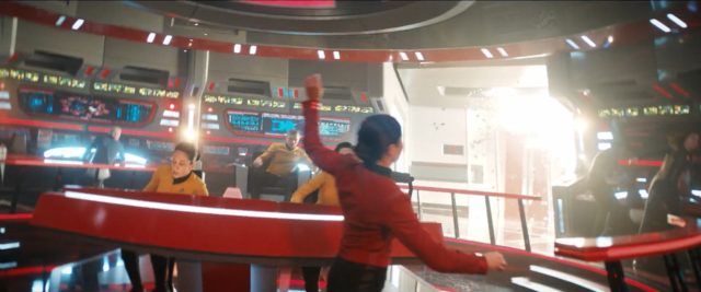
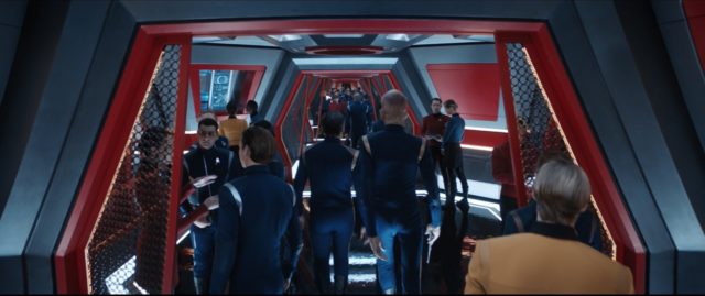
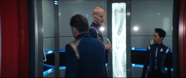
The most buzzed-about new set for the two-part finale of Star Trek: Discovery season two is undoubtedly the bridge of the USS Enterprise. We’re taking a look at the design process behind the new take on the iconic ship, with more images and video of the bridge and the other areas of the Enterprise we saw in part one of “Such Sweet Sorrow.”
Designer discusses Enterprise bridge
Discovery production designer Tamara Deverell spoke to SyFyWire and StarTrek.com about designing the bridge set. Here are some of the highlights:
Work started back in season one
I actually started designing the interior of the Enterprise in season one. There was some thinking that the writers wanted to [use those interiors] earlier, but then we revealed the Enterprise at the end of season one. Starting the design work way back then … was a good thing because when we came to the end of season two, they actually had concept illustrations and most of the bridge of the ship worked out.
Authentic TOS buttons were used for the controls
We actually got some reproductions of the original buttons on the console, the same exact size and color, and we used those as the basis of our buttons.
The buttons came from huge TOS fan and owner of the Official Star Trek Set Tour, James Cawley:
Wow! Do these buttons look familiar? They should! James sent hundreds of buttons to the @startrekcbs production team last year for their version of the Enterprise bridge for Star Trek Discovery!
Come see our buttons @startrektour ! https://t.co/y1EYEEfAay pic.twitter.com/Q4szB4rSH7— @startrektour (@startrektour) April 12, 2019
Getting that TOS orange-red color just right
There is a distinct “Enterprise Red,” I actually took that color from the CBS archives … and it was orange! In certain episodes of TOS, the red became more of an orange. I went insane looking at different color tests. It is red. But, in canon, it’s also orange. In the end, I think it was fine and everyone was happy.
Respecting the classic design
I wanted to echo and be sensitive to The Original Series, so we were looking a lot at the original bridge and its geometry and where everyone was sitting. Still, while we remained true to the design, there’s a new methodology. It was exciting, yes. Terrifying, a little bit, for sure. You can’t worry too much about the history of Star Trek when you work on stuff like this. You can only look at canon and try to follow it with our vision and our Discovery world in mind.
It was a new set built on an extra soundstage
The Enterprise set was completely new, we got a new stage and away we went. There was not one single element of it that was reused. What you’re seeing was really there.
Watch: The Enterprise Bridge
CBS has released a new video today, with Rebecca Romijn and Anthony Rapp speaking about stepping on the bridge of the Enterprise.
More images of the Enterprise bridge and interiors
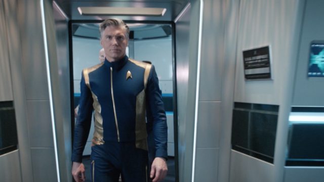
While it’s hard to make out from a still frame, the dedication plaque says “Starship Class” just like on TOS.
Star Trek: Discovery is available exclusively in the USA on CBS All Access. It airs in Canada on Space and streams on CraveTV. It is available on Netflix everywhere else.
Keep up with all the Star Trek: Discovery news at TrekMovie.

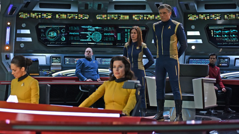
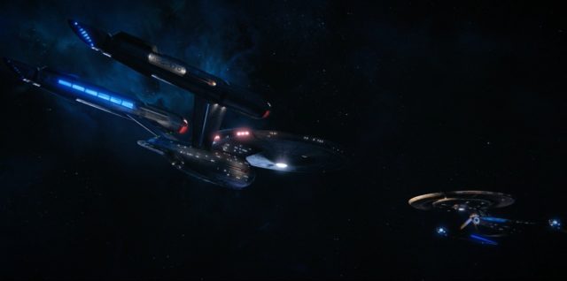
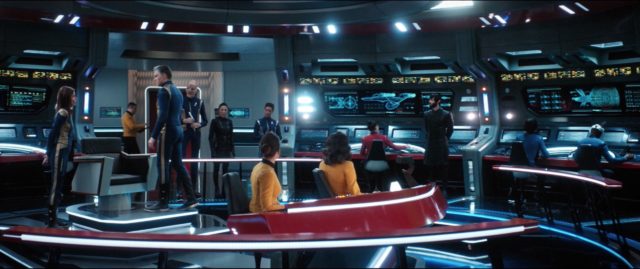
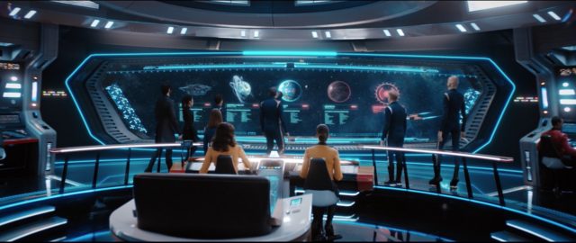
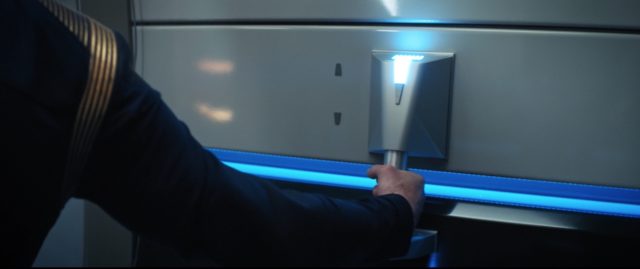
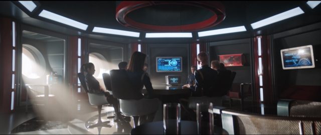
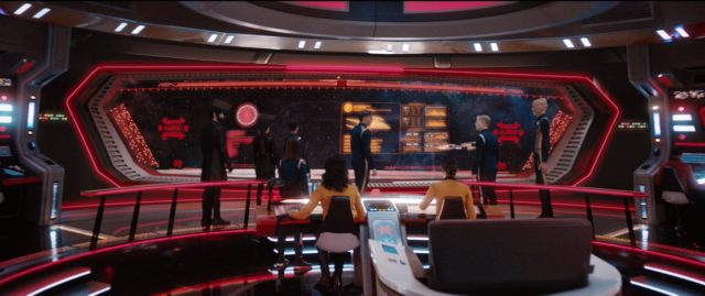




The fact that the Enterprise bridge set is not a redress will fuel a lot of speculation.
Why? Because everyone wants a Pike show or something else.
Regardless of whether or not we get a Pike series, if DSC did nothing else right, the Enterprise inside and out was a beautiful interpretation of the classic. The effort spent on the sets is very well appreciated by this fan of Star Trek.
Only among those wanting another show on the Enterprise.
Which is EVERYBODY!!
Speak for yourself….
Okay – _almost_ everyone.
Well said.
Which is a lot of people.
And includes me!
Me too!!! Bring on Pike, Number One, Spock.. and apparently even Colt!!
That is a better statement.
Hell yes. Pike, played beautifully by Anson Mount, saved Discovery and maybe the future of Star Trek on Tv. He represents the true vision Gene Roddenberry Trek.
L.p. is it just me but Pike being played by Ansun Mount reminds me of Pike in the Kelvin timeline in the movies? This guy brings a lot of depth to this character and makes you feel like you know him already
They can use it as the bridge of any starship. It is beautifully done, what the Abrams movies should have leaned towards. The quality of sets, effects, fight choreography, all of that production stuff has been mind-blowingly good.
The abrams movies were set in a different time line and it is possible that the designers of the enterprise in the different time line may have preferred blue as opposed to red. The original designers prob never joined star fleet or designed another ship and tech obviously progressed at a faster pace
Personally, while I was not a huge fan of the KU ship designs, (The Kelvin bridge itself I thought was REALLY good) those films were essentially reboots so the changes didn’t bug me at all. Easy to get past all that. Discovery, however, keeps telling us they are prime yet look more like the KU than the KU does!
If only the writing was a fraction as good! Instead it is like the CW in space after school special. I agree that the aesthetics are very well done. Props to the production team for that. It isn’t really what the show needs though to be embraced at this point.
I don’t find anything wrong with the writing to be honest.
It’s nothing like you described.
I disagree and here’s why:
The JJverse enterprise is a totally different enterprise that was never meant to look like the TOS original. It was meant to have some loose callbacks but it’s in no way the same ship. It’s a ship built in response to the Narada threat. There were some cut scenes and changes to the movie’s script, but essentially that ship was never meant to be anything other than loosely inspired by the TOS constitution class vessel were it built for different reasons (in response to a threat as opposed to just an evolution in space flight). It’s way bigger, and totally meant to be different. Personally I like the design of it for it being a different ship.
This is actually supposed to be the TOS enterprise. And I love it too. It’s definitely what the prime universe constitution would have looked like, or at least really similar, were the same designers and set builders building it today as opposed to the 60s.
I appreciate both designs with the understanding that they weren’t ever meant to be the same ship. One is a design that’s supposed to be an actual update of the original, the other is a ship loosely based on the original. And I’m fine with it.
The enterprise wasn’t completed the same year in the kelvin timeline as it was in tos so Spock was an instructor at the Academy and you never get that first mission with him and Pike. Number one was working aboard another ship imo. Yeah, the fact it looks different makes totally sense because it isn’t even the same ship. Just like the characters, the kelvin enterprise is her own unique ship influenced by the tech of that reality just like her tos counterpart was the result of events and influences from that reality.
This bridge looks a bit like Abrams version, but with a tos color scheme that I’m not even sure I like. I think neutral colors are safer than making it look like Saturday Night Fever. I don’t find dark bridges and contrast too realistic for what these people do there. I do get the vintage quality to it, but tos sets were the cute 60s flavour of what they thought looked futuristic. It was fun but it was the freaking 60s. Ostensibly trying to have the same thing now is illogical. Nice nod and all for those who care but it shouldn’t become the rule.
They look nothing alike to me. Abrams bridge literally looks like something from another universe. If he went just a bit more in this direction, I think more TOS fans would’ve liked the movies a bit (just a bit though lol).
Not me lol I prefer the look in the movies as I find it more polished, easy to the eyes and better quality design overall. I truly had no issues with it (and I have no complains about discovery as a ship either) I really don’t care about nostalgia, I prefer plausibility and creativity so I’m glad he went on another direction. I doubt those tos fans would’ve liked the movies more if the bridge looked like this, but I wouldn’t design sets according to what those people want anyway because it would be a waste of time.
I’ve wanted a Pike series since the first JJ movie. Anson and Ethan as Pike and Spock in a series would be awesome.
They can build sets and take them down just as fast. It means nothing.
it means they decided it was worth building them. For one episdode that ende up being two? Could be. But no other bridge so far in this series was built for a single use. Shenzhou was featured in the 2-part pilot and the Mirror universe segment. It was then redressed (and heavily modified) for the Section 31 ship, that was used in a handful of episodes this season and could still be getting a spinoff. And, of course, Discovery’s, featured in all episodes but the first two. So, if they built a whole bridge for 1 or 2 episodes only, that would be a first. Not to mention they had a meeting room built as well, and a turbolift. That offsets a lot of costs for a possible spinoff (we would still need at least sickbay, engineering and maybe a rec room, at least), and would allow for telemovies and/or Short Treks right away.
^^^^This
You know I’ve been thinking about those titles that CBS trademarked last year and Star Trek Destiny kind of works for a show focusing on Pike, Spock and the Enterprise…
They had no other choice but to build the set. It’s not like in TNG where they can just Kitbash a cheap bridge set in a day or two.
Even TNG built a partial Enterprise bridge set for that one scene with Scotty.
I have said from the beginning that this is headed toward a reboot of TOS.
This is my favorite thing about last night’s episode. The Enterprise bridge looks amazing! Good job to the designers and crew. They did a awesome job.
They really did. They also did a very good job with the featured crewmembers; they all seemed like people worth seeing more of.
Excellent insights in this article. There is something about the color red on the bridge that instills a unique energy to the bridge. Red alerts seem to become redder, for example.
I think the amazing quality of the reds on TOS owes to how they put some white light in to keep the red from flattening everything. TOS had great contrast with very rich blacks, which is something you don’t see much anymore in this post-Kodachrome era (not saying TOS was shot on Kodachrome, but I shot Kodachrome and TOS level contrasts is what I strove for on my zero-budget space epics.) In fact I think the Berman shows suffered from not handling alerts and intense colors right too (except for maybe TNG s1 & 2 — people complain about those seasons, but they at least had a sharpness that was in the right direction.)
Even when they’re in crisis alone without the red, like DAY OF THE DOVE when Scotty calls Spock a Freak, the lighting is just awesomely expressive.
As a graphic designer I loved the insight into the color research, since I know the effort that goes into color accuracy.
It looked Perfect. Exactly how I imagined it would. Stellar.
Haven’t seen the episode yet, and will probably refrain from commenting until the podcast thread. Still, am pleased to say that I’m prepared to eat some crow — not a full portion, perhaps, but more than a crow drumstick — regarding my initial negative impression of the Enterprise bridge set. Still way too many neon strips and other lighting to glare in your face, still too cluttered with bogus details that don’t add anything useful to the design, and the shiny reflections on the floor just make it all look more busy and uncomfortable as a workspace. Still, as an update of the TOS bridge into DSC’s aesthetic, it’s not bad, and infinitely superior to the Kelvinverse Enterprise iBridge.
(And, of course, the best-looking thing about that bridge: Rebecca Romjin. Hot damn.)
Interesting, too, that James Cawley and New Voyages provided TOS references for the DSC people. When I worked on NV about a decade ago Cawley told us a pretty funny story about his experience seeing the J.J. bridge, which I hope he won’t mind my repeating here. “I was on the Paramount lot for a meeting when I encountered J.J. Abrams, who offered to give me a tour of the sets. Naturally, I was eager to see them, but when he brought me onto that sound stage it was like I’d been kicked in the balls. J.J. was like a kid all eager to show-off his new toy, and when he turned to me and saw my expression it was like someone had kicked him in the balls. I told him that I thought it was a beautiful set, but for me it was just not the bridge of the Enterprise, and never would be, sorry.”
James, if you’re reading this, I hope you found this one more to your liking. :-)
The Enterprise bridge is incredible. I want to be on that ship!
sounds to me like JC and JJ should stop kicking each other in the balls…
the starship Discovery will be thrown into the future and the crew will return and get a Constitutional class starship named Discovery and the set gets to be used with maybe a different paint job.
Yes, this, exactly what I think.
Ties in with the abandoned Short Treks ship.
That’s new and interesting. Not a bad idea. Unfortunately the bulk of the bland characters that permeate Discovery will be there too.
…mehhhh, IDK. I don’t ever recall a Conny named Discovery in Star Trek canon. This might be a hard pill to swallow for devout Trekkers. Casual Trekkies, on the other hand, would probably eat that up.
I happened to catch “The Squire of Gothos” the other night. Kirk asked a crewmember to “notify the discovery.” The intent was probably for him to say “notify STARFLEET OF the discovery,” but I’d accept this as enough evidence of a “Discovery” during TOS. :)
There’s stuff in the role-playing games published over the years -= FASA’s material in particular – suggesting that a Constitution-class Discovery could have been built at some point. Not canonical, true, but they’ve already briefly played with FASA material for Talos IV’s appearances.
The original 12 Constitution Class ships were named in the TOS Writer’s Guide, but no one seems to have taken that seriously, including the third season producers when they gave us the Defiant. So it’s a moot issue at this point.
I’m a devout Trekker and/or Trekkie. I accept it. I also accept Michael as Spock’s sister bc I understand things happen off camera. So, whether or not you do recall (makes you seem like a Casual Trekkie there) the powers that be can make that call and “devout” Trekkers will accept it as they always do until Discovery.
As said before, as a devout Trekker I can accept Spock having an unmentioned adoptive sister. I just felt it was a bad creative choice. Never claimed it was a canon violation.
It doesn’t have to be a Constitution class ship. No more than the Reliant did.
We don’t have the names for all 12 Connies in canon.
I consider myself pretty hard core TOS Trekker. And I would have no problem with a Constitution Class Discovery. It’s only canon if it appears on screen, technically. Other non canon sources have listed the 12 Connies, but they have not all been con screen.
There was that display in Commodore Stone’s office in “Court Martial”, although it doesn’t specifically go into whether those are just those at Starbase 11 or they represent all Constitution-class ships.
I do not recall such a display. But Kirk did say there were 12 ships of the Constitution Class. We’ve only seen or heard of a handful.
Nope. I think they’re going to hit the future and stay in the future. Then they don’t need to build all new sets, and can give the show a clean fresh start, and hence why Spock never talked about Burnham and why Pike is not coming back next year. Also think Calypso — Disco is waaaay in the future and was still captained before being abandoned. I’ve been thinking this is the case for the past couple of weeks since we started getting into the red angel stuff, and if it’s the case it will have made all of this worth while, and i’m very excited about it.
Nope.
And I was thinking Calypso when I posted this.
I still didn’t like the huge, wall sized, view screen, and I wish there were fewer touch screens, but those are minir nitpicks. Over all, I loved the new bridge.
Fewer wall lights in every direction you look would have been good too.
It makes no sense that the viewscreen wouldn’t be the entire wall. And likewise the touch screens. If modern airliners have touchscreens all over, why would a starship 300 years from now go back to buttons or viewscreens smaller than today’s TVs?
I can’t speak for tech 250 years from now but when NASA handed out contracts to design for the now defunct Constellation program they opted to NOT have touchscreens in the capsules.
Yes, I’ve said this elsewhere but is appropriate to say here. Given they were restrained by the new (rebooted but not rebooted) Discovery aesthetic, what they did with the Enterprise bridge was pretty darn good. I said the same thing about the outside design when we saw the Enterprise show up in last season’s finale. But I think it could have been a lot better had they not been beholden to the Discovery aesthetic. And no, that does not mean a 100% duplicate of the ’60’s sets. I mean something that can evoke the feel of those sets but still have a modern take on them.
That bridge does look very nice. It could maybe be a bit brighter (less Discovery-ish) but all in all, it does look very nice.
I’ve been wishing the lights were turned up for all 28 episodes of the show so far.
I have to admit, it’s the first set from any new Trek’s done in the past ten years that I thought looked great and yes a modern take on the old sets.
Why would you ‘hate to admit’ that you liked something?
Somebody’s doing some Freudian-slip-style misreading.
Nah, just a misreading brought on by a pair of eyes six decades old that were never all that reliable to start with. Sometimes a cigar is just a cigar.
This really was a wonderful interpretation of the Enterprise.
It’s a pretty set and all, but I have difficulties reconciling it with the TOS bridge due to the vastly different dimensions. In all of its incarnations, the original Enterprise’s bridge was a much smaller, more cramped space than this is. The Captain’s chair is supposed to be directly behind the helm. The ultrawide viewscreen doesn’t help things, either.
And the dimensions being different really is a killer. That was the one thing that remained consistent between TOS, TMP, Wrath of Khan and Search for Spock even as the bridge’s color scheme underwent major changes.
It’s still Discovery. ;) ALL their ships are pretty big and spacious. I’m not surprised this one is the same. I don’t mind it personally but I can understand why others might.
Yeah, I can’t believe all the praise this abomination is getting. There is still ZERO good reason to even bring the Enterprise onto this show…just let Discovery be its own thing!
Cause although I watch Disc , it’s still in trouble and by far the worst of all trek series. They need to do something to save it. And even the guest actors and characters like new Pike , Spock and #1 are better actors and far more interesting than 98% of Disc. Saru and Tilly are the ONLY ones worth a damn.
That is true. They needed something to bring in the subscribers they DIDN’T have last season. Hence, Pike, Spock and Enterprise. I still wonder what this show will do next season without them. It goes back to the bland crew from season 1 unless they are planning more surprise guests from established, and more popular Trek shows…
Not even the Sisko can save this turd of a series. What they did to the Enterprise is a crime.
Because those who praise it don’t see it as an abomination?
Oh no, someone likes something you don’t.
I’m not a fan of the extra square footage either. Nor that little mini hallway from the turbolift out to the bridge proper. There are elements that I like and glad designers incorporated but I concede that it has to fit withing the existing Discovery aesthetic more than it needs to evoke the feel of the previously established era producers claim their show is set in.
The weapons on Pike’s Enterprise are LASERS(like Lost in Space!), not Phasers at that point in time! The new show better get THAT right! – same with Discovery in the same time frame!
Nobody cares.
We haven’t seen this point in time, the Cage took place two years earlier so those that enjoy the minutiae can assume that phasers were installed on starships shortly after Pike’s mission to Talos IV.
That ship sailed with Star Trek: Enterprise. You’re late to the party.
How so? That show did a great job at paving the way to what we got in TOS. They called their weapons Phase pistols and the shipboard ones, Phase Cannons! One can easily see how 150 years later they became what we saw in TOS. Nothing in Discovery feels that way at all. (Except for 10 years rather than 150)
I loved all the little details like the trapezoidal alert light between helm and navigation. The “Sulu scope” was there. The grill shadows across the turbolift doors. The general shape of the captain’s chair, the railings, the shape of the outer ring consoles were all in the spirit of the original. I’m sure I am missing a bunch more. Bravo Discovery team!
Glad you brought up the Captain’s Chair. I loved it and it was nice that it is duplicated but it is one thing that just doesn’t fit in the aesthetic at all.
The chair got a subtle update. It’s still got those Danish Modern wooden armrests, but the control surface is a wraparound white U-shape with small displays where the buttons used to be. Feels like there are many nods to Scott Chambliss’ designs for ST 2009, but nicely integrated.
I love this incarnation of the helm console, a nice nod to the Cage variant but with the color update of the post-Cage era. And the bridge stations have those ‘arcs’ of controls.
It’s easy to look at this bridge and imagine a few updates to take us to 2265 in the show’s aesthetic, in terms of even more simplified and streamlined shapes, less bulky massing, more subtle lighting etc – but I say this not to diminish the great job Deverell and her team have done.
I think there would have been fewer complaints had the Discovery bridge looked more like this. This is spectacular.
My problem with Discovery is less with aesthetics and more so with character development.
One of the parts that stood out to me in “Such Sweet Sorrow” was the roundtable of bridge officers discussing solutions. Regardless of the inane technobabble, it was reminiscent of classic Star Trek. It was not focusing on one individual.
Some have criticized the moment where Stamets and Culber “kinda” confront their relationship in a very tense moment of separation. But to me, again that was Star Trek. They were being separated by choice, duty, circumstance, whatever, it was still a character development moment…. and it made me empathize with them.
And that is what Star Trek does. It has never focused on one character, it develops all primary characters. It creates a connection between the primary characters and the viewer.
I have no such connection with Michael Burnham and that is my complaint, not aesthetics.
Yeah , Burnham really hurts this show. A new Pike series (with new Pike , Spock and #1) , this great new bridge , somehow save Suru and Tilly… Stammets too maybe but not his partner. Throw everything else out , develop a few more good characters and then we might see some truly great Trek again. Without the guest actors on Disc now season 3 isnt going to be any better than season 1 was
Mirror Georgio and this new Section 31 show coming could be great too. Maybe with some better writers and Frakes directing as many as possible.
I wouldn’t bring anyone from Discovery over to a Pike Enterprise show with the exception of Jett Reno. She should be their chief engineer.
I’m with you and not with you here. I agree that I would prefer good characters over good sets. While the sets were nice and looked good they did NOT evoke the era they were supposed to be in. However, if we had great characters the set problems would be very minor. They wouldn’t go away. They would just be minor.
Sure, the Culber-Stammets relationship talk while there was a crisis with a ticking clock going on was a nice character moment. (except I still can’t accept that Culber is Culber which pretty much takes me 100% out of the moment) But it was TOTALLY the wrong time to do such a thing! Can anyone imagine Bones complaining to Kirk about something as petty while the ship is at crisis? No way no how. Even Tom Paris wouldn’t use a critical moment where time was of the essence to hash out some relationship issue with B’lanna. It just felt wrong for two professionals to act that way. Which also took me out of the scene. One of them should have said, “Really? You want to talk about this NOW?”
But that is also the thing about Discovery characters. There are so many issues that I get taken out of any meaningful moment for nearly all of them. Trek is about the people. This is something Discovery has totally missed the mark on. Which is unfortunate.
TNG also missed the mark when it came to characters. But they made up for it with the occasional good piece of sci-fi writing. Again, something Discovery writers have had a very difficult time with.
I don’t recall the original precisely, but thought red. In my initial work in ancient (90s) computer video, I was advised to stay away from red, as it was very tricky to do justice. So, this episode…I see red, Georgio enters and says, “ugh, ugly orange”. I laughed.
Good looking bridge. Only a minor problem I have, and that’s the super shiny floors and the lighting along the edge of every surface. Reminds me too much of the glossy, overwrought sets on cable news programs.
But I dig the retro Sixties bits incorporated into the design. Nicely done.
As so many have said, this is such a beautiful interpretation of the TOS bridge. It remains true to the spirit of the TOS bridge, unlike (again, as has been pointed out) the JJ bridge.
And yet the JJ bridge was much easier to accept. Why? Because that was a reboot!
This is amazing and I wish we would see more of the set. So much better that jj’s Apple store.
Not sure it was worth the colour-matching given that the end result looked nothing like the interior of an old multi-screen cinema rather than Minority Report, and the original bridge was a bright and cheery grey workspace not a gloomy space full of health and safety tripping hazards due to poor lighting.
Poor lighting? Where?
All over. Do you not see how dark the Discovery show aesthetic is? Not just in tone. But in lighting.
Now that is how you update 60s design for the modern era! DSC designers I salute you!

Wouldn’t it be something if the new ‘Picard’ series has all been a ruse and Discovery ends up in his post TNG era with Picard as lead for season 3? Stranger things have happened…..I have often wondered how exciting a new Picard series could really be, but if they tied in Disco in the 24th century they could use a bunch of actors from TNG, VOY, DS9, and they’d all be about the right age. Really tie up all the series (except ENT)
I doubt that Patrick Stewart would agree to return to TREK only for Picard to be a guest captain on the Michael Burnham show for 1 season.
This is how bad things have sunk when I would actually welcome a bore like Picard to take command of Discovery. At least Stewart has charisma and we are pretty sure he isn’t the MU version.
I would be so in for this.
The oddly anuglar screens are just not practical (not talking about the viewscreen). Keep the angles at 90 degrees.
I’d watch the TMP era movies then. This bridge also borrows from them.
I had a quick glance at the various bridges and the screens are predominantly rectangular or circular. No odd impractical angles. The consoles might be angular, but they have pretty much a fixed button layout, so that’s a slightly another story.
That color looks nothing like orange. If anything this particular red gravitates towards the other side of the color wheel (purple rather than orange). I’m not complaining about the look achieved, it’s simply NOT orange.
J.S. we can’t tell what colour it is from a screencap on our mobiles or a production still.
What I’m seeing depends on which device I’m using and what its settings are.
This is the whole issue Deverell was getting at.
The Enterprise red-orange colour is particularly variable dependent on the lighting, but also the recording media and what its looked at on.
What colour it was originally in reality was not how it appeared on film and then it was further changed by video transmission and people’s TV sets.
I suspect Deverell was trying to make sure that she got it right in reality and on HD….
Not to forget, back in the 60s shooting on soundstages tended to use far harsher lighting setups than is common nowadays. Camera technology got more and more sensitive over the years, which enabled filmmakers and TV show producers alike to shoot in darker and darker conditions without loss of image quality – not to mention that this enabled more creative choices about when and where to shoot, and how to light.
In the lighting that was used in the episode, on several screens that I saw either the episode or the stills it looks nothing like orange, and even the peeping at RGB color values can prove that. That’s why I was put off by Georgiou’s comment about it being “orange”. They might have tried to make it orange but in the lighting used it looks nothing like orange.
love the pic of the bridge crew tossed to one side by enemy fire or turbulence (?).
classic OS move.
Trek’s long-term, Sci-Fi & visual design reached rare, iconic success. People so positively influenced that they became engineers & scientists. I ended-up in animation, set design & video game gigs. So I’m glad to see this great work /dedication continued in this production set. ..HOWEVER..
*The Starfleet uniforms are terrible.* Give the designers freedom to craft bold, iconic uniforms. The current uni’s are not futuristic;
they look contemporary, like chic Nike exercise or UnderArmor athletic gear.
HOW does a massive project, of a legendary & trendsetting production, manage to reboot bold adventurous characters by deflating the forward thinking designs that were the ethos of Trek’s visual success?
To the point that their style defined much of the show’s tone as a cultural icon?
Ok- we know the Legal department will not allow them to make classic Trek uniforms, but it’s NO reason for these corny “zip-up excercise-coverall fashions.”
C’mon.
Evoke some (even a tiny bit) of that TOS style which embodied [pardon the pun] the sense of strong contrasts of dark, mod punky pants & boots, contrasted against great textures & colors that represent the character’s station or assignment, etc..
The current uni’s project NO forward thinking, nor does it evoke the classic “Boldly Go” that set an expanding tone for every Trek series.
The Fans & the Star Trek phenomena deserve better.
“Ok- we know the Legal department will not allow them to make classic Trek uniforms, but it’s NO reason for these corny “zip-up excercise-coverall fashions.””
This is flat out false.
Some Speculation – maybe the upcoming Section 31 series has the Enterprise in it?
The Section 31 show is still not greenlit. There is no date for season 1. My guess is that it has been put on the back burner because CBS as soon as they saw rough cuts with Anson Mount’s Pike that they started considering a Pike series then. All Section 31 stuff slowed down, and they broke the finale into 2 parts at that time.
They are probably gearing up for Pike series, and Section 31 might be in that (probably would), but the Section 31 show is likely not happening.
I would hope Kurtzman would put the brakes on the S31 show and focused on Pike instead. I just woldn’t bet on it happening.
Yeah, I have a feeling they might mix the two shows. The problem is they want Michelle Yeoh for a lead role and I wonder if they could consider or if it is possible to have two leads with Yeoh and Mount together or would they just relegate Mr Mount to a recurring role.
Michelle Yeoh really stinks up the place. Her “acting” is wooden and amateurish in tone. I’ve seen high school plays with better actors! Get her off the show and NEVER allow her to star in a new Star Trek series.
Sheesh, just how stupid are the producers?
“You can’t worry too much about the history of Star Trek when you work on stuff like this”
More clues that the idiots are in charge of the franchise and don’t give a crap about it at all.
Baxter, Deverell is not an idiot. And she absolutely does care.
You are cherry-picking to validate your prejudice.
You’re taking one comment – wherein she’s saying that at a certain point she has to do her job and be a creative and not let herself get too bogged down in researching the production archives.
Basically, she’s saying that she cares a lot, and had to rein in her perfectionism while ensuring the new bridge respected canon
Deverell watched TOS in first run, and it helped shape her as it did many of us. She has spoken about how its images shaped her childhood dreams and nightmares (Talos).
She wouldn’t have sought out evidence of the original colour or reproductions of the plastic buttons if she didn’t care.
And yet isn’t she also the source for the latest ‘cardboard’ reference to TOS?
Yup, kmart she did call them cardboard.
Because it’s a fact that they were made of cardboard.
She’s done the research. And she’s honest enough to put it out there. She’s challenged her own nostalgia about those sets.
Deverell’s noted that cardboard was inexpensive worked for black and white and early colour low definition but would be unacceptable to today’s younger audience. It also had durability issues.
Discovery’s bridge and corridors, which were designed by the original production designer have wood cores and wood framing. We’ve heard that they’ve also had durability issues.
Rumour (or leaks…) about the new Enterprise bridge is that she had it built with a metal frame.
She clearly has high expectations for what they put on the screen.
Isn’t that the attitude we want for a franchise to endure another 50 years?
No, it’s not a fact they were made of cardboard. Plywood, yes. That said, the assertion about cardboard sets on TOS has been an enshrined as a bit of false hyperbole for ages now. Repeating it doesn’t mean that Deverell didn’t love the show growing up, or that she didn’t do the necessary research to perform her job.
I was about to say the same thing. They were NOT cardboard. They were backed with plywood. The same thing the Discovery sets are backed with. This falsehood seems to be as prevalent as the incorrect cliche of “Kirk was a space horndog”.
I think they care. They just don’t get it, though this bridge shows they get some things. The design is pretty close to perfect. What they don’t get are the philosophical underpinnings of a trek story. If they can wrap their head around it, they can fix a lot if what is wrong with discovery. Nothing they can do about annoying characters at this point though. Every trek had one or two but Discovery has really forged an identity based on bad characters nobody likes (excluding Pike and Saru).
Thanks Trek fan…
It sounds as though they get part of it – positivity, science-based solutions, characters drive story…
But haven’t really listened to Roddenberry’s critique of 1950s TV and his motivation for creating Trek…
He very specifically said that he was tired of writing for shows where the last 10 minutes were always a gunfight.
He wanted to create a show where the problems and solutions weren’t always rooted in violence.
It’s as much a problem in the era of peak television as it was in the 50s.
So, Trek can and should stay true to offering something else.
Yes, sometimes Trek historically has gone there, but not just for a weekly quick, cool hit of sensationalism.
But season 2 of Discovery has had as many skirmish or horrific death endings as not.
Note to TPTB – no more than 25% of episodes should have violent or horrific the key dramatic moments.
Otherwise we stop believing that the crew are looking for other solutions.
Right. It isn’t star wars. I like star wars and space operas in general but that isn’t really what trek is about. trek had us reflect on our human qualities while pondering various possible futures. Religion, politics, science, diplomacy, and ethics were dealt with fairly regularly during various challenges faced and interactions with the wider universe. I hope they can get back to including these characteristics. There have been hints of it here and there. The planet with the community that was moved by the red angel and their aversion to tech, or the debate over Ripper and it’s value to the mission versus the value of life itself. These examples are few and far between though. Unfortunately.
Just who are you to speak for everyone, i.e. “nobody likes”?
I’m just a guy. Perhaps I was lazy articulating my thoughts. How about characters most long time Trek fan’s dislike? Or perhaps even more accurately, every trek fan I know personally which is an admittedly small sample yet nevertheless very passionate group? I am fairly certain the dislike extends beyond that though based on rotten tomato rankings and countless other online reviews.
Maybe going forward it would be best just to speak for yourself, and what you like.
It’s called hyperbole. Where one exaggerates on purpose to make a point. It’s quite common and quite easy to spot.
I love that they even got the sounds of the original bridge right. Noticed it immediately and actually got goosebumps. I think Discovery is one of the better Trek iterations so far and I really want more!
Abrams Enterprise bridge looked nothing like TOS. Plus, with added overhead desk lamps at every station the set was blinding,and not as aesthetically pleasing as the Discovery series Enterprise.
For some reason my favorite part is all of the bright lights running along the top of the stations. I’m not a huge TOS fan, but I’m glad they put those in. It also reminds of how more color was added to the NX-01 bridge during the last season of Enterprise.
So when we first follow Pike from the turbolift to the bridge, it seems there is a hallway or open area to the left and right of the turbolift going behind the bridge duty stations. I remember this was a thing seen in the blueprints, but never shown on screen. IF those areas are indeed access to behind the bridge stations then that is extremely cool.
I also think there are too many lights, but other than that this is an amazing bridge set.
Yes, there’s definitely a hallway, at one point there’s even a yellowshirt walking into it.
Hopefully there’s an emergency stairway hidden behind one of those walls. It was a design blunder that the TOS bridge could be blocked by one malfunctioning (or sabotaged) turbolift.
I think the updated bridge set looked amazing. I also appreciated the offset turbolift placement, even though it STILL makes no sense related to the outside of the ship. :)
Here’s hoping we see more of this marvelous set in future seasons (or on other iterations of the franchise—hint hint!)
I still like the idea that the lift travels a short distance to the left, then down, to justify the bridge facing forward. In fact that has to be the case in this situation, given the “window” on the exterior CG model.
I remember when Trek Remastered was being discussed on these forums, and there was one guy who couldn’t get over that they didn’t show the offset in that really cool shot establishing Pike’s bridge.
Since the 2009 etc. movies, the interiors and outsides of the ships have little to do with each other.
Also on the blueprints was a head. Which made sense to me and I understood why it was overlooked on the show. ;)
Seriously would a future Star Ship not be an organic self-healing Artificial Intelligent Craft that instead of the inhabitants connect to all and every device on the Ship via the Helm but a completely open area with no light distractions run by telepathy, minimal controls and with semi-transparent walls to provide total visuals to the outside deep space. If you want to at least break out of light speed it would make sense that the place we imagine would be our destination in a microsecond with no inertia.
Would’ve preferred grey floors and better lighting, but I loved the homages.
I love when Georgiou goes “orange? yechth.”
Especially when it doesn’t look orange in the lighting that they used…
EXCELLENT episode! Very happy to see the Enterprise bridge.That’s how you modernize the looks without disrespect to the past. That’s hoylw I’d like to see the Enterprise in movies … I’d very happy to see a Cap Pike/Number One miniseries, it would be awesome.
The past was totally disrespected and shat on.
Wasn’t the Pike-era bridge predominantly greys and blacks? The red/orange was a Kirk era thing. I know the Enterprise has just been in for repair, but I think I’d prefer the more understated – almost Star Wars Imperial – feel of the bridge (and corridors) in The Cage. Somewhat easier on the eye.
I tend to agree, though I could argue it either way.
This bridge is still predominantly grey and black. The railing is really the only splash of color until the ship goes to red alert.
Looked kinda cool but it also looked cramped and dated compared to Discovery
It reminds me of the bridge of the Enterprise-A in ST: TUC.
Love it! But at the same time, it is kind of cruel to put so much effort in creating the Enterprise bridge and not giving us a Pike series.
Yes, though with the exception of the single offset turbo lift that bridge was actually closer to the original than this one. But of course this bridge design also had to tie-in to the established DSC aesthetic, which it does quite nicely.
I loved how they updated the bridge, I wish they did that for the kelvin films
PLOT TWIST:
The Picard series is set on an old Constitution class starship!
#whatatwist
The Picard series will be shot in California while Discovery is shot in Canada. So they would need to dismantle, ship and rebuild the set if they wanted to use it on the Picard show.
It was a joke
I love Star Trek. Can’t wait to be able to watch this new take
Love the new interpretation of the Enterrprise bridge. With Captain Pike, Spock, Number One, and the Enterprise along with its interiors, we just have to imagine what a Pike spin-off would be like.
Why is it that all the bridges that I’ve seen from Discovery remind me more of a set from Tron than from Star Trek? Even with the Enterprise, take out the handful of TOS elements they threw in, and it’s all black with blue and red neon outlines. Nothing like anything else we’ve ever seen in any incarnation if Star Trek. And I hate that it’s an actual window that spans the entire width of the bridge rather than a more centrally focused view screen. Doesn’t fit in cannon at all.
Yes, thank you. I was just thinking that it looked like Tron threw up in here.
There are too many lights in the wrong place. Impossible place to work.
TMP got it the most right-Illuminated work surfaces with even Mid- to Low- key general lighting.
They did an amazing job creating a “new” TOS Enterprise. When I watched Part 1 on Thursday I was awestruck looking at that bridge. I too, hope to see an episodic Pike/Enterprise Series come to fruition.
It looks terrible with only the slightest resemblance to the original. The people producing this show continue to arrogantly shit on everything that came before.
The bridge set is simply fantastic. First thing I noticed was the integration of the colored light panels just above eye level which really nails it down for me. Yep, this should have been the bridge for the movies. KUDOS to the design team. They got it right and this is coming from a purist.
Looks an Abramsverse bridge with a few TOS-esque doodads tacked on. And did they grease the camera lenses? Every light looks like a smeary glarey blur. Not impressed.
But it doesn’t have to look like the TOS Enterprise bridge, since ST:Discovery is an alternate universe. But couldn’t they stop the flares and glare? Or maybe my eyes are just sensitive to light.
>;>}
Your eyes and mind are simply demonstrating classical tastes, instead of an unhealthy love for bad visual trends that had overstayed their welcome a decade back.
What I would give for Amy Vincent to shoot TREK. Look at THE CAVEMAN’S VALENTINE sometime (it is often streaming), the picture quality is astonishingly clear and sharp and it makes everything so much more inviting and therefore involving, instead of having to look through what amounts to being screen doors, which seriously distances a viewer.
Really like the PD on the show overall, much more successful than the JJ films. Only criticism would be the use of led tape everywhere which may well date it to this decade.
I found it funny when the bridge exploded and there were rocks all over the floor. Why do they have Rocks in computers?
They came from the alternate future, Yesterday’s E, where they were everywhere, especially in Riker’s neck.
In jest, starships had geologists. When they explored new planets, the geologists collected rocks and stored them in the ceilings of the bridge.
I remember when I was a kid building a plastic model of the TOS bridge and having to mix the old Testors red and orange paints to get the right look of what I saw on TV. It is funny that with all of today’s modern tech used to create the exact pantone and colour, they still had a hard time recreating the exact blend of red and orange needed to appear just right taking into account the lighting and post production effects. All and all, I think they did a great job with the colours and with the re-creation of the beautiful classic TOS bridge. Also loved the sound effects when they entered the bridge.