Star Trek: Discovery returns on Thursday on CBS All Access and you can now get a first look at the new title sequence. There are also some new promotional images available, giving you the best look yet at some wardrobe changes for season three.
Season 3 Title sequence
This morning CBS released the title sequence for the third season of Discovery on social media. Like with season two, the title sequence has been updated with some new elements. (Note for international fans: You can see it on Instagram)
Here is your first look at the opening title sequence from #StarTrekDiscovery Season 3. Stream it tomorrow, only on @CBSAllAccess. pic.twitter.com/GgxpNAwWSR
— Star Trek on Paramount+ (@StarTrekOnPPlus) October 14, 2020
New for season 3
In addition to the logo shown above, there were a number of changes and new elements added to the title sequence…
Dilithium crystal now colored red.
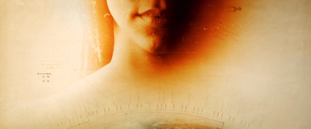
Michael Burnham now has long braided hair.
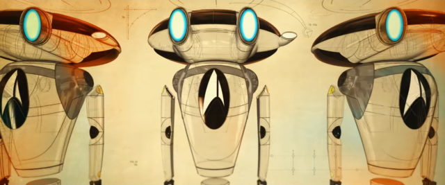
DOT-7 like robots.
A new (possibly 32nd-century Starfleet) phaser or pistol.
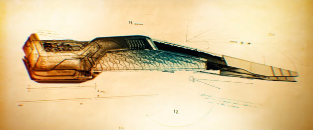
Cleveland “Book” Booker’s ship.
32nd-century Starfleet badges.
The wormhole used to travel to the 32nd century.
New season three images
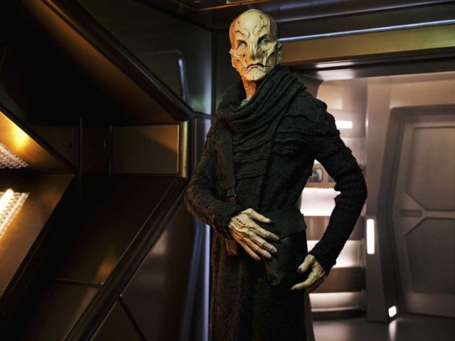
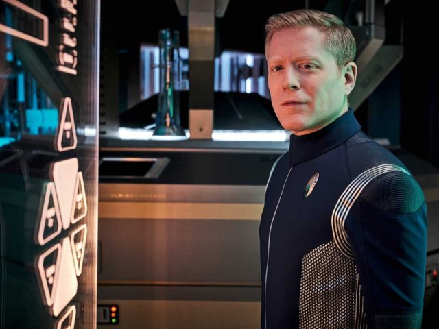
CBS has revealed 10 new character images.
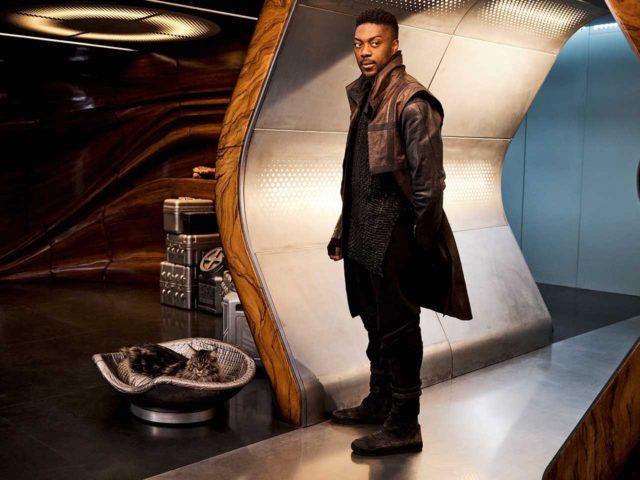
Michael and Book (and his cat) on Book’s ship

Sonequa Martin-Green as Michael Burnham (in civilian clothes) and David Ajala as Cleveland “Book” Booker
Discovery crew
New episodes of Star Trek: Discovery premiere on Thursdays on CBS All Access in the U.S. and on CTV Sci-Fi Channel in Canada, where it’s also available to stream on Crave. Episodes will be available on Fridays internationally on Netflix.
Keep up with all the news and reviews from the new Star Trek Universe on TV at TrekMovie.com.












And now she is even part of the titles.
Disco, for much you try to make us love Michael Burnham, we dont.. and the more you try, it makes it worst.
She is never going to be Picard, Sisko, Kirk or Janeway.. stop trying.
They should just make it official and change the title as well.
THE BURNHAM CHRONICLES
At least then it wouldn’t feel quite as much like a bait and switch!
Be nice!
I hate that I agree. And I hate how much I agree. I looked at the outline of the face in the intro and thought “oh, that’s cool. That’s new. I wonder who that is.“ And when I realized who it was I felt a cocktail of annoyance and disappointment. I don’t dislike the character, and I even like the actress, but neither feel strong enough to lead the show…which I also like. I’m hoping and expecting now that strange new world is on the way — with a traditional format, that DSC will finally find its identity.
Please don’t try to speak for the entire fandom it’s rude trying to insert your opinion over everyone eles’s thanks. ‘She is never going to be Picard, Sisko, Kirk or Janeway.. stop trying.’ She is to me i consider her to be one of the best acted and well written character in the franchise.
Please don’t try to speak for the entire fandom it’s rude trying to insert your opinion over everyone eles’s thanks. ‘She is never going to be Picard, Sisko, Kirk or Janeway.. stop trying.’ She is to me i consider her to be one of the best acted and well written character in the franchise and of course this is just an opinion of a life long Trekkie.
She has always been in the titles.
Warning for gatekeeping.
CLOSED
That title sequence is one big Easter Egg, love it!
Maybe we’ll get to see Ephraim & Dot and family.
I want to see some nice blue glowing space tardigrades like the ones recently discovered that have a protective coating against radiation.
Looking forward to it! The crystals are red now… I think I know why, but will wait and see without further comment ;)
Possibly silly question, but are those Dilithium (Trilithium?) Crystals or Time Crystals?
Not a silly question at all… My thoughts, ever since ep. #212, is that they are Time Crystals… this is of course just speculation on my part. I mean, we only have to scroll back up a little to see the label “Dilithium” regarding them, so it’s very possible I’m letting my ignorant hang out for all to see :/
I have no idea.
I thought originally that the green ones in the titles for season one were dilithium.
But when the season two titles doubled down on the green crystals, I assumed they were time crystals.
Now, I’m wondering if they are in some way related or similar structures since Queen Po and the Discovery team were able to use Po’s dilithium incubator to charge the time crystal.
Not a huge departure from previous seasons. Looking forward to it.
I had the same reaction Phil.
From Kurtzman’s comments when the new title came out a couple of months back, I thought that the main titles were undergoing a more profound update.
I like it though and the tweaks are consistent with the kinds of updates done over the first two seasons.
As for the content, I’m cautiously optimistic.
Oh how great would that be if they transformed the perpetual motion machine of dilithium back into a resource scarce on the frontier where you actually have to work for your energy.
No time for holodeck, we actually need to work for a living and explore the universe. Nice!
I must say I prefer Bernham to Picard or Janeway, she has to make hard calls and has paid prices for her actions. That’s way more realistic than TNG or VOY.
Burnham is the best. One of the most complex and fully realized characters in Trek. Just love her.
The thing is, dilithium is not the source of energy. It is the mechanism that allows safe conversion/combustion of antimatter and matter into energy. According to the TNG tech manual, antimatter for starship use is generated at solar powered conversion stations.
Dilithium in DIscovery is still an important resource – it played a big part of “The Butcher’s Knife Cares Not for the Lamb’s Cry”. And until Queen Po gives the Federation the technology to recrystallize dilithum (which Scotty doesn’t seem to have until Star Trek IV), it will remain important.
I’m still thinking that whatever Po passed on in that prototype dilithium incubator hack they built to charge the time crystal will be a key to solving the problems created by the Burn.
The Federation technology that Scotty had in the later films might not be Po’s method or might be something else she developed.
Being realistic isn’t the point of Star Trek. Being aspirational is. Or at least it used to be. Now it can only aspire toward being aspirational. Well, it’s a Trek for these times, I guess, and more’s the pity.
I wonder how the DOTs will tie into this season. I don’t think there were any on Discovery, and they must be super outdated by the 32nd century.
Jadzia vibes
That cat is a Maine Coon cat; they are very bold cats, and full of adventure
I used to have one. His name was Mush and he was indeed bold. Good cats. They act like dogs and love people.
So excited about the new season!!!!! (But the new com badges are a jumbled mess. Too much going on. Ugly. Crowded. The silhouette of the badge contrasting with the fabric is just an oval until you look closer and see the etched in lines. Looks like student-level design work. Boo)
The cutouts on the righthand side of the ovals are the rank pips.
You can clearly see that Stamets has two full pips and a hollow pip to designate Lieutenant Commander.
Busy yes, but slightly easier to read than the tiny dots on the field of the delta.
Given how hard either are to see, I prefer the colourful SNW uniform solution of having bands on the sleeves.
The old badges, and the new badges are just as bad. Imbedding the “pips” into the badge, is rather lazy, and makes it difficult to tell who’s who at a distance. Even in the 28th Century, Braxton and crew still had pips on their shirt collar. And the pips on the original Discovery badge never made sense to begin with, if indeed Discovery is suppose to be same timeline and (originally) time period as TOS, which had rank insignia on the sleaves! Not as pips.
I don’t agree, but you’re entitled to your opinion. Be careful though. Opinions are called gate keeping these days.
No. People are allowed to have opinions- but when they attempt to force them on to people as fact and attack anyone who disagrees- that’s gatekeeping.
Whenever people say “we” in their comments, they should stop right there and hit the backspace button. There is no “we.” Every fan has his or her own opinion. Just because you like or dislike something doesn’t mean every fan, or even most fans, feels the same way. Get some perspective, folks.
I 100% agree.
Ooh, a cat!
Seth MacFarlane is a Trekkie. Is “Cleveland” a nod? Doubt it, but it crossed my mind.
Not sure I like the new badge. The delta always tugs at my childhood imagination and fandom…. As another comment mentioned, it obscures the delta. But maybe that’s by design, since Starfleet may be a fleet of one at this point, IIRC? “We’re our own thing and this is our new symbol”?
This show has always been more operatic, IMHO, including, sometimes, the soap variety. People cry a lot in this show. It’s not pure adventure and escapism. Like it? Dislike it? I’m mixed. I do very much respect what SMG is doing and how she’s doing it. It’s what she’s *given* that I, personally, am mixed about.
I find Saru to he a very compelling character, although the “ganglia define him… oh, wait, not any more” and quick recovery/adjustment bugged me. Again, the writing — not the actor or the acting.
Been following TrekMovie since it was brand new. Thank you, Anthony Pascale and crew. LLAP.
On behalf of the crew, you are welcome. It’s our pleasure.
LLAP
Can’t wait to see Discovery Season 3. I have a feeling every new season is going to get better. It has happened in previous Star Trek shows.
From this image, it is clear that Adira doesn’t have spots. That means that they probably aren’t a Trill, but it seems that their story is closely related to the Trills somehow.
Maybe they are a symbiont developed, for some reason, in this human like form. The symbionts are the non-binary part of the Trills. The hosts for the most part seem very binary.
“They”? You’re referring to the lady in Babylon 5 uniform? Haven’t seen the episode yet, but does she refer to herself as “we”? Because she doesn’t look large enough to qualify for plural…
I was really hoping for new uniforms to go with the new comm badge. Oh well…
Good point. If the new badges come from the 32nd Century equivalent of Starfleet, and the 23rd Century Discovery crew have replication capacity for uniforms, it stands to reason they should’ve gotten 32nd Century uniforms as well.
Actually, it doesn’t stand to reason Mike.
There is a long tradition in many military organizations of allowing units to keep distinctive and historic uniforms while giving them common rank insignia.
Discovery’s crew are different, trained differently and from a different time. Their unit cohesion will be strengthened by the distinction.
Time for flagrant speculation:
That’s all I got. I love the opening scene. Very promising. But we’d be silly to assume for a moment that Book just /happened/ to be at a position that was (literally, from the teaser) /too/ close to Burnham’s expected arrival trajectory.
We’ve already been given a heads up during official panels that Culber will be focusing on the crew’s mental health.
What that means for Dr Tracy Pollard and the rest of the Sick-bay team is a question, but everyone on the ship is going to be centuries behind in their specialties. These are all super smart people. I doubt they’ll just give up and abandon their disciplines en masse.
Discovery n the 32nd Century is what should have been from the start. I look at their first 2 seasons as prologue.
If everyone in show business wasn’t an executive producer for this show, the credits would be twenty seconds. I guess it takes a lot of them to change a light bulb now. Amazing to think old Trek got by with so few.
There’s a great interview on Art of the Title, with Ana Criado, the lead creative on the titles on season one. One of her comments was that the amount of title cards was unusually large for a TV show. I remember counting once and being appalled at the amount of producer/executive producer credits. It outnumbered cast and creative credits
The link to that article is: https://www.artofthetitle.com/title/star-trek-discovery/
Great read.
Thanks for sharing Karl.
EP just means writer. That’s how screenwriters are credited when they work on staff. The only additional EP is Fuller, because he backed out and Kurtzman had to finish his work with a new staff.
Actually EP is the highest rank for writers in the WGA hierarchy. Below that are co-producers, supervising producers etc.
EP is also used for the creators even if they are no longer working on the series actively. Which for Trek means that the Roddenberry estate gets 2 EPs credited.
The supervising director that oversees production also gets an EP listing.
Has there been *any* mention of Bajorans in any interviews, or have they been seen in any promo pics? Because that looks so much like a Bajoran symbol. It’s probably just a coincidence, but seeing Lurians and Cardassians…hmmm. As a huge DS9 fan, I wish DS9 got more love like TNG and Voyager are getting in these new shows. Here’s hoping.
Also, if the Trill character turns out to be Dax, I might cry from joy haha.
You missed the Vulcan salute with the IDIC Symbol in its palm (at 0:50)
That was added for season two:
https://trekmovie.com/2019/01/15/check-out-new-title-sequence-for-star-trek-discovery-season-two/
I really like Discovery, but I’ve always found the title sequence visually drab and this is no exception. The format of the title sequences is clever in that it can be redone to reflect the storyline, but that’s about all I can praise.
I also preferred the starfield/outer space based title sequences of Classic Trek (and Voyager’s was praised even by the strongest critics of the show!) I think Discovery ditching it reflects its rejection of space exploration. Which given the title of the show is a real shame!
VS, I think that it’s worth reading the article on the titles that someone linked in here.
The creators knew how iconic the original titles were and were very concerned to avoid the disaster of the song that was put on the Enterprise titles. One of the three was a long-term fan while one had no history with Trek: so a balanced team.
They definitely were instructed to come up with something new for a new era, and needed to avoid a voiceover by the captain – because Lorca ;).
Going back to Da Vinci’s diagrams as an inspiration is a creative choice that respects the history of the franchise.
It sounds as though a lot of care went into them, and they are well respected within the community of designers.
Oh, I meant this purely in a visual sense, not the (potential) music/song/voiceover part. I did check out the article actually, I just don’t think paper drawings is a good fit for space-based scifi in general and Star Trek in particular, where paper for business communications has long gone the way of the dodo (actually it already nearly has in our age, and the infection risk of the pandemic will give it another push to go all digital). For me the paper evokes nostalgia and fairytale content. While much Discovery’s scifi certainly qualifies as fairytale (that was in my head reading your description of a “Queen charging a time crystal”, the shocking breaks with canon were anything but nostalgic!
Nitpick from the design and font nerd in me: For some reason they used the new font for “Discovery”, but the old version of “Star Trek”. Was that change to a unified “Star Trek” a last minute decision when the titles were already done? Star Trek hasn’t been good about keeping its logo straight over the years. :)
Extinguish this dumpster fire of a show. It’s a disgrace.
Cleveland Booker and the Vulcan Temple of Doom
It’s a shame that two shows that are parodies of Star Trek are the ones that brought us back the traditional openings of the show: The Orville and Lower Decks. And I hated Lower Decks.
It comes to something when an animated comedy show and a live action comedy that is not even made by CBS are considered the best Star Trek around…
Of course it’s made by CBS.
It’s a CBS Eye Animation production, with Titmouse Vancouver being the contracted animation house.
CBS Eye Animation was announced last year and is ViacomCBS new animation arm.
This is Eye’s first major series, and it’s not clear if CBS will be establishing in-house capacity or continuing to contract externally (as is done for vfx).
Enjoy season 3 y’all, because I am out and I mean all the way…
Wake me up when Strange New Worlds premieres.
The fact Starfleet and the Federation failed because of bad Dilithium crystals is just stupid. Several hundred years in the future and still no better tech?