
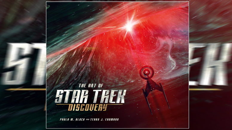
The Art of Star Trek: Discovery
By Paula M. Block & Terry J. Erdmann
Hardcover | $49.95
Published by Titan Books | 208 Pages
For their new coffee table book, The Art of Star Trek: Discovery, veteran writing team Paula M. Block and Terry J. Erdmann interviewed over two dozen artists who worked behind-the-scenes to create the show’s first two seasons. And they found that all of them had one big thing in common.

From the Battle of the Binary stars in The Art of Star Trek: Discovery
“Everyone we interviewed is just a die-hard Star Trek fan,” Erdmann told TrekMovie in a recent telephone interview with the authors. “They’re so proud of being part of it. And they’re deeply hoping that they’re doing the right thing for Star Trek, for they love the entirety of the franchise.”
“In other words, they’re really into it,” Block said. “And we were surprised, because just about everybody we talked to said, ‘I want to make this right. Yeah, we’re making a phaser, and, yeah, we could do anything we want to at this point, because technology is advanced so much beyond the sixties when the original show was made. But we want it to look like that.’”
“They talk about reverse engineering all the time,” Erdmann added, “because they’re doing something for the future, but they have to make it prior to the 1966 look. So they reverse engineer it so that it’ll fit into the timeline. I mean, they really put a lot of effort into doing it correctly.”
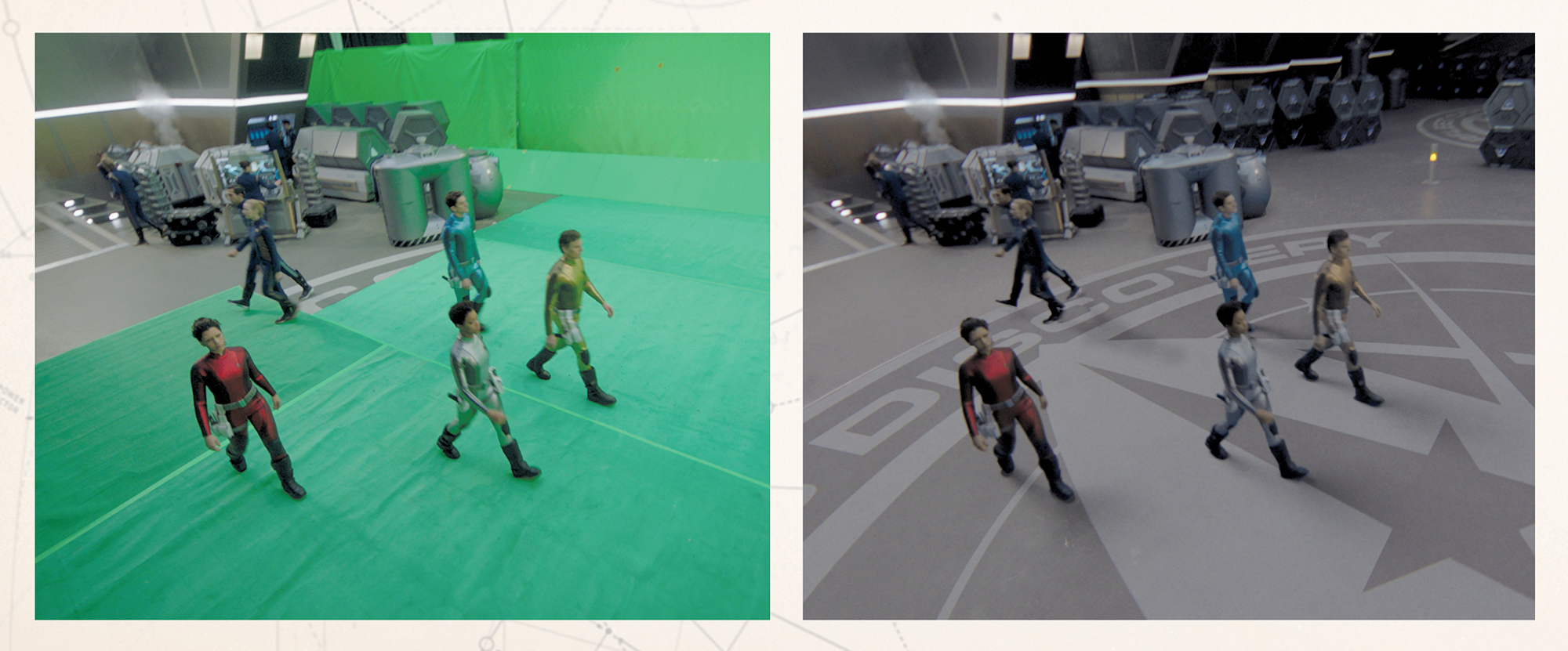
Designs for the show’s season 2 premiere in The Art of Star Trek: Discovery
Putting in a lot of effort is what Block and Erdmann have done for decades. They’ve written numerous books, including Star Trek 101, Star Trek: Costumes, and the classic Star Trek: Deep Space Nine Companion, but this new book had one distinct advantage.
“CBS gave us a list of the people they thought would be able to give us the best information about various aspects of production,” said Block. “They gave us the phone numbers and the email addresses. So it was pretty good. I mean, it was a ton of work, but at least they made it easier for us. We didn’t have to track people down.”
“They found everybody for us,” agreed Erdmann. “On many of our books, Paula has gotten deep into searching for art – the Smithsonian Institute or the Academy of Motion Picture Arts and Sciences library or TV Guide, all kinds of places like that – looking for artwork because the studio doesn’t have it. But on this, because it’s going on right now, the artwork was available, and there was way too much of it.”
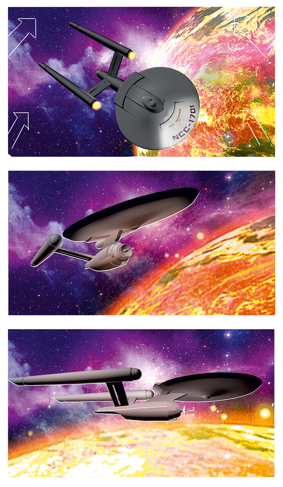
The U.S.S. Enterprise from The Art of Star Trek: Discovery
“They gave us access to this library and let us take anything we wanted from it,” said Block. “As a result, I ended up having to buy more space for my computer because it kept saying ‘too much, too much.’ And it just wasn’t ready for that many gigabytes.”
Along with choosing representative art from across many departments, the authors had to actually write the accompanying text. And for that, each brought their own complementary styles. Erdmann, for instance, tries to think like a teacher.
“I really like showing things and getting people interested,” he said. “I always think there’s a kid in some little Midwestern town, who has no opportunities to get away from maybe being a farmer or working at the grocery store or something like that. And I always try to explain something that will get that kid interested. So I always try to make our books educational. It just makes me feel good to do that.”
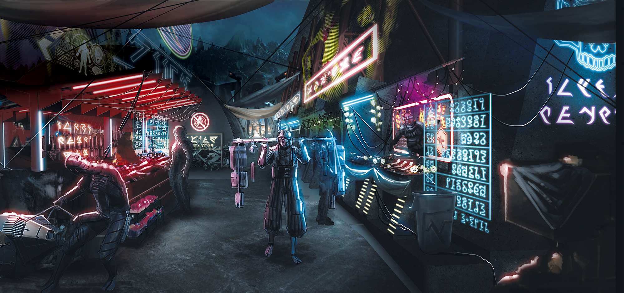
Designs from the season 1 finale in the book The Art of Star Trek: Discovery
Block likes to add puns and other wordplay. “I always wanted to be a writer, from the time that I first went to a library as a little kid,” she said. “And I try to make the text fun, you know? It’s very conversational. I like to put some fun and interest in it, and make people want to keep reading and turning the page.”
The project began in early 2019 with writing wrapped up by that fall. And though the book was scheduled to come out in June 2020, Covid-related shutdowns pushed publication to the gift-giving season. The result is a truly beautiful book.
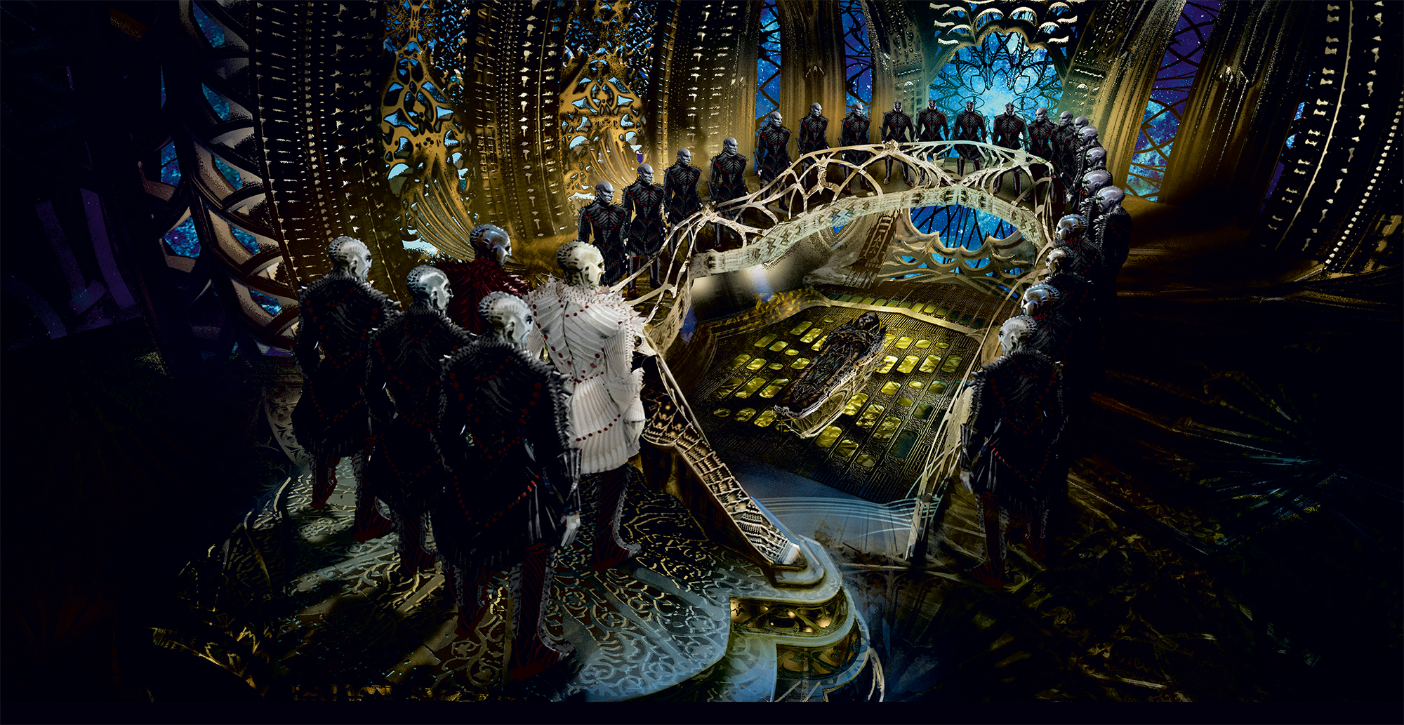
The Klingon sarcophagus ship in the book The Art of Star Trek: Discovery
“Titan, the publisher, went all out to make this book as pretty as possible,” Erdmann said, praising the high quality of the paper and the color processing.
Block said that the beauty of the Discovery artwork is exactly what drew them to the project in the first place.
“The first time we saw Discovery, and I saw the opening credits, I just loved them,” Block recalled. “And I said, ‘I hope somebody does an article about why they picked those images.’ I really liked them.”
“Paula wanted to read an article about making the credits. And she got to write the article she wanted to read,” Erdmann said. “That’s part of the fun of doing this.”
Available next week
All of the images above are taken from The Art of Star Trek: Discovery by Paula Block and Terry J. Erdmann. The 208-page hardcover coffee table book will be released on December 8 and can be pre-ordered on Amazon for $34.79.

Keep up with all the Star Trek merchandise news and reviews at TrekMovie.com.
All Star Trek images are © 2020 CBS Studios Inc. © 2020 Paramount Pictures Corp. STAR TREK and related marks and logos are trademarks of CBS Studios Inc. All Rights Reserved.
DISCLAIMER: We may link to products to buy on Amazon in our articles, these links are customized affiliate links that support TrekMovie by earning a small commission when you purchase through the links.


If only they’d invest as much in the writing as they do the SFX…
Who cares how much they invest if the results are lousy? DARK STAR just used photo cutouts for nearly all their space scenes, but at least there, space is black and CLEAR, as opposed to this foggy low-resolution mess on DSC and PICARD.
“Everybody we talked to said, ‘I want to make this right.”
I LOL’ed!
Seriously, if this book doesnt touch the question every fan is asking or at least thinking – how could the visual design go so wrong for a show that in all earnestness claimed to be a prime universe pre-TOS prequel – it is missing out on a crucial part of Discovery’s reception by fandom!
And frankly, I have no doubt many of the production people set out to do great work and great Trek, and designs like the sarcophagus ship interiors look visually impressive. The problem is just that they have nothing to do with the 23rd century Star Trek aliens, locations and ships already defined by 5 decades of production history!
They could have been proud to say with Discovery’s production design, they stood on the shoulders of giants like Matt Jeffries and William Ware Theiss.
Instead, they trampled all over them…
Absolutely agree with you. I heard that a lot of the initial designs were approved by Bryan Fuller before leaving the show; such as no cylinder nacelles, the copper look, the bald Klingons, etc.
I don’t think we’ll get the real story behind who made what choices until years after the series has finished.
Every fan?? Speak for yourself. Personally, I’m pretty pleased they didn’t return to the aesthetic of The Original Series. I’m pretty sure plywood won’t be the preferred construction material for starships of the future.
For you everything got to be a dichotomy no? If they’re not with you they are against you.
I don’t think anyone on this board, ever, asked for a painstaking, exact recreation of TOS (or rather, “The Cage”) for Discovery, with 60s materials. What was asked for is to honor the spirit and aesthetics that formed the TOS design canon. And for a show that CHOSE to set itself less than 10 years before Kirk, that’s par for the course! Instead, Discovery chose to do the exact opposite in almost every respect, “just because”. The fan backslash to that was entirely warranted.
And then, in season 2, they PROVED that creating a TOS design aesthetic with modern materials and advanced look is entirely possible and, dare I say, attractive, with the uniforms, ship design and interiors they created for Pike’s Enterprise. Again, not an exact replica, but close enough to be acceptable to most fans. Why couldn’t they go this route from the beginning?
It all boils down to the grudge Bryan Fuller held against the former Trek TPTB and his mistreatment at their hands as a junior writer on Voyager (as per RDM). So he had to remake Trek in his own image, from the ground up. Psychology, slighted emotions are a powerful influence.
Now, Trek and fandom on the whole had to suffer because of one man’s hubris despite being ousted before even his own show started. The irony!
The production design is so Star Trek!
I think the key line here is “they’re deeply hoping that they’re doing the right thing for Star Trek.” Deeply…hoping. Yeah, they can hope all they want, but deep down they’re probably thinking, I decanonized the Trek I knew, and replaced it with this half-cooked VFX soup. These aren’t the ships we knew, the props, the aliens, and the fans reacted appropriately, I think. Meanwhile I truly feel like Enterprise had better space VFX than CBS Trek. But a lot of it is very creative, and no doubt these are craftsmen of high caliber, it’s just a shame it was put to something that ultimately wasn’t appreciated simply because of the timeframe it was set in.
I don’t get with all the 3d animators why all the ships apart from the Enterprise and Discovery look so fuzzy… why wouldn’t you have embraced having D-7 battle crusiers facing off with Constitution class starships. I don’t get why the future starfleet all the ships in the 35th century look so hard to make out?!?
Isn’t what’s great about 3d/cgi is that you don’t have to build all these models physically and you can have detailed advanced starships, etc??
Agreed. The D-7’s from ST:TMP (made in 1979!) look so much better.
It’s likely not the models themselves – there’s probably tons of crisp detail there. The space scene art direction leans toward “busy” – lots of things moving all the time, “dust on the virtual lens” faux realism, and busy backgrounds (is there always a nebula visible from all points in space? It’s like they reused the psychedelic sky backgrounds from the 1966 Spider-Man cartoon!)
Traditionally, Star Trek’s ship model space lighting has been unrealistically bright (as if there are space softboxes illuminating all sides evenly, vs realistic hard shadows) as part of the process of getting crisp model silhouettes for traditional film bluescreen mattes, which is also how the Original Trilogy Star Wars‘ model shots were done.
With the move to CGI space scenes in later episodes of DS9 and Voyager, and all-CGI from Enterprise onwards, there was initially a need to keep the look consistent with physical model shots. The KT films went more “realistic” in terms of lighting, but still kept VFX shots clear so the audience could understand which ship was which and what was going on, using a ship exterior as an establishing shot when transitioning between scenes, etc.
I really, really like Discovery overall, but the VFX busyness doesn’t really work. (Even those shots of Federation HQ in Paris at the end of S1, with the Eiffel Tower boxed in by busy busy flying car roadways and futuristic Metro lines, was too busy – and Parisians would never consent to the entire city being turned into the Pompidou Centre…)
The thing with “the art of…” coffee-table books, as a subset of “the making of…” books, is you find out “what was the route to the final visual result?” and “oh, that’s what it was supposed to look like, before the director got fancy.” Such a book will ideally explain who decided what, so if you don’t like the final result, you’ll have a better idea who to blame (unless the principals avoid taking responsibility). Obviously the most the authors (Block and Erdmann, in this case) can aspire to is a candid, complete and coherent account of somebody else’s process.
The thumbnails on the Amazon listing show, for example, a closeup of the U.S.S. Shenzhou’s dedication plaque and the layout of its set.