
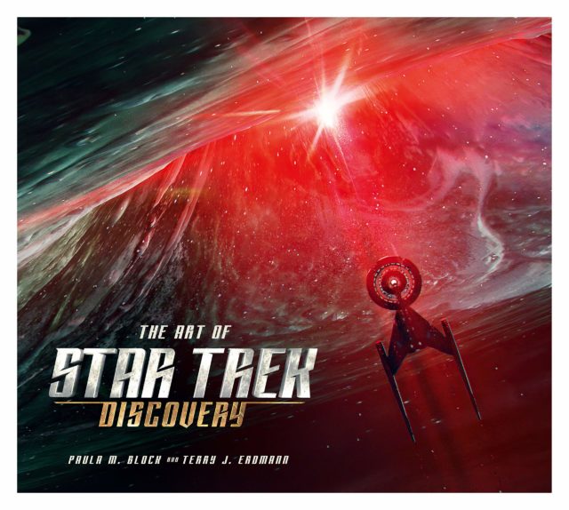
The Art of Star Trek: Discovery
By Paula M. Block & Terry J. Erdmann
Hardcover | $49.95
Published by Titan Books | 208 Pages
Titan Books is on a roll. Earlier this year they released the gorgeous Inside the Art and Visual Effects of Star Trek—The Motion Picture, and just last week came another beautiful Star Trek art book, this one dedicated to the work of visual effects legend Dan Curry.
Now Titan gives us another coffee table book, The Art of Star Trek Discovery by Paula M. Block and Terry J. Erdmann. Filled with striking images and engagingly informative text, The Art of Star Trek Discovery gives us a glimpse at the story behind – and evolution of – the show’s vision.
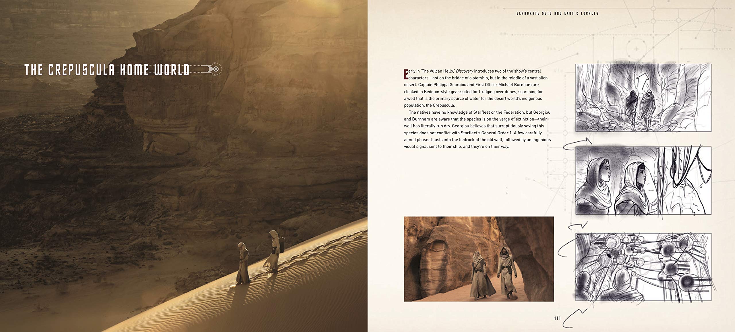
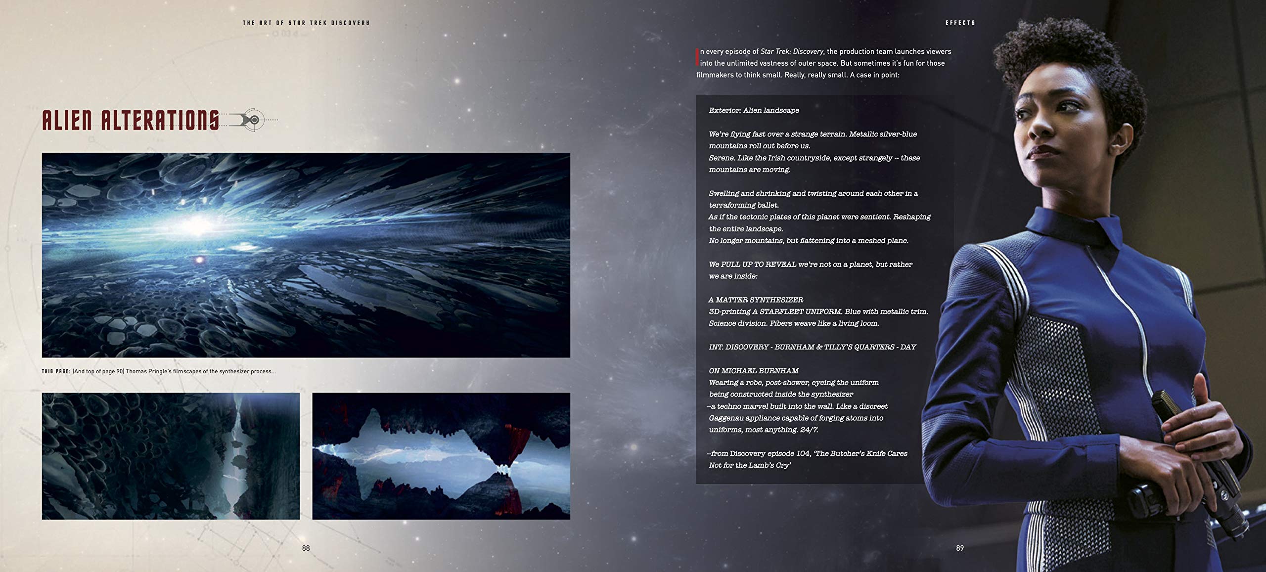
The book covers the first two seasons under five broad categories: The Basics (opening credit sequence, primary ship/uniform/equipment design); The Klingons (new look, weapons/costumes/ships); Effects (digital creatures and scenery); Elaborate Sets And Exotic Locales (alien sets, makeup, costumes); and Changing The Scene (Short Treks, season two).
Authors Block and Erdmann conducted interviews with dozens of crew members, including Executive Producer Alex Kurtzman. Also, somewhat surprisingly, they spoke to co-creator and original showrunner Bryan Fuller, who famously left the show early in production. This lets Block & Erdmann show as well as tell us how certain things were originally conceived and then subsequently evolved.
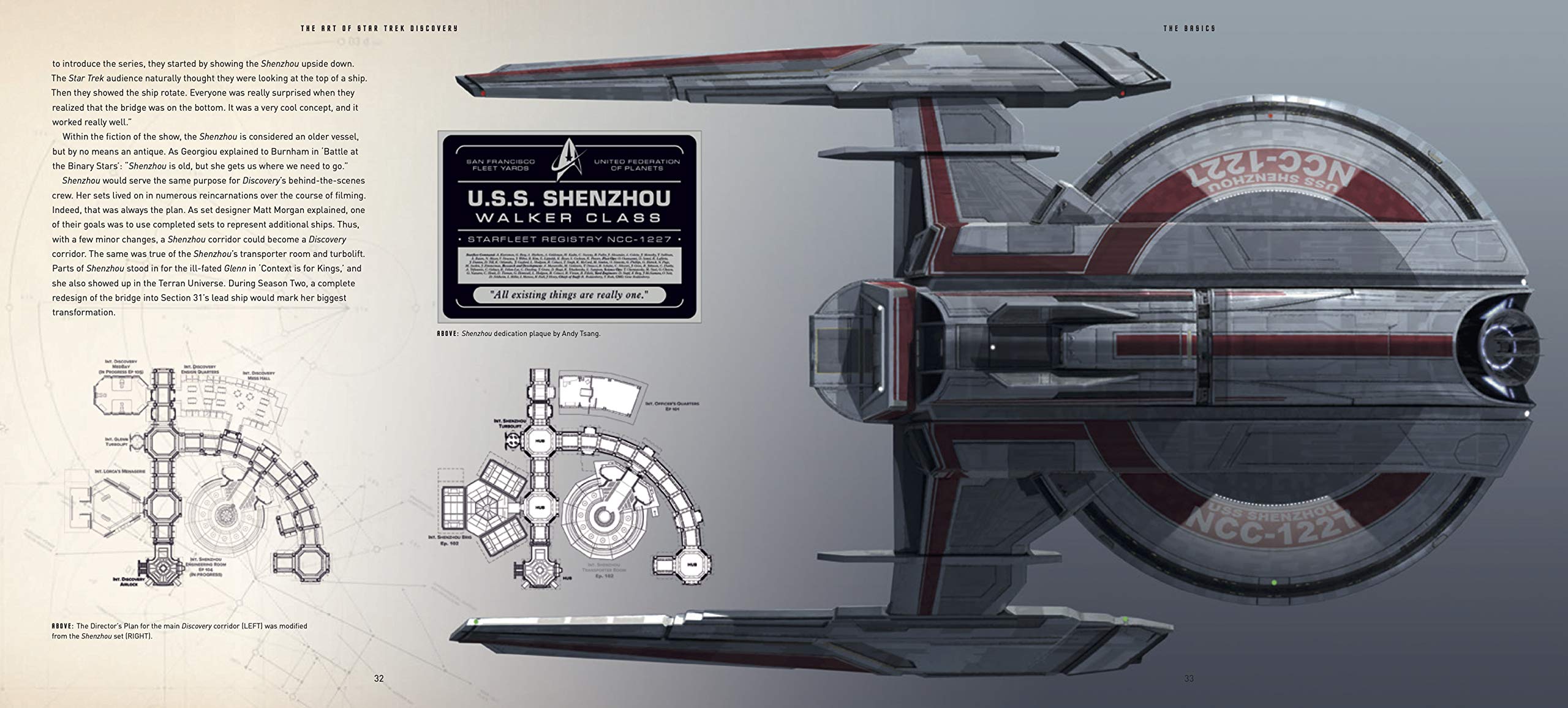
For instance, Fuller originally conceived Saru with multiple eyes on a head reminiscent of a classic Gibson “Flying V” guitar. Makeup department head Glenn Hetrick describes his initial drawings and subsequent makeup and effects tests which ultimately led to an entirely new concept. Block & Erdmann illustrate the story with multiple images of the original wedge head and then another two pages dedicated to the Kelpien makeup we now see on our screens.
That kind of look into the thought process behind a design is indicative of Block & Erdmann’s approach. They offer beautifully reproduced storyboards and photos accompanied by quotes from the designers that detail a design’s rationales, from both a production and in-the-world-of-the-show standpoint.
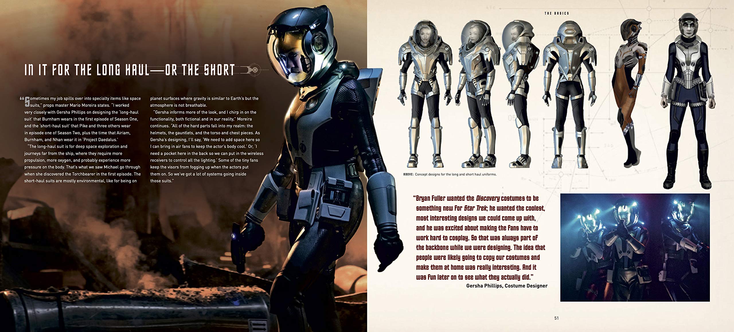
There are deep dives behind the redesigned insignia and uniforms along with the primary props. The book taught me secrets about the new uniform – and how many zippers are involved – that made me watch the show differently. I also loved learning things like the intended symbolism behind L’Rell’s facial jewelry in the episode “Point of Light” (hint: it’s related to the phrase “Call me Mother.”).
Titan could have gotten away with a much different, much simpler, book, with just page after page of beautiful images – because, let’s face it, Discovery is visually sumptuous. But Block & Erdmann turn it into much more than that. The Art of Star Trek Discovery is filled with insight into the thoughts behind the imagery. It’s informative, entertaining, and beautifully bound and produced – the image on the cover, beneath the dust jacket, made me gasp. This is gift-giving season. And this is a perfect one for any Discovery fan.
Available now
The Art of Star Trek: Discovery by Paula Block and Terry J. Erdmann, published by Titan books was released on December 8th. The 208-page hardcover coffee table book can be ordered on Amazon for $39.95.
Keep up with all the Star Trek merchandise news and reviews at TrekMovie.com.
All Star Trek images are © 2020 CBS Studios Inc. © 2020 Paramount Pictures Corp. STAR TREK and related marks and logos are trademarks of CBS Studios Inc. All Rights Reserved.
DISCLAIMER: We may link to products to buy on Amazon in our articles, these links are customized affiliate links that support TrekMovie by earning a small commission when you purchase through the links.


Say what you will about DIS (or STD if you’re being snarky), it’s undeniably the most sumptuously designed show in the canon. My only regret is that the book is coming out awfully late to ensure timely Christmas delivery to the Trekkies on my holiday list.
I won’t mind getting your gift a bit later than Xmas 😇
Whilst I would agree that the special effects and make up are the best out of Star Trek series, the designs themselves are terrible: the ugly pizza cutter ‘hero’ ship with thousands of cubic miles of internal space (cut scenes of turbolifts whizzing about inside the ship); the disastrous Klingon redesign; and the awful uniforms.
Brother, you hit the nail on the head. I love the overall design of the ship, but…the turbolift maze is ridiculous and the warehouse-sized bud bay make no sense (not to mention the sumptuous personal quarters that ‘Cadet’ Tilly was assigned. They aren’t keeping it real.
I agree though it has the benefit of a far bigger budget and more advanced technology than earlier shows.
I would term the show ‘a beautiful mess.’
As I elaborated these designers portrayed in this book remind me of the overachieving student who writes a beautiful and extensive essay for a class assignment – but entirely on the wrong topic! I’m sorry, will the teacher say, but it’s still an “F” ;)
To be fair, it’s not the designers fault but the producers had a chance to enable their entirely new designs from the beginning by starting in the unwritten 32nd century instead of rewriting the 23rd one, absolutely no one asked for!
It is also a pity because it’s obvious that for their design relaunch in season 3 they don’t have nearly the budget they had for all these unwanted season 1 redesigns, as evident in lack of Vulcan / Earth vistas, sloppy uniforms and even reuses of season 1 starships in flashback scenes!
The visuals / production design in Season 3 have been outstanding! Have we been watching the same show?