
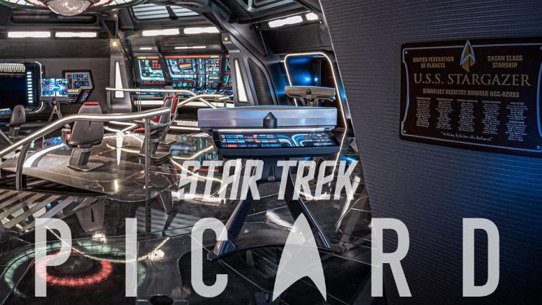
Season two of Star Trek: Picard featured the 25th-century starship the USS Stargazer and the sets were used extensively for season three, standing in for a different (as yet unnamed) Starfleet ship. Over the last week, members of the production team have been sharing closer looks at these sets.
Drexler tours Stargazer bridge
Designer and artist Doug Drexler is one of the Star Trek vets who has been working on Star Trek: Picard, and on Sunday he released a video of a tour of the Stargazer bridge set, featuring production designer Dave Blass joined by graphic designers Mike Okuda, Denise Okuda, and Geoff Mandel. If you listen closely, you can hear Dave Blass talking about “changing this whole scenario over from one ship to another ship,” indicating the Stargazer bridge was redressed to stand in for a different ship in season three.
More photos and video from production designer
Dave Blass has also shared a set of photos of the Stargazer on Instagram.
View this post on Instagram
For comparison, he shared a video showing the concept designs for the Stargazer.
View this post on Instagram
Dr. Crusher to sickbay
Finally, to emphasize how these sets are being used in season three, showrunner Terry Matalas posted an image from sickbay (which wasn’t even used in season two) of a biobed, with the message “A sickbay in need of a doctor” along with a hashtag for the show and “Beverly Crusher” and tagging actress Gates McFadden. She replied with a fun message about medical insurance.
what medical insurance do you carry? #crushercosts https://t.co/KRie9EqDBF
— Gates McFadden (@gates_mcfadden) May 13, 2022
ICYMI: Season 3 cast announcement
The third season of Picard has already been filmed and features the main cast of Star Trek: The Next Generation.
There is no word yet on when the third season of Star Trek: Picard will debut.


I’m sure we just spent more time touring that ship in that clip than we did in the whole of season 2 lol
Helm console reminds me of the exterior of ORVILLE ships …
Oddly the Stargazer Bridge has always reminded me of the Orville Bridge for some reason.
Maybe Because the Orville bridge is inspired by the many Star Trek bridges last time I checked.
Certainly can’t contest that on the matter of ‘borrowed’ aethetics, but ORVILLE’s doesn’t really have the TREK multi-level aspect, does it?
I remember my first take on seeing it was “TNG, but cheaper/tackier, like s2 BUCK ROGERS’ Searcher,” which always compared unfavorably with zero budget sets built in my friends’ garages. Searcher’s bridge was like somebody just backed up a truck full of winky-blinkies rented from Modern Props (which they probably did – the approach worked pretty well for KNIGHT RIDER’s truck interior, but always makes flinch when I watch THE LAST STARFIGHTER, because I think that movie deserved better stuff to fill out Ron Cobb’s designs.)
Actually now that I think of it, I’m jonesing to watch STARFIGHTER again. We saw REMO WILLIAMS last night — most of it anyway, as I was flabbergasted to realize our 2ndhand DVD was fullscreen not wide — and the two movies largely used the same score, excepting the latter’s ethnic motif. Plus they are two of my 80s guilty-pleasure faves, both of which missed pretty badly at the box office in the time of RAMBO FB (despite being a big war/action fan and a total Goldsmith devotee, I’ve still never been able to watch that all the way through in one sitting.)
I think there’s more heart in STARFIGHTER than in the whole history of STAR WARS, just with the main character’s younger brother — the only one who really ‘gets it’ when Grig the lizard guy reveals big bro just saved the Star League’ — and the early scene where Alex is staring up at his little mobile of the solar system while silently lip-synching with the too-familiar conversation of two old-timers outside in the trailer park. It might actually be the first movie I saw as an adult where I found the heart of the film was enough to overcome its lack of brains (TFF being one of my definitive examples.)
Season 3 Orville Bridge has a good deal of enhancements from Trek’s own Doug Drexler!
Really? I honestly don’t see it? Thin sloped consoles possibly? But even the screens look breathtakingly better than The Orville (and that’s not snark for anyone who thinks I’m picking on them)
It’s the sloping curves. I’ve seen the look in Trek concept art for a long while now, so it’s nice to finally see it realized and those displays are gorgeous
I mean how much of the Enterprise E did we really get to see over the course of 3 whole films?
If SkyNet had dropped acid right after first developing consciousness, this is probably what the post-Judgment Day tech would have looked like.
Positively ghastly in its gaudiness, it makes me think what might have happened back on TNG if Okuda had been paid on a per-lambert basis. (Not saying any fully-decked out set isn’t worth a visit – just to try pressing buttons while squinting against the unnecessary and unmotivated light glares — but I wouldn’t want to work or live there.)
Must be tough being the only artistic genius in a universe full of neanderthal hacks…..
You ever see BROADCAST NEWS?
Except that he’s right.
Kmart is one of those people who never comes here and says he LIKES anything–only what he DISlikes.
Just off the top of my head, I’m sure that I’ve mentioned how much I like TFF at least once this last week (I pretty much always do.) And I remember a very recent thread about trek ‘worst seasons’ where I mention how I prefer season 2 of TOS over 1 and 3, and in that same post I mentioned a number of s3 eps I have always enjoyed (more than most people, apparently.) If I didn’t get round to sharing a new round of DS9 appreciation recently, stay tuned, I usually have good things to say about a large number of those. And I did mention that I found Mount and the new security chief in ep 1 on youtube to be interesting, even if the show didn’t really do it for me (and it should have, because it was a good idea.)
For the record, there are also a number of Trek novels I find excellent or better, including A STITCH IN TIME, THE FINAL REFLECTION, PRIME DIRECTIVE and the first two Diane Duane novels. And I love Goldsmith’s TMP and TFF scores, along with most Goldsmiths, and grudgingly admit I play Horner’s TWOK a lot. (twokalot — sounds like a lispy new candy bar.)
If you want me to say something nice about current trek, show me something I can find worthwhile.
Plus I gave a rave to THE LAST STARFIGHTER the same day you made that post, so there!
Agreed. Awful ‘design’. Reminds me of the worst excesses of mid-late 90s design.
Agreed
It’s so over-the-top and crazy-busy that I had a huge WTF guffaw when I first saw it.
Love the Okuda’s personally, but their TNG tech look has not aged very well. I would love to show this to 100 non-Star Trek who are sf fans and ask them what they think — I don’t think that would be a good result in favor of this design theme.
Over-sentimentality and $4.00 will buy you a cup of coffee.
Agreed on the Okudagrams — a LOT of wasted visual space and design for the sake of design.
Too beautiful to not use on a Stargazer show or to have converted to and Enterprise for Picard S3! I like how the white lights are a little more muted than in SNW. The bridge aesthetic for SNW is amazing, but I often myself very distracted by the glaring bright white lights, and the bright white strips they have over many control panels, which must be blinding to anyone sitting at those stations.
Looks beautiful. I hope we don’t see the amount of glass breaking from these displays that we do in Discovery.
You’d think that far in the future, engineers would have discovered a safety glass that doesn’t shatter at every impact.
The ship depicted on the screens on the left and right sides of the Bridge in that concept video/tour of the Stargazer don’t look like the Stargazer… Or maybe I am just hoping it’s the Enterprise :)
Shhhhh! Someone might blur it!
The images on the real life bridge are blurred.
The CGI tour resembles a four nacelled Vesta Class in the briefing room and a regular Vesta on the Bridge. A Nova Class ship is also shown.
Seeing more of this set in session 3 is definitely something to look forward to. Talk about eye candy. It’s quite delicious!
The more I think about it the more I feel this will be reused in some sort of enemy starship situation like The Reliant. No way they’d reuse for the Enterprise
Look at those cool functional colorful panels and displays!!! Don’t those stations look awesome, functional and visually attractive?!
People will like that so instead let’s ensure that the whole aft section of the bridge has none of those, just a door that everyone will see and maybe some hard drive lights. Oh and stairs, way more stairs. Maybe a conference room that all you see is people sitting in a chair in front of a door.
And if this is SNW, decolor the bridge and go monochrome (?!?!?!) despite the fact it was TOS and not TNG that had all the color.
Then let’s ensure we go back in time or the future where we beam across the quadrant that we don’t need any starships.
My wife had the same ‘daring’ design notion I was think of: namely. that they should just have large discreet blank sections that only activate under certain circumstances. That would give you some visual snap and variety instead of the eyenumb of eyecandy in all directions all the time, and tie in with my favorite Joe Jennings line to the effect that you don’t want everything blinking constantly, because then how do you provide visual underscore when the rock is about to hit your ship?
And if large blank is too uhh-uhh, then artwork. I’ve always liked the idea that Picard’s painting on wall should have been able to turn into a viewscreen.
I’ll take that over a door or blank wall with no real function any day. I don’t get why you would spend all this money on expensive good looking stations and then aim the camera at a door.
It it’s and either or choice only, give me the functionless blank wall please.
Samsung did that. It’s called the frame TV.
Cool. I liked the idea of artwork that had a sound feature on it that activated on movement so much I actually spent money trying to build something back in the 90s. Thought it would be an nice way to punch up seascapes.
Soooo the Orville has a door at the back of its bridge and behind that is just a corridor and no one complained.
Voyager and the Enteprise E had stairs though the camera never really showed them very much.
picky much?
“Fans” like One Lion proves to me that it’s best to ignore certain set of the fandom. Nothing will ever satisfy them. If you try something new, it’s not good. If you stick to something old, and even bring back the original designers, it’s still not good.
At this point, especially now that we have SNW and we still got complaints, I’d just ignore the comment section or block them out altogether from now on. What’s the point of enjoying something and torturing myself to negativity anyway?
“Look at those cool functional colorful panels and displays!!! Don’t those stations look awesome, functional and visually attractive?”
No, it looks like the sort of Starship bridge you’d get with a collaboration of Antoni Gaudí and a Japanese vending machine designer.
In their defence I’ll take them in the background over three people sitting in chairs in front of a door and a blank wall with some nonsensical blinking hard drive lights on some stairs shouting down at the crew (similar to Discovery, Prodigy, etc). It’s funny, even the article picture has to show the bridge from some weird angle to get them in the shot. You couldn’t even see them on the show, you only really see the consoles in this behind the scenes video.
By their and them I mean those (I think wonderful) consoles vs. door and stairs.
Wayyyyy too busy (visually) a set! Too many lights, control panels, and shiny surfaces. It’s as haphazard and distracting as Season 2’s ‘plot’. Imagine having to work on that bridge day in/out. You’d be suffering from visual migraine auras in no time! The stairwell to the command area is incredibly stupid too. Zero thought there. It’s evident the design team just went purely for what they thought looks “kewl”. Not practical in the slightest, or sensible. Less is usually far more with bridge design.
I have to agree. It looks like a casino.
Yea, it looks like the sort of Starship bridge you’d get with a collaboration of Antoni Gaudí and a Japanese vending machine designer.
Don’t be mean to Gaudi; instead let’s say this might have been the result if it was handled by a THE FLY style teleporfusion of that vending machine designer and the late NBC sportscaster Curt Gowdy. Not quite as gaudy a result.
Home Depot just called the Federation GSA, and they are really pissed that Starfleet bought all off the piping from their plumbing aisles in every store. LOL
You should read set decorator Roger Christian’s book about how he pretty much invented junkyard scavenging in order to do the first STAR WARS on budget, using tons of aircraft scrap and piping from everywhere to get that ‘used future’ look. Within twenty years, it became so lucrative for junkyards in Europe and I think Africa that they stopped selling to movie companies and would only RENT the junk; for PHANTOM MENACE they had to buy all their aircraft junk from Texas and transport it to the UK for shooting.
The book could use a serious edit (there are maybe 30 or 40 places where info gets repeated unnecessarily), but is still a fun read, especially for folks into SW and the first ALIEN and TIME BANDITS.
Wow. The fact that all these LCARS interfaces are screens now just absolutely blows my mind. Shows how far we’ve come in terms of tech.
Absolutely gorgeous design, cannot wait to see more of it in Season 3.
Man that bridge is stunning! I probably can do without the rails and remove one or two levels where the Captain and first officer chair are, but other than that, it’s very impressive to me.
And I just love all the LCARS are back. To me, that signified Star Trek! I’m just happy to see so many of the old guard like Drexler and the Okudas working on this show. Like the animated shows and SNW, it’s feeling more like proper Star Trek these days. Unfortunately I never had an issue with the look of Picard, it’s the actual story telling part where it severely lacks; but I am keeping my fingers crossed still.
And yes, I really really hope it’s a new Enterprise the TNG crew will be traveling on which probably means it won’t be. ;)
Wow! Thanks for sharing! This is by far the greatest ST bridge…EVER!
No.
Nope
Wow. The interior looks almost identical to the Enterprise F ;)
Giving it an F might be going too far. Grade-wise, let’s just call this the Enterprise D-Minus.
By comparison, this makes the carpeted, “1980’s Circuit City Showroom-looking” original bridge of the D look like the DaVinci of Starship Bridges
Those curved walls look completely not ergonomic unfortunately. It’s nice but it’s form over function.
The screens will be reflecting off each other from certain angles, which may make them less useable than even some Abrams displays.
I’ve worked with some human factors engineers at several points in my career and know enough about the basic HFE principles to be able to say that this bridge would be DOA if reviewed by a certified HFE expert.
Love me some LCARS!
Best bridge since Enterprise/the Berman era days, stunning and perfectly canonical. Not a fan of the MASSIVE window viewscreens, but if they had to use them, I wish they kept the window viewscreen for late 24th/25th Century ships like this and not in the new Discovery/pre-TOS era ships. As having a window/viewscreen hybrid as a progression from the viewscreen would have been cooler. However, that’s just one niggle from the other Kurtzman era shows (influenced by the pesky JJ films) and I absolutely love the Stargazer bridge/sets. I cannot wait to see it redressed for the Enterpris… I mean, undisclosed vessel of S3 ;)
I just pray the writing for next season matches the quality of the production design/set building etc *fingers crossed*
While it doesn’t completely bother me, I have to agree. I don’t love the massive view screens look either but I’m OK with them for the 24th and 25th century ships. For the 23rd century they should feel a little more economical. But not really a huge deal.
While I’m still very hesitant about next season, I did watch an interview with Dave Blass on TrekCulture yesterday discussing the Stargazer and season 3. It sounds like we are getting a full 25th century Starfleet ship show which many fans wanted since first season. A true post-Nemesis live action show! It sounds like what we got in episode one in season 2 but this time the entire season. He promised there is going to be a lot of ship porn coming!
If so it’s another reason to get excited about it. Even more so if another Enterprise is part of the season! ;)
That is exactly what I want!
Although it is a shame we aren’t getting a Stargazer/Rios spinoff, this sounds like the perfect consolation prize and the premise I have been waiting for since they said Star Trek was returning back in 2015.
All I ask is a 25th Century ship and a good show to steer her by ;)
I love it. One of the greatest bridge sets ever. It was also so cute that they put a blank over a certain spot on the opposite side of the bridge… I could “feel” an NCC-1701-F under there. :-)
Tin-foil hat conspiracy time:
I think that all the 2024 Earth stuff was filmed first. Then, Matalas realized how bad the stuff was and decided to re-shoot the first episode or two just to at least have the first two episodes be decent before going into the yuck. They re-dressed this set to be the Stargazer and made a really good first episode for season 2 (and for a small part of the last episode).
It’s just so weird how there is a stark difference in quality between those first two episodes and the rest of the season. This new set may have been built after season 2 was shot.
Haven’t seen any of these yet, but could it just be a matter of badly structuring the show? Like FC throwing its best (but very brief) punch first with the Cube battle.
OMG, WORST BRIDGE EVER! LOL^2
This is the perfect starship bridge for Marvel Character Doc OC to operate. LOL, this bridge is crazy-busy, over-the-top, human factors engineering worst practices nuts! WTF were they thinking?
Did 3M bribed a ton of Federation and Starfleet officials to get the largest touchscreen contract in history?..lol
Also, I think that a couple fans posting positive remarks here on his bridge have complained previously about the DSC bridge being too busy. If my memory is correct on that, then that would certainly seem hypocritical given this bridge is so way over the top busy, wouldn’t it?
Let’s see… I own pink socks. Don’t like them. I also own pink underwear that I love (I look damn good in it too – yes I’m a male). So yeah I guess I’m a hypocrite.
So you’re comparing the DSC bridge to your socks and this other bridge to your underwear?
I’m saying, liking one thing and disliking another, that are different but have common characteristics, doesn’t make you a hypocrite.
Okay, I get it now, sorry. I never liked any post-TOS bridge till TFF (the wasted space on the TMP-TVH bridge with all those oval monitors plus the Lockheed-lunch-room-coloring really bothered me), but tons of people jumped all over TFF’s because it looked like Circuit City with all the barely-disguised monitors.
Then they seemed to love the same bridge once TUC changed the color scheme drastically. I couldn’t reconcile their points of view for the longest time, because it was essentially the same set, and I felt them hypocrites for it till I realized most of them didn’t even realize it was pretty much the same set, just that their gut basically told them they liked ‘this one.’
Wow….lots of appreciation for this effort, almost single-handedly being shouted down by a couple of the guardians for all that’s holy and Trek pure.
I’m somewhat confused… in an earlier article last week Trekmovie presented a new bridge (with stairs and lights aplenty and that 1985 gold Buick vinyl look)… and Matalas (I think it was) said winky-winky like that this was NOT the Stargazer… And that bridge looked over-the-top garish and tacky. Now this bridge here, which IS the Stargazer, looks almost identical judging from the lights and stairs, yet is absolutely gorgeous…
It’s actually quite simple, it’s the lighting. The image you’re referring to was a full out “all stage lights set to full” somewhat overexposed shot from production designer Dave Blass. He posted it to social media to show the set’s details. That’s not how it was lit in the actual show during season 2, nor how it will be lit when it’s used as a the new ship.
Thank you Matt, but are we talking about two different bridges (different ships)? I assume it’s the same set redressed for two different ships… If so, what are the differences?
All the photos are of the set dressed as the Stargazer. They aren’t really showing anyone what it looks like when (re)dressed as the new ship. Expect it to look substantially the same though.
Great. Thanks.
And some consoles are moved around.
I dig the now-functional flatscreen / transparent OLED consoles.
The curve up the wall of the side workstations feels logical in that you get a continuous display surface with no breaks or seams, and that’s kind of been a goal in HCI for a while; for instance, look up the 1990s Sun Starfire demo video, which has a workstation that’s a seamless curved desk-to-display concept, or the emerging number of foldable cell phones.
It does seem like the configuration could be more realistic than just gobs of LCARS filling surfaces, in terms of a central arc of controls within arm’s reach and key information at eye level, secondary information off to the side.
While it was always mentioned that bridge workstations would be reconfigurable to suit any number of tasks, now it can actually be done by changing the graphics, and that’s a great plus for the production.
I agree with most people that what makes this design look overly busy are the LED strip lights in every horizontal surface, combined with the reflective floors. You get a confusing visual soup of curves and lines instead of a purposeful and clear layout. Looks cool with bokeh depth of field blur though!
best bridge design since the enterprise-d refit from generations (which is tied for my ATF with the TWOK ent-a refit bridge) and i’m hard to please when it comes to ship and bridge design so don’t write me off as a bot or a homer.
the only critique i have is the reflective floor is a bit much, the rendered animation showed a matte finish floor and that made the bridge and consoles really pop compared to the built set.
The bridge is gorgeous.
Terrible Bridge.
The much less mirror like reflections in the concept render looks markedly better than the almost mirrored looking surfaces in the set as built to my eye. Before seeing the concept render just now I kept thinking, “There is too much obnoxious reflecting going on in this…” but after seeing it without those my mind went, “Wow, what a great set design- that perfectly ties the previous shows to the current shows.”