
Jonathan Frakes is doing double duty for the third and fourth episodes of Star Trek: Picard season 3, performing as William Riker and directing. And there is a fun new video showing the man in action directing “Seventeen Seconds. Plus we have some more episode three behind-the-scene looks.
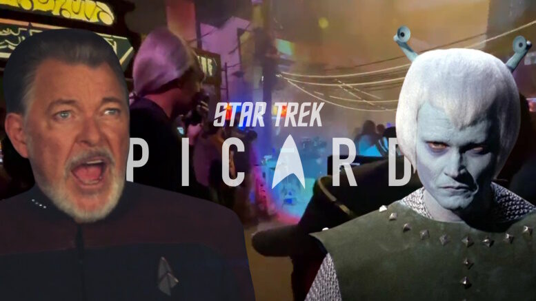
Frakes “bans” Andorians from his set
Jonathan Frakes is known as an actors’ director and is well-loved by cast and crew for his jovial personality. In a new video posted by showrunner Terry Matalas, Frakes shows he had (jokingly) lost his tolerance for one of Star Trek’s founding alien species in a shot he was doing in District Six. Check it out (with some salty language)…
Behold, the sheer joy of working with @jonathansfrakes NSFW #StarTrekPicard pic.twitter.com/y5LBwf4rEF
— Terry Matalas (@TerryMatalas) March 5, 2023
A better look Titan’s sickbay and transporter room.
Art Director Liz Kloczkowski offered up another lights-on shot of the Titan’s sickbay…
Behold, the Titan’s sickbay. Special thanks to Tomas Salvin (const. coord) for giving us all of our wishes, and Flip Orefice (sup. paint foreman) and team for repainting a bunch of it 😅 pic.twitter.com/q8k6m5Zpjr
— Liz Kloczkowski (@lizklocz) March 4, 2023
And production designer Dave Blass shared a shot of the Titan’s transporter room, explaining his design philosophy to make it a “natural evolution” of the TNG era style.
When designing the Titan's Transporter Room, my goal was for folks not to notice it. I didn't want folks to say WOW, how cool. It's just another Transporter room like they have seen before. It should look and feel exactly like a natural evolution of the TNG Era. #StarTrekPicard pic.twitter.com/pbEhlngR6f
— Dave Blass (@DaveBlass) March 4, 2023
High praise from Star Trek royalty
One of the vets who returned for Picard was designer Mike Okuda, who just last year was honored by the Art Directors Guild with a Lifetime Achievement Award for his work on Trek and beyond. In response to a fan thanking Terry for bringing back “Star Trek royalty” like Okuda, Mike turned that around to say Matalas himself deserves that distinction, adding season 3 is a “gift to all of us who love Gene Roddenberry’s creation.” Of course, Terry himself was moved by this praise…
This is the highest praise I could ever receive. You all have no idea what this means to me… https://t.co/S574iSEEN7
— Terry Matalas (@TerryMatalas) March 4, 2023
And here is a nice shot of Mike, in a well-lit Titan corridor.
I'm on the Titan-A, being interviewed for The Ready Room with Wil Wheaton for today's new episode of Star Trek: Picard. As Doug Drexler says, it's been a long time since I've looked forward to a new Star Trek episode every Thurs. Check out Picard AND The Ready Room on Paramount+. pic.twitter.com/lXk3vCvm1u
— Michael Okuda (@MikeOkuda) March 3, 2023
Stewart and McFadden are TVLine’s performers of the week
TVLine declared Sir Patrick Stewart and Gates McFadden as their performers of the week for their work in “Seventeen Seconds.” The write-up summed up…
Stewart did some of his best work ever as Jean-Luc in those moments, and McFadden matched him beat for emotional beat. It was difficult to watch two characters we’ve loved for so long fight like that, but it was a completely mesmerizing scene nonetheless, plumbing depths that Trek shows rarely attempt to reach. We’re happy to see our Next Generation favorites together again, but we’re also happy to see them get such rich material and knock it out of the park.
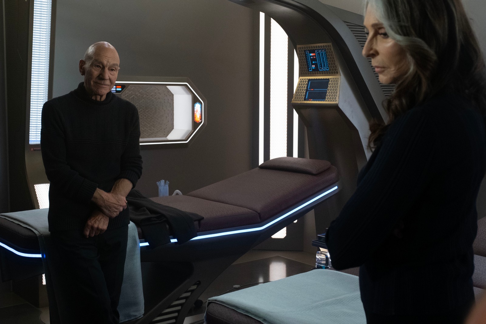
Patrick Steward as Picard and Gates McFadden as Dr. Beverly Crusher in “Seventeen Seconds
Inside Titan and Worf’s return
If you haven’t already, the latest episode of The Ready Room features an interview with Frakes along with segments taking a closer look at the design of the Titan and Michael Dorn’s return as Worf.
The third and final season of Picard premiered on Thursday, Feb. 16, 2023, exclusively on Paramount+ in the U.S., and Latin America, and on February 17 Paramount+ in Europe and elsewhere, with new episodes of the 10-episode-long season available to stream weekly. It also debuted on Friday, Feb. 17 internationally on Amazon Prime Video in more than 200 countries and territories. In Canada, it airs on Bell Media’s CTV Sci-Fi Channel and streams on Crave.
Keep up with news about the Star Trek Universe at TrekMovie.com.


Be advised, just a bit salty there…..
No no everything needs more Andorians
Agreed! Love those blue guys. I miss Bolians too.
I really wish I knew why Michael Okuda blocked me on Twitter. I have never interacted with him at all, but I am blocked. And I know he posts a bunch of cool stuff, so articles like this are the only way I can view them. If I click over to twitter, I’m blocked.
You can view them signed off from twitter.
thanks for the tip. Now that I see the ratio of political stuff to cool Star Trek stuff, I probably won’t go back.
And now we know why he blocked you.
You are making assumptions. I’m apolitical, and do not make political posts. I’m merely stating that the cool Star Trek posts I was assuming were there are very few and far between and not worth the extra chaff in my feed.
For one, if he happens to notice someone espousing Barry Goldwater, that’s an autoblock.
Twitter is a social media people use to express their views and values. No concern about that.
I’m also aware that all of these creatives get blasted on Twitter in a way that crosses the line to abuse. It sounds like they’re sharing lists and just blocking anyone they feel has crossed the line with a colleague. It’s their call to be the moderators of their own access. So be it.
Frankly, I’m more offended by Okuda’s (and Drexler’s) backhanded shade towards the rest of the new franchise shows in his recent tweet where he said “As Doug Drexler says, it’s been a long time since I’ve looked forward to a new Star Trek episode every Thurs…”
Okay, so they only look forward to it when they make it themselves?
They aren’t willing to show the public good grace to at least appreciate or respect the craft of other designers working within the franchise in the other shows?
There’s not one right way. IDIC guys.
More, given how much design trends and ergonomics have changed from the 60s to the 90s to now, not to mention greater appreciation and integration of design language from outside the lower 48 US states through globalization, the lack of design shifts, or retro looks are hard to justify in themselves.
I know the YouTubers love it, but I don’t want one slice of the old fans to dictate design values.
I’m cool with nostalgia design for one show, but for that to be the only one you look forward to? No thanks.
As I’ve said before, love Okudagrams, love Matalas’ work generally, BUT I don’t want the entire franchise locked into one visual or auditory creative perspective.
Yikes guys. Just yikes.
“I’m also aware that all of these creatives get blasted on Twitter in a way that crosses the line to abuse. It sounds like they’re sharing lists and just blocking anyone they feel has crossed the line with a colleague. It’s their call to be the moderators of their own access. So be it.”
There’s also blockchains; if you’re following someone who’s tends to spout odious opinions or has a habit of making a pest of themselves, you can end up blocked by association. Lots of comic artists and writers I follow use it; the dogpiles in those fandoms tend to be pretty wretched, and folks just do not get paid enough to deal with that crap.
If I see a user follows Jordan Peterson, or any personality who spout hates speech and blatant lies that encourage violence and bigotry, that’s an auto block. It speaks to the kind of discourse I’ll get from them, as well as what kind of person they are, and I don’t want them in my life, even on social media. I’m with Okuda on that one.
But I agree, his backhanded insults at discovery are annoying.
Geez, are you trying to say you think the only reason these vets like the show is because they were involved with it? Man, they WANT to like all the shows, they are genuine fans.
I interviewed the DSC production designer from VULCAN HELLO about WANDAVISION awhile back, and he couldn’t stop singing the praises of Okuda when Trek came up, saying that Okuda actually brought in an Okudgram for them when interviewing for DSC and was a totally classy guy he wished they had gotten to work with.
My own very limited interaction with the guy was from a quarter century back while covering INSURRECTION, and he was trying, directly and indirectly, to facilitate getting decent images for the article, which had been a huge problem on the three previous films (and those articles had to be cut significantly as a result because the mag had an established image-to-text ratio. So far as I know, the only time that ratio got waived was for the mag’s coverage of a more recent M:I film where the same studio apparently approved zero images, so the article went wholly un illustrated.) I don’t happen to agree with Okuda about disregarding the TMP/TWOK era references to the refit as Enterprise-Class, but my respect for his work and what I’ve seen of his ethics is considerable.
Your other comment about design aesthetics seems to suggest that modern or current is automatically better, when we’ve seen countless iterations of how ‘advances’ take us rearward rather than facilitating progress, and that by itself shows a bias that verges on stupidity, as in, not trusting your eyes to evaluate whether something is better.Geez, the VFX on these shows looks like somebody just turned down the brightness on INSURRECTION and figured, ‘good enough’ while smearing a lo-con filter over everything — THAT’s an advancement?
kmart, you’re missing one of my key points.
It’s unprofessional to throw backhanded shade at the other productions in the same franchise in the public square.
As you point out, the production designers on Discovery and SNW, or the earlier ones on Picard have had nothing but respect for Okuda.
But here he and Drexler are saying, publicly that they haven’t looked forward to ANY of their colleagues productions.
It’s understandable if they may not have liked the other shows, but within the franchise family they shouldn’t say that in public. Definitely a case of ‘If you can’t say something nice, don’t say anything at all.’
It comes across as having more than a touch of territoriality. Whether or not what’s going on in their heads.
That I take exception to.
It’s not at all what Matalas has said, and in fact in every interview he’s seen he always takes the high road. He says what he wanted to achieve with the design for this show and why, without shading the others. He also clearly says that he believes there’s room for more than one kind of Trek.
So, that’s the kind of good grace and professionalism I expect to also hear from Drexler and Okuda. As someone who has the a lot of the 90s era technical books and has gone to presentations at cons, I respect these guys a lot. I’m really disappointed in this ungracious behaviour.
Discovery and SNW have engaged some of the best production designers. Canadian Tamara Deverell who took over Discovery after the Pilot is an Oscar nominee and has won many other awards. British Jonathan Lee for SNW is of the same calibre.
They like Okuda responded to the direction of the showrunners, who wanted a fresh aesthetic.
I’m not saying current is automatically better. I’m saying that there’s a bigger world of design influences and that a show that wants to be global, needs to avoid locking itself into a specific period of very American design language.
What I am also saying is that Okuda, Drexler and the old guard fans who are vocally intolerant to change should be humble enough to remember that had the old TOS hands and fans had their way, we’d never had an Okudagram.
There are still a few here that want everything in the franchise to look like the bright primary mid century modern, early age of colour television designs of TOS. But Roddenberry himself wasn’t afraid to update for TMP, and again for TNG.
To address your last point first, TMP is largely an attempt to go back to THE CAGE aesthetic and director Robert Butler’s low-key reality-based approach. (and Butler, to address another point you make here about changing design visions, also evolved his view on TREK — he turned down TWOK because he wanted to do it with a ‘worn’ look, coffee stains on uniforms and such, and Bennett felt they needed to hew closer to the old TOS series feel.) So I wouldn’t consider TMP an update at all, especially given the too-70s-trendy beige look that I call, “Lockheed break room.”
GR tended to fixate on only a few details, like wanting the stupid oval monitors, which are extremely inefficient, while missing the boat on bigger aspects, like having consoles molded into walls at a fixed height, which is about as user-unfriendly a design as I can imagine offhand, having worked with a variable height desk for years that accommodated my relief being over a foot shorter than me.
Or even the most obvious aesthetic details — looking at the bridge from the main viewer, you see the back of the helm as a plain blank surface that gets more light than the actors — shoot, even on a cheapie like BLAKE’S 7 they knew enough to put something on off-side of the consoles with SCORPIO (probably half of a sunglass rack, but at least it looked like it belonged) so you didn’t have a distracting hunk of bland in your masters looking back at cast working their stations.
In fact, GR is probably at least partly to blame for the Abel situation on TMP, getting seduced by a bunch of pretty but probably not practical concept art and buying into that vision over the learned knowledge of his original art director on TMP, Joe Jennings, who basically got ousted for trying to straddle the updating with common sense — he’s the guy who told all the directors, ‘look, if you turn everything on all the time, then what do you have left to do visually when the asteroid is about to hit the ship?’ (I think Shatner and/or Zimmerman might have been on the right track with TFF – there, you had a kind of ‘Architectural Digest’ cover bridge, but at least you had a dramatic visual change in alert conditions that went in the right direction. TUC, for all its other appeal, always looks like a submarine, so that limits the ‘dramatic change’ of battle status displays.)
Quite honestly, I’d have been happy if TREK held onto the 90s ‘tv showroom’ look for its bridges … especially when compared to the visual overkill of Abrams, with it’s Target store cosmetic aisle brightness — PIC’s gloom and murk is overkill in the opposite direction, with the same result: how can you work in an environment where vision is impaired, either by too much light or by some kind of fog in the air?
I have always loved the silver-and-black prop aesthetic of TOS, and personally find a lot of midcentury design to be timeless, especially the way the tapering supports for tables and such even leans toward the idea that they can defy gravity a little with their furniture.
I’m at an utter loss to explain why a loss in visual clarity is a goal for any production, Trek or otherwise. Note that I’m not knocking darkness per se — if you look at season 2 of the US version of THE KILLING, man, that is seriously dark, but there’s usually a sliver of well-exposed sharp clarity that draws the eye — but murky doesn’t engage the eye, which is just one reason why most 80s stuff seems so blase … smoke works for FLASHDANCE and for a lot of Ridley Scott stuff, but is distractingly wrong most of the time (in ST IV, Chekov runs through a virtual cloud bank at one point while jogging through the interior of the CVN-65.)
I think I get where you’re coming from regarding not knocking the franchise, but personally I think that the ‘if you can’t say anything nice’ adage has to come into play, then you’re self-censoring and that is not a good thing.
I could probably go on and on, but I’ve got a deadline and probably shouldn’t have even been on this site today, cuz I still have to cut another 3000 words out of my PICARD s2/s3 cinematography article, which is verging on the impossible given I’ve already cut that much from my assembly draft. Will try to check back in Wednesday evening.
I think I agree with most, if not all, of your views here (midcentury!). As far as knocking the franchise, at least speaking for myself (and I maybe others too), any criticism I express is because I care about Star Trek. Hopefully, the criticism is constructive, but sometimes I think it is enough to call out the things that just don’t work.
One thing I get on my high horse about is when the perceived error leading to the criticism is a chronic error — I get this way over Bond as well as Trek, but not so much with other franchises because I’m not invested in the long-term with them. I think the Bond films in particular made some wrong calls and then went much deeper in the wrong direction this century, as opposed to in the past when they reversed course abruptly after going off the rails.
With TREK, I get pissed over story structure stuff a lot more than canon … it still seems to me that shows like the s2 end for DSC were written without any consideration for dramatic tenets, it was just a wall of wrong calls and really killed any incentive I had to keep coming back (which was mainly for Mount anyway, since nobody else really engaged me and the aesthetics such as they are for DSC are the opposite of an attractor.) With series that are written by committee, it boggles my mind that apparently nobody brings up the most straightforward objections to bad storytelling. When I had a writing partner briefly in the early 90s, we were largely merciless with one another, and it was all with the hope of getting something right, and as nearly unquestionably right, as possible.
To the point about embracing design aesthetics that are less Western/US-biased, that is an interesting topic worth exploring. At the end of the day it’s an American franchise, but there’s room to expand the design language, surely.
Well, there’s been enormous American fan resistance to Canadian and British design influences on the uniforms and some of the sets for Discovery and SNW.
People talk IDIC values but really seem very narrow in their visual and auditory tolerances, at least in live action.
Twitter is a cesspool. I deleted my account years ago and never thought about it again.
Maybe Drexler and Okuda are referring to the fact that TOS was originally shown on Thursdays, at least for the first season.
Seriously? I guess he’s not enlightened then
since you posted this, I visited his Twitter acct. I would assume that if you are anything but far left in your comments/thinking, you’d get banned. He is a super duper left leaner and most of his posts are political in nature, not so much cool Trek stuff.
Yup, that’s what I found. I post very little, and nothing political. I don’t feel as bad about it now. I realize I’m not missing much.
He probably hates you.
Thank you for your input.
So far Picard season 3 is the best Star Trek since Enterprise season 4. Please please please stay this good!
Best Trek since season 7 of DS9 for me.
Best Trek since The Jihad for me.
You know why ENT S4 was so good? It had Andorians. That’s the secret. That’s why Prodigy season 1 was good too. (This is all joking)
LoL! 😂😂
The irony is it was Enterprise and Shran who made me fall in love with the Andorians.
ENT was the first time Andorians actually got to actually feature much and be developed, so that does make sense. That was why I love them too. And then my love for them just continued because of LD and PRO and other parts of new Trek.
F(—salty—)g Andorians…
Ent. season 4 is overrated. its way better than that.
I won’t make that judgement until we get to the end of the season. I remember saying season 2 was going to be the best since TNG after the first two episodes…and then that season fell hard real fast. Too fast.
But so far obviously enjoying it and I hope it will be better than Enterprise by the end.
That is the only thing keeping me from shouting it’s praises from the mountain tops, my fingers are crossed that they can keep it up for the whole ten.
#season2trauma
I felt the same last year. I take heart in that several youtubers who are even harsher about nuTrek than I am have seen the entire season and sing it’s praises.
Overrated… Sure explains why so many people like other shows more.
I like Enterprise, I may actually like it better than Voyager at times… and think there’s value in all four seasons. But Season 4 always has this reputation of being the best, and I don’t think it is. I still think Seasons 1 & 2 are better than people give them credit for.
There I was saying that ENT is not overrated from everything I’ve seen
I prefer Disco
And you mister are not invited to the 25th century with such rank bigotry. Back the Blue.
“Back the blue” lol
Those sets are beautiful. Wish we could see them on the show.
Agreed!
But you can! All you have to do is watch :)
It’s a little better with the lighting setting turned way up. My TV sets are new but they are not OLED. I wonder if people with OLED TV set have the same issues?
Yes, we do.
So bad production design isn’t the reason, they refuse tu turn the lights on on set. Those are beautiful (except for the lack of carpets of course :-D)
I wonder if the darkness is a post production choice because some stuff is well light enough and other stuff is darker than Discovery season 1.
Jonny, to quote Captain Shaw, “NO”. We want more Andorians! 🖖😂
No. We want one specific Andorian :)
Ah yes. Tysess from Prodigy.
Yer darn right.
We always need more Andorians!
I’ve basically gotten used to the dimly lit sets, to the point I don’t really notice them anymore. However, when you show me beautifully well lit versions of the same sets, it makes me kinda sad and even an annoyed that that’s not what we’re seeing in the show! It reminds me of Zach Snyder’s films, wherein he drains a ton of the color. The affect works for certain movies (300 and Watchmen being good examples), but for something like Superman, the lack of color just doesn’t fit the tone (pun fully intended) of the character.
We’ve got the same issue here: Sometimes dark sets work well for the story you’re telling, such as the scenes in District 6. But on a starship? Let alone the bridge of a starship?
I’m actually surprised that Matalas has been asked point blank about the dark lighting (unless he has, and I missed it somewhere), as it’s really the only thing about Season 3 that I do not like.
Maybe they are still fans of the ‘darker is better’ trend
.
.
.
…from 20-30 years ago…
As far as Superman, Snyder REALLY drained the color out of Superman for the Snyder Cut.
Humour is a difficult concept.
It’s really a shame the lighting (or final grading) of this show is so freaking dim in order to fit the visual aesthetic Discovery established for this new era of shows… those sets are gorgeous and you’d never really know because it’s almost like Starfleet decided to skimp out on lightbulbs.
I don’t think it’s being done to “match discovery” like some people think. My gut says they truly believe that darker visuals are somehow more popular in sci-fi.
I’m not arguing it’s well done (I in fact hate it, and think it’s poorly done even for what they’re trying to do) but lots of other recent sci-fi shows have similar dark aesthetics, and I would bet the studio blithely assumes that’s what makes them popular.
That said, I also remember in the 90s when fans decried DS9’s look for being “overly dark and muddy.”
The difference with DS9, in my opinion, is less that it was “overly dark and muddy” in the lighting and more that it was a ton of dark surface tones. But that aside, DS9, when on Starfleet ships not at Red Alert, was still pretty consistent light level, just with darker surfaces.
Either way, when the show’s art director tweets agreement with someone that they’re tired of ships having no lights on inside it kind of feels like a much much more deep seated issue from the highest of the leadership than anything else… which leads me to believe it’s a Kurtzman/C-Suite related imposition.
https://twitter.com/lizklocz/status/1629272211218640897
But I think you are correct, in a way, that it may not be to match Discovery specifically but rather to match the same overall idea about “dark visuals” in scifi which Discovery was trying to mimic… which I sort of attribute to the visual slide TV scifi started to take when the BSG series was so successful. BSG also birthed the, in my opinion, over used “snap zoom onto a far away space ship moving really fast” VFX shot which has, thankfully, mostly gone away now… one thing works and everyone loses their minds trying to copy it thinking these superficial things are what made something successful.
Seems to me in space, which according to Shatner is darkness and death one would want as much simulated sunlight and brightness as possible. Just for one’s own mental health and so you’re ass doesn’t trip over a fallen red shirt. (He he)
We want simulated sunlight and brightness and subliminal nature sounds and crew persons in Ken and Barbie beachwear like The Cage/Menagerie. (I am actually serious about that.) I hate, hate, hate the big window instead of a viewscreen in the big shiny lens-flarey but still too-dark-to-see bridge.
>;>|
So, I’m currently binging Trek (I’m still on TOS) and to me it seems like Discovery is kind of a mix of trying something new but giving you also some of the classic Trek elements that one would be familiar with from past shows/movies. I say, don’t change the formula, keep it as it’s been from the beginning.
In looking back over the show, I think a lot of Discovery’s problems stem from indecisiveness and behind-the-scenes drama. The studio really didn’t know what they wanted, they picked Fuller and gave him a clean slate to do whatever he wanted, and then panicked when they saw what he was doing.
Then bad on-set behavior led them to fire the new showrunners, and the incoming creatives, whether on their own or at studio directive, completely overhauled the show due to backlash.
I still think moving the series into the far future was the worst thing the series did. SNW proved you can set a show in that time period. But they felt more secure in that series because it had Spock and the Enterprise.
One thing I don’t understand and maybe season 5 will clear up…if Discovery is supposed to set up TOS or maybe a new TOS style series after SNW….how is it going to do that being set 1,000 years in the future? Because the idea is it’s a prequel to TOS
I think their original plan was to cover the years 2255-2264 or so. Perhaps ending with a reboot of TOS. The jump to the 32nd century was damage control to the fan feedback. I think SNW has now taken over the role of “setting up TOS.” If they do reboot TOS, I’d prefer it if they jump to the final 2 years of the 5 year mission and maybe cover some of the time between that mission and TMP to avoid contradicting TOS. Or perhaps a 2nd 5 year mission as has been supposed in the lit-verse.
Personally, i’d love them to actually remake episodes of TOS. But I know i’m in the tiniest fraction of the minority there. I think there’s a real possibility they could do as you suggest, or even have them on a second 5-year mission (have they ever established on-screen what happened after the 5-year mission but before TMP?)
My god.. this sets. It is sich a shame this is not what the show looks like.
It’s a little shocking how good the sets look in these pictures. I’m going make some of these pictures my computer wallpapers.
The show looks phenomenal, they NAILED the sets. For me a big part of the initial appeal of TNG is that it was all designed so well, the details and design consistency all made the show way more compelling. Furthermore, they were always evolving and advancing design, just like the real world. So it’s a key ingredient to make this season successful and I’m so thankful they all understand that so well.
Frakes is walking joy!
Wait now, I’ve watched episodes 1-3 multiple times with the brightness turned all the way up and had no idea that sickbay was that beautiful! The transporter room also. I know that the darker lighting is supposed to me more moody and “cinematic” (even though the JJ movies were very well lit and look spectacular) but what’s the point of creating sets this lovely if the audience can’t see them. That goes for the bridge as well. Just saying.
So if I turn up the brightness on some these shows, will it turn up the intelligence too?
>;>}
No! LOL
I love that the sickbay has the operating theater straight out of Voyager, and the transporter room does look perfectly like an evolution of the TNG room. The set design is great.