 The new USS Enterprise released yesterday has spawned dozens if not hundreds of articles across the globe in the mainstream press and the geekosphere. Reaction here at TrekMovie has been running at one comment every 49 seconds for 24 hours straight. In that deluge are a few notables, including former Star Trek designer Rick Sternbach and the designer of the new ship, Ryan Church.
Sternbach and Church on the new E
Rick Sternbach was a senior illustrator and designer for the Trek franchise going all the way back to star Trek The Motion Picture, working mostly on the TV series in the TNG era (Next Gen, DS9 and Voyager). He designed dozens of Trek ships and stations, including Deep Space Nine, the Klingon Vor’cha battle cruise, the USS Voyager, and the USS Enterprise C.
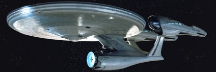
I get the distinct impression that to do the nacelles and secondary hull, someone stared at the USS Pasteur for a while. Just a thought. But even the Pasteur’s Bussard collectors had line of sight to open space, which the nacelles on this new ship don’t seem to have. Perhaps the designers didn’t know exactly how the different hardware bits worked (I violated this rule a little here and there, but I knew when I was doing it). Now I’m not being a whiner, just an informed critic. There’s room in this Trek world for healthy design criticism, as well as simply sitting back and enjoying a well made SF film. I -hope- the film is well written and clever and has good proportions of action, humor, tech, etc. but I’m also prepared to analyze the design work to see, perhaps, how far the shapes and colors and functions stray from 40 years of evolved gear.
This and the many other comments got the notice of the designer of the new Enterprise, Ryan Church, who has worked on the Star Wars prequels, the Transformers movies and the new James Cameron film Avatar. Church wrote in the TrekMovie comments:
I’m not going to get involved in the mud slinging, here, but needed to assure you guys and gals: we’ve built you a fine ship. To clarify: there’s a slight optical illusion occurring here, consequence of the “camera” angle. For Rick and others who worry the nacelles don’t have a clear line of sight over the disc — they, in fact, do. We were hardly working in a vacuum. I raided ILM reference photos like a madman. We were deferential to “inviolates” of Star Trek design vocabulary. Additionally, the profile here isn’t 100% representative, because, as you’ve noticed, the Bussards are dimmed. The true profile of the nacelles may or may not be revealed here, and that’s all I’ll say.
Sternbach replied back, noting that he has since had a chance to see a new angle of the Enterprise (lucky Rick!)
I went back and checked the Bussard clearance, and yeah, it works. I’ve seen a port side ortho[graphic] elevation, and I don’t have a problem with the mechanics of it, it’s the proportions and flows of the basic parts that look odd to me. Granted, no ship ever looks perfect in every ortho view, nor in every perspective view. We who have done this stuff in our sleep know that most vehicle and prop designs have their “best” faces. I’m not going to bore people with excerpts from my classical art and architecture books, though I will probably thumb through them here just to see if I can glean anything relevant. Like I said, I’ll wait to see how the film looks as a whole effort.
Which all just goes to show you that even the pros can take different views and even modify their views, especially when given more information. So far we have only two views of the new Enterprise and we have yet to see it in motion, that is worth considering.
Fan comparisons and mods
One of the great things about TrekMovie.com is our community of Trekkies and their creativity. Here are some comparison and modification images from our members (click to enlarge).
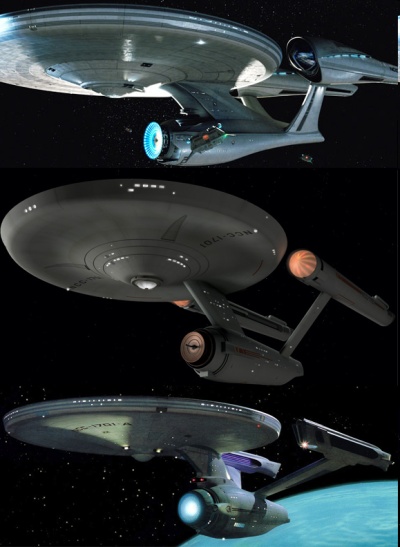
Comparison of new with TOS and TMP Enterprises by Kirky
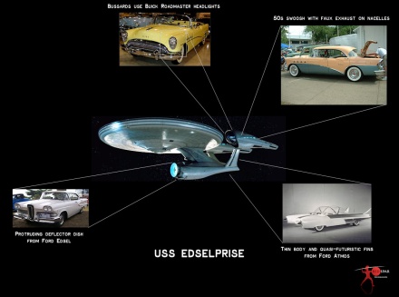
Tongue in cheek critique via comparison to 50s cars by RedSpar
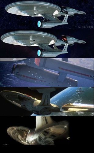
Modded primary hull and nacelle cap plus strut comparisons by Aqua and Jochen G.

modded secondary hull by Spockboy Paul
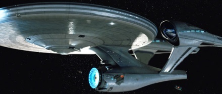
modded in secondary hull and TMP struts by Ben
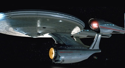
another secondary hull and nacelle mod by Daniel Broadway
And this for a little fun
The current poll shows that fans are split on the new Enterprise, with a bit over half ‘loving it’ or ‘mostly liking it.’ Although less than 1 out of 5 are voting that they don’t like it, it appears that some of that group are quite vocal to be sure. Our pal Spockboy Paul also put together this little video that encapsulates some of those fans reaction to the new Enterprise
Note on new image: it is not in the trailer
The new image released this week of the USS Enterprise is not a shot from the trailer. The Enterprise is seen clearly in the trailer being constructed and also going to warp. It may also be seen briefly in some of the quick cut battle scenes, but the specific shot released yesterday from Paramount is from a different point in the film.

Keeping an open mind…
I like the new Enterprise just the way it is.
Keeping an open mind too….would like to see a few more angles.
Holy crap it looks amazing! Love it! Can’t wait to see 007 and see the trailer!
Great video clip Spockboy!
Maybe we need a Trek design smackdown between past and present Trek design luminaries (presided over by Matt Jefferies via Ouija Board).
It’s not awful. Still like Gabe Kroener’s better, but I really REALLY need to see other angles. And maybe full technical specs and a manual ;)
I’m okay with it in all honesty. My only complaint is the deflector dish juts out a little too far for my taste. My head did not explode when I saw the third nacelle on TNG Enterprise so I’m sure in time I will learn to love this also…
What will really knock me out will be the interior sets…
Of course there is a big reaction , its Star trek , the enterprise is Star trek in many ways, its a symbol of the show, and in my opinion it is the most Real thing on the show .
I remember reading that one of the most important things to gene was that the ship was real , and felt real, non of that lost in space , ship being bigger on the inside then on the outsidet stuff.
i knew they would change the design , but i was hoping for something more like Gabe Koerner design , really its not too bad, just the neck and engineering sec look wrong , like its top heavy.
Some one over at subspace-comms.net was photoshoping it ,
I think this looks alot better , but thats just my opinion
http://aqua.mysfdb.com/wp-content/gallery/fan-art/fifth_ugly_kitbash.jpg
Still cautiously optimistic… I’ll wait until another angle of the Enterprise shows up and to see it in it’s full glory on the big screen before I make a final decision.
Still hate the engineering hull. Both Spockboy’s and Ben’s rendering give it more balance. Not against change at all. Fine with the updated design but the engineering hull looks like poo and I have hundreds of other posters here who think the very same thing.
Fix the damn engineering hull and flip the warp pylons upside down so we can get behind this baby,…please???
Now that I’ve had a chance to take it all in…I *love* it! Nicely done.
Thanks for re-posting these comments. For one, I had no idea that Ryan worked on this design (GREAT JOB RYAN! If this is mostly yours, it’s one of your finest!). More than anything else, though, I would encourage the pros to take no notice of us, rah-rah’ing or whining. It’s counterproductive. It was an impossible task. You would never have made everyone happy. AFAIC, you were true to the spirit of Trek and of this new Trek in particular. Kudos for that!
It’s great that people involved with Trek production post here. The new design is growing on me. I can’t wait to actually see some footage of it.
I’m wondering at what point (while reading the feedback) did Ryan Church regret taking this gig? :)
Cheers, it’s fun to watch a new Enterprise ‘reveal’
I love the look and direction so far in the new film. This is a re-imagination the franchise and they have been extremely faithful of the original while making it look modern. Kudos!
This new design has definitely grown on me. If you keep an open mind and stop trying to compare it to other designs, it becomes that much more stunning.
nice article, AP!!!
awesome.
THE WOMEN!!
=h=
Actually, now that I’ve had some time to look at it, it does look pretty cool! (I did get a shock when I first saw it) It looks 60’s and very futuristic at the same time. I just hope it looks ‘real’ on the big screen.
I still like this design. It’s still close enough. A good enough representation of the Enterprise and a true beauty.
Trust me, the normal folk either won’t notice the difference (since it’s reasonably close to the Movie enterprises), won’t care or will just go “OHHHH, pretty special effects!”.
I like the ship! It looks cool! It looks a lot better than the one in the Enterprise TV series.
I love it! Great job!!
And for those who cry foul with the design, I understand. It’s different yes, but this gives them an opportunity to evolve the design. Just like Kirk and Spock at each others throats (literally) the ship will evolve over the course of the movies.
Now I doubt it’ll change at the end of this movie, but I believe they will be respecting the look of the original E… eventually. Now let’s say this new series of movies goes on for three or four films, I’d imagine they’d gradually change bits and pieces to bring this new E in line with the old one over the course of those films.
The Nacelles are bigger… yes… but remember how big computers used to be? And mobile phones? So that doesn’t bother me at all. The hull plating is obvious, I mean come on! ILM is doing the FX I want them to detail every little piece of this ship. And they’ll probably do what they did with the NX-02 on “Enterprise” give it a slightly white paint job as the films go on.
I’m enjoying this ride, can’t waiting ’till May!
…I like the shuttles.
Let’s see some other angles so that we can get the complete picture. I don’t think this could qualify as its “beauty shot”.
Hey, looking at those photos, and taking in Ryan’s comments, I just realized something…. THE DEFLECTOR SECTION IS GOING TO MOVE. In this photo, it’s extended forward. It can pull back in when “deactivated”, bringing it closer to the traditional profile. Just a theory. But pull up that “filled in” shot, and soom in on it. Anyone else agree?
Whatever else it means, at least we are talking about Star Trek again. That’s nice despite people being rude.
Reminds me of the NX-01 reveal… and the 1701E reveal… and the 1701D reveal… and the TMP reveal… Wow, I’ve been at this way too long.
like I said in the other thread, for those who think it’s disproportionate or top-heavy, they’re looking at it the wrong way… the secondary hull doesn’t support the saucer, the saucer supports the secondary hull… it ‘hangs’ off of it, much the same as the Kelvin, or even the Saladin-class or any other ship where the primary hull is well, the primary part of the ship…
also, ortho-views for Ashley please? ^_^
I think we should take serious (in that sense) the idea that this is one view, and it’s incomplete. And, it’s moving.
I’m really happy Ryan Church has come out quite quickly to discuss this. It’s somewhat of a thankless job, and I assume his “E” will be analyzed to a subatomic level, and that, because he’s in the business, he realizes it.
I agree with 3. “Brian” that a few more photos would help.
For what it’s worth, some grandeur would help. Enterprise is not a clunky Imperial Cruiser, a hyperactive tiefighter, or a spunky X-wing doing barrell-rolls over Coruscant.
Hopefully, Mr. Church realizes this.
I wish Gabe Koerner had got the job. I’m not a hater or an obsessed fanboy, but for me, this just simply doesn’t feel like the Enterprise.
It’s missed the potential to be someting special instead of a parody.
That said, I am really looking forward to the movie and I hope it looks better on screen.
I hope this is the worst thing about the film
I personally LOVE the ‘new old’ Enterprise.
Yup, I could totally get behind this ship if it looked like this…
http://img.trekmovie.com/images/st09/st09ent2_spockboyt.jpg
or this..
http://img.trekmovie.com/images/st09/st09ent2_bent.jpg
There was plenty of room for the designers to create something that was far more true to the Enterprise. I would have been happy with either of these designs. They’re far more balanced. We’ve got until May….how about making some tweaks JJ and Team.
i like the shuttles too lol .
http://www.ex-astris-scientia.org/schematics/shuttle-70172-screen.jpg
http://www.ex-astris-scientia.org/schematics/shuttle-70172.jpg
Small observation… no visible registry number under the saucer.
Needs more editing
I still think they really messed up the Neck/Secondary Hull. I’m sorry, but it just doesn’t make the Enterprise look graceful. I mean, I’ve never seen so many call a ship “Ugly” before! If the target audience like it, fine, but goodness!
Fantastic article-about-the-article. Very cool job, Trekmovie staff.
I just wanted to add my comments about Gabe’s version of the Enterprise. While it is a masterpiece into itself, I think it’s a bit too “busy” for what they wanted to do in this film. This design is very sleek and retro. It totally fits into what I’ve been hearing from JJ and the crew.
lol spockboy that is too funny
@32 (lol myself), repaste , dont click on the links i posted above.
also this topic will go on for another 1,000 post, Paramount needs to man up and post some video clips of the ship moving and from maybe a different angle . !
10% of the saucer section is missing and 20% of the left nacelle, and another 15% of the engineering section is blocked by those shuttles flyin’ around.
C’monn guys, you can give us a better shot of the ship. It’s not like we are going to brake the DaVinci code if we had a better glimpse.
Jeez, come on, people – this thing is beautiful. Yes, it’s a little different than what we’re all used to, but every artist has his own vision. I can’t imagine how much complaining there’s gonna be when the phasers/communicators/tricorders get updated. and somehow, I doubt Chris Pine will have a little stack of rectangular plastic chips to stick into the computer interface on his chair. I wish everyone would just lighten up and wait for the damn movie to come out before ripping every little detail. I think these guys know what they’re doing.
You know, now I’ve looked at the new E for the hundredth time…
No, I still hate it.
Edselprise, indeed!
Spockboy’s video is hilarious and amazing! If you’re out there SB, what software did you use to put that together?
I have held off commenting until I got used to the new design.
My first thought when I saw the new design is it is still unmistakingly the Enterprise. It will still take awhile to get use to it, but I do like it.
I saw the modified pics of the enterprise here..it looks better..now change the nacelles to their original shape, then maybe i’ll shut up…..I think the saucer and deflector are fine though..guess i wasnt quite ready to shut up :)
Yeah it’s crap and he knows it. looks like his version went thru the mud slinger. Even the phase 2 version looks better than this garbage scow.
Yep, it’s the extended deflector dish that’s bothering me. My eye keeps getting drawn to it and it looks out of place.
Remember the scene in the last Austin Powers movie where he’s obsessed with Fred Savage’s mole? I’m kinda in that mode right now….
The nacelle clearance was one of my first head-tilt moments upon initial viewing. Once I saw the great XI – TOS – TMP comparison provided here, it all makes more sense.
I think our perception of this new ship will evolve as we see it from different angles and in motion. I can’t wait to see the “go to warp” effect in the trailer!
My general reaction is that it is a fantastic update of the TMP ship. I have no idea how Church was able to integrate all the elements of the TMP E that he did while updating it seemlessly, especially the neck, which has been the site of much criticism, but which I think is the most impressive part of the update.
My only concern is that it still moves like a ship at sea. Roddenberry was a Navy man, and Trek is a Navy-based show. These things are mammoth space vessels, not agile sports cars. Treat the movement with the reverence and respect a ship of this caliber deserves, and it’s all good by me.
I’ve loved the grey lady since the early 70s, I have the Franz Joseph blueprints, etc… and this redesign looks good to me. I was hoping a little bit for the 1964 Enterprise but I am fine with this take, which, to me, is blends the lines of the Matt Jefferies symmetrically planed original wooden boat with the organic, sweeping compound curves of Andrew Probert’s radical (but lovely) Enterprise-D.
Not sure I understand the snark coming off Sternback’s comments (unless it is pique) because there’s a whiff of his Enterprise-E in the thickened shoulders and the glowing blue geegaws. Thankfully they did not mess with the flying saucer, merely suggested a much stronger construction for the secondary hull, defensible given the insane torque that must come off her huge engines.
Can’t wait for the new blueprints!!!
right so votes are in , most us of would be happy with spock boy’s verison of the ship , maybe tone done the nacelles, so movie is coming out in the summer, that still gives ILM time to redue every single effects shot with the big E ??? it will only cost a few million, come on Paramount MAN UP ! , >>;)