
 There were two main concept artists for the new Star Trek feature film. In the last few weeks Ryan Church has posted a couple his designs on his site. Now James Clyne has joined in, by putting up over two dozen pieces of Star Trek concept art on his site. TrekMovie talked exclusively to Clyne about his work. See below for his sketches and what lies behind them.
Trek designer shows his concepts
The visualization of the new Star Trek movie started with two veteran concept illustrators, James Clyne and Ryan Church. Working with production designer Scott Chambliss, the pair stated in early 2007. Clyne tells TrekMovie that he is “proud” he and Church “had the opportunity to do the first visualizations of the new Star Trek." The pair also worked closely with director JJ Abrams. It was their task to work with Trek’s past while also envisioning something new. Clyne notes:
It was a lot of fun. JJ was fantastic to work with and very approachable. Throwing ideas was really collaborative…JJ wanted us to explore new visuals because he wanted to create a whole new world and reinvigorate Star Trek, which he did.
In the end Clyne ended up working on the project for over a year, staying on after the concepts were done to art direct the designers at ILM as they came up with the CGI models. Clyne took TrekMovie step by step through the parts of the film that were his responsibility…
The Narada
One of Clyne’s major contributions to the Star Trek movie was the design of Nero’s Narada. Clyne came up with the concept art for the externals and internals for the Romulan ship. The artist tells TrekMovie that he mostly had a blank page and that there was no detailed description for the ship in the script beyond calling it the ‘Battleship Narada’ and that it was from the future and not a traditional looking Romulan ship. JJ Abrams directed Clyne to create something ‘never seen before’ and said he wanted something ‘threatening looking’ which is what he got.
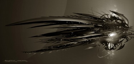
![]()

![]()
Clyne’s Design sketches of the Narada
(click to see full sized at his site – select the Star Trek XI gallery)
According to Clyne, he envisioned that because the ship was traveling through time (what he thought was back and forth through time), and that it had ‘contracted some kind of virus, so the ship became like an organism.’ As for the size of the ship, Clyne notes "there was a lot of debate about that, it is massive, but not as big as V’ger."

Clyne’s sketch of the Narada traveling through time
Clyne tells TrekMovie that some involved with the film, including some designers at ILM, had thought that the ship moved like a squid with the points moving forward, so on some sketches he had to note which end was the rear and even draw arrows on it some times. Clyne says "I thought it was more menacing to have the spikes forward."

Sketch noting the rear of the Narada
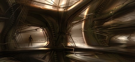
Clyne was also responsible for designing the interiors for the Narada as well. As you can see from the sketches, the ship was supposed to have hand rails.
![]()

Narada bridge and interiors
Clyne also designed the drilling rig, which was a major set piece for the feature film. In order to help out with the ILM team, Clyne also built a real ‘rudimentary model’ of the drilling platform.
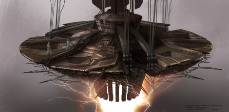

Drilling rig and early sketch of chain
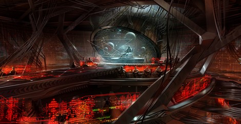
Kelvin interiors
The exterior of the USS Kelvin was designed by Clyne’s collaborator Ryan Church (who also designed the Jellyfish and the USS Enterprise), however Clyne was responsible for the interiors, including the bridge, corridors, the turbolift and the shuttlebay. Regarding the look, Clyne said Abrams and production designer Scott Chambliss wanted the Kelvin (originally called ‘Iowa’) to be more like traditional Star Trek designs, but also to be more ‘functional’ and have "more of a battleship aesthetic." Clyne said he drew inspiration from the TOS bridge, the bridge of the USS Reliant from Wrath of Khan and current military ships and submarines. Clyne admits that even though he was familiar and liked the Star Trek TV series and films, he didn’t consider himself an expert. However, he says that Paramount actually had a ‘Star Trek expert’ on staff who would “pore over the designs to keep us in check.”
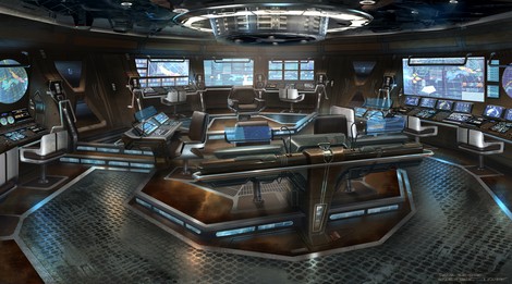
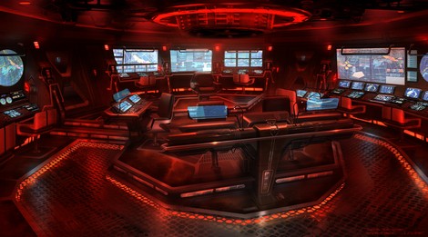
Kelvin Bridge (including red alert version)
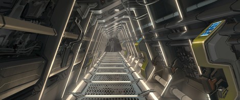
Kelvin corridor
Vulcan architecture and vistas
Clyne was also tasked with designing the vistas of planet Vulcan. Clyne used Vasquez Rocks and SkyRose Chapel as the basis for his designs, as both locations had already been selected to be used for the Vulcan scenes. Clyne came up with the idea for the ‘hanging buildings’ which were used in the final film. Clyne tells TrekMovie that it was originally planned for Vulcan to have a heavier atmosphere and red sky, but as we know Vulcan ended up with a blue sky (although Bob Orci contends Vulcan’s sky is ‘seasonal’).

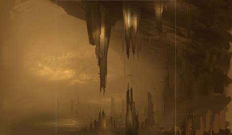
Vulcan vistas

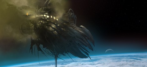
Drilling rig attacks Vulcan (note moons or other bodies in background)
Space shots
Clyne also did concept art for a number of Space shots in Star Trek. This first one shows the destruction of the fleet at Vulcan. Clyne tells TrekMovie that this shot was done early in the process and before there were new designs to draw on and so Clyne looked to Trek’s past, including the NX-01, the original TOS Enterprise and the USS Reliant.

Post-attack ships around Vulcan


More space shots from James Clyne
Cut scenes
Clyne also tells TrekMovie that he has some additional designs that have not been released yet from scenes that were cut from the film. Clyne was responsible for the designs for the Klingon Prison Rura Penthe (which was a redressed industrial location). He also designed (and they built), a special bike for Sarek, used in the Vulcan scenes. There were also additional sketches for Spock’s home on Vulcan. Hopefully these designs will be revealed by Clyne at a later date.
Clyne did reveal an extra tidbit about his work. One of this many projects working on the Star Trek film was to design the cool new Burger King glasses (and their packaging).
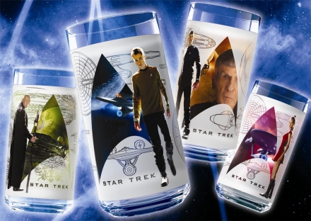
Clyne designed the Star Trek glasses
Clyne’s work will next be seen in the James Cameron film Avatar, which comes out later this year and he is currently at work on a new 20 Thousand Leagues Under The Sea.
More on James at his official site.
cool!
Those Kelvin interiors are awesome, I wish the Enterprise bridge had been a mix between those and the TOS from the original series.
Also, if Mr. Clyne is reading, is there a source to get Enterprise orthos? I see he used them on the glasses, and I’d love to get some orthos for 3D modeling reference.
Awesome!
The Kelvin Bridge is absolutely a stunning design. I only wish the Enterprise bridge could have taken a note from it!
BTW, speaking of the Narada, whatever happened to the Playmates toy of this ship?
This is very cool. I can’t wait to see more of Church’s sketches.
Awesome designs!!!!!
All very nice, but I want to know when the ART OF STAR TREK (and all such related books) are coming out.
LLAP
Bet I could Own those jokers
When I got the glasses I wanted to put them on a shelf next to my other Trek stuff, my wife took them down and insists on using them, but I still kept the packaging thinking it was cool, now that I know an actual bona fide designer of the film worked on them, that makes it extra cool!
Those are absolutely incredible…
Beautiful! I like the Kelvin bridge design better than the Enterprises.
I suppose it carried the idea that the Enterprise was new, still I like the added drama of the darker lived in Kelvin.
I want to go see this movie again.
Judging from these and other concept sketches we’ve seen (which show an Enterprise with orange bussard collectors) it seems that the decision to change the color to blue occured fairly later. Even some of the Burger King pictures showed orange bussards I’d still like to know why they went with blue, of all colours – those blue bussards annoy the hell out of me.
5. Devon
The Narada Playmates ship must have been considered too dangerous for children.
I like the H.U.D.s on the Kelvin’s bridge. Gonna have to see the movie again!!
The Kelvin blows everything else in the film away.
beautiful work
gorgeous, gorgeous art…. the designs in this film are unparalleled, truly.
This is beautiful stuff. Thanks Mr. Clyne!! This fan is happy.
Just gorgeous. Church and Clyne are amazing; both great choices for the new Trek designs.
I only wish I could buy a book with all of the new art and designs :(
I still want to know what the woman was yelling when she was being sucked out of the Kelvin.
Wow, those are some AWESOME Klingon Warship bridge and corridor concepts!! They really capture the look and feel of Klingon technology and aestetics.
…wait, those are the KELVIN interiors? A Federation ship? Oops, my mistake!
The Kelvin Bridge could have looked more like this: http://www.webolutionary.com/3d/images/bridge_goddard-8.jpg
It’s not only recognizable as a Federation bridge, but a TOS one at that…except “realistic” or whatever without going overboard, like Mr. Clyne (respectfully) did.
Yeah, I’m glad to see hand-rails hadn’t been “forgotten about” in the 24th Century, especially in such a massively cavernous setting as the inside of the Narada. It seems like a bit of a Star Warsian oversight from the designers of Romulan mining ships. Common sense, for me, dictates that if there’s lots of cris-crossing walkways over a huge chasm on my ship, basic safety features like a guard rail would be a bit of a no-brainer. Something a bit more secure, like, oh I don’t know, a wall would be better again. Perhaps the designers sought to save weight be eliminating such trivial things… despite being in space?
Anyway, apart from the Narada (the design for which doesn’t sit well with me – exterior either – should’ve been in Aliens), these designs rock. Probably prefer them to Church’s, if you’re going to compare them. Agree with what everyone else says about the Kelvin bridge, even though the “window” viewscreen still doesn’t work for me.
For me, though, the scene where the Enterprise warps into Vulcan orbit into the battle-torn fleet seemed like was completely awry with it’s sense of scale. But that’s picking nits.
Sometimes the end result makes much more sense when you can see the begginings of where they came from!
The Post-attack ships around Vulcan picture shows
the NX-01, The NCC-1701 (tos) and a USS Reliant all destroyed
which just feels to me like just an FU to past trek.
I known most people will hate me for saying that, but
It is just odd to me that all the Prime Star Trek easter eggs
in the new film are destroyed or blow up.
* Saurian brandy smashed.
* the NX-01, The NCC-1701 (tos) and a USS Reliant all destroyed
* Vulcan (A Prime Star Trek Fav) destroyed.
* Beastie Boys’ “Sabotage”, was more likely a dig at William Shatner (I think JJ is lying that it is not).
* The 1966 Corvette being destroyed. 1966 being the year Trek was first broadcast. seem like a dig to TOS (I think JJ is lying that it is not).
* and so on
Why does most of the Prime Star Trek easter eggs have to be destroyed?
The Artwork of the Kelvin Bridge just great (too bad the Kelvin Bridge in the film does not look like this and looks cheap).
The Artwork of the Kelvin Bridge is just awesome.
It like the NX-01’s Bridge meets TOS’s Bridge.
this Artwork of the Kelvin Bridge is canon to me for a Bridge of sometime between 2160 to 2240.
Darrksan (25) – you’re paranoid. Stop being such a victim. I don’t hate you for saying it. I just think you’re living in the past. Do you think Abrams would go to all the trouble of getting a licence to play Sabotage in the movie just to piss Bill Shatner off? If so, that’s a pretty childish thing to do. I think it was just an opportunity to get some nice Nokia product placement into the film. If anything, the ‘Vette getting thrown off the cliff can just as easily be seen as some kind of prediction of yesterday’s news of GM filing for Chapter 11. But that’s just crazy. People need to stop looking so much into things like that and just enjoy the film for what it is.
You talk about the NX-01 being an “FU to past trek”. Well, a lot of people would disagree, and would say the fact that Star Trek: Enterprise was ever greenlit was an “FU to past trek”. Personally, I’m a fan, but it didn’t wash with a lot of fans. At least, not until four years in, at which point it had it’s fate sealed already.
25.. My friend.. seak help.. you are, (just maybe) a tad paranoid.. Seak help.. or better still A LIFE!
why isn’t there a “making of” book for this movie?
I’d been wondering which E. Fay Jones chapel had been used in the film. This isn’t one of his best, but was probably the most handy to film. Thorncrown Chapel (which is where I had guessed the Vulcan scenes were shot) was designated one of the best buildings of the 20th century by the American Institute of Architects.
I hope the filmakers for the sequel will consider using Arcosanti, AZ (by Paolo Soleri) or the City of Arts and Science in Valencia, Spain (by Santiago Calatrava). Both would make outstanding locations for the 23rd century!
Well, the NX01 is a great ship to my opinion, very realistic. If I see the Kelvin I can see it’s an evolution of the NX01-NX02 etc.
It looks very awesome and realistic as well. The new Enteprise is another big evolution of those ships. It’s ‘the’ switch from dark to light.
Personaly.. I think they got it totaly right with the look of the Kelvin, then the Enterprise.. when you look at the NX01 Enterprise, then the Kelvin, then the Enterprise.. it shows the kind of progression in design and tech, that makes it all hang together as “real”..
In the second picture of the Narada, the Enterprise is visible in the “exhaust” of the ship. Was the Enterprise originally scripted as hiding from the Narada’s sensors in its wake (ala Voyager and the Hirogen in “Flesh and Blood”), rather than in Titan’s atmosphere as in the film? Looks that way to me…
Well I think its kinda ironic that he is now working on 20,000 Leagues Under The Sea since the Narada ship design immediately reminded me of a cross between the giant squid from that classic movie and the Nautilus submarine ship itself-that Disney movie from the 50s is such a classic with an awesome design and look that still holds up to any of todays movies–one of my faves! I cant believe they would be remaking it and the rock is gonna be Nemo? Sheesh! Doesn’t he seem to be more like the physical yet kinda simple minded heroic harpooner Ned Land? He was so outta place in the witch mt remake which except for a Whitely Strieber cameo, sucked! Five minutes of the original witch mt had more depth and suspense than the whole race to witch mt remake-the original had Ike Eisenman from WOK in it-has the word been given Admiral?
Clyne is a great artist-I have to admit that the BK glasses are the best designed movie tie in glasses I have ever seen-now I know why!Both the glasses and the boxes they came in were so awesome that even though I am using the glasses I couldn’t throw the boxes away-they are just too cool! Thanx for the great designs Mr Clyne!
I’ve wanting an ‘Art of Star Trek ‘ book for a while. Now I’m salivating for it!
pity they didnt stick to his vulcan designs- why was the sky changed- hoe did nero traveling back in time do this?
fashion and technology can be influenced and changed but a planets atmosphere?
Seasonal? – what a cop out.
I understand they might have wanted vulcan to appear cold dull and umwelcoming but they could have done that with the archetecture colour and lighting of the sets- and the intrusive flashes of red sky peeking in as a reminder of the human emotion barely contained in spock could have been wonderfully symbolic- these are the cannon violations that hurt the series- u can create an alternate time line and gift us with a clean slate for storytelling but u cant change everything- there has to be a line.
I can’t wait for the follow-up books, artwork, visual guides, etc. like the ones that are out for Star Wars and Watchmen.
DVD by Christmas????
Beautiful work.
Remarkable talent.
Narada was a fine piece of work, bravo mister Clyne.
Church, however, should be posting apologies on his site. That Enterprise redesign has surely earned him a trial at the Hague.
39. I wasn’t a big fan of the Enterprise until I saw it on the big screen. Yes, elements still bother me, but my initial apprehension was quashed between seeing the first released stills and beholding it in motion. I think a lot of people feel the same way about it as I do, too.
I think the Narada has a certain Farscape-esq vibe. I could see ol’
Scorpy chasing Moya in the Narada.
The NX-01 and the TOS style starship debris above Vulcan is chilling…
the Vulcan vistas are beautiful..though I still am not buying a seasonal red sky…I’ve heard several scientists explain atmospheric blah blah blah…but I think that Vulcan is a mainstay and she should have been shown in her red splendor..though I guess that does not matter anymore..
LONG LIVE VULCAN!
As for the Big E re-design…didn’t care for it much at first, but those shots of her going to warp and above appearing above Saturn are so beautiful, that she definately grows on you fast….the engine room is still up for debate!!
I like his designs much more than those of Ryan Church. The Kelvin bridge looks way better, than the one of the Enterprise and all his other designs are much more fitting – with the exception of the Narada, which is just style over substance and doesn’t make any sense in any universe. As Scotty put it: “If there’s any sense to the design of the enemy ship, I’ll be putting you in the middle of the cargo bay.” – and we know where Kirk and Spock ended up.
I can live with Church’s Enterprise on screen, but I caught myself thinking several times: How much better would this look with a decent design. Especially, when we see her for the first time.
I agree with all the comments above re: the Kelvin bridge – why couldn’t the bridge of the enterprise look this good? Maybe next time…
“The NX-01 and the TOS style starship debris above Vulcan is chilling…”
Yeah, but more in line with what I was wanting…
They could have perhaps done it, the new “Enterprise” along side all of her TOS style companions…Sulu leaves the parking brake on, and the Enterprise arrives in the scene above…
Hidden message – “Nero just blew your precious canon all to Hades!”
;)
End of the day.. design is subjective, for every person who likes a thing, there will be another who don’t.. for me I liked the Kelvin and the Ent.
It’s very easy for folks to bitch and moan on an Internet board, but the truth is, very few who do, actualy have diddly squat idea, as to how much work really goes into the “creative process”.. and to simply say “oh I don’t like it, this looks better”.. is rather an injustice to those who are creative and talented enough to bring this movie to life…
Wow! This is great stuff. Clyne’s work reminds me of Ralph McQuarries pre-production artwork for “Star Wars – A New Hope” and for “Star Trek Phase II (the 1970s).”
It’s great seeing the roots of the movie. Both his and Church’s work compliment each other nicely.
“pour over the designs”…
No. It should be PORE over, as in examine on the skin pore level.
Great images, btw. Yes, we need a big book of this stuff!
I hate to go all fanboy, but the Narada makes perfect sense even if you don’t include the Borg stuff from “Countdown.” Though I have to admit Countdown’s idea of Borg nanotech working without control for a while is a chilling concept (and adds to things like there being no safety considerations)…
However, even just looking at the film dialogue, the Narada is a mining ship. It’s got the drill for planets and moons when necessary, but I don’t think it’s a stretch that such a ship mined asteroids too. Hence all the spikes and tentacles. Depending on the size of the asteroid, the Narada could either anchor itself with the spikes, or pull a smaller chunk in toward the interior for easier mineral extraction. You don’t want to go back and forth to home port as much, so the ship is huge to allow for more mined cargo. Sometimes, the drill can’t be properly deployed against a rotating asteroid- so they carry a number of high yield explosive charges, primitively propelled with rockets instead of being a warp capable torpedo.
It’s the Romulans by the way- I doubt they have labor unions who strike due to worker safety concerns. If you don’t want to fall off the edge Mr. Romulan miner, don’t walk toward the side. When you do drop, we’re all going to laugh at your broken corpse. Or did it seem like when Nero, or even Kirk jumped, there was some kind of variable gravity thing going on? Perhaps you don’t need railings because the ship will catch you.
On a different note, I was quite displeased with the Church Enterprise when I first saw it… but seeing it in motion has really changed my tune. She’s not meant to stand still. She is meant to soar, never idle. How like an Enterprise…
He put an NX saucer section in the wreckage.