
 2011 may seem a long way away, but the Star Trek: Ships of the Line: 2011 Wall Calendar has just been released, and it is yet another great collection of starship porn for Trekkies. We have some high res images below of the front and back covers plus a couple of interior pages, including the "centerfold"…hubba hubba.
Ships of the Line 2011
click images to enlarge
Front and Back Cover (Showing thumbnails of all the months)

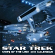
Ships of the Line 2011 Front cover
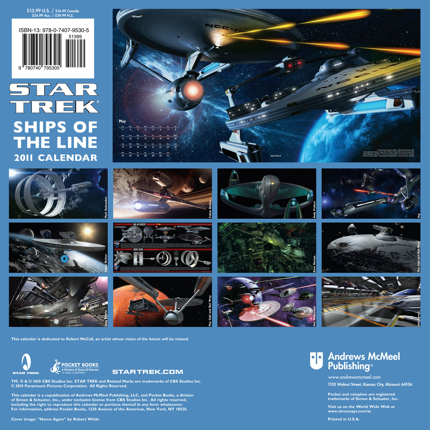
Ships of the Line 2011 Back cover
Interior pages, showing the centerfold with details on the NX-02 refit and ring ships.
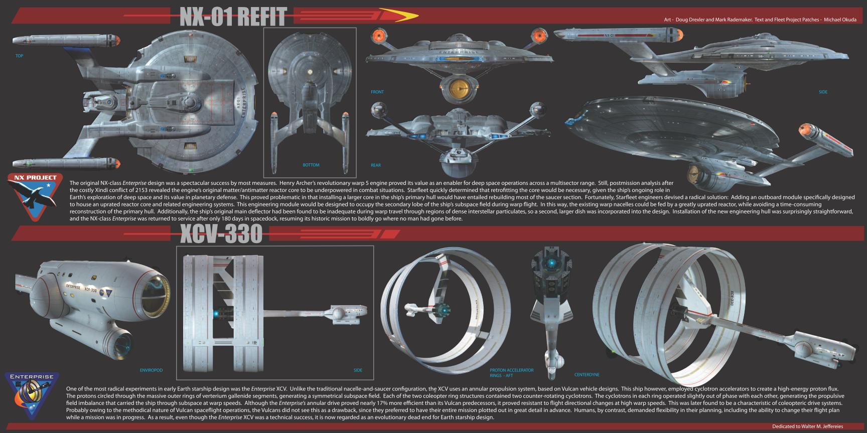
Ships of the Line 2011 Centerfold
The new Ships of the Line calendar is available now at Amazon and book stores.
P: Note cover shown at Amazon is not the final cover.
Nice! I know what I’ll be picking up!
FYI that’s the 2010 October pic.
SWEET ! IM GETTING 2 OF THEM . ONE FOR COLLECTION ONE FOR MY WALL :-D
Awesome! This could be one of the best SOTL calendars so far. Great focus on the Enterprise to TOS/ST09 era, kinda wish there was some more TNG (Enterprise -D or -E) but what’s in this edition looks great.
Love the NX-01 refit, and there’s a very interesting ship design in the second last image.
In These Are The Voyages, didn’t we see Tripp in the old engine room working on the original warp reactor? And didn’t he say something like he’d continue to maintain it until the ship joined the moth ball fleet? If the ship received a new secondary hull and uprated reactor core, why did the holo recreation Riker was running show Tripp working on the old core rather than the new one?
My bad, just realised the final image was of the Ent-E by the look of it.
That NX refit is pretty cool, also kinda nice seeing another take on the old ring ship. Also that cover pic, while similar to one of the movie shots is pretty cool too!
Personally I dislike it that at least half of the calendar is always showing TOS. It’s a great series, but why doesn’t every calendar include at least one month for each series?
But, having seen the pics of the 2011 cal I have to admit… the TOS and TMP pictures look totally great! So, weak complain on my side…
But I’d really like to see the Luna class U.S.S. Titan – that would be awesome!
Conclusion: 2011 – really great and eye candy
Gorgeous artwork as always.
@5 “And didn’t he say something like he’d continue to maintain it until the ship joined the moth ball fleet”
Because the Rike holodeck program was set before the the refit? And the remark about maintaining the ship until she was mothballed was just a throw away remark about devotion to the NX-01?
Wow. This reminds me of the whole reason I love Star Trek. Cool ships.
It’s too TOS heavy… Each series should get a fair share of pages.
2 TOS
2 TNG
2 DS9
2 VOY
2 ENT
2 Movies (1 – 11)
I’d like to see the Aventine from another angle.
The Enterprise picture from the new movie is from Tobias Richter. Very nice!
There are TONS of Star Trek wallpapers on his homepage:
http://www.thelightworks.com/
Reel&More -> Wallpaper (Don’t forget to scroll! There are more than the Star Trek Part I and II 1280×1024 wallpapers! Move the mouse on the big pictures.)
And under VFX/TV there are some excerpts of a Star Trek video he made for the Fedcon.
I love these Ships of the Line calendars, though quite honestly I think the Aventine is one of the weaker Trek designs I’ve seen – never cared for that flattened look. Anyhow, they really brighten up my office at work (and are an endless source of conversation). This will be picked up with my next Amazon purchase.
>>> too TOS heavy
FINALLY!!
And that includes TOS series, movies and Star Trek 09,
Love, love, love the cover.
XD “coleopteric drive”?! Bug propulsion?
This calendar is a must have!
I cant help but feel that thats what the NX-01 should of looked like anyway…
Oh, what could of been
The Robert McCall dedication is cool.
Gorgeous artwork as always.(2)
This is a definite “must have” for my 2011 budget.
Hey, if anyone in the industry is listening, these would make wonderful full-sized posters also.
I would really love them to release a 2nd Ships of the line book. I don’t use paper calendars anymore but love the artwork to these.
I wouldn’t mind if they came out with a toy that looks like the refitted NX-01 Enterprise.
The art is really lovely, but I do wish these were actually functioning calendars, where you could write notes, etc. I ordered one last year not realizing it really was only a display item.
Looks like the 2011 version is a keeper! This artwork keeps me coming back for more.
Beautiful, beautiful, beautiful, all of them. The NX-01 / XCV-330 layout is my favorite, followed closely by the Aventine. This is the best SOTL calendar yet — a definite must-have!
Just wanna say Tobias Richter in particular is spectacularly talented…
Tobias’ and Doug’s stuff- WOW!
SO COOL….is there any ship more awesome than 1701 and 1701A…
sory but TREK09’s big E just doesn’t move me…watched TMP last night and still get a chill when Kirk sees the Enterprise in drydock for teh first time…she is grace and design!…than page with Enterprise firing on Reliant is beautiful!
Not enough TOS!
The Aventine looks like a predecessor to STO’s Star Cruisers
Oops. I meant upper RIGHT corner for Deg’s Enterprise.
Love me some TOS. Gorgeous renderings… I’m buying this one for sure!
@12 – Calendar design should definitely NOT be based upon equal representation. There is always one era that gets the glory in these calendars. This year it was TOS, and I’ll bet it’s because of the recent movie. Newcomers to the franchise are most familiar with that era, and the designers know it. Honestly, so long as everything is original and beautiful, I’m happy. In the past there have been some very shoddy designs, but this year it looks good!
This is one of the best ones yet!
Only Star Trek nerds like me (and engineers) would go “hubba hubba” over starship calendar centerfold.
Hubba^2.
I know what I’ll be buying! :D
Nice. But I’m still wondering why the new J.J.prise hotrod didn’t have any ghost flames going down the side of the nacelles or a pair of fuzzy dice hanging from the deflector dish. And would it have killed Uhura to wear a tube top? C’mon, if they want to appeal to the youth market (Ipod bridge, James T. Kirk Cameron, brew-gineering, etc.), they might as well go all the way.
The NX refit is absolutely brilliant–and beautiful!
Ships of the Line:
Starship Pourn. Love it! (But not literally)
WTF?? Ugly ST09 ships in my beloved Ships of the Line calendar! I’m seriously considering cancellation of my pre-order.
Totally agree, the whole “ST09” thingie could be in a post Nemesis setting, with these same actors playing different characters.
Quinto could be just another troublesome vulcan, Pine could be just another dude inspired by the past.
Then it would have no conflict, it wouldn´t be this big white elephant that doesn´t fit with the rest of Star Trek.
This “ST09” Enterprise could be “Enterprise-F”, could be as many shaky cameras and it would be just nfine.
40, I love the way that the refit has been interpolated as well.
Trek people are, without any doubt in my mind, some of the most imaginative and rational creative types in the entire world. What a wonderful way to make the transition from the NX-01 to the TOS Constitution-class Enterprise.
And I have great affection for the mission patch for the Enterprise-class, as well. Clearly the XCV was a pioneering design, and what better mutual honor is there than to give the name to that class of ships.
In the real world, “Enterprise” is a storied name. Yesterday’s Enterprise — that of World War II fame — was the most decorated U.S. naval ship of her time. Today’s Enterprise was the first nuclear-powered aircraft carrier ever made, and the longest aircraft carrier in the world (longer even than the Nimitz-class, though not as heavy). And although the cruiser, the USS Long Beach was the first ships of the “nuclear navy,” the Long Beach was scrapped a long time ago, while the Enterprise still serves.
Finally, how often can you use “imaginative,” “rational,” and “creative” in the same sentence to describe the same people? Not very often!
Wonderful, wonderful work at a level I can still only aspire to. Congrats to all of the artists involved in this project.
#39 – But they obviously didn’t do that, so not sure what you’re point is.
#46
I think he was being sarcastic.
#23: “I don’t use paper calendars anymore but love the artwork to these.”
Too bad they don’t have digital version of the Star Trek calendars too. It would make a great addition to my computer wallpaper…
I have every single calendar they have produced from the first on (1976, I think).
As far as the NX refit goes, I don’t even count “These Are The Voyages” as cannon since the whole thing took place in a holodeck recreation set 200 years in the future so there could be a lot that wasn’t accurate. What I’m wondering is why, if they added that big deflector dish to the engineering hull did they leave the original dish in place as well? That thing takes up a lot of space in the primary hull after all and would be a waste of power. Too bad Enterprise hadn’t gone on long enough for that refit to become a reality.
#46
What? You don’t like ghost flames, Chewie? No fuzzy dice either? Hey, if you’re gonna go swinging around the cosmos, you gotta turn some heads and eyeballs, man. You can’t just go impulsin’ along with gray primer and factory speakers. Competition’s stiff out there. Ain’t you seen Kor’s new ride? Brand new battlecruiser off the lot with two-tone metalflake and a warp-7 flathead. Make you dizzy, sucka.