 The international marketing for Star Trek Into Darkness continues to ramp up. Today Paramount released the final one-sheet theater poster for the movie with a new tagline. You can check it out below, we also have more details on UK and Ireland ticket sales starting on Tuesday. [UPDATE: More country variations added]
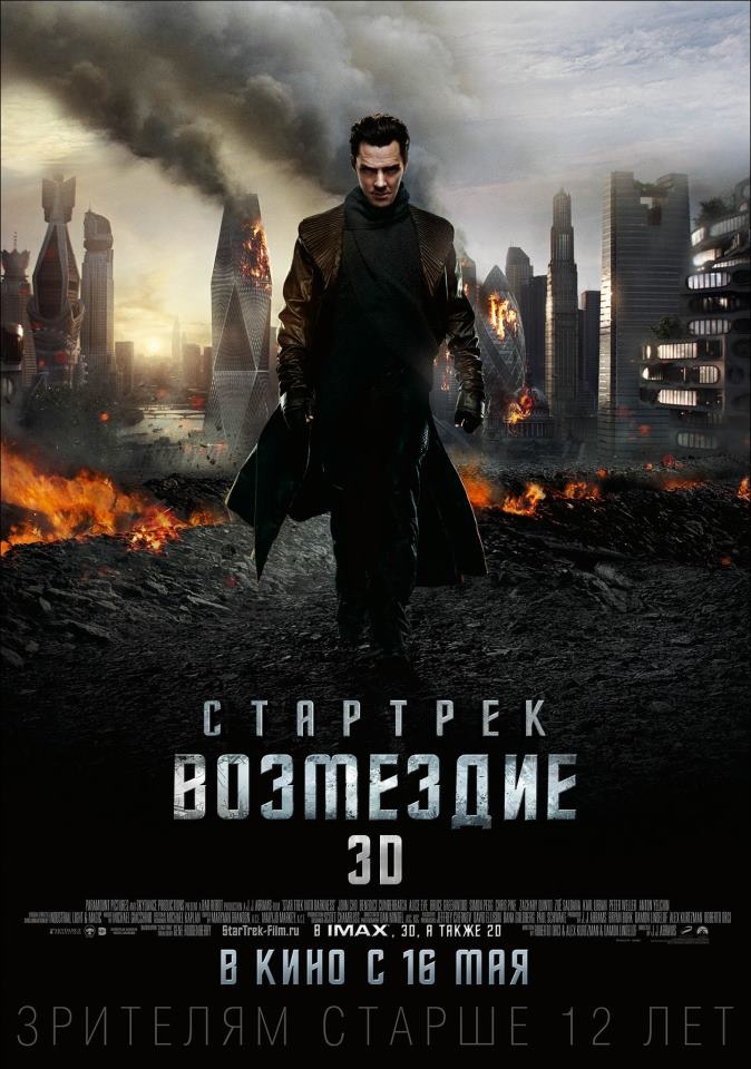
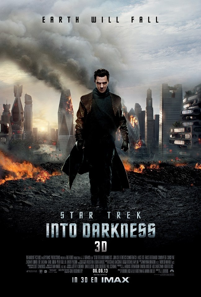
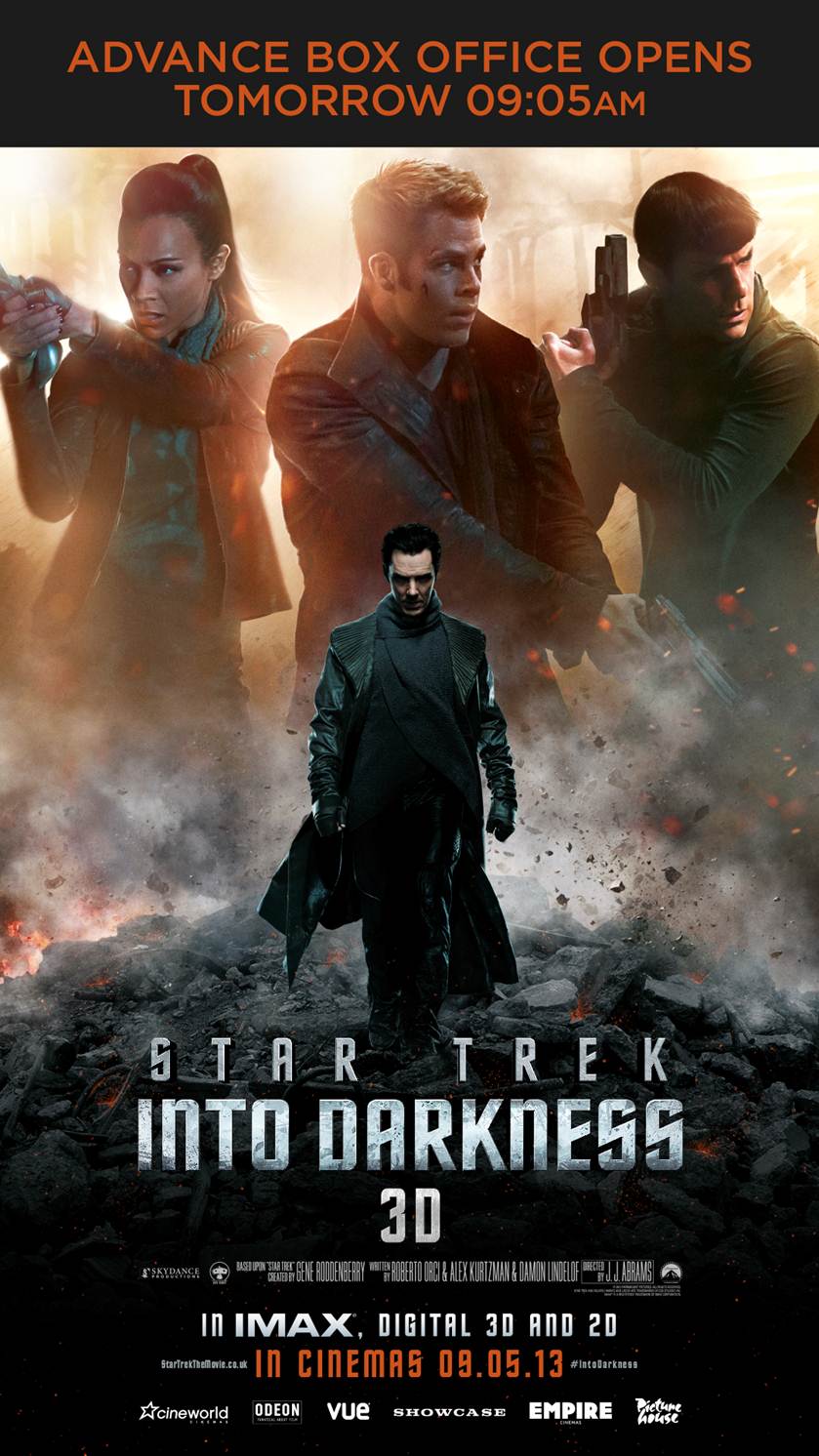
New International one-sheet Poster – Earth Will Fall
Today Paramount released their international ‘one-sheet’ theater poster. Here is the UK version.
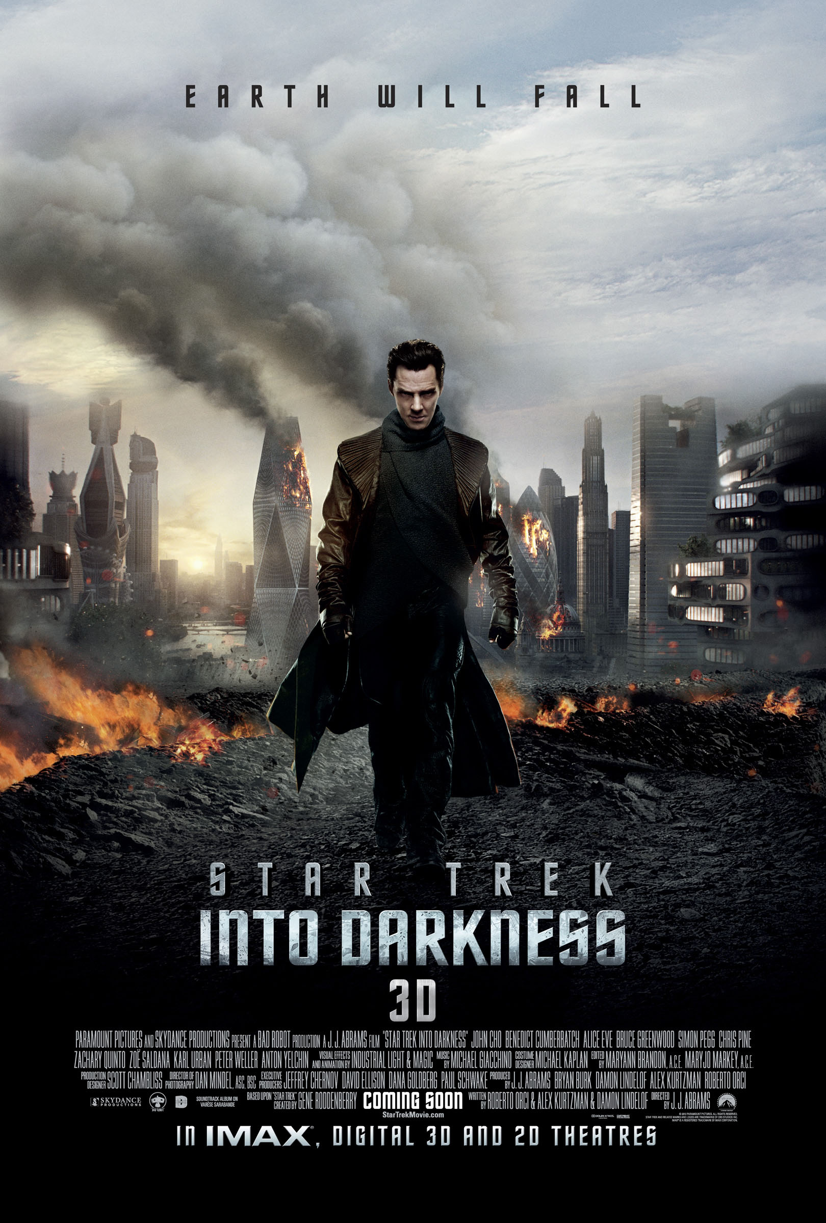
International Star Trek Into Darkness One-sheet Theater poster (click to enlarge)
[Download right click – choose "save link as…"]
As with much of the international marketing for the movie, Into Darkness is being presented as a traditional summer action-movie. This is due to an effort to boost international sales where Star Trek has traditionally under-performed.
UPDATE: More variations
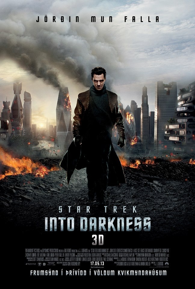
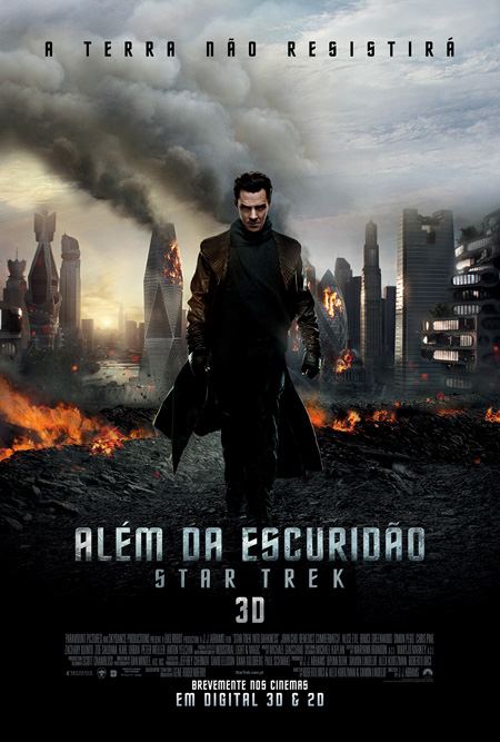
There are also localized versions of this new poster.
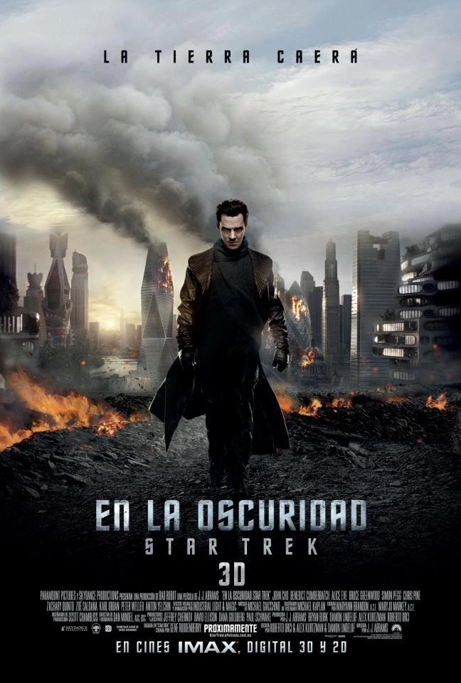
Latin America, Iceland and Russia versions of int’l poster


Austria, Finland and Netherlands versions of int’l poster
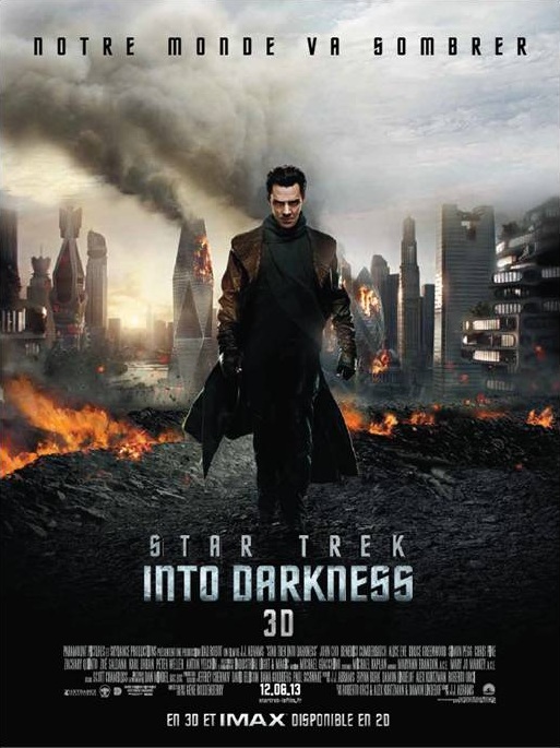

France, Belgium and Portugal version
Domestic one sheet poster still to come
TrekMovie has confirmed that the final US one-sheet theater poster has not been revealed yet – and it is going to be different than the above international poster. The international marketing is a little ahead because the movie opens in some international markets a week before the domestic opening on May 17th.
More details on UK & Ireland sales starting Tuesday
Yesterday TrekMovie reported Odeon would begin selling Into Darkness tickets on Tuesday morning at 9:05 AM for the UK. According to Paramount tickets will also be available (for both the UK and Ireland) from Odeon, Cineworld, Vue, Empire, Showcase, and Picturehouse cinemas. You can also get tickets at the Paramount Website.
UK Early Ticket Sales promo poster
TrekMovie is still trying to find out ticketing information for other countries, but if you are in one of the countries where Star Trek opens on May 9th, you should check your local theater websites.
POLL: You like the poster?
So are you a fan of the poster? Or not. Sound off below and in the new TrekMovie poll.
[poll id=”712″]
Beautiful. And something we’ve never, ever seen in Trek before. That’s a good thing.
BORING poster! Like I said in a different thread,they REALLY need new marketing people.
J-R!
@2
they will probably get better as the movie draws closer, its just to let people know its ther
If I didn’t know what this was, this poster would make me want to see this film. At the very least I’d stop if I saw it, back up, and then Google for more info. Marketing success!
It’s a really interesting poster, visually, but if you took the text off, you would have no idea it was a Star Trek movie. That’s what makes the other poster more effective, because it incorporates the Starfleet delta into it.
No it’s not JRT!. That Briliant. They put the Brit celeb in London and show London burning behind him. It’s the “INTERNATIONAL” poster (for Britain,) to advertise Star Trek in a market historically unfavorable to Star Trek.
@3
I hope so. This is just,meh. But since it’s the international poster,I guess they wanna really push the Brit to the forefront,lol! Let’s hope the US one is better than this.
Yes it is,I’mPaul! lol.
J-R!
This poster is boring generic action schlock. Not to mention as a graphic designer/vfx artist, I can’t help but notice they duplicated the same smoke element 3 times in the background.
@ JRT
If they could make a poster like this http://th03.deviantart.net/fs71/PRE/i/2013/005/0/6/star_trek_into_darkness_by_n8ma-d5qi9pt.jpg
I would be happy
LOL! Yep,boring. I have to admit my reaction was completely opposite of AyanEva. Does not make me wanna find out more about the movie and epic fail in marketing.
But I’m sure we’ll get something better,at least I hope we do. Looking forward to the movie though.
J-R!
Don’t have any strong opinion about the poster, good or bad, but come on Paramount (or Bad Robot?) graphic designers! Check out the smoke billowing from the buildings – can say “clone and stamp?” What an awful Photoshop job. Looks like something the Iranians or North Koreans would do to cover a botched missile launch.
OH DUDE! Now THAT’s a poster! GEE,why don’t YOU work in marketing for them dude!? THAT I would put on my wall,this one…..no.
J-R!
#8 – Sorry Daniel – didn’t see your post. Talk about cloning…
Boring poster, terrible tagline. I love the poster from the 2009 movie with the Enterprise flying at warp. Star Trek posters should show ships in space. Crew posters are boring, character posters are boring. Ce la vi.
LOL @ 11!
LOL! I like this thread,’tis funny.
#10- Well if they’re marketing it overseas to a more action-oriented crowd, and I’m pretending that I’m one of these non-Trekkie casual observers, then I think this poster does the trick. It looks like awesomeness and mayhem is happening with Cumberbatch somehow involved and you probably don’t need much more than that, tbh.
These new posters sadly dont even close to the amazing poster featuring the stylized black and white Enterprise from the first movie, yet are much better than the odd black and white individual crewmember posters from the first movie.
Strangley enough, I think one of the best, yet rarely used, promotional picture from the first movie was a great image of Kirk and Spock, artistically lit, on the Kellogs Cornflakes box. Sits on my refrigerator as we speak. Hopefully there are more interesting images from the new movie that have yet to surface.
#9- I… actually hate that poster. Too many things going on, too many elements, not a clear message. lol Good thing the group of us aren’t a focus group. They’d never figure out what we wanted! LOL
Wow! copy and paste smoke. I learned that in my 9th grade Photoshop class. I should work for big companies like paramount
Why is it almost every Trek movie has Earth in it, when they should be exploring the Final Frontier???
i like the poster myself (though it would be epic with a -small- Star Fleet ship exploding in mid air, to remind you its ST)…
Is it just me or did they copy and paste the smoke element…
@ 21
William shatner already discovered that for us in Star Trek V, we haven’t dared returned to it hence
;)
It looks like a poster for a generic amateur made action movie on youtube?
This screams “generic action movie” rather than “Star Trek”. Bleh.
@6. I’mPaul,
“It’s the “INTERNATIONAL” poster (for Britain,) to advertise Star Trek in a market historically unfavorable to Star Trek.”
I don’t believe the UK has been an historically unfavorable market. I believe it’s just the opposite.
Now if its for other countries in the EU and elsewhere that would love to see London burn, then maybe you have something. Just not so sure how strong that is to encourage viewers who aren’t historically interested.
One thing is for sure, it’s CLEAR who the STAR in Star Trek is in this film …
… Hope Chris Pine doesn’t cry about this too …
They should just drop the word “Star” from the title. I think “Trek into Darkness” is a perfect title for this movie.
The dude – EXACTLY! Now go and get that job in marketing at Paramount! And show’em that cool poster you posted a link to,lol!
AyanEva – LOL! I KNOW,right!? As an international poster I guess they have to do this kinda thing. Still wouldn’t peak my interest though,it’s too samey,seen it before kinda thing.
star trackie – lol! LOVE that cereal! Such a fun colorful box! Wish they’d bring it back for this movie.
are we all getting a new poster design each or what?
#26 and #27 have you seen the trailers? Because that will confirm your observations.
I think to everyone who is saying “that doesn’t look like a Star Trek movie poster”, I would say you are correct!
I would also say, that’s probably the point. They are reaching for a much wider audience. I would guess that most of the posters, commercials, marketing materials etc that we will see leading up to the release date won’t look like a Star Trek movie at all in order to reel in more viewers. I think that might the nature of the beast when it comes to advertising Star Trek as a summer tentpole movie. I would respectfully disagree that “whoever is in Paramount Marketing needs to be let go” because we as a fanbase are not in the advertisers’ crosshairs in this instance, and they are zeroing in on the average movie-goin’ joe schmo who is deciding which movie to go see that particular week.
And I don’t think there’s anything wrong with that per se. More butts in seats means more ticket revenue means continued Trek adventures and merch.
Im faithful that the content of th film will be stronger than the blitz to promote it. It was back in 09 and I have every expectation it will again.
But yeah that Enterprise-in Warp poster was my fav the last time around too…I just don’t see that sort of image presented for the fans happening this time around
@ 27
And generic action movies scream
KHAAAAAAAAAAAAAAAAAAAAAAAAAAAAAAAN!!!!!!
This the worst poster ever made!
There is nothing worst then this and nobody can tell me otherwise, you can choose any (ever) and this one tops it as the worst, (look at that smoke, yea just the smoke).
I am pretty sure the smoke is just the exact same cloud layered over each other
Somebody works for Paramount and JJ and thinks we’re stupid…
Maybe they should hire fans to the make posters, we could at least actually put some effort in and blow up London to get real smoke. JK
I said “not really”… I’m not impressed with this poster … lack something, it’s boring!
31. Buzz Cagney – April 8, 2013
are we all getting a new poster design each or what?
#26 and #27 have you seen the trailers? Because that will confirm your observations.
I’m trying to suppress the memory. And hoping that everything that happens in the trailers is just a small 10 minute part of the movie and the actual plot and the rest of it is something completely different.
______________________________
32. Planet Pandro – April 8, 2013
You know you’ve hit the rock bottom when you have to rely on successfully tricking people into seeing your work.
I like all the posters so far but I miss the Enterprise. But then, anything with the Cumberlord on it has got my vote!
That smoke!
#5. LLAP:
It’s a really interesting poster, visually, but if you took the text off, you would have no idea it was a Star Trek movie.
My thoughts exactly.
#28 Curious Cadet:
One thing is for sure, it’s CLEAR who the STAR in Star Trek is in this film
This, too.
… nothing against BC at all. I’m positive he’s as wonderful as everyone says he is, but call me a bit of a traditionalist… a Star Trek poster ought to have you know, Star Trek regulars on it, in the very least. Novel concept, I know. Apparently we’ve gone beyond debating the virtures of McCoy vs. Uhura being on the poster, now we don’t even get Kirk or Spock. :(
Hey Paramount, you remember Kirk, right? 47-year-old character. Captain. Modeled after Horatio Hornblower. They character Forbes bases it’s five lessons in leadership on? (http://www.forbes.com/sites/alexknapp/2012/03/05/five-leadership-lessons-from-james-t-kirk/).
Then there is Spock. Vulcan. Exceedingly popular. Voted #3 favorite non-human character of all-time behind only Kermit the Frog and Lassie (http://www.tv.com/shows/2020/best-in-tv-best-non-human-character-2571755/)?
… just thought I’d remind you because you seem to have forgotten them.
#37 – I realise you’re joking but suggesting blowing up a city, even in jest, in in very poor taste.
Uh, is Benedict Cumberbatch in some new post-apocalyptic zombie movie I’ve never heard of?
Kirk holding a Beretta, Spock holding a Glock, and Uhura holding a firelock. Great. And a poster that looks like it’s advertising a video game rather than a Star Trek movie.
I don’t really like the poster because it is much the same as the poster already out there.
It is colourless – I know this story is about dark, grey times, but really? Surely, included in the poster could have the Enterprise crashing or something. This is London? – it just looks like any other city anywhere, totally bland. Perhaps that is how it will be in the future. All features that make a place distinctive – like the architecture of Piccadilly Circus, Tower Bridge and other interesting architectural feats – will no longer exist. Oh, how “exciting”…:(
They’re going in the right direction. Trekkies will love it and this will likely draw in those who would otherwise be put off by pictures of space, the Enterprise, Kirk, and Spock, and the words “Star Trek.” By having a Brit as the only person in it will help in that market as well.
here if you want to complain about the posters not being “trek” enough or with the “real characters” why don’t you complain about this BC’s fest instead of whining when they include Uhura? At least she’s one of the main characters.
Cool guys don’t look at explosions.
They turn their heads and they walk awaaayy…
The poster looks like a generic war/terrorist movie playing on earth in the present. I usually don’t waste money on these kind of movies in the cinema.
I guess the poster was made to attract people, who dislike scifi movies, movies playing in the future in general and even Star Trek, considering how much bigger the “Into Darkness” part is than the “Star Trek” part. Overall it is practically false advertising.