
 Trouble with Quibbles
Working under a ludicrous schedule and forced to deliver unfinished work is no doubt a sore spot for the folks at CBS Digital. The first episodes of Star Trek: Remastered were uneven at best. Quality matte and live action replacement details were accompanied by poorly lit space shots, and a decidedly plastic looking Starship Enterprise. Such quality is usually only seen in test shots never meant to be seen outside the studio screening rooms. Years ago I had gone through the process of trying to find a style and look that was reminiscent of the original and yet still updated for the modern day. CBS Digital has been going through this same process as well, but with an audience watching their progression each week. We lived through the good, the bad and the mediocre. Now, at last, there is a lot more of the good in Star Trek Remastered.
A new day and a new model
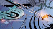
With the creation of a new Enterprise model, the FX team now have the ability to finesse lighting and textures to more closely resemble the original 11 foot studio model. Are they successful? Yes…mostly. The textures are nicely varied now with more subtle paneling and variance (or at least these textures now have a chance to be seen, I have a feeling they were always on there). What seems to be lacking is a little more of the specularity that existed on the original, along with some of the more visible weathering (especially on the secondary engineering hull). The lighting too is improved with less fear of shadow areas and giving the ship contrast. The style however seems more in keeping with later shows with no attempt at colored fill. This leads to a more monochromatic look which is exacerbated by a virtually colorless Enterprise paint scheme. For all the people who have said that the blue tinge on the original shots are because of the spill from the bluescreen shots I say ‘Yes, I agree’. However, that look should be at least hinted at in the FX shots, because I think it makes them cut more smoothly with the high chroma look of the live action. The nacelle caps are much improved but my personal preference goes to a less contrasty propeller look than they are utilizing. I’m sure we will see many versions in the future much like the variances on the original show itself.
Much better…but where is that hint of blue?
This is more like it
In general, I really like the direction things are going its really beginning to look like the original, which I’m sure is the overall plan. The guys at CBS Digital have done a great job against some horrible deadlines and they are finding their space-legs. It’s just a shame that the first episodes were sacrificed to the necessities of experimentation and research. I Hope that they’ll get the chance to revisit the earlier episodes and upgrade the upgrades.
Shot By Shot Notes
I took notes as I was watching and here they are unedited and unrefined. This stream of conciousness will let you know my mindset and what gets a reaction from me and what doesn’t.
Opening Shot:
The first shot pretty good the stars look right. Ship a good color nacelle spokes are still a bit too prominent but good. The scale of the ship is ruined a bit for me when it banks all the time. Why are the zooms out of sync in the opening of the show? The ship flies past, and the whoosh comes with the zoom of the title. Too much movement in the shots, camera drift is very prominent and there doesn’t seem to be direction in the shots. Camera placement is not conducive to showing scale or composition.Act 1 Establishing Shot:
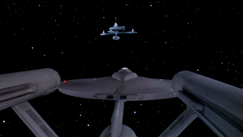
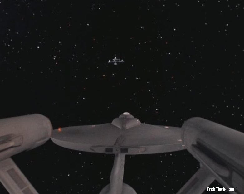
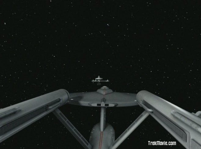
Opening shot after first break the stars look odd and sped up with no motion blur look pixilated in their motion. K7 looks good but scaling of the paneling is suffering from the same problem as the paneling on the Romulan ship in Balance of Terror; good coloring though. The dissolves are distracting and make the show seem rushed. Nice close-up shot of Ent flying past between camera and K7. They’ve done some good work fixing the model and texturing just wish the surface was a bit more weathered.Act 2 Establishing Shot:
At beginning of second act, the K7 shot is quite nice. Paneling still wanky but the shot was nicely restrained. Kind of a shame that we see the Klingon ship just as Kirk says they’re 100 km away. Would have been understandable if we first saw the Klingons in the next shot after kirk agreed to the klingons shore leave. Would have been nice to see the klingon ship out the window a couple times and not just the enterprise.Compressed?
Everything seems so fast I know this episode backward and forward Maybe its just my mind playing tricks on me but the whole episode seems sped or time compressed perhaps its just my brain slowing downNo DS9
It is good to see that none of the shots from DS9 were in there besides the fact that it would lessen the importance of this original episode the composites from that episode really don’t hold up on second viewing (the shot of O’ Brien with the shadow over his face in the lineup is especially cringe-worthy) but that’s neither here nor there glad to see this original unscathed in that sense. The bar fight also works so much better here with the original music perhaps when they re-release the DS9 episode THAT could be added to their show.Different than orig. Syndication
This isn’t the same cut as the original syndication cut the syndication cut, as I remember from the 70s had a shorter version of the lineup scene (some showings even cut the whole scene out I think I only knew about it from the fotonovel for a while)Repeated shots?
At the next shot of k7 were ALREADY having stock shots used again? A shame. Another repeated shot or if it isn’t, its very very close to the other one. Would have been nice to see an overhead shot of the station with perhaps the Enterprise top moving in foreground. Nice balance of the lighting but I still think they’re being stingy with the coloring of the space shots. Looking at the shots in the original, there are subtle pastel colors in the lights and the new shots look overall grey drab not matching the colorful interior shots. Were there only 3 shots of the exterior done? They all look the same…would have also been nice to see a closer view of the windows of the station maybe showing Lurry’s office. Became kinda silly that every time we cut to the view of Lurry’s window the Enterprise is just seen coming into view never in the middle or leaving to the left. But I suppose its to make the most of the other shots in the scene and still have the ship in there through the whole scene. But again, no sign of the Klingon ship in the window. More repeated shots of K7.End shot
Banking of the Enterprise too much reduces its scale would have liked to see a more dynamic angle of the exit from k7. Glad to see the impulse engines lit up but again, maybe too evenly lit? They don’t look like they’re lit by bulbs.
Daren R. Dochterman was the Visual Effects Supervisor on “Star Trek: The Motion Picture – The Director’s Edition” and is the Creator of “Star Trek Enhanced”. Read the TrekMovie.com interview with Daren Dochterman to learn more about Daren, ST:TMP:DE and ST:E.


Yeha, they did do alot of trimming through out the entire episode dropping entire scenes. At least they put back in the Spock-McCoy exchange though. I do miss the second double line by Shatner though. “Storage comparments, storage comparments……………the what, the what?!”
Good review, thank you. Wish I could take a crack at this, it’s killing me.
Some nice points, things some of us don’t even think about, perhaps, conciously. I think I did wonder about the Klingon ship not making at least an appearance in the window. Since, I haven’t seen this episode since I was a kid, at least, I think so, it’s hard for me to say that it feels rushed. Can’t miss what your old self has forgotten. Shame on me. ;)
I really do hope they take another pass at the already completed fx before they release this effort to dvd or whatever… shouldn’t be too hard, right?
The only thing in the Review I didn’t get was the bulbs in the Impulse engines comment… Say what? Let me get this straight, you want them to look like they’re lit by bulbs? Huh?
Heh, Heh, if we are going to go that route… I’d love for the nacelles to leave a glittery exhaust trail like some of the novel covers and comics seems to suggest…. okay, I’m kidding. ;)
I say great work CBS; keep pushing the envelope, please! :D
Very Excellent Review and Terrific Professional insight. Thanks Daren. Now heading over to trekenhanced.com
Terrific review Daren! They are most definitely getting their “space legs.”
#1 – acb – You are absolutely right on the money. “The what, the what?!” is the punchline.
Nice review, and I agree mostly. Although I think you are perhaps nitpicking to excess by insisting there should be a hint of blue (which I struggle to see on the original shot) left over from the bluescreen shots of the original being included on the new Enterprise.
I don’t know. I think that the tiny hint of blue helps the ship look less drab. It’s the kind of thing that the average person can’t really point out, but when it’s not there…something just doesn’t look right. Would only be a minor adjustment for them to fix.
Am I crazy or is it true?
Look at the old version of the Enterprise orbiting K7, the shot where K7 is in the foreground, and the Enterprise is in the background. Is that really a “cleaned up” version of the USS Constellation?
Note the warp nacelles, they are NOT paralell. Considering the episode was filmed after “The Doomsday Machine”, and the budget that Star Trek had at the time, and that the average TV back then was so small you’ld probably never notice the non-paralell nacelles.
Any thoughts? Can anyone find out?
#8 –
While not the Constellation itself, it probably is an old AMT Ertl model. They used the AMT model kit for the Constellation, and they probably did here, too.
The reason why is simple enough: the studio model of the Enterprise was huge, and they couldn’t pull the camera back far enough to make the ship appear more distant. So, slap together the much smaller AMT model.
The small Enterprise in the office window of the un-remastered version was an AMT model kit. The same model was probably used in the space shots when the Enterprise was tiny, behind the space station. The big 11′ model was used when the Enterprise was large, in front of the station. In both cases, the Enterprise’s warp nacelles were drooping noticably. This was clearly a case where total accuracy to the original would NOT have been a good thing!
Thanks, Daren, for the thoughtful and enlightening review.
10
D. Gerrold noted the fact that the Enterprise, in the Station Manager’s office window was (a) in the same position (and noted that K-7 was shown rotating slowly — and added his nitpick about the stationary model and the rotating K-7) in each office shot, and (b) that it was one of the AMT models.
I remember having one of the then-contemporary AMT kits (the lighting kit with the grain-of-wheat bulbs, batteries in the secondary hull — and the secondary hull deflector dish housing being the switch for the lights) , and it was a pain to not have the nacelles sag. I’m not surprised that the stage crew had the same problem — given the production schedules.
Ya’ know what just occurred to me… Given the leaps and bounds the folks at CBS Digital are making… the space shots are looking better and better… the re-imagining of old matte paintings… the careful added touches placed here and there during the live-action portions… generally the finesse exhibited for the this amazing Star Trek “redux”… Can you imagine how good “Spock’s Brain” will be?
Did I just say that out loud?
Couldn’t agree more with your review, Daren. Great points.
Finally allowing some specular highlights on the ship really helps.
They really should introduce some colored gel-type lighting- yes we know the ship is gray, but the degree to which they depict it is almost jarring!
And what the hell, since there ARE red and blue stars out there now, a perfect excuse exists for a little magenta-blue fill. (Again, much like your version in your Doomsday footage.)
They need to evoke the “feeling’ of the original FX- without the horrible matte artifacts, grain, and dust, of course.
They have not quite arrived at it just yet.
Thank you for the fine review Daren…
#8 candlepin…. could the non-parallel engines be a product of the camera angle?
Oh yeah, this episode WAS severely time compressed. Very annoying.
Hey, I remember my old AMT model had sagging nacelles- a condition almost impossible to correct! (When you’re 12, that is.)
#15 – Dr. Image – Talk about bringin’ back memories… I can remember, as a kid, trying anything and everything to recreate the most accurate model of the Enterprise. And, of course, sagging nacelles were the worst!
I tried glue-ing them in position using splints and rubber bands… using a v-shaped cardboard cut-out brace… yeah, I know… obviously I had a very remedial understanding of physics.
I finally made a wire infra-structure that snaked up the pylons and into the nacelles. As I attached them to the top of the Engineering Hull and connected them to the internal brace, I remember the anticipation I had at how cool it would be to have the best Enterprise model.
So, you can imagine how crestfallen I was as I eye-balled the alignment of the nacelles only to see they were in exactly the same position they were on every version I had built before. I think that’s when i got interested in girls.
Anyway, it amazes how much of my life was consumed by a sagging nacelle when I was a kid.
I’m a little worried about that whole Lion King “Circle Of Life” thing because as I round the half century mark of my life… I hope like hell I don’t have to revisit my concerns about a sagging nacelle.
Great reveiw which covers many of my feelings. I wish to gods these guys had had more time in the beginning. I really feel for them. I’m also mightily impressed by their dedication to revise going forward. Kudos.
#16 – Scott O.T.M.- Oh, what a great story.
Although I became quite heartened upon learning of the usage of the AMT model in this ep. and the Doomsday machine-
I now posessed something that was not only what has come to be known as “canon,” but looked every bit as shitty.
#18 — LOL. I’ve had the drooping pylon issue myself with the movie Enterprise model kit in addition to the classic Enterprise.
Daren: excellent review — a big thanks to your keen eye for cinematic CGI.
Great review, Daren!
I especially agreed with your assessment of the impulse engine effect. It looked like two red rectangles image mapped onto the mesh. I am glad they tried it, but it could sure be better.
And I had the same idea for a top view shot for the K7 orbit. Too bad they didn’t do it.
TTM
I like it when people refer to the “original AMT/ERTL model”–ERTL merged with AMT prior to the release of The Wrath of Khan I think and that iteration of the TMP refit kit was the first AMT/ERTL Trek kit.
…and the original method of attaching the engine pylons to the engineering hull on the AMT kit was one of the most boneheaded pieces of model engineering ever–the pylons had a tab that was hollow, essentially a “U” attached to the pylon, so you slipped that into the top of the engineering hull then shoved this ugly block of plastic into the hole of the “U” to lock it in place…I would say that it was physically impossible to either avoid nacelle droop or get anything like a symmetrical alignment with that system so any time they used the AMT model on the show it would almost have to have pronounced droop and misalignment…
Jeff, I remember my problems with nacelle and pylon droop. I corrected mine in a different way. My solution was inspired by the way I wished to display my ship… suspended. I found some very light-weight monofiliment fishing line and looped the line under the engines, astern of the pylons. Pardon the bra comparisons, but it lifted and separated them nicely.
AND Btw…. Nice to see peace and civility on this thread.
I didn’t notice… were there any Tribbles that got CGI’ed?
I’m still thinking there’s a very obvious audio glitch on the last line of Kirk/Spock/Cyrano Jones … It’s obviously supposed to be:
KIRK
You’ll do it?
SPOCK
He’ll do it.
JONES
I’ll do it!
(Or something like that… I don’t have the episode handy)
I’m still not hearing Spock’s part of this exchange!! Am I the only one who notices this? Or thinks it’s a problem?
Glad to see the EFX work getting better…
While I am an ardent supporter of this project, and greatly appreciate the artistry and effort being done against a background of time constraints by the CBS Digital team…and although I think that the new CGI model of the Enterprise is an improvement…as a Graphic Designer, I am one of the number who, like Daren and post #13 Dr. Image above, feel that SOME COLOUR to the “lighting” of the Enterprise would be very welcome indeed.
One of the factors that invigorated and made the Original Series stand apart so much, was it’s exhuberance of COLOUR in all aspects of it’s production…EVERYTHING, from it’s set design and lighting, to it’s uniforms and starfields, was imbued with a colorful zest. So although the lighting on the upgraded Enterprise MAY be more “correct” given our view of our real Solar System now…I firmly believe that this particular “creative choice” is a disappointment. I would like to see some overall ( “cosmos” ? lol ) colour added to SOME shots NOW AND AGAIN, as this is important I feel to further integrate the new material into the old without it feeling a jarring change from the lighting ethic of the original craftpeople on the show. And does the YouTube Video, in a thread a couple back show the LEFT light ( and I presume, the RIGHT also… ) on the upper side of the “saucer” blink WHITE instead of the RED and GREEN I so loved?…
A subtle blue or whatever colored fill light originating from approx. 45degrees above and behind the model should kick just enough specularity off the surface to provide dimension.
There. Now pay me.
to the article author: Do you want the Enterprise to look like the original 1960’s plastic model or the ideal of what the starship enterprise should be?
My ideal of what the starship enterprise should be in the original series is to have it look like the 11 foot shooting model as lit in the 3rd season… (with the addition of real light bulbs in the impulse engines.) :)
Enterprise, Constellation, Lexington, Farragut – any more constellation class space ships?
Excalibur, Intrepid, Defiant, Exeter, Yorktown. I think there was another one in The Ultimate Computer…but I’m drawing a blank.
Let’s not forget the Constitution. The namesake of all the _Constitution_ class ships.
Enterprise, Constitution, Constellation, Defiant, Excalibur, Intrepid, Exeter, Yorktown, Farragut, Hood, Potemkin, Kongo … and one more I can’t recall from memory… (I don’t have my original AMT decal sheet here with me…) Are there 12 or 13? Kirk says “There are only twelve like it in the fleet”… but who knows… lol
Here’s a lisitng with Wikipedia in answer to Starship rosters…
http://en.wikipedia.org/wiki/List_of_Starfleet_starships_ordered_by_class#Constitution_class