
Trek’s second pilot gets the CGI treatment, featuring a different Enterprise…
SFX Video
(wmv)
New and Old
Intro Shot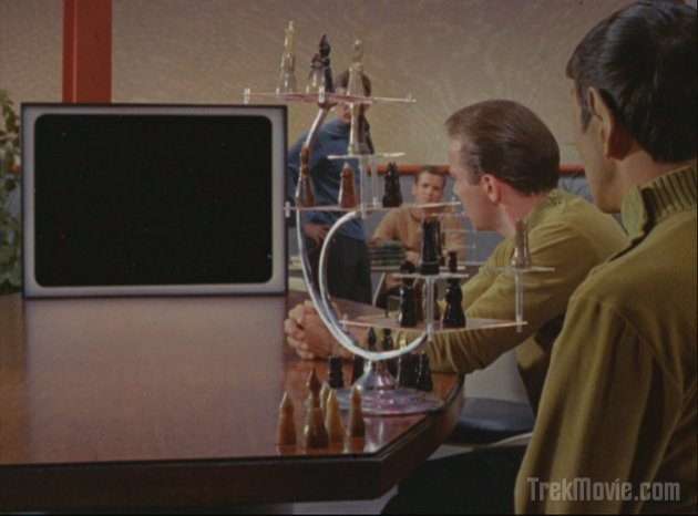

Starfield on the monitor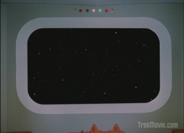
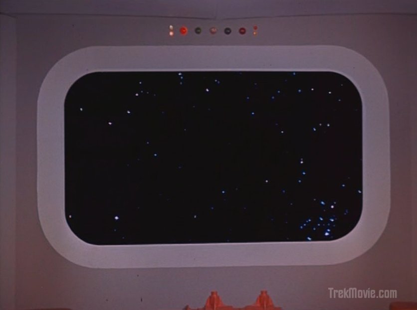
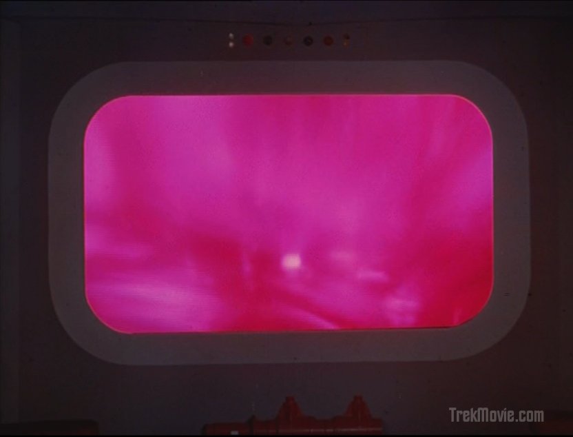
Starfield on the viewscreen
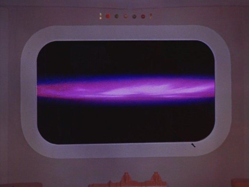
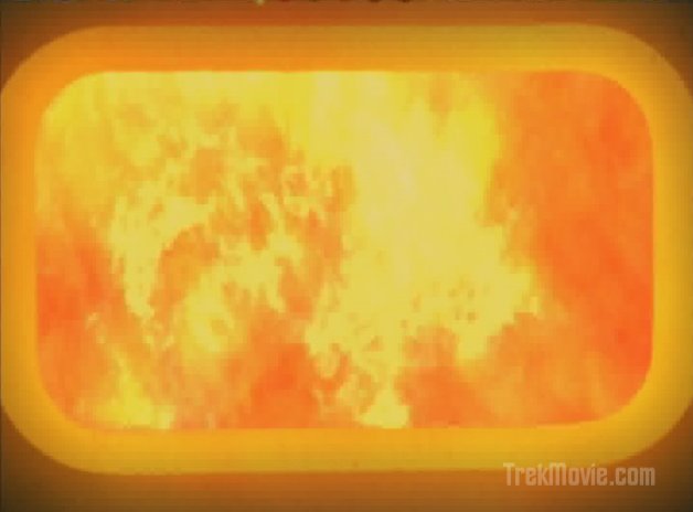
The barrier on the viewscreen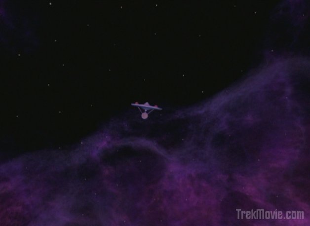
Approaching the barrier edge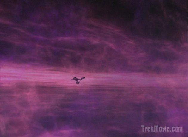

The Enterprise delves into the barrier

The barrier storm as seen on the viewscreen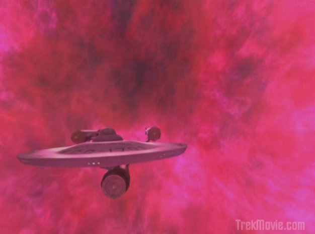
Leaving the barrier![]()
![]()
Clearing the barrier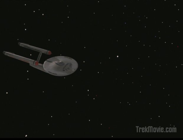
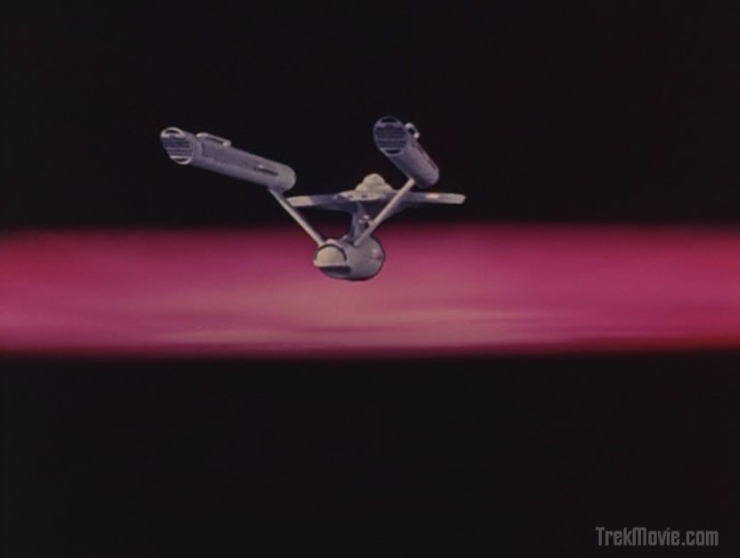
The Enterprise limps in space after the barrier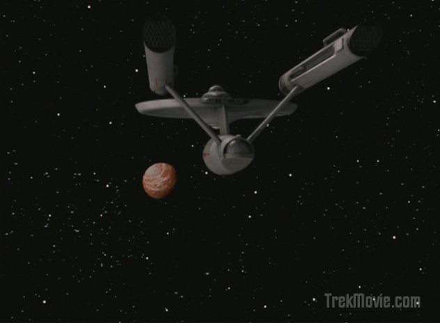
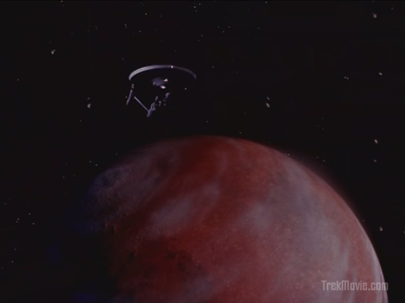
Approaching Delta Vega
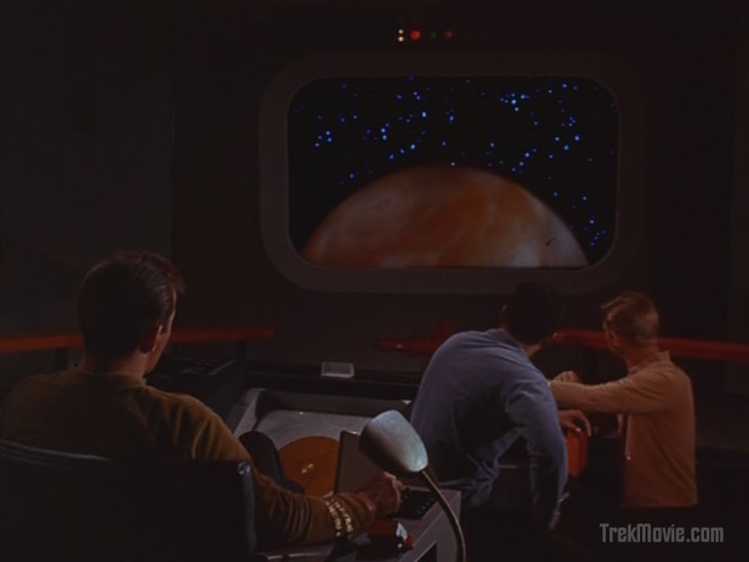
Delta Vega on the viewscreen
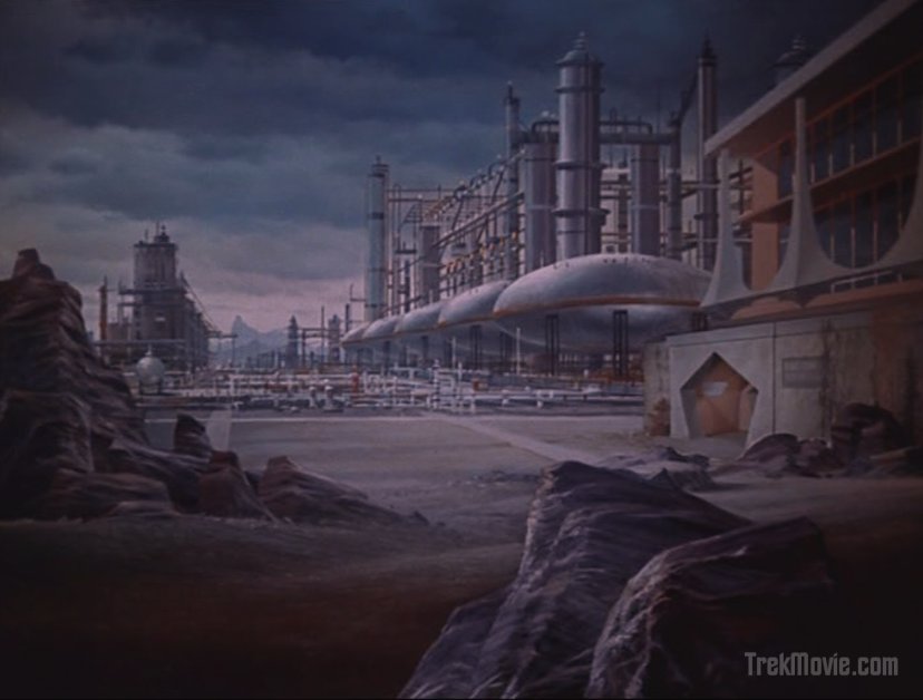
Delta Vega in the evening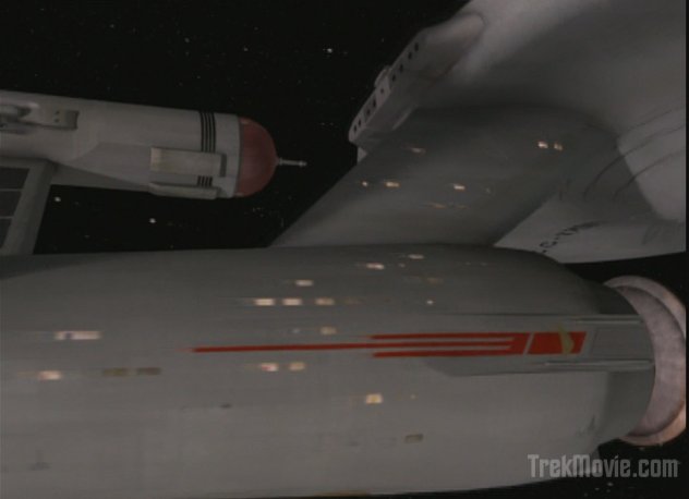
The Enterprise leaves Delta Vega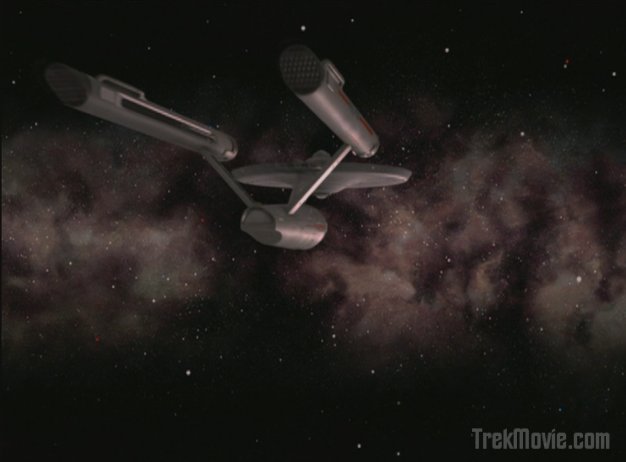

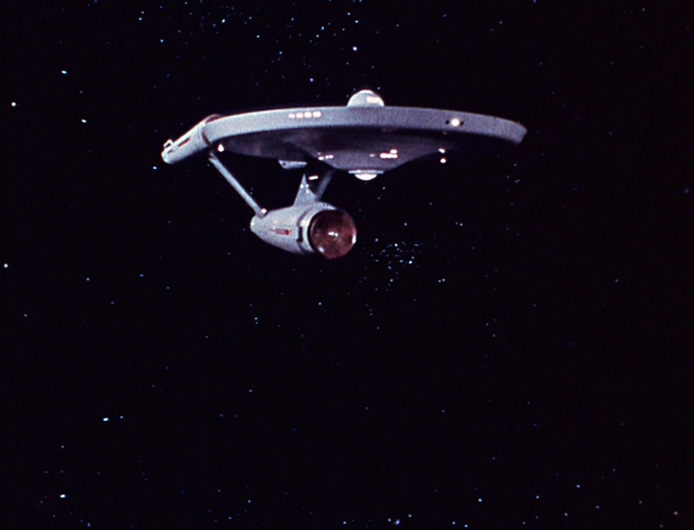
Closing Shot
Assorted Shots
![]()
The S.S. Valiant Probe Transmits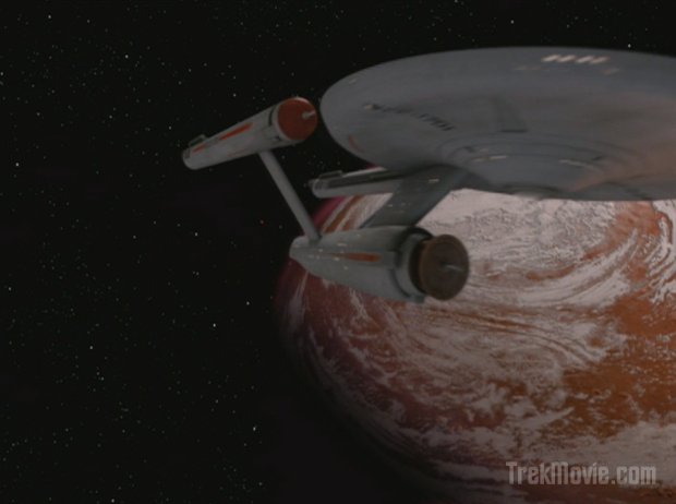
The credits squence with pilot Enterprise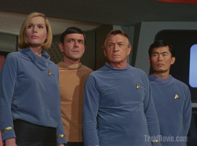
The Department Heads on the bridge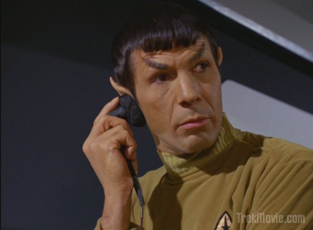
Spock shows an unusual amount of emotion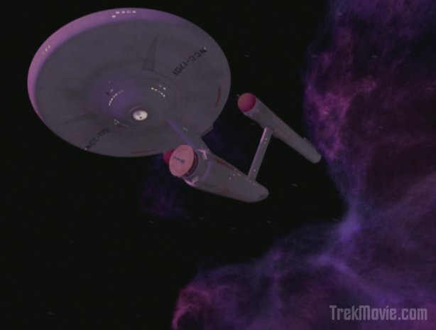
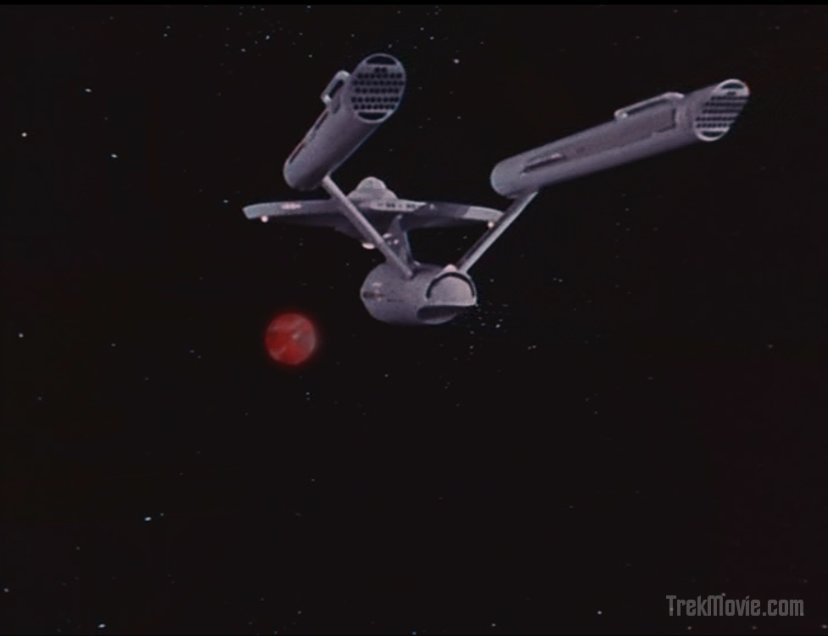
A new angle of the Enterprise in the barrier
You’d better be good to me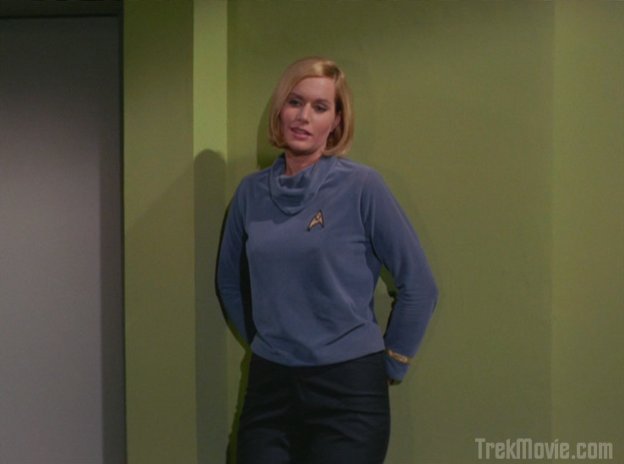
Dr. Dehner strikes a pose in sickbay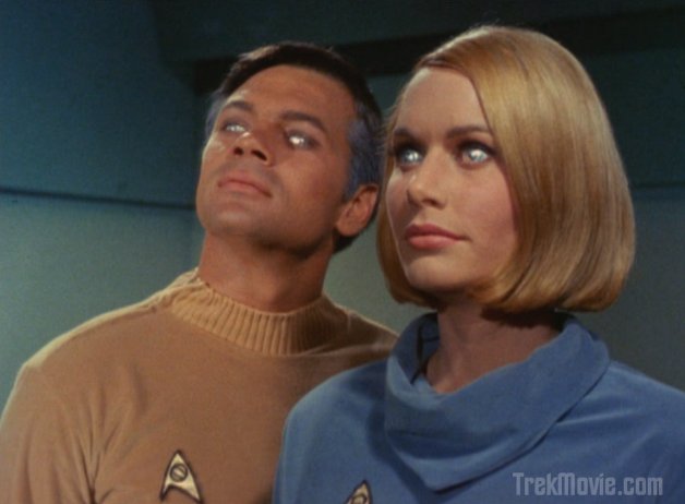
The "gods"
Kirk is forced to bow
New close-up of the Phaser rifle fire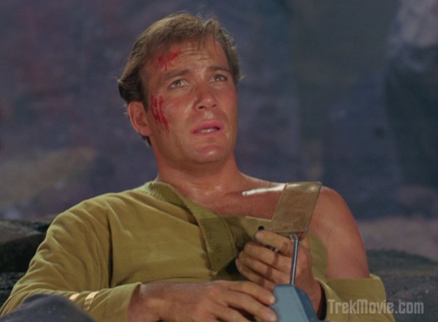
The first torn shirt
It’s not there! Oh, why is not there?
Wait, nevermind, it just came up.
what?
Good stuff. Ship looked gorgeous, love the early ship of the cage being used here, it blends right in with the different look of this episode. The shots with the nebula and the shots with the barrier were really nice, can’t wait to see them in HD someday. What happened to the new matte? Maybe it’s actually present in the un-edited version but got cut for syndication. The colors were particularly nice, never noticed the command green collars and tunics, I always thought they were brown like Kelso and Mitchell’s. Another revelation was good old Mister Leslie, dressed in blue, standing silently in the background. Never really noticed the green walls and viewer in sickbay either…great job on the color correction here. And no T. on the tombstone..thank goodness…I actually enjoy that little inconsistancy. Well done CBS!
Just a note. I’ve set a couple updates to the TOS-R schedule e-mail but it still says for Seattle KSTW 10:00 Saturday.
After Balance of Terror in Sptemeber this was changed to 6:00pm Saturday
Sorry, Anthony. The video wasn’t there when I first went to view it on YouTube. It must have just been uploaded. I was worried something had happened with CBS.
bear in mind there is always a dl option under the video…which is better than the res you get at youtube
Yeah, just realized that. :)
Dang, you’re gonna make me stay up until 3:05am again, watching Star Trek. I need my beauty sleep, but I know my priorities.
Actually like that the nacelles look burned out after their encounter with the barrier.
If this is all that was fixed, then it was not nearly enough. I bet those guys at CBS-D probably want to fix everything, but don’t have enough time.
WNMHGB could also be known as “Kirk trashes Pike’s Enterprise”. The Captain Pike era Enterprise (w/Spiked Nacelle Caps) sustained serious damage in its Galactic Barrier encounter. Repairs seems to have been good enough to reach a Drydock somewhere after the episode. Between this segment and The Corbormite Maneuver the USS Enterprise has been Upgraded both inside [Bridge, Briefing Room] and out [Warp Engines]. Not to mention Uniforms – Everyone’s Sideburns (still to come).
Also, there is an added Phaser Rifle Beam as the Rock topples into the Grave. The original was always too short a burst not in sync with the sound effect.
Great work CBS Digital. However, the ESP Reports on Screen did look like a 1960’s typewriter did them … wonder why?
First of all, thank you VERY much Joe for capturing and posting those clips.
Much appreciated.
NOW,
1)-The opening shot of the Enterprise was beautiful.
2)-I CAN”T believe they didnt fix the lack of reflection of the table. Damn! That’s bugged me for years!
3)-Delta Vega kinda looks like a bowling ball. I thought the original planet looked just fine.
4)-The angle they used for the Enterprise limping away after the encounter with the barrier seemed completely pointless.
5)-The barrier was beautifully done.
6)-The back of the nacelles looked wrong.
7)-The Enterprise pulling away from the planet was sweet (as usual)
8)-I’m sick of CBS rushing these poor bastards!
WE (the fans) dont mind waiting 2 weeks instead of 1.
Let these guys do their job!!!
Other than the nacelles(back of them) the Enterprise looked very nice (especially in the barrier)
WELL DONE on that.
It kinda worries me a bit now that Doomsday Machine is going to suck because there are SO MANY effects shots.
-Wrecked Constellation.
-Doomsday Machine.
-Enterprise and Constellation phaser battles with Doomsday Machine.
-Viewscreen shots.
-Shuttlecraft sequence including hangar deck.
-Destroyed solar systems.
-Destroyed Doomsday Machine.
MY GOD there are alot of FX shots in there!
Two words. Absolutely Unacceptable.
I just finished watching this episode, and at this point I have almost nothing good to say about it. This was very 2d, lame, dead, lifeless. It even looked like the transporter effect was missing from the recorder-marker -though I was watching on a fuzzy TV with rabbit ears, so I could have missed it.
The shots of the Enterprise had potential, but looked little better than cartoons. Delta Vega looked horrible. This was just so very, very, VERY dissapointing. The Story/Directed credits just before the closing credits were in the wrong font, the galaxy looked fake, the barrier was passable, the Enterprise had potential but the aft of the nacelles look horrible… this was just simply unacceptable.
I can’t begin to tell you how disappointed I am with this episode.
Rob+
I was enjoying the CBS Digital work for the most part these last few weeks, but this episode feels like a step backwards. The effects just didn’t feel right. I don’t understand why they insist on still using that awkward zoom in angle of the Enterprise…it didn’t look right with the original model, and it doesn’t look right now.
Overall, the effects looked alright…but they didn’t really look like they fit with the existing live footage. That’s the main issue I’m having with this project…their attention to matching the original live footage is spotty, and all over the board.
It’s good work, but it’s not good TOS.
Fantastic job CBS-D. The new effects looked amazing!
Looked really good. Really enjoyed it
Just want to make it clear that I understand the time constraints of this project.
Whoever is in charge at CBS…cut these guys some slack already and give them MORE TIME to do a good job on these episodes. What the hell will you accomplish by only letting them half do their work? It’s pointless.
I haven’t seen it on TV yet, but everything looked fine except the milky way looked a little odd on TOS style stars. Someone called it a nebula earlier, but it’s not, you’re looking horizontally through all the stars in the milky way. So to have that put on top of big bulky TOS stars just doesn’t fit. And why was it in so many of the shots?
I think the credits were exactly the same font as original, although I agree that the lighting on the ship this week was pretty poor. And I still don’t understand why they didn’t fix Gary Mitchell’s reading screen.
what the fetch?!?!
Everything had been looking SO much better the last few eps. that this one while very very ambitious, just doesn’t look finished. I really looks like a video game to me. I give them alot of credit for the work but it just doesn’t look right.
Sorry, my opinion.
Will somebody please go down there and show these guys what LIGHTING is all about?
I mean SPACE SEED looked great. Everyone said it did. It didn’t look like a cartoon and dont give me this nonsence about lighting taking a long time. If you know what you’re doing, you’ve done it right before, and you have a look that’s already established, it shouldn’t take any longer than anything else. Scott Gammans, Daren Docherman, and Dennis Bailey (to name a few) never had ANY trouble with lighting that I noticed, and these are guys sitting alone on their PC/MACs puttering away without nearly as much equipment and manpower as CBS has.
I don’t mean to sound negative but I’m so sick of this lighting thing.
Who’s deciding what looks right down there, Bugs Bunny?
“Yeah, dat’s good doc more cartoon-like”
Here is the correct comparison cap(the original fromTrekcore, the new from here) Now look at the original. It looks real. It looks like it actually exists. Other than the black matte line it looks great. Look at how bright the lights are, and that’s shitty 1960’s lightbulbs. Now look at the new one.
http://img.photobucket.com/albums/v617/spockboy/WNMGB05.jpg
I’m sorry but enough is enough.
I liked this episode a great deal.
The opening shot of the Enterprise emmerging from the nebulous material INSTANTLY transported me to the opening scene of the Enterprise approaching in “The Search For Spock.”
The depth of field and mass of the Enterprise had a motion picture quality to it.
Frankly, I’m uncertain what sort of monitor or television screen people complaining about it were watching but, it looked breathtaking to me.
Ah how art is subjective.
The galactic barrier was fantastically depicted and menacing.
I liked the blue and purple color palette used, as the Enterprise approached the barrier I was reminded of it’s approach years later towards Vejurs’ cloud.
Outstanding work CBS Digital, when is that Damn DVD coming out??
Does anyone know why KWGN (The Denver Station) didn’t show Star Trek Tonight at their usual time….I haven’t watched it in several weeks. Have they had a time change for it? Instead they had what seemed to be a small marathon of The Shield on instead. Any information would be appreciated.
Thank You!
Whiners, complainers.
The episode looked great.
And Yeoman Smith was hot, hot, hot.
As to the lighting of the ship, what’s the beef?
The original model was flood lit from all angles, unrealistically so,
the CBS Digital model is illuminated from one source of light, as a real object in space would be.
It’s not whining and complaining foolbar,
It’s analysis WITH suggestions, the main one being…
“CBS, GIVE THESE GUYS MORE F&%KING TIME TO WORK !”.
and Yeoman Smith WAS hot.(but not as hot as Yeoman Rand)
It’s all subjective……: )
Dear Josh T. (the motionless picture) Kirk;
What do you mean ONE source of light?
What do you think all of those stars are?
They’re suns… : )
silly, silly, billy.
Besides, if CBS actually WAS using one source of light then at least the ship would have some constrast and not look to flat and grey. Trust me, they are NOT using only one source of light .
Anyway we are NOT talking about reality here, were talking about a TV show.
Look at TNG, DS9, VOYAGER, ENTERPRISE. None of the lighting is realistic. The only difference is, now is they have ONE light brighter than the rest to simulate realistic light.
The truth is unless there was actually a sun(star) nearby, all you would see are the lights of the ship cruising by(which are too damn DIM in this case).
Wait a minure, did I say “too damn dim?”
My God I need a vacation.
Yeah that’s right I said constrast!
It’s just like contrast………………………. only BETTER!
Are ALL of those stars equidistant from the Enterprise providing uniform illumination Spock Boy? Not in the real world, only the studio flood lit model of the Enterprise from the original unaltered episodes.
The CBS Digital illumination provides the best of both worlds.
It is deep space, therefore the Enteprise isn’t illuminated like a Halogen light.
There is stark contrast and shadows.
There is self illumination i.e. the windows.
The Enteprise is finally depicted the correct color (Camouflage Grey) and not Turqouise, blue, green, or white.
Yes, it’s a T.V. show and not reality, therefore the team has only their own artists eyes to fall on and satisfy, speaking of Constrast, perhaps the issue is you should adjust your television?
^^^^^^
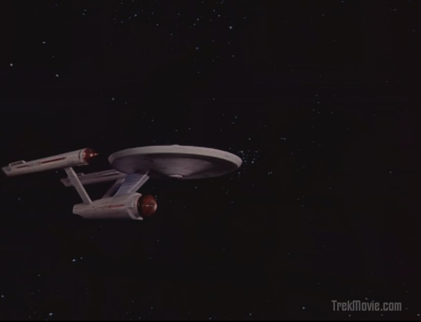
See the shot above titled “closing shot” which features the rear view of the Enterprise approaching the nebulous instellar material?
See the reflectivity and luster on the secondary hull?
Now go watch “The Motion Picture” as the Enterprise approaches Vejur from almost the same angle.
Movie quality effects here.
the originals have a luminosity the new effects lack, they ‘pop’ right off the screen
“They’re suns… : )
silly, silly, billy.”
And they’re also really far away, thus negating most of the light they send. Only one source of light would dominate in a single star system. Having the Enterprise lit from different angles could only be realistic in a multiple star system.
Yes but DaggarMind,
What do you mean they’re far away?
How do you know?
MY assumption is that there are stars all over the place in varying degrees of distance.
It IS the universe isn’t it?
They’re not all side by side like some sort of grid are they?
-some near
-some far
-some very near
-some very far
-multiple star systems
-quazars
yadda yadda yadda…..
You get the idea….
My other point was obviouly lost on you….
IT’S A TV SHOW!
Alright then. Lets settle on this…
I will agree that to make it look more realistic there should be less sources of light.
But for God’s sake lets bump up the intensity a little bit shall we?
Even the flashing lights on the ship are practically invisible.
WHY ARE THEY SO AFRAID OF THE LIGHT???????
: )
Didn’t the original opening credits lack Shatner’s narration?
Josh,
There is stark contrast and shadows.
There is self illumination i.e. the windows.
The Enteprise is finally depicted the correct color (Camouflage Grey) and not Turqouise, blue, green, or white.
First of all I NEVER complained about the color.
Second of all you say there is STARK CONTRAST?
You need LIGHT to have contrast my friend, and thats the whole problem.
MORE LIGHT=MORE CONTRAST(or constrast)
Third, What self illumination?
As I and many others have stated we can barely SEE the flashing lights for a start, and if you want to talk Star Trek the Motion Picture-check out the flashing lights on that baby.
Finally your statement;
See the reflectivity and luster on the secondary hull?
Now go watch “The Motion Picture” as the Enterprise approaches Vejur from almost the same angle.
Movie quality effects here.
Okay, you wanna see quality effects with a TOS ship?
You want lustre and reflectivity?
And some actual light thrown in for good measure?
Authentic detail?
All with the same aforementioned camera angle?
scroll down to scene 14 and check it out…
http://www.scottgammans.net/weblog/star_trek/doomsday_machine_project/
#24 Duane “Does anyone know why KWGN (The Denver Station) didn’t show Star Trek Tonight at their usual time….I haven’t watched it in several weeks.”
KWGN moved Trek Remastered up to 10:00pm local a few weeks ago, its a good thing. I watched it here in the East at Midnight last night. Two episodes of “The Shield” now follow.
Greg: Thanks for the information. Now I just wonder….do they still show the previous weeks episode at 6:00 P.M. Eastern? Change is good as they say.
#22 Spockboy, I agree that in general CBS have been playing it too safe with the highlight on the ship’s hull but in that comparison the light on the planet is coming from the right and rear of shot. In the old version the enterprise is lit from the exact opposite direction, so in the new version the lighting on the Enterprise has been matched to the planet – hence most of the illumination will be on the far side of the hull.
In contrast, the ‘Enterprise in Orbit’ shots just prior to and after the matte painting of the surface in the VFX reel have a lot of brilliant sunlit highlights on the Enterprise (you can see a hint of the same thing in the final “closing shot” screengrab above.)
I may be through with TOS Remastered. Just saw “Where No Man Has Gone Before” and I’m more disappointed than ever. While the TOS-R team has proven themselves technically proficient with their enhancements, they are patently incompetent when it comes to deciding what to keep and what to change. Never mind that I knew going in that the tombstone wouldn’t be fixed to show Kirk’s correct middle initial, “T” (as opposed to “R”, one of TOS’s most notorious glitches), but to think they actually decided to keep the early 20th century typewriter text on Mitchell’s and Dehner’s records as it shows on the viewscreen is UNFORGIVABLE. This is either pure stupidity or total laziness. No more will I anticipate the trailers or the episodes themselves, and if this level of neglect continues, for certain I will not be buying any TOS-R DVDs. What a complete and utter waste of opportunity. The whole thing reeks of the half-assed Star Wars special editions where attention isn’t given to the real details that matter. And I’m willing to bet that the “they’ll fix it later for the DVDs” belief will prove false. If they don’t have time to re-do simple f*cking viewscreen text now, do you really think they’ll go back and do the tombstone plus insert the new Enterprise model into the first handful of shows? Not gonna happen. It was a fantastic opportunity, to de-cheesify TOS and make it fit into the rest of the canon, but this team seems to want to do 25% of the work and pretend like it’s a done deal. Unacceptable.
Art is definately subjective…
I am completely fine with suspending my disbelief in order to enjoy a program, but these effects were simply bad.
As I have reviewed some of the screenshots, there are even differences in the model that they went to the trouble to recreate for WNMHGB (though I could even overlook those if the effects were of better quality). The SFX looked like a cartoon. I hated those ‘stopping short’ shots of the ship… the overhead shot of the ship limping back from the barrier was terrible and flat (it looked like a Star Fleet Battles piece being drug across a hexboard!)
The Enterprise in the original episode had some weight, and the planet looked good. Now both seem cartoonish, rushed, and unfinished.
Also, can someone confirm for me… did the Valiant’s recorder-marker just fade in or did it have the transporter effect? I couldn’t tell because I was watching on Rabbit Ears.
Rob+
As far as I’m concerned, all looked fine even though they used the model that I hate (I’ve always hated the big deflector dish and spiked nacelles). I just feel that version (whether CGI or a model) has always looked more unrealistic. Makes sense that they’d use it, though, since this was the pilot episode.
I STILL hate the shot of the ship from way up above looking down (as the ship limps off to Delta Vega. Just reaks of the word “fake”. Other than that, I’ll live with this one. There are some great shots, yet this one kinda rubbed me the wrong way. Not sure why. Kinda weird.
#38 Duane “Now I just wonder….do they still show the previous weeks episode at 6:00 P.M. Eastern? Change is good as they say.”
Previous weekend episodes air at 6:00 a.m. ET Saturday Mornings [4:00a.m. Denver local] and that is not a good thing. But the Primary Denver 10:00 p.m. Saturday night slot [Midnight ET] is better than their original Midnight [2:00 a.m. ET]. So there must have been some demand for the series to move it up a couple of hours.
#41 Father Rob “so, can someone confirm for me… did the Valiant’s recorder-marker just fade in or did it have the transporter effect? I couldn’t tell because I was watching on Rabbit Ears”
The Transporter Effect was there but it was not very noticeable. Very Dim. Understandable why you could not see it on Rabbit Ears.
Transfer Trouble? Did anyone else notice [every once in a while] a small dark spot dropping down the center of the screen? Most notable during Mr. Sulu’s “If you want the mathematics of this” segment. This spot occurs at times throughout the episode.
I’ve found it during all feeds of this weekend’s episode.
#35 AJ
The Cage and WNMHGB (broadcast version) did not have a voice-over. That was added for The Man Trap. The orchestration they used had the organ and a fantastic piece of wind-band score!
This is tooo funny. Why can’t youse guys just sit back and enjoy the fact that they are actually showing these episodes? All this nitpicking and and blaming is crazy. Go watch the old versions if you like them better. It seems like it has been clearly stated that the group remastering these episodes is under time constraints, yet there are comments like “UNFORGIVEABLE.” Criminy!!! Get a Life People!!!
If you look carefully at the Delta Vega facility scene, you’ll notice that the clouds are moving from left to right in the sky, very slowly. I’m not sure it was like that in the original. Actually, I’m not sure they could have done that for the original.
Also, I noticed that when Gary and Elizabeth are zapping each other at the end of the episode, the color has a more pinkish hue to it, instead of the pale-white of the original.
Holy shit I thought I was cynical. This was Awesome!!!!! The opening shot of the E coming into screen was beautiful and the engine rumble was great. The altered opening credits with the pilot model were an excellent touch. When the E was twisting through the barrier energy I almost pooped my pants!!!! It looked gorgeous. There was a terrific sense of scale. On the closeup you get a sense of the E’s enormous size then as the angles change you see just how small our E is when compared to a stellar phenonoma or the vastness of space. The lighting of the ship was proper on true HD it will have even more punch. it makes me hope they redue TWOK mutara nebula in a similar manner. The end caps were correct as were the impluse engines with the multiple round exhaust ports instead of the round balls. The only difference was they went black with the caps instead of the original silver. I thought they nailed the E in Tribbles but I am contunuely impressed with the subtle improvements each week. I too wish they would go back and redue the landscapes but we can’t have everything. They have to have a reason to re re re release another remastered special edition 5 years down the line afterall. Some have complained of the remastered scenes being too dark. These are HD masters being shown on an analog signal, you don’t get the true potential of how gorgeous the film is in this manner. The xbox 360 HD episodes don’t have this problem especially on a big screen HD tv. In any case I’m blown away and very happy
Why fly through the barrier and not over or under it?