
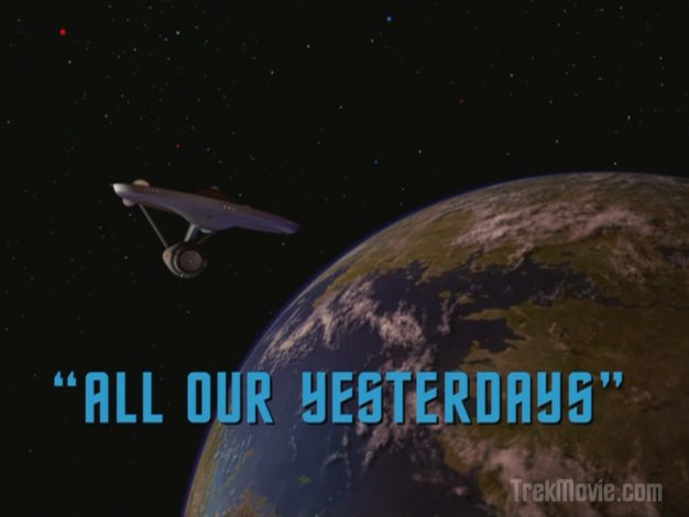
Spock’s ancient lovefest remastered
SFX Video
(WMV)
New and Old
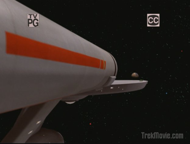

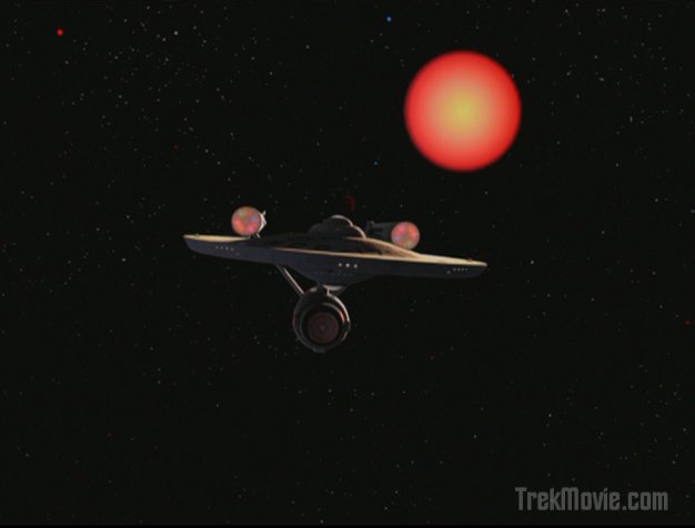
Approaching Sarpeidon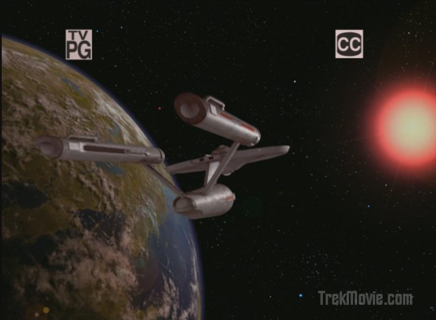
In Orbit of Sarpeidon

Sarpeidon’s sun starts the supernova process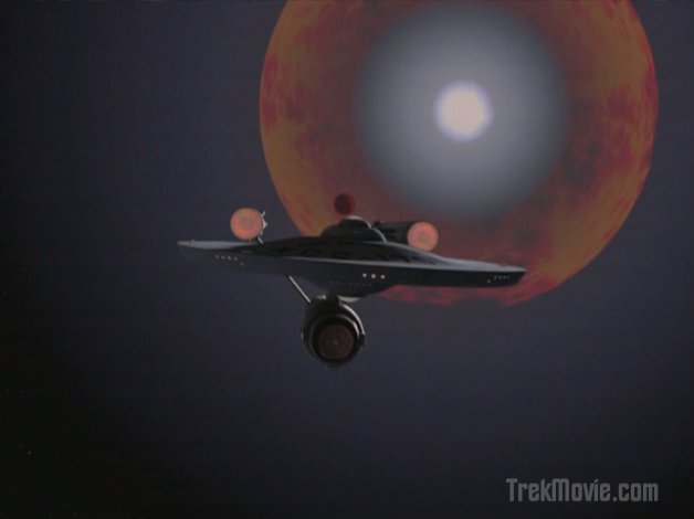
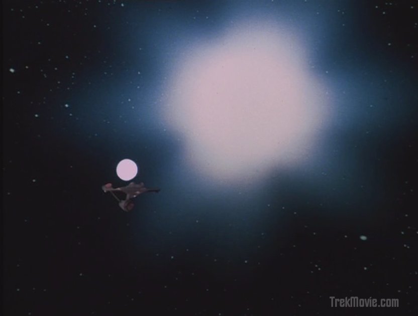
Sarpeidon’s sun blows off the last layers of material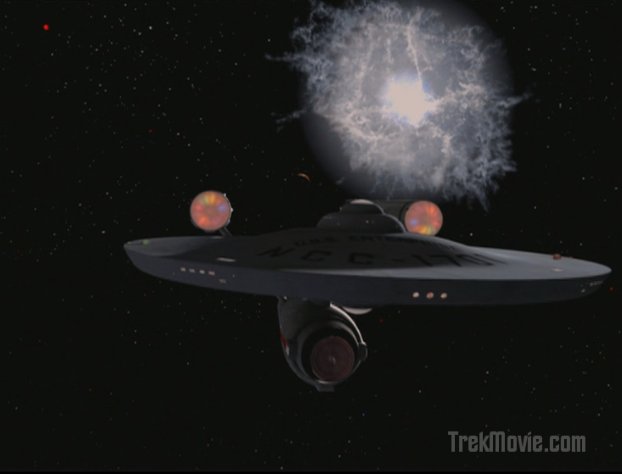
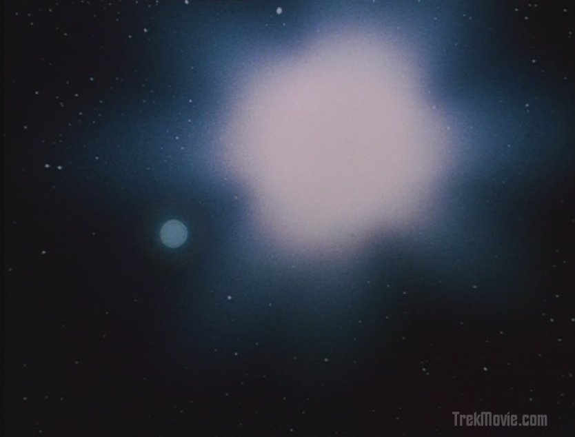
The ionized particles expand into a cloud
Sarpeidon breaks up in the shockwave
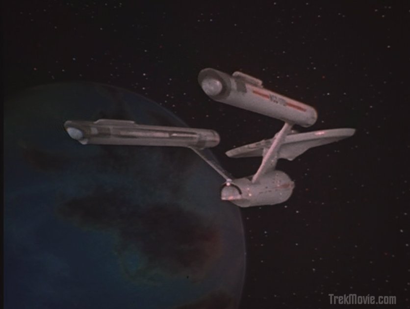
Assorted

Mr. Atoz
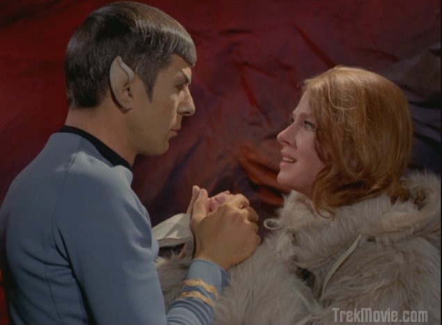
Zarabeth — Ice Age Hottie

The wimpy prosecutor
Spock tells Zarabeth he is real
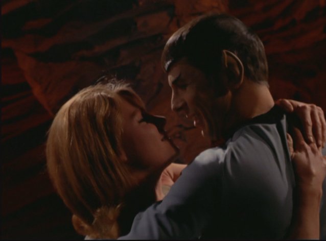
Scooping up Zarabeth with smile
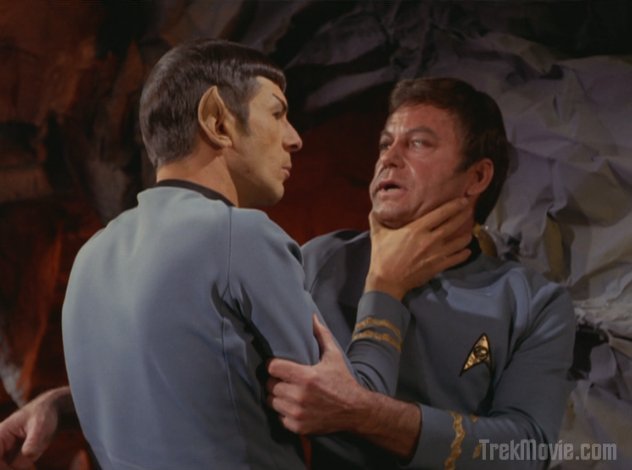
Choking McCoy

Mr. Atoz shoves Kirk on an anti-grav platform
UPDATE: Spockboy’s Alternative Supernova
Sarpeidon’s destruction was a terrific effect.
I really liked how they handled the supernova. Seeing the planet destroyed by the shockwave was an added plus. The new shots/angles of the Enterprise were also cool to see. Nicely done CBS-D!
I agree with Greg .I do expect ten times better .As much as the still looked cool it ended up looking like the worst effect shot CBS-D team has done . i hate Star Wars Ring shots in Trek. It looks like crap.
#3: Do you mean the “ring” surrounding the star going nova?
Um…. that’s how stars look when they explode. The outer layer gets blown off. Trek is borrowing from what we like to call “real life,” not from Star Wars.
LOL Still it looks terrible.
Looks AWESOME!!!!
Also looks like they fixed the nacelle caps. Really, really cool stuff, CBS-D!
I’ll get to see the episode in about fifteen mins.
#4 — He’s refering to the BS ring added for the Star Wars SE when any planet or the death star explodes. The star going nova doesn’t have a ring persay, it has a sphere of material that goes out in all directions.
The scene where McCoy convinces Spock that he’s reverting to the behavior of his ancestors (regardless of how much sense it makes as an explanation) is *gold*. DeForest Kelley was always ace.
Actually the ‘ring shot’ was first done on Star Trek 6, it was later added to the special editions of Star Wars for the death star explosion
Beta Niobe’s destruction looks essentially the same as the destrution of the Veridian sun in Star Trek: Generations, and very little like the “ring” effect seen in the destruction of Praxis in Star Trek VI.
The first part of the supernova looked bad (The sun turns into a big orange circle? What’s with that? Why can’t it look like a sun?), but the second part (the cloud and the destruction of the planet) looked brilliant.
The “ring” shockwave looked kind of bad too. It just didn’t seem as realistic as the other FX in the episode. I did like the flash of light across the Enterprise, though.
I thought the effects were well done in this episode. I just wished they could have added something to the ice cliff scene.
The opening shots were freakin excellent!
The supernova was absolute CRAP.
I could do a better effect on my laptop.
As stated earlier, the first “shockwave” effect like that used in feature films was STVI. ‘Ol George adopted it for the Star Wars SE years later. Personally I think the new shots look great(although the Enterprise seems to be rather casually moving away from a supernova). The first batch of these remastered episodes looked…..funky…..but the last few months you can really see CBS/Paramount team really hitting their stride.
Is this like the ‘splosion of Kronos in STVI, which sent a ring shaped shockwave a buh-zillion miles into space? How unlucky for Sulu to be on the same plane.
Opening shot of Enterprise nice and closing shot of nova also nice. But as is usual with cgi limited episodes, the acting will have to carry the show. There were a few chances to “tweak” cgi (in the library, etc.) But that may be beyond the remastering mandate. Transfer to 16/9 would be a great plus.
#11 — In the life cycle of a massive star before it goes nova it is a Red Giant, so it being a red is correct. The cloud portion is actually the least correct part of the effect squence. Of course even before the Red Giant phase I would think Sarpedion would be uninhabitable.
It was CRAP .(as I feared it would be and even worse.)
They RUINED the ending with the non scientific “crapnebula” so called effect….BIG TIME.
F- MINUS for the ruining of Mr. Spocks “City on the Edge of Forever”.
It grieves me greatly.
:-(
I used to think that the simple shapes of the original 1701 were so dated. These rematered edistions are proving that they can look just as cool and just as majestic as all the ‘newer’ models of ships. I hope the movie stays with this design, because it looks absolutely marvelous from all these different angles…
The opening shot panning over the left nacelle was a great shot. It was nice to finally see the parent star in an orbital shot. Usually the star is off screen.
The Supernova effect was very well done IMO. Loved the shock wave and bright flash. Seeing Sarpeidon dissolve was great too.
Still would have liked to see the library expanded digitally or the arctic wasteland enhanced with a wide shot or two.
That was kinda sad and dramatic when the shockwave dissolved the world away.
Worlds being dissolved away is poignant and tragic. It would be sort of poignant if our Sun went nova and dissolved our world away before the team can finish these episodes.
I would be mildly dissapointed.
I’m just disappointed in how many people here can’t seem to tell the difference between a ring and sphere.
This is the most simple and basic geometry.
LMAO!!!
The 4th picture of Zarabeth is actually quite gruesome. Shes a nice looking woman otherwise but that particular still belongs in a Halloween episode. Can’t deny this though….she had – has some good legs. And the effects at the end and throughout the entire episode are really good. Some people just expect and want to much out of these episodes and when a honest to goodness attempt is done then some still complain.
The feed from the Denver station KWGN seemed to have about a one second or so lag….where it was chopped off – also I don’t know IF it was because I was watching it from a 2nd source….(Dish Network) but I noticed lines running across the screen from right to left….anyone else notice this?
#23 — My local digital broadcast feed had about 3 spots where the epsiode “hitched”, is the best way I can describe it.
The lines you describe were they on the top? If so that was the analog Closed Captioning data, normally it is hidden by TV overscan, but still present, I have to crop it out of all of my screenshots/videos I make. Hypothetically, in 2009 when we finally ditch analog TV those analog CC data artifacts should go away, since CC is carried as a digital stream (of course) in [ATSC] digital TV.
#24 I honestly can’t quite remember but I seem to recall that they were toward the top but more in the center then anything else. Hitched is a good name for it.
I think the new supernova effect is wonderful. It is so much more visually pleasing than a glob of bright light, which is all the original effect was (this is separate from the discussion of scientific accuracy, as I’m commenting on the “look.”)
I’m struck by the tone of negativity about the effects. In my opinion this is a tremendous improvement over the original, it is so much “cooler” and fun and dynamic. I guess that’s the word- many of Star Trek’s effects are now “dynamic” thanks to the remastering. I never thought this would ever happen. Since my childhood I have imagined the episodes with improved effects as the technology advanced but the show, alas, was frozen in time. How wonderful that we have this gift. Not to say every effect is a home run in the remastering, but still.
There is this line from “The Matrix” (sorry to use another sci-fi endeavor) where the “agent” said they tried running the original “Matrix” simulation on the humans where they could be happy and content but the humans kept waking up and rejecting this first Matrix. It was only when the reprogrammed it so they could be more negative and unhappy that they stopped rejecting it. Some of the negative postings above remind me of that.
I haven’t seen anyone mention it yet, but if you look closely just after the star explodes, Sarpedion glows red for a brief second as the atmosphere is burned away. Then the shockwave hits breaking it apart. Nicely done and scientifically accurate.
That was no Star Wars ring effect, that circle is a sphere and represents the outer shell of the star blowing away and releasing the energy trapped within. Its is absolutely 100% accurate based on our current knowledge on novas, supernovas and deaths of stars in general.
Yep I loved that the atmosphere was burned off before being turned into space rubble.
Its refreshing to read some nice comments by the readers of this site and by the fans of the show. The fine people who are slaving away deserve ample praise for a job well done. IF not then say so in a kind and creative fashion that will warrant inner discussion and thought by all of us here instead of discord and ill feelings. I myself would gladly pay a several bucks without hesitation each weekend to see the remastered episodes on the big screen in HD.
dammit.
the cw channel here in the bay area moved TREK to 2am from 11pm. Bastards…
I’ll place myself in the camp that liked the new nova. It was certainly more dramatic and satisfying than the original, and the poignancy of the planet being clearly obliterated caps the story nicely. They at least made an attempt to echo some of the aspects of a real nova, while taking sufficient poetic license to fit the sequence into the available seconds and create something visually interesting. (Although the extremely rapidly forming nebula struck me as distant cousin of the Crystalline Entity of TNG.)
I’m glad they left the Atavachron doorway alone, as I think the original effect serves the story well. It was really just a plot device, but I always thought it most interesting for the time portal to appear just like an exterior opening in the library building, instead of the elaborate exposed mechanism one might expect. And to think those clever Sarpeidons managed to cobble together a time machine out of scrap parts of M-5 and Gary Seven’s computer!
I noticed they DID IN FACT update the shots of the silver discs in the library. They removed the matte ring around them. I was very surprised to see that since it was such a small detail. But nicely done none the less.
Now on to a small matter… has anyone ever explained why the phaser doesn’t work? Was it because this was a time before phasers were invented? And if so, then why did the Tricorder and Medical Scanner work?
Just curious.
Thanks Matt for getting those up so FAST.
Again, I have to say that the opening shots were fabulous.
Supernova, not so fabulous. If you’ve ever seen the Atomic Bomb tests you’ve see how incredibly intense the light can get, so imagine how a supernova would bath the Enterprise in light.
(more light please)
: )
#32
Good point Rick!
On the ball as usual.
Original supernova was just fine. I wonder if Stanky would call the new one a “fake supernova.” I would. As usual, model shots of the Enterprise are consistently more realistic. But, I do like the new angles as mentioned by some posters.
The new Supernova shot looks cool, but a little cartoonish. And why the hell didn’t they add an ice cliff????
Alright, Spockboy , the next time you say dumb **it like you can do better on your laptop’ do it and show it to back up your claim. God i hate tools that boldy state thier greatness’ knowing theyll never have to back it….Tool!
Tool is one of my favorite alternative rock bands. Otherwise I don’t think it has a place here.
When Kirk first gets sent to the puritan past he states, “we must have gotten separated somehow.” There’s a few missing frames of video and audio there that have been cleaned up a bit, but the glitch is still obvious…but more obvious on the dvd of this episode and the “special edition” version that aired on Sci-Fi Channel a few years ago. I’m curious if this glitch dates back to 1969…or if any other prints exist that have the missing frames.
Ian Wolfe (Mr. Atoz) had quite a film history…and even looked old when he was young. Kind of like Alan Napier…Alfred the butler on Batman. Speaking of which…when will Fox and the estate of Wm. Dozier settle ownership dispute and release this classic series on dvd? Fans might want to check out the Star Trek Vs. Batman fan film on rascofilms.com site. Pretty cool.
That’s racsofilms.com for the Star Trek vs. Batman fan film. I am such a tool.
Vindicated yet again. RMFX too cool for school.
One of my fav episodes just got better. Well done CBS-D!
Very exciting, can’t wait to see the full episode tonight. The nova looks good at least in WMV form, maybe a tad overdone, but I like that they had some fun with it. Also, I have to say after all my earlier whining about star fields, they’ve been looking great lately and I’m loving that the red and blue stars have made a comeback in recent weeks.
Is it just my ‘magination runnin away with me, or did the E look a little brighter (and whiter) in these screenshots?
My two cents are as follows.
1) The Nova looked friggin’ sweet. It was elegant and overall evoked a sense of tragedy. The planet’s disintegration was also consistent with Generations, which was very cool.
2) The opening shot of the E approaching the planet bothers me. I know it’s been done in other episodes before, but seeing a planet speeding toward you looks weird to me. I understand the perspective is supposed to be from the E’s POV, but I would think they’d have dropped out of warp before getting that close to a planet. The following shot of the E falling into orbit, on the other hand, looks perfect.
3) At the end, shouldn’t the Enterprise be hightailing it out of there? I mean – look how fast the NOVA caught up to the planet. I’ll just assume she put the pedal to the metal after leaving the frame.
#17:
That’s not my point. I understand the sun becoming red. What I didn’t like was the fact that it was just a big red circle. It looked really flat with no detail to it. It didn’t look like a real star, just a cartoon one.
Great work CBS-D. The opening approach shot was fantastic as was the super nova. The animators and designers are certainly getting comfortable with the nacelle caps as evidenced by the new close-ups we are seeing of them.
My mirror-universe man AtoZ looked a little cleaner than he used to although he is still a grumpy SOB…
Can’t wait for Tomorrow Is Yesterday and Ultimate Computer.
Saw it on an HD channel last night (WXYZ). Looked fantastic. Lots of detail on the Enterprise, even in the opening.
Kelvington @32: Maybe the Atavachron was designed to disable travelers’ energy weapons. Maybe any weapon with a complex mechanism, but we can’t know that for sure.
Stunning and a wonderfully poingant episode to boot anyone ever read the sequal by A.C. Crispin???? I read it when i was 7, might have to pick it up and read it again. That shot at the end is a small taste of what we can expect to see in the upcoming film. What a gorgeous ship. Marta will dance for Mr. Atoz
Look outstanding. Nova looks great and so does the Enterprise. No complaints here, just praise.