
AOL/Moviephone has got the exclusive on the first glimps of the USS Enterprise from the new Star Trek.
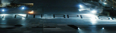
Here she is…being built. Presumably an image from the teaser.
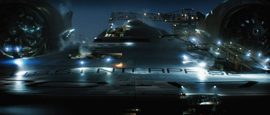
click to enlarge
Redesigned?
At first glance it appears pretty faithful to the TOS Enterprise. The nacelles seem a bit over sized and the skin is more like the movie era Enterprise, but I think everyone’s childhood is safe from being ravaged.
an even higher res version is available at AOL/Moviephone
VOTE: Love the new E?
Vote in our latest poll. What do you think of what you can see so far of the new Enterprise? (see right sidebar)
Let me be the FIRST to say…she’s alive
I’ve got a good feeling about this!
Why hello there! :-)
It looks good.
Please people no bitching
2 LOL.
wow
wow…looks like it will be faithful to the original. Is it me or do the Nacelles look an awful lot like Gabriel Koerner’s concept?
Wow this looks very cool!!!!!!!!
UH-OH…
…the LETTERING is different, folks. Get ready for the sh*tstorm.
Pants = soiled. Awesome! This is bigger than Duke Nukem Forever’s impending release :D
That looks great!
Yee haw!
Nice… Maybe I will go see Cloverfield.
#8 – Yep, looks a lot like Koerner’s. I hated his concept, too “busy” and “industrial,” but I think we’re stuck with it.
Pretty faithful to the original. Faithful enough that I’m cool with it. One weird thing is the nacelles. They look like they might… transform?
LOOKIN GOOD!!!!
Hooray! We can relax…. it’s TOS ship with TMP detailing…just what I was hoping for!
However, this ship is way before the timeframe for the movie… we are probably seeing a special scene made just for the trailer, or maybe one thwt will be used under the opening credits showing the history of the ship.
I hated the “aztec” pattern on the movie enterprises. Gimme the pristine hull of the original.
woohoo!!! this whole bigger scope thing is exactly what im looking for!!
Ummm……wow!
Lettering is NOT CANNON! BOYCOTT!!!
I like it. Look close at the engines – there are slight fins along the length. Here are your wings folks!
Why is there steam rising from one of those open panels? Is the Enterprise being constructed IN San Francisco??
This looks great, better than I expected. Anyone planning to complain please save your breath (or fingers).
You know.. with that glare on the U in U.S.S. it kindof looks like an I.. as in I.S.S.
Sweet.
To quote the late great chief engineer:
“Aye, She’s a beauty, lad.”
#22
I think those ”fins” are supposed to be the updated coolers for the warp drive nacelles.
Freaking Sweet!
24 – Why can’t we complain? I don’t like the way it looks. Alas.
I just have to say that is so effing cool! Thank you, Roberto.
Interesting proportions for the bridge bubble and nacelles. Maybe this is to accomodate a “grander” vision of the bridge, more in scope like the Cygnus from the Black Hole
Mmmmmm………..can’t talk, looking! :)
Looks good. The engines are too big, but maybe only coz of the perspective. I think in movement it will work.
Exactly as I imagined her. Until now good job.
Other than the fact that the nacelles look bit too large, I’m extremely happy with the first look!
First time I’ve ever posted anything over here, but I have to say, the ship looks great!
I don’t knew, i just hope they have fixed thin neck line. I need to see more of this. Can we have some confirmation that this is authentic Enterprise for XI movie or do we haved to wait until 18 jan..
I like it!!!!!!!!!!!!!!!!!!!!
Cant wait to see the teaser !
Looks like the covers for the nacalle caps are not in place yet, and we are seeing the interior of the blades that cause the light effects. Cool that they actually incorporate that into the actual ship! I can see why some thought “airplane engines,” it looks like a turbine!
Now im officialy stoked about this movie!
Best shot ever!
I CANT WAIT!
#34 – I thought the same thing about the nacelles at first too, but looking at this drawing, it seems right on the dot:
http://www.shipschematics.net/startrek/images/federation/heavycruiser_enterprise_up1.jpg
WOW. She looks BEAUTIFUL. This is everything we hoped for. We have matinee tickets for Cloverfield, and I can’t wait!!
Thanks, Anthony!
holy crap!!!!! aw man that looks sick!!!!
Hello, Big E
You are such a sweet beauty!
Oh man…this is going to bring down the entire US internet structure, and for good reason, hahaha
@33
I think in “the cage” the bridge bubble also was a bit different than in the rest of the serie. So the 1701 had a redesign even before the Refit.
awesome… the next 11 months is going to feel like a prison sentence.
“There she is… THERE she is!
First time I got goosebumps since they greenlit the movie
Look at the size of those honkin’ warp nacelles! Roberto, you guys ROCK! I can’t wait to we get a ‘full frontal’! LOL ;-)
First the cool sleek modern new logo, and then a rare glimpse into the skeleton of an absolutely iconic vessel.
Absolutely awesome trek fan day!