EW Previews Star Trek Comic Con Posters – With First Cast Photos July 17, 2008
by Anthony Pascale , Filed under: ST09 Cast, Star Trek (2009 film) , trackback
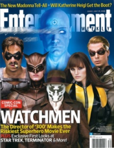
Today Star Trek got a whole lot realer. In their Comic Con Preview edition, Entertainment Weekly has a sneak peek at some posters that are going to be given way at Comic Con next week…and for the first time ever we have images of actual cast members from JJ Abrams Star Trek. [MINOR SPOILERS]
Abrams: Sorry
Entertainment Weekly’s Comic Con 2008 edition previews a number of hot upcoming films and in their Star Trek section EW notes that director JJ Abram touted his new Star Trek at last year’s Comic Con and regarding this year EW asks ‘Abrams is bringing …almost nothing?’ Abrams tells the magazine:
Sorry, but hopefully when [fans] eventually do see more, it will be that much more exciting.
Not Nothing–Paramount is bringing new posters–with cast photos!
As reported by TrekMovie previously, even though Star Trek wont have a panel, it will have a presence at the Paramount booth in San Diego. EW reports that this presence will include four posters that form a single larger ‘one sheet’ poster. However, it appears fans will only get one section each so you will need three friends to get the whole effect. TrekMovie has also been told these posters are not the full extent of the Star Trek presence from Paramount.
Here they are
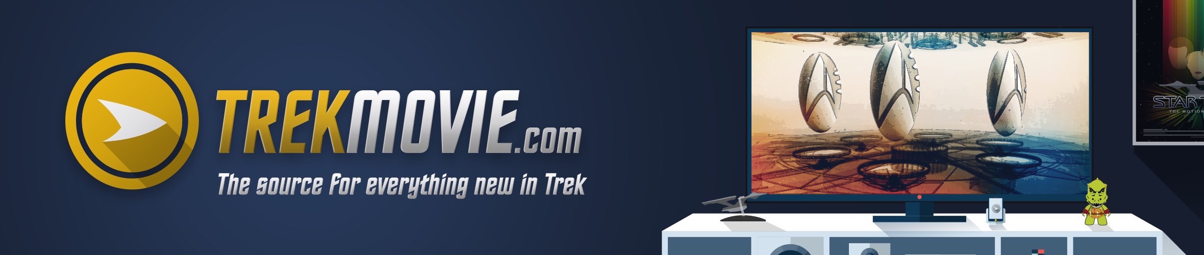
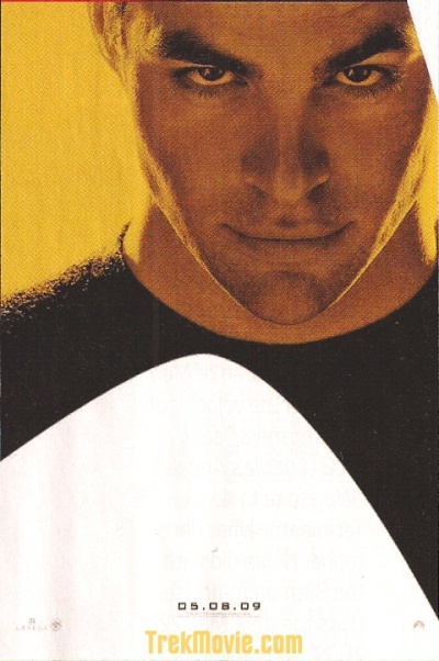
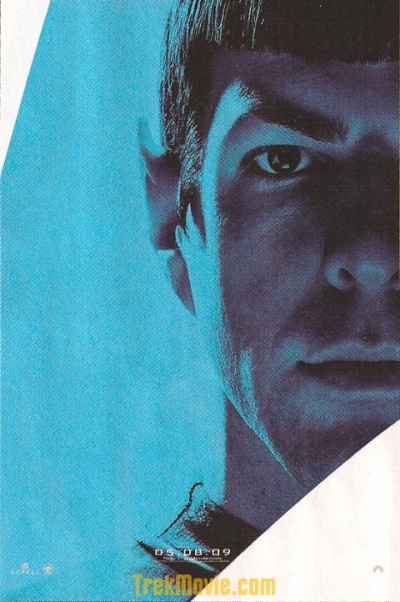
The first official images of Kirk (Chris Pine), Spock (Zachary Quinto), Uhura (Zoë Saldana), and Nero (Eric Bana). By the way, look closely at the eyes.

James T. Kirk (Chris Pine) looking cocky

Mr. Spock (Zachary Quinto), so logical

Uhura (Zoe Saldana), ready to communicate

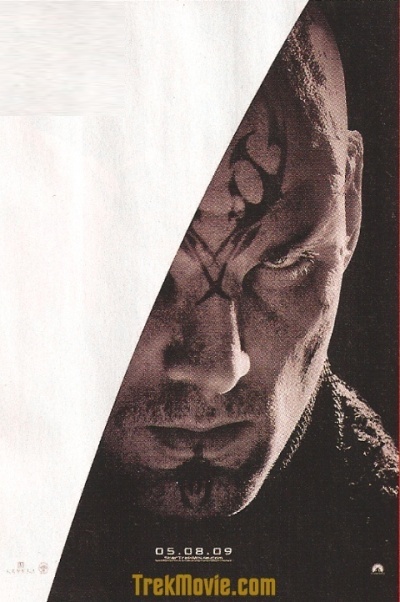
…and the villain Nero (Eric Bana), seems angry about something
Put them all together and you get this:

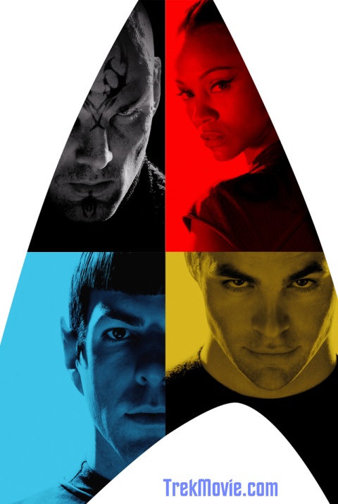
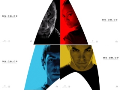
UPDATED New composite image made from newly available desktops from the official site (see below)
Official Site Wallpapers
Friday afternoon the official site went through a redesign and added a download section with wallpapers based on the new posters. CHECK IT OUT.
Quick thoughts:
-
Note the background colors, red, gold, blue correspond to the original uniform colors for Uhura, Kirk and Spock
-
Nice touch with the reflection of the delta shield logo in the eyes for Kirk, Spock and Uhura. It looks like there is one there for Nero too, but hard to tell.
-
Spock’s shirt looks very close to original TOS
-
As we knew it would, Quinto looks perfect as Spock
-
Pine has the right look of a young, serious, cocky Kirk
-
Hard to tell for sure, but it looks like Starfleet pointy sideburns are still in style
-
Zoe’s Uhura = HOT
-
Nero looks badass, but what is is going on with his ear? He is reportedly a Romulan, did someone chew the tip off?
-
And as TrekMovie.com reported before, no TNG era bumpy headed action on the Romulans…with the new twist of tattoos!…Fascinating
Thank you JJ
This is what we have all be asking for…and lets face it…whining about for so long. So a big thank you to JJ Abrams and to your band of brothers (Lindelof, Orci, Kurtzman, and Burk). And thank you Paramount.
Get your own copy in the latest issue of Entertainment Weekly arriving on newsstands now.
Thanks to Michael, Florian and the many fans who sent in tips regarding this EW article


TrekMovie.com is represented by Gorilla Nation. Please contact Gorilla Nation for ad rates, packages and general advertising information.
Comments»
These are awsome!
Tattooed Romulans? Am I first…? wow
Super Bad!!!
Tiberius Kirk
Is it me or does Eric Bana’s ears look chewed/burned off?
TK
fascinating!!
Finally some images…Kirk, Spock, Uhura, and Nero…they have to have posters of the rest of the crew!
This move is going to rock so bad (in a good way), it’s gonna blow us all away. Now, I am officially excited, however I still worry that the uniforms and the “comm badge” will look like the TOS, and that is a definite no-no if Star Trek wants to restart and be in with the times. I mean skin tight spandex uniforms….
However, I can’t wait for the movie, and Uhura is smoking hot !
no bumpy forehead on the romulan it seems! yehh, back to old school!
No offense to Uhura but the poster should have been of Kirk, Spock, and McCoy! The Romulan looks wicked.
NERO! LOOKS! ABSOLUTELY! AWESOMSE!
ALMOST…Reman? As in Nemesis?
NAAAAAHHHH….
9
what can you say…they need to sell this movie …and sexyness sells
Pine and Quinto (Nimoy’s clone?), look really cool in these images…and of course Uhura is looking as beautiful as I imagined!
there is a reflection of somthing in their eyes?
#4 I agree – that is a battle scarred ear;
Chris Pine does look Shatneresque in that shot.
Quinto is very believable as Nimoy.
Great stills but that is all they are. Gimme more!
9. Eric
I see where you’re coming from, but on further reflection, the addition of Uhura to the teaser is a stroke of genius in that it makes the movie more accessible to a wider audience. I love the CYMK color scheme as well.
Very cool, without giving too much away…loveitloveitloveitloveit
13, yes the star trek comm badge crescent
It’s the starfleet/enterprise emblem reflected in their eyes. Pretty cool posters!
looks like nero’s ears have been filed down or something. Wicked!!
Hahaha I finally get some cast photos, and I complain. They’re glamour shots, head shots, nothing we haven’t seen before. With the exception of Nero, what’s going on there?!?!?!?!?!
I like the look, but is it me or does Nero look like Fred Durst???
Nero looks like he went a round or two with Tyson…
Wow, it’s still freaky how much Quinto channels Nimoy’s Spock at least in the looks department.
I guess I can’t draw any conclusion from Pine as Kirk or Zoe as Uhura. Kind of nondescript pictures to me. But I will wait for the first looks at something tangible before I give an opinion on Bana as the tatooed, ear mangled Romulan. Curious that.
nice, trek insignia reflections, looks old school, just the way i like it!
Quinto looks EXACTLY like Nimoy! DAMN! Awesome!
And I didn’t know Andy Warhol was doing movie posters.
I hope Uhura features prominently in the movie. She never got enough screen time in the show!
Good posters, now how about another trailer?
Finally!!! The photos are awesome! In particular I’m relieved to see Pine’s Kirk looking v. kirkish!! yay!!! I can’t believe there’s still 293 days to go! The PAIN!!! aaaaaaaaaaaaaaaaaaaaaaaaa
Can we get EW in the UK?
YES!!!!! Finally something!!!!!! These posters made me so excited!!!!!!
GOOSE-BUMPS!!!!!!!!!!
This… is gettin’… good!
(Cue Stanky, the resident Parade-Rainer…) >:P
Oh, cool, I see the Trek logo now… when you said look closely at the eyes, I thought you were referring to Chris Pine’s correct brown Kirk eyes!
Finally, something for THX to chew on.
There’s the bone you’ve been digging for.
;-)
The forehead isn’t bumpy but there is something going on there, look at the folds of skin near his eyes. His ears do seem to be docked. Probably get in the way during close combat – or as a way to distinguish themselves from the weaker Vulcans. They all look fantastic. Hoooooraaaaah!
Apparently…
…not only did the Romulans clone Jean-Luc Picard, they traveled back in time to around 1978 and cloned Leonard Nimoy, too!
….I think I just shat myself.
I think I just fell in love with Chris Pine. He’s got that bad boy look, alright.
Maybe the whole Romulan thing is misdirection. Bana looks a great deal more like a Klingon.
Pine looks great. Quinto, of course. Bana’s Nero: daring and puzzling.
Zoe’s Uhura: SEXY AS HELL.
I always though Nichols’ Uhura was just ridiculously hot–even as a kid. But Zoe looks bewitching and vulnerable.
Nero’s going to have a great story, that’s what I’ve been thinking. I’m glad to see the tats and damaged scalp/ears… it all adds up to a guy that’s frieken pissed, a guy who hates himself.
We may be free of the stupid wigs and ridges, but it does look like Nero’s nose has been widened a bit, in a Reman kind of way.
If Nero comes from far enough in the future, he could be the Kahn-like product of some post NEMESIS reunification of the Romulan-Reman line. Either that or he was raised in a spaceship with nothing but Mike Tyson fight videos to watch.
Can we have hi-res images? I really need a new desktop wallpaper.
Nice. Retro!
Also, Nero looks more Klingony.
Oh no, I hope thats not a trendy facial Tattoo on Bana. Hasn’t that been done to death.
RE: Nero’s ear(?)
You think Nero and his crew were purposefully disfigured? To protect the timeline?? The Federation’s not supposed to have met Romulans face to face at this date…
Ooh, interesting thought Izbot… I like it!
I meant to say “RE: Nero’s ear(s?)”
Whoa, they’re good! I’m counting down the days, folks. I hope there’ll be a midnight showing the day before the premiere because if so I plan on having my ticket early.
Although, if Nero’s come back to disrupt the timeline somehow, what would he care? Hmm…
HMMM….
…face tats and chewed ear? Eric Bana seems to be playing Mike Tyson’s great, great, great, great, great, great, great, great, great-grandson.
I could look into Spock’s eyes all day…
THANK YOU to everyone who made these posters possible. THIS is what I want to see: Style, substance and creativity as part of the marketing/publicity effort.
Maybe Nero’s disfigured ear says something about his character. Self-mutiliation in order to distance himself from the Vulcan culture, perhaps?
…and I’ll reserve my jugment of the tat until I see the whole thing. As of now, it looks a bit too absurd for my tastes.
Overall though, STAR TREK!!! Pine is starting to grow on me, and Quinto is perfect. I wonder how large of a character Uhura is going to be in this story.
drop the canon bs, already!
it’s a time travel story and villains don’t consult Memory Alpha before instituting plans of galactic domination.
you realize this means we’re going to see the E in San Diego, right?
Take it easy, we’re just musing here…
One small problem — when I look at Zachary Quinto as Mr. Spock, I actually see Zachary Quinto. Whenever I look at Leonard Nimoy as Mr. Spock, I see Mr. Spock.
Still, I really hope this works.
Oooh, cast pictures!!! A hot, smokin’ Spock, a cocky, droolicious Kirk and a sexy, tough Uhura –
That’s the way
Uh huh, uh huh,
I like it,
Uh huh, uh huh.
I added a note of thanks to the article. I do believe that Paramount did listen to the fans and knew they couldn’t release another poster with another logo on it, so thanks for listening. Perhaps the level of whinging might ratchet down a bit…one can only hope
Loving the posters…very classy, creative designs. The only thing I’d suggect is filling the negative space with the Big-E…lol
I’ve had high hopes for this movie all along…and they just keep growing.
Thanks for posting them, Anthony.
Nero’s Tatoos are kind of like war paint.
It could be that their mission is a secret one, and they mutilated their ears, and travel in an unrecognizable ship so that they won’t be recognized.
In case they fail …
It all depends on what they want to change, and what they want the result to be.
Look closely at Zachary Quinto’s top: Is that a Classic Trek uniform top?
It is similar.
FINALLY! Verrrry nice.
Quinto can nail it with a look. That’s SO frakkin’ important and great to see.
Now, for the inevitable inane comment: are they all modeling Starfleet underwear or will Zohura be wearing short sleeves? Can’t tell whether Zpock is in uniform, but Cirk is definitely in a 23rd century James Dean mode.
God, it’s a long way until next May… even on a weekend when we’ll all be going Batz, this seems like the one center of the universe.
I’m totally geeking.
Denise, are you up for a little underoos photography??
Are those seams on Spock’s ear? Well that’s a real nod to the old show…
#9
The reason they didn’t use McCoy is because they wanted the red/gold/blue, by having McCoy, they would have Gold/Blue/Blue
yeah, Paramount rocks for these! I hope we get some new trailer soon.
61…and there is another reason…they wanted at least one female. They didn’t want Trek to look like a sausage fest.
Anyone who takes it as some kind of insult to Trek or Scotty or McCoy…well I think you need to refill your chillpill prescription
Yippee!!! :)
**marking calendar. this is the day Anthony used the phrase ’sausage fest’ like something out of the chat threads. hehehe.**
He he… (in best 2nd grade singsong voice)
Anthony sa-a-aid sausage fest!
CmdrR, bring on the camera. And will I look utterly insipid if I ask who James Dean is?
ZQ has it. 110%
Whatever Bana is, well, it looks like we may all get horrid hangovers from this, unless he shaved his ears, and is “blending in.”
Although, Kirk in uniform would have been nice, I’m still happy.
Nero kind of reminds of Darth Maul with all those tatoos.
Is it possible Nero is 1/2 Reman? This would settle some issues regarding the Romulan’s canonical first appearance.
Fascinating.
T.’.
Finally, SOMETHING!!!!
Ooh, ooh, I cannot wait for the con in Vegas. I wonder if these will be given out there or if additional pics will be available. Only 3 weeks! (jumps up and down)
hmmm….when i voted in te poll…i voted “dont like them”
i mean…its cool to finally have something and see it start to come to life…..but theres just something about the overall design that i dont like. the delta logo in the eyes is awfully though.
Im not really sure why the Quinto response is so positive. It good but not over the top, jump for joy good. im not usually a nitpicker or naysayer….but whats up with Quinto’s bushy eye brows. they really need to thin those suckers out!
Now There You F*#%ing GO!!!! Was That REALLY so Hard? Spock Looks Like Spock, as I figured, Kirk, well with no uniform it’s just Pine. Nero Looks Evil Dude!! (is that a Bird of prey on his chin?) Zoe……Uhm….Where’s the Bee Hive? Or The Round Hair Cut thing? Or the gigantic hoop Earrings? Hot, Yes, But Uhura?…. I’ll Give the Full Look the Benefit of The Doubt. and of Course, Thanks!!!!
Denise: James Dean made three major films, one a classic, one an overblown Hollywood thundercat, and one flawed attempt to bring a thinking man’s novel to the big screen. Having therefore accomplished the goals of every actor, he got in a car, drove real fast and past into mythology.
I have no idea how this ties into Trek. I need sleep.
Thanks, Anthony for posting this and for revealing your human side.
At last. Very cool.
Sweet Jesus!
I love these pictures! I just textmsged several friends of mine who are Trekkies to check here!
Soon we will get pics of Bones, Scotty, Sulu and Chekov!
God Bless Paramount!
57. OneBuckFilms.
“Nero’s Tatoos are kind of like war paint. It could be that their mission is a secret one, and they mutilated their ears, and travel in an unrecognizable ship so that they won’t be recognized. In case they fail …” TOTALLY MAKES SENSE. AND IT WOULD KIND OF HELP WITH CONTINUITY. IF THEY DON’T LOOK ALIEN.
“Look closely at Zachary Quinto’s top: Is that a Classic Trek uniform top?” I SAW THAT TOO.
THIS IS GONNA ROCK!
Good show!
ALL THAT “TREK XI” REALLY NEEDS…
…is a knock-down, drag-out, hand-to-hand fight between young Kirk and Nero. Give Pine a torn tunic, with a little bit of blood in the corner of his mouth, throw in some Shatner-esque Flying Leg Kicks and Lame Karate Neck Chops and I’m sold.
Loves it.
Oh my gracious, at first glance of Zach’s Spock, I thought I was looking at Nimoy, he looks exactly like him.
These are awesome, I can’t wait to see this movie!
Is it just me, or does Nero’s goatee look like the bird emblem of the Romulan Star Empire?
Love the old school uni on Spock. He does look a lot like a young Spock except for the fact that Nimoy’s face was longer and with more pronounced cheek bones. Still, Quinto looks more like the original than do the other new actors. Only 10 more months. . .I hope the effects are worth the wait and wouldn’t mind if they could squeeze the Shat in with that vast expanse of time they have to work with.
is it my imagination or is pines look as kirk in the poster lookin kinda vaguely…’*gasp*–shinzon-like? and yes quinto looks amazingly like nimoy, although in my opinion his ears are too short…nero looks almost like somethin ECW-inspired and uhura….WOW—even beyonce couldnt have pulled off such sexiness as zoe does here–she even makes T’Pol, Seven of Nine AND Kes look like what id imagine a female Reman to look like in comparison LOL
Seams on Spock’s ears? Goodness, I don’t see anything like that on the poster. I’d be shocked if they’d let something like that slip by on a promotional item especially. I think Quinto looks GREAT as Spock!
And so it begins…..
Just a taste from JJ. We eagerly await more and count the days! This is going to be the start of a wonderful relationship between the fans, the new trek cast and a great new creative team.
wow.
82. x0epyon0x: “does Nero’s goatee look like the bird emblem of the Romulan Star Empire?” YOU’RE RIGHT. IT IS!!!
Nero’s tattoo is too similar to Darth Maul… sorry.
88
At last we shall have our revenge. And we need a bird of prey tat to do it.
Woah, Bana is 7 shades of badass in that picture! Is it possible we’ll have our first decent Trek villain since Gen Chang??!
Thank you Anthony!!
post deleted
only the chin looks like Maul.
Here is a quick side by side shot
http://gallery.me.com/dbhays#100063/Nero%20vs%20Maul&bgcolor=black
Damb!
ZQ looks gooooooood !!!!! :)
#83 -
Apparently, some here WERE expecting a Leonard Nimoy clone…
*sigh* “Nimoy’s face was longer with more pronounced cheekbones.” Please say that phrase out loud.
#92 -
DAMMIT!!! Rick-Rolled again! LOL!!! I’ll never learn…
THANKS!
wow…that should keep me fed for a month or so!
Now this is what I’m talkin’ bout!
Ok, I’m excited now.
I am a happy llama.
And to those who think Quinto doesn’t look enough like Spock . . . I challenge you to find someone who looks more right for the roll!
You know, I love women as much as the next guy…
…but that Chris Pine is one good-lookin’ dude. If it helps more women decide to check out STAR TREK XI, that’s fine with me.
Capt Richard#92- That was so wrong…
96., 101. Don’t feel badly, I followed the link and was appropriately Rickrolled as well.
#93 — Thanks for the side-by-side comparison. I meant that having a villain with prominent tribal-style face tattoos was too much like Darth Maul, but it’s true that the actual designs are different.
I guess I’m a little touchy about Star Trek imitating Star Wars, but it can’t be helped — once something passes into the great stew of cultural references, it’s all fair game, I guess….
(At least Nero won’t be wielding a double-bladed lightsaber, or any lightsaber for that matter)
In all my uptightness, I forgot to remark that, indeed, Quinto as Spock rocks, as everyone else has already given praise.
But what’s up with Pine not wearing a proper uniform? It’s just a black T-shirt, as far as I can tell.
Whoa! Great Shots! The uniforms look great! I love the TOS the best and their uniforms were the greatest! Quinto = SPOCK
It looks unfinished – like there are other panels missing to complete the Delta. Perhaps McCoy, Sulu, Scotty, Chekov, & The Big E???
Anthony, please ban Capt. Richard for sharing a fake link which rickrolled us.
If this is a younger Spock, why doesn’t his uniform collar match the ribbed collar seen in The Cage and Where No Man Has Gone Before?
Great teaser. I’ll bet Nero’s other ear is normal(pointed) and that is the Romulan emblem on his chin. And a Bat’leth on his head?
Maybe the Romulans disguised themselves as humans?
That’s actually very encouraging. Like the old look.
ah, you no doubt noticed the ears? perhaps you could explain the accident you had as a child… you see, he got his ears caught in a mechanical rice picker…
About time we see new images from the Star Trek XI movie. They’re all looking good as close to the originals as they can, especially the new Spock.
Nero might be the coolest dude I have ever seen.
That tatoo is defiantly of a Romuland Warbird logo.
111:
LMAO!
No Bones? WTF? Uhura is a freaking receptionist for crying out loud!
She wasn’t even the only one back there. The chick in the “Corbomite Maneuver” was actually hotter.
Seems to be catering to the core Trek fans.
The poster has a very old school vibe.
And with the heavy reliance on the Startfleet Insignia, it says to the non-fanbase, “You’re in for the same old ‘Star Trek’ that you’ve always found so corny.”
I want something new and fresh that keeps true to the spirit of Star Trek.
These posters rock, I am thrilled, especially about the uniform on Spock!
This should hold you over for a day or two?
Mr. Bob! Why are you not attending the con in Vegas? I was looking forward to seeing you and Anthony ham it up for us (and yes, the pictures will definitely do – I am giddy with glee…).
LOL @ Bob.
I am now more apprehensive about Chris Pine’s Kirk.
1) He sees his Kirk to be much like “Han Solo” which is WRONG
2) He has said little else on Kirk
Compare that to Quinto, whom I am very optimistic about.
And finally, this image, to me, is consistent with the first two points. The poster of Pine looks like generic 2008 slick cool guy (an updated Han Solo?) and not like the strong but vulnerable and intelligence Captain Kirk.
I hope I’m wrong- but remember, I said it here.
107. Simple, the TOS uniforms are more recognizable than the Cage/WNMHGB uniforms.
116: Negotiator… not sure what you’re saying, because Uhura was in “The Corbomite Maneuver”
Bob! Yes, these will be fine. For now. :)
Alright, Pine should be a big hit with the ladies, and I can look at him and say, “Ok, it’s young Jim Kirk.” I had to do a double-take when I looked at Quinto… definitely Spock. I don’t mind seeing Zoe in this poster one bit… Bana looks rather heavy-metal or wrestler, so I’ll have to see him in action… Otherwise, very cool to get some new stuff…
118 posts in how many minutes?! [more by the time I hit post, I'm sure] Gotta love it.
Now that’s the first picture of Pine that I find, well, smoking hot as others have opined. And Zoe sure is pretty. As for Quinto, eyebrows are a little bushier than I thought they’d be.
Denise – I’m sure we’ll get the poster at Creation and we won’t lose appendages there — I don’t even want to imagine the melee with 140,000 people at CC grabbing for stuff. I’ve bailed from CC since no Trek panel with JJ & cast.
I agree with the assessment in the quick thoughts part of the article.
And I think this will be truly the first movie since the last original cast movie, that will move Star Trek back into notice with the general public in a big way, as well as those fans that can accept the updating and the changes.
I also hope, only judging from the Nero portion of the posters, that the aliens who figure prominently would be those who are known in the original Star Trek as “humanoid”.
I find as a viewer, as long as I can identify with the alien race in some way, then I’m accepting of the drama that much more. If the aliens get ‘way out’ in their customs and behavior, then I’m not really caring about their dilemma in any given presentation.
And I think with the original Star Trek, one of its charms was the way aliens were portrayed. Perhaps we might find out that many of the races on other planets are very much as we are. (Yes, perhaps not scientifically accurate, but for the sake of the drama, please…)
I’d like to see the movie go back to some of what the original Star Trek had. Not everything, but much more then anyone has done since the inception of the spin-off series and spin-off movies.
Oh, and I’m not wanting any further information about the movie, then the people who are making it want me to have at any given time. As a young fan of what we called, “Star Trek” I knew much more about every movie then I really needed. It never ruined each, but if I knew next to nothing, then the big surprises in each film would have been even more surprising at the time.
But, I do want to see the ship before the movie comes out, by the way…
I’m psyched to see the posters!
I LOVE the fact that Uhura is getting major play here guys and gals. It is so awesome to see my favourite original series character get to step it up. I am so beyond excited for this! Helloooooo eBay to score those posters.
I havn’t been this excited since the first trailer! Thanks Paramount and crew!
krikzil#125- Are you going to Vegas in August?
Denise — I am indeed. Want to meet up girlfriend?
krikzil- Finally I find someone from Trekmovie who is going. So, what is your favorite drink at Quark’s?
Chirs Pine as Coky Kirk “AWESOME” I WANT MORE
Zoe’s eyelash makeup is identical to Uhura’s on the old show, brilliant touch. Looks like Spock is wearing the standard duty uniform, so why are Kirk and Uhura wearing t shirts? Oh well, I really love the expressions each of the actors is making. Oh, and Nero looks badass.
awesome ! love it.
can’t wait.
WOW!!!!!
Anyone notice that Pine has lo-o-o-ng, thick eyelashes in that photo, just like Shatner in his TOS closeups…
thank you bob orci.
thank you anthony pascale.
star trek lives!
best!!
=h=
“krikzil- Finally I find someone from Trekmovie who is going. So, what is your favorite drink at Quark’s?”
Warp Core Breach amuses me.
“Anyone notice that Pine has lo-o-o-ng, thick eyelashes in that photo, just like Shatner in his TOS closeups…”
Yes. Shatner sure was handsome back in the day. (He looks great too for 77.)
I think the burned ears/tattoo/apparent brow prosthetic/photoshopping–ever so slight–is an awesome idea, if they’re going that way.
Krikzil- Meet me in chat. Top of page, click on chat tab. I will look under the bar and see if we have any Romulan ale in stock.
So, that’s the best shot of Pine they could get to signify a young Shatner?
Not good enough, damnit, not good enough!
Both his facial expression AND uniform should have been much different………………and better!
You blew it, JJ!
Boborci…
I have a question for you.
Will the movie be made in IMAX too?
Wow!!!! This is AWSOME!!!! I love it……..Kirk and Spock look so cool and Uhura is looking Great, Can’t wait to see what Macoy and Scotty look like as well as Checkov and Sulu!
Most satisfactory.
Zachary Quinto is cast as Spock? I had no idea!
Dammit Jim, cool, but I want McCoy, my personal favorite.
Kirk MUST have his green shirt ripped in the movie!
Yes! Woo! Can’t wait to see more this year!
Zoe Saldana did make the Maxim Hot 100 list for 2008
http://www.wcbs880.com/pages/2235759.php?imageGalleryXRefId=547252
“Note the background colors, red, gold, blue correspond to the original uniform colors for Uhura, Kirk and Spock ”
um…about that……
in her first appearance, didn’t Uhura wear gold?
150. Doesn’t matter, DC. Red is Uhura’s recognizable color.
“This should hold you over for a day or two?”
Why? What’s coming next? An Orion lap dancer? Or even something hotter?
119 – Does that mean there will be more in a day or two? >;>}
Good. I was hoping for brown/hazel (or whatever) contacts for Pine. I hope they don’t make Kirk too cocky. Remember, he was described a stack of books with legs. He should know more and be better than anyone else in the class (except of course he gets his ass beat by Finnegan). The “Han Solo” approach would be a caricature and not consistent with the character.
Of course, he could be cocky and something happens to make him more serious, but that would be very contrived, and again not consistent with Kirk’s character. Kirk should be driven: he want to be a starship captain: he is focused like a laser beam on that goal. Of course, I guess a certain lab technician could distract him…
but I digress. Quinto looks good as Spock (although I thought they were going to give him earlobes). Can’t see much of Saldana, and Bana looks…I don’t know. Good use of colors.
Obviously, we need to see more.
Cautiously optimistic.
I am not surprised that Uhura is on that poster.
All JJA productions (Lost, Alias) I have seen so far strong women played a major part and Uhura maybe finally gets a bit longer and more important space in this movie. :)
Bana looks great on that poster, to change the skin by making a tatoo at the same position is a cool idea, so does Quinto,
only Pine reminds me a bit too much to Hayden Christensen and his bad Vader performance. We’ll see.
Just, thanks. Seriously, this is GREAT.
i WANT MORE!! :)
RE: 119. Boborci – July 17, 2008
“This should hold you over for a day or two?”
Does this mean that in a day to two we’ll get more?! ;-)
[...] Star Trek Auf TrekMovie.com gibt es erste Charakterbilder aus dem neuen Star trek Film zu sehen: ST.jpg Oben Links: Erik Bana [...]
Awesome posters indeed. I would have preferred to see McCoy instead of Uhura, but of course that would’ve screwed up the colour scheme… ;)
Fan-dabby-dozie.
[...] source – trek movie [...]
why does it look like only Spock is wearing the correct uniform?
I love how it captures the colour schemes of the 60s uniforms and the correct colour for the character.
Nero looks unlike any Romulan I have seen.
Whether by deep shaving or by CGI – it should be noted that Zachary Quinto’s ever-present mini-stubble is finally GONE!
Here I put all the images together in a full size version. I’m sorry I don’t no how to remove the words trekmovie under each picture. Enjoy!
http://img258.imageshack.us/my.php?image=copyofewnero1ro8.jpg
Looking pretty good. The poster reminds me somewhat of an old cover for a James Blish novel. Totally Retro.
These posters are awesome! And here I thought my anticipation level for this movie couldn’t get any higher. Silly me. :)
This one has better resolution, than the one above.
http://img137.imageshack.us/my.php?image=ewnero1kt4.jpg
[...] http://trekmovie.com/2008/07/17/preview-of-star-trek-comic-posters-with-first-cast-photos/ [...]
EXCELLENT
S.T. WOOD!!!
“”"” why does it look like only Spock is wearing the correct uniform?
I love how it captures the colour schemes of the 60s uniforms and the correct colour for the character.
Nero looks unlike any Romulan I have seen.”"”"
Perhaps the whole, serving under Pike for X amount of years bit coming to light?
#52
maybe a ferengi female to win miss universe :D
im glad some one finaly mentioned darth maul. i was thinking more of a ds9 frehead of the week meets darth maul with a hint of ming the merciless.
as to the release. i say thank you. quinto/spock is the only one imo that looks good. the others are just pictures of people to me and not wetting my star trek appetite.
but with it i still give this movie a thumbs down at this point.
after reading the JJ ’sorry’ bit at top. i haft to wonder. it looks like sure he would love to show moree but ’cause the movie was pushed back till may his hands are kinda tied right now. and we’ll just have to wait. Now it mid july and w/ an original xmas release i haft to ask Bob (or JJ) what (if any one would know) what would the poster, trailer etc release schedule would have been. now thats torture. ‘they would have put out a new tv spot next week but…’ :D
#150
i dont reecall corectly on that. but iirc sulu is said to be a helmsman instead of the dpt head he was in wnmhgb (astro physics ? ah thre it is astrosciences @memoryalpha)
#151
sorry but this movie is targeted at non trek fans who wont know the differance. and to the core audiance who will.
#119
oh thats torture.
yea nero looks pretty cool
[...] (Trek Movie) [...]
Isn’t command supposed to be red? The movies were red uniforms, Picard had red, so did Sisko and Janeway. Even Archer had a red line on the uniform… It must appear that red looks more important than yellow.
Great photos.. though… did is Nero fighting Mike Tyson in the film or something?
Thanks to all involved
Nice – Sort of retro looking…like if Shatner, Nimoy and Co had made that prequel film Roddenberry talked about making in the 1960s
Quinto looks just like a generic Vulcan, once again proving that Nimoy is the only true Spock.
I LOVE IT!!!!
Pine looks great!! Well… everyone does! Love Uhura’s short sleeves.
Strange thing with Nero’s ears though… someone here mentioned the Remans. Some quick thoughts: doesn’t the new film involve time travel? If so, Nero and the rest of the evil bunch could somehow be connected to what happened in ST Nemesis… I’d actually like it if they somehow tied it to the TNG timeline.
#173 (Bart): wasn’t Kirk’s uniform gold? I had a replica once, and it definitely wasn’t red. :) Scotty’s was red, though.
I like that Nero seems to have a forehead halfway between TOS and TNG.
Notice that the upper nose area flares out in a non-human manner.
Looks cool.
#173 Bart — wrong era, mate. :) Oh, and Archer’s uniform was gold-lined, not red.
On Enterprise (22nd century) and The Original Series (23rd century), command was gold, science was blue, and engineering/security was red. On TNG/DS9/Voyager (i.e. in the 24th century), the colors of command and engineering/security were switched.
The new movie takes place primary in the 23rd century (TOS era) and will follow the costuming scheme of that era.
Eric Bana definatly DOES wear a prosthetic! Look at his nose and upper eyelid. There’s something of a Romulan eyebrow arch going on there, but not as high on the forehead as in TNG.
No reason the next poster – a companion one – couldn’t be McCoy (blue), Scotty (red), Sulu (or Chekov) (gold), and the other villain – or Len Nimoy, for that matter. This is a theme that could easily be carried over a set of posters.
I wonder if all of the Romulans’ ears in this movie are mangled instead of being pointed, to differentiate them from Vulcans. (Like the fact that the Romulans are all going to be bald.) If so, that would suck. Otherwise, these posters totally rock!
I love the posters. The one of Chris Pine is the one that really stands out to me. There’s just the right amount of cockiness, mischief and humour there to make sure that this guy has ‘the look.’
These guys need to have ‘the look’ rather than be exact clones of their past characters. Zachary Quinto, predictably, is dead on. Zoe Saldana looks gorgeous. Personally, I have no issue with her not having the beehive hairstyle: she should wear what suits her look and figure. Also, we know that her Uhura is going to be a bit more in the action than Nichelle Nichols version was.
A nice set of slightly retro posters. I’d love to get these as postcards.
New Posters of Kirk and Spock – just had to add a little something:
(http://www.flickr.com/photos/28700070@N07/2679807012/)
Wow, I didn’t even recognize Eric Bana at first. I love what they did with his look – he looks badass.
Ah Mr. Orci you truly know the fans well! A day or two! hehe!
Now a shot of the Enterprise sometime this year and I’ll be content until next May.
….the adventure continues….
>186. CanuckLou
>Now a shot of the Enterprise sometime this year and I’ll be content until next May.
I’m with CanuckLou
Posters look cool
Note about Pine’s T-shirt (Spock wore the same shirt style in the “Naked Time” for you canonist out their)
[...] Visto aquí [...]
Fantastic!
-cs™
Nice to see Qunto’s eyebrows thick like Spock’s in The Cage & WNMHGB…
Boy do folks get easily excited. I see nothing really new here, other than a confirmation of the TOS style uniforms being worn on Spock. Which is great, but we already knew from eyewitness accounts that we’d see the classic uniforms. We’ve seen Quinto as Spock already, so that’s old news and the others are just regular publicity photos.
Well I have to take some of that back, the reveal of Bana’s character is cool, that’s a very different look for the Romulans and appropriately threatening…and the non-pointed ear is very interesting.
Also, the graphic design of the poster is very cool, but it really doesn’t offer much that we haven’t already seen. But yeah, it’s better than nothing.
Forget Spocks eyebrows
Anybody else spot the Ming the Merciless style eyebrows on Nero?
One mean looking villain tho.
C’mon Star Trackie don’t be a party pooper! ;D
Jump into the pool and join the fun!!!!
…the adventure continues….
WHOO-HOOO! Thank you Parmount!!!!
[...] es el característico logo de la franquicia, vamos, el de la Federación Espacial. Los pósters a mayor tamaño, escaneados de la revista, pero con marca de agua incluida en T…. Lo más curioso es lo colorido de la cartelería… la razón es la [...]
Eric Bana is cool as Nero I love it!!!!!!!!!
[...] Trek Movie via Cool [...]
Uhura was used instead of McCoy for several reasons. One is she wears red and they wanted to show the three colors. McCoy and Spock both wear blue. But they also wanted to appeal to a wider audience than white men.
Bob Orci said “This should hold you over for about a day or two ?”
Like I said in the other thread, I don’t see HOW these new fans would of survived the 10 years the old fans did back in the day for TMP.
Yeah this will keep them busy for about a couple of days then they’ll whine for more and more until the whole movie is spoiled.
I can wait.
Very cool. Very Cool.
Want to see more….
Amazing how much quinto looks like the real spock. This is gonna be good.
[...] James T. Kirk full of piss and vinegar. Cool! Head on over to the official site to check out the other two posters and get the skinny on Star Trek The Movie coming next year. These fans can’t [...]
[...] You can grab a better look at all these posters – and get some further information about them here at [...]
Hope the slight retro feel carries through to the feel/look of the film, it is bang on. Zach IS Spock, no question, but Nero has more of a Sith look than a Romulan to me. Great artwork, lets see more of my favourite Trek typeface (one of my favourite typefaces of all) TOS title font, genius design that. Funny how it looks better now than in the 70’s-80’s….
During his academy days Kirk iwas supposed to be like a stack of books with legs, positively grim.. I hope Cris Pine uses some of that with his portrayal of Kirk.
…..- WoW…wOw..WoW… finally.. something new….cool ..!!!
The tattoos look very bad. Tribal tattoos on a Romulan? For real? The rest of him and the crew looks great.
[...] this year in the form of posters, cast photos and, one would hope, something else. But, for now, TrekMovie has uploaded the posters from the upcoming issues of EW. There will be four character posters, [...]
At least they kept Uhura’s Egyptian eye makeup!
RE SEAMS ON SPOCK’S EARS.
They are there.
Look at the top of the ear. Note how the light falls off drastically @ half an inch below the top edge. Appears to be the mold seams (similar to those on Nimoy’s ear pieces from the original show, which incidentally are more pronounced on the remastered series).
[...] you’re into Star Trek you might be interested in this preview of the posters for the new upcoming Star Trek [...]
Wow…so freaking cool! Very retro looking! I absolutely can’t wait for this…
RE SEAMS ON SPOCK’S EARS.
“They are there.
Look at the top of the ear. Note how the light falls off drastically @ half an inch below the top edge. Appears to be the mold seams (similar to those on Nimoy’s ear pieces from the original show, which incidentally are more pronounced on the remastered series).”
Just looks like the lighting effect to me…
@ 211
Egyptian eye makeup? That’s pretty different.
This is more of a retro 60’s makeup I think
WOOT!!!!!
Denise and 74…
James Dean makes real good breakfast meats. Bring some along ta’ tha’ aforementioned sausage fest.
Oh… wait a tic… did something else happen here? Oh- tha’ bloody movie! Forgot aboot that fur a sec…
Arrrrrr…
I noticed the seams on Quinto’s ears right away. Seems odd they’s still have them this many years later, with better makeup effects… Maybe it’s a trick of the light. Hopefully.
Any by Egyptian I meant the cateyes makeup Uhura always wore that made her look more distinctive.
192. John Gill
I hope that silences all the people saying his eyebrows are too thick. Sometime Canonists are too strict
Wow, Quinto IS Spock! And I really love the colorful sixties’ style of the poster!
But what’s that? A Romulan with a tattoo one is more likely to find around the aft section of a teeny girl?? Replacing 1960s kitsch with 2000s kitsch, are we, Mr. Abrams?
canon freaks should really be obsessing over THE CAGE uniforms. looks like Kirk’s the exception here, as Spock and Uhura appear to be wearing blue and red.
also, I wonder how Quinto will fill the spiritual aspect of Spock’s character. he looks very CAGE-esque here [angry, robotic], which is appropriate, but didn’t we all kind of fall for the guy with an identity crisis who meditates and plays the lyre?
139 and 141
I am also heading to Vegas
It’s going to be awesome
Man, they’re all young.
[...] Yeah. TrekMovie.com has images from four teaser posters to be showcased at the Paramount booth at Comic Con ‘08 this [...]
What is with all the sites shilling their crap without even making a comment. If i wanted to promote my site, id at least make an intelligent comment first.
What a great start! The fact that these have already been released and Paramount said this isn’t the extent of Star Trek’s presence leads me to believe we are in great shape. By reading through everyone’s posts, it seems some people’s fears are being laid to rest.
BTW I submitted my comment before i read #225. That proves my point aye?
#228, IIRC those are automatically generated posts that are made when another blog links back to trekmovie. It;s called a linkback. It lets Anthony and the rest of the trekmovie staff know who’s linking to them. http://en.wikipedia.org/wiki/Linkback
Nero looks Perfect! Eric Bana is the one casting I got excited about! Once again he brings total impact with his presence. I wonder if the Cage match with Mike Tyson is in the film.
#226 – I believe that’s automatic when people add the news to their sites. It’s just showing who is linking back to the article is all.
#226
It’s called a pingback. They aren’t posting, Anthony just has it set up so that he’s notified anytime someone links to this article (or any other on Trekmovie.com).
Fascinating….
but I still want the Enterprise.
Throw me a bone, man!
Amazing shots and love the uniforms and colours
The Swinging sixties are back
Seems to be catering to the core Trek fans or back to the Classic Trekkies
We have an article on the original episodes on our retro site.
Any fans want to leave there memories on the the original episodes would love to hear from you.
http://www.skool-days.co.uk/2008/07/star-trek-1966-retro-television.html
I think this will keep in with the true spirit of Star Trek – great move.
I really love the colorful sixties’ style of the poster!
But what’s that? A Romulan with a tattoo one is more likely to find around the aft section of a teeny girl?? Replacing 1960s kitsch with 2000s kitsch, are we, Mr. Abrams?
[...] The above image is of course, Zachary Quinto (Sylar in Heroes) as young Spock. I got this from Trekmovie.com, which got it from the Entertainment Weekly issue with the Watchmen [...]
I LOVE the retro feel from what we’ve seen thus far. It’s not (and shouldn’t try to be…IMHO) a duplication of 1966 aesthetics. But I think it’s great that there are clearly some strong influences of the era; the poster layout and colors (Warhol-ian), eye-liner, mini-shirts, what we can see of Spock’s uniform. I can’t wait to see how this translates to sets, ships and especially music.
I can’t believe it! Spock’s picture actually looks like young Leonard Nimoy. Remarkably fascinating.
I don’t know how anyone can make any kind of suppositions on the new movie based upon what little we’ve seen so far. I mean, the cast looks like the originals and the uniforms look retro, but for anyone to be disappointed this early in the process has to be mentally handicapped.
What some fans don’t understand is this movie can be “retro” and new at the same time.
It looks like these pictures have silenced many canon Nazis.
I am extremely pumped about this, but I disagree with Anthony that this is some ‘gift’ to us. It is most likely the start of the marketing campaign.
EW, which has always favored Trek, is mainstream, and has now put TrekXI in front of Joe Sixpack for the first time since the teaser came out. I would expect subsequent changes to the website, new posters with the other characters, and some more fat tidbits to show up soon. “Under Construction” will probably also disappear.
If Trek marketing recedes back into its shell, it’s just a waste of money due to loss of impact.
Hacket and others
lets not pre-flame people, and throwing around the Nazi term is not cool
Neuvo-Spock looks terrific. My jury is still out on the rest of them, especially Pine.
142
I don’t think they’re trying to signify a young Shatner. Pine is playing a younger version of a character named Kirk. If the ST IX team set out to re-cast the classic CHARACTERS simply on resemblance to the original ACTORS alone…we really would be in trouble (IMHO). The exception being the resemblance between the older and younger Spocks. There’s a greater need for a similar appearance since both versions of the character will be in the same movie…possibly on-screen together from what we’ve heard.
63. Anthony –
You’re right, I’m sure they didn’t want the poster to look like a sausage fest. But in addition to that, hasn’t JJ, Bob Orci, and the others said that the movie has very strong female characters?
I wouldn’t be surprised if Uhura is on the poster because she has a really important role in the story — not just to balance it with her feminine qualities.
Which is fine with me! I can’t wait to see Uhura kick some ass!
(btw, Anthony, thanks so much for all your hard work and this great scoop!)
Nero as depicted shows Shinzoneque lameness… you can almost see the mustache-twirling and hear the evil laughter… did they say “realistic”?!
[...] Isla de Pascua en tener la noticia en exclusiva. Via io9 (el mejor blog sci-fi de l a galaxia) y trekmovie. Los 4 posters después del [...]
Wow! These look fantastic! I might explode, just like the deathstar!!
[...] will be giving out some promo posters for Star Trek at Comic Con, Entertainment Weekly has a sneak peek at them. The four combine into the larger image, but fans are only getting one-per. I don’t think the [...]
201.
Too true…
The production crew will be reading these comments and grinning incessantly lol!
Quinto looks uncanny!
FAN-BLOODY-TASTIC!
These posters have brought up more questions for me…
like… why do I want to do Captain Kirk? Have I changed genders and turned blue or green
#252- LOL!
These posters are awesome!
I cannot wait (but will have to)!
I’m diggin’ those tribal face tattoos. Can’t wait to see what else pops up at the con next week…….
Zac looks frightningly accurate as mr spock, i wonder how they are going to address certain things such as the fact Sulu was senior botanist at the start of the show, and Uhura was in the command division in the first episode she appeared in – i reckon they’ll just ignore these minor details – i really wish they’d start giving us more with regards to the film, such as pictures rather than various small tidbits of info otherwise it could cause a backlash later on!
251
“FAN-BLOODY-TASTIC!”
I want to start using “bloody”. We need to all start doing that in America. Watching “Extras” makes me want to talk that way. As well as using “cheeky”. As soon as I pinpoint exactly what that word means.
Man, you’ve all been drinking the kool-aid haven’t you?
#245 – If I may offer.. you would notice that Leonard Nimoy’s Spock is not on the poster either who undoubtedly has an even bigger role than Uhura. I’m going stick my neck out and say that what we see was a creative decision. Not to detract from Uhura at all, of course.
The new posters kicks ass!!!
Picture of the Enterprise please Mr. Abrams! Please with sugar on top. Us fan boys will be good. Just one picture, pleaseeeeee!!!!
The shadow people are pointing out is not the seam on the appliance and cannot be, because that is not where the appliance attaches and there are no seams there to be revealed.
What I think is funny is that the lighting makes it look a little like Quinto’s sideburn is floating free and casting a shadow on his cheek.
Maybe Nero (Eric Bana) does that to his own ear, maybe he hates Vulcans so much he doesn’t wanna look like them in any way.
Awesome poster! This is my new iPhone wallpaper.
That Chris Pine/Kirk photo is creepy as it look’s like ZQ’s Syler expression.
Scott#262- Hmm… I must go with the mechanical rice-picker theory…
My… God. Leonard Nimoy will always be Spock, but after seeing that shot of Zach Quinto in the full ears, haircut and what appears (bless you, JJ) an honest to god TOS uniform, there looks like tis town IS big enough fer two Mr Spocks!
[...] Trek Movie Cast Photos Trekmovie.com have posted the first set of posters for the next Star Trek film. Each poster highlights one member of the new [...]
There appears to be some subtle prosthetic work on Bana’s character – obviously not the same as TNG era Romulans, but noticable and I like it.
“As we knew it would, Quinto looks perfect as Spock”
Shouldn’t it be “As we knew HE would?” I’m assuming the pronoun is meant to refer to Quinto…
Anthony
okay I am sorry. I will not repeat the word here.
RE SPOCK’S EAR SEAMS
The seam evident on the ear is the mold seam, not the edge of the appliance to Qunito’s skin. As such, it’s exactly where it should be.
“The shadow people are pointing out is not the seam on the appliance and cannot be, because that is not where the appliance attaches and there are no seams there to be revealed.”
Nero doesn’t look that Romulan to me.
planning to pick up my posters next week in san diego! fun fun fun!
Pfft. No Bones?
I like the Spock one. Kirk just doesn’t seem like Kirk.
#256
He was actually a staff physicist, not Chief Botanist. Though he obviously did have an interest in botany.
Yes, yes, very nice, WHERE’S THE BLOODY SHIP!?!
looked at the pics
skipped to the end
barely read any comments
my comment
fookin awwwwwwwwwwwwwwwwesome
to paraphrase my future countryman
‘ah cannae wait’
Its sort of reminded me of this promo shot from TOS :
http://www.myextralife.com/wp-content/uploads/2007/08/kirk-and-spock.jpg
Combined with the famous Beatles psycadelic art work from the 60s:
http://www.bookshopontheheath.co.uk/sitebuildercontent/sitebuilderpictures/.pond/beatlesposters.jpg.w180h230.jpg
LOVE IT!
It’s SO sixties!
In fact, it looks like a 1966 ad for a Polaroid Swinger or something.
this plus the first watchmen trailer on the same day
what’s jj et al going to do when it’s actually my birthday ‘cos this is pretty much the best a boy could be hoping for!
[...] | TrekMovie.com trackback ¿Recomendarías este post? Más noticias sobre: Posters Tags: Chris Pine, [...]
Looks superb. Very dark and moody.
I’m an optimist, and I’d do Uhura as played by any actress (wouldn’t we all?) but this all reminds me of the 1970’s Star Trek projects where “Kirk” and the rest were drawn so as to not appear too much like Shatner and the other actors but rather by an artist’s concept of the characters minus the actors. It was all about paying franchise image royalties to the actors for having their “likeness” replicated in the name of selling Star Trek, and Paramount’s 1970’s response to lawsuits by the actors. I can buy these actors as the characters, so long as we want to add gene pool manipulation into the mix which we already know involves alternate possibilities and time travel. But “Star Trek” is Klingon for “make a ton of money,” and all of that aside, I know just enough about this next film to be VERY excited about it, and hope that privately leaked details prove to be true. If so I will truly go from being one of the biggest skeptics to one of the top supporters of this next Star Trek film.
Ok I got my trek fix for the moment…
Quinto and Saldana look awesome. Pine and Bana…less so.
[...] some excellent analysis over at TrekMovie.com, particularly: look closely at Spock and Kirk’s eyes. [...]
I showed the Quinto poster to my son, who’s 6.
Told him it’s the new Spock, a new guy playing Spock. He’s seen the Nimoy version in TOS.
His answer: “But it’s still Spock.”
Which distills everything down to this: like Bond, like Batman, like Superman, these are characters that MIGHT just have a little room left for other actors to inhabit.
I can’t tell anything from this poster one way or the other and neither can you.
[...] image.Zachary Quinto could be Leonard Nemoy’s son he looks so much like him. You can go here to see larger images of the [...]
The $64,000 question is..
HAVE THEY GIVEN PINE BROWN CONTACTS?
Cant really tell from that pic..hold on take another look…yes…YES i think they have!!
Oh yeah and Kirk looks like James Van Der Beek from Rules of Attraction in that pic
While there won’t be a Star Trek panel at ComicCon, there is an interactive “Star Trek: The Exhibition” at the San Diego Air & Space Museum just around the corner from it. It’s a world premiere of an official exhibition, so maybe they will use that venue to make some more announcements and surprises… ?
[...] EW Previews Star Trek Comic Con Posters – With First Cast Photos | TrekMovie.com [...]
100
yo STD, it really does not sound like you like women “as much as the next guy”
*sigh* “…but that Chris Pine is one good-lookin’ dude”
Consider saying THAT out loud.
Those who live in glass houses really should consider not throwing stones.
[...] 4 separate posters… EW Previews Star Trek Comic Con Posters – With First Cast Photos | TrekMovie.com __________________ “I Am Come To Stay.” “I’ve Retired More Men Than Social Security.” My DVD [...]
The versions they have on the official site are a lot clearer, and damn, Spock looks good on my desktop. Even with the clearer image, Nero’s tats are still making me nervous, and being able to see more of them doesn’t help.
All look very awesome!
Does anyone else think that Nero’s tattoo look sorta like a set of Raptor wings? You know… the kind the Romulans use are their emblem?
Just thinking…
Nero doesn’t look alien enough. With the chewed off (or whatever) ear, he just looks like a bald human idiot…I knew getting rid of the ridges would be a mistake. Well, all you lunatics who were clammoring to get rid of ridges got your wish…and now (judging from this picture, anyway) we just have bald humans with pointed ears.
Lame.
Theory:
Perhaps in JJ’s Trek, Romulans (or Nero’s little group of Romulans) purposely disfugure their ears as a way of denying their common heritage with Vulcans. Doesn’t seem so far fetched.
[...] Via TrekMovie.com: [...]
[...] Wil Wheaton, my favorite source for great geek news, linked the new Star Trek Movie poster for all of us to see. I literally went from not wanting to sit through a Kirk movie to [...]
#297
Redjac, if I follow your logic, and I think I do, you’re saying that if Ruffles have ridges, why don’t Romulans?
M’yeah, see your point!
Loving the slighty Evil Kirk-iness of that shot. No, he doesn’t look like the great Shat, but there’s some sort of channelling going on there in that smile, those eyes… Rowrrr.
Ditto most everyone else’s comments. Quinto – wow…just, wow . If I were a guy or a different sort of girl, I’d certainly find “New-hura” quite fetching. And the Romulan is awesome.
So the casting is excellent (c’mon JJ, let’s see more!) Let’s just hope and pray (those who do that) that the movie delivers.
I think that this looks a lot like younger Shatner!
Maybe it doesn’t resemble the Star Trek: Year One version…
…but it does look like the Shatner from his pre-Star Trek days. He looks like Shatner from his Twilight Zone appearances.
I can’t wait for this film!
[...] posters for 2009’s Star Trek hit the net. poster, Star [...]
I imagine we’ll get other similar character posters making up the Starfleet ‘A‘ -..e.g. Scot, Bones, sulu, Chechov..then maybe more…
Maybe a similar poster has been prepared with Nimoy and Shatner striking similar poses to their counterparts and that this will be released closer to the film’s release date?
Just thinking out loud….
@ 305 SNAKE:
Unless Mr. Shatner is in the movie after all (contrary to what everyone connected to the production has been saying) I doubt that they’ll use his image for posters or any other official promo material.
Closeups aren’t kind to fake sideburns (I’m looking at you, Mr. Spock). Nonetheless, awesome poster. Chris Pine’s Kirk should especially put some of the Pine-Isn’t-Shatner worriers at ease. Zoe Saldana’s Uhura… smokin! And who knew they could make a guy as good-looking as Eric Bana look so… intimidating.
Aces!
sweet! I would like to see some more full size photos, but this is still a treat!
#117. R
“Seems to be catering to the core Trek fans. The poster has a very old school vibe. And with the heavy reliance on the Startfleet Insignia, it says to the non-fanbase, “You’re in for the same old ‘Star Trek’ that you’ve always found so corny.” I want something new and fresh that keeps true to the spirit of Star Trek.”
Sorry, but I don’t understand your comment.
In my opinion, it has an “old school” vibe because that’s what they were wearing in those days (i.e. at the time of the original series). You can’t expect them to violate history and change it. That would be poor movie-making whether it’s Star Trek or not. If you’re filming a period piece you HAVE TO GET THE COSTUMES RIGHT.
And to make a judgement on the quality of the movie just because they use the Star Trek insignia once, is ludicrous. Unless someone has seen the movie, one cannot make that comment. What was “corny” about TOS was some of the poor stories and some of the cheesy aliens or cheesy special effects. How can you derive that from the use of the familiar Star Fleet insignia in ONE photo? Heavy reliance? It’s the first official picture they’ve released. Good grief! I happen to think it’s clever and from the looks of the other posts, so do many others.
And btw, they ARE keeping true to the spirit of Star Trek. As you yourself mentioned, that was the symbol of Star Fleet. Um, why would they change that? Why would they have to? They ARE in Star Fleet and that’s how the insignia looked. Again, to be a credible director you must get as many details correct as you can.
Honestly, some of the original things have to look the same, don’t you think?
kg
What a crappy nothing poster.
shame that Pine looks bugger all like Kirk. WTF is that look all about? sheesh.
Uhura gets top billing over McCoy?
I don’t see McCoy on the poster.
True.Ilea was featured on TMP poster but she was not a series regular like Uhura.
Perhaps the producers are messing with the Kirk/Spock/McCoy chemistry? That’s what I call a 168 million dollar gamble.
hope they get the guy who did the original trek movie posters to do the main one sheet
i believe each film had a teaser and movie poster
TMP – Phase II Ent with charater insert photos (teaser)…rainbow with Kirk Spock and Ilia (main)
TWOK – logo (teaser)…painted with Khan prominant over Kirk, Spock and Savikk
TSFS – crystal outline of Spock (teaser)…painted Spock head with Kirk and co at bottom (MAIN)
TVH – words flying to earth (teaser)…BOP flying over Gate bridge with K&S heads
TFF – cinema seat with seat belt (teaser)…painted K&S heads with Ent..similar to TVHs (main)
TUC – Ent and flying klingon head (teaser)..Kirk, spock, bones heads amidst the Ent under attack (main)
You can love it or you can hate it; you can disagree with it; you can elaborate on any conspiracy theory that suits your fancy, but one thing you gotta admit…it’s got us all talking about it. Very clever, I think, to release tidbits in tiny dribs and drabs, to keep the anticipation high and interest intense.
I…cannot…wait!
Um, don’t mean to be a TOS geek but doesn’t a Romulan enemy conflict with the Balance of Terror episode, the TOS’ FIRST encounter with Romulans? Everytime new producers, directors and writers get involved they screw with the history (remember Khan recognizing Chekov…) Hope they can explain it…
Aw man, those are nice. I’m dying to see the whole thing. And I want Bones poster, too!
What’s up with the stubble, though? Is that some kind of trend or what? Kirk very obviously did not shave this morning, and neither did Spock. At least Uhura doesn’t have any stubble…
Did anybody notice the delta sheild is reflected in all the characters eyes?
Someone should photostop a shatner, nimoy, nichols and ..erm…Montoban poster in the same style
316: That you can see in the picture, anyway.
The posters look just as stupid as this premise of this movie? Anyone who supports this movie is no fan of Star Trek!
Can I just say that I love the shape of Eric Bana’s head? It looks like one of those helmets that the centurions wore in TOS. Love the tattoos also.
[...] via Source] Tags: ‘Star Trek’ addthis_pub = [...]
We’re gonna Be So Sick of these things in a month.
The nerd in me is already screaming “They should be wearing the turtle necks from the Cage or Where No Man Has Gone Before!” But I’ve FINALLY got a new Trek movie so I’ve beaten said nerd with a dead fish to shut him up.
Andy, sounds like you’re going to see the new movie for the halibut!
Quinto looks convincing. Bana looks cool. Pine sucks. I’m a JJ fan but overall this movie seems like a really bad idea. There’s only one Kirk and only one Spock. You can not re-cast characters as iconic as these.
Eh, I’d prefer to have something set after Nemesis. Star Trek: Generation 3 or whatever. But in this day of practically no good sci-fi, I takes what I can gets.
Kirk has brown eyes!
Thank goodness :D
#315—First of all, Khan recognizing Checkov is not a canon violation. Just because Checkov was not seen in “Space Seed” does not mean he wasn’t on the ship. 50 minute ST episodes often cover days of “real time”. Obviously, Checkov and Khan met at some point while Khan was aboard.
Second, the Romulans are travelling back in time with the apparent intent of “altering” the history we know. Perhaps they will show themselves prior tto “BOT”, or maybe only 24th Century Spock will see them.
“There’s only one Kirk and only one Spock. You can not re-cast characters as iconic as these.”
I’m sure this is true for a lot of fans; equally untrue for a lot of other fans. I know for me, Shatner & Nimoy ARE Kirk and Spock and I’m still not convinced the movie is a good idea. But at the same time, I realize it might be entertaining and it might work for many people. A whole lot of fans enjoy the idea of Kirk and Spock and it isn’t necessarily dependent on the actual actors — more along the lines of the comic book or other iconic figures like James Bond as pointed out above. I will be curious to see if the general public goes for it.
Could it be that NERO will be a Vulcan who doesnt wish to be vulcan so the ears are knarled away!
Hm, i don’t know what to say.
They look nothing like the Original actors. Except Quinto as Spock. And what’s so hot about the new Uhura? o_O I don’t get it. It’s just an Actress. No one special. She resembles in no way the original Uhura.
Nero is another Story. He looks like a Low Budget Sith with no pointy Ears.
I’m still convinced that this movie is not a good Idea and Time travel Episodes have been done so many times now.
So in my opinion this movie will be a 24th Century Post Nemesis Time Travel Episode. Nothing more. Nothing Special.
Oh wait. There is one Specialty. Abrams ignores most of Canon.
Thanks but no thanks.
It looks good. Am I the only who noticed that Spocks’ sideburn appears lifted away from his skin? You can see a shadow under it, clearly.
[...] scanned them all and published all four on their website. They feature James T. Kirk (Chris Pine), Spock (Zachary Quinto), Uhura [...]
Really cool… But Bones should have been there instead of Nero.
#331 – Could it be that NERO will be a Vulcan who doesnt wish to be vulcan so the ears are knarled away!
FYI, Nero is Romulan, not Vulcan. I still don’t understand why the pointy ears are missing, though. It seems…. wrong. And what’s with all the tatoos? Weird…
[...] EW Previews Star Trek Comic Con Posters – With First Cast Photos 07/21/2008 | Movies Tags: Chris Pine, Comic-Con, Eric Bana, movie news, movie poster, Star Trek, Zachary Quinto, Zoe Saldana [...]
#335—It (one of the ears) has obviously been damaged. You can see the scars from the wound. Nero doesn’t look like someone who is overly concerned with surgically repairing it. How can you determine that it “seems wrong” without knowing anything about the character? And I am sure the tatoos hold some significance. Note the BOP art within it.
I think the probable cause for McCoy’s absence from the poster has been repeatedly addressed here. He wears blue, and that color was already represented on the poster. Scotty could have been featured in red, but they probably felt the need to include a female on the poster.
[...] to fans. The four solo posters, when combined, form the Starfleet federation logo, as seen here. [Source] I am pretty sure J.J. Abrams is going to do a good job with this movie. I have to admit that I was [...]
I wonder if there will be a point in this film where we see a future earth from space that has been colonised by alien invaders?
And only one crew can go back and change history…
[...] believe Abrams has it right. More about this and other stuff here too. EW Previews Star Trek Comic Con Posters – With First Cast Photos | TrekMovie.com __________________ My Games: NR2K3(patched;300+ tracks;2000+ cars)online name-086goinfast [...]
can’t wait to see it!
cool!
Kirk hell….that looks like Norman Bates….this movie is heresy and is doomed for poor attendance and fast release to dvd.
Oh seriously if Abrams thinks non Trek fans are going to be flocking to the theater to see a Trek movie he’s in for a surprize. Why the h*ll would they ? They have no history or interest in the characters (which of course he is butchering) and most non Trek fans think Trek is nerd and really want nothing to do with it. A lot of real Trek fans are p*ssed about this film and won’t be going, so that leaves minimal Trek fans who really don’t care about canon and just want CG and action.
Love the colouring of the posters… each to match the colour of the uniform that is worn. Brill!
i think this will be a great movie.
maybe not all star trek, but still a great movie.
fingers crossed for pine. ive been a big fan of his for a long time and im sure he’ll do an awesome job. i just hope he manages to pull off that han-soloness he’s been talking about. not really kirk.
and eric bana. dude, a semi-croatian AND star trek AND chris pine?
psyched for sure.
Wow, cool poster!
On Nero’s ears: Maybe Abrams is going for an idea where some Romulans are so set against the Vulcans’ embracing of logic that they mutilate their ears so they look less like Vulcans?
Post #348. New record?
I’m tired of hearing people say that the Uhurah character shouldn’t be in the poster. For all it’s greatness, star Trek has never been particulary kind in developing Nichelle Nicols character on the series or in the movies. I’d like to see her get a much larger backstory. Why should the characters of color be designated as sidekicks with no history ?
[...] time to capitalize on Star Trek again. (J.J. Abrams is pushing out a new Star Trek movie, which the movie posters look fabulous, and hopefully, Abrams can follow up with a suitable plot ending for [...]
[...] feeling JJ Abrams’ upcoming prequel yet. The first poster got me all excited, but the second one(s) did just the opposite. Now back to [...]
I’m a huge Star Trek fan, but the franchise should have been let go a long time ago, everything after First Contact and the end of Voyager has just been one big waste of time. The Enterprise series for example has completly ruined the Star Trek time-line. First contact with the Klingons was supposed to lead to a distarous war, it didn’t. This new film, granted will look good, but in the end of the day Abrams is just cashing in.
[...] Check out the four individual posters below via TrekMovie.com. [...]
[...] keeping an eye on developments in the world of Trek. In the past few weeks, we’ve seen two posters be released by Paramount, showing the first photos of the cast in costume, heard that [...]
[...] has them up on their site, so I wont go ahead an hotlink the images this time. Click this link to see posters of Kirk, Spock, Uhura and Nero, and click this link to see images of Sulu, Scotty, [...]
Uhura = “Communications channel open/closed, sir.” Period. Nichelle herself has been quoted in interviews over the years as not having liked the role for that aspect of it.
Enterprise: WTF? It’s the NCC-1701 and the design isn’t even the same. I’m not talking about making it look more modern and cooler. I could have taken that. No, I’m talking about that third nacelle on top that we seem to see in the trailer. I’m talking about the see-through tops of the side nacelles. I’m talking about the struts for the nacelles curving out of the fuselage instead of coming straight out.
J.J. Abrams FTL. This one is gonna blow chunks, ladies and gentlemen. Time travel, ignoring canon, and a weak sauce plot.
Wait for this one to hit the “Two for $5!” bin at Wal*Mart. And even then, think twice about picking it up. You might catch something off it…
Apologies. I now see the ship with the nacelle on top is another ship. Fine. The Enterprise is still not the same design.
ly9MYw hi! nice site!
Dissapointed: not that you’re ever going to read this but honestly the vast majority of people who will watch this film aren’t going to be the trekkies/trekkers etc who run around in their TOS jammies with battery powered phasers but ordinary joe public who really couldn’t care less if the movie isn’t entirely canon (I mean most of the ST series had major canon f-ups anyway).
While you might nitpick at the reason why Uhura’s nipple tassles aren’t of the canon length and colour, or the fact that gay butt sex between Kirk and Spock was always from behind (canon) not from the front (movie); majority of people aren’t going to care. At the end of the day the so-called reboot is a re-imaging of the franchise to make it more appealing to the masses of the cerebrally challenged rather than a geek laden intellectual sausage fest on whether Dianna Troy gives good head or the percentage probability of getting laid- refer to Galaxy Quest fanboy.
The film looks action packed, you have young sexy people, wardrobe, set and visuals look amazing – it is going have mass appeal beyond the fanatic die hard fans (who were probably the only ones who went to watch Insurrection and Nemesis anyway at the box office).
The two things we agree on though is that: time travel as a plot device is always a bad idea. Second that you should never go full retard when playing Wesley Crusher – otherwise everyone will hate you even your own mother.
[...] a comment » TrekMovie.com has some really great posters featuring the cast of J.J. Abram’s Star Trek film. [...]